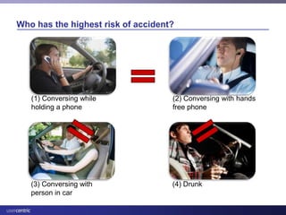
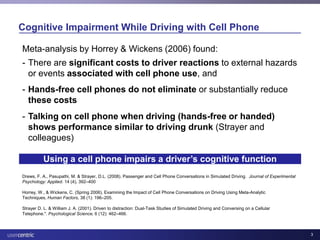
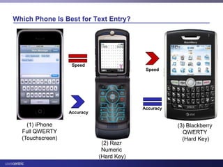
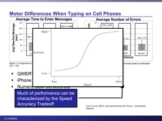
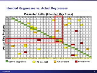
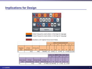
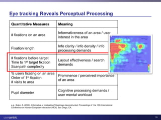
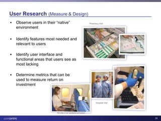
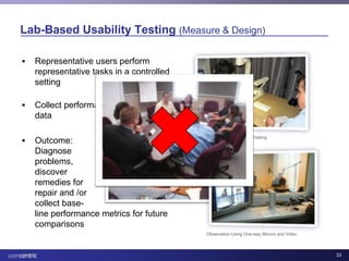
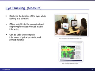
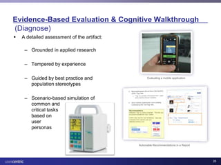
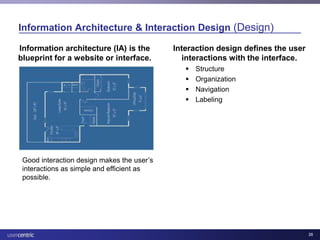
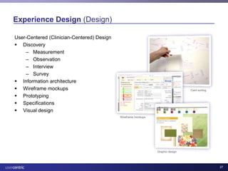
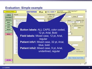
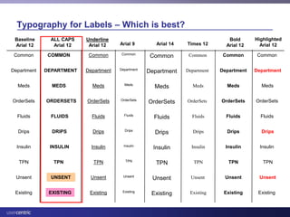
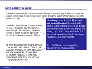
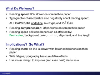
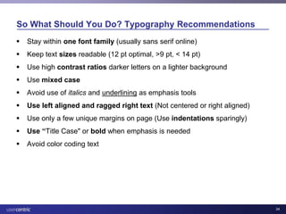
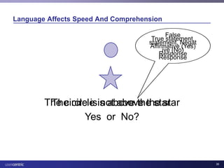
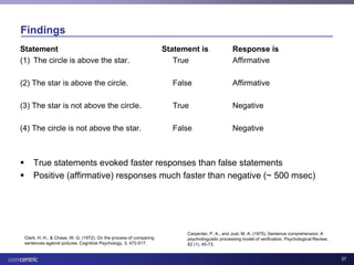
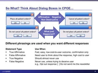
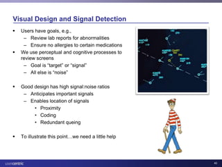
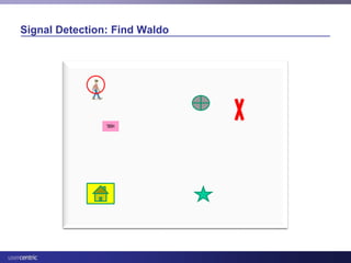
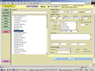
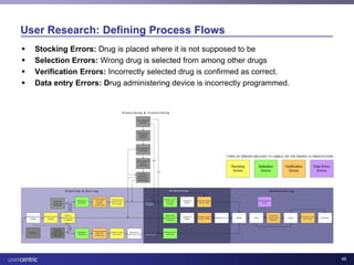
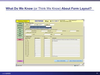
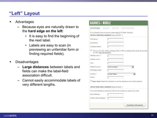
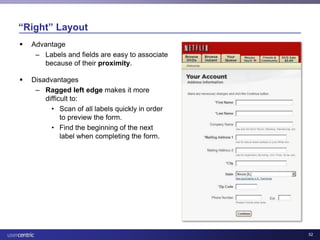
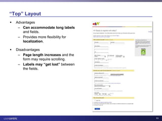
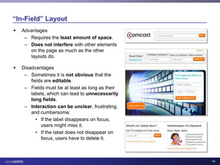
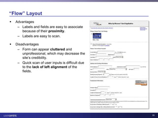
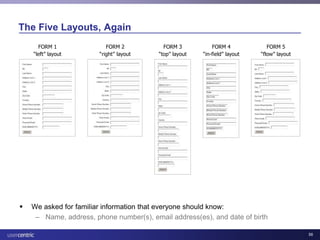
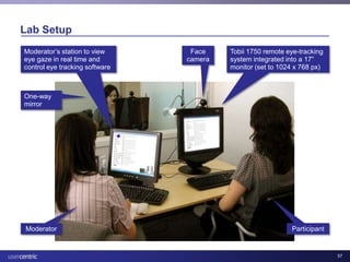
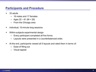
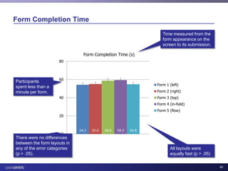
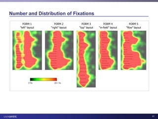
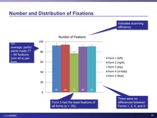
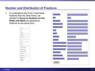
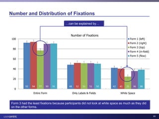
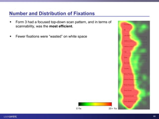
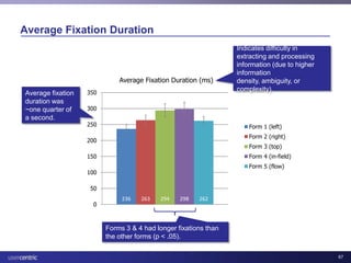
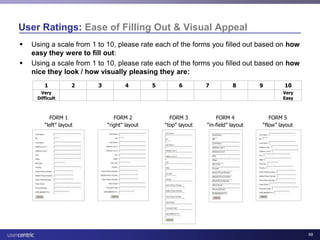
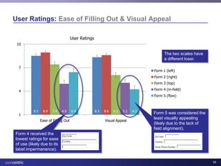
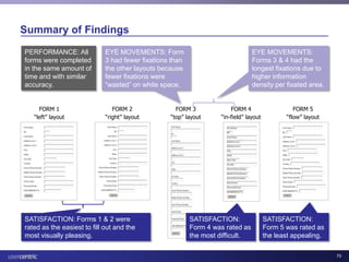
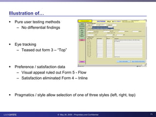
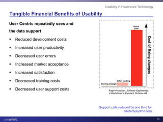
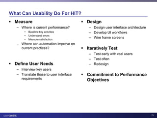
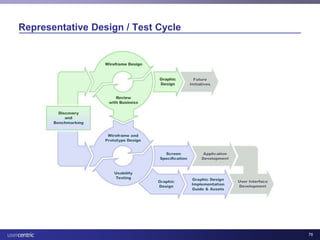
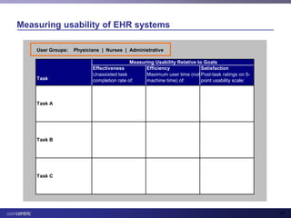
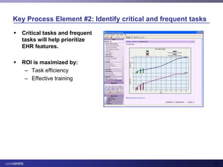
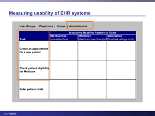
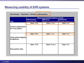
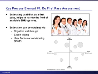
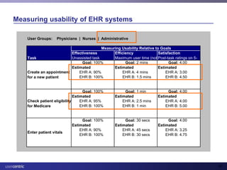
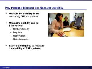
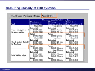
Usability and Health IT

Editor's Notes

  • #2 Thank you.NamePleasure to be here to speak to you.I am Managing Director of a user research firm HQ in OBT, with test studio @ 500N and in Beijing ChinaWant to start out with a few non-HIT examples to illustrate some points about usability- In fact these examples are set to illustrate – three areas of usability: cognition, motor performance, and attention.Some may seem a little strained, but we’ll weave them togetherIt’s my hope that you’ll walk out tonight with a greater appreciation for what Usability is, how it is used, and specifically how it can be applied in HIT
  • #3 Cognitive
  • #4 Driver performance when talking on a cellphone is roughly equivalent to being drunkDriver performance is no different when on handsfree and hand holding Epidemiological and forensic analysis support these lab findingsLive conversation is much less impaired than cell conversationReason: Cognitive demands of conversation impair ability to perform primary task track lanes and brakeTheory: Multiple resource theoryImplications: Accidents may not go down, and could possibly go upMeta-analysis by The Canadian Automobile Association[9] and The University of Illinois[10] found that response time while using both hands-free and hand-held phones was approximately 0.5 standard deviations higher than normal driving (i.e., an average driver, while talking on a cell phone, has response times of a driver in roughly the 40th percentile). Horrey, William; Christopher Wickens (Spring 2006). \"Examining the Impact of Cell Phone Conversations on Driving Using Meta-Analytic Techniques\" (PDF). Human Factors (Human Factors and Ergonomics Society) 38 (1): 196–205. Strayer D. L., Drews F. A. & Johnston W. A. (2003). \"Cell Phone-Induced Failures of Visual Attention During Simulated Driving.\". Journal of Experimental Psychology: Applied 1 (9): 23–32. doi:10.1037/1076-898X.9.1.23Strayer D. L. & William J. A. (2001). \"Driven to distraction: Dual-Task Studies of Simulated Driving and Conversing on a Cellular Telephone.\". Psychological Science 6 (12): 462–466. cell phone drivers exhibited greater impairment than intoxicated drivers.  POINT: Cognitive impairment\"Drivers need to keep not only their hands on the wheel; they also have to keep their brains on the road,\" passenger conversations differ from cell phoneconversations because the surrounding traffic not only becomes a topic of the conversation, helpingdriver and passenger to share situation awareness, but the driving condition also has a direct influenceon the complexity of the conversation, thereby mitigating the potential negative effects of a conversationon driving.cell phone and passengerconversation differ in their impact on a driver’s performanceand that these differences are apparent at the operational, tactical,and strategic levels of performance.
  • #5 Motor
  • #6 MOTOR Performance
  • #7 A 26 x 26 matrix was constructed to further analyze the errors users made on the iPhone keyboard.The columns represent the intended key press or the targeted letter.The rows represent the actual key press made by the participant.
  • #8 ExampleSet up
  • #12 PerceptualSeeFeelHearSmellTouchCognitive-Remember-Recall-DecideMotor-Act
  • #13 5 minutes
  • #15 Not market research, focus groups, user acceptance testing, surveys, graphic designThere is a kernel of truth in all of these, they are worthy subjects and have their place, however these are not what we’ll be talking about here
  • #17 Main Entry:us·ableVariant(s):also use·able  \\ˈyü-zə-bəl\\Function: nounDate:14th century1 : capable of being used2 : convenient and practicable for use
  • #18 Usability is a soft construct
  • #19 Here are just a few examples of present and past work by human factors/ergonomics experts that has made a difference in our lives:What would driving today be like without the center high-mounted rear brake light in cars? Human factors/ergonomics professionals found that use of this safety feature helped to prevent rear-end collisions, saving millions of dollars each year. Numerous contributions by HF/E professionals have made air travel safer. These efforts focus on both cockpit safety and effectiveness as well as improved interaction between pilots and air traffic controllers.Those with diabetes are benefiting from usability studies performed on a range of blood glucose monitoring systems, which have resulted in improvements to these devices. HF/E professionals are helping to ensure that other medical devices for use in both health care institutions and the home are safer and easier to use.
  • #21 Czerwinski, M., Horvitz, E., & Cutrell, E. (2001). Subjective Duration Assessment: An Implicit Probe for Software Usability. In Proceedings of IHM-HCI 2001 Conference, Volume 2, (September, 2001, Lille, France), p. 167–170
  • #27 It is the foundation upon which interface design can be successfully implemented.
  • #31 Evaluations and EHR
  • #32 I tried to find some more information about what “harder to read” means statistically. I managed to find some numbers in Janice Redish’s book, Letting Go of the Words: Writing Web Content that Works. (This is a great writing-for-the-web book, by the way!) ALL CAPS slow reading speed by about 15 percent. Given that website visitors tend to want to obtain and read information quickly on the web, making web content harder to read by using ALL CAPS should generally be avoided.
  • #38 Clark, H. H., & Chase, W. G. (1972). On the process of comparing sentences against pictures. Cognitive Psychology, 3, 472-517.Just, M. A., & Carpenter, P. A. (1971). Comprehension of negation with quantification. Journal of Verbal Learning and Verbal Behavior, 10, 244-253.
  • #39 All have same result if you press “return”
  • #40 People have goals when they use systems. We are constantly looking over our visual field Looking for a passport
  • #44 Evaluations and EHR
  • #46 Guideline: Do not use two (or more) different ways to highlight the same information on one page.Comments: One study found that participants were able to complete tasks faster when the interface contained either color-coding or a form of ranking, but not both. The presence of both seemed to present too much information, and reduced the performance advantage by about half.Sources: Bandos and Resnick, 2004; Resnick and Fares, 2004. Bandos, J. & Resnick, M.L. (2004). The effects of semantic and syntactic instruction on users performance and satisfaction in search user interface design. Proceedings of the Human Factors and Ergonomics Society Annual Meeting.Resnick, M.L. & Fares, C. (2004). Visualizations to facilitate online tabular presentation of product data. Proceedings of the Human Factors and Ergonomics Society Annual Meeting.
  • #74 Like any quality activity, benefits are hard to quantify for an individual project.There is ample research that supports incorporation of usability activities as a cost-reduction mechanism.Typical figures quoted are a benefit of between 10:1 and 100:1 (that is, a saving of between $10 and $100 for every dollar spent).Decreased user errorsOne project we did was with New Zealand Surf Lifesaving, where we helped simplify the web interface to their database. SLSNZ are actually surprisingly big on measuring statistics. The season that we did the work there were 1847 rescues performed by 4000 active lifeguards around New Zealand. They need these kind of statistics to justify their funding – they make a difference by saving lives. One of the biggest advantages of having a user centred focus was fewer errors in the database. Decreased training costsFurthermore, the new interface was much simpler and resulted in less training cost. Not having their trainer fly all over the country to visit 75 surf clubs from the far north to the deep south makes a big difference for a not-for-profit.Decreased user support costsWork with did with the official e-commerce site of the Canterbury clothing company resulted in far fewer enquiries about shipping information, and where stores are located, as a result of the changes we recommended.
  • #75 ***Will reduce these slides so fewer words and details***
  • #78 We’ve seen that specific techniques for measuring user performance exist…A lot of current problems are solved problemsApplying usability and human factors to healthcare systems would help organizations reach their patient-centered goals (STEEP) and practitioner-centered goals.This diagram is from a study showing the impact of interface design on technology-induced error in healthcare – by applying usability principles, errors decrease.
  • #80 ***Will adjust the diagram to better show this message:***There are often tradeoffs and many constraints in designing healthcare technology.Nobody starts out saying, “I’m going to make this really difficult to use.”HIT has come a long way, using healthcare domain expertise along with technology expertise,but to take it to the next level, usability is needed.
  • #84 That is, [CLICK] from our analysis of 34 publicly available RFPs for EHRs, [CLICK] 26 out of 34 RFPs made no mention of usability. Seventy-five percent of the RFPs do not include usability as an important component to the proposal of developing and implementing EHRs. Of those RFPs that did make mention of usability, [CLICK] many RFPs used vague descriptions when discussing usability.From our content analysis, the importance attributed to usability is miniscule at best.