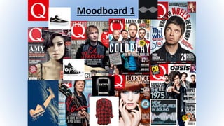
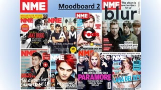
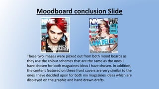
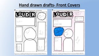
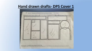
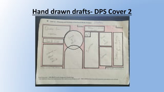
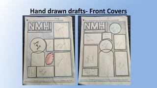
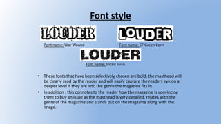
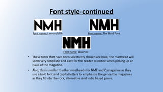
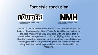
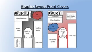
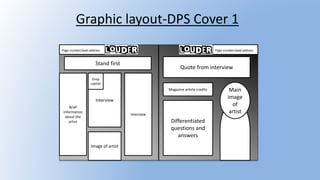
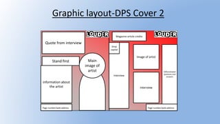
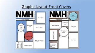
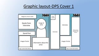
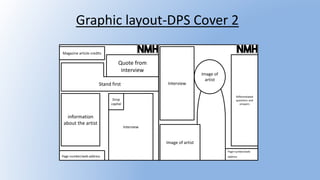
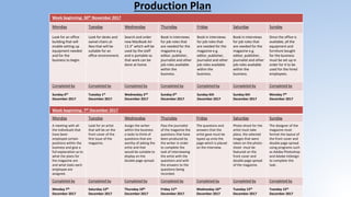
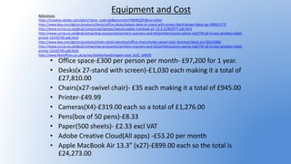
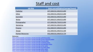
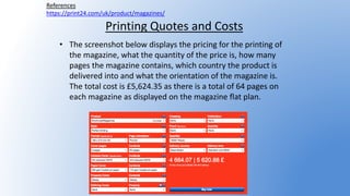
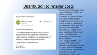
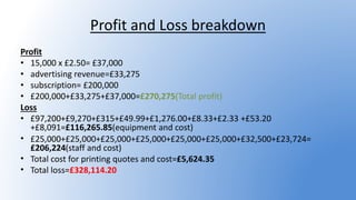
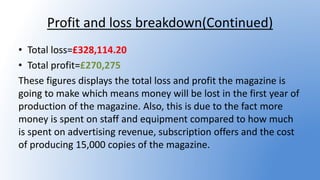
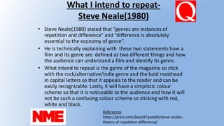
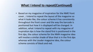
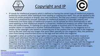
This document provides information and ideas for developing two music magazines targeted at 16-30 year olds. It discusses color schemes, mastheads, images, frequencies, and target audiences for the magazines. Font styles, graphic layouts, and mockups are proposed for the magazine covers and sample double page spreads. Key details include using red, white, black and blue colors; releasing issues monthly; and focusing on genres like indie, alternative and rock. Fonts and cover designs are selected to be bold and visually appealing to the intended audience.
Unit 13 (LO1) – Understanding existing print-based media products and how the...mdelmar97
Mojo is a monthly music magazine published in the UK since 1993. It focuses on classic rock music and targets upper middle class readers aged 35 and older. The magazine promotes itself through social media platforms and aims to build connections between readers and artists. It uses in-depth articles and reviews to provide surveillance of the music industry and help readers find community and identity through their shared love of classic rock.
Unit 13 – Planning and Pitching a Print based Media Product (LO2)mdelmar97
This document contains the slide contents for a presentation on the development of a music magazine concept. It includes slides on mood boards, font styles, magazine layout plans, photography plans, cover and spread designs, and proposals for two magazine title ideas - "Tune iN" and "Beat". Key elements that are explored include house styles, color schemes, graphic layouts, and annotated codes and conventions for the magazine designs. The presentation shows the process behind conceptualizing and designing the different elements of an original music magazine.
This document provides details on Nicole Mukonjo's magazine pitch for two magazine ideas - 'Louder' and 'NMH'. It includes mood boards, mind maps, hand-drawn drafts and graphic layouts for the magazine covers and spreads. It also discusses the target audiences, production plans, photoshoot plans and connotations behind the magazine names. The document aims to convince the reader of Nicole's magazine concepts and showcase their visual designs and plans for content, style and production.
The document describes the design and conventions used in a mock magazine cover and articles that the author created. Key points:
1. The cover uses conventions of real magazines like a masthead, barcode, date and price. It features a main image and pull quotes to entice readers.
2. The articles use an interview format with questions in red and answers in black. Main images take up space and pull quotes draw readers in.
3. The author learned skills with the text and image tools to create stylistic elements like strokes and effects to achieve a "rocky" tone fitting the genre.
This document outlines plans for two music magazines targeting 16-30 year olds. Key details include:
- The magazines will have similar color schemes of red, white, black, and blue for brand consistency.
- Images on the covers will be close-ups or mid-shots of artists to emphasize or convey their image.
- The mastheads will use bold fonts like "The Bold Font" and "CF Green Corn" to stand out visually.
- Issues will be released monthly to allow time for distribution. The magazines will have A4 size to fit content.
The document is an evaluation of a student's media magazine project. It discusses how the magazine uses conventions of real magazines through elements like the masthead, cover lines, images and footer. It also addresses how the magazine represents social groups through the images and styles used. Finally, it discusses the target audience as teenagers interested in rock music and what was learned about design technologies through constructing the project.
The document describes the design and conventions used in a mock magazine cover and articles that the author created. They analyzed how their design challenged or followed conventions of real magazines like Kerrang!. Their cover used standard elements like the barcode and date, but challenged conventions by listing band names in the footer in an unusual format. Their interview article used question and answer format and visual elements like pull quotes to engage readers. The author learned skills using Adobe InDesign like adding text effects and strokes to make elements stand out.
The document provides details on the planning and research for a music magazine front cover and contents page project. It describes the step-by-step process taken to create the front cover, including adding graphics, images, and text. It also outlines the steps to create the contents page layout. Research is presented on established music magazines like Q and Billboard to identify conventions and the target audiences. Key points about the publishers and statistical information about circulation and readers are also summarized.
The document outlines plans for a new rock music magazine. It will target an audience aged 13-20 and feature information on rock bands, albums, tours, and reviews. The magazine will be published monthly with a retail price of £3. It will have a casual, informal style with red as the main color. The content will include articles, posters, and free CDs or digital codes with issues.
This document analyzes the contents page and double page spread (DPS) of NME Magazine from November 2008 and 2011. It summarizes the key conventions used, including subheadings in boxes to label sections, a band index, a subscription box, colored drop capitals, pull quotes, and filling most of the DPS with an image of a featured artist. The document concludes that incorporating these conventions would help appeal to the target audience of a music magazine and increase readership based on theories of star appeal and genre expectations.
The documents provide details on the proposed layouts, designs, and target audience for two electro music magazines called Pulse and Electro Eskimo. Key details include:
- The magazines will have a weekly release schedule and target 16-24 year olds who enjoy electro-pop artists like Alan Walker and Tobu.
- The color scheme will be bold blacks, whites, and blues to stand out on newsstands. Thumbnail images of other artists will also be included.
- Inspiration is taken from existing magazine layouts, including large central images, differentiated text sizes, and consistent logo placement.
- Draft layouts and typeface options are presented, with the goal of a professional,
The document discusses how a media product (a rock magazine) uses conventions of real media. It uses social media logos and established brands like iTunes to interact with audiences. It follows color schemes and fonts used by other rock magazines to appeal to its target audience. Key words are bolded, pull quotes are used, and competitions and subscriptions are advertised to attract readers. Photos in the magazine represent the target 16-24 age group to make them feel related to. Overall, the document examines how the magazine incorporates standard media formats and represents its intended social group of rock fans aged 16-24.
Jack Kay has created a hybrid music/skateboarding magazine called "Manchester Scene Mag". The target audience is primarily males aged 15-25 who are interested in indie music and skateboarding, especially around the Manchester, UK area. Key elements that address this audience include male-oriented colors, images of skateboarding and music venues/events, and cover stars that represent the target demographics. The magazine would be distributed monthly through IPC Media to compete with similar magazines like NME. It challenges conventions through original design elements while also conforming to standard magazine formats and layouts.
The document provides instructions for a foundation portfolio assignment analyzing the front covers of two music magazines targeted at different audiences. Students are asked to choose two magazine covers, analyze elements like the target audience, house style, design principles, images, masthead, and cover lines. They must then write an essay comparing and contrasting the two magazines and commenting on similarities and differences. The deadline for submission is February 15th.
This document provides information about NME magazine, including its target audience, publisher, and circulation numbers. NME targets mainly men aged 17-30 with an interest in new music. It has experienced declining circulation, with an average weekly sale of 18,184 in 2013 dropping to 14,312 in 2014. NME is published weekly and its publisher is Timeinc.UK. The magazine aims to cover the past, present, and future of music through features, interviews, and reviews that appeal to its target psychographic groups of survivors and explorers interested in music and social change.
The document provides information on several music magazines, including NME, Kerrang, and Q Magazine. It summarizes their circulation numbers and describes their target audiences. NME readers are described as completely trusting the brand and relying on editorial content and ads to stay up to date on new music. Kerrang ensures it appeals to a spectrum of rock music fans from teenagers to fans of heritage bands. Q is described as a "bastion for music of substance" that guides readers to "just the good stuff" in all forms of music. The document then analyzes design and layout elements across sample pages from the magazines to engage and draw in readers.
The document provides an analysis of the front cover design for a magazine media product. It summarizes how the cover design both conforms to and challenges conventions of real music magazines. It conforms by using colors and layout elements typical of indie/rock magazines like NME. However, it also challenges conventions by using a less crowded layout between the styles of two example NME covers. The cover is meant to represent and attract teenage audiences interested in music and culture through the image of a teenage girl and use of music-related language.
The document provides information about various music magazines, including:
1) NME (New Musical Express) is a UK-based weekly magazine that started as a newspaper and is now owned by IPC Media.
2) Bauer Media Group owns several UK music magazines including Kerrang, Q, and Mojo.
3) Rolling Stone is a US-based biweekly magazine founded in San Francisco that was started by Jann Wenner and Ralph J. Gleason.
4) Billboard is a US-based magazine that provides information about its large audience which is predominantly between 25-54 years old and has an average yearly household income.
Jon Villacci conducted primary research through a questionnaire to gather information about what readers find most appealing in an alternative rock magazine. The responses indicated that images, interviews, popular bands, and information are most interesting to readers. Star appeal and promotions were also found to impact readership. The appropriate price range was determined to be £2-3, which is consistent with similar magazines. The research provided insights into design elements and content that will attract readers and influence sales of Jon's magazine.
The document provides research and planning for a Motown music magazine. It includes:
1) An overview of the AIDA model and research on the Mojo magazine style.
2) Research findings on common music magazine conventions like mastheads, barcodes, and striking cover images.
3) Examples of covers, contents pages, and articles from the Mojo magazine that will be emulated.
4) A summary of the Motown genre and research results on the target audience for the magazine.
The document provides information about Q magazine, including its publisher, target audience, content, and analysis of design elements. Bauer Media Group publishes Q magazine, a monthly music magazine in the UK with a circulation of 48,353. It focuses on rock and roll music and includes interviews, reviews, and advertisements. Q magazine aims its content at readers interested in current developments in the music industry. It maintains a consistent brand identity across its magazine and website through consistent use of typography, color schemes, and layout.
This document provides information about the magazine Q, including its publisher, circulation, readership demographics, mission and style elements. Q is a large UK music magazine published by Bauer Media, with a younger readership of around 550,000 people, most aged 29. It aims to provide coverage of good music across all genres. The magazine has a simple yet stylish design focused on photography of artists against uncomplicated backgrounds in red, white and black colors.
The document provides an analysis of various music magazine covers and contents. It examines similarities and differences between magazine covers in terms of mastheads, images, colors and styles. It also analyzes layout, images and text on magazine contents pages. Double page spreads are looked at for title placement, images, colors and layout. Overall conventions and techniques are discussed for effectively presenting information to music magazine audiences.
The document discusses how the magazine attracts and addresses its target audience of girls aged 16-19 who are interested in rock music. The main image on the cover features two models of the target age/gender to create relatability. Throughout the magazine, bold fonts, vivid colors, images of rock icons, and informal language are used to appeal to the youthful audience. Pull quotes and previews of band interviews draw readers into articles and keep their attention. The consistent branding and preview of diverse content aims to convince readers that the magazine is worth purchasing.
- The document outlines plans for a new music magazine called "Bottleneck" aimed at audiences aged 16-20.
- The magazine will be released weekly on Mondays, with an end-of-month issue summarizing the previous three.
- It will focus on rock music and feature articles, interviews, reviews and freebies related to bands, concerts, and other music-related topics.
- The magazine will cost £2.49 per issue and use innovative cover designs and layouts to attract readers.
The document provides a detailed evaluation of a media coursework project to design a music magazine. It summarizes the key conventions used from real magazines, including a colorful masthead, reviews highlighted in "pugs," and inclusion of a barcode. It also discusses challenges to conventions like placing the masthead to avoid obstruction. The target audience is identified as teenagers interested in indie music. Overall, the document reflects on the progress made in skills and understanding of magazine design conventions over the course of the project.
The document analyzes the front cover of Kerrang magazine to understand its target audience. Kerrang targets predominantly male rock fans aged 17-24. The front cover uses conventions like a dominant image of a rock artist and headlines in line with the magazine's house style to attract this audience. The codes and conventions employed on the cover aim to appeal to the attitudes and lifestyle of the target readership.
The document discusses choosing a genre and name for a new music magazine. It analyzes that a pop rock genre would be most successful as it combines popular rock and pop music. Research shows magazines like Q with this format sell well. An abbreviated name like MM (Music Matters) or one clearly stating the pop rock genre like Pop & Rock would help potential readers identify the magazine's content. Color schemes and fonts used by successful magazines like NME should be considered to develop the magazine's house style and make it recognizable to readers.
The document discusses choosing a genre and name for a new music magazine. It considers focusing on pop rock as this combination has been successful for other magazines like Q. A pop rock genre would appeal to a wide target audience of young adults and incorporate popular music. It also discusses choosing a name that identifies the genre and engages readers, as well as establishing a consistent house style through color scheme and fonts to brand the magazine. Proper article layout and design is also important to create appealing content and maintain the house style across issues to build recognizability with readers.
This document provides details on the planning and design process for two proposed hip hop music magazines titled "Rhythm" and "Beat". It includes initial mind maps for each magazine covering color schemes, target audiences, and content. Font styles and mood boards are presented for consideration. Hand drawn drafts show potential front cover and double page spread layouts incorporating elements like mastheads, images, interviews, and social media icons. The target audience for both magazines is identified as 15-20 year olds. Key details like monthly release schedule, 99p price point, and A4 size are outlined. Color schemes of red/white/black and white/yellow/grey are selected for "Rhythm" and "Beat" respectively.
The document is an evaluation of a music magazine called "Noir" created by the author. It discusses how the magazine uses, develops, and challenges conventions of real music magazines. It includes typical magazine features like reviews, interviews, and photos within the limited scope of the project. The target audience is described as those interested in music, film, and art. Photos of the band member Jack are used to represent his personality and appeal to readers. The magazine would likely be distributed by a publisher targeting both male and female readers with diverse interests, such as Bauer Media or by publishing it online through websites like Issuu.
The document provides information about NME (New Musical Express), a British music magazine. It discusses the magazine's history, including being founded in 1952 and recently changing publishers from IPC Media to Time Inc. Details are given about Time Inc. as the current publisher and owner of NME. Demographic information is also included, stating that 61% of NME readers are from social grades A-C1.
The document provides instructions for a foundation portfolio assignment analyzing the front covers of two music magazines targeted at different audiences. Students are asked to choose two magazine covers, analyze elements like the target audience, house style, design principles, images, masthead, and cover lines. They must then write an essay comparing and contrasting the two magazines and commenting on similarities and differences. The deadline for submission is February 15th.
Carmel Seager proposes creating a music magazine called "M" focused on indie music but covering various genres. The magazine would have a similar format to Q magazine, with the logo in the top left corner of the cover and main image taking up most of the front page. The interior pages would follow a consistent house style using the colors green, black, and white. The target audience is 16-24 year olds, mostly British initially but expanding internationally, who are passionate about music. Carmel plans to use Photoshop to lay out at least 125 pages per issue to the size of an A4 magazine.
This document provides an overview of the contents for a presentation on magazine design. It includes mind maps for magazine ideas, proposals for two magazine concepts ("M" and "E"), graphic layouts, mood boards, and details on the development of "My Magazine" including genre, layout, style, content, audience, subscription offers, and masthead font designs.
The magazine aims to engage with mod culture through its design elements that reference symbols of mod subculture like the Union Jack. These include the masthead, cover lines in red, white and blue, and a feature photo of a band member addressing the camera intensely. The double page spread continues these design elements and features a large photo of a band in black clothes against a background with graffiti, appealing to the aesthetic tastes of the target audience. The magazine targets males aged 18-45 interested in mod music, fashion, and lifestyle, especially those interested in reliving the mod revival era or passing the culture to younger generations.
This document contains a student's evidence submission for a media studies coursework assignment on planning and pitching a print-based media product. The submission includes analysis of Mixmag magazine, a print and online magazine focused on dance music and club culture. The analysis covers Mixmag's publisher, purpose, content, target audience, and production process. Examples from magazine issues are provided to examine features like cover design, articles, and interviews. Relevant media theories are also applied to understand Mixmag's approach.
This document provides details on the planning and design of two weekly hip hop magazines. It discusses color schemes, target audiences, types of images to be used, and branding strategies. The color scheme for the first magazine is red and white, while the second magazine's color scheme is green, white, and black. Both magazines will target 15-35 year olds and feature a variety of big name hip hop artists to appeal to different readers each week. Close up and angled photos will be used throughout to showcase the artists. The logos and mastheads will be bold, bright colors to stand out on shelves.
This document outlines plans for a new music magazine called "Lyrical" focused on pop and rock music. It discusses the target audience as 16-30 year olds from socio-economic classes B-C2 of both genders. It proposes a monthly circulation to allow time to source stories and images. The color scheme, masthead font, and social media strategy are described. Sample pages from an issue include contents, editor's note, interviews, reviews, advertisements and competitions. Inspiration is drawn from Billboard magazine in terms of layout and design elements.
The document analyzes magazines to understand how they engage readers. It finds that music magazines NME and Billboard are most popular, targeting teenagers and young adults. They use bright colors and bold text to attract younger audiences. The document then analyzes magazine covers and contents pages, finding they all feature famous artists to grab attention. Bright colors and set brand colors allow readers to recognize magazines. It plans to feature a street performer in its own magazine to tell their story.
The document discusses the final front cover and double page spread (DPS) designs for a magazine. It provides details on the design process, including using tools like the gradient and magnetic lasso tools to create backgrounds and crop images. Font choices and layouts were selected to ensure the text is readable and draws the reader in. Feedback was incorporated to improve the designs. Both the cover and DPS feature the main artist through images and an interview to clearly highlight them as the focus.
The document outlines mind maps and plans for two music magazines titled "Riddim" and "Bass" that include details on mastheads, color schemes, target audiences, and frequencies. It also includes mood boards and analyses of magazine covers and genres to help develop the brand identities and house styles of the two magazines.
1. The document proposes a new music magazine called "Tune iN" that will cover various genres including rock, folk, soul, country, reggae, electronic, and experimental music.
2. The magazine will include articles on backstage at festivals/concerts, upcoming tours, album and film reviews, interviews with popular artists, and competitions.
3. It will be promoted on social media and have a monthly publication schedule, with the goal of competing with the established magazine "Mojo" while targeting a younger audience aged 15-24 that values discovery and experience.
The document provides an evaluation of the student's media coursework assignment to create a magazine. It summarizes the key ways the student's magazine both follows and challenges conventions of real music magazines in its design. This includes using layouts similar to Kerrang magazine but with unconventional color schemes and fonts. It also discusses how the content focuses solely on punk rock, representing that genre. Overall, the student learned important skills in using Photoshop and balancing conventions with original designs.
The magazines researched target different audience demographics. Kerrang targets a younger audience interested in punk and alternative music. It uses casual writing and includes free posters. Mojo targets an older audience with more established music tastes. It focuses on classic artists. Q targets the widest range of ages and musical interests but lacks a consistent visual identity across issues. Common features included bold color schemes, photography focuses, and double page spreads for major stories.
The document is a student's evaluation of their music magazine called 'Noir'. It discusses how the magazine challenges conventions by combining music, film, and art. Photos and writing are used to represent the featured artist, Jack Potkins, as creative and influential. Audience feedback was positive about the clear house style and representation of the target audience.
The document discusses hand-drawn drafts and Photoshop work for the sign up page and homepage of a social media website called WorldFace. It provides details on the color scheme, layout, and features included in the drafts and Photoshop designs to make the pages suitable for users. The target audience, terms and conditions, privacy policy, and types of advertising that could be used are also reviewed.
The document provides an overview of WorldFace, a proposed social media website. It describes the purpose of WorldFace as allowing long-distance communication and sharing news and opinions. It notes the logo, color scheme, and layout are meant to be easily recognizable and simple. The target audience is described as mainly being ages 16 and older from social classes C1 to E. The document then outlines the website functionality, including sign up/login pages, homepages, profile pages, and terms and conditions. It proposes job roles and salaries for producing the site, as well as a 4-week production plan. Finally, it discusses advertising revenue, budget, and important legal and ethical considerations like copyright, intellectual property, and the Data Protection
Snapchat is a photo and video messaging app launched in 2011. Its purpose is for users to communicate with friends by taking images or videos that last for a few seconds before being deleted. Users can edit their snaps with filters, lenses, stickers and send them to friends or add them to their story for all friends to view. Revenue comes from geofilters that users can purchase to display on their snaps in certain locations, and advertising placements that companies pay to display in the discover and story sections. Legal issues include respecting intellectual property and copyright of content posted, and ensuring user privacy through controls on sharing location data.
This document provides details on the development of two social media website ideas: WorldFace and WebChat.
For WorldFace, the target audience is 16+ and it aims to inform users on news and connect with friends globally. Key features include a news feed, personal profiles, posts and comments. The color scheme is blue and white.
WebChat aims to recreate chatting from the past but with updated features like a news page. The target is 18+ as it is similar to old chat sites. The color scheme is red and white to stand out.
The document includes brand name and slogan ideas, font styles, draft designs, and a conclusion selecting WorldFace as the stronger idea due to its broader appeal and
The document outlines plans for producing a festival poster, including hand-drawn drafts, graphic layouts, a photoshoot plan, logo design, and production schedule. It discusses designing the layout, choosing artists, dates, and visual elements for the poster. A budget table estimates costs for equipment, software, office space, and salaries for roles like publisher, marketing, and design needed to create the poster.
The document outlines the plans for a 3-day music festival, including:
- Hand drawn drafts and graphic layouts of the festival format.
- The campaign message of "New Music Hits" to promote the festival.
- A photoshoot plan and house style for the festival poster with bold colors and a sunset background.
- A production plan spanning 3 weeks for designing and releasing posters and advertisements.
- A budget summary listing estimated staff salaries and equipment costs like office space and desks.
This document provides details on planning and producing a festival poster. It includes a mind map outlining ideas like logo, target audience, slogans and colour scheme. Hand drawn drafts and graphic layouts are presented. Artists being considered are listed. A production plan outlines tasks over 3 weeks such as finalizing designs, sending to print and releasing. Legal/ethical constraints and references are also noted to ensure compliance. The goal is to create appealing posters that effectively advertise the festival and its lineup.
The document discusses the advertising campaign for Latitude Festival, which is held from July 14-16, 2017 at Henham Park in Suffolk, England. The campaign aims to promote the festival and gain a wider audience by showcasing the music artists as well as other entertainment like comedy, theater, and a kids' area. The target audience is those aged 13 and older, though under-13s can attend with a parent or guardian. Most attendees are in social classes C1-E and include students and families. The festival appeals to explorers and aims to provide an escape and community for attendees.
Free newspapers and magazines, called "freesheets", are distributed for free in public places like train stations and shopping centers. Advertisers pay for the cost of freesheets. Red top tabloids focus on soft news like celebrity gossip rather than hard news. They may include misleading or unproven information. Broadsheets are larger newspapers that contain more in-depth hard news coverage across multiple columns.
This document summarizes the environment, materials, and evidence related to a presentation pitch. It includes images of the camera, tripod, computer, and clicker used during the pitch. Screenshots are also provided of the witness statement evaluating what went well and could be improved. The materials used to create the pitch included Microsoft PowerPoint for the slides and Prezi to organize them. A link to the Prezi presentation is included. In conclusion, the document explains how the environment and equipment allowed for effective delivery of the pitch and use of PowerPoint and Prezi made the pitch more professional.
The document provides feedback from a witness statement on the presenter's magazine pitch. One strength noted was that the presenter presented well and was prepared with details. An area for improvement was fixing minor issues with front cover images. The presenter made several improvements based on the feedback, such as adding a spending power section, competitors page, adjusting the front cover design, and including a photoshoot plan. An online survey gathered additional feedback, and the presenter analyzed the results to further strengthen the pitch for future presentations.
Here are 3 potential questions for the interview:
1. What inspired you to pursue a career in music?
2. How would you describe your musical style and influences?
3. What are your hopes and goals for your upcoming debut album?
These questions provide insight into the artist's background and motivation, their musical style and sound, and their ambitions for the future release. They help paint a picture of the artist for readers in a concise yet informative way.
The document outlines plans for producing a festival poster, including:
- Hand-drawn drafts and graphic layouts were created to decide the best format.
- A photoshoot plan and location recce were done to capture images for the poster.
- Detailed production plans schedule the poster creation over 3 weeks.
- Budgets include estimated costs for equipment, salaries, and printing 200 posters.
- Risk assessments address technical and safety issues, and legal/ethical constraints are considered regarding copyright and regulations.
This document contains information for planning and producing advertisements for a music festival. It includes hand drawn drafts and graphic layouts exploring suitable formats. It outlines the campaign message, photoshoot plan, house style, and production plan spanning 3 weeks. Budget details include estimated costs for equipment, salaries, office space, and printing 200 A4 posters for £40. Risk assessments cover software use and an outdoor photoshoot location. Steps taken in Photoshop to create the festival advertisement are provided.
This document provides details of a production plan for creating festival posters and advertisements. It includes budgets, equipment needs, job roles, and a three-week production schedule. The budget outlines expected costs for office space, equipment like computers and cameras, and staff salaries. Production is scheduled over three weeks, with tasks including deciding the festival dates and artists, designing layouts, sending designs to print, and releasing posters online and on social media. The plan aims to produce multiple posters and advertisements to market the festival and reveal artists over time.
Latitude Festival is a three-day music, comedy, theater and dance festival held annually in Suffolk, England. The advertising campaign promotes the 2017 festival through various methods. An audiovisual advertisement on YouTube highlights past festivals to convey the atmosphere and entertainment options to potential attendees. The target audience is teenagers and adults, though children are allowed with guardians. The festival aims to attract a wide range of people from various social classes and backgrounds by offering diverse acts across multiple stages.
This document provides details about the environment, materials, and feedback from the presenter's pitch. It includes images of the camera, computer, presentation clicker, and tripod used during the pitch. Screenshots of the witness statement feedback are also included, highlighting what went well and could be improved. A survey monkey feedback report outlines responses to questions about the magazine covers, proposals, and improvements for future pitches. Plans for improving the pitch include adding details on spending power, competitors, and a photoshoot plan.
The document outlines the graphic layout and design of magazine covers and spreads, including sections for the front cover, double page spreads, hand drawn drafts, final magazine pages, and proposals. It provides examples of layout configurations for key design elements like headlines, images, text blocks, and other graphical conventions across various pages. The pages are meant to demonstrate the planned structure and visual presentation of content within the magazine.
This presentation was provided by Steph Pollock of The American Psychological Association’s Journals Program, and Damita Snow, of The American Society of Civil Engineers (ASCE), for the initial session of NISO's 2024 Training Series "DEIA in the Scholarly Landscape." Session One: 'Setting Expectations: a DEIA Primer,' was held June 6, 2024.
How to Build a Module in Odoo 17 Using the Scaffold MethodCeline George
Odoo provides an option for creating a module by using a single line command. By using this command the user can make a whole structure of a module. It is very easy for a beginner to make a module. There is no need to make each file manually. This slide will show how to create a module using the scaffold method.
Macroeconomics- Movie Location
This will be used as part of your Personal Professional Portfolio once graded.
Objective:
Prepare a presentation or a paper using research, basic comparative analysis, data organization and application of economic information. You will make an informed assessment of an economic climate outside of the United States to accomplish an entertainment industry objective.
it describes the bony anatomy including the femoral head , acetabulum, labrum . also discusses the capsule , ligaments . muscle that act on the hip joint and the range of motion are outlined. factors affecting hip joint stability and weight transmission through the joint are summarized.
Executive Directors Chat Leveraging AI for Diversity, Equity, and InclusionTechSoup
Let’s explore the intersection of technology and equity in the final session of our DEI series. Discover how AI tools, like ChatGPT, can be used to support and enhance your nonprofit's DEI initiatives. Participants will gain insights into practical AI applications and get tips for leveraging technology to advance their DEI goals.
How to Add Chatter in the odoo 17 ERP ModuleCeline George
In Odoo, the chatter is like a chat tool that helps you work together on records. You can leave notes and track things, making it easier to talk with your team and partners. Inside chatter, all communication history, activity, and changes will be displayed.
Introduction to AI for Nonprofits with Tapp NetworkTechSoup
Dive into the world of AI! Experts Jon Hill and Tareq Monaur will guide you through AI's role in enhancing nonprofit websites and basic marketing strategies, making it easy to understand and apply.
This presentation includes basic of PCOS their pathology and treatment and also Ayurveda correlation of PCOS and Ayurvedic line of treatment mentioned in classics.
A Survey of Techniques for Maximizing LLM Performance.pptx
Unit 30 LO2
1.
2. Mind map- Both magazines
Colour Scheme
Masthead
Types of
images
that will
be used
Target audience
Frequency
Brand identity
It is aimed for
those who are
within the age
range of 16 to 30
years old
The magazine is
suited for both
male and females
based on the
individual that
appears on the
magazine.
close up-focuses on the
artist that appears on
the magazine only (to
emphasize to the
reader about the artist
that appears on the
front cover.)
Mid shot-when the
image is taken at a
medium shot(to
convey to the reader
the artists true image
and their impression
towards everyone .
The colour scheme will consist of red,
white, black and blue between both
magazines and also keeps it very
simplistic and not to overpowering on
the colours so that the audience can
recognize it easily.
An issue of the magazine will be released
at the end of each month and will give
the company time to distribute issues of
the magazine to its retail outlets.
Music
press
Booming
sound
Fast forward
NMHLouder
HOS(Home
Of Sounds)
The masthead is going to be
placed over the main
headline- this implies to the
reader that the masthead
relates to the headline and
helps the reader to be more
aware of what the magazine is
named.
Use bold text to alert to the
reader and imply to them how
the magazine stands out to
other competitors
Strapline
Magazine ideas
“The UK’s Best Guide to music”
“New Music Hits”
“Your Top
Source To
Music”
“Your Source To
Everyday Music”
Ideas in bold indicates that they will be used for the final magazines.
3. Genre
Q magazine is known for promoting upcoming artists and new
releases of music material from well known musicians and
new artists. They are also known for exclusive interviews with
artists that they are able to share with readers through the
magazine which makes them more intrigued to analyze more
about the artist and get to know them more through their
music and through themselves as people, that’s how the
reader is able to connect with the artist/band through their
music and who they are as individuals. The genre of Q
Magazine would usually be indie, alternative and rock due to
the fact that’s really what the magazine bases all their articles
on and the artists which are ranged in the two genres.
References
http://lauranatmason.blogspot.co.uk/201
1/02/analysis-of-q-magazine.html
4. Genre(continued)
Secondary research
As shown in the pie chart, the percentage of pop music sales is
the highest as it is 36% compared to rock music sales which is
35% so they have a 1% difference. This implies how pop music
is popular amongst all audiences in the UK. These figures are
from 2015 so compared to all other music genres, rock and
pop music is the most favoured from all audiences in the UK.
References
http://www.gigwise.com/news/
99413/pop-music-overtakes-
rock-as-uks-most-popular-genre
Pop music
sales
36%
rock music
sales
35%
R&B music
sales
6%
Dance
music sales
17%
Classical
music sales
3%
Hip Hop
music sales
3%
Most popular music genre in
the UK 2015
5. Publisher of Q magazine
• Bauer Media Group is a entertainment network which was founded in Hamburg in 1875
and now operating in 19 countries which includes the UK, Australia, New Zealand and
the USA.
• It has at least 11,000 employees worldwide and in the UK, So far, it has 25 million
consumers like Kiss, Absolute Radio and Magic.
• They are also Britain's biggest magazine publisher as they publish magazines like Q
Magazine, Closer, Kerrang! Magazine, Mojo magazine and many other magazines all
from different genres.
• Since 2010, the CEO of Bauer Media Group is Paul Keenan.
Reference- http://www.bauermedia.co.uk/about/our-company
8. Moodboard conclusion Slide
These two images were picked out from both mood boards as
they use the colour schemes that are the same as the ones I
have chosen for both magazines ideas I have chosen. In addition,
the content featured on these front covers are very similar to the
ones I have decided upon for both my magazines ideas which are
displayed on the graphic and hand drawn drafts.
9. Front cover- inspiration slide
The masthead of the magazine
is clearly cut by the guitar as it
wants the reader to focus more
on the main image to connote
to the reader that the main
image( Paul McCartney) is the
most important feature of the
magazine along with the
masthead.
With the coverlines, each artist
is in bold text along with what
their feature in the magazine is
about which is under their
names but in normal text. This
conveys to the reader how the
artists are what attract the
audience and how they relate
to the genre the magazine is
implying to the audience.
Another feature of front cover of a
magazine is puff promotion which would
usually be seen in bubble or border
shape which highlights to the reader
what promotions the magazine have to
offer to the reader and how they are
giving something back and rewarding
the reader for purchasing an issue of the
magazine.
Based on Steve Neale-1980, I
will repeat the way Paul
McCartney is positioned on the
front cover in order to connote
to the reader the body
language of the artist and how
passionate they are about
music. The guitar has been
given the 3d effect in which it
stands out to the reader in a
way the guitar is Pauls’ secret
weapon into being more
successful in the music industry.
10. DPS-inspiration slideTwo images of Jake
Bugg have been used
which is one of him
looking in the distance
and the other of him
playing at one of his
gigs. The initial
thought of the first
image could suggest
that he is looking back
at what he was before
he gained attention for
his music and the
other image connotes
how much passion he
has for music and
dedication he has for
it.
There is a drop capital in which this suggests where the reader starts
reading the dps and this in a way gets the readers attention as they are
more interested in the interview compared to other features on the dps.
The main headline
uses a pun as the
editor of this page
wanted to suggest
how this dps is comical
but at the same time
can have moments in
the interview which
are serious and in a
way, this main quote is
what keeps the reader
going.
Below the main headline of this page is stand first which
suggests what the reader should look at first before they start
reading the full article so that they come across the point of
this dps. The words in white text in the stand first highlight the
important individuals in this article which includes Jake Bugg as
he is the main artist of this dps that is being interviewed.
Under the stand first is magazine credits in which the magazine is
giving all the credit to the editor of this page who worked on
setting up the page and constructing it in a way readers will
understand it. By crediting the editor, this connotes to the reader
that it isn't the artist that should be given credit as they took part in
photo shoots and the interview but not the whole editing of this
page.
19. Font style
• These fonts that have been selectively chosen are bold, the masthead will
be clearly read by the reader and will easily capture the readers eye on a
deeper level if they are into the genre the magazine fits in.
• In addition , this connotes to the reader how the magazine is convincing
them to buy an issue as the masthead is very detailed, relates with the
genre of the magazine and stands out on the magazine along with the
image.
Font name: War Wound Font name: CF Green Corn
Font name: Sliced Juice
20. Font style-continued
• These fonts that have been selectively chosen are bold, the masthead will
seem very simplistic and easy for the reader to notice when picking up an
issue of the magazine.
• Also, this is similar to other mastheads for NME and Q magazine as they
use a bold font and capital letters to emphasize the genre the magazines
as they fit into the rock, alternative and indie based genre.
Font name: Lemon/Milk Font name: The Bold Font
Font name: Quartzo
21. Font style conclusion
The two fonts chosen will be the font styles that will be used for
both my final magazine ideas. These fonts will be well suited for
the each magazine as they juxtapose with the genre that is
based on both magazines and bold text highlights to the reader
that the magazines stand out to them and this is one feature on
the magazine that is supposed to grasp the reader’s attention
along with the main image and the content featured in the
magazine.
Font name: The Bold FontFont name: CF Green Corn
22. Graphic layout-Front Covers
Strapline
Image of
artist
Puff
promotion
Main headline
Cover
lines
Barcode,price,
dateofissueand
convergence
Cover lines
Headline
quote
Puff
promotion
Main headline
Strapline
Headline
quote
Main
image
of
artist Cover lines
Barcode, price,
date of issue and
convergence
23. Graphic layout-DPS Cover 1
Page number/web address Page number/web address
Stand first
Brief
information
about the
artist
Interview
Drop
capital
Image of artist
Interview
Quote from interview
Magazine article credits
Differentiated
questions and
answers
Main
image
of
artist
24. Graphic layout-DPS Cover 2
Page number/web address
Stand first
information about
the artist
Image of artist
Interview
Quote from interview
Magazine article credits
Differentiated
questions and
answers
Main
image of
artist
Interview
Drop
capital
Page number/web address
26. Graphic layout-DPS Cover 1
Page number/web address Page number/web address
Magazine article credits
Quote from
interview
Stand first
Image of artist
information about the
artist
Image of
artist
Interview
Drop
capital
Interview
Image of artist
Differentiated
questions and
answers
27. Graphic layout-DPS Cover 2
Page number/web address
Magazine article credits
Quote from
interview
Page number/web
address
information
about the artist
Image of
artist
Interview
Drop
capital
Differentiated
questions and
answers
Stand first
Image of artist
Interview
28. Production Plan
Week beginning: 30th November 2017
Monday Tuesday Wednesday Thursday Friday Saturday Sunday
Look for an office
building that will
enable setting up
equipment needed
and for the
business to begin.
Look for desks and
swivel chairs at
Ikea that will be
suitable for an
office environment.
Search and order
new MacBook Air
13.3” which will be
used by the staff
and is portable so
that work can be
done at home.
Book in interviews
for job roles that
are needed for the
magazine e.g.
editor, publisher,
journalist and other
job roles available
within the
business.
Book in interviews
for job roles that
are needed for the
magazine e.g.
editor, publisher,
journalist and other
job roles available
within the
business.
Book in interviews
for job roles that
are needed for the
magazine e.g.
editor, publisher,
journalist and other
job roles available
within the
business.
Once the office is
available, all the
equipment and
furniture bought
for the business
must be set up in
order for it to be
used for the hired
employees.
Completed by Completed by Completed by Completed by Completed by Completed by Completed by
Sunday 6th
December 2017
Tuesday 1st
December 2017
Wednesday 2nd
December 2017
Sunday 6th
December 2017
Sunday 6th
December 2017
Sunday 6th
December 2017
Monday 7th
December 2017
Week beginning: 7th December 2017
Monday Tuesday Wednesday Thursday Friday Saturday Sunday
A meeting with all
the individuals that
have been
employed certain
positions within the
business and give a
full explanation as to
what the plans for
the magazine are
and what tasks each
employee are
assigned.
Look for an artist
that will be on the
front cover of the
first issue of the
magazine.
Assign the writer
within the business
a tasks to think of
questions that are
worthy of asking the
artist and that
would be suitable to
display on the
double page spread.
Pass the journalist
of the magazine the
questions that have
been produced by
the writer in order
to complete the
task of interviewing
the artist with the
questions and with
the answers to the
questions being
recorded.
The questions and
answers that the
artist gave must be
typed up onto the
page which is placed
on the interview.
Photo-shoot for the
artist must take
place, the selected
images that were
taken on the photo-
shoot must be
featured on the
front cover and
double page spread
of the magazine.
The designer of the
magazine must
format the layout of
the front cover and
double page spread
using programs such
as Adobe Photoshop
and Adobe InDesign
to complete this
task .
Completed by Completed by Completed by Completed by Completed by Completed by Completed by
Monday 7th
December 2017
Saturday 12th
December 2017
Thursday 10th
December 2017
Friday 11th
December 2017
Wednesday 16th
December 2017
Tuesday 15th
December 2017
Tuesday 15th
December 2017
29. Production Plan
Week beginning: 14th December 2017
Monday Tuesday Wednesday Thursday Friday Saturday Sunday
Assign the
journalist into
getting more
relevant
information about
alternative rock
and indie music
and its influence on
all audiences.
By using Adobe
Photoshop, edit the
photos which were
taken on the
photo-shoot so
that they are more
relevant and
appealing to the
magazine.
Once the double
page spread has
been set up, the
interview must be
inserted into the
DPS.
Go through
businesses that are
more likely to
advertise the
magazine provided
to them.
Add in other
articles and stories
that are relevant
into the magazine.
Weekend- Days off
for all staff
Weekend- Days off
for all staff
Completed by Completed by Completed by Completed by Completed by Completed by Completed by
Friday 18th
December 2017
Monday 21st
December 2017
Monday 21st
December 2017
Monday 28th
December 2017
Monday 21st
December 2017
Week beginning: 21th December 2017
Monday Tuesday Wednesday Thursday Friday Saturday Sunday
Complete the
design and format
of the magazine.
Look for more
short stories that
are based on the
artist featured on
the magazine
Look through
certain stories that
are about the artist
that is featured on
the front cover and
dps of the
magazine
Gather all the
sources of
information that
have been
collected about the
artist and check to
see if this
information is
accurate.
Send off the
completed
magazine to the
production
company that will
be working on
producing issues of
the magazine.
Weekend- Days off
for all staff
Weekend- Days off
for all staff
Completed by Completed by Completed by Completed by Completed by Completed by Completed by
Friday 25th
December 2017
Friday 25th
December 2017
Friday 25th
December 2017
Friday 25th
December 2017
Friday 25th
December 2017
30. Production Plan
Week beginning: 28th December 2017
Monday Tuesday Wednesday Thursday Friday Saturday Sunday
As soon as the
magazines have
been posted and
have arrived in the
office, start looking
for places as to
where the
magazine will be
distributed
Once places for
distribution have
been found,
distribute copies of
the issues of the
magazine to the
stores and online
stores that have
given you their
permission to
advertise and sell
your product to
that specific store.
Make social media
accounts in order
to promote and
advertise the
magazine to the
audience
Make social media
accounts in order
to promote and
advertise the
magazine to the
audience
Launch of the
brand new
magazine.
Weekend- Days off
for all staff
Weekend- Days off
for all staff
Completed by Completed by Completed by Completed by Completed by Completed by Completed by
Tuesday 29th
December 2017
Friday 1st January
2018
Friday 1st January
2018
Friday 1st January
2018
Friday 1st January
2018
This is a 5-week plan as to how the production of my magazine ideas will go. The first week will consist of
buying equipment, hiring employees through setting up interviews and setting up the office. The second
week consists of giving out tasks especially to the photographer, writer and journalist and looking for an
artist to feature on the front cover and dps. The third week is formatting the front cover and dps through
programs such as Adobe Photoshop as well as adding the interview and other relevant stories into the
article. The fourth week consists of finding other stories that could be featured in the magazine that are
relevant to the genre ad sending off the completed magazine to the production company. The last week is
based on the distribution of the final magazine idea, setting up social media accounts that lead up to the
launch of the magazine. It also displays how employees get weekends off so they don’t have to turn up for
work on the weekend, that is their 2 days off.
31. Production process
1. Firstly, you need to decide on the date of publication of the magazine, this is important because this is the date the issue so
when the issue is completed is set to be released to the general public for them to purchase it. Once this date has already
been set, this means that a schedule should be set. The schedule is the plan in how the production process should go to be
successful and how each process in the schedule will go to move forward with the magazine.
2. Also, you need to manage the schedule in order for the schedule to go to plan, this is the most important step of the process
and should not be taken for granted when the production of the magazine comes into place. In order for the magazine to be
produced efficiently, you need to manage the schedule in a sufficient way. To meet the deadline, there should be ways to
solve issues that could possibly be an interruption to the production of the magazine so that it can easily meet the deadline if
those issues are resolved.
3. There is also editorial and budgetary decision which is when the magazines editorial team have to decide what topics should
be covered in the magazines next issue for it to be published. The editorial team discuss about the important contents that will
be featured and make up the magazine. As soon as the topics, photographs, stories and illustrations are decided for the next
issue of the magazine, the team have to make the budgetary decisions of the magazine. They look into how much the
production of the magazine will cost and the money that will be available for them when it comes to producing and publishing
the magazine.
References
http://hosbeg.com/the-magazine-production-process/
32. Production process (continued)
4. The next stage is content acquisitions, which is when the topic decisions for the magazine are finalized
and also when the artwork(illustrations and pictures that will be used for the magazine) and
graphics(images that are edited on a computer program like Adobe Photoshop) for the issue of the
magazine are also worked on in order to publish the next issue of the magazine. Also, more research in
detail about the topics and events that will be covered in the magazine will be done by journalists or
reporters of the topics, research can be done on the internet and news which covers similar topics.
5. Sub editing is the quality control of the issue of the magazine, this is checking if all facts used in the
article are accurate, being sure that the words are spelled properly, making sure that grammar and
punctuation is correct, if all articles follow the same house style and working on how the page should be
laid out.
6. Page layout is how each page of the issue should be laid out so the layout decided by the layout team
do this on many pages in order for the magazine to come together.
7. The next step is proofreading so the editorial team print out a hardcopy of the issue in order to find
the mistakes easily whereas with a softcopy it will be harder. They keep proofreading if they are satisfied
that all the mistakes are no longer visible.
8. File emailed to printer is once the magazine is proof read, the dtp( desktop publishing) file of the
entire issue of the magazine is then printed and pre-pressed so sending the fonts and images that have
to be used in the magazine with the file. As soon as this is completed, the company that are printing the
magazines take over but before that, the company prints out a few copies and then sends them to the
publication editor to have at least one more check over the magazine. Once the team are pleased with
the printers proof, then they are able to print out hundreds and thousands of copies of the magazine
which will be the finished product that will be sold to the general public.
9. This is the final stage of the production process which is distribution, once the printing company have
finished printing out all the copies of the magazine, they are able to package them nicely and send them
to the warehouse. After being sent to the warehouse, the magazines are then distributed to the retailers
and then sold to the general public. References
http://hosbeg.com/the-magazine-production-process/
33. Equipment and Cost
• Office space-£300 per person per month- £97,200 for 1 year.
• Desks(x 27-stand with screen)-£1,030 each making it a total of
£27,810.00
• Chairs(x27-swivel chair)- £35 each making it a total of £945.00
• Printer-£49.99
• Cameras(X4)-£319.00 each so a total of £1,276.00
• Pens(box of 50 pens)-£8.33
• Paper(500 sheets)- £2.33 excl VAT
• Adobe Creative Cloud(All apps) -£53.20 per month
• Apple MacBook Air 13.3” (x27)-£899.00 each so the total is
£24,273.00
References
https://creative.adobe.com/plans?store_code=gb&promoid=P3KMQZ9Y&mv=other
http://www.ikea.com/gb/en/products/desks/office-desks/bekant-desk-sit-stand-with-screen-black-brown-black-spr-39061177/
http://www.currys.co.uk/gbuk/computing/laptops/laptops/apple-macbook-air-13-3-21962977-pdt.html
http://www.currys.co.uk/gbuk/computing-accessories/printers-scanners-and-ink/printers/canon-pixma-mg5750-all-in-one-wireless-inkjet-
printer-10143745-pdt.html
http://www.ikea.com/gb/en/products/chairs-stools-benches/office-chairs/torkel-swivel-chair-bomstad-black-art-50212486/
http://www.currys.co.uk/gbuk/computing-accessories/printers-scanners-and-ink/printers/canon-pixma-mg5750-all-in-one-wireless-inkjet-
printer-10143745-pdt.html
http://www.flexioffices.co.uk/surrey/leatherhead/reigate-road_kt22_id4935
35. Printing Quotes and Costs
• The screenshot below displays the pricing for the printing of
the magazine, what the quantity of the price is, how many
pages the magazine contains, which country the product is
delivered into and what the orientation of the magazine is.
The total cost is £5,624.35 as there is a total of 64 pages on
each magazine as displayed on the magazine flat plan.
References
https://print24.com/uk/product/magazines/
36. Distribution to retailer costs
• This screenshot displays the email
I sent to Marketforce which is a
TimeInc company.
• In addition, this email is evident
that I contacted Marketforce
through their email found on the
contact us page, it explains that I
am researching about magazine
distribution to retailers like
WHSmith and I am finding out
about a estimation to how much
it costs to distribute two
magazines that have 60 pages
each to retailers.
• I have also specified that I am
studying CTEC media which
indicates to Marketplace that this
is for educational purposes and
this information is vital in order to
complete research into
distribution to retailer costs.
37. Distribution to retailer costs(continued)
This screenshot displays the
response that I got from one of the
employees that work in
Marketforce regarding to the email I
sent on the previous slide about
distributing magazines to retailers.
In addition, this email explains how
the retailers would take around 10-
20% of the cover price of the
magazines but this depends on
which retailer you chose to
distribute the magazines.
through this response, this is able to
give me an idea of what the
distribution costs for my magazine
will be as well as the cover price of
the magazine.
38. Spending power
• The cost of both magazine ideas is £2.50 which is
a reasonable price for the audience I am targeting
my magazine ideas at and based on the amount
of content that is within each issue of the
magazine.
• As the social class is high up on the socio-
economic needs, this means that the spending
power will be higher compared to social classes
that are lower on socio-economic needs as
people within ABC1 social classes have jobs that
have a high income.
39. Advertising revenue
• As displayed on the magazine flat plan, there is 11 full page advertisements
that are in each issue of the magazine which is an appropriate number of
advertisements in an issue of the magazine.
• The price of each full page FH(full page advertisement) is £3,025 (according
to advertising rates on the screenshot above).
• As there is 11 pages that are full page advertisements on my magazine flat
plan, the total cost of the 11 full page advertisements is £33,275.
References
http://www.bauermedia.co.uk/uploads/Kerrang!-MediaPack-2011.pdf
40. Subscription offers
1 magazine each month(12 months) for the
price of 8 magazines=
8 x £2.50= £20.00
10,000 subscriptions x £20.00=£200,000
£200,000 = The total that is made through
subscription offers for the magazine.
41. Profit and Loss breakdown
Profit
• 15,000 x £2.50= £37,000
• advertising revenue=£33,275
• subscription= £200,000
• £200,000+£33,275+£37,000=£270,275(Total profit)
Loss
• £97,200+£9,270+£315+£49.99+£1,276.00+£8.33+£2.33 +£53.20
+£8,091=£116,265.85(equipment and cost)
• £25,000+£25,000+£25,000+£25,000+£25,000+£25,000+£32,500+£23,724=
£206,224(staff and cost)
• Total cost for printing quotes and cost=£5,624.35
• Total loss=£328,114.20
42. Profit and loss breakdown(Continued)
• Total loss=£328,114.20
• Total profit=£270,275
These figures displays the total loss and profit the magazine is
going to make which means money will be lost in the first year of
production of the magazine. Also, this is due to the fact more
money is spent on staff and equipment compared to how much
is spent on advertising revenue, subscription offers and the cost
of producing 15,000 copies of the magazine.
43. What I intend to repeat-
Steve Neale(1980)
• Steve Neale(1980) stated that “genres are instances of
repetition and difference” and “difference is absolutely
essential to the economy of genre”.
• He is technically explaining with these two statements how a
film and its genre are defined as two different things and how
the audience can understand a film and identify its genre.
• What intend to repeat is the genre of the magazine so stick
with the rock/alternative/indie genre and the bold masthead
in capital letters so that it appeals to the reader and can be
easily recognizable. Lastly, it will have a simplistic colour
scheme so that it is noticeable to the audience and how it will
not be such a confusing colour scheme so sticking with red,
white and black.
References
https://prezi.com/3ewc87yoxddt/steve-neales-
theory-of-repetition-difference/
44. What I intend to repeat(Continued)
• Based on my magazine of inspiration for the NME front
cover , I intend to repeat the layout of the magazine so
what it looks like, the colour scheme it has consistently
throughout the front cover and the way the barcode is
positioned but how it is displayed will be changed. In
addition, what I intend to repeat with my magazine of
inspiration dps is how the stand first is positioned in the
first dps, the colour scheme for the NMH magazine idea
will involve a similar shade of blue that is in the first dps
whereas with the Louder magazine idea, the colour
scheme consists of black and red.
46. Legal and Ethical issues- ipso
• The editor’s code of practice is based on rules which have been enforced by members of
industries that relate to magazines and newspapers that have to be agreed on and accepted. It
is administered by the Editors’ Code of Practice committee that includes ten editors and 5 lay
members which certainly include a chairman and chief executive of the IPSO.
• This is relevant for my magazine as this makes sure that any errors that are made during the
production of my magazine, ipso must be taken into consideration as failing to comply with
the clauses listed on the ipso website could lead to legal action being taken against my
magazine from a certain individual featured in the magazine or competitor.
• On the previous slide, it displays how to make a complaint through ipso about a certain
publication that you were unhappy with or spoke in such nature that was not appropriate to
mention in a publication.
• In order to fill in a complaint to IPSO, an online application form can be filled in, they also
accept writing in a complaint and telephoning in is acceptable.
• There is also a time period in which the complaint must be submitted into IPSO within 4
months of when the article that is being complained about was published or any action that
has taken place. they could possibly take in complaints that are about an article that still has
access through the website of the magazine/newspaper within 12 months of when it was
published.
• This relates to my magazine as accuracy(Clause 1 of the Editors’ Code) is one of the clauses
that relates to my magazine which means that the information given in the magazine must be
accurate, from a reliable source e.g. the artist featured and must relate to the genre of the
magazine and the magazine itself. if any inaccuracy is spotted within the magazine, a
complaint can be sent in by the reader if they are reading information that is false, doesn’t
come from a reliable source or doesn’t relate to the magazine or article featured whatsoever.
References
https://www.ipso.co.uk/editors-code-of-practice/
https://www.ipso.co.uk/faqs/editors-code/#what-is-the-editors-code-of-practice
https://www.ipso.co.uk/make-a-complaint/
47. Legal and Ethical Issues-ASA
ASA stands for Advertising Standards Authority which is a UK
independent advertising regulator so they ensure that
advertisements that are broadcasted or not broadcasted across
the UK comply with the advertising codes that are provided.
This applies to my magazine as this makes sure that any offensive
material or any subjects deemed unsuitable for advertising isn’t
displayed to the public as this could lead to legal action and
possibly fines if any material deemed unacceptable is discovered.
References
https://www.asa.org.uk/about-asa-and-cap/about-regulation/about-the-asa-and-cap.html
48. Editors Code of Practice
The other clauses listed on the Editor’s Code of Practice which relates to my magazine are:
Clause 12- discrimination
– The press must prevent any content that is prejudicial to a certain individual’s race, colour, religion,
gender, sexual orientation etc.
– Any details that cover any of the subjects above must not be spoken of unless it is relevant to the
content that has been published.
This relates to my magazine as some artists which feature could be from a black background so those
who are involved in the production of the magazine as well as writing the article about the featured
artist should be carefully in terms of the words and phrases used which could relate to the black culture
as some terms could be offensive and cause some outrage with some readers. This could possibly lead to
the magazine being sued and causing the ipso to take action against this.
Clause 14-Confidential sources
– Every journalist have moral obligations in order to protect any sources of information that have to be
kept confidential and out of the public eye.
– This is important as any information that should be kept from the public but then released means
that any news source can gain information from this and legal action can be taken into place as there
is evidence to back up that the release of confidential information is in breach of Clause 14.
This is relevant for my magazine as this makes sure that any errors that are made during the production
of my magazine, ipso must be taken into consideration as failing to comply with the clauses listed on
the ipso website could lead to legal action being taken against my magazine from a certain individual
featured in the magazine or competitor.
References
https://www.ipso.co.uk/editors-code-of-practice/
49. Ethical issues
• There is issues which regards to either a person or group having no choice
but to voice their opinions on whether alternatives are ethical (right) or
unethical (wrong).
• When it comes to producing magazines, companies will have to comply
with the rules once the magazines have been published and sold to
consumers so it will prevent any harm or offence caused to individuals.
• If any ethical issues were to occur in music magazines, it would be more
relevant to those who are younger artists compared to those who have
been in the music industry for long enough to be irrelevant.
• As my magazine features more of younger artists rather than artists that
have been in the music industry for years, this means that ethical issues
will be more relevant to my magazine as they are more to voicing their
opinions through interviews that take place that would be featured in the
magazine.
50. Copyright and IP
• IP stands for Intellectual property which is defined as having the correct type of intellectual property
protection to prevent other individuals from stealing or copying your work. This can be applied to the
names of certain products or brands, your own inventions, the way your product is designed and the
work that is produced by yourself. Examples of intellectual property is Copyright, patents and
trademarks and these types of intellectual property can be already be there automatically or will
need applying so that intellectual property is protected. Intellectual property can either have more
than one author/owner, if it belongs to a group of people or business and if it has been sold to
another owner or transferred to another individual/business. This relates to my magazine as it is
similar to the copyright rules based on protecting any of the content that is included in the magazine
such as the text used and any images that were taken specially for the magazine. Also, this prevents
users from having unauthorised access to the logo and text within the magazine.
• Copyright is when an author has legal rights into creating copies, licenses and other musical or
artistic work whichever the format and is entitled to owning that work that requires authorised
access for it to be used by other individuals if the author gives permission. This links with my
magazine in terms of the content that is presented throughout an issue especially with the images of
the artists that have been taken specifically for the magazine. In addition, images that have been
taken specifically for the magazine comply with copyright as I am the original owner of the images,
meaning that people would have to ask for permission to use the images.
References
https://www.gov.uk/intellectual-property-an-overview
https://www.gov.uk/copyright
http://www.dictionary.com/browse/copyright
51. Watermark
• Watermarking is defined as a specific mark that is place on
different types of paper whilst in production that can only
be identified and seen in certain angles of light.
• Depending on the number of photos and videos that will
be watermarked, the prices range from £0 to £13.37 per
month.
• In order to go through the process of watermarking, the
easiest and fastest way of watermarking your images is
through certain websites like watermark.ws which requires
monthly pay in order for it to watermark a certain number
of images and videos that you require.
• What I would watermark on my magazine is the front
cover and back cover so that it conveys to the reader that
each of the material that is featured on the front cover
shouldn’t be plagiarized or else certain action would be
required for this to be prevented.References
http://dictionary.cambridge.org/dictionary/english/watermark
https://www.watermark.ws/plans
52. Data Protection Act 1998
The data protection act allows you to control how personal information from
certain individuals is passed around in businesses, organizations or the
government.
This information must be used lawfully, fairly , must be accurate, has to be
kept safe and secure from the public eye, it also must be kept within a certain
time period if necessary and must be relevant to the content.
This is relevant to my magazine as it highlights that it is important to keep any
information relating to the featured artists away from the media as some
information that is leaked that wasn’t supposed to be could lead to legal
action occurring as the data protection act is put in place in order to protect
all information on people specially from the public.
References
https://www.gov.uk/data-protection/the-data-protection-act