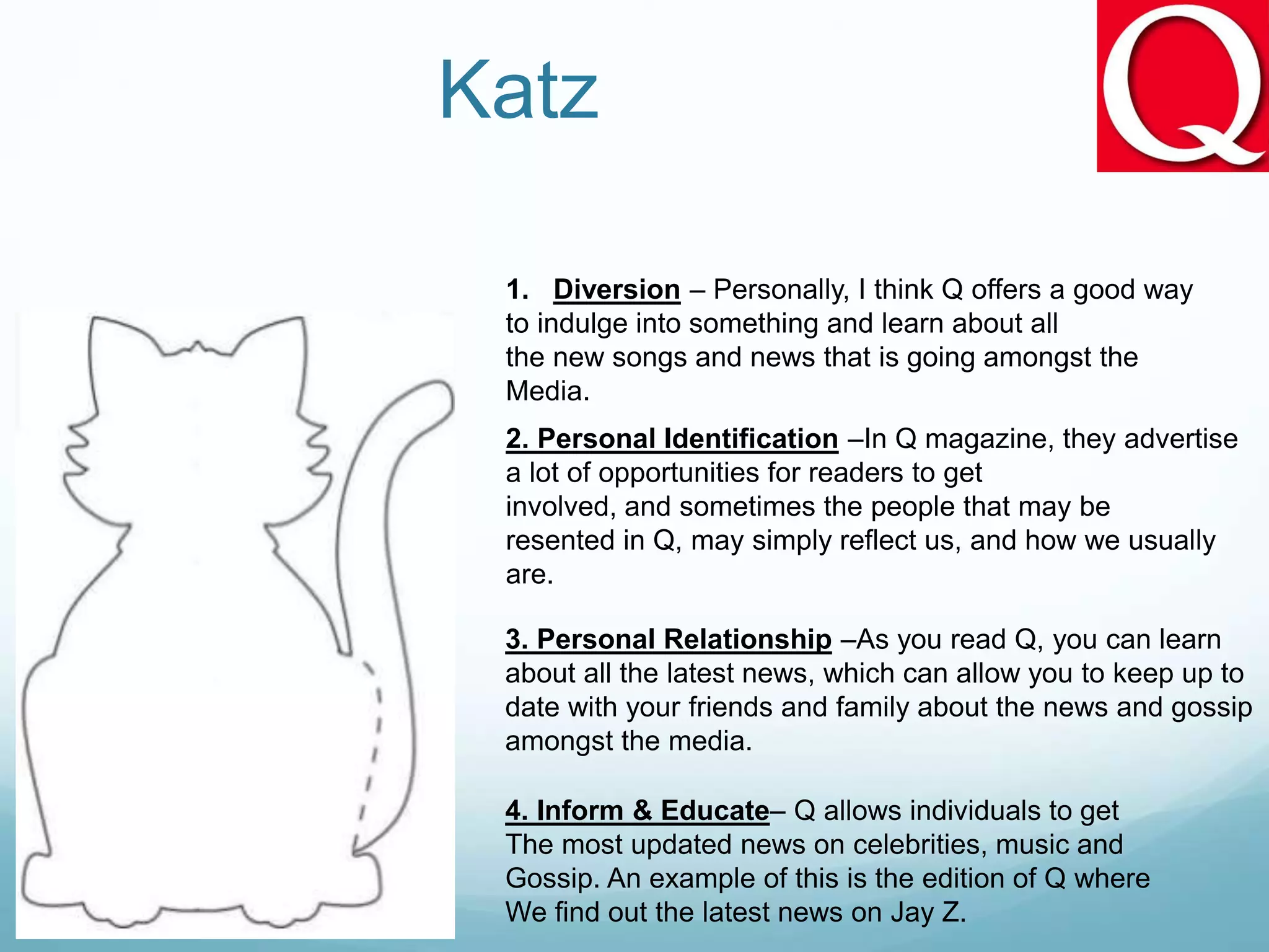
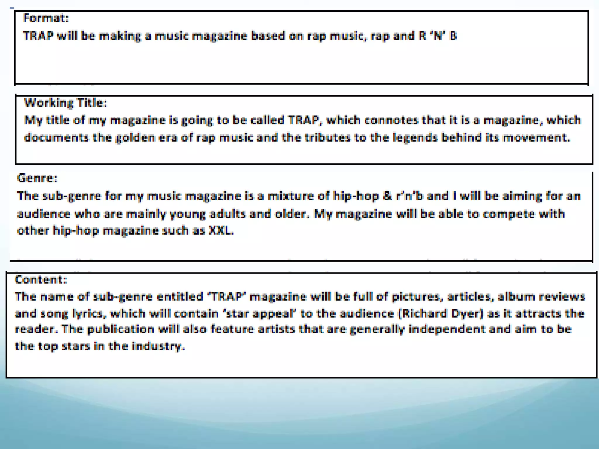
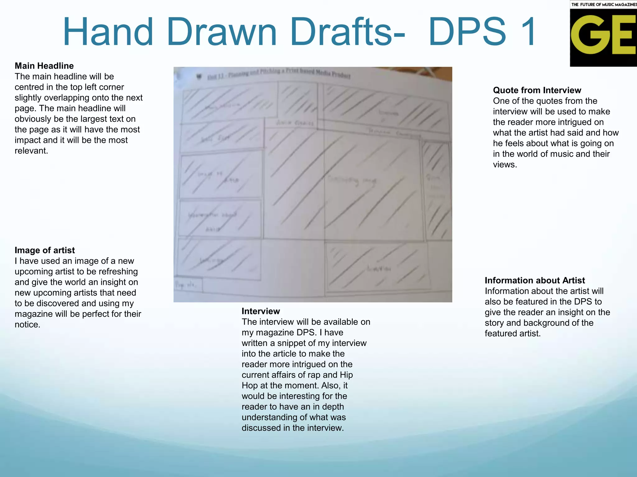
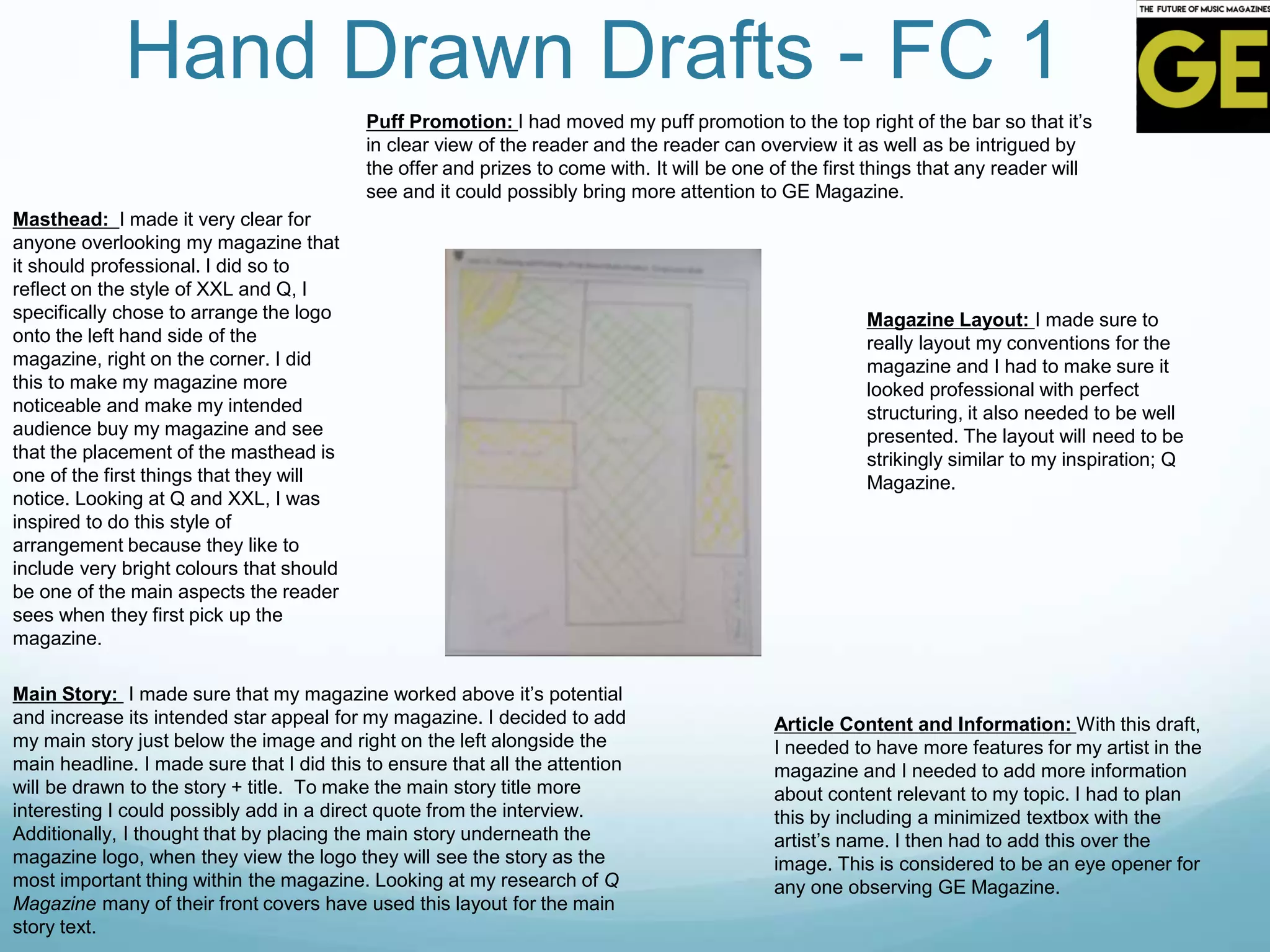
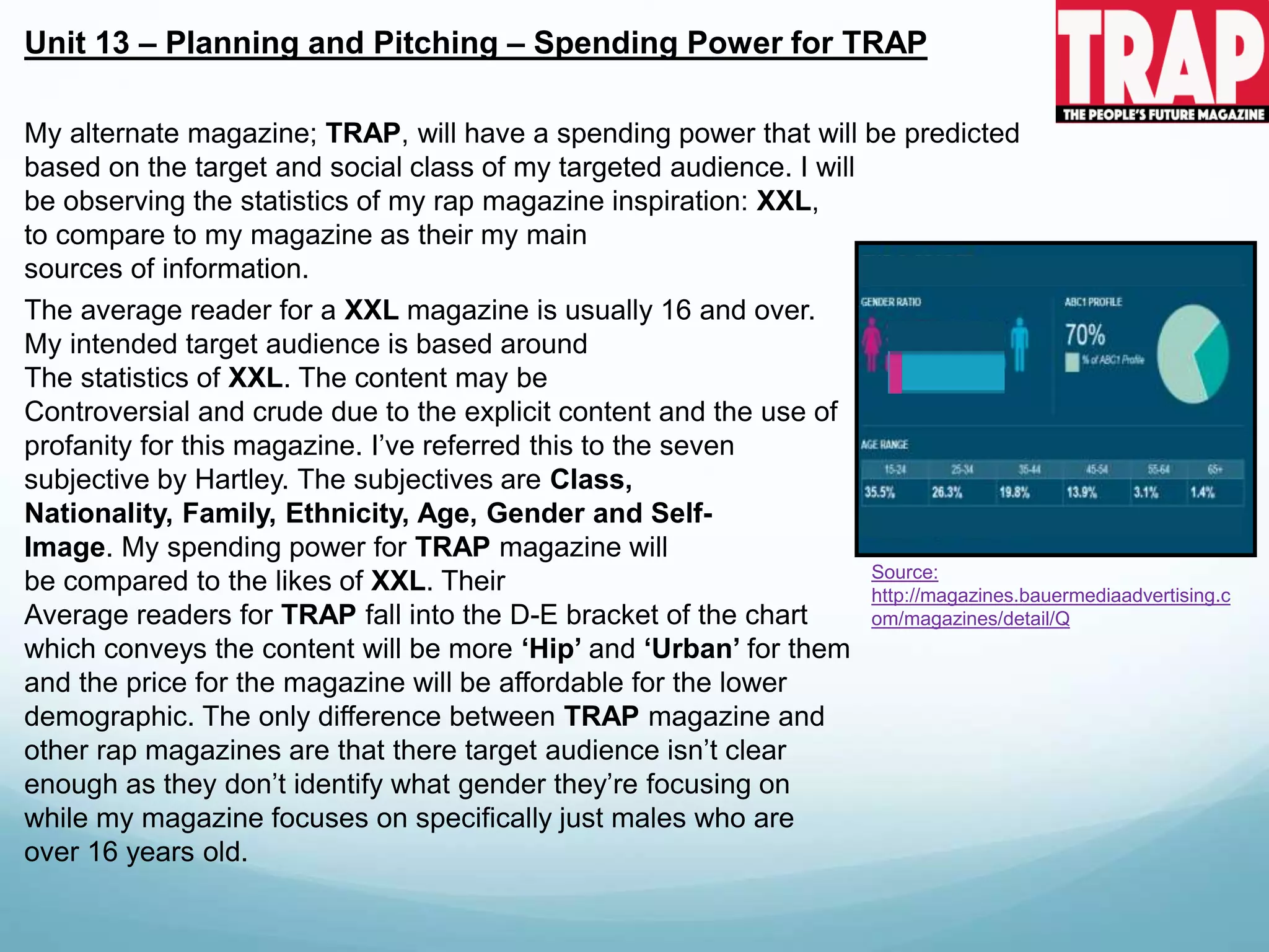
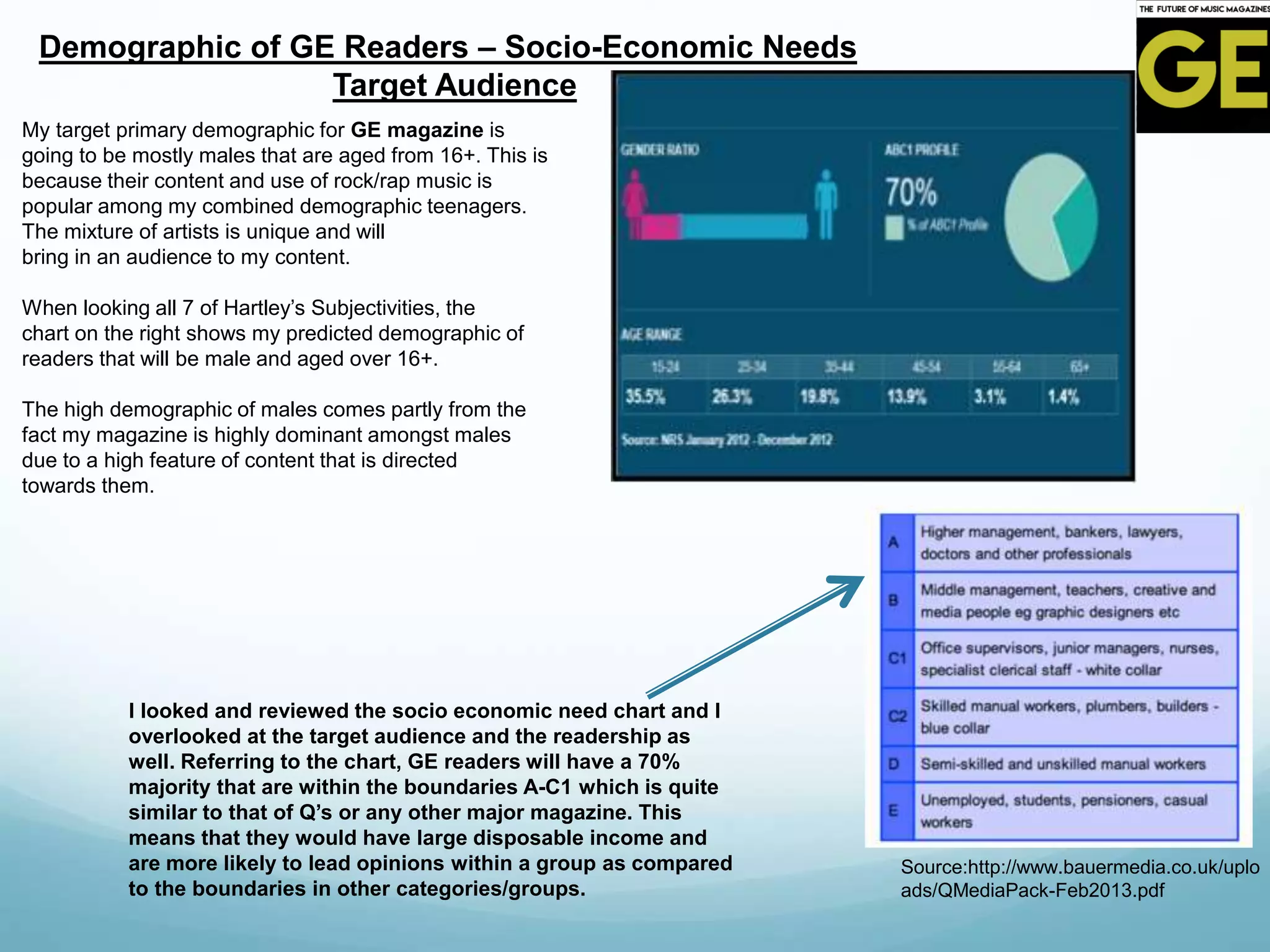
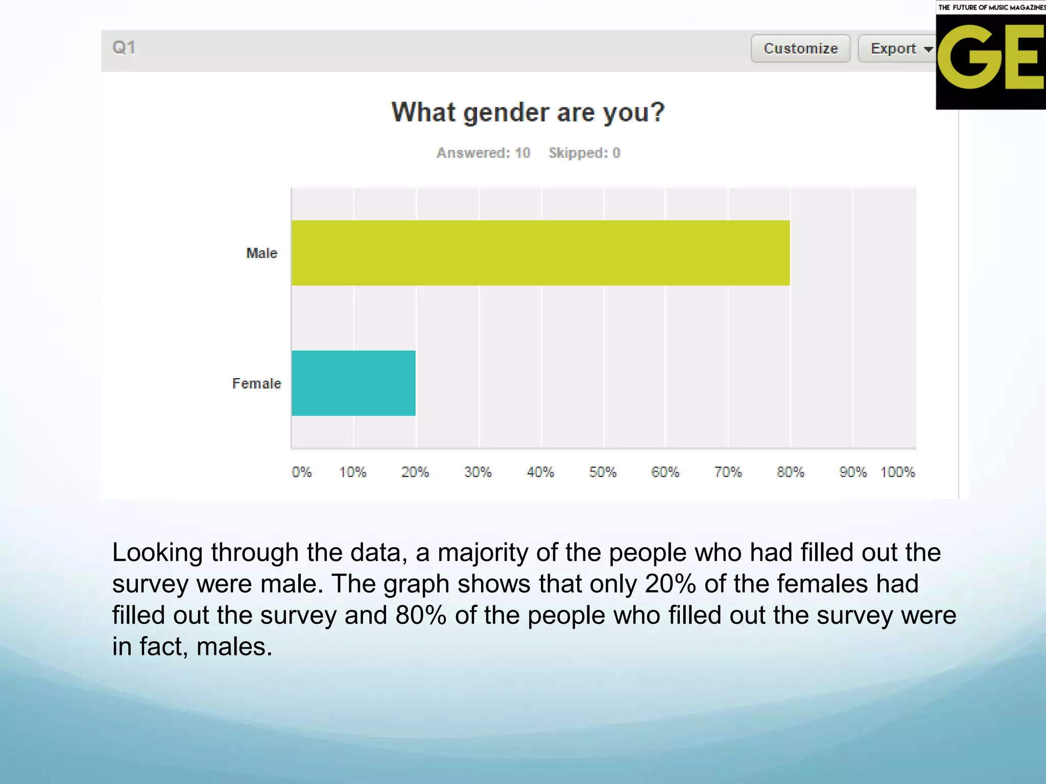
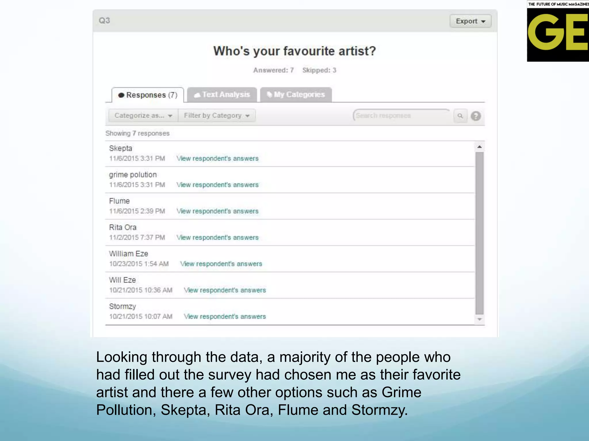
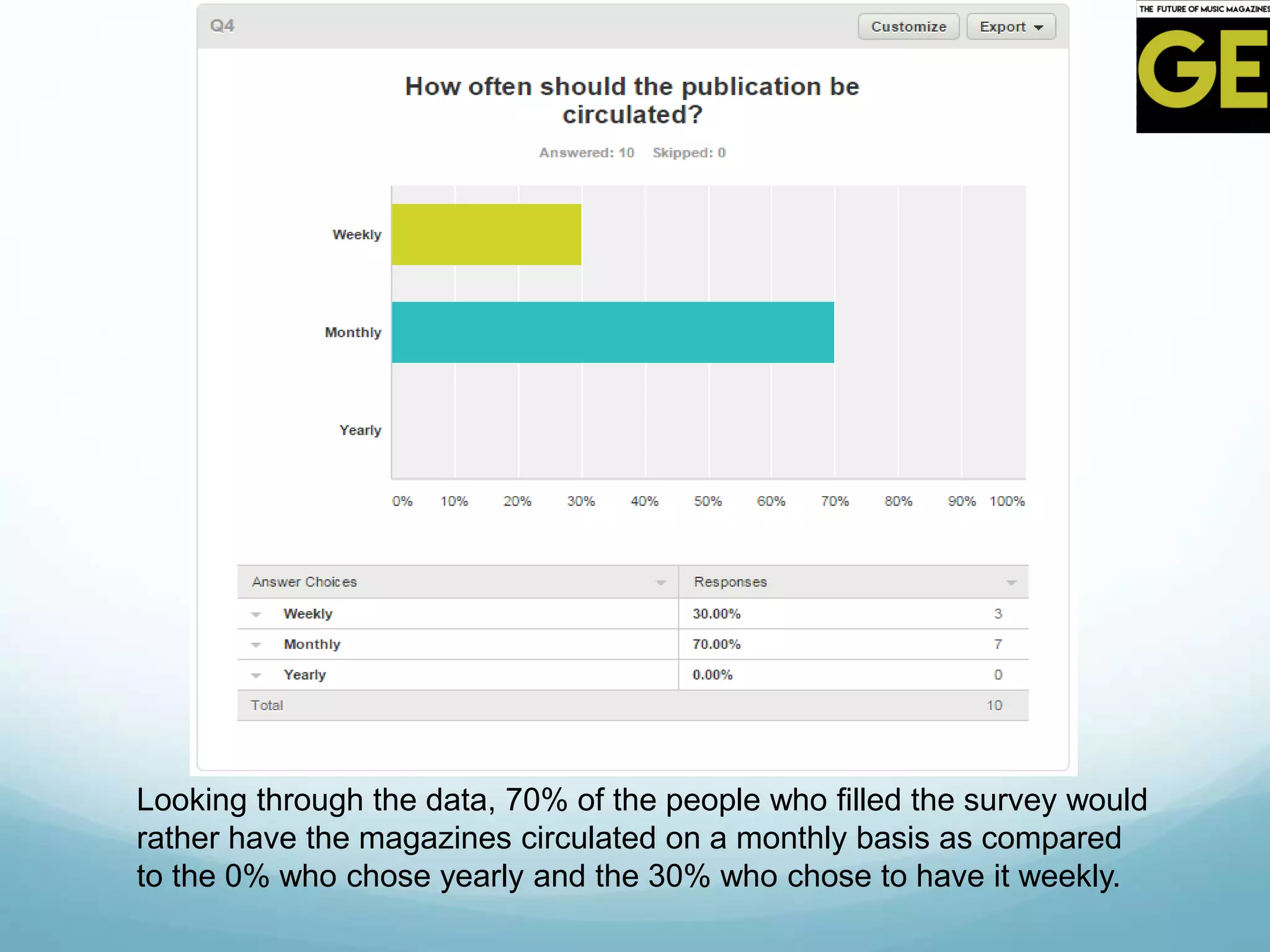
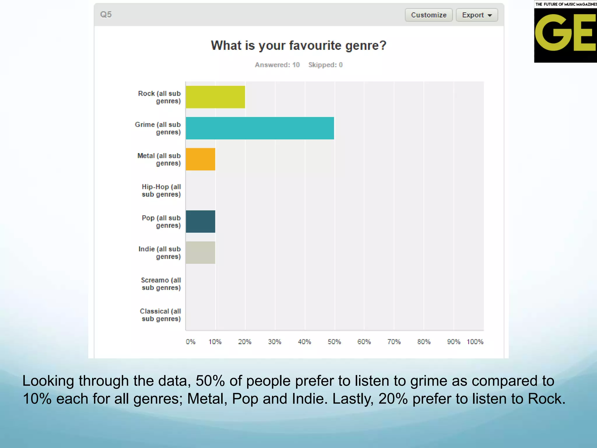
The document provides an analysis of Q magazine, a UK-based music magazine. It discusses the magazine's genre, target audience, form and style, language used, and publisher. Some key points:
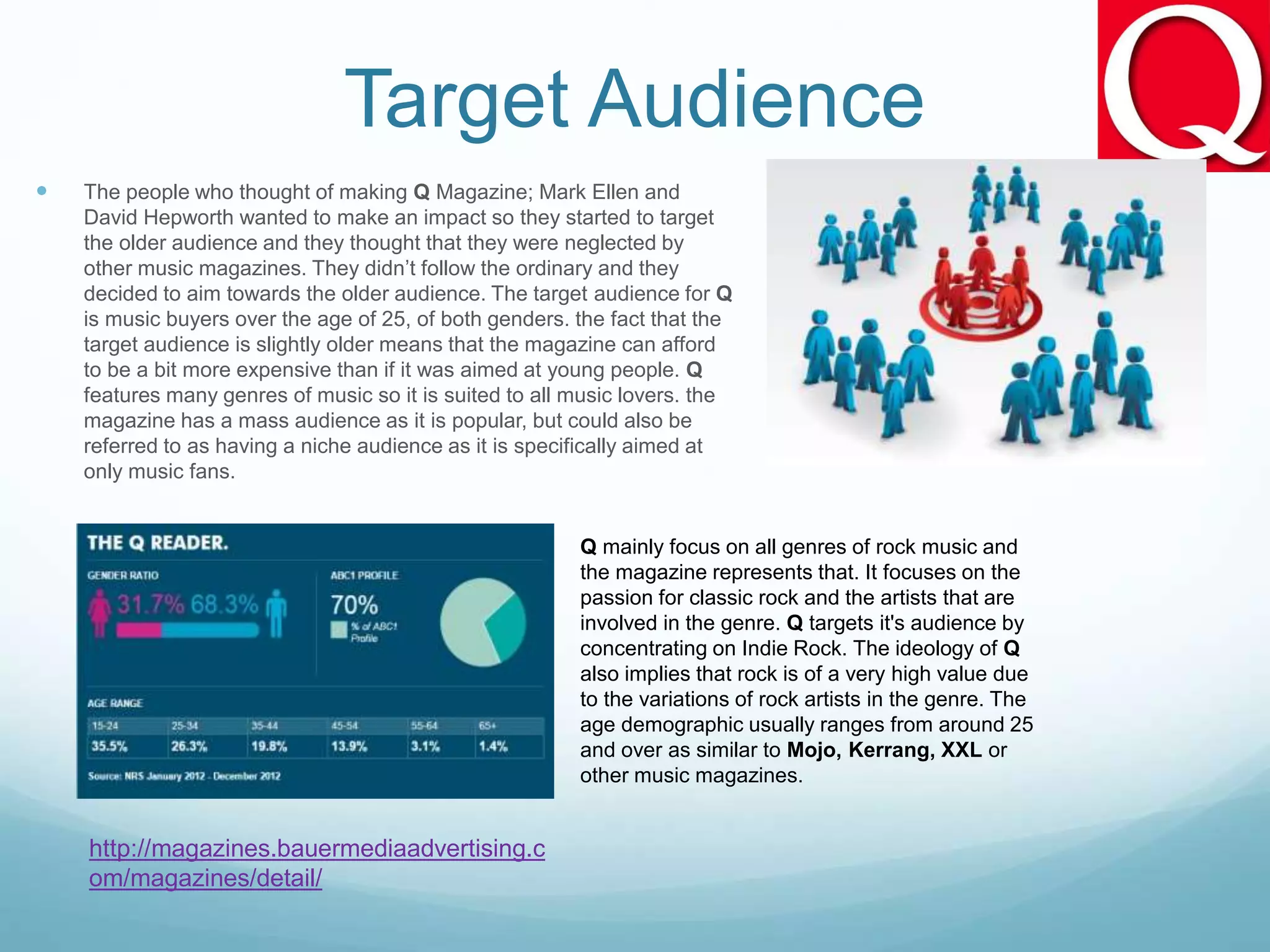
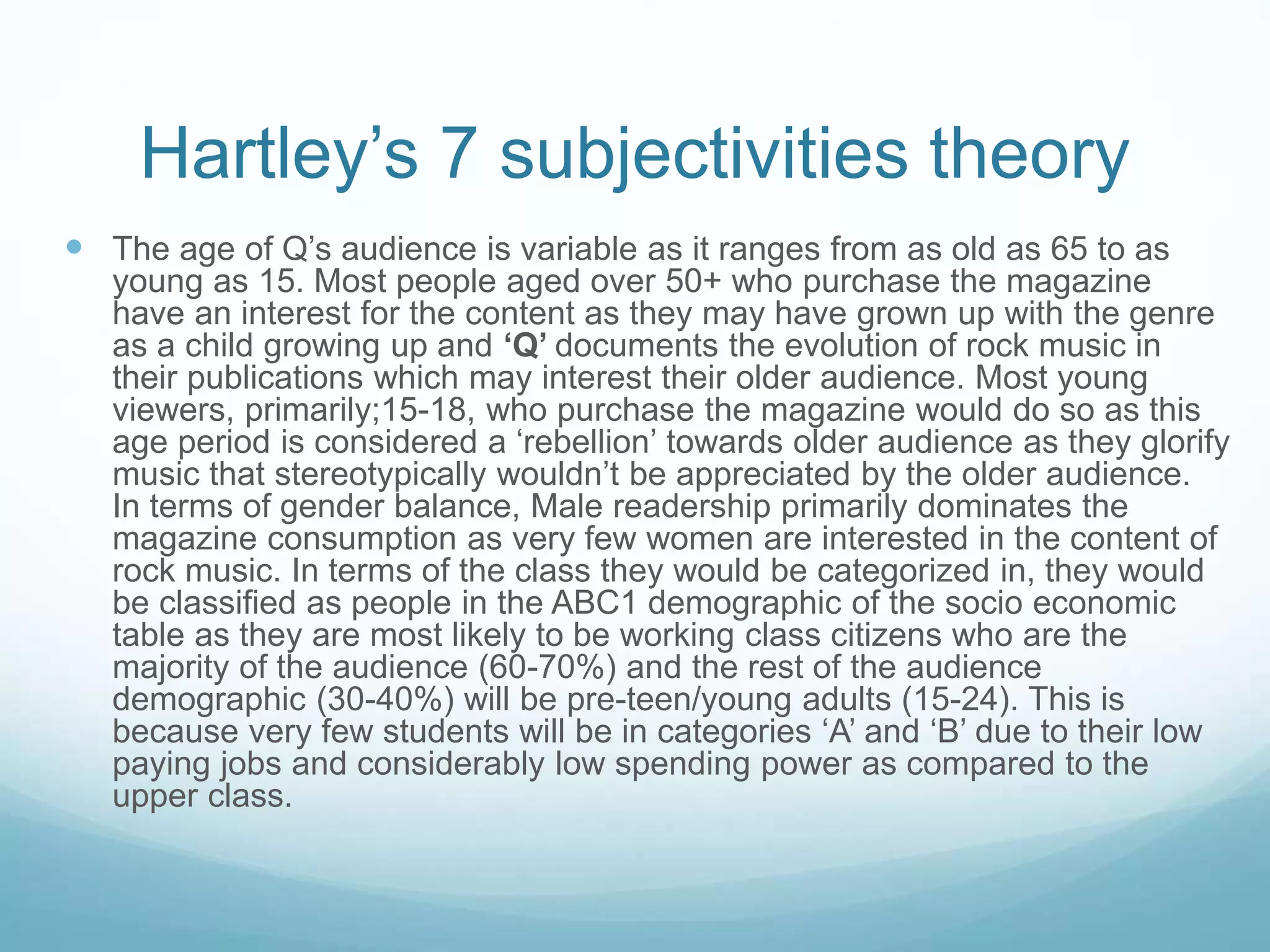
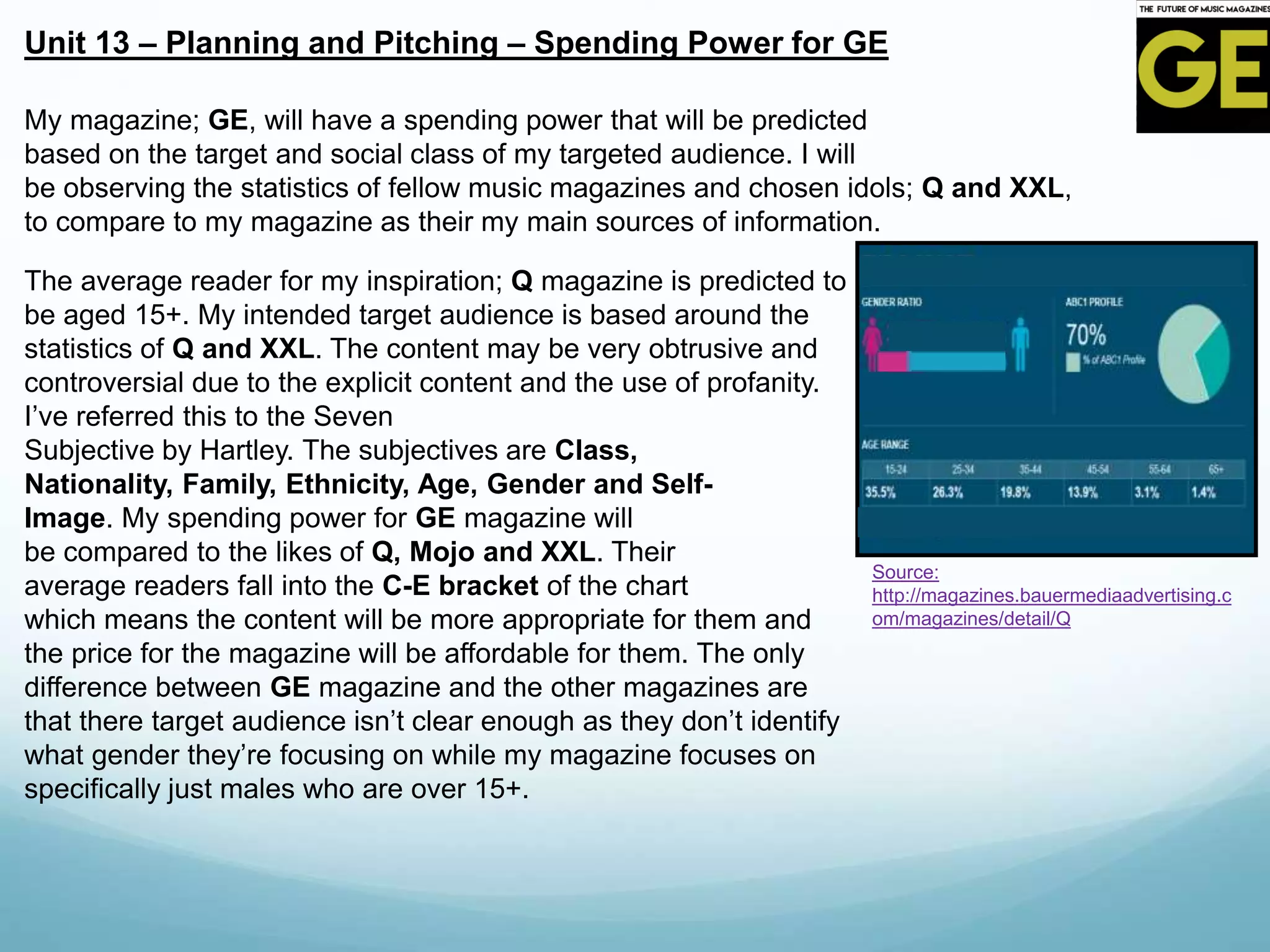
- Q magazine targets music buyers over age 25, with the highest proportion being males ages 30+. It covers various music genres including rock, indie, and pop.
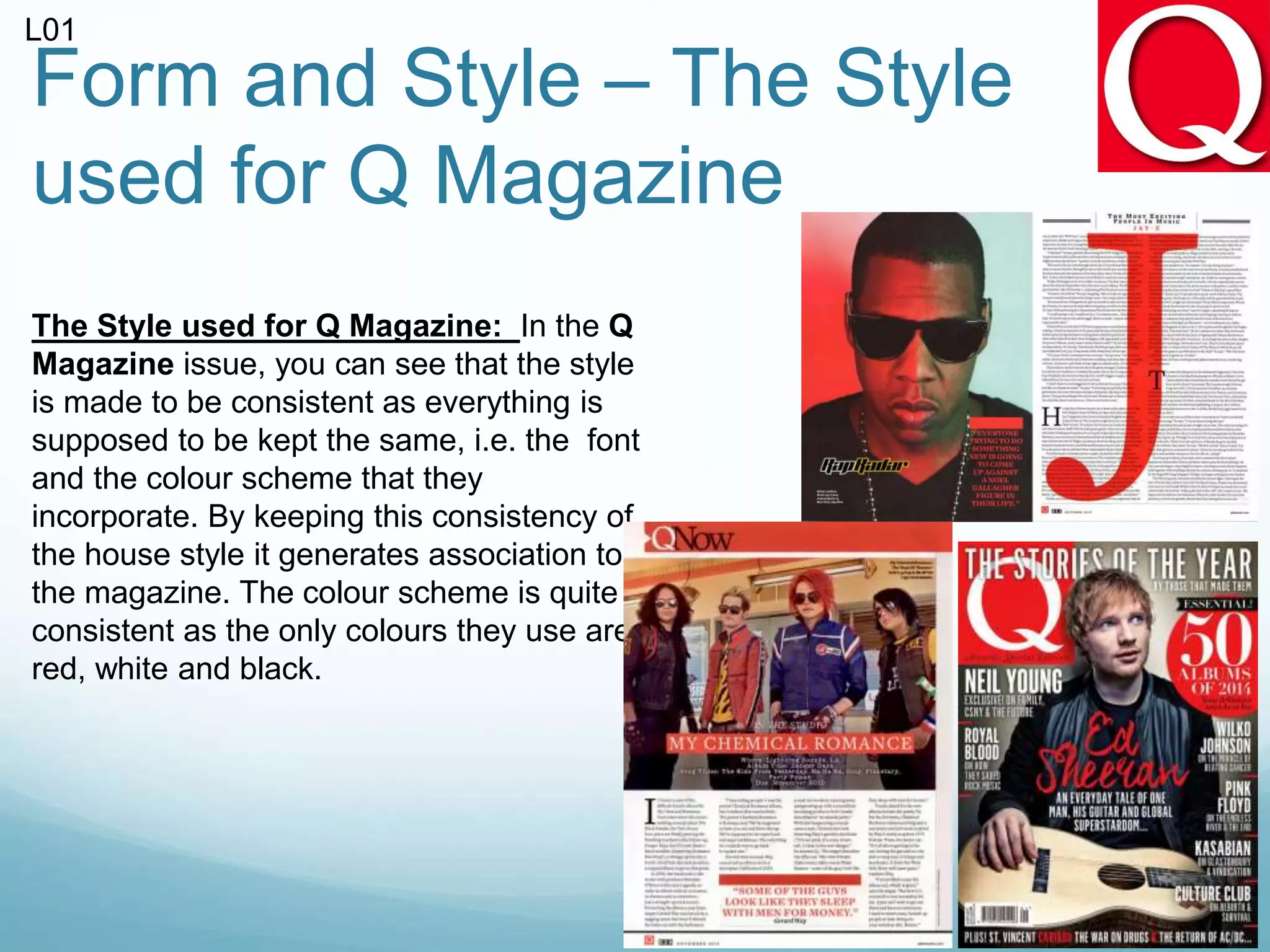
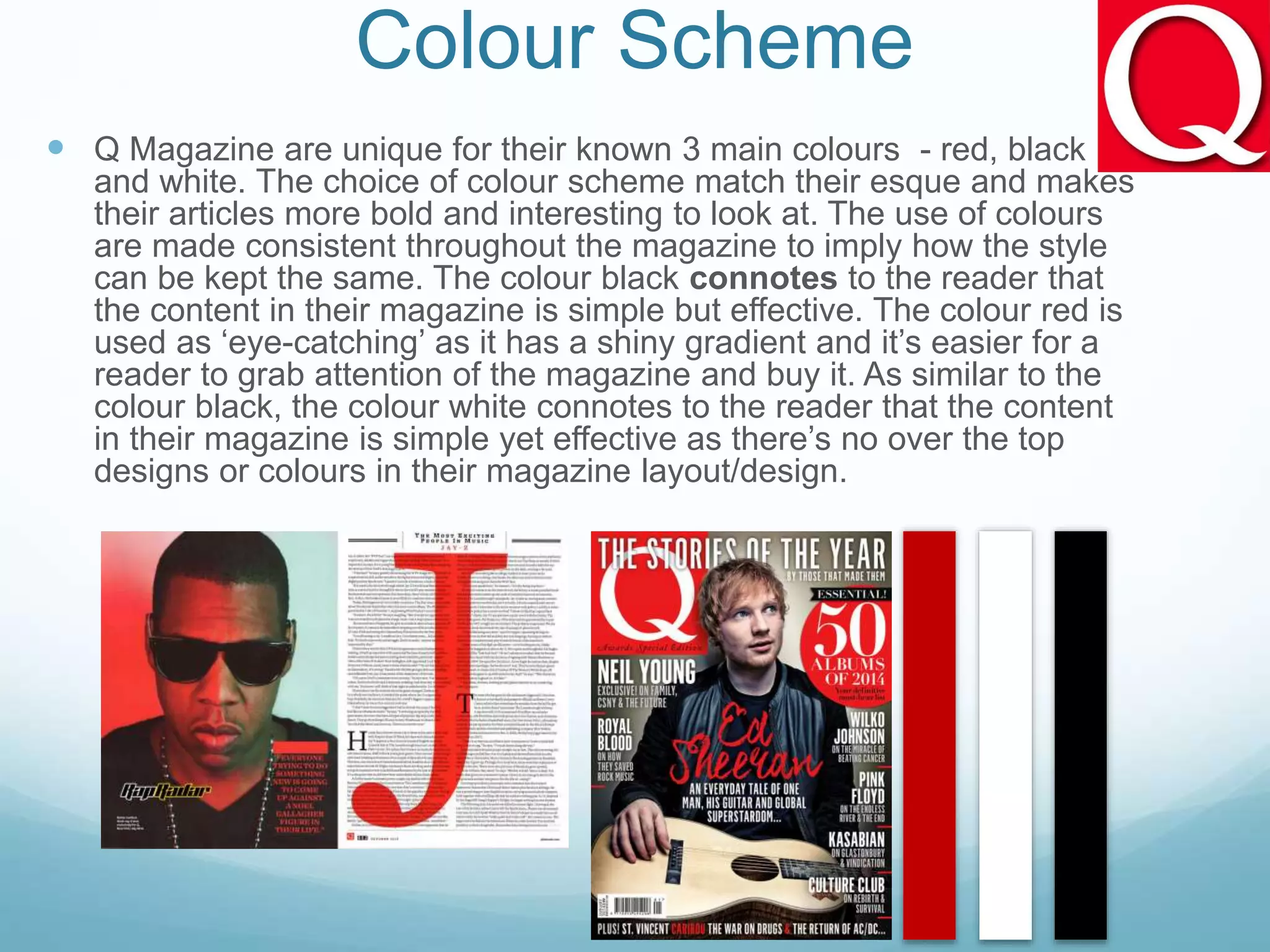
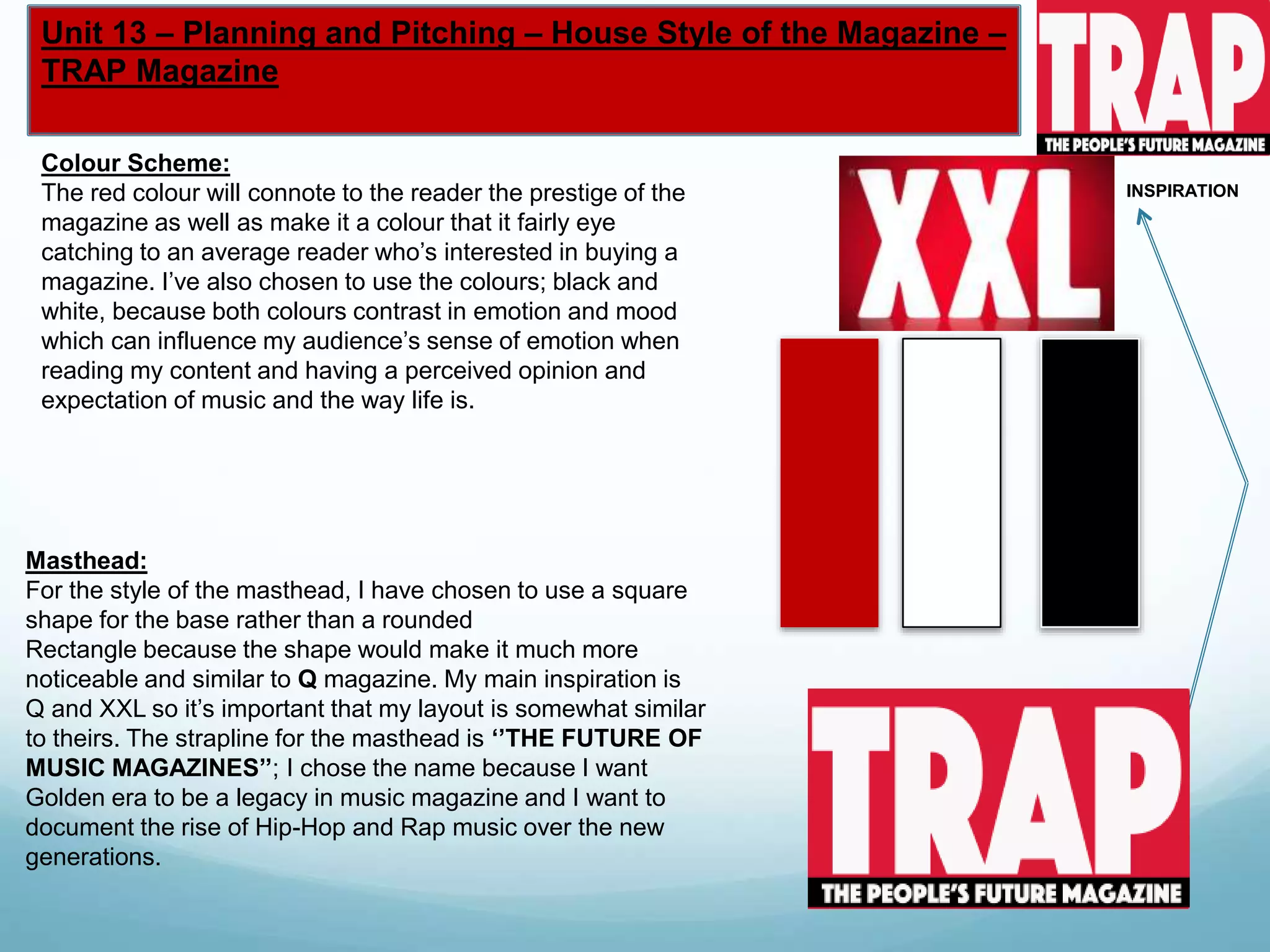
- The magazine has a consistent house style using red, black, and white. It is published monthly both in print and digital formats.
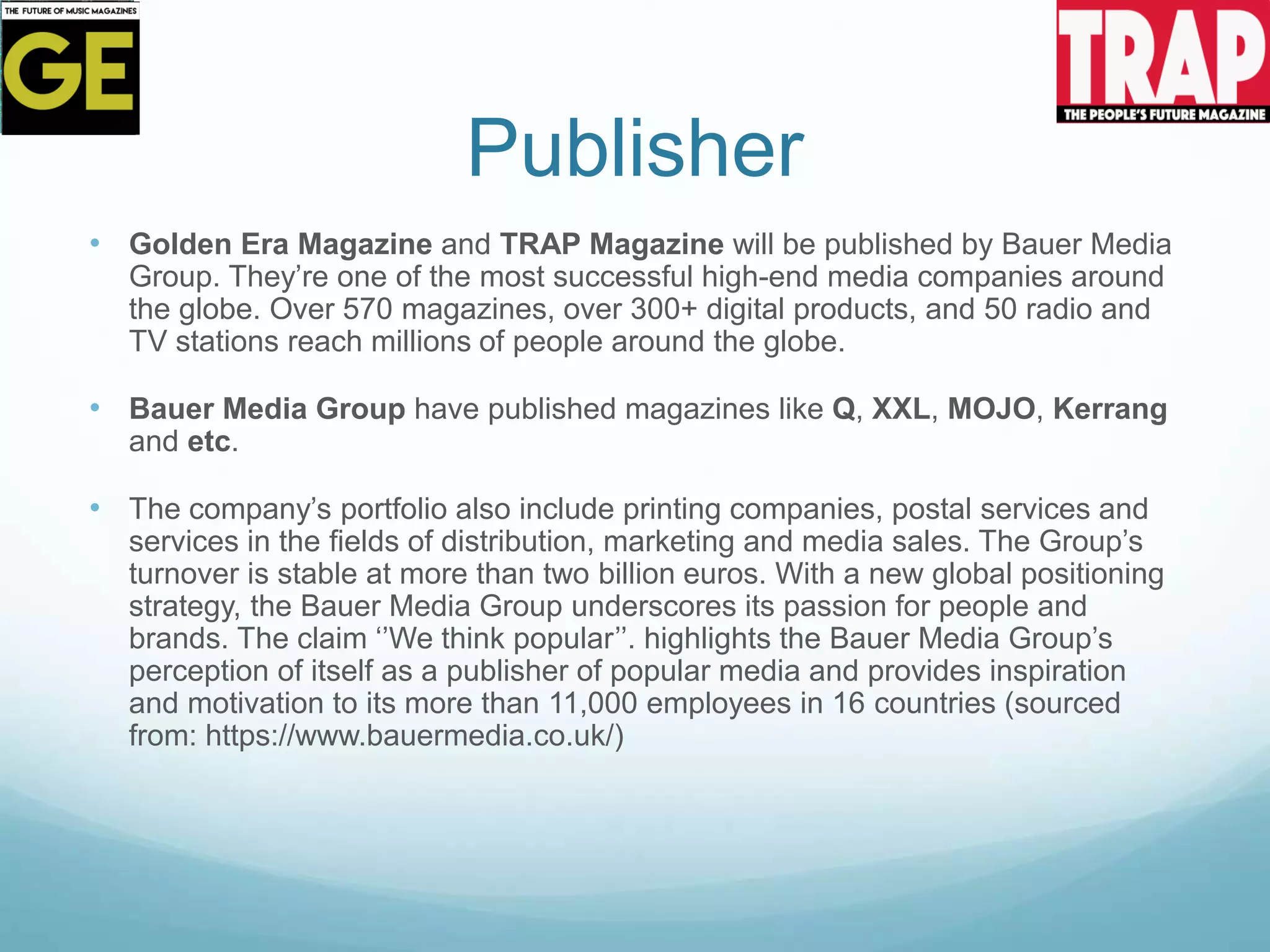
- The publisher, Bauer Media Group, is a large international media company.
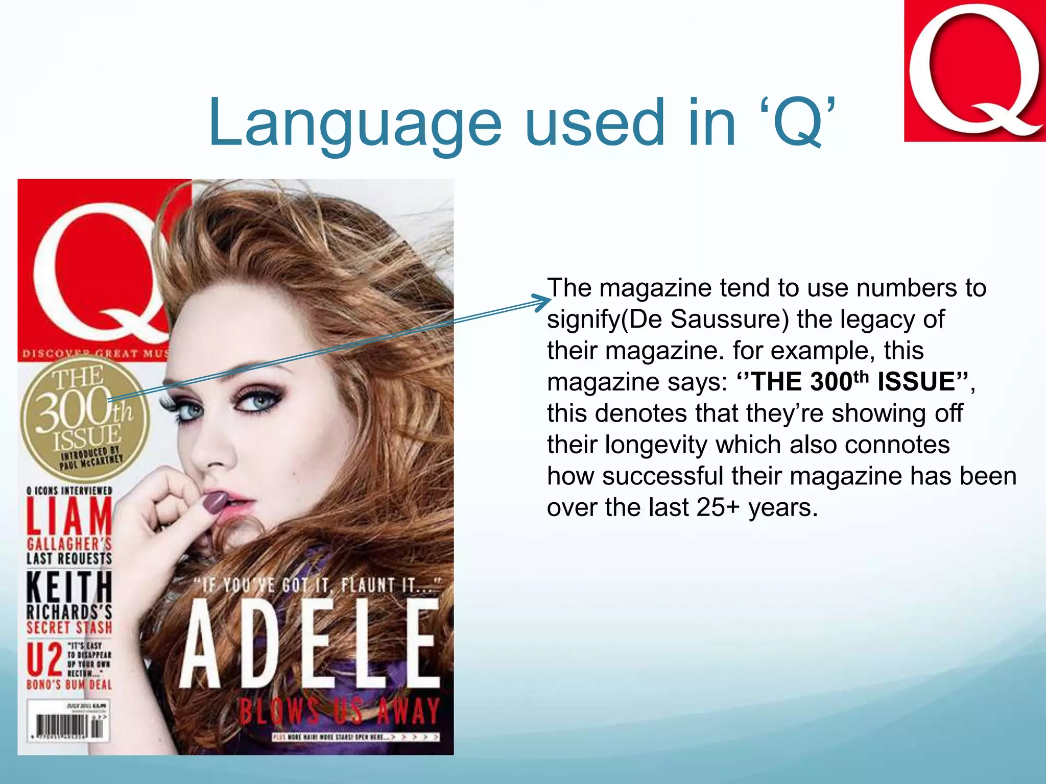
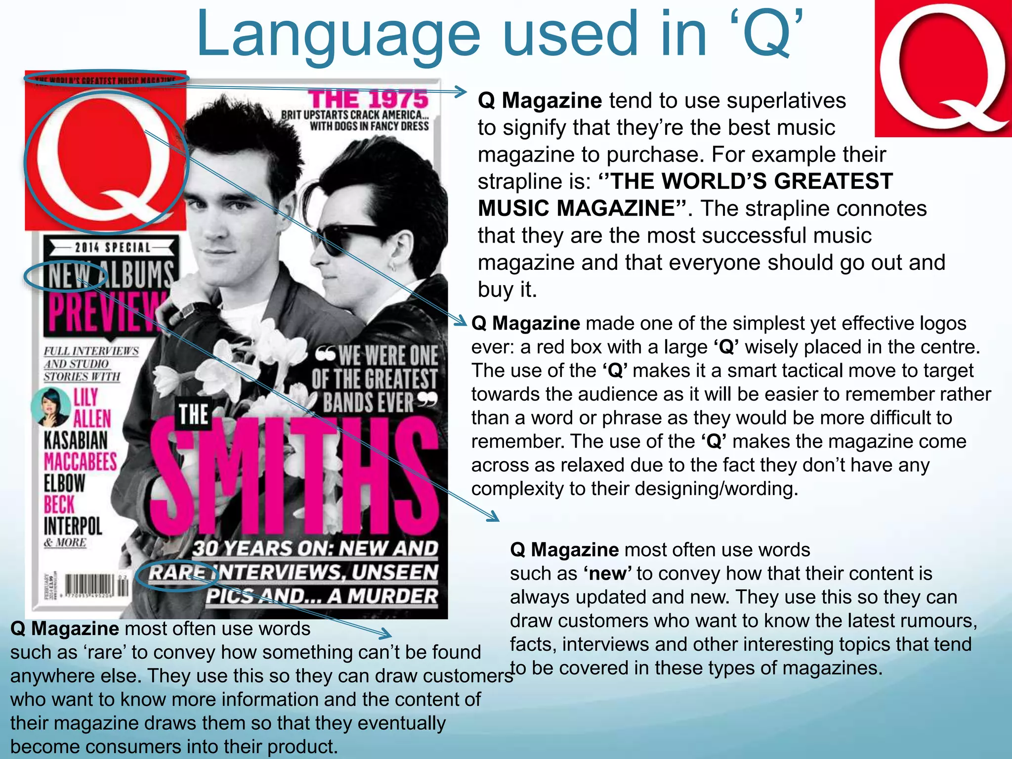
- The language in Q emphasizes its longevity and positions it as the best music magazine. It aims to attract readers seeking to