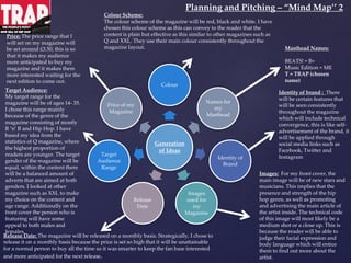
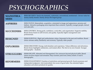
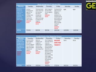
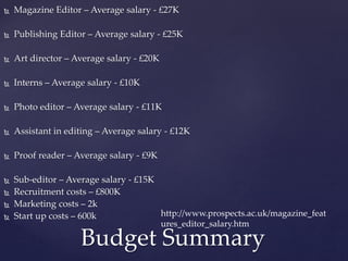
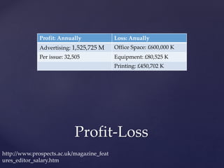
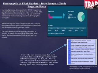
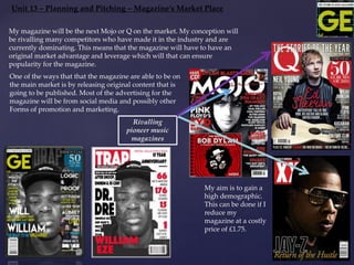
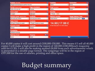
{
L04 Magazine
Pitch
William Eze
 Welcome to greatness, this is the pitch for
Golden Era Magazine. Today we will be talking
all the main factors of how my magazine will
be made and how much money will be
required for this process. Golden Era will be
competing against XXL, Mojo and Q Magazine.
My aim for the next few years is to make GE
Magazine the top brand for Bauer Media.
Introduction
Proposal 1: Golden Era
Proposal 2: Inspiration
I chose to name my alternate magazine
‘TRAP’ because based on the fact that it’s a
music magazine and the music is
inspirational, I named it TRAP because it
traps you into the magazine’s content
because it’s so interesting.
Connotation of TRAP
masthead
 I chose to name my main magazine
‘GOLDEN ERA’ because we’re in an era
where records are broken in terms of album
sales and record singles so I based my name
on that stat because more records will be
broken in the future and I want Golden Era
to document that.
Connotation of Golden
Era masthead
Promotion
I made a Facebook page to promote my magazine and this
helps to build synergy within my audience as this can help to
promote my brand and gain a bigger following.
 I think that my target audience will be teenagers/adults.
They would mostly E and Don the chart however I think
that I will have an audience from all of the sections shown
on the graph.
Target Audience
A Higher management, bankers, lawyers, doctors and other professional
B Middle management, teachers, creative and media people e.g. graphic designers etc.
C
1
Office supervisors, junior managers, nurses, specialist clerical toff – white collar
C
2
Skilled manual workers, plumbers, builders – blue collar
D Semi-skilled and unskilled manual workers
E Unemployed, students, pensioners, casual workers
My magazine of inspiration is Q magazine and my choice of music genre is an
Eclectic of Hip Hop/ R ‘n’ B/ Rap music. According to the socio-economic graph the
target audience would be in my chosen demographic of E and D. I have chosen this
demographic group because for E they are unemployed but they might have money to
buy my magazines and the students who are unemployed are quite young so my choice
of genre could influence them to buy my magazines. I have chosen D because they’re
most likely older but they can buy more articles as compared to the E group.
This defines the adult population largely by the job they do.
This is based on the National Readership Survey (NRS)
AUDIENCE DEMOGRAPHICS
Graham Burton: Socially and
Media grouped audiences
 Graham Burton has a theory about classifying audiences
by their social and media grouping. According to the
socio-economic graph the target audience would be
demographics of D and E because the demographic would
be fairly young because they probably won’t have jobs but
they would have enough money to buy their articles. The
social grouping of Q Magazine’s target audience is centred
for ages 25+ of all genders. The likeliness will be that
they’re American but they could be British as well because
all the publications are circulated around those countries;
they’ll most likely be fans of rock music and white. The
media grouping for Q Magazine’s target audience will be
fans of rock music and other forms of rock and indie.
PSYCHOGRAPHICS
MAINSTREA
MERS
SEEK SECURITY. Tend to be domestic, conformist, conventional, sentimental – favour value for
money family brands. Nearly always the largest group
ASPIRERS SEEK STATUS. Materialistic, acquisitive, orientated to image and appearance, persona and
fashion. Attractive packaging more important than contents, Typically younger people, clerical
and sales jobs.
SUCCEEDERS SEEK CONTROL. Strong goals, confidence, work ethic, and organisation. Supports stability.
Brand choice based on self-reward, and quality. Typically higher management and
professionals.
RESIGNED SEEKS SURVIVAL. Rigid and authoritarian values. Interested in the past and tradition. Brand
choice stresses safety, familiarity and economy. Typically older people.
EXPLORERS SEEKS DISCOVERY. Energy, individualism and experience. Values difference and adventure.
Brand choice highlights satisfaction, and instant effect. The first to try new brands. Younger
demographic – students.
STRUGGLERS SEEKS ESCAPE. Alienated and disorganised. Few resources beyond physical skills. Brand
choice involves impact and sensation. Buys alcohol, junk food, lottery tickets. D and E
demographic.
REFORMERS SEEKS ENLIGHTMENT. Freedom of restrictions and personal growth. Social awareness and
independent judgment. Anti-materialistic but aware of good taste. Has attended higher
education and selects products for quality.
Katz, Hartley and Mazlow
Theory
1. Diversion – This means where the audience
Can RETREAT from their reality and engage
Themselves into the content.
2. Personal Identification – This means where the
Audience are able to relate to a character or
Their problem.
3. Personal Relationship – Where the audience
are able to gain a following (audience) and bond
with character or a bunch of different characters.
4. Inform & Educate– Where the audience LEARN
something from engaging into the text/content.
Production Plan
Planning and Pitching –
Production Plan (GE Magazine)
Week starting from 23rd January 2016
Monday Tuesday Wednesday Thursday Friday Saturday Sunday
Decide a target
distribution date
for GE. After that,
create a
production plan
detailing
deadlines for
each story and
timing for
proofreading as
well as detail the
printing
deadlines.
DEADLINE:
23/1/16
Management
team should also
decide what
content will be
included in the
magazine, i.e.
information on
artist, double
page spread, tour
dates and
reviews
DEADLINE:
25/1/16
Management
team should
decide on a
budget for the
production of
magazine,
artists,
resources,
printing.
DEADLINE:
27/1/6
Editorial staff
should plan the
style and layout
of the pages for
the magazine
production.
DEADLINE:
27/1/16
Editorial staff
should plan the
stories and for
each story, there
should be a
detailed plan
which includes
content, it’s
type, i.e.
interview and
background
information.
DEADLINE:
30/1/16
N/A N/A
23/1/16 24/1/16 25/1/16 26/1/16 27/1/16 28/1/16 29/1/16
Week starting from 30th January 2016
Monday Tuesday Wednesday Thursday Friday Saturday Sunday
Meet the artists
that will be
interviewed and
put them in a
photo-shoot for a
few pictures.
DEADLINE:
30/1/16
Structure and
start to plan the
pages for the
magazine,
including…DPS,
Interviews,
Reviews and
other content.
DEADLINE:
10/2/16
Think about what
stories other than
the interviews
that will be
included and
choose what
albums and songs
to review for the
magazine.
DEADLINE:
3/2/16
Decide on what
pictures will be
included in the
content pages
DEADLINE:
2/2/16
Start to type up
information for
the content and
the pages.
DEADLINE:
9/2/16
N/A N/A
30/1/16 31/1/16 1/2/16 2/2/16 3/2/16 4/2/16 5/2/16
Week starting from 6th February 2016
Monday Tuesday Wednesday Thursday Friday Saturday Sunday
Continue to
develop the
pages for the
magazine,
including…DPS,
Interviews,
Reviews and
other content.
DEADLINE:
9/2/16
Continue
developing the
pages for the
magazine,
including…DPS,
Interviews,
Reviews and
other content.
DEADLINE:
9/2/16
Think about what
stories other than
the interviews
that will be
included and
choose what
albums and songs
to review for the
magazine.
DEADLINE:
9/2/16
Add in images to
the final drafts
for the magazine
pages.
DEADLINE:
9/2/16
Proofread all the
pages and send
feedback if
needed. An
example of this
could be that the
proof-readers can
look through the
pages and tell
them to change
anything if
needed.
DEADLINE:
10/2/16
N/A N/A
6/2/16 7/2/16 8/2/16 9/2/16 10/2/16 11/2/16 12/2/16
Fourth Week of the Magazine Process
Monday Tuesday Wednesday Thursday Friday Saturday Sunday
Pages should
have been read
through and the
planning of how
the magazine is
to be structured
will start
tomorrow.
DEADLINE:
13/2/16 –
14/2/16
Structure all the
pages together
and make a
practise magazine
issue with all the
pages thoroughly
checked and
added in.
DEADLINE:
14/2/16
Make any
changes to the
magazine if
needed and re-
read the new
copy and make
any changes from
there.
DEADLINE:
15/2/16
Once changes are
done then start to
create the
magazines and
after finishing the
printing process,
determine as a
group to mutually
decide the cost of
the magazine
based on printing
costs, budget,
paper distribution
and hardcover
material.
DEADLINE:
16/2/16
RELEASE
DATE FOR
TODAY!!!
N/A N/A
13/2/16 14/2/16 15/2/16 16/2/16 17/2/16 18/2/16 19/2/16
 Magazine Editor – Average salary - £27K
 Publishing Editor – Average salary - £25K
 Art director – Average salary - £20K
 Interns – Average salary - £10K
 Photo editor – Average salary - £11K
 Assistant in editing – Average salary - £12K
 Proof reader – Average salary - £9K
 Sub-editor – Average salary - £15K
 Recruitment costs – £800K
 Marketing costs – 2k
 Start up costs – 600k
Budget Summary
http://www.prospects.ac.uk/magazine_feat
ures_editor_salary.htm
Profit-Loss
Profit: Annually Loss: Anually
Advertising: 1,525,725 M Office Space: £600,000 K
Per issue: 32,505 Equipment: £80,525 K
Printing: £450,702 K
http://www.prospects.ac.uk/magazine_feat
ures_editor_salary.htm
Profit(1,558,330)- Loss(1,031,227)= £527,103
loss
Outgoings and Income
Unit 13 – Planning and Pitching – Spending Power for GE
Source:
http://magazines.bauermediaadvertising.c
om/magazines/detail/Q
My magazine; GE, will have a spending power that will be predicted
based on the target and social class of my targeted audience. I will
be observing the statistics of fellow music magazines; Q and XXL,
to compare to my magazine as their my main
sources of information.
The average reader for my inspiration; Q magazine is of ages
15+. My intended target audience is based around
the statistics of Q and XXL. The content may be
Controversial due to the explicit content and the use
Of profanity. I’ve referred this to the Seven
Subjective by Hartley. The subjectives are Class,
Nationality, Family, Ethnicity, Age, Gender and Self-
Image. My spending power for GE magazine will
Be compared to the likes of Q, Mojo and XXL. Their
Average readers fall into the C-E bracket of the chart
Which means the content will be more appropriate for them and
the price for the magazine will be affordable for them. The only
difference between GE magazine and the other magazines are that
there target audience isn’t clear enough as they don’t identify what
gender they’re focusing on while my magazine focuses on
specifically just males who are over 15+.
Unit 13 – Planning and Pitching – Spending Power for TRAP
Source:
http://magazines.bauermediaadvertising.c
om/magazines/detail/Q
My alternate magazine; TRAP, will have a spending power that will be predicted
based on the target and social class of my targeted audience. I will
be observing the statistics of my rap magazine inspiration: XXL,
to compare to my magazine as their my main
sources of information.
The average reader for a XXL magazine is usually 16 and over. My
intended target audience is based around
The statistics of XXL. The content may be
Controversial and crude due to the explicit content and the use of
profanity for this magazine. I’ve referred this to the seven
subjective by Hartley. The subjectives are Class,
Nationality, Family, Ethnicity, Age, Gender and Self-
Image. My spending power for TRAP magazine will
be compared to the likes of XXL. Their
Average readers for TRAP fall into the D-E bracket of the chart
which conveys the content will be more ‘Hip’ and ‘Urban’ for
them and the price for the magazine will be affordable for the
lower demographic. The only difference between TRAP magazine
and other rap magazines are that there target audience isn’t clear
enough as they don’t identify what gender they’re focusing on
while my magazine focuses on specifically just males who are over
16 years old.
Demographic of GE Readers – Socio-Economic Needs
Target Audience
I observed the socio-economic need chart and I
overlooked at the target audience and it’s
readership. Referring to the chart, GE readers have
a 70% majority that are within boundaries A-C1
which is very similar to that of Q’s. This means
that they would have large disposable income and
are more likely to lead opinions within a group as
compared to the boundaries below.
When looking all 7 of Hartley’s Subjectivities, the
chart on the right shows my predicted demographic
of readers that will be male and aged over 16+.
The overly dominated demographic of males is
mainly because GE Magazine have a highly
dominant amount of male artists.
Source:http://www.bauermedia.co.uk/upl
oads/QMediaPack-Feb2013.pdf
My target primary demographic for GE magazine is
going to be mostly males that are aged from 16+. This is
because their content and use of rock/rap music is
popular among my combined demographic teenagers.
The mixture of artists is unique and will
bring in an audience to my content.
Demographic of TRAP Readers – Socio-Economic Needs
Target Audience
I observed the socio-economic need chart and I
overlooked at my intended target audience and it’s
readership. Referring to the chart, TRAP readers
have a 70% majority that are within boundaries C1-
E which is very similar to that of XXL’s. This means
that they would have a low disposable income.
When looking at Hartley’s Subjectivities, the chart on
the right shows my predicted demographic of readers
that will be male and aged over 16-18+.
The high demographic of males as compared to
females is mainly because TRAP Magazine have a
highly dominant amount of male artists and rap
groups.
Source:http://www.bauermedia.co.uk/upl
oads/QMediaPack-Feb2013.pdf
My target primary demographic for TRAP magazine is
going to be mostly males that are aged from 16-18+. This
is because their content and use of hip hop and r ‘n’ b r
is extremely popular among my urban demographic
teenagers.
Unit 13 – Planning and Pitching – Magazine’s Market Place
My aim is to gain a
high demographic.
This can be done if I
reduce my
magazine at a costly
price of £1.75.
Rivalling
pioneer music
magazines
My magazine will be the next Mojo or Q on the market. My conception will
be rivalling many competitors who have made it in the industry and are
currently dominating. This means that the magazine will have to have an
original market advantage and leverage which will that can ensure
popularity for the magazine.
One of the ways that that the magazine are able to be on
the main market is by releasing original content that is
going to be published. Most of the advertising for the
magazine will be from social media and possibly other
Forms of promotion and marketing.
For 40,000 copies it will cost around £100,000-150,000 . This means if I sell all 40,000
copies I will make a high profit in the region of 140,000-£180,000(each magazine
sold for £1.50). I will also be making around £8,000 from each advertisement which
is presented in a double page format. The outgoings will be in the region of
£537,000 for the use of salaries, printing and office space.
Budget summary
60
Office for Golden Era
 1,375ft² [128m²] Total Office Space Required
 Access 24/7
 24/7 security
 Air-conditioning
 Administrative support
 Macbook Air (20 computers) – in the region of £48,000-
£50,000
 Desks will cost around £1,400 for 20 desks costing £70 each.
Office Space
Unit 13 – Planning and Pitching –
Magazine Flat Plan 1 – Weekly
version – Golden Era Magazine
Unit 13 – Planning and Pitching –
Magazine Flat Plan 2 – Monthly
version – TRAP Magazine
 There are 60 pages in total.
 For 40,000 copies it will cost around the region
of £120,000-180,000
Advertising Revenue for
Golden Era Magazine
7 Double Page Spreads
included in the
magazine. £9,510 x 7 =
£66,570
Advertising Revenue for
TRAP Magazine
5 Double Page Spreads
included in the
magazine. £9,510 x 18 =
£171,180
Hand Drawn FC Templates
Hand Drawn DPS Templates
Test Photography - Filters
Test Photography
Unit 13 – Planning and Pitching – Magazine’s Market Place
My aim is to gain a
high demographic.
This can be done if I
reduce my
magazine at a costly
price of £1.75.
Rivalling
pioneer music
magazines
My magazine will be the next Mojo or Q on the market. My conception will
be rivalling many competitors who have made it in the industry and are
currently dominating. This means that the magazine will have to have an
original market advantage and leverage which will that can ensure
popularity for the magazine.
One of the ways that that the magazine are able to be on
the main market is by releasing original content that is
going to be published. Most of the advertising for the
magazine will be from social media and possibly other
Forms of promotion and marketing.
Photoshop Front Cover #1
Photoshop Front Cover #2
Photoshop DPS #1
Photoshop DPS #2
Generation
of Ideas
Colour
Names for
my
Masthead
Identity of
Brand
Images
used for
my
Magazine
Release
Date
Target
Audience
Range
Price of my
Magazine
Price: The price range that I
will set on my magazine will
be set around £1.30, this is so
that my fans can buy the
magazine all the time without
worrying about their own
expenses. Identity of brand : There
will be certain features that
will be seen consistently
throughout the magazine
which will include technical
convergence, this is like self-
advertisement of the brand, it
will be applied through
social media links such as
Facebook, Twitter and
Instagram
Images: For my front cover, the
main image will always be centred
in the middle with new stars and
musicians. This implies that the
presence and strength of the eclectic
of both genres; rock and hip-hop, as
well as promoting and advertising
the main article of the artist that is
featured. The technical code of this
image will most likely be a medium
shot or a close up.
Masthead Names:
Golden Era = GE
(chosen name)
Music = M
Release Date: The magazine will be released on a weekly basis. Strategically, I chose to
release it on a weekly basis because the price is affordable and I can achieve a regular fan
base by selling weekly.
Target Audience:
My target range for the
magazine will be of ages 13- 25.
I chose this range mainly
because of the genre of the
magazine consist of rock music
but may also have odd features
of R ‘n’ B and Hip Hop. The
target gender of the magazine
will be dominantly male,
within the content there will be
a balanced amount of adverts
that are aimed at both genders.
I looked at other magazine
such as XXL to make my choice
on the content and age range.
Additionally on the front cover
the person who is featuring
will have some appeal to both
males and females.
Colour Scheme:
The colour scheme of the magazine will be black, gold and white. I
have chosen this colour scheme as this can convey to the reader that
the content is earthly and natural but can be effective as the colours are
sort of similar to what XXL or Q would use. They use their main
colour consistently throughout some of their magazine layouts. The
colour scheme in both drafts are the same but the layout will be
different to convey originality and it’s different.
Planning and Pitching – “Mind Map’’ 1
Planning and Pitching – “Mood Board’’
Generation
of Ideas
Colour
Names for
my
Masthead
Identity of
Brand
Images
used for
my
Magazine
Release
Date
Target
Audience
Range
Price of my
Magazine
Price: The price range that I
will set on my magazine will
be set around £3.50, this is so
that it makes my audience
more anticipated to buy my
magazine and it makes them
more interested waiting for the
next edition to come out.
Identity of brand : There
will be certain features that
will be seen consistently
throughout the magazine
which will include technical
convergence, this is like self-
advertisement of the brand, it
will be applied through
social media links such as
Facebook, Twitter and
Instagram
Images: For my front cover, the
main image will be of new stars and
musicians. This implies that the
presence and strength of the hip
hop genre, as well as promoting
and advertising the main article of
the artist inside. The technical code
of this image will most likely be a
medium shot or a close up. This is
because the reader will be able to
judge their facial expression and
body language which will entice
them to find out more about the
artist.
Masthead Names:
BEATS! = B+
Music Edition = ME
T = TRAP (chosen
name)
Release Date: The magazine will be released on a monthly basis. Strategically, I chose to
release it on a monthly basis because the price is set so high that it will be unattainable
for a normal person to buy all the time so it was smarter to keep the fan base interested
and more anticipated for the next release.
Target Audience:
My target range for the
magazine will be of ages 14- 35.
I chose this range mainly
because of the genre of the
magazine consisting of mostly
R ‘n’ B and Hip Hop. I have
based my idea from the
statistics of Q magazine, where
the highest proportion of
readers are younger. The target
gender of the magazine will be
equal, within the content there
will be a balanced amount of
adverts that are aimed at both
genders. I looked at other
magazine such as XXL to make
my choice on the content and
age range. Additionally on the
front cover the person who is
featuring will have some
appeal to both males and
females.
Colour Scheme:
The colour scheme of the magazine will be red, black and white. I have
chosen this colour scheme as this can convey to the reader that the
content is plain but effective as this similar to other magazines such as
Q and XXL. They use their main colour consistently throughout the
magazine layout.
Planning and Pitching – “Mind Map’’ 2
Planning and Pitching – “Mood Board’’
Font
Name:
Test:
Official font
for
Masthead:
LEMON
MILK
Times New
Roman
Didot
Didot Bold
Regular
Unit 13 – Planning and Pitching – Magazine
Masthead/Logo
When I was creating my masthead, I wanted to it to be eye-catching. Therefore when it is on magazine shelves it will be the
first thing that is seen because of it’s style and choice of colour. I had to make clear that the logo was at least inspired from
my magazine of inspiration Q and XXL magazine, hence I made sure it was one bold block colour, in the end I chose gold so it
connotes to the readers that this is a professional, holy ,reliable and of high quality magazine. For my logo, I will just include
the initials of the magazine name (GE), I wanted to choose a font that at least the same or similar to that of Q magazine. I
tried and tested different font styles on Adobe Illustrator and dafont.com/fontspuirrel.com to overview how I wanted to
final product to look. In the end I found a font called ‘LEMON/MILK’ , this is a very conservative font that is easy to read and
I feel will work well on the front cover of the magazine.
After editing the font on Illustrator I created the main logo.
When creating the logo I used different effects. I believe that
all of these features made the logo appear more realistic
and professional. The background colour for the logo is just
plain white, I plan to continue using this colour throughout
the magazine. By exploring the fonts and colour choices for
the magazine I have been able to develop and plan where I
will include consistency throughout the magazine features.
An example of this is using the main magazine ‘GE’ logo on
all pages of the magazine like Q. By including it next to the
page number at the bottom of the page, this can connote to
the reader the professionalism and reliability of the
magazine.
Unit 13 – Planning and Pitching – House Style of the Magazine – GE
Magazine
Masthead:
For the style of the masthead, I have chosen to use a square
shape for the base rather than a rounded
Rectangle because the shape would make it much more
noticeable and similar to Q magazine. My main inspiration is
Q and XXL so it’s important that my layout is somewhat
similar to theirs. The strapline for the masthead is ‘’THE
FUTURE OF MUSIC MAGAZINES’’; I chose the name
because I want Golden Era to be a legacy in music magazine
and I want to document the rise of Hip-Hop and Rap music as
well as Rock genre over the new generations.
Colour Scheme:
The gold colour will connote to the reader the prestige of
the magazine as well as make it a colour that it fairly eye
catching to an average reader who’s interested in buying a
magazine. I’ve also chosen to use the colours; black and
white, because both colours contrast in emotion and mood
which can influence my audience’s sense of emotion when
reading my content and having a perceived opinion and
expectation of music and the way life is.
Unit 13 – Planning and Pitching – House Style of the Magazine –
TRAP Magazine
Masthead:
For the style of the masthead, I have chosen to use a square
shape for the base rather than a rounded
Rectangle because the shape would make it much more
noticeable and similar to Q magazine. My main inspiration is
Q and XXL so it’s important that my layout is somewhat
similar to theirs. The strapline for the masthead is ‘’THE
FUTURE OF MUSIC MAGAZINES’’; I chose the name
because I want Golden era to be a legacy in music magazine
and I want to document the rise of Hip-Hop and Rap music
over the new generations.
Colour Scheme:
The red colour will connote to the reader the prestige of
the magazine as well as make it a colour that it fairly eye
catching to an average reader who’s interested in buying a
magazine. I’ve also chosen to use the colours; black and
white, because both colours contrast in emotion and mood
which can influence my audience’s sense of emotion when
reading my content and having a perceived opinion and
expectation of music and the way life is.
INSPIRATION
Font
Name:
Test:
Official font
for
Masthead:
LEMON
MILK
FIRA SANS
CHUNKFIV
E
Unit 13 – Planning and Pitching – Magazine
Masthead/Logo
When I was creating my masthead, I wanted to it to be hip-hop and urban. I had to make clear that the logo was at least
inspired from one of my magazines of inspiration; XXL magazine, hence I made sure it was one bold block colour with a
shiny reflective gradient, in the end I chose red because it conveys to the readers that this a future competitor in the
magazine industry and it supposed to replicate the magazine; XXL. For my logo, I will just include the initials of the
alternative magazine name (TRAP), I wanted to choose a font that at least the same or similar to that of XXL magazine. I
tried and tested different font styles on Adobe Illustrator and found the right font on fontsquirrel.com to overview how I
wanted my final product to look. In the end I chose to use the same font ‘’LEMON/MILK’ but make the writing much thicker
and wider.
The making of the logo wasn’t very difficult, it was actually
quite simple to construct. First thing I did was make a
proportional rectangle and used a dark and light red tint to
give it that sparkling effect to the logo then I used the text
tool to measure the width and length of the logo so that it
fits evenly across the rectangle. The logo is simple but at the
same time looks professional.
 For my final magazine, I have chosen to
produce Golden Era over TRAP because the
costs for production, office space, use of
content and printing will be more beneficial for
Golden Era over TRAP.
Final Magazine
 Thanks for listening to my pitch, fill out the
survey below you:
https://www.surveymonkey.com
/summary/80Kl2FpcFn5wQtnA
XQhqfNeN_2FIZ26UC2v2JE388
RquE_3D

Pitch - used on Prezi

  • 1.
  • 2.
     Welcome togreatness, this is the pitch for Golden Era Magazine. Today we will be talking all the main factors of how my magazine will be made and how much money will be required for this process. Golden Era will be competing against XXL, Mojo and Q Magazine. My aim for the next few years is to make GE Magazine the top brand for Bauer Media. Introduction
  • 3.
  • 5.
  • 7.
    I chose toname my alternate magazine ‘TRAP’ because based on the fact that it’s a music magazine and the music is inspirational, I named it TRAP because it traps you into the magazine’s content because it’s so interesting. Connotation of TRAP masthead
  • 8.
     I choseto name my main magazine ‘GOLDEN ERA’ because we’re in an era where records are broken in terms of album sales and record singles so I based my name on that stat because more records will be broken in the future and I want Golden Era to document that. Connotation of Golden Era masthead
  • 9.
  • 10.
    I made aFacebook page to promote my magazine and this helps to build synergy within my audience as this can help to promote my brand and gain a bigger following.
  • 11.
     I thinkthat my target audience will be teenagers/adults. They would mostly E and Don the chart however I think that I will have an audience from all of the sections shown on the graph. Target Audience
  • 12.
    A Higher management,bankers, lawyers, doctors and other professional B Middle management, teachers, creative and media people e.g. graphic designers etc. C 1 Office supervisors, junior managers, nurses, specialist clerical toff – white collar C 2 Skilled manual workers, plumbers, builders – blue collar D Semi-skilled and unskilled manual workers E Unemployed, students, pensioners, casual workers My magazine of inspiration is Q magazine and my choice of music genre is an Eclectic of Hip Hop/ R ‘n’ B/ Rap music. According to the socio-economic graph the target audience would be in my chosen demographic of E and D. I have chosen this demographic group because for E they are unemployed but they might have money to buy my magazines and the students who are unemployed are quite young so my choice of genre could influence them to buy my magazines. I have chosen D because they’re most likely older but they can buy more articles as compared to the E group. This defines the adult population largely by the job they do. This is based on the National Readership Survey (NRS) AUDIENCE DEMOGRAPHICS
  • 13.
    Graham Burton: Sociallyand Media grouped audiences  Graham Burton has a theory about classifying audiences by their social and media grouping. According to the socio-economic graph the target audience would be demographics of D and E because the demographic would be fairly young because they probably won’t have jobs but they would have enough money to buy their articles. The social grouping of Q Magazine’s target audience is centred for ages 25+ of all genders. The likeliness will be that they’re American but they could be British as well because all the publications are circulated around those countries; they’ll most likely be fans of rock music and white. The media grouping for Q Magazine’s target audience will be fans of rock music and other forms of rock and indie.
  • 14.
    PSYCHOGRAPHICS MAINSTREA MERS SEEK SECURITY. Tendto be domestic, conformist, conventional, sentimental – favour value for money family brands. Nearly always the largest group ASPIRERS SEEK STATUS. Materialistic, acquisitive, orientated to image and appearance, persona and fashion. Attractive packaging more important than contents, Typically younger people, clerical and sales jobs. SUCCEEDERS SEEK CONTROL. Strong goals, confidence, work ethic, and organisation. Supports stability. Brand choice based on self-reward, and quality. Typically higher management and professionals. RESIGNED SEEKS SURVIVAL. Rigid and authoritarian values. Interested in the past and tradition. Brand choice stresses safety, familiarity and economy. Typically older people. EXPLORERS SEEKS DISCOVERY. Energy, individualism and experience. Values difference and adventure. Brand choice highlights satisfaction, and instant effect. The first to try new brands. Younger demographic – students. STRUGGLERS SEEKS ESCAPE. Alienated and disorganised. Few resources beyond physical skills. Brand choice involves impact and sensation. Buys alcohol, junk food, lottery tickets. D and E demographic. REFORMERS SEEKS ENLIGHTMENT. Freedom of restrictions and personal growth. Social awareness and independent judgment. Anti-materialistic but aware of good taste. Has attended higher education and selects products for quality.
  • 15.
    Katz, Hartley andMazlow Theory 1. Diversion – This means where the audience Can RETREAT from their reality and engage Themselves into the content. 2. Personal Identification – This means where the Audience are able to relate to a character or Their problem. 3. Personal Relationship – Where the audience are able to gain a following (audience) and bond with character or a bunch of different characters. 4. Inform & Educate– Where the audience LEARN something from engaging into the text/content.
  • 16.
  • 17.
    Planning and Pitching– Production Plan (GE Magazine) Week starting from 23rd January 2016 Monday Tuesday Wednesday Thursday Friday Saturday Sunday Decide a target distribution date for GE. After that, create a production plan detailing deadlines for each story and timing for proofreading as well as detail the printing deadlines. DEADLINE: 23/1/16 Management team should also decide what content will be included in the magazine, i.e. information on artist, double page spread, tour dates and reviews DEADLINE: 25/1/16 Management team should decide on a budget for the production of magazine, artists, resources, printing. DEADLINE: 27/1/6 Editorial staff should plan the style and layout of the pages for the magazine production. DEADLINE: 27/1/16 Editorial staff should plan the stories and for each story, there should be a detailed plan which includes content, it’s type, i.e. interview and background information. DEADLINE: 30/1/16 N/A N/A 23/1/16 24/1/16 25/1/16 26/1/16 27/1/16 28/1/16 29/1/16 Week starting from 30th January 2016 Monday Tuesday Wednesday Thursday Friday Saturday Sunday Meet the artists that will be interviewed and put them in a photo-shoot for a few pictures. DEADLINE: 30/1/16 Structure and start to plan the pages for the magazine, including…DPS, Interviews, Reviews and other content. DEADLINE: 10/2/16 Think about what stories other than the interviews that will be included and choose what albums and songs to review for the magazine. DEADLINE: 3/2/16 Decide on what pictures will be included in the content pages DEADLINE: 2/2/16 Start to type up information for the content and the pages. DEADLINE: 9/2/16 N/A N/A 30/1/16 31/1/16 1/2/16 2/2/16 3/2/16 4/2/16 5/2/16
  • 18.
    Week starting from6th February 2016 Monday Tuesday Wednesday Thursday Friday Saturday Sunday Continue to develop the pages for the magazine, including…DPS, Interviews, Reviews and other content. DEADLINE: 9/2/16 Continue developing the pages for the magazine, including…DPS, Interviews, Reviews and other content. DEADLINE: 9/2/16 Think about what stories other than the interviews that will be included and choose what albums and songs to review for the magazine. DEADLINE: 9/2/16 Add in images to the final drafts for the magazine pages. DEADLINE: 9/2/16 Proofread all the pages and send feedback if needed. An example of this could be that the proof-readers can look through the pages and tell them to change anything if needed. DEADLINE: 10/2/16 N/A N/A 6/2/16 7/2/16 8/2/16 9/2/16 10/2/16 11/2/16 12/2/16 Fourth Week of the Magazine Process Monday Tuesday Wednesday Thursday Friday Saturday Sunday Pages should have been read through and the planning of how the magazine is to be structured will start tomorrow. DEADLINE: 13/2/16 – 14/2/16 Structure all the pages together and make a practise magazine issue with all the pages thoroughly checked and added in. DEADLINE: 14/2/16 Make any changes to the magazine if needed and re- read the new copy and make any changes from there. DEADLINE: 15/2/16 Once changes are done then start to create the magazines and after finishing the printing process, determine as a group to mutually decide the cost of the magazine based on printing costs, budget, paper distribution and hardcover material. DEADLINE: 16/2/16 RELEASE DATE FOR TODAY!!! N/A N/A 13/2/16 14/2/16 15/2/16 16/2/16 17/2/16 18/2/16 19/2/16
  • 19.
     Magazine Editor– Average salary - £27K  Publishing Editor – Average salary - £25K  Art director – Average salary - £20K  Interns – Average salary - £10K  Photo editor – Average salary - £11K  Assistant in editing – Average salary - £12K  Proof reader – Average salary - £9K  Sub-editor – Average salary - £15K  Recruitment costs – £800K  Marketing costs – 2k  Start up costs – 600k Budget Summary http://www.prospects.ac.uk/magazine_feat ures_editor_salary.htm
  • 20.
    Profit-Loss Profit: Annually Loss:Anually Advertising: 1,525,725 M Office Space: £600,000 K Per issue: 32,505 Equipment: £80,525 K Printing: £450,702 K http://www.prospects.ac.uk/magazine_feat ures_editor_salary.htm
  • 21.
  • 22.
    Unit 13 –Planning and Pitching – Spending Power for GE Source: http://magazines.bauermediaadvertising.c om/magazines/detail/Q My magazine; GE, will have a spending power that will be predicted based on the target and social class of my targeted audience. I will be observing the statistics of fellow music magazines; Q and XXL, to compare to my magazine as their my main sources of information. The average reader for my inspiration; Q magazine is of ages 15+. My intended target audience is based around the statistics of Q and XXL. The content may be Controversial due to the explicit content and the use Of profanity. I’ve referred this to the Seven Subjective by Hartley. The subjectives are Class, Nationality, Family, Ethnicity, Age, Gender and Self- Image. My spending power for GE magazine will Be compared to the likes of Q, Mojo and XXL. Their Average readers fall into the C-E bracket of the chart Which means the content will be more appropriate for them and the price for the magazine will be affordable for them. The only difference between GE magazine and the other magazines are that there target audience isn’t clear enough as they don’t identify what gender they’re focusing on while my magazine focuses on specifically just males who are over 15+.
  • 23.
    Unit 13 –Planning and Pitching – Spending Power for TRAP Source: http://magazines.bauermediaadvertising.c om/magazines/detail/Q My alternate magazine; TRAP, will have a spending power that will be predicted based on the target and social class of my targeted audience. I will be observing the statistics of my rap magazine inspiration: XXL, to compare to my magazine as their my main sources of information. The average reader for a XXL magazine is usually 16 and over. My intended target audience is based around The statistics of XXL. The content may be Controversial and crude due to the explicit content and the use of profanity for this magazine. I’ve referred this to the seven subjective by Hartley. The subjectives are Class, Nationality, Family, Ethnicity, Age, Gender and Self- Image. My spending power for TRAP magazine will be compared to the likes of XXL. Their Average readers for TRAP fall into the D-E bracket of the chart which conveys the content will be more ‘Hip’ and ‘Urban’ for them and the price for the magazine will be affordable for the lower demographic. The only difference between TRAP magazine and other rap magazines are that there target audience isn’t clear enough as they don’t identify what gender they’re focusing on while my magazine focuses on specifically just males who are over 16 years old.
  • 24.
    Demographic of GEReaders – Socio-Economic Needs Target Audience I observed the socio-economic need chart and I overlooked at the target audience and it’s readership. Referring to the chart, GE readers have a 70% majority that are within boundaries A-C1 which is very similar to that of Q’s. This means that they would have large disposable income and are more likely to lead opinions within a group as compared to the boundaries below. When looking all 7 of Hartley’s Subjectivities, the chart on the right shows my predicted demographic of readers that will be male and aged over 16+. The overly dominated demographic of males is mainly because GE Magazine have a highly dominant amount of male artists. Source:http://www.bauermedia.co.uk/upl oads/QMediaPack-Feb2013.pdf My target primary demographic for GE magazine is going to be mostly males that are aged from 16+. This is because their content and use of rock/rap music is popular among my combined demographic teenagers. The mixture of artists is unique and will bring in an audience to my content.
  • 25.
    Demographic of TRAPReaders – Socio-Economic Needs Target Audience I observed the socio-economic need chart and I overlooked at my intended target audience and it’s readership. Referring to the chart, TRAP readers have a 70% majority that are within boundaries C1- E which is very similar to that of XXL’s. This means that they would have a low disposable income. When looking at Hartley’s Subjectivities, the chart on the right shows my predicted demographic of readers that will be male and aged over 16-18+. The high demographic of males as compared to females is mainly because TRAP Magazine have a highly dominant amount of male artists and rap groups. Source:http://www.bauermedia.co.uk/upl oads/QMediaPack-Feb2013.pdf My target primary demographic for TRAP magazine is going to be mostly males that are aged from 16-18+. This is because their content and use of hip hop and r ‘n’ b r is extremely popular among my urban demographic teenagers.
  • 26.
    Unit 13 –Planning and Pitching – Magazine’s Market Place My aim is to gain a high demographic. This can be done if I reduce my magazine at a costly price of £1.75. Rivalling pioneer music magazines My magazine will be the next Mojo or Q on the market. My conception will be rivalling many competitors who have made it in the industry and are currently dominating. This means that the magazine will have to have an original market advantage and leverage which will that can ensure popularity for the magazine. One of the ways that that the magazine are able to be on the main market is by releasing original content that is going to be published. Most of the advertising for the magazine will be from social media and possibly other Forms of promotion and marketing.
  • 27.
    For 40,000 copiesit will cost around £100,000-150,000 . This means if I sell all 40,000 copies I will make a high profit in the region of 140,000-£180,000(each magazine sold for £1.50). I will also be making around £8,000 from each advertisement which is presented in a double page format. The outgoings will be in the region of £537,000 for the use of salaries, printing and office space. Budget summary 60
  • 28.
    Office for GoldenEra  1,375ft² [128m²] Total Office Space Required  Access 24/7  24/7 security  Air-conditioning  Administrative support  Macbook Air (20 computers) – in the region of £48,000- £50,000  Desks will cost around £1,400 for 20 desks costing £70 each. Office Space
  • 29.
    Unit 13 –Planning and Pitching – Magazine Flat Plan 1 – Weekly version – Golden Era Magazine
  • 30.
    Unit 13 –Planning and Pitching – Magazine Flat Plan 2 – Monthly version – TRAP Magazine
  • 31.
     There are60 pages in total.  For 40,000 copies it will cost around the region of £120,000-180,000
  • 32.
    Advertising Revenue for GoldenEra Magazine 7 Double Page Spreads included in the magazine. £9,510 x 7 = £66,570
  • 33.
    Advertising Revenue for TRAPMagazine 5 Double Page Spreads included in the magazine. £9,510 x 18 = £171,180
  • 34.
    Hand Drawn FCTemplates
  • 35.
    Hand Drawn DPSTemplates
  • 36.
  • 37.
  • 38.
    Unit 13 –Planning and Pitching – Magazine’s Market Place My aim is to gain a high demographic. This can be done if I reduce my magazine at a costly price of £1.75. Rivalling pioneer music magazines My magazine will be the next Mojo or Q on the market. My conception will be rivalling many competitors who have made it in the industry and are currently dominating. This means that the magazine will have to have an original market advantage and leverage which will that can ensure popularity for the magazine. One of the ways that that the magazine are able to be on the main market is by releasing original content that is going to be published. Most of the advertising for the magazine will be from social media and possibly other Forms of promotion and marketing.
  • 39.
  • 40.
  • 41.
  • 42.
  • 43.
    Generation of Ideas Colour Names for my Masthead Identityof Brand Images used for my Magazine Release Date Target Audience Range Price of my Magazine Price: The price range that I will set on my magazine will be set around £1.30, this is so that my fans can buy the magazine all the time without worrying about their own expenses. Identity of brand : There will be certain features that will be seen consistently throughout the magazine which will include technical convergence, this is like self- advertisement of the brand, it will be applied through social media links such as Facebook, Twitter and Instagram Images: For my front cover, the main image will always be centred in the middle with new stars and musicians. This implies that the presence and strength of the eclectic of both genres; rock and hip-hop, as well as promoting and advertising the main article of the artist that is featured. The technical code of this image will most likely be a medium shot or a close up. Masthead Names: Golden Era = GE (chosen name) Music = M Release Date: The magazine will be released on a weekly basis. Strategically, I chose to release it on a weekly basis because the price is affordable and I can achieve a regular fan base by selling weekly. Target Audience: My target range for the magazine will be of ages 13- 25. I chose this range mainly because of the genre of the magazine consist of rock music but may also have odd features of R ‘n’ B and Hip Hop. The target gender of the magazine will be dominantly male, within the content there will be a balanced amount of adverts that are aimed at both genders. I looked at other magazine such as XXL to make my choice on the content and age range. Additionally on the front cover the person who is featuring will have some appeal to both males and females. Colour Scheme: The colour scheme of the magazine will be black, gold and white. I have chosen this colour scheme as this can convey to the reader that the content is earthly and natural but can be effective as the colours are sort of similar to what XXL or Q would use. They use their main colour consistently throughout some of their magazine layouts. The colour scheme in both drafts are the same but the layout will be different to convey originality and it’s different. Planning and Pitching – “Mind Map’’ 1
  • 44.
    Planning and Pitching– “Mood Board’’
  • 45.
    Generation of Ideas Colour Names for my Masthead Identityof Brand Images used for my Magazine Release Date Target Audience Range Price of my Magazine Price: The price range that I will set on my magazine will be set around £3.50, this is so that it makes my audience more anticipated to buy my magazine and it makes them more interested waiting for the next edition to come out. Identity of brand : There will be certain features that will be seen consistently throughout the magazine which will include technical convergence, this is like self- advertisement of the brand, it will be applied through social media links such as Facebook, Twitter and Instagram Images: For my front cover, the main image will be of new stars and musicians. This implies that the presence and strength of the hip hop genre, as well as promoting and advertising the main article of the artist inside. The technical code of this image will most likely be a medium shot or a close up. This is because the reader will be able to judge their facial expression and body language which will entice them to find out more about the artist. Masthead Names: BEATS! = B+ Music Edition = ME T = TRAP (chosen name) Release Date: The magazine will be released on a monthly basis. Strategically, I chose to release it on a monthly basis because the price is set so high that it will be unattainable for a normal person to buy all the time so it was smarter to keep the fan base interested and more anticipated for the next release. Target Audience: My target range for the magazine will be of ages 14- 35. I chose this range mainly because of the genre of the magazine consisting of mostly R ‘n’ B and Hip Hop. I have based my idea from the statistics of Q magazine, where the highest proportion of readers are younger. The target gender of the magazine will be equal, within the content there will be a balanced amount of adverts that are aimed at both genders. I looked at other magazine such as XXL to make my choice on the content and age range. Additionally on the front cover the person who is featuring will have some appeal to both males and females. Colour Scheme: The colour scheme of the magazine will be red, black and white. I have chosen this colour scheme as this can convey to the reader that the content is plain but effective as this similar to other magazines such as Q and XXL. They use their main colour consistently throughout the magazine layout. Planning and Pitching – “Mind Map’’ 2
  • 46.
    Planning and Pitching– “Mood Board’’
  • 47.
    Font Name: Test: Official font for Masthead: LEMON MILK Times New Roman Didot DidotBold Regular Unit 13 – Planning and Pitching – Magazine Masthead/Logo When I was creating my masthead, I wanted to it to be eye-catching. Therefore when it is on magazine shelves it will be the first thing that is seen because of it’s style and choice of colour. I had to make clear that the logo was at least inspired from my magazine of inspiration Q and XXL magazine, hence I made sure it was one bold block colour, in the end I chose gold so it connotes to the readers that this is a professional, holy ,reliable and of high quality magazine. For my logo, I will just include the initials of the magazine name (GE), I wanted to choose a font that at least the same or similar to that of Q magazine. I tried and tested different font styles on Adobe Illustrator and dafont.com/fontspuirrel.com to overview how I wanted to final product to look. In the end I found a font called ‘LEMON/MILK’ , this is a very conservative font that is easy to read and I feel will work well on the front cover of the magazine. After editing the font on Illustrator I created the main logo. When creating the logo I used different effects. I believe that all of these features made the logo appear more realistic and professional. The background colour for the logo is just plain white, I plan to continue using this colour throughout the magazine. By exploring the fonts and colour choices for the magazine I have been able to develop and plan where I will include consistency throughout the magazine features. An example of this is using the main magazine ‘GE’ logo on all pages of the magazine like Q. By including it next to the page number at the bottom of the page, this can connote to the reader the professionalism and reliability of the magazine.
  • 48.
    Unit 13 –Planning and Pitching – House Style of the Magazine – GE Magazine Masthead: For the style of the masthead, I have chosen to use a square shape for the base rather than a rounded Rectangle because the shape would make it much more noticeable and similar to Q magazine. My main inspiration is Q and XXL so it’s important that my layout is somewhat similar to theirs. The strapline for the masthead is ‘’THE FUTURE OF MUSIC MAGAZINES’’; I chose the name because I want Golden Era to be a legacy in music magazine and I want to document the rise of Hip-Hop and Rap music as well as Rock genre over the new generations. Colour Scheme: The gold colour will connote to the reader the prestige of the magazine as well as make it a colour that it fairly eye catching to an average reader who’s interested in buying a magazine. I’ve also chosen to use the colours; black and white, because both colours contrast in emotion and mood which can influence my audience’s sense of emotion when reading my content and having a perceived opinion and expectation of music and the way life is.
  • 49.
    Unit 13 –Planning and Pitching – House Style of the Magazine – TRAP Magazine Masthead: For the style of the masthead, I have chosen to use a square shape for the base rather than a rounded Rectangle because the shape would make it much more noticeable and similar to Q magazine. My main inspiration is Q and XXL so it’s important that my layout is somewhat similar to theirs. The strapline for the masthead is ‘’THE FUTURE OF MUSIC MAGAZINES’’; I chose the name because I want Golden era to be a legacy in music magazine and I want to document the rise of Hip-Hop and Rap music over the new generations. Colour Scheme: The red colour will connote to the reader the prestige of the magazine as well as make it a colour that it fairly eye catching to an average reader who’s interested in buying a magazine. I’ve also chosen to use the colours; black and white, because both colours contrast in emotion and mood which can influence my audience’s sense of emotion when reading my content and having a perceived opinion and expectation of music and the way life is. INSPIRATION
  • 50.
    Font Name: Test: Official font for Masthead: LEMON MILK FIRA SANS CHUNKFIV E Unit13 – Planning and Pitching – Magazine Masthead/Logo When I was creating my masthead, I wanted to it to be hip-hop and urban. I had to make clear that the logo was at least inspired from one of my magazines of inspiration; XXL magazine, hence I made sure it was one bold block colour with a shiny reflective gradient, in the end I chose red because it conveys to the readers that this a future competitor in the magazine industry and it supposed to replicate the magazine; XXL. For my logo, I will just include the initials of the alternative magazine name (TRAP), I wanted to choose a font that at least the same or similar to that of XXL magazine. I tried and tested different font styles on Adobe Illustrator and found the right font on fontsquirrel.com to overview how I wanted my final product to look. In the end I chose to use the same font ‘’LEMON/MILK’ but make the writing much thicker and wider. The making of the logo wasn’t very difficult, it was actually quite simple to construct. First thing I did was make a proportional rectangle and used a dark and light red tint to give it that sparkling effect to the logo then I used the text tool to measure the width and length of the logo so that it fits evenly across the rectangle. The logo is simple but at the same time looks professional.
  • 51.
     For myfinal magazine, I have chosen to produce Golden Era over TRAP because the costs for production, office space, use of content and printing will be more beneficial for Golden Era over TRAP. Final Magazine
  • 52.
     Thanks forlistening to my pitch, fill out the survey below you: https://www.surveymonkey.com /summary/80Kl2FpcFn5wQtnA XQhqfNeN_2FIZ26UC2v2JE388 RquE_3D