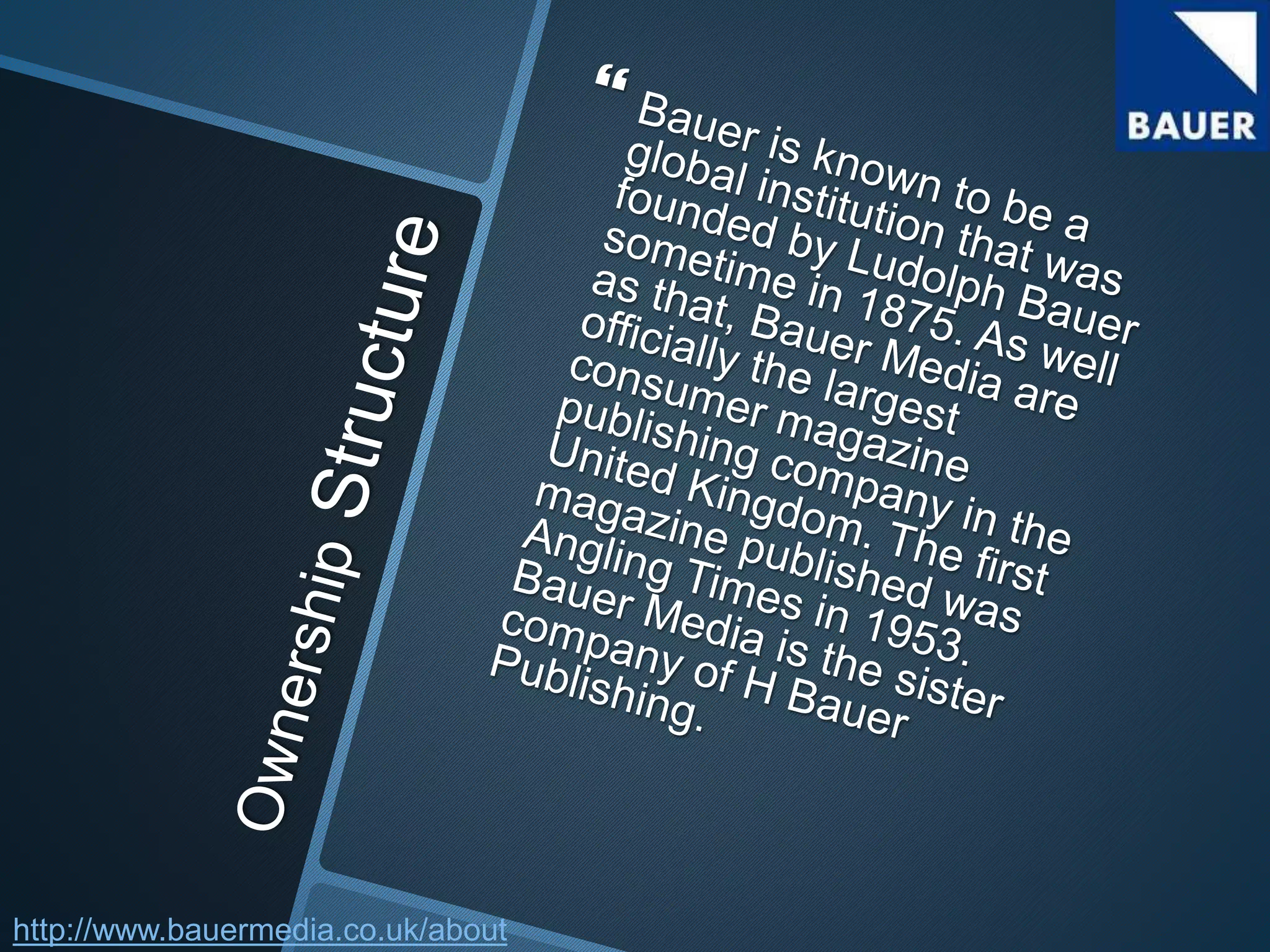
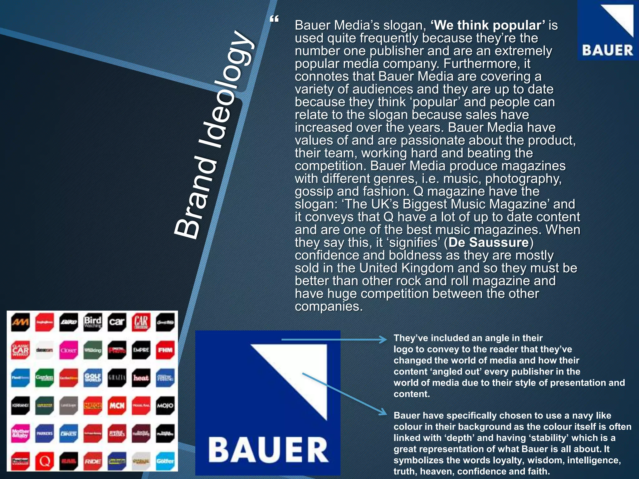
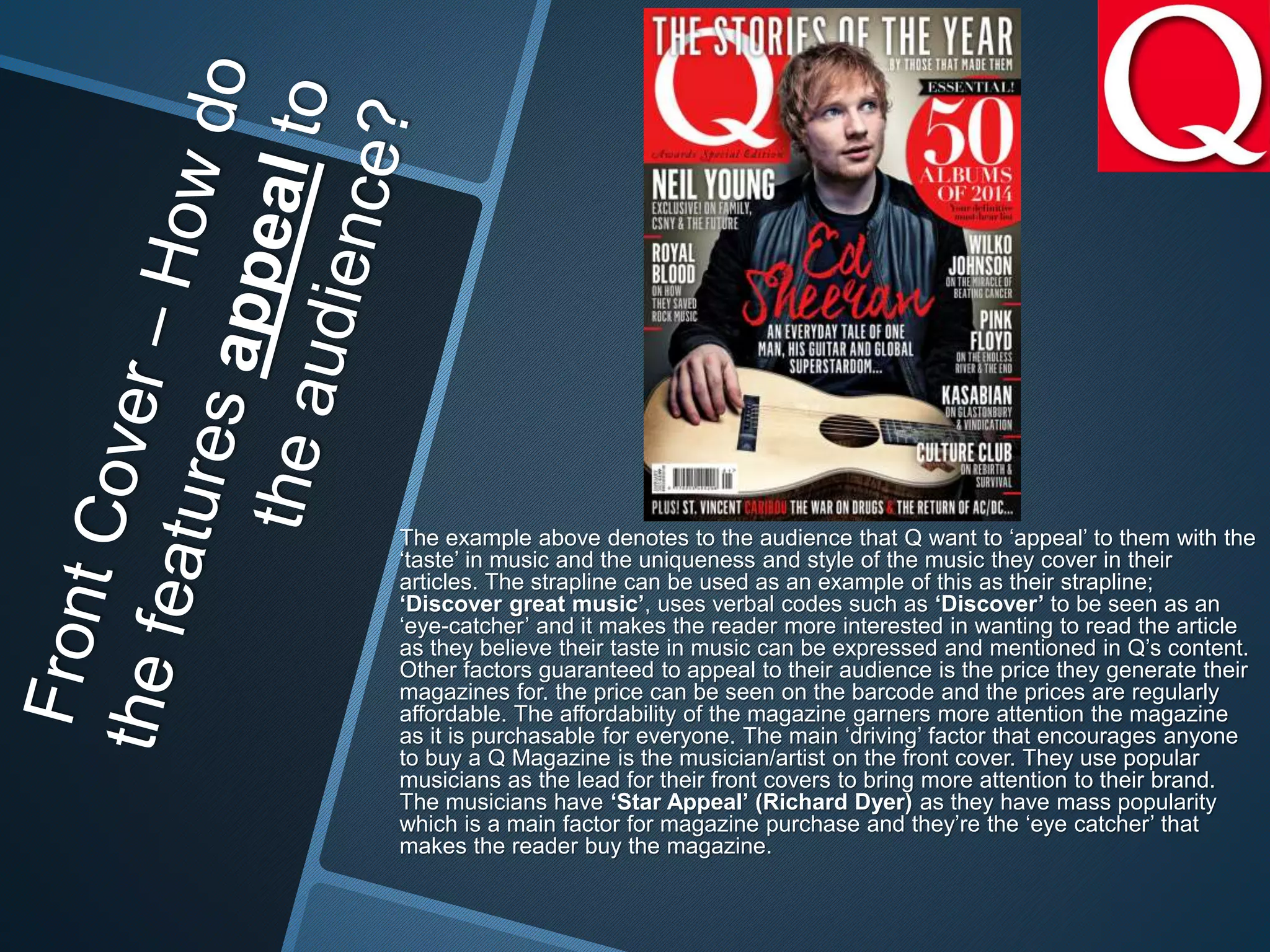
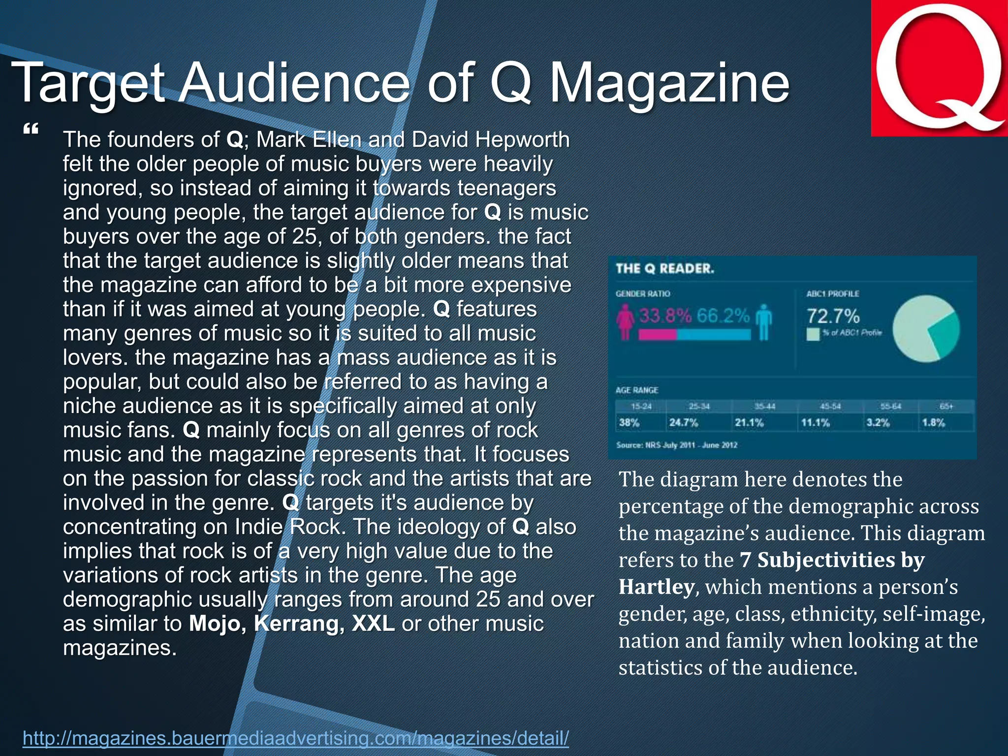
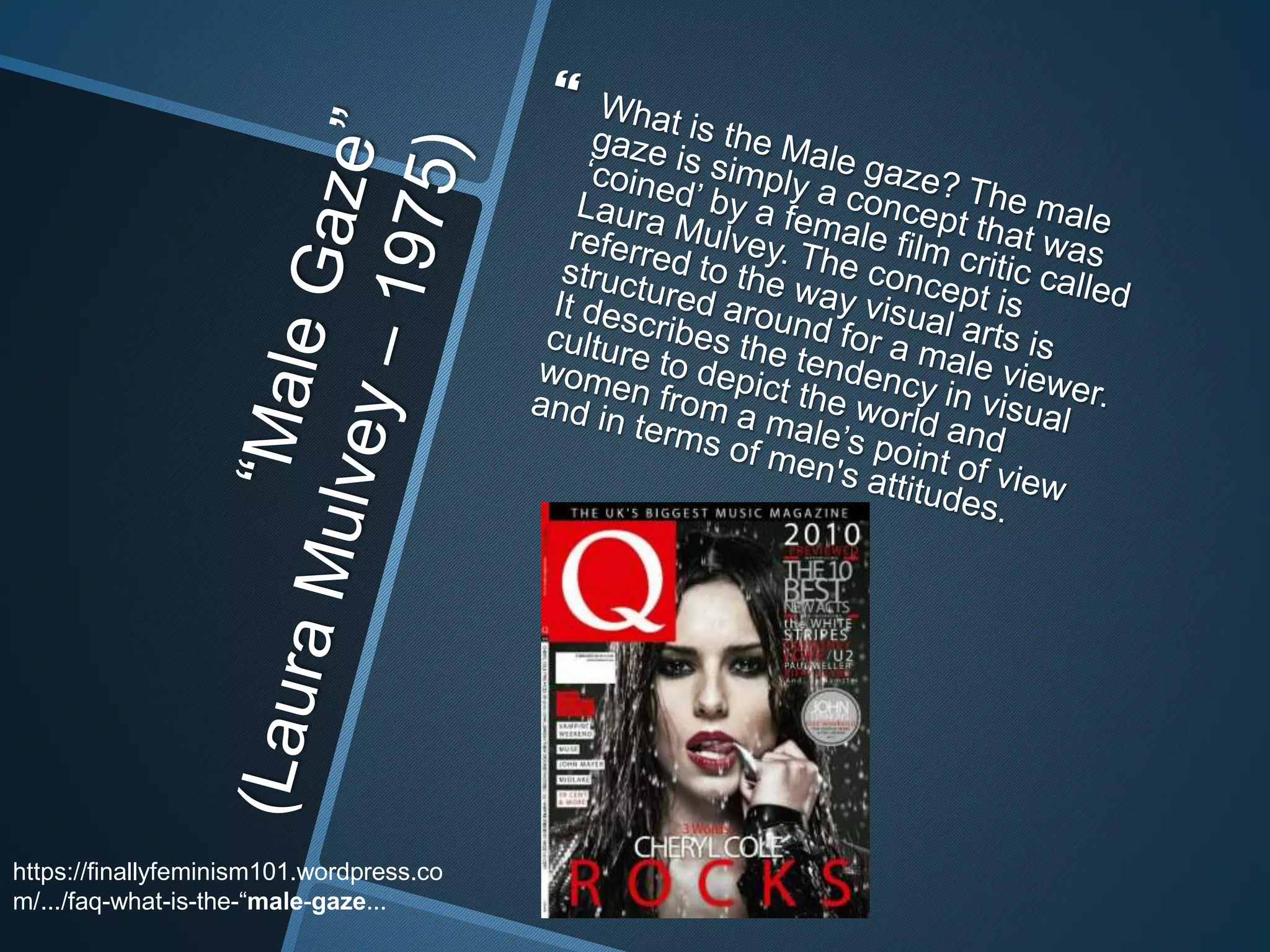
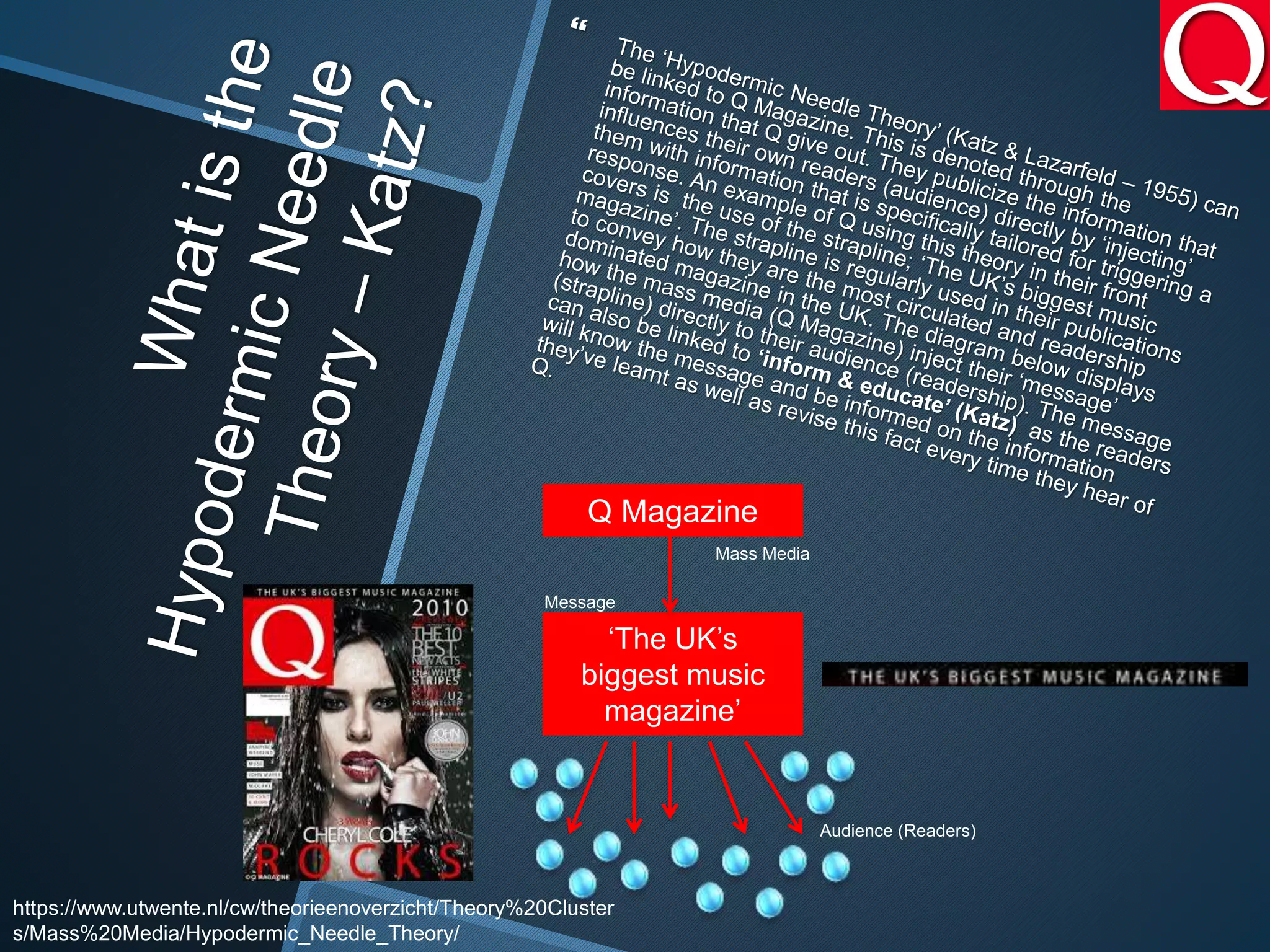
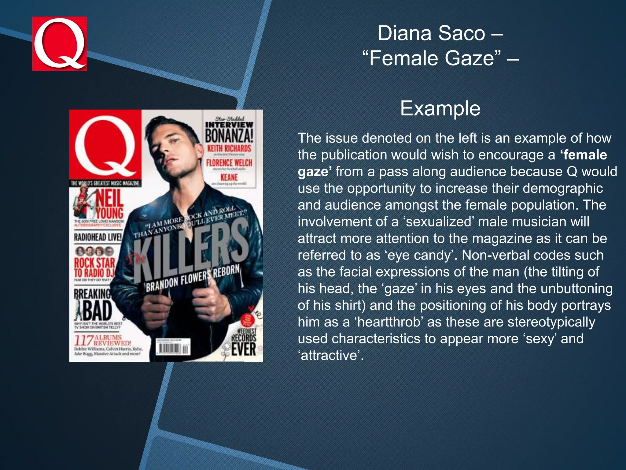
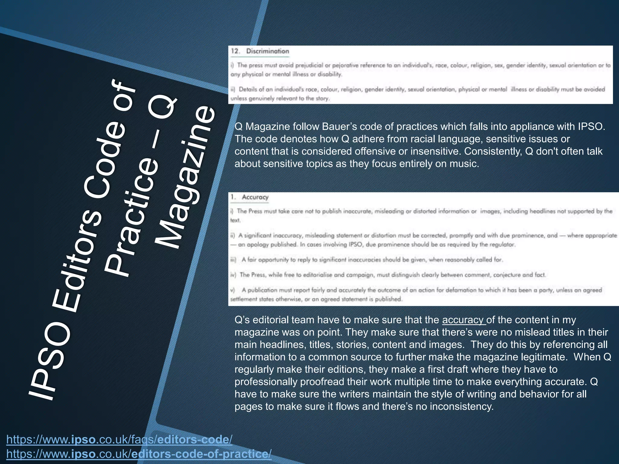
Bauer Media is a UK-based media group known for magazines and radio. It was founded in 1953 and now spans over 80 brands covering diverse interests. Bauer Media joined the larger Bauer Media Group in 2008. Q Magazine is one of Bauer Media's magazines focused on rock music. It uses a consistent style with red, black, and white colors and covers various music genres aimed at readers aged 25 and over, especially males.
Flogo - A Golang-powered Open Source IoT Integration Framework (Gophercon)Kai Wähner
Golang-powered open source IoT project Flogo to build ultra-lightweight integration microservices.
The Internet of Things (IoT) brings up 50 billion devices until 2020, which have to be connected somehow. Challenges include low bandwidth, high latency, non-reliable connectivity and the need for low network costs. Therefore, a gateway is needed remotely on site of the devices to filter, aggregate and send just relevant data into the cloud or data center. This session introduces project Flogo: A 100% open source framework, which allows developing ultra lightweight IoT integration applications with a zero-coding web user interface or design chat bot. Coders can also rely just on code, of course. It is written in Google’s Go programming language and 20-50x more lightweight than similar Java or JavaScript frameworks. Therefore building very lightweight microservices independent of IoT is another good use case for this framework, e.g. for serverless architectures using open source frameworks such as OpenWhisk. The session focuses on live demos and shows how to build microservices and integrate IoT devices using standards such as MQTT, WebSockets, CoaP or REST. The last part of the session compares Project Flogo to other open source IoT projects like Node-RED and SaaS offerings such as AWS IoT.
Please use the Flogo community to discuss or ask questions:
https://community.tibco.com/products/project-flogo
Video recording of these slides:
https://youtu.be/-ThK6BZdoxw
2024.06.01 Introducing a competency framework for languag learning materials ...Sandy Millin
http://sandymillin.wordpress.com/iateflwebinar2024
Published classroom materials form the basis of syllabuses, drive teacher professional development, and have a potentially huge influence on learners, teachers and education systems. All teachers also create their own materials, whether a few sentences on a blackboard, a highly-structured fully-realised online course, or anything in between. Despite this, the knowledge and skills needed to create effective language learning materials are rarely part of teacher training, and are mostly learnt by trial and error.
Knowledge and skills frameworks, generally called competency frameworks, for ELT teachers, trainers and managers have existed for a few years now. However, until I created one for my MA dissertation, there wasn’t one drawing together what we need to know and do to be able to effectively produce language learning materials.
This webinar will introduce you to my framework, highlighting the key competencies I identified from my research. It will also show how anybody involved in language teaching (any language, not just English!), teacher training, managing schools or developing language learning materials can benefit from using the framework.
This is a presentation by Dada Robert in a Your Skill Boost masterclass organised by the Excellence Foundation for South Sudan (EFSS) on Saturday, the 25th and Sunday, the 26th of May 2024.
He discussed the concept of quality improvement, emphasizing its applicability to various aspects of life, including personal, project, and program improvements. He defined quality as doing the right thing at the right time in the right way to achieve the best possible results and discussed the concept of the "gap" between what we know and what we do, and how this gap represents the areas we need to improve. He explained the scientific approach to quality improvement, which involves systematic performance analysis, testing and learning, and implementing change ideas. He also highlighted the importance of client focus and a team approach to quality improvement.
Instructions for Submissions thorugh G- Classroom.pptxJheel Barad
This presentation provides a briefing on how to upload submissions and documents in Google Classroom. It was prepared as part of an orientation for new Sainik School in-service teacher trainees. As a training officer, my goal is to ensure that you are comfortable and proficient with this essential tool for managing assignments and fostering student engagement.
How to Split Bills in the Odoo 17 POS ModuleCeline George
Bills have a main role in point of sale procedure. It will help to track sales, handling payments and giving receipts to customers. Bill splitting also has an important role in POS. For example, If some friends come together for dinner and if they want to divide the bill then it is possible by POS bill splitting. This slide will show how to split bills in odoo 17 POS.
Read| The latest issue of The Challenger is here! We are thrilled to announce that our school paper has qualified for the NATIONAL SCHOOLS PRESS CONFERENCE (NSPC) 2024. Thank you for your unwavering support and trust. Dive into the stories that made us stand out!
5. 1.Bauer media is known to be a multi-platform UK-
based media group that is consisted of many
companies collected around two types of media–
Magazines and Radio.
2.Bauer originated somewhere around 1953.
3.Currently, Bauer Media spans over 80 influential
brands that covers a fairly diverse range of interests
including heat.
4.Bauer Media is a sister company of H Bauer
Publishing, publisher of the UK's biggest TV listings,
Take a Break and Bella.
5.Bauer Media joined the Bauer Media Group in January
of 2008.
http://www.bauermedia.co.uk/about/our-
company
http://www.bauermedia.co.uk/about/awards
9. Bauer Media’s slogan, ‘We think popular’ is
used quite frequently because they’re the
number one publisher and are an extremely
popular media company. Furthermore, it
connotes that Bauer Media are covering a
variety of audiences and they are up to date
because they think ‘popular’ and people can
relate to the slogan because sales have
increased over the years. Bauer Media have
values of and are passionate about the product,
their team, working hard and beating the
competition. Bauer Media produce magazines
with different genres, i.e. music, photography,
gossip and fashion. Q magazine have the
slogan: ‘The UK’s Biggest Music Magazine’ and
it conveys that Q have a lot of up to date content
and are one of the best music magazines. When
they say this, it ‘signifies’ (De Saussure)
confidence and boldness as they are mostly
sold in the United Kingdom and so they must be
better than other rock and roll magazine and
have huge competition between the other
companies.
Bauer have specifically chosen to use a navy like
colour in their background as the colour itself is often
linked with ‘depth’ and having ‘stability’ which is a
great representation of what Bauer is all about. It
symbolizes the words loyalty, wisdom, intelligence,
truth, heaven, confidence and faith.
They’ve included an angle in their
logo to convey to the reader that they’ve
changed the world of media and how their
content ‘angled out’ every publisher in the
world of media due to their style of presentation and
content.
15. Other genres that Bauer Media excel in is
fashion; Grazia magazine is an example of a
fashion magazine published by Bauer Media.
Compared to some of the magazines, Grazia
have a bigger circulation and readership, as well
as a greater female and ABC1 percentage. Q
magazine has a monthly circulation and Grazia is
weekly and Q magazine have a higher
percentage of the age range 15-24. Recently,
Grazia has been sold at around £1 and with
circulation at 155, 289 that means there’s a profit
of about £155, 289, which is £37, 639.47.
http://magazines.bauermediaadvertising.com/magazines/detai
l/grazia
http://magazines.bauermediaadvertising.com/magazines/detai
l/Q
16. Market Position
Three of Bauer
Media’s magazines
are included in the
top 6 rock music
magazines.
Kerrang!, Q
Magazine and Mojo
are those
magazines.
http://www.ppa.co.uk/marketing/research/abc-figures-january-
to-june-2013/
Net Circulation
Bauer Media
IPC Media Ltd
Music and Media Solutions
Group Limited
Bauer Media’s Net Circulation-
Kerrang!
Mojo
Q
19. Company Name Ipc Media Group Limited
Name Variation Ipc Media Group Ltd
Status DISSOLVED (DORMANT)
Category Private Limited Company with Share Capital
Company Number 00226890
Incorporation Date 24 December 1927
Company Age 87 Years 9 Months
Activity Description Dormant.
http://www.endole.co.uk/company/00226890/ipc-media-group-
limited
20. Company Name Music And Media Solutions Limited
Name Variation Music And Media Solutions Ltd
Status DISSOLVED
Category
Private Limited Company with Share Capital
Company Number 06278494
Incorporation Date 13 June 2007
Company Age 8 Years 3 Months
Activity Description Arranging sponsorship for the benefit of
group companies. the 27.04.13 accounts
indicate that the company is either dormant
or no longer trades.
http://www.endole.co.uk/company/06278494/music-and-media-
solutions-limited
21. Company Name Future Plc
Status ACTIVE
Category Public Limited Company with Share Capital
Company Number 03757874
Incorporation Date 22 April 1999
Company Age 16 Years 5 Months
Activity Description
Publishing of special interest consumer
magazines and websites, notably in the areas of
technology, film, games, future women, sport,
auto & music.
http://www.endole.co.uk/company/03757874/future-
plc
31. Front cover Analysis
The use of a clear cut
masthead and strapline is
definitely one of the most
important features that are
used in a magazine article.
This connotes to the reader
that the magazine is of high
importance and is of a
professional quality. The
colour scheme is also
important as you need to be
consistent throughout the
magazine house style. For
example, the masthead of Q
is white, red and black. They
use the same colours
throughout the magazine to
show professionalism and
consistency.
This is a technical code that is used for the
primary image. This is mainly focused on a
close up image of the artists’ face. The use
of the close up creates interest for the
reader to find out why the style used has
been chosen. With my photograph I will use
Photoshop, this is so I can deliver a
professional quality image that is suitable
for being the main feature of the my pages.
More visual codes that I myself will plan
to include on the front cover are basic
symbols such as the plus sign (+), this will
notify the reader of extra content that will be
made available. Secondly, borders around
text that is typically seen on certain
magazines will be used. The different shape
on the page draws the eye well whilst also
keeping it away from other text so it does not
get lost within the majority of the name and
image of artists.
The variety of text size and font draws
attention and is an eye-opener for readers to
look at certain articles that are advertised. It
creates a diversity of content whilst also
grabbing the readers attention with ‘star
appeal’ (Richard Dyer) which is the use of
including famous artists on your pages to
further promote and advertise.
The barcode there features the date of the
publication, the website link and the price of
the magazine. Social media links will
occasionally be seen on the barcode as well.
The image is placed directly in
the centre to add attention to the
main image as the headline is what
sells the magazine as the readers will
only buy it just for the person that is
featured. Also, it conveys that
they’re the centre of attention as
they’re the one that is featured on the
front.
The strapline, ‘the world’s best music magazine’,
conveys to the reader that based on their sales and readership that they are the best and
most sold out magazine ever. The verbal code also conveys to the reader that they’re
confident with the content that they release. The verbal code ‘worlds’ implies to the reader
that Q are comparing their content to the rest of the worlds content and making a bold
statement saying they’re the best music magazine in the ‘world’.
The cover stories are featured at the
front of the magazine to notify the reader
the information that they can read and
what is featured on the magazine.
32. The denotation of the masthead of the magazine is
a ‘Q’ letter. The design of the masthead is a basic
red background with a bold ‘Q’ letter centered in the
middle. The design of the masthead is very
recognizable and easy to distinguish from the rest
of the magazines as the concept of the logo is very
basic yet effective. The colour ‘red’ connotes how
passionate about what articles they put forward to
their audience. The colour ‘black’ is described to be
a colour that is ‘formal, elegant, and very
prestigious’. This relates to Q as they post content
that is for higher classes in the hierarchy and
they’re a highly circulated magazine that has strong
market power.
33. Double Page Spread (DPS)
Analysis
Within the main article of the double page spread,
there’s an vastly oversized J in the background of the
writing, this is an effective method of attracting the
readers attention to the start of the text.
To accentuate its presence they have coloured the
drop capital in the typical Q magazine red, this is
contrasting with the main body of text which is black.
One of the main features of the
double page spread that I plan to
‘repeat’ (Steve Neale – 1980) is
an image that ranges over more
than half of the page. A technical
code of this will be the shot type,
which will be focussed with a
long shot of the artist. I plan to
do this within the the technical
conventions of my magazine this
is so it gives the most dramatic
effect possible.
Underneath the main image a pull quote is
coloured in bold red and white text from the
interview that was done. The purpose of this is to
focus on the most central and amusing aspects.
The quote has been positioned at the bottom of the
page so it can be easily seen against the image.
The stand first for this article is below the main quote. I feel that within
this example pairing the quote and stand first together does not work as
well because there are no effective eye-catching aspects other than the
drop capital. On my double page spread for the magazine I will choose to
position the stand first above the main body of text, this is so that the reader
is attracted to the larger text first off and will then continue to read on into the
article.
The page number is featured at
the bottom of the page on the left
hand side to help the
reader identify what page certain
content is
on.
The main image is placed on the left
as it gives the idea to the reader that the
DPS is based on them and that’s what
the content is about.
The headline is at the top of the
magazine to convey to the reader
what the content is about.
34. Contents Page Analysis
TITLE/LOGO
The title of this contents page is quite
small and not as eye catching as the
other features on this page. However, the
title of the page is in capitals, bold in
whiten and clear at the top left of the
page. It is positioned at the top because
it’s used to make the page more formal
and professional. The logo is featured on
this contents page. This is done to show
consistency throughout the whole
magazine.
ISSUE NUMBER/DATE
Both features is included in the page and
it is showing the reader what month or
what week the magazine is set to be
launched.
MAIN IMAGE
The main image of the contents page is the only
eye catching feature of the page as it takes the
most space and most focus of the page. This is due
to the editor wanting the reader of the article to
focus on the image of the magazine. It gives the
reader an idea of what is featured in the
magazine. The pull quote is featured and it’s
included in the article.
‘EVERY
MONTH’
This is one of the
features included in the
magazine. It shows that
there is a page about
subscribing to Q and if
they subscribe then
that means that he can
have access to each
edition sent to them as
it’s released time after
time.
‘’MAIN
CONTENT’’
The page number and the
titles of the article is
positioned on the left hand
side of the page. Each title
has a brief description of
what is on that certain
page.
36. Purpose and Meaning of Q
Magazine
The denotation of the genre of Q magazine is eclectic as it is revolved
around all genres of music, most focus around rock music and indie music.
Q magazine is eclectic because the magazine wants more of an audience
so it reaches out to all genres so that everyone will be interested in the
diversity of Q. Evidence of this genre can be found on the front of their
magazines which features a variety of rock bands such as Foo fighters,
artists such as Kanye West and much more. Additionally the genre of the
magazine is aimed at ages 25 years old and above. The highest proportion
of readers are male between the ages of 30 and above.
37. Purpose of Q Magazine
The denotation of the genre of Q magazine is revolved around all genres of music, most focus
around rock music and indie music. Evidence of this genre can be found on the front of their
magazines which features a variety of rock bands such as Foo fighters, artists such as Kanye West
and much more. Additionally the genre of the magazine is aimed at ages 25 years old and above.
The highest proportion of readers are male between the ages of 30 and above.
Strapline Connotation:
The denotation of the strapline for Q Magazine is “The worlds best music magazine.” This connotes
to the readers that the magazine is overly confident that their content is of high quality and has the
confidence to state that it is the best when in competition with other popular magazines. The use of
‘World’s’ can connote that it is known on a global scale which furthermore demonstrates its scale of
popularity
38. Genre of Q Magazine
The denotation of the genre of Q magazine is revolved around all styles and genres
of music, primarily around rock music and indie music. Evidence of this is included on
the front pages of their magazines where the artists are portrayed to convey what the
main focus of genre will be focused on in the magazine. Famous names included are
Kanye West, Jay Z, Foo Fighters, Queen, The Beatles, Guns N’Roses and the
Rolling Stones. Additionally the variety of genres of the magazine are supported by
the overall demographics of Mojo. The highest proportion of readers are male
between the ages of 25 and above.
39. Form and Style
Q magazine’s house style and colour scheme is consistent
throughout as the only colours they include are red, black and
white. The consistency of their house style increases interest from
readers mainly because of the colours they like to use in their
layout. They use the same three colours as a way to demonstrate
their boldness.
The same three colours for its
house style: red, black and white.
40. Form and Style – Print Editions and
Digital Editions for the Magazine
Print Editions and Digital Editions for the Magazine:
Q magazine usually publish their articles with a paper-
based or onto an electronic device. This means that their
content is a lot easier to access as compared to other
magazines because of the different varieties that it can be
consumed. There is a lot of advertisement on their
website, they usually like to regularly recommend that
their customers subscribe to their articles, the deals are
usually at a reasonable price. They offer discounted
subscription service to readers.
Subscription to their website
Advertisement
Q’s Print + Digital
Q’s Digital
Q’s Print
41. Form and Style – The Style used
for Q Magazine
The Style used for Q
Magazine: In the Q
Magazine issue, you can
see that the style is made to
be consistent as everything
is supposed to be kept the
same, i.e. the font and the
colour scheme that they
incorporate. By keeping this
consistency of the house
style it generates association
to the magazine. The colour
scheme is quite consistent
as the only colours they use
are red, white and black.
42. Form and Style – The size and
Dimensions of a ‘Q’ Magazine
The Size and Dimensions of a ‘Q’
Magazine: With very thorough research on
the Q Magazine’s official website, I have
found that the dimensions and widths of
the print version of the magazine is
measured to be around ‘’30.6 x 22.2 x 1.2
cm’’. This is around the average size for a
basic music magazine.
43. Production Process of Q
Magazine
http://hosbeg.com/the-magazine-production-
FIRST STEP: Date of Q Magazine’s – the first step in
this whole process is to settle on the date of Q’s due
release. The date of release is when you want the
magazine to be released to the public
SECOND STEP: Working with a schedule – this step
is one of the most important ones when it comes to the
production of a magazine. The schedule should be made
in a way that there are preventions for certain mishaps
so that even when these mishaps occur, you can always
meet the day it’s due (deadline).
44. http://hosbeg.com/the-magazine-
production-process/
THIRD STEP: Budget for production of Q Magazine– the
next step in this process is taken during the process of the
production of the magazine is the editing decisions. The
editorial decisions usually involve the magazine’s editing team
planning what topics will be covered in the next issue of Q. After
deciding what article ideas or topics and photographs will be
used in the magazine, the editing team will now make the
budgeting decisions.
FOURTH STEP: What Content they want to use– the content
choosing process is probably the most important step because
without content we simply cannot have the magazine. Content
for the magazine is very ‘key’. It is at this stage that artwork and
graphics are also worked on. The artwork is known as pictures
that are going to be placed in the magazine. Graphics are the
pictures or images that are designed with a computer program,
i.e. Photoshop or InDesign.
Production Process of Q
Magazine
45. http://hosbeg.com/the-magazine-
production-process/
FIFTH STEP: Sub-editing – this is the next step in the
production process. Sub editing is focused one important thing,
which is quality. This step involves the following important
things:
Checking the legitimacy of all facts used in articles for Q
Making sure that grammar and punctuation are accurate for the
articles
Making sure that all articles have the same house style
Working on the layout of the articles…..
SIXTH STEP: Page Layout – in the main big publications, there
is a special work team that are responsible for page layouts
called the layout staff. Their job is to layout the various pages
that come together to make the magazine. In performing this
task, they use very powerful Adobe Desktop Publishing
programs such as InDesign to get the job done. It is at this
stage that adverts from advertisers are placed into the content.
Production Process of Q
Magazine
46. SEVENTH STEP: Proofreading the articles for Q – The next step in this process is re-
reading the text in all articles to make sure it’s adequate for release. The editorial department
will print out a copy of the magazine for the sole purpose of reading through to re-correct any
mistakes in it. The editorial team keeps proofreading until every member is satisfied that all
mistakes have been made.
EIGHTH STEP: File emailed to printer – After the re-reading stage, there’s a DTP file of the
entire magazine which is sent to the printer whose job will be to print the magazine. Before the
release of the magazine, there is another process called the ‘’Pre-press’’ which means that it’s
checking to make sure that you are sending all the fonts and images that will be required for the
magazine with your file. Once this stage is finished, their printing staff will then take over. Before
the printing staff prints loads of copies requested by the publication, the staff first prints a few
copies and sends them to the publication’s editor for checking once again.
NINTH STEP: Distribution – this is the final stage in the stage development of Q magazine. Q’s
printing staff will package them neatly and send them to a warehouse. From the warehouse, the
magazines are then distributed and then sold to their audience.
Production Process of Q
Magazine
http://hosbeg.com/the-magazine-
production-process/
47.
48.
49.
50. The example above denotes to the audience that Q want to ‘appeal’ to them with the
‘taste’ in music and the uniqueness and style of the music they cover in their
articles. The strapline can be used as an example of this as their strapline;
‘Discover great music’, uses verbal codes such as ‘Discover’ to be seen as an
‘eye-catcher’ and it makes the reader more interested in wanting to read the article
as they believe their taste in music can be expressed and mentioned in Q’s content.
Other factors guaranteed to appeal to their audience is the price they generate their
magazines for. the price can be seen on the barcode and the prices are regularly
affordable. The affordability of the magazine garners more attention the magazine
as it is purchasable for everyone. The main ‘driving’ factor that encourages anyone
to buy a Q Magazine is the musician/artist on the front cover. They use popular
musicians as the lead for their front covers to bring more attention to their brand.
The musicians have ‘Star Appeal’ (Richard Dyer) as they have mass popularity
which is a main factor for magazine purchase and they’re the ‘eye catcher’ that
makes the reader buy the magazine.
51. Consistently, a pull quote is always seen in a Q double page
spread. The example above denotes to the audience that pull
quotes are used as direct references from the interviewee (the
person being interviewed). The pull quote can ‘appeal’ to the
audience as they would find the pull quote insightful and
interesting, they would want to learn more if they read the whole
article. The same can also be said for the ‘drop capital’ as it is
deemed an ‘eye-catcher’ that can draw their readers in to look
around their magazine as the capital is colourful and large that
can instantly attract ‘attention’.
52.
53. Target Audience of Q Magazine
The founders of Q; Mark Ellen and David Hepworth
felt the older people of music buyers were heavily
ignored, so instead of aiming it towards teenagers
and young people, the target audience for Q is music
buyers over the age of 25, of both genders. the fact
that the target audience is slightly older means that
the magazine can afford to be a bit more expensive
than if it was aimed at young people. Q features
many genres of music so it is suited to all music
lovers. the magazine has a mass audience as it is
popular, but could also be referred to as having a
niche audience as it is specifically aimed at only
music fans. Q mainly focus on all genres of rock
music and the magazine represents that. It focuses
on the passion for classic rock and the artists that are
involved in the genre. Q targets it's audience by
concentrating on Indie Rock. The ideology of Q also
implies that rock is of a very high value due to the
variations of rock artists in the genre. The age
demographic usually ranges from around 25 and over
as similar to Mojo, Kerrang, XXL or other music
magazines.
The diagram here denotes the
percentage of the demographic across
the magazine’s audience. This diagram
refers to the 7 Subjectivities by
Hartley, which mentions a person’s
gender, age, class, ethnicity, self-image,
nation and family when looking at the
statistics of the audience.
http://magazines.bauermediaadvertising.com/magazines/detail/
54. How does the Katz, Hartley and
Mazlow Theory relate to Q Magazine
1. Diversion – Personally, I think Q is a good way to indulge into something
and learn about all the new songs and news that is going amongst the
media.
2. Personal Identification –In Q magazine, they advertise a lot of
opportunities for readers to get involved, and sometimes the people that may
be resented in Q, may simply reflect us, and how we usually are.
3. Personal Relationship –As you read Q, you can learn about all the
latest news, which can allow you to keep up to date with your friends and
family about the news and gossip amongst the media.
4. Inform & Educate– Q allows individuals to get the most updated news
on celebrities, music and gossip. An example of this is the edition of Q
where we find out the latest news on Jay Z.
55. A Higher management, bankers, lawyers, doctors and other professional
B Middle management, teachers, creative and media people e.g. graphic designers etc.
C1 Office supervisors, junior managers, nurses, specialist clerical toff – white collar
C2 Skilled manual workers, plumbers, builders – blue collar
D Semi-skilled and unskilled manual workers
E Unemployed, students, pensioners, casual workers
This defines the adult population largely by the job they do.
This is based on the National Readership Survey (NRS)
Audience Demographic of Q Magazine
Q’s Demographic
56.
57. Psychographic of Q Magazine
MAINSTREAMERS SEEK SECURITY. Tend to be domestic, conformist, conventional, sentimental – favour value for money
family brands. Nearly always the largest group
ASPIRERS SEEK STATUS. Materialistic, acquisitive, orientated to image and appearance, persona and fashion.
Attractive packaging more important than contents, Typically younger people, clerical and sales jobs.
SUCCEEDERS SEEK CONTROL. Strong goals, confidence, work ethic, and organisation. Supports stability. Brand
choice based on self-reward, and quality. Typically higher management and professionals.
RESIGNED SEEKS SURVIVAL. Rigid and authoritarian values. Interested in the past and tradition. Brand choice
stresses safety, familiarity and economy. Typically older people.
EXPLORERS SEEKS DISCOVERY. Energy, individualism and experience. Values difference and adventure. Brand
choice highlights satisfaction, and instant effect. The first to try new brands. Younger demographic –
students.
STRUGGLERS SEEKS ESCAPE. Alienated and disorganised. Few resources beyond physical skills. Brand choice
involves impact and sensation. Buys alcohol, junk food, lottery tickets. D and E demographic.
REFORMERS SEEKS ENLIGHTMENT. Freedom of restrictions and personal growth. Social awareness and
independent judgment. Anti-materialistic but aware of good taste. Has attended higher education and
selects products for quality.
58.
59. There are charts that observe the percentage in how many men and women observe the magazine yearly/monthly. The
chart below states that 31.7 % of readers are female as compared to the dominated gender of over 68%. As proven by
what I stated earlier in the previous slide, the age ratio is dominated by the group of 18-24 year old as they make up nearly
40% of the viewership compared to that of other ages. There are ‘Aspirers’ and ‘Reformers’ who aim to learn what they can
and thrive to be ‘informed’. On Q’s website, they give you the opportunity to do this by encouraging their readers to
subscribe to their magazine and follow their pages on social media.
61. On Q’s website, you can observe the language Q
magazine use to release stories and bring ‘attraction’
to their pages. They use verbal codes such as
‘Watch’ ‘More’ and phrases such as ‘Find out’ and
‘Read More’ as a way of ‘escaping reality’ and
reading more and more until they’re indulged into the
stories and seek to read more on the website or the
magazine itself.
63. On Q’s website, you will these on the website
regularly. They social media links that can accessible
through the website, this gives the audience a n urge
to follow them and be more personal with the team
of Q as they can comment to them and get to know
and understand their style and taste of music. Q also
give out work/career experience opportunities for
individuals who seek to increase more of a personal
relationship with Q and work behind the scenes on
the development of the Q magazines.
64. Katz
1. Diversion – This means where the audience
Can RETREAT from their reality and engage
Themselves into the content.
2. Personal Identification – This means where the
Audience are able to relate to a character or
Their problem.
3. Personal Relationship – Where the audience
are able to gain a following (audience) and bond
with character or a bunch of different characters.
4. Inform & Educate– Where the audience LEARN
something from engaging into the text/content.
65. Katz
1. Diversion – Personally, I think Q offers a good way
to indulge into something and learn about all
the new songs and news that is going amongst the
Media.
2. Personal Identification –In Q magazine, they advertise
a lot of opportunities for readers to get
involved, and sometimes the people that may be
resented in Q, may simply reflect us, and how we usually
are.
3. Personal Relationship –As you read Q, you can learn
about all the latest news, which can allow you to keep up to
date with your friends and family about the news and gossip
amongst the media.
4. Inform & Educate– Q allows individuals to get
The most updated news on celebrities, music and
Gossip. An example of this is the edition of Q where
We find out the latest news on Jay Z.
66.
67. Social Climbers – Where the audience are
driven by improving their hierarchy in the
social ladder.
Caregivers- Where the audience sympathize
with the characters situation.
Explorers – Where the audience are driven by
social change.
Survivors – Audience members who want the
security and routine of knowing the
characters will be ok or something will be
resolved.
68.
69. Primary Research
Pros Cons
Easy Time consuming
Make a survey about what you want, i.e.
surveys, phone surveys or any other process
of surveys.
May not be accurate
Can get specific answers that you would like
to know, i.e. letting the answer be a simple
yes or no.
Could cost a lot
Quick and cheap for a small sample survey Large scale is time consuming
Could be out of date by the time the survey is
probably finished
As part of my assignment, I will carrying out a primary research for a music
magazine which will be made using Survey Monkey.
http://georgiamediablogs.blogspot.co.uk/2012/03/pros-and-cons-of-primary-and-secondary_06.html
71. Looking through the data, a majority of the people who had filled out the survey were
male. The graph shows that only 20% of the females had filled out the survey and
80% of the people who filled out the survey were in fact, males. With this new found
information, I’m now confident that my target audience has been reached and it also
shows my demographic target audience is predominantly male.
72. Looking through the data, a majority of the people who had filled out the survey were 18 and
under. The graph shows that only 10% of the people had filled out the survey were of ages 27 and
over while 10% shows that people aged between 19-21 had filled out the survey and 80% of the
people who filled out the survey were of ages 16-18. This conveys to me that my audience has
been reached as my demographic is between 15+ so the ages that were filled out where within the
age bound.
73. Looking through the data, a majority of the people who had filled out the survey have
chosen different varieties such as Grime Pollution, Skepta, Rita Ora, Flume and Stormzy.
This conveys to me that there is a variety of artists that have been mentioned and that my
genre is all linked to their style of interest which helps to bring in my intended audience.
74. Looking through the data, 70% of the people who filled the survey would rather have the magazines
circulated on a monthly basis as compared to the 0% who chose yearly and the 30% who chose to have
it weekly. This helped me to finalize my decision on whether or not I should have it produced monthly
and weekly. In the end, I chose to do it monthly to bring in more revenue + have more content to release
to my intended audience.
75. Looking through the data, 50% of people prefer to listen to grime as compared to 10% each for all
genres; Metal, Pop and Indie. Lastly, 20% prefer to listen to Rock. This helped me to know what genres
should be included in my magazine as I will now know what my audience want and it will make it
easier for me to react my target audience now that I know what they want to read.
76. Looking through the data, 40% each would prefer to buy a magazine for £1-1.50 and £2-2.50. Only 20%
chose to pay £3-3.50. This helped me to decide what the best price range for my magazine is and how
my magazine will appreciate the price of my magazine as it’s within their spending range and this could
help to increase my audience.
77. Looking through the data, no one voted to prefer a free prize (0%). The likeliness is that the older
individuals chose not to have free prizes because they didn’t seem too interested in kiddie prizes as it
would be deemed unimportant to them. 70% would want a free prize and 30% are not sure. The use of
this information helped me to have a balance on my decision of whether or not I should mention prizes
and or add in my puff promotions.
78. Looking through the data, 30% of people prefer to have green, shite and gold as a color scheme as
compared to the other 30% who would rather have black, grey and gold as compared to the 10% who
would prefer blue and gold and the other 10% who would have black and gold then lastly, the 0% who
chose black and grey. The information wasn’t really helpful as I had to later change the colour layout
from green, gold, white and black to gold, white and black.
79. Looking through the data, 70% of people always listen to music while 30% will sometimes listen to
music. This really helped me to narrow down what ages I need to focus on and what group of people I
need to focus on the most as I need to find the group with the most attention towards music and their
attitudes towards it. I had to identify the ones who cared about music rather than listen to it as they’re
the best customers to cater too as more money can be generated from the use of content given to them.
80. Looking through the data, 50% of the people who had filled out the survey would rather buy a
magazine from the supermarket as compared to the 20% who would rather buy it from a gas station
and the 30% who would buy it from a corner shop. The information displayed here connotes to me that
I’ve targeted my attention to Supermarkets as it would be the best place to distribute my magazines.
81. Secondary Research
The customer reviews are from their app for the
magazine. The magazine was received mostly
negative reviews for bad layout, fuzziness, lazy
construction of the lap (layout, wording, positioning,
missing content, etc.)
http://blog.magvault.com/post/2014/06/11/Q-
Music-Review - The link to the website is
reviewed by a music critic who talks about their
use of interaction, value and the verdict.
82.
83.
84. How Q Magazine have Synergy with
Social media Links
Q magazine use social media links. For example, they use Twitter, Instagram
and Facebook. This is so Q magazine can let their readers know what is
updated in the next issue and to keep their readers interested. Also, you can
get Q magazine online and as an app so they can expand on a worldwide
demographic and then they can possibly get more viewers/readers.
Moreover, throughout the magazine, they mostly advertise/ promote any up
coming gigs or albums and then where you can buy any tickets and what the
best songs are on the album.
88. Above the line is a type of advertising
through media such as television, radio, print,
cinema and out of home to promote media
based projects or to spread the awareness of
a special offer. Above the line marketing sort
of differs from Below the Line advertising,
which uses mainly unconventional brand-
building and promotional strategic plans,
such as direct mail, sales promotions, flyers,
telemarketing and printed media, i.e.
brochures and usually involve no motion-like
graphics. It is much more effective than when
the target group is very large and difficult to
define.
http://www.theadvertisingclub.net/index.php/features/editorial/
3256-difference-between-above-the-line-and-below-the-line-
advertising
95. Distribution of Q Magazine Editions
Q Magazine are sold mainly in the UK and they have a fairly high cult
following as they’re circulation figures are estimated to be over 360K. Q
Magazine offer many opportunities to have their articles subscribed to
and read by the high viewers around the web.
http://origin.mediauk.com/magazines/36219
/q/readership-figures
Q magazines are sold
mainly around the UK;
especially England.
There was an edition
of Q found in
Sainsbury’s and other
newsagents.
96. Examples of Q Magazine distribution
Q magazines are
sold mainly around
the UK; especially
England. There was
an edition of Q
found in
Sainsbury’s and
other newsagents.
www.alamy.com
97. Is the Q magazine editions available
online?
You can’t purchase the magazine online through a
computer but they have a personalised app which
you can download so you can check on their app
updates and look at their most recent issues.
http://www.qthemusic.com/
98. Can fans of the magazine subscribe to the
magazine and have it delivered to their
address?
If you go onto their website, you can subscribe to their
articles and you can get access to their old articles on
their website. If you subscribe to their issues, you can
get up to 12 articles a year. You can pay for it on their
website and it requires you to put it in your address so
it can send you the publications.
http://www.qthemusic.com/
99. Foreign and UK Distribution of
Q Magazine
PRODUC
T
TOAL
CIRC.
2013
CIRC.
CHANGE
Y/Y
DIGITAL
EDITION
Q 48,353 58,980 -18.0% 2,257
PRODUC
T
TOAL
CIRC.
2013
CIRC.
CHANGE
Y/Y
DIGITAL
EDITION
Q N/A N/A N/A N/A
http://www.pressgazette.co.uk/uk-magazine-combined-
printdigital-sales-figures-first-half-2014-complete-breakdown/
UK
Worldwide
104. Ethical Issues – UK Tribes
UK Tribes is a category based on teenagers who dress, behave and act depending
on what category they belong to. The categories in UK Tribes are Alternate,
Mainstream, Leading Edge, Urban and Aspirant. The tribes were made in late 2005
from Channel 4.
My own magazine; Golden Era is an urban magazine that focuses mainly on Hip
Hop, R’n’B and Rap Music. The tribe that would best suit my target audience would
be the Urban Tribe, targeted primarily at Stylers and Wasteman.
http://www.uktribes.com/
106. MEN
Shown as ‘’all muscular, no intelligence’’
Powerful
Clueless
False expectations of what one can look like
WOMEN
Shown as ‘’sexy, no intelligence’’
Clueless
Powerful
Fake/Plastic
False expectations of what one can look like
110. Diana Saco –
“Female Gaze” –
Example
The issue denoted on the left is an example of how
the publication would wish to encourage a ‘female
gaze’ from a pass along audience because Q would
use the opportunity to increase their demographic
and audience amongst the female population. The
involvement of a ‘sexualized’ male musician will
attract more attention to the magazine as it can be
referred to as ‘eye candy’. Non-verbal codes such
as the facial expressions of the man (the tilting of
his head, the ‘gaze’ in his eyes and the unbuttoning
of his shirt) and the positioning of his body portrays
him as a ‘heartthrob’ as these are stereotypically
used characteristics to appear more ‘sexy’ and
‘attractive’.
112. Typical stereotypes be like:
Enjoy pop-Music
Listen to Vanilla Ice
All Caucasians are discriminative towards other races
Like Outdoor Activities
All enjoy golf
http://racist-stereotypes.com/
116. Q Magazine follow Bauer’s code of practices which falls into appliance with IPSO.
The code denotes how Q adhere from racial language, sensitive issues or
content that is considered offensive or insensitive. Consistently, Q don't often talk
about sensitive topics as they focus entirely on music.
Q’s editorial team have to make sure that the accuracy of the content in my
magazine was on point. They make sure that there’s were no mislead titles in their
main headlines, titles, stories, content and images. They do this by referencing all
information to a common source to further make the magazine legitimate. When Q
regularly make their editions, they make a first draft where they have to
professionally proofread their work multiple time to make everything accurate. Q
have to make sure the writers maintain the style of writing and behavior for all
pages to make sure it flows and there’s no inconsistency.
https://www.ipso.co.uk/faqs/editors-code/
https://www.ipso.co.uk/editors-code-of-practice/
118. The Q Magazine cover denotes to the
audience the stereotypical depiction of a
typical ‘African-American’ rapper (Jay Z).
The rapper displayed in the front cover
appears to be wearing baggy blue jeans
with an oversized black t-shirt and a long
golden chain that is stereotypically worn in
music videos and rap shoots.