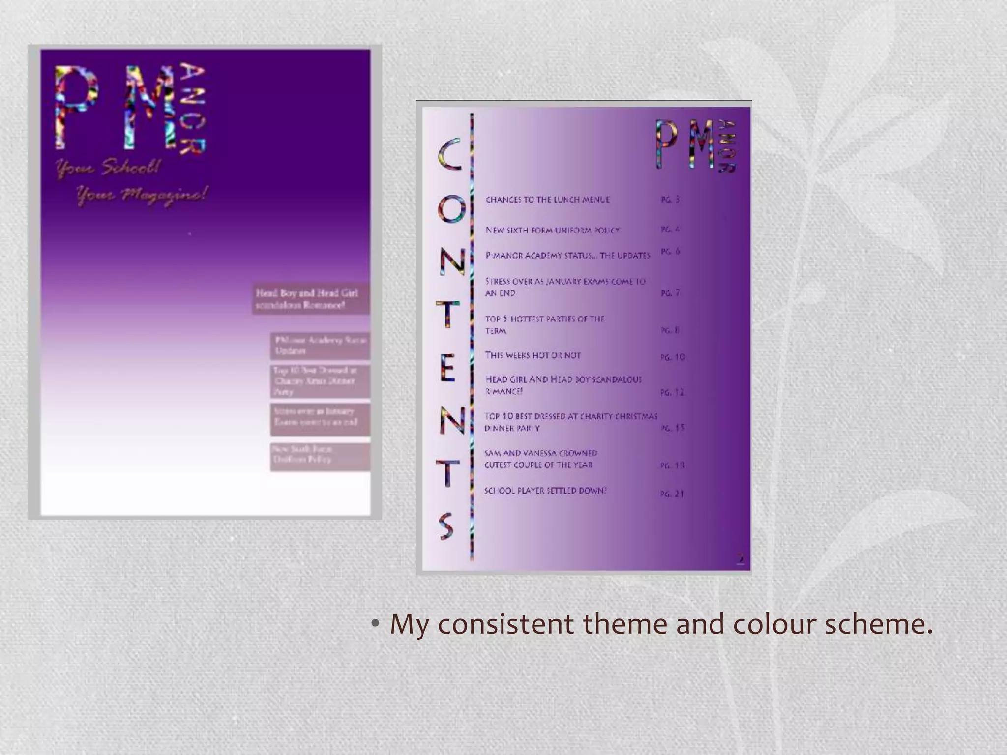
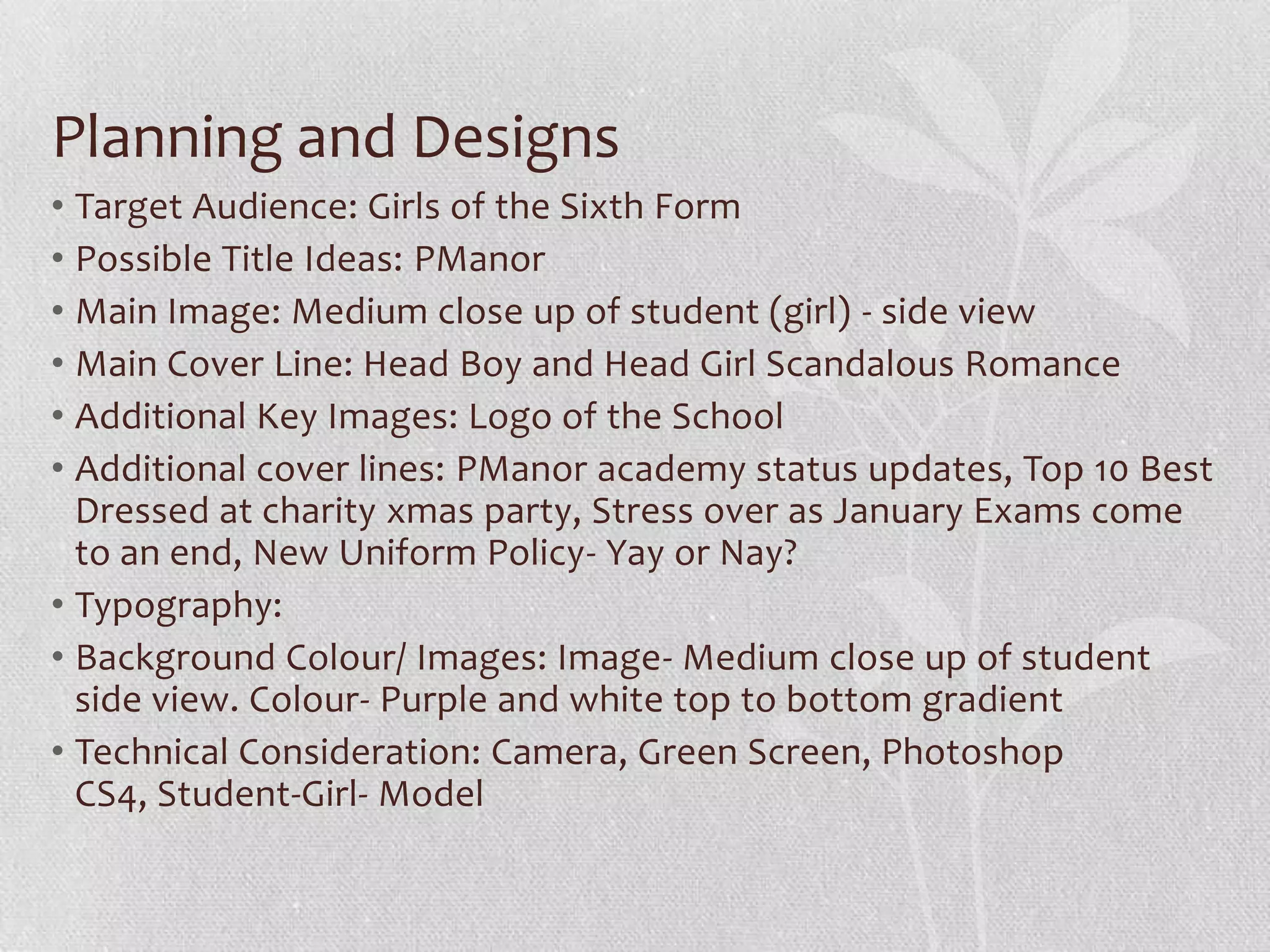
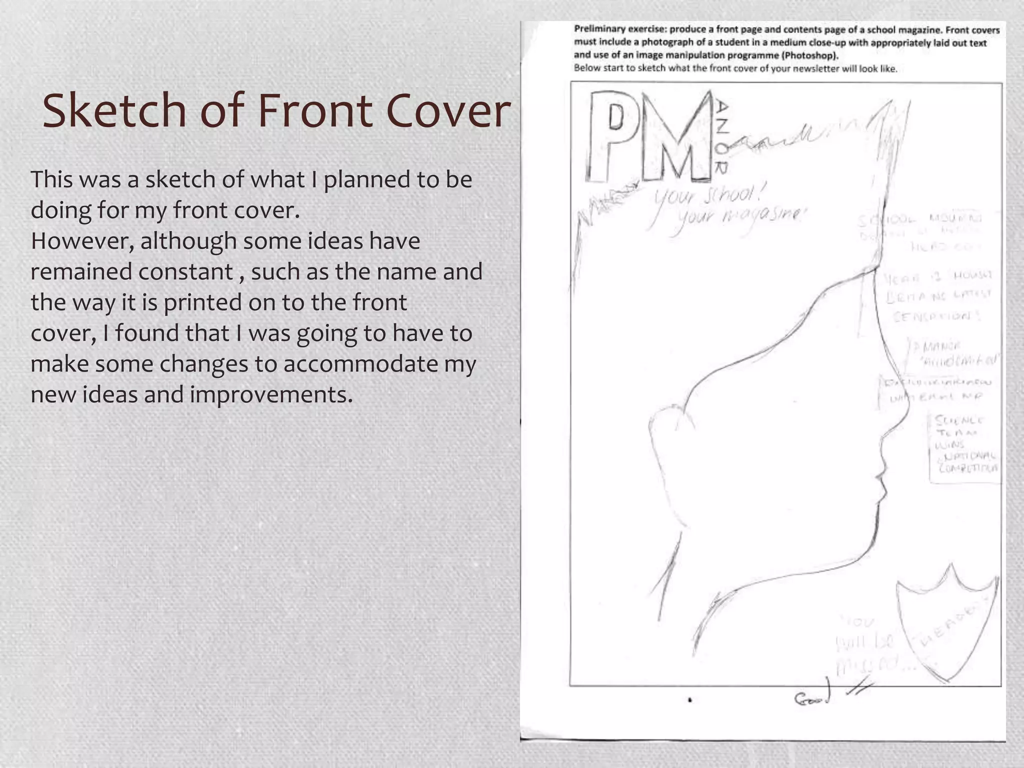
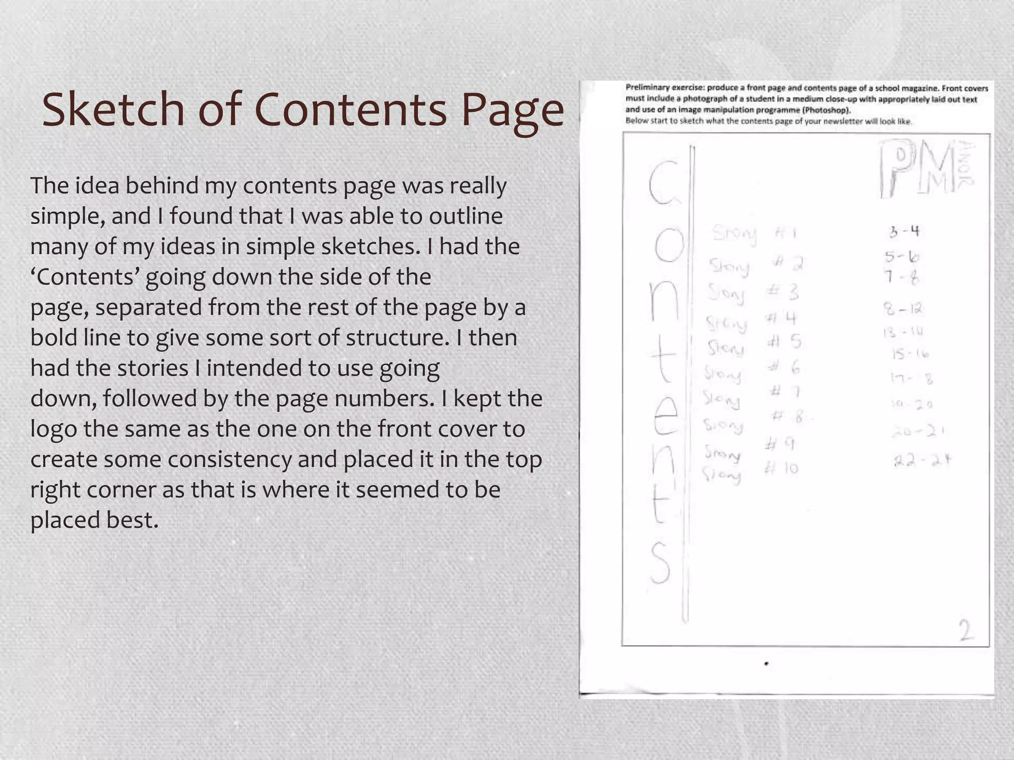
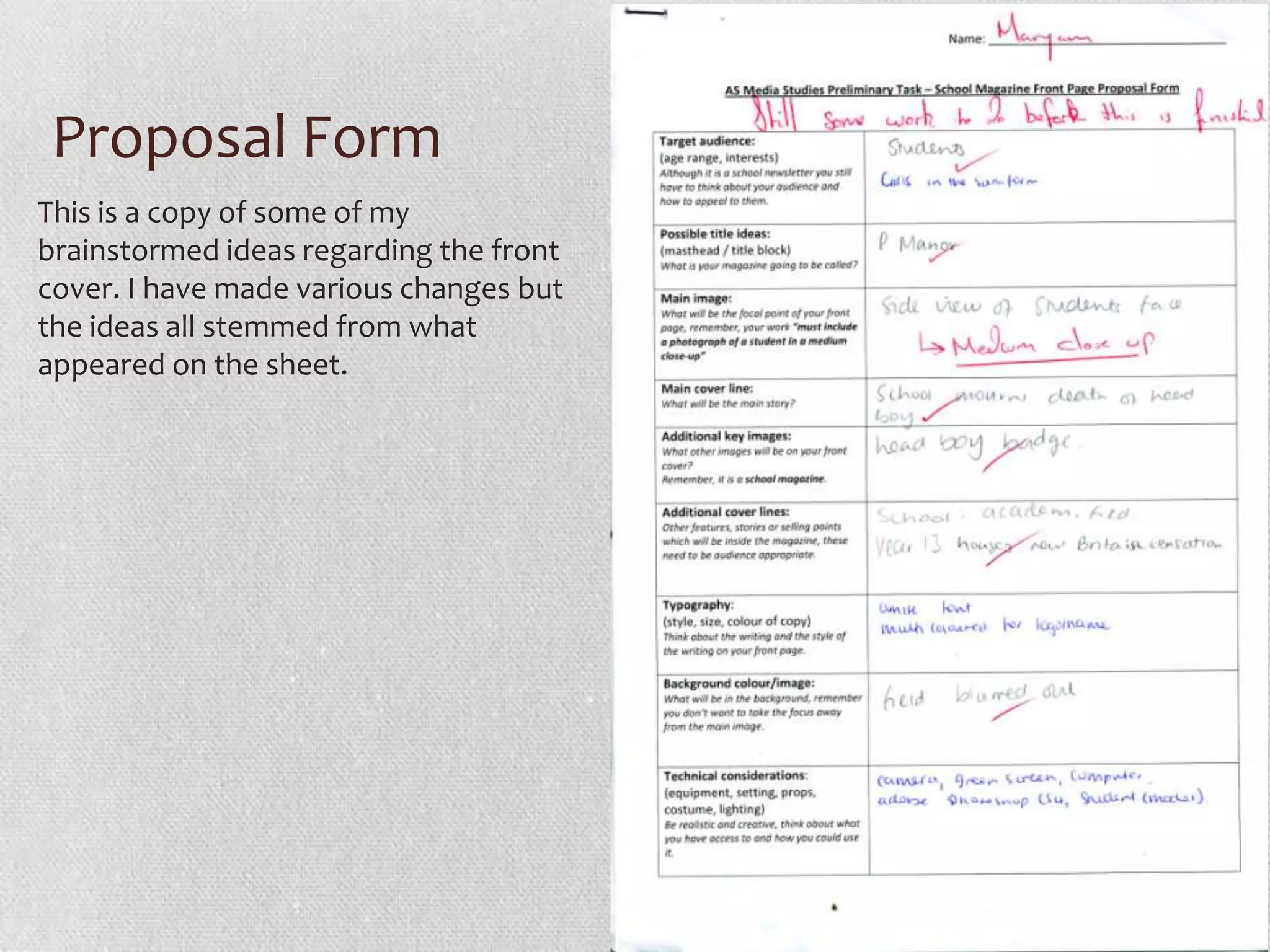
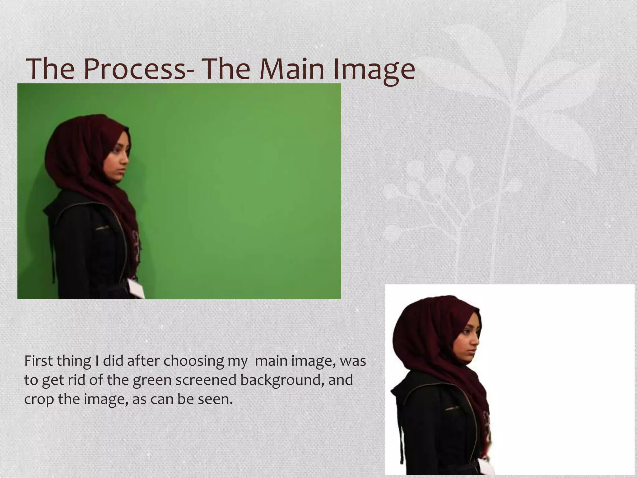
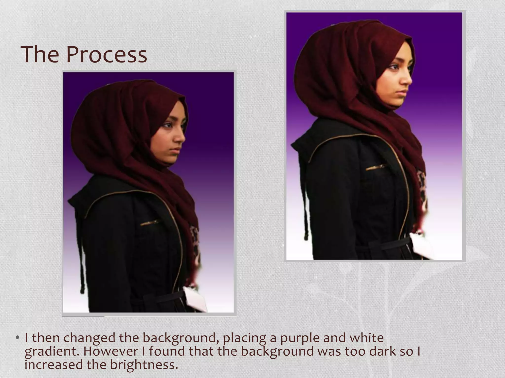
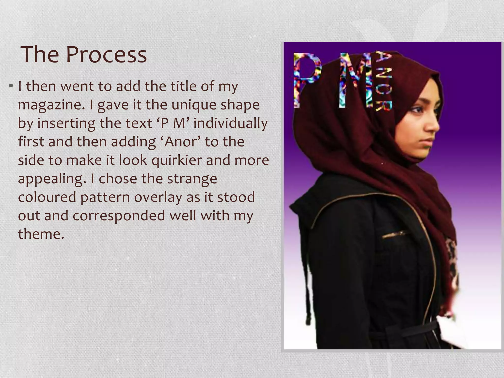
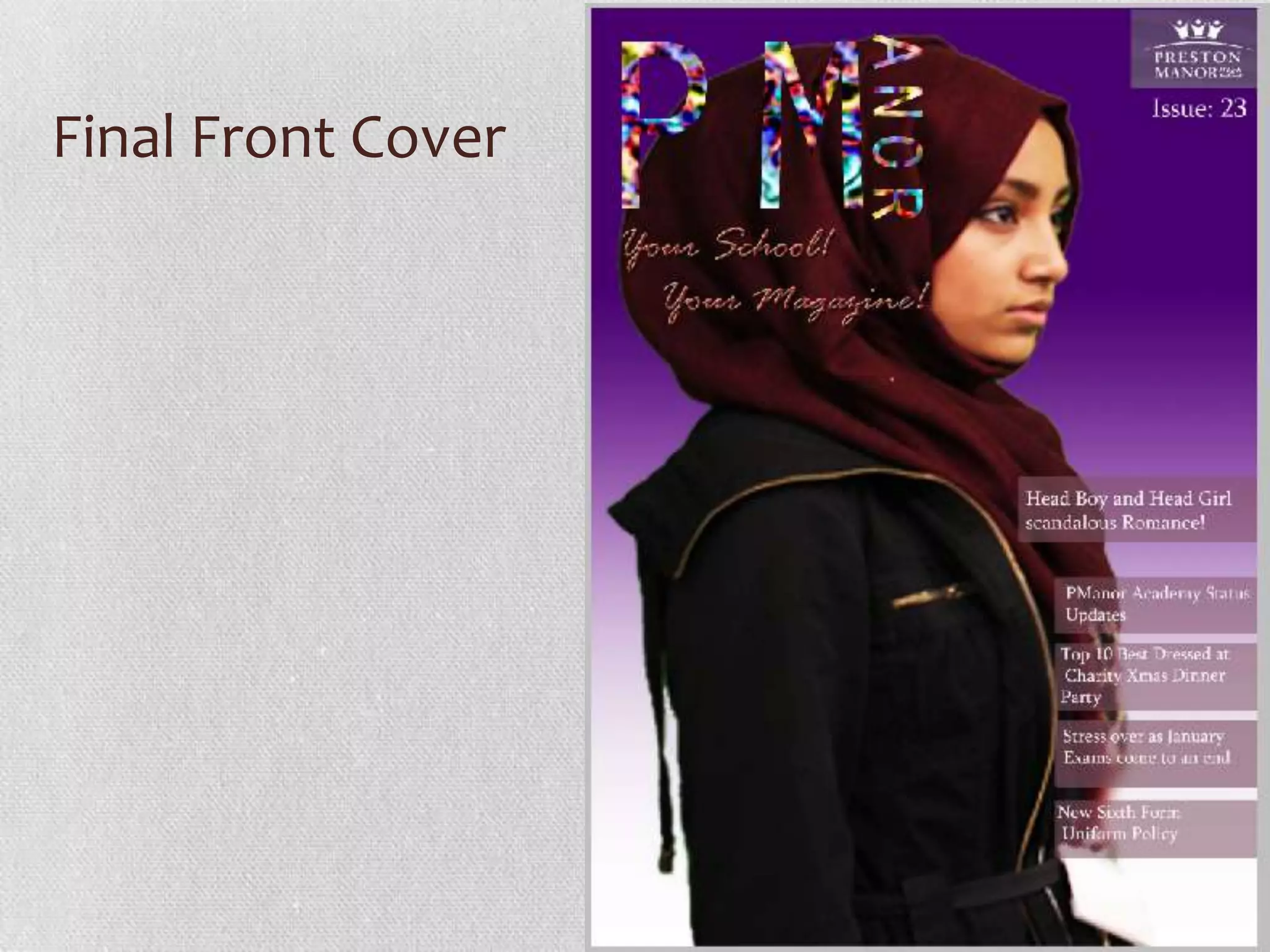
THE PRELIMINARY
TASK
The Task Itself
• As a preliminary task, I was asked to create a school magazine
  (front cover and contents page) in preparation for my controlled
  assessment where I will be asked to create a front cover and
  contents page of a music magazine.
• This task was mainly to allow me to get to grips with the
  software, allowing me to experiment and get used to using it with
  more confidence than before. Using this software before starting
  work on my main task also gave me the space to make
  mistakes, learn how to correct them and know what goes
  well, what I should avoid. This gave me an insight on how I would
  be able to complete my main task to the best of my
  ability, hopefully gaining the highest marks.
My Research
• Before completing the task, I completed some research by
  analysing another schools magazine.
• I realised that it is essential to have a consistent theme, the colours
  should be complimentary to each other, and easy on the eye.
  Nothing too bright, or too out there and the colours should NOT be
  unrelated. I based my colours and fonts to create a theme of mainly
  purple and white with slight variation in colours and fonts.
• I also realised through my research that the school logo is preferred
  to be present. Looking at various different examples of school
  magazines, I discovered the most common positioning of the logo
  is for it to be placed in a corner, and that is what I have
  incorporated into my school magazine.
My Research
• After comparing other magazines to school magazine, I found that
  a grand majority of other magazines had a front cover provided
  with a barcode. However, as school magazines are simply
  distributed and not sold, I realised that it was unnecessary and not
  needed for me to add the barcode on to my design, hence leaving it
  out.
• Headlines are a main part of the front cover, arguably one of the
  most important parts as they are what grabs the readers attention
  and, quite frankly, are the deal breakers. They must be
  short, snappy, straight to the point, and have some level of
  excitement or intrigue that will spike the readers interest to pick up
  the magazine and read more. From research, I found that the main
  story’s headline is usually bigger than the others as it tends to
  attract the most attention. Bearing this in mind I separated my main
  story headline from the others to create a similar effect.
• My consistent theme and colour scheme.
Planning and Designs
• Target Audience: Girls of the Sixth Form
• Possible Title Ideas: PManor
• Main Image: Medium close up of student (girl) - side view
• Main Cover Line: Head Boy and Head Girl Scandalous Romance
• Additional Key Images: Logo of the School
• Additional cover lines: PManor academy status updates, Top 10 Best
  Dressed at charity xmas party, Stress over as January Exams come
  to an end, New Uniform Policy- Yay or Nay?
• Typography:
• Background Colour/ Images: Image- Medium close up of student
  side view. Colour- Purple and white top to bottom gradient
• Technical Consideration: Camera, Green Screen, Photoshop
  CS4, Student-Girl- Model
Sketch of Front Cover
This was a sketch of what I planned to be
doing for my front cover.
However, although some ideas have
remained constant , such as the name and
the way it is printed on to the front
cover, I found that I was going to have to
make some changes to accommodate my
new ideas and improvements.
Sketch of Contents Page
The idea behind my contents page was really
simple, and I found that I was able to outline
many of my ideas in simple sketches. I had the
‘Contents’ going down the side of the
page, separated from the rest of the page by a
bold line to give some sort of structure. I then
had the stories I intended to use going
down, followed by the page numbers. I kept the
logo the same as the one on the front cover to
create some consistency and placed it in the top
right corner as that is where it seemed to be
placed best.
Proposal Form
This is a copy of some of my
brainstormed ideas regarding the front
cover. I have made various changes but
the ideas all stemmed from what
appeared on the sheet.
The Process- The Main Image


First thing I did after choosing my main image, was
to get rid of the green screened background, and
crop the image, as can be seen.
The Process


• I then changed the background, placing a purple and white
  gradient. However I found that the background was too dark so I
  increased the brightness.
The Process
• I then went to add the title of my
  magazine. I gave it the unique shape
  by inserting the text ‘P M’ individually
  first and then adding ‘Anor’ to the
  side to make it look quirkier and more
  appealing. I chose the strange
  coloured pattern overlay as it stood
  out and corresponded well with my
  theme.
The Process
• After that I proceeded to insert
  the slogan for my magazine
  ‘Your school! Your magazine!’
• I chose the font as it contrasted
  with the title nicely. However
  the colour of the font was similar
  to the students headscarf so I
  bevelled, embossed and added
  an outer glow for it to stand out
  and look more appealing.
The Process
• Finally I included the main
  cover stories. I couldn’t find a
  good font colour that stood out
  from the main image and the
  background, so after some time
  I decided to place the text in a
  filled in box, where I then
  changed the opacity so that it
  wasn’t overlapping everything
  but still giving more emphasis
  to the white text.
• I also added an issue number
  and the school logo in the
  corner to finalise the magazine
  as a final touch.
What have I learnt?
• After completing this preliminary task, I learnt various different
  things that I know will come to help me in my controlled
  assessment task.
• I came to grips with the Photoshop software programme, learning
  how to manipulate images, and the various different effects I can
  apply to them to improve and edit them.
• I also learned the main connotation and denotations of magazines
  and what I must include and the things that I should avoid. This
  helped give me an idea of the things I will have to think through
  when planning my music magazine for my coursework.
Final Front Cover
Final Contents Page

Updated prelim pppt

  • 1.
  • 2.
    The Task Itself •As a preliminary task, I was asked to create a school magazine (front cover and contents page) in preparation for my controlled assessment where I will be asked to create a front cover and contents page of a music magazine. • This task was mainly to allow me to get to grips with the software, allowing me to experiment and get used to using it with more confidence than before. Using this software before starting work on my main task also gave me the space to make mistakes, learn how to correct them and know what goes well, what I should avoid. This gave me an insight on how I would be able to complete my main task to the best of my ability, hopefully gaining the highest marks.
  • 3.
    My Research • Beforecompleting the task, I completed some research by analysing another schools magazine. • I realised that it is essential to have a consistent theme, the colours should be complimentary to each other, and easy on the eye. Nothing too bright, or too out there and the colours should NOT be unrelated. I based my colours and fonts to create a theme of mainly purple and white with slight variation in colours and fonts. • I also realised through my research that the school logo is preferred to be present. Looking at various different examples of school magazines, I discovered the most common positioning of the logo is for it to be placed in a corner, and that is what I have incorporated into my school magazine.
  • 4.
    My Research • Aftercomparing other magazines to school magazine, I found that a grand majority of other magazines had a front cover provided with a barcode. However, as school magazines are simply distributed and not sold, I realised that it was unnecessary and not needed for me to add the barcode on to my design, hence leaving it out. • Headlines are a main part of the front cover, arguably one of the most important parts as they are what grabs the readers attention and, quite frankly, are the deal breakers. They must be short, snappy, straight to the point, and have some level of excitement or intrigue that will spike the readers interest to pick up the magazine and read more. From research, I found that the main story’s headline is usually bigger than the others as it tends to attract the most attention. Bearing this in mind I separated my main story headline from the others to create a similar effect.
  • 5.
    • My consistenttheme and colour scheme.
  • 6.
    Planning and Designs •Target Audience: Girls of the Sixth Form • Possible Title Ideas: PManor • Main Image: Medium close up of student (girl) - side view • Main Cover Line: Head Boy and Head Girl Scandalous Romance • Additional Key Images: Logo of the School • Additional cover lines: PManor academy status updates, Top 10 Best Dressed at charity xmas party, Stress over as January Exams come to an end, New Uniform Policy- Yay or Nay? • Typography: • Background Colour/ Images: Image- Medium close up of student side view. Colour- Purple and white top to bottom gradient • Technical Consideration: Camera, Green Screen, Photoshop CS4, Student-Girl- Model
  • 7.
    Sketch of FrontCover This was a sketch of what I planned to be doing for my front cover. However, although some ideas have remained constant , such as the name and the way it is printed on to the front cover, I found that I was going to have to make some changes to accommodate my new ideas and improvements.
  • 8.
    Sketch of ContentsPage The idea behind my contents page was really simple, and I found that I was able to outline many of my ideas in simple sketches. I had the ‘Contents’ going down the side of the page, separated from the rest of the page by a bold line to give some sort of structure. I then had the stories I intended to use going down, followed by the page numbers. I kept the logo the same as the one on the front cover to create some consistency and placed it in the top right corner as that is where it seemed to be placed best.
  • 9.
    Proposal Form This isa copy of some of my brainstormed ideas regarding the front cover. I have made various changes but the ideas all stemmed from what appeared on the sheet.
  • 10.
    The Process- TheMain Image First thing I did after choosing my main image, was to get rid of the green screened background, and crop the image, as can be seen.
  • 11.
    The Process • Ithen changed the background, placing a purple and white gradient. However I found that the background was too dark so I increased the brightness.
  • 12.
    The Process • Ithen went to add the title of my magazine. I gave it the unique shape by inserting the text ‘P M’ individually first and then adding ‘Anor’ to the side to make it look quirkier and more appealing. I chose the strange coloured pattern overlay as it stood out and corresponded well with my theme.
  • 13.
    The Process • Afterthat I proceeded to insert the slogan for my magazine ‘Your school! Your magazine!’ • I chose the font as it contrasted with the title nicely. However the colour of the font was similar to the students headscarf so I bevelled, embossed and added an outer glow for it to stand out and look more appealing.
  • 14.
    The Process • FinallyI included the main cover stories. I couldn’t find a good font colour that stood out from the main image and the background, so after some time I decided to place the text in a filled in box, where I then changed the opacity so that it wasn’t overlapping everything but still giving more emphasis to the white text. • I also added an issue number and the school logo in the corner to finalise the magazine as a final touch.
  • 15.
    What have Ilearnt? • After completing this preliminary task, I learnt various different things that I know will come to help me in my controlled assessment task. • I came to grips with the Photoshop software programme, learning how to manipulate images, and the various different effects I can apply to them to improve and edit them. • I also learned the main connotation and denotations of magazines and what I must include and the things that I should avoid. This helped give me an idea of the things I will have to think through when planning my music magazine for my coursework.
  • 16.
  • 17.