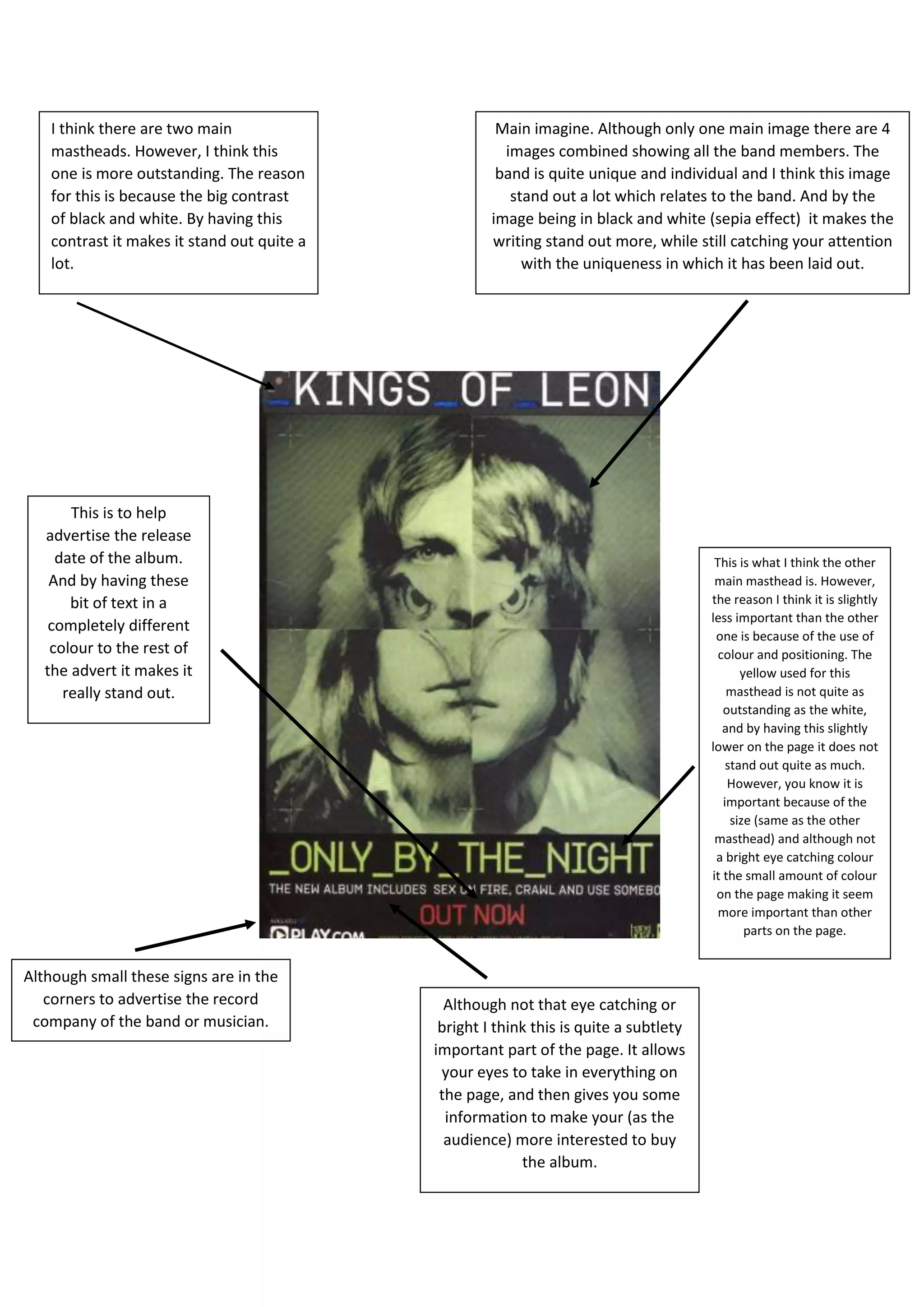
Main imagine. Although only one main image there are 4
images combined showing all the band members. The
band is quite unique and individual and I think this image
stand out a lot which relates to the band. And by the
image being in black and white (sepia effect) it makes the
writing stand out more, while still catching your attention
with the uniqueness in which it has been laid out.
I think there are two main
mastheads. However, I think this
one is more outstanding. The reason
for this is because the big contrast
of black and white. By having this
contrast it makes it stand out quite a
lot.
This is what I think the other
main masthead is. However,
the reason I think it is slightly
less important than the other
one is because of the use of
colour and positioning. The
yellow used for this
masthead is not quite as
outstanding as the white,
and by having this slightly
lower on the page it does not
stand out quite as much.
However, you know it is
important because of the
size (same as the other
masthead) and although not
a bright eye catching colour
it the small amount of colour
on the page making it seem
more important than other
parts on the page.
Although not that eye catching or
bright I think this is quite a subtlety
important part of the page. It allows
your eyes to take in everything on
the page, and then gives you some
information to make your (as the
audience) more interested to buy
the album.
Although small these signs are in the
corners to advertise the record
company of the band or musician.
This is to help
advertise the release
date of the album.
And by having these
bit of text in a
completely different
colour to the rest of
the advert it makes it
really stand out.

Analysis of advert 1.

  • 1.
    Main imagine. Althoughonly one main image there are 4 images combined showing all the band members. The band is quite unique and individual and I think this image stand out a lot which relates to the band. And by the image being in black and white (sepia effect) it makes the writing stand out more, while still catching your attention with the uniqueness in which it has been laid out. I think there are two main mastheads. However, I think this one is more outstanding. The reason for this is because the big contrast of black and white. By having this contrast it makes it stand out quite a lot. This is what I think the other main masthead is. However, the reason I think it is slightly less important than the other one is because of the use of colour and positioning. The yellow used for this masthead is not quite as outstanding as the white, and by having this slightly lower on the page it does not stand out quite as much. However, you know it is important because of the size (same as the other masthead) and although not a bright eye catching colour it the small amount of colour on the page making it seem more important than other parts on the page. Although not that eye catching or bright I think this is quite a subtlety important part of the page. It allows your eyes to take in everything on the page, and then gives you some information to make your (as the audience) more interested to buy the album. Although small these signs are in the corners to advertise the record company of the band or musician. This is to help advertise the release date of the album. And by having these bit of text in a completely different colour to the rest of the advert it makes it really stand out.