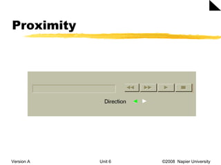
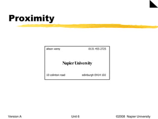
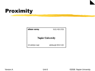
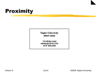
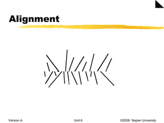
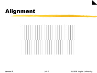
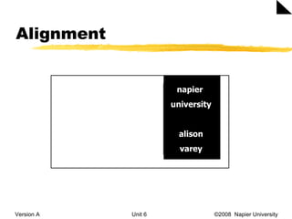
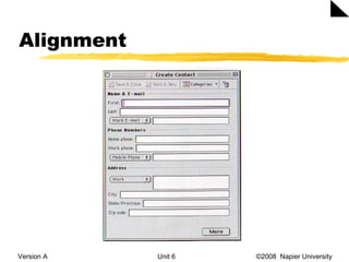
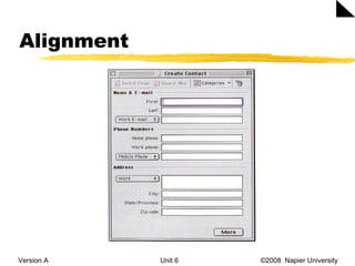
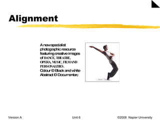
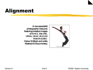
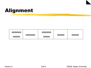
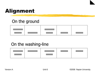
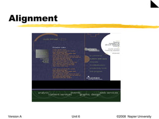
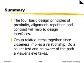
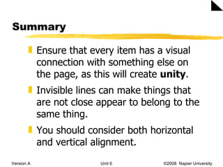
IMD09117 and IMD09118  Web Design and Development Unit 5 Layout principles
Basic design principles  Version A Unit 6   ©2008  Napier University  Proximity Alignment Repetition Contrast
Proximity Version A Unit 6   ©2008  Napier University
Proximity Version A Unit 6   ©2008  Napier University  alison varey    0131 455 2725 Napier University 10 colinton road    edinburgh EH14 1DJ
Proximity Version A Unit 6   ©2008  Napier University  alison varey     0131 455 2725 Napier University 10 colinton road    edinburgh EH14 1DJ
Proximity Version A Unit 6   ©2008  Napier University  Napier University alison varey 10 colinton road edinburgh EH14 1DJ 0131 455 2725
Proximity Version A Unit 6   ©2008  Napier University
Proximity Version A Unit 6   ©2008  Napier University  Remember closeness implies a relationship Group related items together Organise the items on a page as this helps to create more white space
Proximity Version A Unit 6   ©2008  Napier University  Be conscious of where your eye is going, where you start looking, the path you follow, where do you end up and what happens then Use the squint test to see how many visual elements are on a page. If there are more than 3-5 items, can you group any of them?
Proximity Don’ts Version A Unit 6   ©2008  Napier University  Creating relationships with elements that don’t belong together Leaving equal amounts of white space between elements unless each group is part of a subset Too many separate elements on a page
Proximity Don’ts Version A Unit 6   ©2008  Napier University  Confusion over to what a headline/caption is referring to Don’t stick things in the corners and in the middle
Alignment Version A Unit 6   ©2008  Napier University  Nothing should be placed arbitrarily on the interface. Every item should have a visual connection with something else on the page.
Alignment Version A Unit 6   ©2008  Napier University  Napier University alison varey 10 colinton road edinburgh EH14 1DJ 0131 455 2725
Alignment Version A Unit 6   ©2008  Napier University
Alignment Version A Unit 6   ©2008  Napier University  napier  university alison varey
Alignment Version A Unit 6   ©2008  Napier University
Alignment Version A Unit 6   ©2008  Napier University  A new specialist photographic resource featuring creative images of  DANCE, THEATRE, OPERA, MUSIC, FILM AND PERSONALITIES. Colour – Black and white Abstract – Documentar y
Alignment Version A Unit 6   ©2008  Napier University  A new specialist photographic resource featuring creative images of  DANCE, THEATRE, OPERA, MUSIC, FILM AND PERSONALITIES. Colour – Black and white Abstract – Documentary
Alignment Version A Unit 6   ©2008  Napier University
Alignment Version A Unit 6   ©2008  Napier University  On the ground On the washing-line
Alignment Version A Unit 6   ©2008  Napier University
Alignment Version A Unit 6   ©2008  Napier University  Alignment leads to cohesion and invisible lines can make things that are not close appear to belong to the same thing. Don’t centre everything. It is safe, comfortable, formal, ordinary, dull.  Make sure each item has some visual alignment with another item on the page.
Alignment Version A Unit 6   ©2008  Napier University  Lack of alignment is probably the biggest cause of unpleasant-looking pages. Our eyes like to see order, it creates a calm, secure feeling. If your alignments are strong, then you can break through the alignments consciously and it will look intentional.
Alignment Version A Unit 6   ©2008  Napier University  Unity  is an important concept in design. To make all the elements of the page appear to be unified, connected and interrelated, there needs to be some visual tie between the separate elements.
Alignment Version A Unit 6   ©2008  Napier University  Other sites http://admissions.nebrwesleyan.edu/ http://www.agency.com   http://www.aaronjasinski.com   http://moma.org/exhibitions/2008/tallbuildings/index_f.html   http://www.vikmuniz.net   http://www.j6studios.com   http://www.jasonsiu.com/
Summary Version A Unit 6   ©2008  Napier University  The four basic design principles of proximity, alignment, repetition and contrast will help to design interfaces. Group related items together since closeness implies a relationship. Do a squint test and be aware of the path a viewer’s eye takes.
Summary Version A Unit 6   ©2008  Napier University  Ensure that every item has a visual connection with something else on the page, as this will create  unity .  Invisible lines can make things that are not close appear to belong to the same thing.  You should consider both horizontal and vertical alignment.

Layout Principles 1

  • 1.
    IMD09117 and IMD09118 Web Design and Development Unit 5 Layout principles
  • 2.
    Basic design principles Version A Unit 6 ©2008 Napier University Proximity Alignment Repetition Contrast
  • 3.
    Proximity Version AUnit 6 ©2008 Napier University
  • 4.
    Proximity Version AUnit 6 ©2008 Napier University alison varey 0131 455 2725 Napier University 10 colinton road edinburgh EH14 1DJ
  • 5.
    Proximity Version AUnit 6 ©2008 Napier University alison varey 0131 455 2725 Napier University 10 colinton road edinburgh EH14 1DJ
  • 6.
    Proximity Version AUnit 6 ©2008 Napier University Napier University alison varey 10 colinton road edinburgh EH14 1DJ 0131 455 2725
  • 7.
    Proximity Version AUnit 6 ©2008 Napier University
  • 8.
    Proximity Version AUnit 6 ©2008 Napier University Remember closeness implies a relationship Group related items together Organise the items on a page as this helps to create more white space
  • 9.
    Proximity Version AUnit 6 ©2008 Napier University Be conscious of where your eye is going, where you start looking, the path you follow, where do you end up and what happens then Use the squint test to see how many visual elements are on a page. If there are more than 3-5 items, can you group any of them?
  • 10.
    Proximity Don’ts VersionA Unit 6 ©2008 Napier University Creating relationships with elements that don’t belong together Leaving equal amounts of white space between elements unless each group is part of a subset Too many separate elements on a page
  • 11.
    Proximity Don’ts VersionA Unit 6 ©2008 Napier University Confusion over to what a headline/caption is referring to Don’t stick things in the corners and in the middle
  • 12.
    Alignment Version AUnit 6 ©2008 Napier University Nothing should be placed arbitrarily on the interface. Every item should have a visual connection with something else on the page.
  • 13.
    Alignment Version AUnit 6 ©2008 Napier University Napier University alison varey 10 colinton road edinburgh EH14 1DJ 0131 455 2725
  • 14.
    Alignment Version AUnit 6 ©2008 Napier University
  • 15.
    Alignment Version AUnit 6 ©2008 Napier University
  • 16.
    Alignment Version AUnit 6 ©2008 Napier University napier university alison varey
  • 17.
    Alignment Version AUnit 6 ©2008 Napier University
  • 18.
    Alignment Version AUnit 6 ©2008 Napier University
  • 19.
    Alignment Version AUnit 6 ©2008 Napier University A new specialist photographic resource featuring creative images of DANCE, THEATRE, OPERA, MUSIC, FILM AND PERSONALITIES. Colour – Black and white Abstract – Documentar y
  • 20.
    Alignment Version AUnit 6 ©2008 Napier University A new specialist photographic resource featuring creative images of DANCE, THEATRE, OPERA, MUSIC, FILM AND PERSONALITIES. Colour – Black and white Abstract – Documentary
  • 21.
    Alignment Version AUnit 6 ©2008 Napier University
  • 22.
    Alignment Version AUnit 6 ©2008 Napier University On the ground On the washing-line
  • 23.
    Alignment Version AUnit 6 ©2008 Napier University
  • 24.
    Alignment Version AUnit 6 ©2008 Napier University
  • 25.
    Alignment Version AUnit 6 ©2008 Napier University Alignment leads to cohesion and invisible lines can make things that are not close appear to belong to the same thing. Don’t centre everything. It is safe, comfortable, formal, ordinary, dull. Make sure each item has some visual alignment with another item on the page.
  • 26.
    Alignment Version AUnit 6 ©2008 Napier University Lack of alignment is probably the biggest cause of unpleasant-looking pages. Our eyes like to see order, it creates a calm, secure feeling. If your alignments are strong, then you can break through the alignments consciously and it will look intentional.
  • 27.
    Alignment Version AUnit 6 ©2008 Napier University Unity is an important concept in design. To make all the elements of the page appear to be unified, connected and interrelated, there needs to be some visual tie between the separate elements.
  • 28.
    Alignment Version AUnit 6 ©2008 Napier University Other sites http://admissions.nebrwesleyan.edu/ http://www.agency.com http://www.aaronjasinski.com http://moma.org/exhibitions/2008/tallbuildings/index_f.html http://www.vikmuniz.net http://www.j6studios.com http://www.jasonsiu.com/
  • 29.
    Summary Version AUnit 6 ©2008 Napier University The four basic design principles of proximity, alignment, repetition and contrast will help to design interfaces. Group related items together since closeness implies a relationship. Do a squint test and be aware of the path a viewer’s eye takes.
  • 30.
    Summary Version AUnit 6 ©2008 Napier University Ensure that every item has a visual connection with something else on the page, as this will create unity . Invisible lines can make things that are not close appear to belong to the same thing. You should consider both horizontal and vertical alignment.