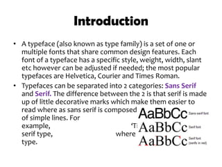
Typefaces
Olivia Ferrante
Introduction
• A typeface (also known as type family) is a set of one or
multiple fonts that share common design features. Each
font of a typeface has a specific style, weight, width, slant
etc however can be adjusted if needed; the most popular
typefaces are Helvetica, Courier and Times Roman.
• Typefaces can be separated into 2 categories: Sans Serif
and Serif. The difference between the 2 is that serif is made
up of little decorative marks which make them easier to
read where as sans serif is composed
of simple lines. For
example, ‘Times New Roman’ is a
serif type, where as ‘Arial’ is a sans serif
type.
History
• Typography dates back almost 3800 years and has
recently a significant part of filmmaking, developing over
the years with the fashions and trends of the time.
• Typefaces are something that are used by many short
film makers; however it is also overseen by so many
others, particularly in lower budget films. Julia May from
Smashing Magazine wrote an article on ‘The Art Of Film
Title Design Throughout Cinema History.’ She stated -
“Film titles can be great fun. In them we see the bond
between the art of filmmaking and graphic design and
perhaps visual culture as a whole. They have always
served a greater purpose than themselves: to move the
overarching story forward.”
Typefaces within films
• Typefaces play a very important role in films as they usually give the
audience a hint of what the genre of the film is. This can depend on
different factors such as movement, colour or positioning.
• Lets take a thriller film for example; the typeface in ‘Face/off’ not
only suits the ‘creepy’ setting in the opening sequence but the
colours are also black and white which is a typical convention of a
thriller and creates an eerie atmosphere.
• As you can see from this opening title sequence, it consists of a bold
black and white capital font which justifies the fact that the use of
colour can represent genres.
Conclusion – What I have learnt
• From this research I have not only learnt what typefaces
are, but how they can be used to make a big impact. Simply
by choosing a certain type of font size or colour, it can have
a significant effect on the audiences’ perception of the film
that they are watching. For example the boldness and
thickness can alter a romantic or comedy opening sequence
into a thriller film effortlessly.

Typefaces powerpoint

  • 1.
  • 2.
    Introduction • A typeface(also known as type family) is a set of one or multiple fonts that share common design features. Each font of a typeface has a specific style, weight, width, slant etc however can be adjusted if needed; the most popular typefaces are Helvetica, Courier and Times Roman. • Typefaces can be separated into 2 categories: Sans Serif and Serif. The difference between the 2 is that serif is made up of little decorative marks which make them easier to read where as sans serif is composed of simple lines. For example, ‘Times New Roman’ is a serif type, where as ‘Arial’ is a sans serif type.
  • 3.
    History • Typography datesback almost 3800 years and has recently a significant part of filmmaking, developing over the years with the fashions and trends of the time. • Typefaces are something that are used by many short film makers; however it is also overseen by so many others, particularly in lower budget films. Julia May from Smashing Magazine wrote an article on ‘The Art Of Film Title Design Throughout Cinema History.’ She stated - “Film titles can be great fun. In them we see the bond between the art of filmmaking and graphic design and perhaps visual culture as a whole. They have always served a greater purpose than themselves: to move the overarching story forward.”
  • 4.
    Typefaces within films •Typefaces play a very important role in films as they usually give the audience a hint of what the genre of the film is. This can depend on different factors such as movement, colour or positioning. • Lets take a thriller film for example; the typeface in ‘Face/off’ not only suits the ‘creepy’ setting in the opening sequence but the colours are also black and white which is a typical convention of a thriller and creates an eerie atmosphere. • As you can see from this opening title sequence, it consists of a bold black and white capital font which justifies the fact that the use of colour can represent genres.
  • 5.
    Conclusion – WhatI have learnt • From this research I have not only learnt what typefaces are, but how they can be used to make a big impact. Simply by choosing a certain type of font size or colour, it can have a significant effect on the audiences’ perception of the film that they are watching. For example the boldness and thickness can alter a romantic or comedy opening sequence into a thriller film effortlessly.