
Recommended
More Related Content
Similar to Infographics And The Brain
Similar to Infographics And The Brain (20)
Recently uploaded
Recently uploaded (20)
Infographics And The Brain
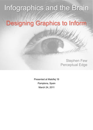
- 1. Infographics and the Brain Designing Graphics to Inform Stephen Few Perceptual Edge Presented at Malofiej 19 Pamplona, Spain March 24, 2011
- 2. I work in the field of data visualization, working with people in organizations of all types who are responsible for finding and making sense of the stories that live in data and then telling those stories to others. Unlike most of my fellow speakers here at Malofiej 19, I don’t focus on journalistic infographics. My clients are data analysts, statisticians, business intelligence professionals, managers, and even administrative assistants– people who, often with little training and no tool but Excel, are responsible for using data to support better decisions. The three books that I’ve written so far illustrate what I do: Show Me the Numbers teaches simple and practical skills for presenting quantitative data effectively in tables and graphs. Information Dashboard Design teaches simple and practices skills for designing data packed displays that people can use to monitor what’s going on, resulting in ongoing situation awareness. Now You See It teaches simple and practical skills for using interactive data visualization to explore and make sense of data. I teach people basic skills that are accessible to a broad audience of people, based on principles that have been developed from years of research in the field of data visualization. I focus on the craft of data visualization, doing my best to steer data visualization into the realm of what actually works, trying to help people compensate for software tools that, with rare exceptions, make it difficult for people to visualize data in useful ways.
- 3. Upon this gifted age, in its dark hour, rains from the sky a meteoric shower of facts…they lie, unquestioned, uncombined. Wisdom enough to leach us of our ill is daily spun; but there exists no loom to weave it into a fabric. “Huntsman, What Quarry?”, 1939, Edna St. Vincent Millay Now that you have a basic understanding of the world that I live in and the concerns that drive me, I’d like to share a poem that poignantly describes the relationship of most people to data today. Even though Millay wrote these words long before the information age as we’re experiencing it today began, she beautifully described one of the fundamental challenges of our time: to make use of data that now exists in abundance. The primary task of journalistic infographics is to inform. Infographics only inform if they present information in a way that can be easily perceived by the eyes and fully understood by the brain. Most infographics fall short of this goal.
- 4. Hurray technology! We live in a time when information technology is celebrated almost without reservation.
- 5. Yet this is reality that most people experience today. They’re buried in data, not because there’s too much but because we haven’t learned how to weave into into something meaningful. For that reason, the promise of the information age still eludes us.
- 6. We must learn to tap into the steady stream of information in ways that allow us to make sense of it and then use what we learn to do good in the world. Information must be expressed ways that make the stories the dwell within visible to our eyes and meaningful to our brains. When words and numbers fail, we need pictures to coax the stories that live in our data from the shadows into the light.
- 7. And not just any picture will do. We must craft pictures that clarify and enlighten.
- 8. David visits America. A picture is worth a thousand words. As we all believe, the right picture can often tell a story in a way that words could never match.
- 9. William Playfair (1786) We’ve been using graphics to present quantitative information for a long time. Here’s an example of one of the earliest quantitative graphs, hand drawn by William Playfair in 1786. In his time, Playfair did the unprecedented by inventing or greatly improving many of the quantitative graphs that we use today. (Source: This graph was included in Playfair’s The Commercial and Political Atlas in 1786 to make a case against England’s policy of financing colonial wars through national debt.)
- 10. Today, graphs are commonplace, but few work as well as Playfair’s pioneering efforts over 220 years ago. The principles for doing this well that Playfair figured out on his own long ago are largely being ignored today.
- 11. Graphics–especially Infographics–can tell important stories powerfully and effectively, but for every one that works...
- 12. ...I can show you many that fail–often miserably. They give visualization a bad name.
- 13. Intended Message Infographic Outcome Inform Persuade Teach Move to action Infographics are a specialized form of visualization that combine words and pictures to communicate a particular message–or at least it ought to be. That message is crafted to achieve a particular outcome–or at least it ought to be. Infographics may used to achieve several goals. For instance, they may be used to inform, to persuade, to teach, or to move people to action. To qualify as an infographic, however, by definition they must inform.
- 14. To do this, they must be designed in a way that allows them to get past peoples eyes and visual cortex and then into the thinking parts in their brains, resulting in understanding.
- 15. Understanding They succeed only to the degree that those who look at them gain understanding.
- 16. Confused? People are confused about data visualization. So much of what’s called “data visualization” today gives the field a bad name and causes confusion about what it is, how it works, and what can be accomplished when it is properly done.
- 17. Too much decoration; too little substance. Rather than building useful tools, most software vendors are competing to out dazzle one another with silly visual effects that treat data visualization like it’s a video game.
- 18. Bling your graph! Stories in our data become completely hidden in flashy packaging like this. All I’ve done here is use features that are readily available in the latest version of Excel.
- 19. Dashboards like this have become a popular form of information display in the last few years, but while they give the appearance of data density, most of them in fact present far too little and the little that they present is presented poorly. All 20 of the products listed on the left that must be selected and viewed one at a time could be displayed at the same time and with more information in the same space that is used to show a single product on this dashboard.
- 20. Pie!!! Many data visualizations, including infographics, show little understanding of the human brain and little respect for it. When we design infographics, we should treat people as reasonably intelligent, assuming that they want to be informed and not merely entertained by cute pictures and pretty colors.
- 21. Inform Impress It is much easier to impress with cheap visual effects than it is to inform. Only one, however, is beneficial to anyone but you.
- 22. Gestalt School of Psychology Ever since the pioneering work about perception by the Gestalt School of Psychology in the early 20th century...
- 23. Jacques Bertin (1918 - 2010) and then later with Jacques Bertin’s groundbreaking research to understand graphics as a language for communicating data, contained primarily in his book Semiology graphique (The Semiology of Graphics–published in 1967), much research has followed into how our eyes and brains process graphics. We now know a great deal about the way that graphics can be used to present information effectively. We’ve learned many of the rules. I’ve built my career on this work and have done what I can to extend it and teach it to others in simple and practical ways. As a consequence, I have little patience for people who claim to produce data visualizations that fail to enlighten, because they’ve never bothered to learn the rules for doing this well.
- 24. Principles are simple, but not always obvious.
- 25. We must not only know when to use pictures of data, but also how to design them to tell stories clearly, accurately, and compellingly. This recent visualization fails to do this. This series of circles within circles--blue for the market values of banks in quarter 2 of 2007, before the recent financial meltdown, and green for declined values as of January of 2009--was published by Bloomberg. You would never guess its purpose, however, which was to show that J. P. Morgan’s decline in market value was less severe than all other major banks except one: Santander. This picture of the data doesn’t tell the story clearly, simply, or accurately. The comparative sizes of the circles are far from the comparative market values. Even if the sizes of the circles were accurate, we would still struggle with this chart because visual perception isn’t well-tuned to handle size comparisons, but it is tuned to handle length comparisons,...
- 26. ...such as the lengths of these bars in my redesign of the chart. We can now easily see that J. P. Morgan lost roughly half of its market value during this period, but the fact that its losses were less severe than all by one bank–Santander–still isn’t obvious. The right addition to the picture, however, such as this one in the bottom half that displays the losses directly, can make this part of the story clear as well.
- 27. Best attributes for quantitative encoding 2-D Position Length We know through research that the best visual attributes for displaying quantities are 2- D position and lengths from a common baseline. These are the attributes that we should use to display quantitative values, rather than sizes and color intensities, whenever we can.
- 28. Despite their popularity as a means of quantitative display, pie charts do the job poorly, because they encode values using attributes that we can’t decode well. Which graph makes it easier to determine whether Mid-Cap U.S. Stock or Small-Cap U.S. Stock has the greater share? Pie charts encode values as the areas of the slices and the angles formed by them in the center, but visual perception isn’t well-tuned to decode either of these attributes. On the other hand, we can easily compare the lengths of the bars. Nevertheless, people love circles. Something about this perfect form attracts us, but it seldom serves as an effective way to present information
- 29. Here’s one that recently appeared on Fox News, which adds up to 193%.
- 30. They can be quite beautiful,...
- 32. There’s something beautiful about the perfect symmetry and comforting about the containment of a circle that appeals to us.
- 33. Many infographic artists demonstrate their love of circles in ridiculous displays. In this visualization of color meanings in different colors created by David McCandless, notice how hard it is to perceive the information. Try to find all of the meanings that are associated with light blue in a particular culture. Scanning is a circle is difficult. Notice how much more emphasis is given to Western/American culture on the outside of the circle compared to South American culture on the inside, simply because circles are smaller around near the center than thay are along their perimeters. For what reason was this information arranged in a circle?
- 34. Leonardo da Vinci, as a great artist, scientist, and designer, combined these skills and perspectives to produce marvelous works. He knew to use a circle when a circle fit the task, and unlike McCandless, he knew to use a square when that was suitable.
- 35. Here I’ve redesigned the display in a linear, tabular arrangement that works much better for our eyes and brains.
- 36. Colors should only be used in meaningful ways. When used gratuitously, they actually create dysfunction. The top graph varies the colors of the bars unnecessarily. We already know that the individual bars represent different countries. Varying the colors visually separates the bars by making them look different from one another, but we want them to look alike to encourage people to compare them and to see the ranking pattern that they form as a whole.
- 37. If we want to present information to people in ways that they can understand, we must learn a bit about how brains process information. Despite the fact that our intelligence has placed us at the top of the evolutionary heap here on Earth, our brains are far from perfect. The fact is, they’re not particularly well designed, are terribly inefficient, and are fraught with many limitations.
- 38. Visual working memory is limited. Only 3 or 4 chunks at a time Imagination The Working World Memory Long-term Memory When we think about things, trying to make sense of them, information is temporarily held in working memory. Only three or four chunks of visual information can be stored in working memory at any one time. Information that comes in through our eyes or that is retrieved from long-term memory in the moment of thought is extremely limited in capacity. When you release information from working memory, it can take one of two possible routes on its way out: 1) it can be stored permanently in long-term memory by means of a rehearsal process that we call memorization, or 2) it can simply be forgotten.
- 39. In addition to understanding visual perception, visual analysis tools must also be rooted in an understanding of how people think. Only then can they recognize and support the cognitive operations that are necessary to make sense of information. Memory plays an important role in human cognition. Because memory suffers from certain limitations, visual analysis tools must be able to augment memory. The example above illustrates one of the limitations of working memory. We only remember that to which we attend. Any part of this image that never gets our attention will not be missed when we shift to another version of the image that lacks that particular part. If we don’t attend to it, we might notice the change from one version of the image to the next, but only if the transition shift immediately from one to another, without even a split second of blank space between them. In addition to not remembering, we also don’t clearly see that on which we don’t focus. To see something clearly, we must focus on it, for only a small area of receptors on the retinas of our eyes are designed for high-resolution vision. (Source: This demonstration of change blindness was prepared by Ronald A. Rensink of the University of British Columbia. Several other examples of this visual phenomenon can be found at http://www.psych.ubc.ca/%7erensink/flicker/download/index.html.)
- 40. If we want people to compare the distribution of county populations by age, it wouldn’t work if we only allowed them to see one country at a time. Many countries and many points in time can be displayed simultaneously, making it possible to make rich comparisons.
- 41. Attention is also limited. “Ever saw a magic show and wondered just how the magician took your watch without you even noticing? Ever wonder why is it that you can search for a set of misplaced keys for a long time, only to later find them sitting in the exact place where you were looking? Research has shown that we don’t always see everything we’re looking at, and that attention plays a big part in what consciously registers to us. The effect where we’re blind to things we don’t attend to is known as ‘Inattentional Blindness’.” (Source: This demonstration of inattentional blindness and the explanation above was prepared under the direction of Ronald A. Rensink of the University of British Columbia. Several other examples of this visual phenomenon can be found at http:// psyclab1.psych.ubc.ca/~viscoglab/.)
- 42. Eloquence through simplicity I can express the essence of my data presentation philosophy as “eloquence through simplicity,” that is eloquence of communication through simplicity of design. It’s amazing how artists can use a few simple well-placed lines to communicate so much. For me, simplicity isn’t a design preference, it is a fundamental principle of usability. Thinking and communication are dramatically improved through simplification; by abstracting information in a way that eliminates all but what’s essential for the purpose at hand.
- 43. “Simplicity is the ultimate sophistication.” Leonardo da Vinci Simplicity isn’t always easy; it takes skill.
- 44. Scott McCloud, Understanding Comics Amplification through simplification Comic book artist Scott McCloud describes his work as the amplification of meaning through simplification of visual representation. To do this well, you must be able to recognize what’s essential to the data’s meaning and strip away all else. Antoine de Saint-Exupery wrote: “Perfection is achieved, not when there is nothing more to add, but when there is nothing left to take away.”
- 45. Walls of data like this infographic from the New York Times–a publication that produces some of the best–overwhelm people and send them running rather than inviting them into the story.
- 46. Walls of data like this infographic from Good magazine overwhelm people and send them running rather than inviting them into the story. This infographic has an important story to tell about homelessness in America, but told in this way, it will never be heard. These walls of data fail to lead our eyes through the information.
- 47. For our eyes and brains to process stories, information needs to be sequenced in meaningful and comprehendible chunks.
- 48. Getting to Know the Homeless The design should lead people through the story, one step at at time, not be bombarded by the entire story at once. This is basic journalism, but many creators of infographics have never learned the basics of storytelling.
- 49. Getting to Know the Homeless
- 50. I want to recommend four books that every infographic journalist ought to read.
- 51. For an introduction to how our brains work, I recommend Brain Rules by John Medina.
- 52. For an introduction to visual perception and how we can design visual displays that work for our eyes, I recommend Visual Thinking for Design, by Colin Ware.
- 53. And for an introduction to design best practices that have emerged from research and apply directly to infograhics, I recommend Visual Language for Designers, by Connie Malamed.
- 54. Form Function I’m weary of the debate between form and function, between beauty and usability. Talented designers of infographics do not assume a conflict between form and function, between beauty and usability.
- 55. Beautifully Understandable Information To be good at this, to be effective, you must find ways to merge these complementary qualities to inform in beautifully usable ways.
- 56. I began my presentation with a poem, and I’d like to end with a poem as well. This one was written by T. S. Elliot in 1930. O perpetual revolution of configured stars, O perpetual recurrence of determined seasons, O world of spring and autumn, birth and dying! The endless cycle of idea and action, Endless invention, endless experiment, Brings knowledge of motion, but not of stillness; Knowledge of speech, but not of silence; Knowledge of words, and ignorance of The Word. All our knowledge brings us nearer to our ignorance, All our ignorance brings us nearer to death, But nearness to death no nearer to God. Where is the Life we have lost in living? Where is the wisdom we have lost in knowledge? Where is the knowledge we have lost in information? Excerpt from The Rock, 1930, T.S. Elliot [Image source: www.irishastronomy.org]
- 57. O perpetual revolution of configured stars, O perpetual recurrence of determined seasons, O world of spring and autumn, birth and dying! The endless cycle of idea and action, Endless invention, endless experiment, Brings knowledge of motion, but not of stillness; Knowledge of speech, but not of silence; Knowledge of words, and ignorance of The Word. All our knowledge brings us nearer to our ignorance, All our ignorance brings us nearer to death, But nearness to death no nearer to God. Where is the Life we have lost in living? Where is the wisdom we have lost in knowledge? Where is the knowledge we have lost in information? Excerpt from The Rock, 1930, T.S. Elliot [Image source: www.trekvisual.com]
- 58. O perpetual revolution of configured stars, O perpetual recurrence of determined seasons, O world of spring and autumn, birth and dying! The endless cycle of idea and action, Endless invention, endless experiment, Brings knowledge of motion, but not of stillness; Knowledge of speech, but not of silence; Knowledge of words, and ignorance of The Word. All our knowledge brings us nearer to our ignorance, All our ignorance brings us nearer to death, But nearness to death no nearer to God. Where is the Life we have lost in living? Where is the wisdom we have lost in knowledge? Where is the knowledge we have lost in information? Excerpt from The Rock, 1930, T.S. Elliot [Image source: www.i.pbase.com]
- 59. O perpetual revolution of configured stars, O perpetual recurrence of determined seasons, O world of spring and autumn, birth and dying! The endless cycle of idea and action, Endless invention, endless experiment, Brings knowledge of motion, but not of stillness; Knowledge of speech, but not of silence; Knowledge of words, and ignorance of The Word. All our knowledge brings us nearer to our ignorance, All our ignorance brings us nearer to death, But nearness to death no nearer to God. Where is the Life we have lost in living? Where is the wisdom we have lost in knowledge? Where is the knowledge we have lost in information? Excerpt from The Rock, 1930, T.S. Elliot [Image source: www.]
- 60. Truth O perpetual revolution of configured stars, O perpetual recurrence of determined seasons, O world of spring and autumn, birth and dying! The endless cycle of idea and action, Endless invention, endless experiment, Brings knowledge of motion, but not of stillness; Knowledge of speech, but not of silence; Knowledge of words, and ignorance of The Word. All our knowledge brings us nearer to our ignorance, All our ignorance brings us nearer to death, But nearness to death no nearer to God. Where is the Life we have lost in living? Where is the wisdom we have lost in knowledge? Where is the knowledge we have lost in information? Excerpt from The Rock, 1930, T.S. Elliot [Image source: www.shepherdpics.com]
- 61. O perpetual revolution of configured stars, O perpetual recurrence of determined seasons, O world of spring and autumn, birth and dying! The endless cycle of idea and action, Endless invention, endless experiment, Brings knowledge of motion, but not of stillness; Knowledge of speech, but not of silence; Knowledge of words, and ignorance of The Word. All our knowledge brings us nearer to our ignorance, All our ignorance brings us nearer to death, But nearness to death no nearer to God. Where is the Life we have lost in living? Where is the wisdom we have lost in knowledge? Where is the knowledge we have lost in information? Excerpt from The Rock, 1930, T.S. Elliot [Image source: www.i163.photobucket.com]
- 62. The value of information depends on how it’s used. Use it wisely. O perpetual revolution of configured stars, O perpetual recurrence of determined seasons, O world of spring and autumn, birth and dying! The endless cycle of idea and action, Endless invention, endless experiment, Brings knowledge of motion, but not of stillness; Knowledge of speech, but not of silence; Knowledge of words, and ignorance of The Word. All our knowledge brings us nearer to our ignorance, All our ignorance brings us nearer to death, But nearness to death no nearer to God. Where is the Life we have lost in living? Where is the wisdom we have lost in knowledge? Where is the knowledge we have lost in information? Excerpt from The Rock, 1930, T.S. Elliot [Image source: www.jamin.org]