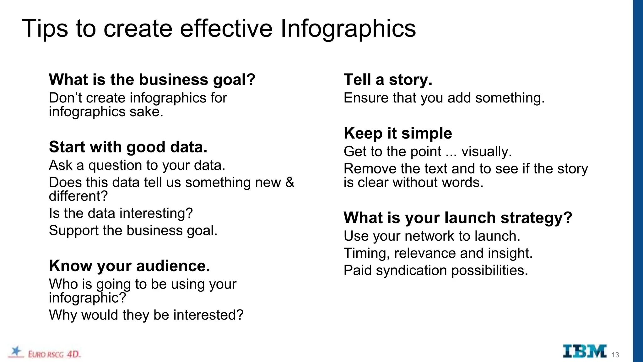
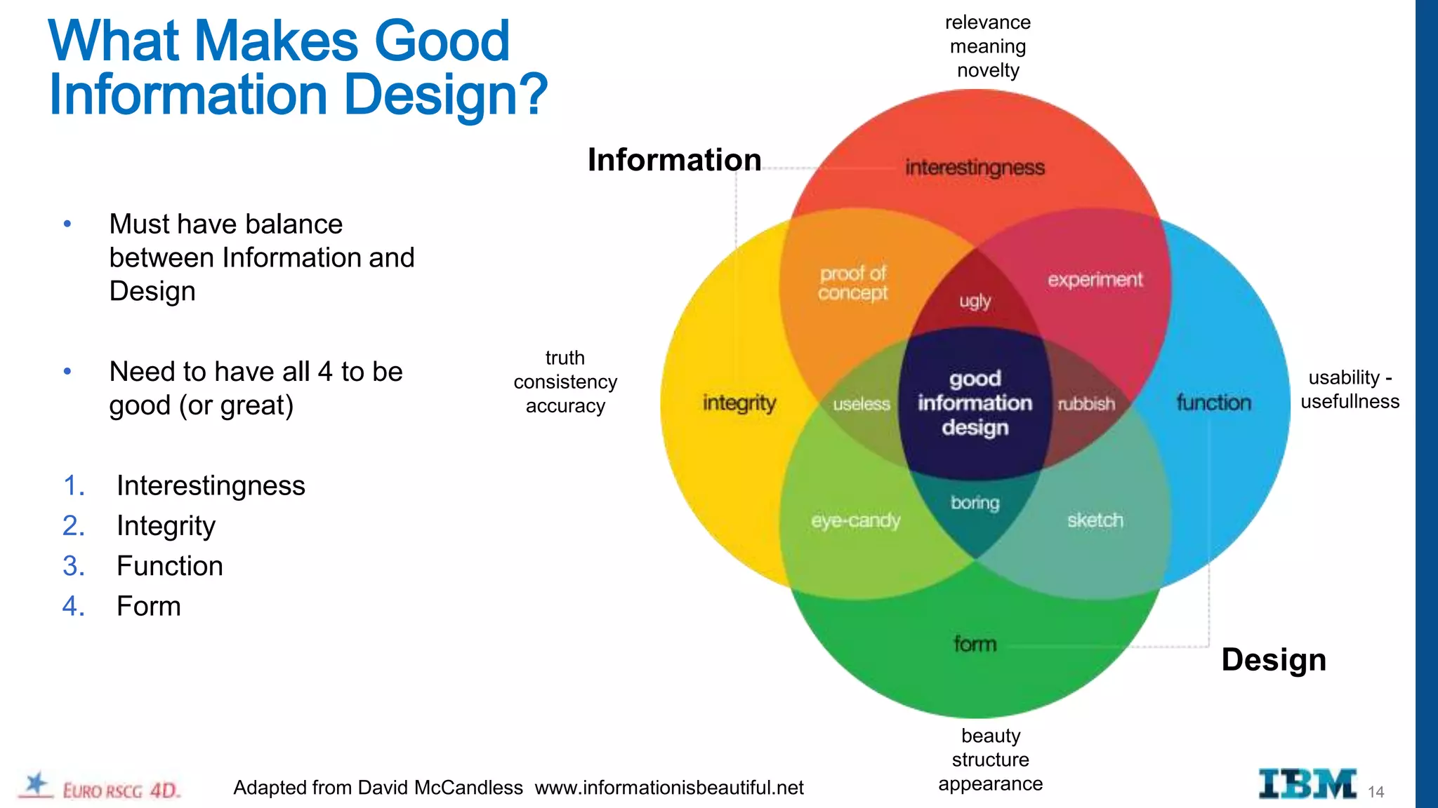
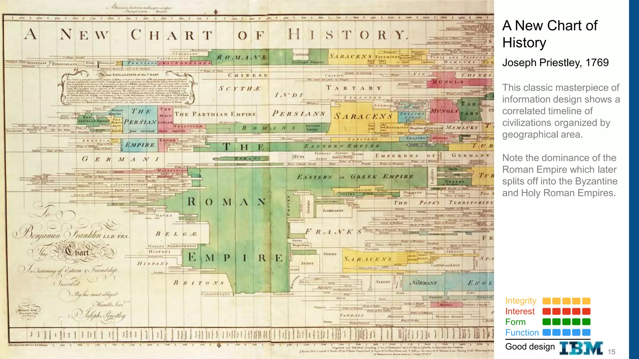
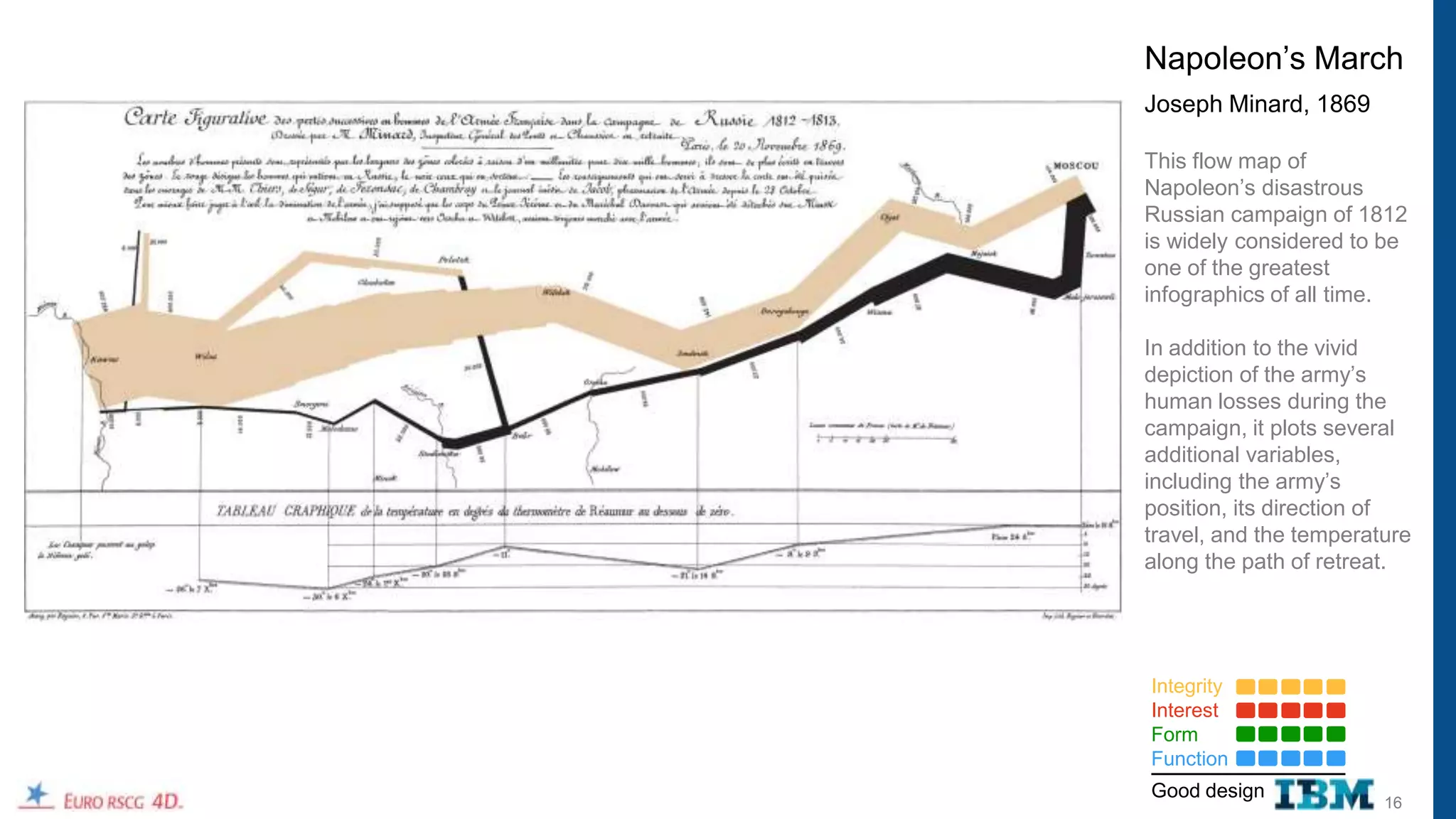
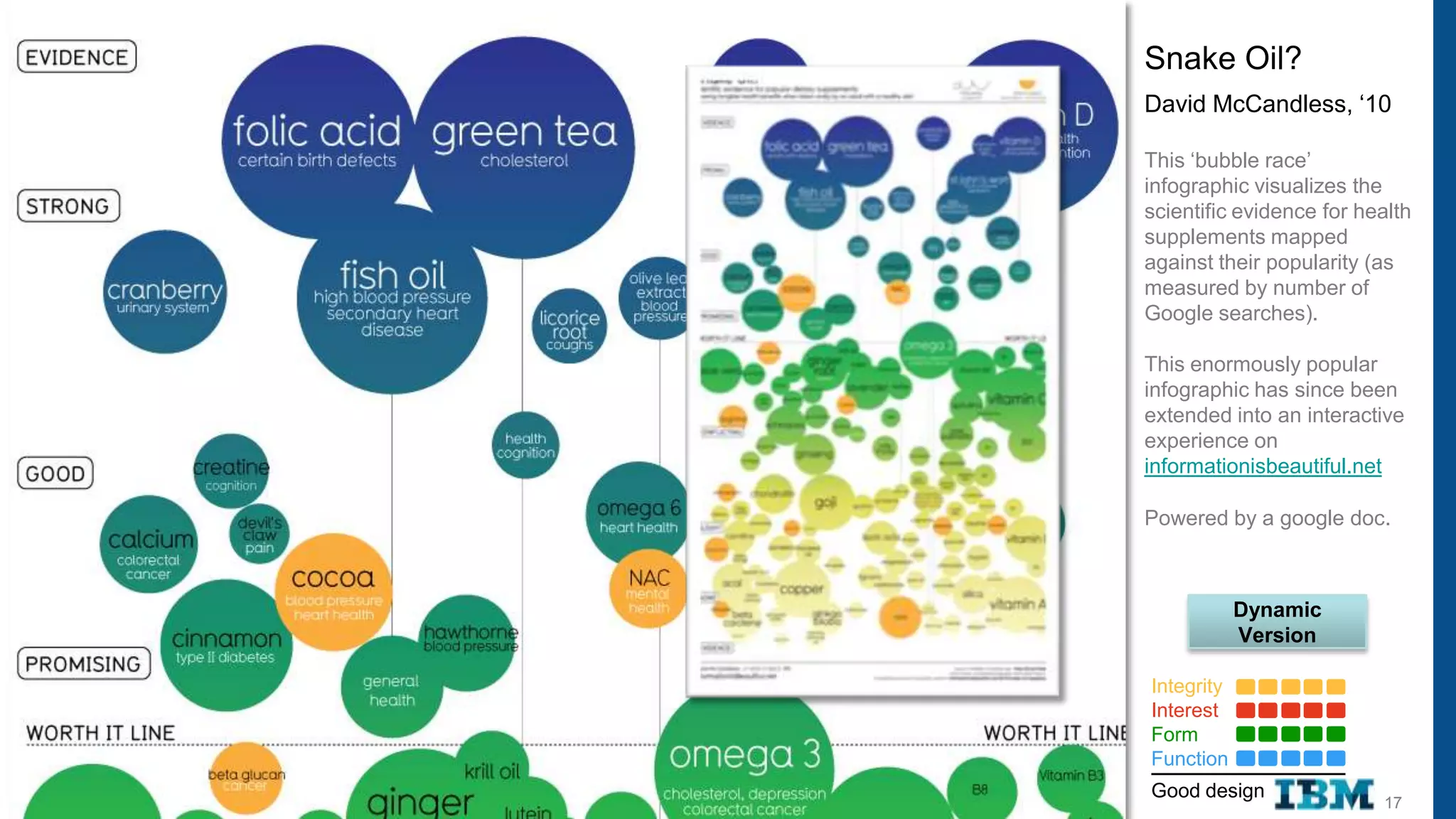
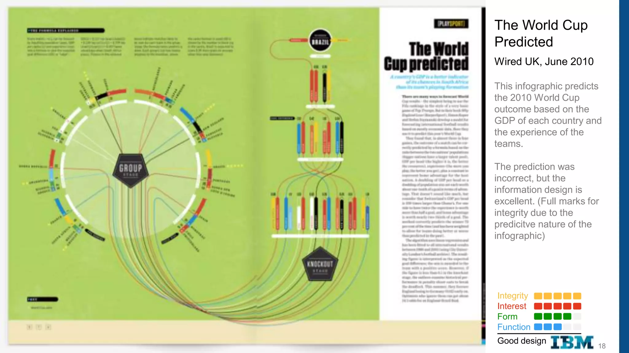
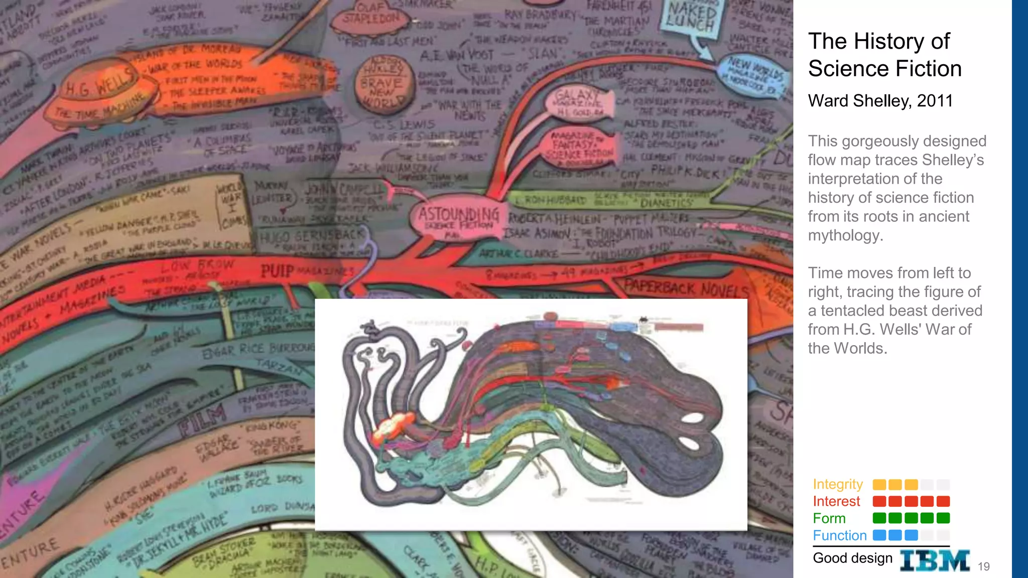
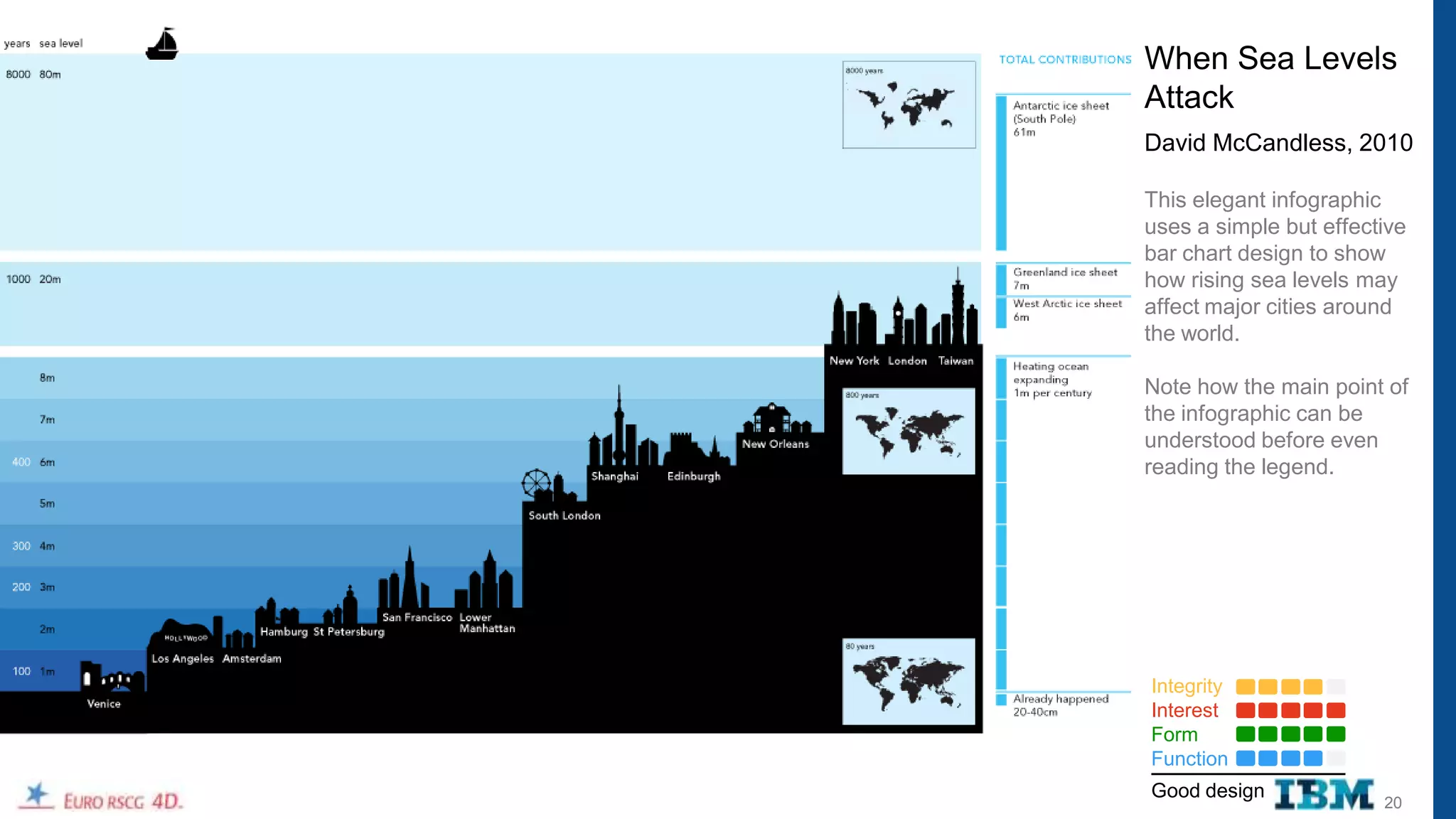
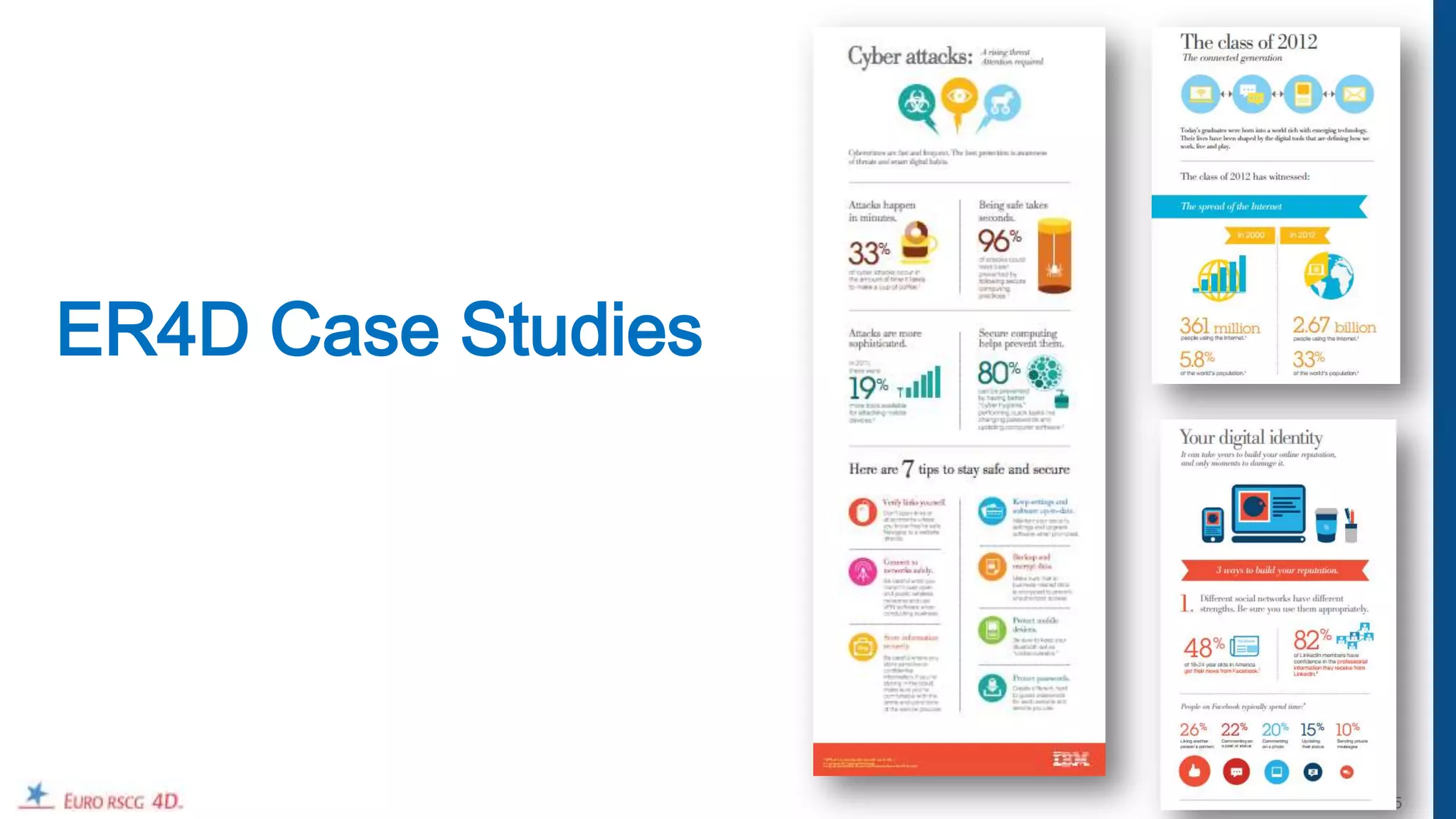
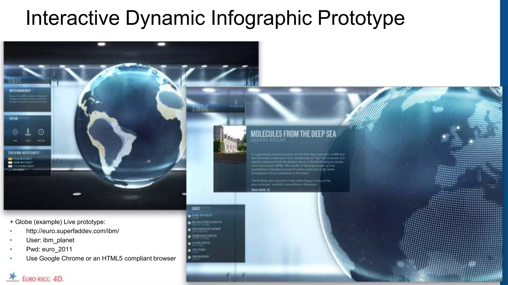
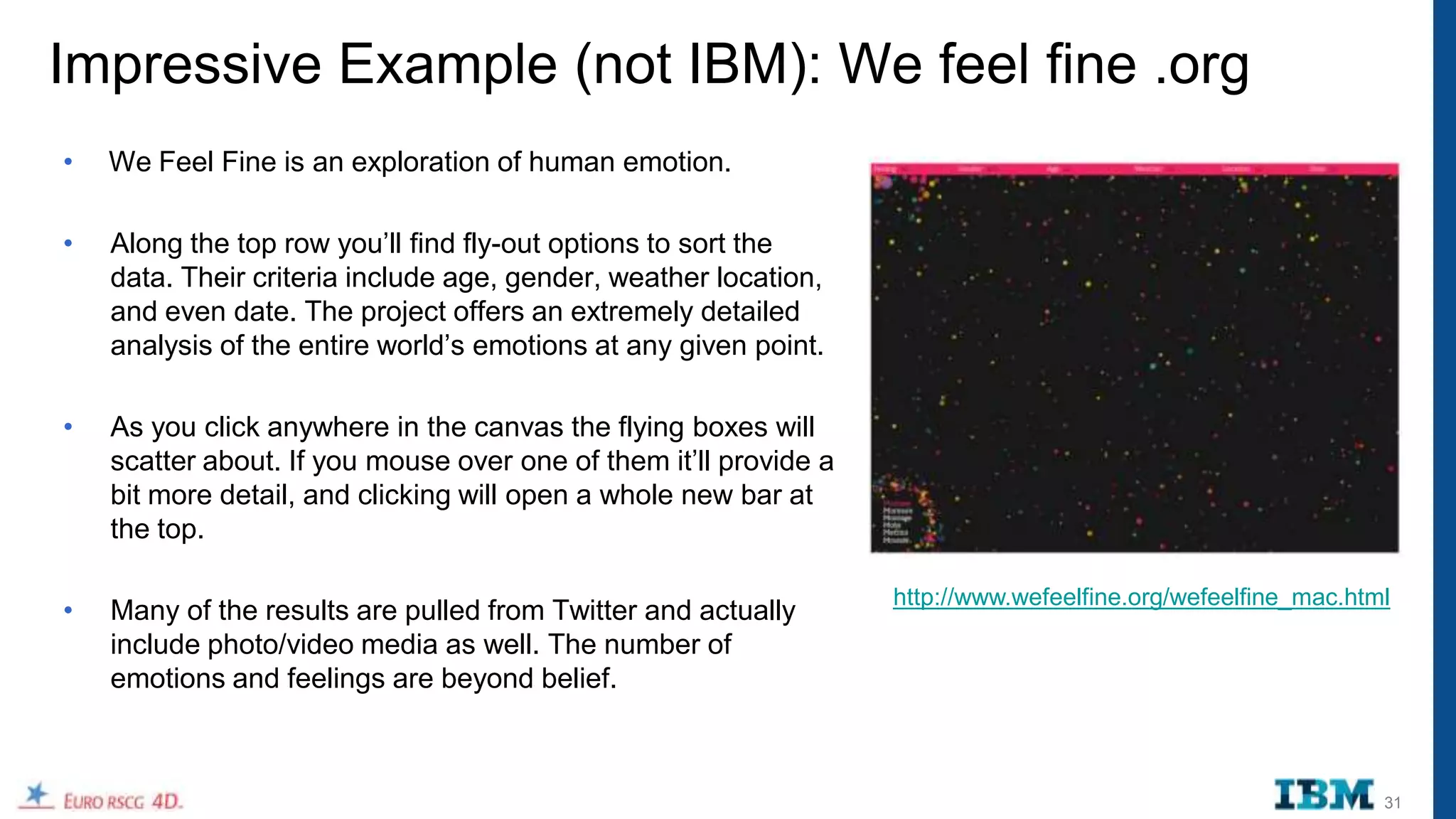
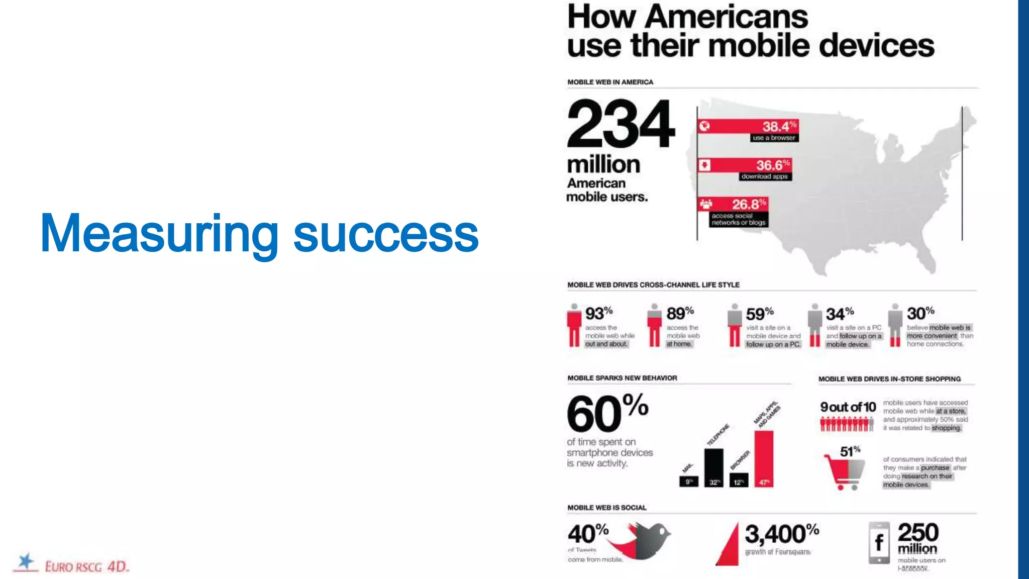
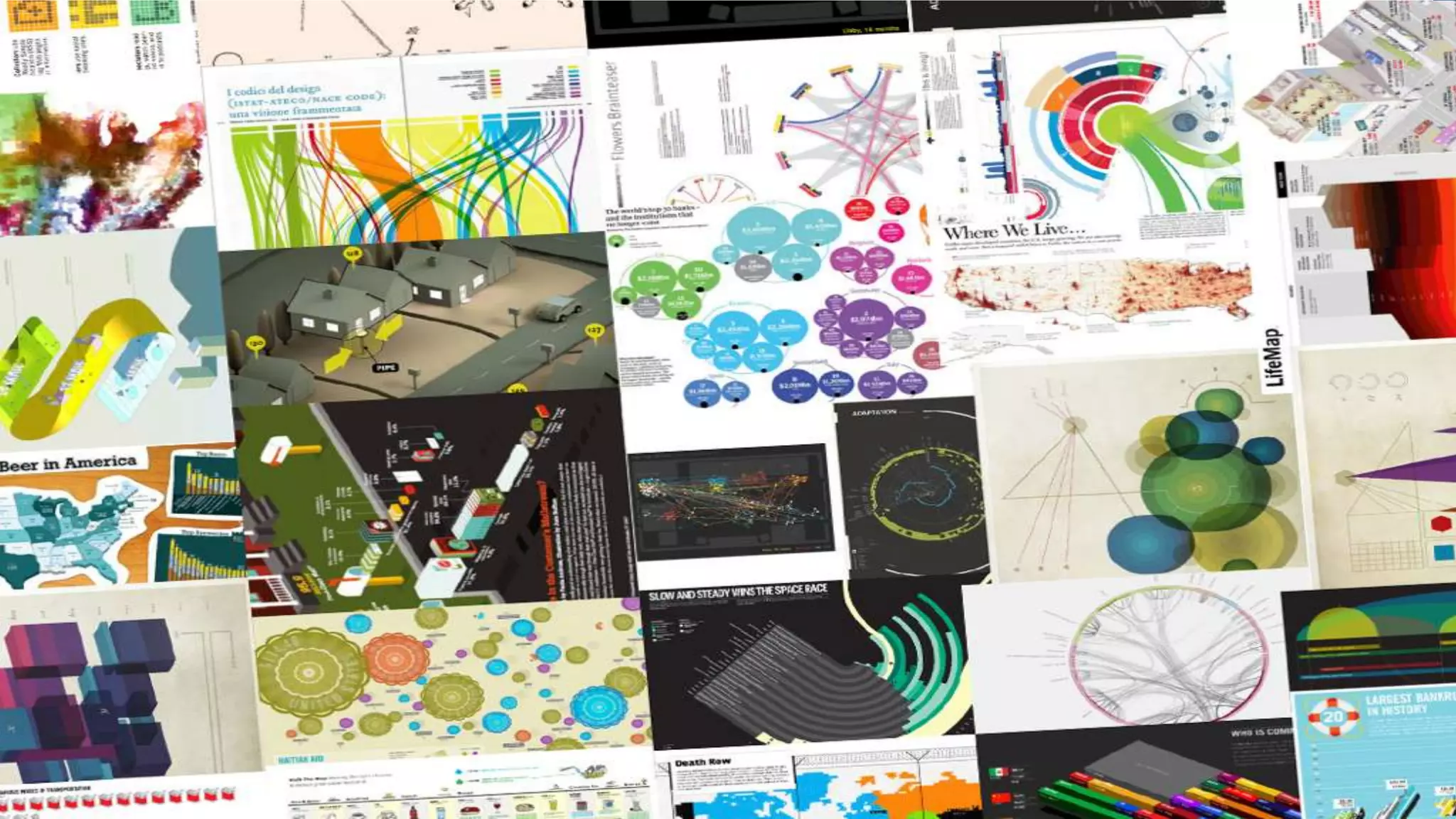
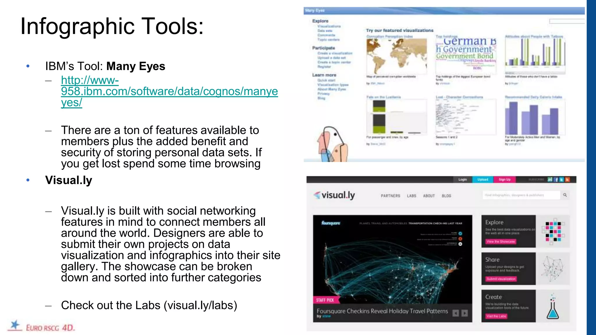
The document discusses infographics, providing definitions, best practices for creating effective infographics, and case studies. It defines infographics, explains why they are used and provides a brief history. It outlines tips for creating infographics including determining the goal, using good data, knowing the audience, and ensuring a balance of information and design. The document presents examples of both effective and ineffective infographic designs and discusses tools for measuring success and creating infographics.
Stephen Few\'s presentation from the Malofiej 19 summit. This was an international competition and summit dedicated to journalistic infographics. Very good information.
The approach to visualize information into graphic designTracy Hsu
A study record and works about information graphic during 2011-2012 by Tracy Hsu Hsuan-Chi in the master course: visual communication in Birmingham City University (BIAD).
An illustrated lecture introducing key concepts in the emerging field of Computational Creativity.
Computational Creativity is the scientific study of the creative potential of machines: to determine whether machines can indeed be creative, it aims to build generative machines and programs that exhibit human-scale creativity.
As a part of the 30% exploratory IP/ tech based products/ projects we used to do in And Then. We decided to explore simplification and automation of data visualisations. So, corporate employees with zero design training and skills could generate and use designed infographics. Based on pre-set templates of colour and iconography. This project was a collaboration between me and one of our brightest design interns 'Santhosh'. It was a fabulous learning for me, and this documentation by Santhosh is a good summation.
Fallon Brainfood: Lessons About New Digital, Brought To You By Old TVAki Spicer
Fallon's Rocky Novak (@rockynovak) Director of Digital Development, and Aki Spicer (@akispicer), Director of Digital Strategy present 5 lessons about digital marketing as gleened from hours of their childhood hours of "wasted" TV viewing.
Keynote Address @University of Minnesota Student Advertising Summit (#Ad2SAS), February 2013
Fallon Brainfood x VCU Brandcenter: The Engagement OpportunityAki Spicer
Aki Spicer, Fallon's Director of Digital Strategy conducted a workshop at VCU Brandcenter's Executive Training Program for account planners.
"The Engagement Opportunity" outlines the evolving role and function of strategic planning in this age of digital and social technologies and proposes a methodology for integrated creative ideation.
Slides from a workshop on Data Storytelling hosted at the Turnbull Center, University of Oregon, April 2016. https://2016.designweekportland.com/events/data-storytelling-workshop
Fallon Brainfood: From Boring to Big BangAki Spicer
...From Boring to Big Bang: How Causes Can Get Interesting And Get Attention From News and Newsfeeds . Presented at Strategy for Good Twin Cities, December 10, 2011.
Aki Spicer, Director of Digital Strategy at Fallon Worldwide, challenges social entrepreneurs and non-profits with a framework for brainstorming their marketing initiatives into bigger, more "social" ideas.
What I learned about AI, ML and Blockchain from one Wired conference!John Powers
IMHO, the people and organizations to forge relationships with are the ones that hunger to understand the use cases for these technological developments in order to visualize and collaborate on projects that can and will affect change in the world.
I have included some detailed information about some of these organizations and the technology they bring to the table.
Being Digital: 5 key tactics towards modernizing your organization and ideas
Fallon co-sponsored presentation event with MN AMA (American Marketing Association)
With so many rapid-fire changes in the digital landscape, how are agencies and marketers adapting their strategies and creativity to engage and connect with people?
Join Aki Spicer, Director of Digital Strategy at Fallon, as he shares insights on driving creativity in the age of digital and social media. Learn how his team is broadening its bench strength and skill sets; embracing the user over the viewer mindset; evolving measurement and ROI; building a process for experimentation; and planning for social content strategy. As a marketer, discover new ways to encourage investment in small experiments that can lead to bigger results.
Gain relevant insights from Fallon attendees of the Mashable Media Summit 2010 about Creating and Choreographing Engaging Content in the Modern Age, enjoy a lunch of mashed potatoes and food for thought.
Presenters: Chris Campbell, Erin Simle, Marty Wetherall, and Julianna Simon with Aki Spicer as Moderator.
*Brainfood is Fallon agency food for thought that stimulates lively discussion and provides valuable insights and applications for you and your clients.
Previous Brainfoods: http://www.slideshare.net/group/we-are-fallon
Fallon Brainfood x Planning-ness 2010: How To Plan AppsAki Spicer
Aki Spicer, Fallon's Director of Digital Strategy will reveal some learnings and tips for account planners trying to operationalize the process of concepting, selling and building applications and digital tools.
Learn some pitfalls to avoid, shortcuts for bridging the gap between "start-up" culture and agency culture, guidance for selling apps to clients who are "bottom-line" or "ad message" minded, and shifting your teams from campaign thinking to service mentality.
http://planningness.com
September 30th – October 1st at Denver’s, Space Gallery.
As head of JESS3's strategy and operations for the last five years, COO & co-founder Leslie Bradshaw shares her insights and observations around how data, content and workforce are impacting and leveraging one another.
Leslie posits: Whether you are an agency, brand, educator or public sector organization, these trends will all play a part of how you organize, think and produce.
Originally presented for RefreshDC's November meetup on 11/16/11.
Technology, AI and the future of marketing: key themes from SXSWJodie Collins
An overview of the the key themes from SXSW 2016 including artificial intelligence, virtual reality, Internet of Things, brands doing content marketing well, live streaming and the future of management.
While many recent reports speak about the negative impact AI and work, our presentation introduces the idea and vision of the future of AI as a complementary force that improves all areas of human activity. The deck also gives an overview of Sherpa.AI's conversational AI platform as a potential driving force of that integration.
Presenter: Lang Richardson, CEO, Lifejoin
Physical Terrain Modeling in a Digital AgeWatson Mary
The momentum of digital geospatial data collection combined with fast network delivery, cheap computer memory, storage and powerful processors point to a future of virtual landscapes, fly-throughs and synthetic environments. Created by http://www.solidterrainmodeling.com
The content experts at IQ want to help you turn data into easy-to-consume, shareable content. So we narrowed the process of infographic creation down to 5 simple steps.
An introduction to infographic design written for global health and development professionals, including ideas for storyboarding, design tools, and tips and tricks to create fun, meaningful infographics. Lots of links to free web-based tools and great resources.
In today's data-driven world, data visualization plays a pivotal role in conveying complex information, making it accessible and understandable to a broad audience. Whether in the context of business, science, journalism, or academia, data visualization is a powerful tool that helps storytellers convey their messages effectively. In this essay, we will explore the role of data visualization in storytelling with data, highlighting its significance, benefits, and best practices.
How to start generating leads with infographicsInfogram
Infographics are a powerful way of communicating information since they combine data and visual images - left brain and right brain - thereby making it easier to digest, remember and share information.
They get shared more frequently on social media than a simple text-only post with the same information.
Creating infographics for your website can get you more traffic.
So how do we go about creating effective infographics that tell our brand story through data visualisation? And how do we promote those infographics to drive real, qualified leads for our sales team?
In this presentation we show you:
- What infographics are and why you should care
- The "dos and dont's" of Infographic creation
- How to optimise your infographic for lead generation
- How to promote your infographic
- Measure and optimise your infographic campaign
- Make your storytelling more effective through infographics
infogr.am
How to Entertain audiences using data led content - Trend Report Spring 2015infogr8
In this seasons trend report, we open the lens to best practice campaigns from across the digital landscape whilst seeking opinions from the data visualisation community on the hot trends coming our way. Campaigns include airbnb, UNESCO, Virgin, IBM, Nike and some exploratory thinking on Tesla. Thought leading opinions from the likes of Alberto Cairo, Georgia Lupi, Andy Kirk.
Presented on May 7, 2015 by Amanda Makulec from JSI's Center for Health Information, Monitoring, and Evaluation to the TechChange Technology for M&E course.
The aim of the presentation was to highlight key considerations in designing visualizations as part of international development programs, and includes both challenges of visualization in development programs and six things to consider when designing visualizations.
This will explain you what is data visualization,why we need it,what are the technologies in it ,tools available for it and it ends up with how can we get the excellence in visualization
Does your organization have loads of unused data? Information design can turn that data into understandable visuals, giving your members the right information to make choices or learn something new about your industry. Be better positioned to tell your story by learning how to make your infographics clear, compelling, and convincing. Learn how infographics can boost your website’s SEO and can aid in user engagement in this free webinar.
There’s more data than ever -- and more ways to get it. As the world gets more complex and attention spans grow shorter, brands and marketers are being pushed to present information in meaningful, digestible and visual ways. In this session, Lee Sherman, Visual.ly co-founder and chief content officer, will discuss best practices for using big data as a marketing vehicle for your organization and will share his tips and tricks for developing successful infographics that will get your organization noticed.
Speaker: Lee Sherman, co-founder and chief content officer, Visual.ly @lsherman
Jean Villedieu's slides from his talk at Connected Data London. Jean, co-founder of Linkuriuos presented a sarcastic presentation of what developers should consider when creating a graph visualisation.
Telling Stories with Data_ The Art of Creating Powerful Visuals.docxSannidhiShetty19
Unleash the true potential of your data-driven narratives! Join us on a captivating blog journey to master the art of creating powerful visuals. Learn key principles, tools, and techniques to transform raw data into compelling stories that inspire action. Elevate your data visualization game today!
Similar to Infographics overview e&e 20120608_final (20)
Acetabularia Information For Class 9 .docxvaibhavrinwa19
Acetabularia acetabulum is a single-celled green alga that in its vegetative state is morphologically differentiated into a basal rhizoid and an axially elongated stalk, which bears whorls of branching hairs. The single diploid nucleus resides in the rhizoid.
Unit 8 - Information and Communication Technology (Paper I).pdfThiyagu K
This slides describes the basic concepts of ICT, basics of Email, Emerging Technology and Digital Initiatives in Education. This presentations aligns with the UGC Paper I syllabus.
The Roman Empire A Historical Colossus.pdfkaushalkr1407
The Roman Empire, a vast and enduring power, stands as one of history's most remarkable civilizations, leaving an indelible imprint on the world. It emerged from the Roman Republic, transitioning into an imperial powerhouse under the leadership of Augustus Caesar in 27 BCE. This transformation marked the beginning of an era defined by unprecedented territorial expansion, architectural marvels, and profound cultural influence.
The empire's roots lie in the city of Rome, founded, according to legend, by Romulus in 753 BCE. Over centuries, Rome evolved from a small settlement to a formidable republic, characterized by a complex political system with elected officials and checks on power. However, internal strife, class conflicts, and military ambitions paved the way for the end of the Republic. Julius Caesar’s dictatorship and subsequent assassination in 44 BCE created a power vacuum, leading to a civil war. Octavian, later Augustus, emerged victorious, heralding the Roman Empire’s birth.
Under Augustus, the empire experienced the Pax Romana, a 200-year period of relative peace and stability. Augustus reformed the military, established efficient administrative systems, and initiated grand construction projects. The empire's borders expanded, encompassing territories from Britain to Egypt and from Spain to the Euphrates. Roman legions, renowned for their discipline and engineering prowess, secured and maintained these vast territories, building roads, fortifications, and cities that facilitated control and integration.
The Roman Empire’s society was hierarchical, with a rigid class system. At the top were the patricians, wealthy elites who held significant political power. Below them were the plebeians, free citizens with limited political influence, and the vast numbers of slaves who formed the backbone of the economy. The family unit was central, governed by the paterfamilias, the male head who held absolute authority.
Culturally, the Romans were eclectic, absorbing and adapting elements from the civilizations they encountered, particularly the Greeks. Roman art, literature, and philosophy reflected this synthesis, creating a rich cultural tapestry. Latin, the Roman language, became the lingua franca of the Western world, influencing numerous modern languages.
Roman architecture and engineering achievements were monumental. They perfected the arch, vault, and dome, constructing enduring structures like the Colosseum, Pantheon, and aqueducts. These engineering marvels not only showcased Roman ingenuity but also served practical purposes, from public entertainment to water supply.
Model Attribute Check Company Auto PropertyCeline George
In Odoo, the multi-company feature allows you to manage multiple companies within a single Odoo database instance. Each company can have its own configurations while still sharing common resources such as products, customers, and suppliers.
How to Make a Field invisible in Odoo 17Celine George
It is possible to hide or invisible some fields in odoo. Commonly using “invisible” attribute in the field definition to invisible the fields. This slide will show how to make a field invisible in odoo 17.
The French Revolution, which began in 1789, was a period of radical social and political upheaval in France. It marked the decline of absolute monarchies, the rise of secular and democratic republics, and the eventual rise of Napoleon Bonaparte. This revolutionary period is crucial in understanding the transition from feudalism to modernity in Europe.
For more information, visit-www.vavaclasses.com
Biological screening of herbal drugs: Introduction and Need for
Phyto-Pharmacological Screening, New Strategies for evaluating
Natural Products, In vitro evaluation techniques for Antioxidants, Antimicrobial and Anticancer drugs. In vivo evaluation techniques
for Anti-inflammatory, Antiulcer, Anticancer, Wound healing, Antidiabetic, Hepatoprotective, Cardio protective, Diuretics and
Antifertility, Toxicity studies as per OECD guidelines
2. Overview
• Definition
• Why & History: infographics
• Best practices: How to create effective infographics
• Case studies
• How to measure success
• Appendix: Tools and links
2
7. Why Infographics?
• They’re eye-catching & engaging.
A great way to bring to life content that would otherwise be dry, uninteresting or
unshareable. According to research, 83% of learning occurs visually.
• It’s everything you need to know, simplified.
Easily digested because they address the valuable ideas, facts and statistics
that people want to know. In fact, studies show, people remember only 20%
of what they read.
• They are shareable.
Easily downloaded and shared via social channels.
• They improve SEO.
Increasing the number of backlinks to your website improves visibility to
search engine‟s algorithms. As a result, page rankings become higher.
7
8. Edward Tufte: Literally wrote the book on Information Design
“One of the Best 100 books of the 20th century."
Edward Rolf Tufte is an American statistician and
professor emeritus of political science, statistics, and
computer science at Yale University. He is noted for
his writings on information design and as a pioneer in
the field of data visualization.
8
9. David McCandless‟ TED Talk:
“It feels like we're all suffering from information
overload or data glut. And the good news is
there might be an easy solution to that, and
that's using our eyes more.
So, visualizing information, so that we can
see the patterns and connections that
matter and then designing that information so it
makes more sense, or it tells a story, or allows
us to focus only on the information that's
important.
Failing that, … visualized information can just
look really cool.”
http://www.ted.com/talks/lang/en/david_mccandless_the_beauty_of_data_visualization.html 9
11. 3 Types of Infographics
Infographics can also be categorized according to how they present graphic information
1. Static:
Balance between information display and design. Information presented at once and in its
entirety. These graphics have a quick and immediate impact on the reader.
2. Interactive:
Exemplify your infographic to make it interactive, allowing multiple layers of data to be
streamed in a single interface, creating a unique experience for the viewer. Information is
presented according to the reader‟s choice.
3. Dynamic:
Display of information over time. Can also be interactive or even a video.
11
12. 3 Types of Infographics: Demonstrated with GDP
1. Static:
http://en.rian.ru/infographics/20120425/173008889.html
2. Interactive:
http://www.maps.igemoe.com/fact_gdp_growth.htm
3. Dynamic:
http://www.gapminder.org/world/#$majorMode=chart$is;shi=t;ly=2003;lb=f;il=t;fs=11;al=30;stl=t;st=t;nsl=t;se=t$
wst;tts=C$ts;sp=5.59290322580644;ti=2011$zpv;v=1$inc_x;mmid=XCOORDS;iid=phAwcNAVuyj1jiMAkmq1iM
g;by=ind$inc_y;mmid=YCOORDS;iid=phAwcNAVuyj2tPLxKvvnNPA;by=ind$inc_s;uniValue=8.21;iid=phAwcN
AVuyj0XOoBL_n5tAQ;by=ind$inc_c;uniValue=255;gid=CATID0;by=grp$map_x;scale=log;dataMin=282;dataM
ax=119849$map_y;scale=lin;dataMin=12;dataMax=83$map_s;sma=49;smi=2.65$cd;bd=0$inds=;example=75
12
13. Tips to create effective Infographics
What is the business goal? Tell a story.
Don‟t create infographics for Ensure that you add something.
infographics sake.
Keep it simple
Start with good data. Get to the point ... visually.
Ask a question to your data. Remove the text and to see if the story
Does this data tell us something new & is clear without words.
different?
Is the data interesting? What is your launch strategy?
Support the business goal. Use your network to launch.
Timing, relevance and insight.
Know your audience. Paid syndication possibilities.
Who is going to be using your
infographic?
Why would they be interested?
13
14. What Makes Good
relevance
meaning
Information Design?
novelty
Information
• Must have balance
between Information and
Design
truth
• Need to have all 4 to be consistency usability -
good (or great) accuracy usefullness
1. Interestingness
2. Integrity
3. Function
4. Form
Design
beauty
structure
Adapted from David McCandless www.informationisbeautiful.net appearance 14
15. A New Chart of
History
Joseph Priestley, 1769
This classic masterpiece of
information design shows a
correlated timeline of
civilizations organized by
geographical area.
Note the dominance of the
Roman Empire which later
splits off into the Byzantine
and Holy Roman Empires.
Integrity
Interest
Form
Function
Good design
15
16. Napoleon‟s March
Joseph Minard, 1869
This flow map of
Napoleon‟s disastrous
Russian campaign of 1812
is widely considered to be
one of the greatest
infographics of all time.
In addition to the vivid
depiction of the army‟s
human losses during the
campaign, it plots several
additional variables,
including the army‟s
position, its direction of
travel, and the temperature
along the path of retreat.
Integrity
Interest
Form
Function
Good design
16
17. Snake Oil?
David McCandless, „10
This „bubble race‟
infographic visualizes the
scientific evidence for health
supplements mapped
against their popularity (as
measured by number of
Google searches).
This enormously popular
infographic has since been
extended into an interactive
experience on
informationisbeautiful.net
Powered by a google doc.
Dynamic
Version
Integrity
Interest
Form
Function
Good design
17
18. The World Cup
Predicted
Wired UK, June 2010
This infographic predicts
the 2010 World Cup
outcome based on the
GDP of each country and
the experience of the
teams.
The prediction was
incorrect, but the
information design is
excellent. (Full marks for
integrity due to the
predicitve nature of the
infographic)
Integrity
Interest
Form
Function
Good design
18
19. The History of
Science Fiction
Ward Shelley, 2011
This gorgeously designed
flow map traces Shelley‟s
interpretation of the
history of science fiction
from its roots in ancient
mythology.
Time moves from left to
right, tracing the figure of
a tentacled beast derived
from H.G. Wells' War of
the Worlds.
Integrity
Interest
Form
Function
Good design
19
20. When Sea Levels
Attack
David McCandless, 2010
This elegant infographic
uses a simple but effective
bar chart design to show
how rising sea levels may
affect major cities around
the world.
Note how the main point of
the infographic can be
understood before even
reading the legend.
Integrity
Interest
Form
Function
Good design
20
21. Over Under
EngineeringDegree.net,
2011
This landmark infographic
probes the critical
question of toilet paper
orientation.
Take it at face value, and
it falls into the „useless‟
category. But of course
that‟s not the point, so full
marks for its brilliant
ribbing of info-geekery.
Integrity
Interest
Form
Function
Good design
21
22. The Three Trillion
Dollar War
Athletics Design
Collective, 2011
The only true information
in this cluttered design is
conveyed in the callouts
on the right. The rest of
the execution is a
collection of icons and
words that are visually
hard to parse and convey
no meaning.
Integrity
Interest
Form
Function
Ugly, useless
22
23. Web Trend Map
Athletics Design
Collective, 2011
This infographic attempts
to map the main web
industry players onto the
Tokyo subway map.
Unfortunately, despite its
appealing design, it
conveys no actual
information except for a
basic grouping of
companies by type.
Integrity
Interest
Form
Function
Boring, useless, rubbish
23
24. Knot Tied
Timko & Klick for
good.is, 2009
This infographic was
intended as a timeline of
gay marriage laws in the
U.S.
Despite some interesting
design elements, this
execution does not read
like a timeline and the
stylized pie charts do not
visually convey the
intended percentage
splits.
Integrity
Interest
Form
Function
Useless
24
30. Interactive Dynamic Infographic Prototype
+ Globe (example) Live prototype:
• http://euro.superfaddev.com/ibm/
• User: ibm_planet
• Pwd: euro_2011
• Use Google Chrome or an HTML5 compliant browser
30
31. Impressive Example (not IBM): We feel fine .org
• We Feel Fine is an exploration of human emotion.
• Along the top row you‟ll find fly-out options to sort the
data. Their criteria include age, gender, weather location,
and even date. The project offers an extremely detailed
analysis of the entire world‟s emotions at any given point.
• As you click anywhere in the canvas the flying boxes will
scatter about. If you mouse over one of them it‟ll provide a
bit more detail, and clicking will open a whole new bar at
the top.
http://www.wefeelfine.org/wefeelfine_mac.html
• Many of the results are pulled from Twitter and actually
include photo/video media as well. The number of
emotions and feelings are beyond belief.
31
35. Infographic Tools:
• IBM‟s Tool: Many Eyes
– http://www-
958.ibm.com/software/data/cognos/manye
yes/
– There are a ton of features available to
members plus the added benefit and
security of storing personal data sets. If
you get lost spend some time browsing
• Visual.ly
– Visual.ly is built with social networking
features in mind to connect members all
around the world. Designers are able to
submit their own projects on data
visualization and infographics into their site
gallery. The showcase can be broken
down and sorted into further categories
– Check out the Labs (visual.ly/labs)
35
37. Infographic Examples
• State of the internet: http://www.onlineschools.org/state-of-the-internet/soti.html
• Slavery Footprint: http://slaveryfootprint.org/
– http://slaveryfootprint.org/survey/#whats_on_your_plate , http://slaveryfootprint.org/survey/#jewellery ,
http://slaveryfootprint.org/survey/#closet_clothing
• Presidential Poll Tracker Slider : http://www.usatoday.com/news/politics/presidential-poll-tracker
• Candidate match game: http://www.usatoday.com/news/politics/candidate-match-game
• Edlundart : http://www.edlundart.com/pages/is-the-internet-awake.html
• What‟s Your Economic Outlook? : http://www.nytimes.com/interactive/business/2011-economy-sentiment.html
• Evolution of the web : http://evolutionofweb.appspot.com/
• http://mashable.com/2011/10/23/top-mashable-infographics/
• http://mashable.com/2011/09/16/airlines-social-media-infographic/
• http://news.xerox.com/pr/xerox/photo.aspx?fid=146374&id=E0C17733
• http://venturebeat.com/2011/10/21/how-the-enterprise-is-adopting-tablets-infographic/
• http://gigaom.com/2011/11/02/what-do-young-workers-want-social-media-device-freedom/
37
38. Twitter Data Visualization
Twitter tools to create data visualization (dynamic infographics with the twitter firehose)
– http://moritz.stefaner.eu/projects/revisit
38