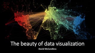
The beauty of data visualization
•Download as PPTX, PDF•
0 likes•296 views

How data visualization will help in your career and why one should choose it. See this video of Hans Rosling, a master of data visualisation: https://www.youtube.com/watch?v=jbkSRLYSojo
Report
Share
Report
Share

Recommended
The beauty of data visualization
Data visualization is a set of processes that uses visual representations of data to help people understand patterns and insights more easily than textual data. It has several benefits, such as turning information into a visual landscape to focus on important details, helping new insights and innovations emerge. Effective data visualization examples include charts that use the size and color of boxes to indicate values or timeframes when certain events commonly happen. Overall, data visualization can help managers make sense of large amounts of information and find elegant solutions by transforming data into beautiful and clarifying graphics.
Benefits of data visualization
Data visualization is a complex set of processes which is like an umbrella that covers both information and scientific visualization simultaneously. We can’t ignore the benefits of data visualization for its accurate quantities, as it is easily comparable. It also lends valuable suggestion pertaining to the usage of its technique and tools. Scientifically its effectiveness lies in our brain's ability to maintain a proper balance between perception and cognition through visualization.
5thingsyourspreadsheetcantdo eng
This document discusses 5 limitations of spreadsheets for data analysis and visualization and provides alternatives:
1. Spreadsheets can't handle large, diverse datasets from multiple sources like databases and data warehouses. Integrating and analyzing all relevant data is important for accurate insights.
2. Complex calculations and macros can slow down spreadsheets, wasting time. Connecting to live data sources allows fast analysis of large datasets.
3. Blending and cleaning data from different sources is difficult in spreadsheets. Joining datasets on common fields provides a unified view.
4. Spreadsheets offer limited basic charts but advanced visualizations like maps and dashboards provide faster, more intuitive understanding.
5. Interactive dashboards with up
Better decisions, by design - Data visualisation for decision support
Data-driven decision-making can become the norm for people across your organisation if you enable them to use vision to think, by harnessing the data they need with well-designed visualisations. In this talk we’ll look at why this is important and how it makes a difference. We’ll see how visualisation impacts different types of users and will look at the different types of data visualisation and their relevance to the work environment. Finally, we’ll explore some examples of the data visualisation projects we’ve worked on to help professional users make better decisions, faster.
The Importance of Data Visualization
Data visualizations make huge amounts of data more accessible and understandable. Data visualization, or "data viz," is becoming largely important as the amount of data generated is increasing and big data tools are helping to create meaning behind all of that data.
This SlideShare presentation takes you through more details around data visualization and includes examples of some great data visualization pieces.
Getting The Most Out Of Mapping Overview
This document discusses different types of mapping and how they can help with organization and productivity. It defines mind maps as hand-drawn diagrams with a central concept and linked ideas, while mindmanager maps are digital diagrams created with software. The document outlines the basic steps for creating a mind map by hand and emphasizes that the most important rule is to do what works for the individual. Various applications of mapping are mentioned for focus, review, strategizing, and more.
Spreadsheet problems
This document discusses how spreadsheets can limit data analysis capabilities and recommends integrating data from multiple sources and using better visualization tools. It notes that spreadsheets cannot handle large datasets, integrate different types of data, or create advanced visualizations needed for insightful analysis. Better tools allow users to blend, clean, and visualize integrated data in interactive dashboards with current data feeds to gain a holistic understanding and answer unanticipated questions.
5 Data Visualization Pitfalls
Visite QlikView Argentina en http://www.dataiq.com.ar y conozca más sobre QlikView: Inteligencia de negocios simplemente revolucionaria.
Coursera MAB3WJU4B7VN
Crispino Cabral Kako Kamboh has completed the online Specialization "Excel to MySQL: Analytic Techniques for Business" from Coursera, consisting of 5 courses in business metrics, data analysis in Excel, data visualization in Tableau, managing big data with MySQL, and increasing real estate profits through data analytics. The Specialization taught skills to frame business challenges as data questions and use tools like Excel, Tableau, and MySQL to analyze data, create models and forecasts, design visualizations, and communicate insights, culminating in a capstone project applying these skills to a real-world business process.
What do we do with data
This document discusses big data and how it can be interpreted in different ways. It notes that data can be both stubborn and stupid depending on how it is interpreted and used, and that data analysis can have both positive and negative outcomes. The document recommends that managers take informed decisions by aligning business goals, choosing alternative actions based on data analysis, and considering different problem solving perspectives to make the most of big data insights.
Techniques of Data Visualization for Data & Business Analytics
This document provides an outline for a training on techniques of data visualization. It begins with introducing data visualization and its benefits such as making large amounts of data easy to summarize and see patterns. It discusses essential skills needed for data visualization as well as core principles like understanding context and purpose. The document then covers technology tools for data visualization, focusing on Tableau. It provides an overview of Tableau products and their differences. Finally, it outlines learning areas for Tableau, such as installation, connecting data, and creating different visual output types. The overall purpose is to provide staff skills in visualizing and communicating data through cutting-edge tools.
A Pixar Twist on Presenting Data
A short workshop from MERL Tech 2016 on how we can think more purposefully about telling stories with our data and designing visualizations to bring those stories to life in global health and development.
Power of data visualization
Data visualization is a technique for representing data in a graphical format to help people understand the significance of the data. It enables decision makers to see analytics visually and identify patterns. Data visualization is important as it can identify areas needing improvement, clarify factors influencing customer behavior, and help predict sales. It provides advantages like enhanced business insights, trend identification, and predictive analysis. Choosing the right visual is key to effective data visualization.
Simplifying analytics
The document discusses simplifying analytics by focusing on important data and how to use it to improve business outcomes, rather than complex analytics. It recommends building an environment to accelerate data processing for faster insights and decisions. Companies should leverage business intelligence, data visualization, and data discovery tools, as well as machine learning models, to automate analysis and gain insights from large data sets. Different problems may require hypothesis-based or discovery-based approaches. The key is to identify important data, delegate analysis to tools when possible, visualize data for better understanding, uncover hidden patterns, and customize the approach to the specific problem and data.
Simplify Your Analytics Strategy by Narendra Mulani
Week 4 day 5 of my Data Analytics internship at IIM Lucknow under the supervision of pof sameer mathur
Elmers Iq Quiz Result
The document provides the results of an IQ test, indicating a score of 126 and identifying the test taker as a "Visual Mathematician". It explains that this means they have strong visual-spatial and mathematical processing abilities, along with strengths in logic. As a Visual Mathematician, the test taker is able to understand and manipulate patterns visually and numerically to solve problems and come up with ideas that simplify processes. They tend to excel in clearly defined work environments and strategic activities like chess that involve pattern recognition.
Simplify your analytics strategy
The Presentation is about "Simply Your Analytics Strategy" By Narendra Mulani given by Prof.Sameer Mathur under the Internship(IIM Lucknow).
eResearch AU 2015, intro slides
Big data and visual analytics can provide new insights. Dr. Tomasz Bednarz discusses using analytics methods, models, training and visualization on big data to gain insights. Challenges include developing fast, efficient algorithms to analyze large, complex datasets from different sources and types.
The Importance of Data Visualisation in Analytics
Data visualization is important for data analysis because it allows analysts to find unknown patterns in data and make an impact by communicating their findings to stakeholders in order to change the world. Specifically, visualizing data makes it easier to spot problems, opportunities, and insights that may have otherwise gone unnoticed. This allows organizations to use data to do good in their communities by showing what resources are needed where and how people can help. In short, data visualization has the potential to identify issues and solutions that could positively change the world.
The Beauty Of Data visualisation
Data visualization is the graphical presentation of data that enables decision makers to easily understand complex concepts and identify patterns. It is an effective way to convey large amounts of information because the human brain processes visual representations better than text. Data is like soil that can bloom into flowers - meaning interesting patterns and insights are revealed when data is explored and visualized creatively. For businesses, data visualization can help uncover emerging trends to gain a competitive advantage and spot issues to address before they become problems. It is also an important tool for communicating insights to others in an engaging way. In conclusion, data visualization is a wise investment for making sense of big data.
Excellencein visualization
This document discusses data visualization in the context of big data. It notes that data visualization is important for making sense of large datasets and gaining insights. However, visualizing big data presents challenges related to scalability, heterogeneity, and speed. Effective visualization of big data requires tools that can handle its scale and complexity through techniques like cloud computing and advanced user interfaces. The document also provides examples of different visualization techniques like word clouds and line charts that can be used to display different data types.
Stop searching for that elusive data scientist
Companies are increasingly seeking data scientists to drive data-based decision making, but there is a lack of qualified candidates. To address this, companies should build effective teams by coordinating existing resources, promoting a data-focused culture, and encouraging all members to contribute insights from available data. Even small groups can draw meaningful conclusions and make informed decisions by maximizing their current capabilities.
Simplify your analytics strategy
This presentation contains the key ideas from the article "Simplify your analytics strategy" by Narendra Mulani published in HBR. This presentation is a part of my internship under Prof. Sameer Mathur, IIM-L
Data Dinner Parties
Ideas and lessons from experiences designing and using data placemats for participatory data analysis.
Nurturing Data Visualization
Building your own skills is one step in strengthening how you use visualization in your work, but fostering organizational change can be hard. Here are a few quick considerations on how to nurture data visualization as a personal skill and as an organizational value, and tips for successful collaborations on data visualization activities.
Originally presented as part of the HC3 Innovation Webinar Series on March 8, 2017.
Data visualization introduction
Data visualization is the graphical representation of information and data. It is used to communicate data or information clearly and effectively to readers by leveraging the human mind's receptiveness to visual information. Effective data visualization can improve transparency and communication, answer questions, discover trends, find patterns, see data in context, support calculations, and present or tell a story. Common tools for data visualization include charts, graphs, maps, and diagrams. Specialized roles involved in data visualization include data visualization experts, data analysts, business intelligence consultants, tool-specific consultants, business analysts, and data scientists.
Data Visualization
This document discusses data visualization and provides examples related to Egyptian elections. It defines data visualization as visually communicating information clearly and effectively. It also outlines the elements of an effective infographic. Several examples are presented that visualize Egyptian political party maps, election results, and presidential election results. Tools for creating visualizations like Infogr.am, Visual.ly, and Gephi are also mentioned. Finally, it describes the data visualization lifecycle from data collection to analysis to creating visualizations.
Katya Vladislavleva - Tech Startup Day 2015
This document discusses building a data science company called DataStories. It provides an overview of the company's services in creating mathematical models to predict and optimize key performance indicators from customer data. The document introduces the team members and shows growth in the company's total turnover from 2011-2016. It provides advice on scaling up the company, such as embracing communication technology, trusting your passion, and seeking mentorship.
Data Visualization Resource Guide (September 2014)
A summary guide to data visualization design, including key design principles, great resources, and tools (listed by category with short explanations) that you can use to help design elegant, effective data visualizations that help share your message & promote the use of your information.
Note that the tools & resources highlighted are suggested, and inclusion should not be considered as an endorsement from JSI.
Business Intelligence Insights: How to Present Visual Data your Team Understands
Don’t miss out on valuable business intelligence insights by failing to present visual information effectively.
More Related Content
What's hot
Coursera MAB3WJU4B7VN
Crispino Cabral Kako Kamboh has completed the online Specialization "Excel to MySQL: Analytic Techniques for Business" from Coursera, consisting of 5 courses in business metrics, data analysis in Excel, data visualization in Tableau, managing big data with MySQL, and increasing real estate profits through data analytics. The Specialization taught skills to frame business challenges as data questions and use tools like Excel, Tableau, and MySQL to analyze data, create models and forecasts, design visualizations, and communicate insights, culminating in a capstone project applying these skills to a real-world business process.
What do we do with data
This document discusses big data and how it can be interpreted in different ways. It notes that data can be both stubborn and stupid depending on how it is interpreted and used, and that data analysis can have both positive and negative outcomes. The document recommends that managers take informed decisions by aligning business goals, choosing alternative actions based on data analysis, and considering different problem solving perspectives to make the most of big data insights.
Techniques of Data Visualization for Data & Business Analytics
This document provides an outline for a training on techniques of data visualization. It begins with introducing data visualization and its benefits such as making large amounts of data easy to summarize and see patterns. It discusses essential skills needed for data visualization as well as core principles like understanding context and purpose. The document then covers technology tools for data visualization, focusing on Tableau. It provides an overview of Tableau products and their differences. Finally, it outlines learning areas for Tableau, such as installation, connecting data, and creating different visual output types. The overall purpose is to provide staff skills in visualizing and communicating data through cutting-edge tools.
A Pixar Twist on Presenting Data
A short workshop from MERL Tech 2016 on how we can think more purposefully about telling stories with our data and designing visualizations to bring those stories to life in global health and development.
Power of data visualization
Data visualization is a technique for representing data in a graphical format to help people understand the significance of the data. It enables decision makers to see analytics visually and identify patterns. Data visualization is important as it can identify areas needing improvement, clarify factors influencing customer behavior, and help predict sales. It provides advantages like enhanced business insights, trend identification, and predictive analysis. Choosing the right visual is key to effective data visualization.
Simplifying analytics
The document discusses simplifying analytics by focusing on important data and how to use it to improve business outcomes, rather than complex analytics. It recommends building an environment to accelerate data processing for faster insights and decisions. Companies should leverage business intelligence, data visualization, and data discovery tools, as well as machine learning models, to automate analysis and gain insights from large data sets. Different problems may require hypothesis-based or discovery-based approaches. The key is to identify important data, delegate analysis to tools when possible, visualize data for better understanding, uncover hidden patterns, and customize the approach to the specific problem and data.
Simplify Your Analytics Strategy by Narendra Mulani
Week 4 day 5 of my Data Analytics internship at IIM Lucknow under the supervision of pof sameer mathur
Elmers Iq Quiz Result
The document provides the results of an IQ test, indicating a score of 126 and identifying the test taker as a "Visual Mathematician". It explains that this means they have strong visual-spatial and mathematical processing abilities, along with strengths in logic. As a Visual Mathematician, the test taker is able to understand and manipulate patterns visually and numerically to solve problems and come up with ideas that simplify processes. They tend to excel in clearly defined work environments and strategic activities like chess that involve pattern recognition.
Simplify your analytics strategy
The Presentation is about "Simply Your Analytics Strategy" By Narendra Mulani given by Prof.Sameer Mathur under the Internship(IIM Lucknow).
eResearch AU 2015, intro slides
Big data and visual analytics can provide new insights. Dr. Tomasz Bednarz discusses using analytics methods, models, training and visualization on big data to gain insights. Challenges include developing fast, efficient algorithms to analyze large, complex datasets from different sources and types.
The Importance of Data Visualisation in Analytics
Data visualization is important for data analysis because it allows analysts to find unknown patterns in data and make an impact by communicating their findings to stakeholders in order to change the world. Specifically, visualizing data makes it easier to spot problems, opportunities, and insights that may have otherwise gone unnoticed. This allows organizations to use data to do good in their communities by showing what resources are needed where and how people can help. In short, data visualization has the potential to identify issues and solutions that could positively change the world.
The Beauty Of Data visualisation
Data visualization is the graphical presentation of data that enables decision makers to easily understand complex concepts and identify patterns. It is an effective way to convey large amounts of information because the human brain processes visual representations better than text. Data is like soil that can bloom into flowers - meaning interesting patterns and insights are revealed when data is explored and visualized creatively. For businesses, data visualization can help uncover emerging trends to gain a competitive advantage and spot issues to address before they become problems. It is also an important tool for communicating insights to others in an engaging way. In conclusion, data visualization is a wise investment for making sense of big data.
Excellencein visualization
This document discusses data visualization in the context of big data. It notes that data visualization is important for making sense of large datasets and gaining insights. However, visualizing big data presents challenges related to scalability, heterogeneity, and speed. Effective visualization of big data requires tools that can handle its scale and complexity through techniques like cloud computing and advanced user interfaces. The document also provides examples of different visualization techniques like word clouds and line charts that can be used to display different data types.
Stop searching for that elusive data scientist
Companies are increasingly seeking data scientists to drive data-based decision making, but there is a lack of qualified candidates. To address this, companies should build effective teams by coordinating existing resources, promoting a data-focused culture, and encouraging all members to contribute insights from available data. Even small groups can draw meaningful conclusions and make informed decisions by maximizing their current capabilities.
Simplify your analytics strategy
This presentation contains the key ideas from the article "Simplify your analytics strategy" by Narendra Mulani published in HBR. This presentation is a part of my internship under Prof. Sameer Mathur, IIM-L
Data Dinner Parties
Ideas and lessons from experiences designing and using data placemats for participatory data analysis.
Nurturing Data Visualization
Building your own skills is one step in strengthening how you use visualization in your work, but fostering organizational change can be hard. Here are a few quick considerations on how to nurture data visualization as a personal skill and as an organizational value, and tips for successful collaborations on data visualization activities.
Originally presented as part of the HC3 Innovation Webinar Series on March 8, 2017.
Data visualization introduction
Data visualization is the graphical representation of information and data. It is used to communicate data or information clearly and effectively to readers by leveraging the human mind's receptiveness to visual information. Effective data visualization can improve transparency and communication, answer questions, discover trends, find patterns, see data in context, support calculations, and present or tell a story. Common tools for data visualization include charts, graphs, maps, and diagrams. Specialized roles involved in data visualization include data visualization experts, data analysts, business intelligence consultants, tool-specific consultants, business analysts, and data scientists.
Data Visualization
This document discusses data visualization and provides examples related to Egyptian elections. It defines data visualization as visually communicating information clearly and effectively. It also outlines the elements of an effective infographic. Several examples are presented that visualize Egyptian political party maps, election results, and presidential election results. Tools for creating visualizations like Infogr.am, Visual.ly, and Gephi are also mentioned. Finally, it describes the data visualization lifecycle from data collection to analysis to creating visualizations.
Katya Vladislavleva - Tech Startup Day 2015
This document discusses building a data science company called DataStories. It provides an overview of the company's services in creating mathematical models to predict and optimize key performance indicators from customer data. The document introduces the team members and shows growth in the company's total turnover from 2011-2016. It provides advice on scaling up the company, such as embracing communication technology, trusting your passion, and seeking mentorship.
What's hot (20)
Techniques of Data Visualization for Data & Business Analytics
Techniques of Data Visualization for Data & Business Analytics
Simplify Your Analytics Strategy by Narendra Mulani
Simplify Your Analytics Strategy by Narendra Mulani
Similar to The beauty of data visualization
Data Visualization Resource Guide (September 2014)
A summary guide to data visualization design, including key design principles, great resources, and tools (listed by category with short explanations) that you can use to help design elegant, effective data visualizations that help share your message & promote the use of your information.
Note that the tools & resources highlighted are suggested, and inclusion should not be considered as an endorsement from JSI.
Business Intelligence Insights: How to Present Visual Data your Team Understands
Don’t miss out on valuable business intelligence insights by failing to present visual information effectively.
Data Visualization Design Best Practices Workshop
This document provides guidance on effective data visualization. It emphasizes starting with the audience and their needs, identifying the key story or message in the data, and using simple, clear design principles. Charts should be designed in 5-8 seconds to engage the audience. The document recommends several resources for choosing effective chart types and improving visualization skills. Overall, it stresses the importance of visualization in empowering stakeholders to make informed decisions.
Data Visualization Design Best Practices Workshop
Presentation shared at the #MA4Health Data Visualization workshop cofacilitated with my colleague Tahmid Chowdhury. Our aim was to empower participants with simple principles they can apply to any graph or chart to improve its effectiveness in communicating information, and to share resources on viz design relevant to global health practitioners.
7 Key Benefits of Data Visualization Tools_BacklinkContent.pptx
Mapsted's pattern visualization tool is the perfect choice. Mapsted pattern visualization is the expert-recommended choice for businesses looking to maximize space utilization and create a customer-centric in-store experience.
Data visualisation
Data visualization is the graphical representation of information and data using visual elements like charts, graphs, and maps. It provides an accessible way to see and understand trends, outliers, and patterns in data. Data visualization tools are essential for analyzing massive amounts of information and making data-driven decisions. The key benefits of data visualization are that it makes big data digestible, increases accessibility, and leads to greater efficiency and understanding. Good data visualization should communicate data clearly and effectively using graphics.
Just Make Me a Dashboard!
Up Leveling Enterprise Data Visualization
Watch the Enterprise X Insider talk here: https://vimeo.com/331014279
Tableau ppt
Tableau is a business intelligence tool that allows users to visually analyze data through interactive dashboards that depict trends, variations, and patterns in data through graphs and charts. It offers speed of analysis, self-reliant data discovery, the ability to blend diverse data sets, real-time collaboration, and centralized data. Tableau training from Sterling IT helps students learn the software and secure jobs in data visualization and business intelligence.
Grc t18
- The document discusses a session on data analysis and visualization for security professionals. It provides key learning points about using data and visualization to understand environments, thinking of solutions rather than just buying tools, and how visualization can quickly communicate complexity.
- Some tools mentioned for visualization include R, Python, Tableau, and MongoDB. Guidelines discussed include using simple, truthful visualizations and that data visualization is a skill that must be learned.
12 nt cviz
1) The document discusses a session on data visualization techniques for social change. It provides an agenda that covers measuring networked nonprofits, using data for assessment, learning and management, and communications and advocacy.
2) The session discusses how visualizing data through techniques like maps, placemats, dashboards and research findings can help nonprofits better understand and communicate information.
3) Effective data visualization follows design principles like maximizing data ink, using color and contrast effectively, allowing the purpose to guide the medium used, and incorporating classic graphic design elements. Visuals can help nonprofits evolve to more impactful communication.
Picturing Your Data is Better than 1,000 Numbers: Data Visualization Techniqu...
This document contains an agenda and slides from a presentation on data visualization for nonprofits. The agenda includes opening remarks and sessions on measuring the networked nonprofit, data assessment and learning, and communications and advocacy. The slides discuss creating a data-informed nonprofit culture, using data visualization principles like maximizing data-ink ratio and allowing purpose to select the medium. Examples are given of using maps, dashboards, and research findings visualization. The importance of visualizing data rather than just numbers is emphasized.
wepik-insightful-perspectives-a-data-visualization-overview-20240401133024gp4...
This presentation explores the power of data visualization and its impact on decision-making and storytelling. It discusses how effective data visualization can simplify complex datasets and enhance understanding, and how it can tell compelling stories by combining data analysis with visuals. Modern interactive visualization tools can help users uncover hidden insights and gain deeper understanding by exploring and analyzing data dynamically.
Untitled document.pdf
Understanding Data Science: Unveiling the Basics
What is Data Science?
Data science is an interdisciplinary field that combines techniques from statistics, mathematics, computer science, and domain knowledge to extract insights and knowledge from data. It involves collecting, processing, analyzing, and interpreting large and complex datasets to solve real-world problems.
Importance of Data Science
In today's data-driven world, organizations are inundated with data from various sources. Data science allows them to convert this raw data into actionable insights, enabling informed decision-making, improved efficiency, and innovation.
Intersection of Data Science, Statistics, and Computer Science
Data science borrows heavily from statistics and computer science. Statistical methods help in understanding data patterns, while computer science provides the tools to process and analyze large datasets efficiently.
Key Components of Data Science
Data Collection and Storage
The first step in data science is gathering relevant data from various sources. This data is then stored in databases or data warehouses for further processing.
Data Cleaning and Preprocessing
Raw data is often messy and inconsistent. Data cleaning involves removing errors, duplicates, and irrelevant information. Preprocessing includes transforming data into a usable format.
Exploratory Data Analysis (EDA)
EDA involves visualizing and summarizing data to uncover patterns, trends, and anomalies. It helps in forming hypotheses and guiding further analysis.
Machine Learning and Predictive Modeling
Machine learning algorithms are used to build predictive models from data. These models can make predictions and decisions based on new, unseen data.
Data Visualization
Visual representations of data, such as graphs and charts, help in understanding complex information quickly. Data visualization aids in conveying insights effectively.
The Data Science Process
Problem Definition
The data science process begins with understanding the problem you want to solve and defining clear objectives.
Data Collection and Understanding
Collect relevant data and understand its context. This step is crucial as the quality of the analysis depends on the quality of the data.
Data Preparation
Clean, preprocess, and transform the data into a suitable format for analysis. This step ensures that the data is accurate and ready for modeling.
Model Building
Select appropriate algorithms and build predictive models using machine learning techniques. This step involves training and fine-tuning the models.
Model Evaluation and Deployment
Evaluate the model's performance using metrics and test datasets. If the model performs well, deploy it for making predictions on new data.
Technologies Driving Data Science
Programming Languages
Languages like Python and R are widely used in data science due to their extensive libraries and versatility.
Machine Learning Libraries
Libraries like Scikit-Learn and TensorFlow prov
NTC 2012: Data Visualizaiton Panel
This document contains an agenda for a workshop on data, information visualization, communications, and advocacy for nonprofits. The agenda includes opening remarks and then three presentations: Beth Kanter will discuss measuring the impact of networks in nonprofits; Johanna Morariu will cover data collection, assessment, learning and management; and Brian Kennedy will talk about communications and advocacy. The document provides brief summaries of each presentation and includes slides from Beth Kanter's presentation on creating a data-informed culture in nonprofits.
Data Visualization using Word Clouds
This document discusses data visualization and provides best practices for visualizing data. It defines data visualization as translating information into visual formats like charts and graphs to make insights and trends easier for people to understand. The document recommends finding the story in the data, cleaning and sorting it, selecting appropriate visual elements to represent it, avoiding exaggeration, and citing sources. It highlights how visuals help illustrate data creatively, uncover new insights, engage audiences, represent big data, and drive decision making. The importance of using word clouds to reveal audience thoughts in an exciting, emotional, and engaging way is also covered, along with ten examples of word cloud generating tools.
Brief introduction to data visualization
A short presentation on the keys to good data visualization, trends in the market, and how companies are using data visualization solutions.
Is Data Visualization Literacy Part of Your Company Culture.pdf
Data literacy is now a sought-after ability for many workers. To begin, leaders must be aware of data literacy and develop a common language for learning.
How to foil the three villains of data visualization - Tableau Software Edition
See how the Tragedy of Tables™, the Tyranny of Pie Charts™, and the Treachery of Averages™ cause confusion and mayhem. Learn practical tactics to defeat them and become a visualization hero. Excelsior!
5 errores de la visualización de datos en Qlik View
This document discusses 5 common pitfalls of data visualization and provides tips to avoid each one. The pitfalls are: 1) Color Abuse - using too much or inappropriate color that can confuse viewers. 2) Misuse of Pie Charts - including too much data in pie charts which obscures the big picture. 3) Visual Clutter - including unnecessary elements or too many KPIs which obscures meaning. 4) Poor Design - prioritizing aesthetics over effective communication of data. 5) Bad Data - visualizations that reveal issues with the underlying data sources. The document provides tips for each pitfall such as using color purposefully, limiting pie charts' data, keeping visuals simple, involving designers, and addressing data
Similar to The beauty of data visualization (20)
Data Visualization Resource Guide (September 2014)
Data Visualization Resource Guide (September 2014)
Business Intelligence Insights: How to Present Visual Data your Team Understands
Business Intelligence Insights: How to Present Visual Data your Team Understands
7 Key Benefits of Data Visualization Tools_BacklinkContent.pptx
7 Key Benefits of Data Visualization Tools_BacklinkContent.pptx
Picturing Your Data is Better than 1,000 Numbers: Data Visualization Techniqu...
Picturing Your Data is Better than 1,000 Numbers: Data Visualization Techniqu...
wepik-insightful-perspectives-a-data-visualization-overview-20240401133024gp4...
wepik-insightful-perspectives-a-data-visualization-overview-20240401133024gp4...
wepik-insightful-perspectives-a-data-visualization-overview-20240401133024gp4...
wepik-insightful-perspectives-a-data-visualization-overview-20240401133024gp4...
Is Data Visualization Literacy Part of Your Company Culture.pdf
Is Data Visualization Literacy Part of Your Company Culture.pdf
How to foil the three villains of data visualization - Tableau Software Edition
How to foil the three villains of data visualization - Tableau Software Edition
5 errores de la visualización de datos en Qlik View
5 errores de la visualización de datos en Qlik View
More from Abhi Rana
You may not need big data after all
The document discusses how companies can better utilize data and analytics to support decision making rather than focusing primarily on acquiring more data. It argues that most companies do not effectively use the data they already have. To leverage data, companies need to adopt evidence-based decision making as a cultural shift. This involves establishing single data sources, providing real-time feedback to decision makers, explicitly defining and updating business rules based on facts, and coaching employees who make regular decisions. Empowering employees to make decisions based on data analysis, like at Seven-Eleven Japan, can provide competitive advantages if companies learn to effectively capture, analyze, and act on data.
Lies, damned lies and statistics
The document discusses analyzing data from over 1.3 million words of TEDTalk transcripts and millions of user ratings to determine characteristics of the best and worst TED talks. It finds that choosing an interesting topic is important, and that the best talks tend to be about 50% longer than the worst talks. It also notes the importance of visuals and delivery style. The document concludes by advising managers to choose topics of interest to the audience and give the best possible delivery when presenting.
Big data hype (and reality)
Big data provides an unprecedented opportunity to predict consumer behavior through the longitudinal and cross-sectional analysis of vast time series data. However, the inherent randomness of human behavior poses a limiting factor, and while marginal gains can be made through big data, breakthroughs may remain elusive as long as human behavior stays inconsistent, impulsive, and dynamic. The biggest impact of big data will be creating new areas like personalized medicine, improved customer service, and powering artificial intelligence through vast data analysis to understand and anticipate human behavior.
How to use data to make a hit tv show
Business decisions are not based on data only but an individual's risk taking ability. Sebastian Wernicke explains this characteristic with examples of Netflix, Amazon and Google.
Stop searching for that elusive data scientist
Look beyond the charm of data scientist in the organisation and find easy, quick and low-cost solutions. Team collaboration and peer learning is one the best way for small firms.
A leader’s guide to data analytics
This document discusses the importance of managers having a working knowledge of analytics according to Florian Zettelmeyer. It argues that managers should view analytics as integral to business processes rather than something separate and technical. Managers need to understand how data is collected and ensure it is aligned with business goals. A working knowledge allows managers to identify faulty assumptions, avoid misinterpreting results, and use analytics to generate genuine insights rather than bad decisions. Managers' domain knowledge is crucial for validating data-driven findings.
Good data vs bad data: 3 ways to spot a bad statistics
A thin line between good statistics and a bad statistics. This presentation gives three questions that you should ask to your data.
A Predictive Analytics Primer
This document discusses predictive analytics and its importance for managers. It explains that predictive analysis uses customer data collected through digital marketing to predict future customer wants and needs. This allows companies to determine customer lifetime value, recommend the best products, and accurately forecast demand. The document outlines that while data scientists build predictive models, managers must communicate the meaning and implications of the analysis. It stresses that both making assumptions and checking their validity are essential parts of creating an effective predictive model.
The best stats you've ever seen
Hans Rosling, a legend in the field of data visualisation explains development of world using stats and graphics.
Data is worthless if you don;t communicate
This document discusses the importance of data communication for managers. It notes that while data scientists analyze data, managers must communicate insights to key stakeholders to enable effective decision making. Managers can now make decisions based on data rather than intuition. The document provides examples showing that communicating research findings can lead to adoption of ideas or creation of new businesses. It outlines a framework for communicating data that involves defining a business problem, measuring relevant variables, collecting and analyzing available data, developing initial and refined solutions, and communicating the business impact. The overall message is that data is only valuable if insights are effectively communicated.
Are you data driven
The document discusses traits of being data-driven. It lists traits such as making decisions at lower levels, bringing in diverse data, having a deeper understanding, dealing with uncertainty, and learning from mistakes. It also discusses how data-driven companies work to drive decision making to the lowest possible level which frees up senior time for important decisions. It notes the importance of having the right organizational capabilities and taking care of data variations by focusing on the simplest process in the most controlled situation. It emphasizes recognizing variations and understanding them easily through high quality data and execution as well as having a different approach to problem solving.
Make data more human
Jer Thorp uses software-based art and data analysis to discover relationships between people on the internet and build historical narratives. He examines how shared content spreads from person to person in a process he calls "structuring a cascade." Thorp believes data science can honor victims of tragedy like 9/11 by showing the meaningful connections between victims. The document also discusses the value of human mobility data for understanding customer preferences and encounters with brands, but notes data should be approached from an ethical perspective that respects people.
How to think like a data scientist
1) The document discusses how to think like a data scientist by walking through collecting and analyzing data to answer a question about meeting start times.
2) It recommends starting with an interesting or bothersome work question, defining relevant data to collect, and then gathering that data over a period of time while modifying definitions as needed.
3) The example analyzes meeting start times over two weeks, finds that on average meetings started 12 minutes late with 10% starting on time, and discusses what else the data might reveal and whether others would believe the results.
What do we do with all this big
Big data is useful in many ways. But what are they and how they impact our lives. Is it the the ultimate thing that will drive our goals in future? Let's find out. What do we do with all this big data.
Data analytics is the sexiest job of 21st century.
Let;s see why there is a buzz of data scientists. See corporates who have successfully employed this new structure.
Why you should love statistics
Explore the possibilities of statistics in business world and see why it is important to your business.
More from Abhi Rana (16)
Good data vs bad data: 3 ways to spot a bad statistics
Good data vs bad data: 3 ways to spot a bad statistics
Data analytics is the sexiest job of 21st century.
Data analytics is the sexiest job of 21st century.
Recently uploaded
ViewShift: Hassle-free Dynamic Policy Enforcement for Every Data Lake
Dynamic policy enforcement is becoming an increasingly important topic in today’s world where data privacy and compliance is a top priority for companies, individuals, and regulators alike. In these slides, we discuss how LinkedIn implements a powerful dynamic policy enforcement engine, called ViewShift, and integrates it within its data lake. We show the query engine architecture and how catalog implementations can automatically route table resolutions to compliance-enforcing SQL views. Such views have a set of very interesting properties: (1) They are auto-generated from declarative data annotations. (2) They respect user-level consent and preferences (3) They are context-aware, encoding a different set of transformations for different use cases (4) They are portable; while the SQL logic is only implemented in one SQL dialect, it is accessible in all engines.
#SQL #Views #Privacy #Compliance #DataLake
一比一原版(BCU毕业证书)伯明翰城市大学毕业证如何办理
原版定制【微信:41543339】【(BCU毕业证书)伯明翰城市大学毕业证】【微信:41543339】成绩单、外壳、offer、留信学历认证(永久存档真实可查)采用学校原版纸张、特殊工艺完全按照原版一比一制作(包括:隐形水印,阴影底纹,钢印LOGO烫金烫银,LOGO烫金烫银复合重叠,文字图案浮雕,激光镭射,紫外荧光,温感,复印防伪)行业标杆!精益求精,诚心合作,真诚制作!多年品质 ,按需精细制作,24小时接单,全套进口原装设备,十五年致力于帮助留学生解决难题,业务范围有加拿大、英国、澳洲、韩国、美国、新加坡,新西兰等学历材料,包您满意。
【我们承诺采用的是学校原版纸张(纸质、底色、纹路),我们拥有全套进口原装设备,特殊工艺都是采用不同机器制作,仿真度基本可以达到100%,所有工艺效果都可提前给客户展示,不满意可以根据客户要求进行调整,直到满意为止!】
【业务选择办理准则】
一、工作未确定,回国需先给父母、亲戚朋友看下文凭的情况,办理一份就读学校的毕业证【微信41543339】文凭即可
二、回国进私企、外企、自己做生意的情况,这些单位是不查询毕业证真伪的,而且国内没有渠道去查询国外文凭的真假,也不需要提供真实教育部认证。鉴于此,办理一份毕业证【微信41543339】即可
三、进国企,银行,事业单位,考公务员等等,这些单位是必需要提供真实教育部认证的,办理教育部认证所需资料众多且烦琐,所有材料您都必须提供原件,我们凭借丰富的经验,快捷的绿色通道帮您快速整合材料,让您少走弯路。
留信网认证的作用:
1:该专业认证可证明留学生真实身份
2:同时对留学生所学专业登记给予评定
3:国家专业人才认证中心颁发入库证书
4:这个认证书并且可以归档倒地方
5:凡事获得留信网入网的信息将会逐步更新到个人身份内,将在公安局网内查询个人身份证信息后,同步读取人才网入库信息
6:个人职称评审加20分
7:个人信誉贷款加10分
8:在国家人才网主办的国家网络招聘大会中纳入资料,供国家高端企业选择人才
留信网服务项目:
1、留学生专业人才库服务(留信分析)
2、国(境)学习人员提供就业推荐信服务
3、留学人员区块链存储服务
→ 【关于价格问题(保证一手价格)】
我们所定的价格是非常合理的,而且我们现在做得单子大多数都是代理和回头客户介绍的所以一般现在有新的单子 我给客户的都是第一手的代理价格,因为我想坦诚对待大家 不想跟大家在价格方面浪费时间
对于老客户或者被老客户介绍过来的朋友,我们都会适当给一些优惠。
选择实体注册公司办理,更放心,更安全!我们的承诺:客户在留信官方认证查询网站查询到认证通过结果后付款,不成功不收费!
原版制作(swinburne毕业证书)斯威本科技大学毕业证毕业完成信一模一样
学校原件一模一样【微信:741003700 】《(swinburne毕业证书)斯威本科技大学毕业证》【微信:741003700 】学位证,留信认证(真实可查,永久存档)原件一模一样纸张工艺/offer、雅思、外壳等材料/诚信可靠,可直接看成品样本,帮您解决无法毕业带来的各种难题!外壳,原版制作,诚信可靠,可直接看成品样本。行业标杆!精益求精,诚心合作,真诚制作!多年品质 ,按需精细制作,24小时接单,全套进口原装设备。十五年致力于帮助留学生解决难题,包您满意。
本公司拥有海外各大学样板无数,能完美还原。
1:1完美还原海外各大学毕业材料上的工艺:水印,阴影底纹,钢印LOGO烫金烫银,LOGO烫金烫银复合重叠。文字图案浮雕、激光镭射、紫外荧光、温感、复印防伪等防伪工艺。材料咨询办理、认证咨询办理请加学历顾问Q/微741003700
【主营项目】
一.毕业证【q微741003700】成绩单、使馆认证、教育部认证、雅思托福成绩单、学生卡等!
二.真实使馆公证(即留学回国人员证明,不成功不收费)
三.真实教育部学历学位认证(教育部存档!教育部留服网站永久可查)
四.办理各国各大学文凭(一对一专业服务,可全程监控跟踪进度)
如果您处于以下几种情况:
◇在校期间,因各种原因未能顺利毕业……拿不到官方毕业证【q/微741003700】
◇面对父母的压力,希望尽快拿到;
◇不清楚认证流程以及材料该如何准备;
◇回国时间很长,忘记办理;
◇回国马上就要找工作,办给用人单位看;
◇企事业单位必须要求办理的
◇需要报考公务员、购买免税车、落转户口
◇申请留学生创业基金
留信网认证的作用:
1:该专业认证可证明留学生真实身份
2:同时对留学生所学专业登记给予评定
3:国家专业人才认证中心颁发入库证书
4:这个认证书并且可以归档倒地方
5:凡事获得留信网入网的信息将会逐步更新到个人身份内,将在公安局网内查询个人身份证信息后,同步读取人才网入库信息
6:个人职称评审加20分
7:个人信誉贷款加10分
8:在国家人才网主办的国家网络招聘大会中纳入资料,供国家高端企业选择人才
一比一原版(CBU毕业证)卡普顿大学毕业证如何办理
CBU毕业证offer【微信95270640】《卡普顿大学毕业证书》《QQ微信95270640》学位证书电子版:在线制作卡普顿大学毕业证成绩单GPA修改(制作CBU毕业证成绩单CBU文凭证书样本)、卡普顿大学毕业证书与成绩单样本图片、《CBU学历证书学位证书》、卡普顿大学毕业证案例毕业证书制作軟體、在线制作加拿大硕士学历证书真实可查.
如果您是以下情况,我们都能竭诚为您解决实际问题:【公司采用定金+余款的付款流程,以最大化保障您的利益,让您放心无忧】
1、在校期间,因各种原因未能顺利毕业,拿不到官方毕业证+微信95270640
2、面对父母的压力,希望尽快拿到卡普顿大学卡普顿大学毕业证成绩单;
3、不清楚流程以及材料该如何准备卡普顿大学卡普顿大学毕业证成绩单;
4、回国时间很长,忘记办理;
5、回国马上就要找工作,办给用人单位看;
6、企事业单位必须要求办理的;
面向美国乔治城大学毕业留学生提供以下服务:
【★卡普顿大学卡普顿大学毕业证成绩单毕业证、成绩单等全套材料,从防伪到印刷,从水印到钢印烫金,与学校100%相同】
【★真实使馆认证(留学人员回国证明),使馆存档可通过大使馆查询确认】
【★真实教育部认证,教育部存档,教育部留服网站可查】
【★真实留信认证,留信网入库存档,可查卡普顿大学卡普顿大学毕业证成绩单】
我们从事工作十余年的有着丰富经验的业务顾问,熟悉海外各国大学的学制及教育体系,并且以挂科生解决毕业材料不全问题为基础,为客户量身定制1对1方案,未能毕业的回国留学生成功搭建回国顺利发展所需的桥梁。我们一直努力以高品质的教育为起点,以诚信、专业、高效、创新作为一切的行动宗旨,始终把“诚信为主、质量为本、客户第一”作为我们全部工作的出发点和归宿点。同时为海内外留学生提供大学毕业证购买、补办成绩单及各类分数修改等服务;归国认证方面,提供《留信网入库》申请、《国外学历学位认证》申请以及真实学籍办理等服务,帮助众多莘莘学子实现了一个又一个梦想。
专业服务,请勿犹豫联系我
如果您真实毕业回国,对于学历认证无从下手,请联系我,我们免费帮您递交
诚招代理:本公司诚聘当地代理人员,如果你有业余时间,或者你有同学朋友需要,有兴趣就请联系我
你赢我赢,共创双赢
你做代理,可以帮助卡普顿大学同学朋友
你做代理,可以拯救卡普顿大学失足青年
你做代理,可以挽救卡普顿大学一个个人才
你做代理,你将是别人人生卡普顿大学的转折点
你做代理,可以改变自己,改变他人,给他人和自己一个机会道银边山娃摸索着扯了扯灯绳小屋顿时一片刺眼的亮瞅瞅床头的诺基亚山娃苦笑着摇了摇头连他自己都感到奇怪居然又睡到上午点半掐指算算随父亲进城已一个多星期了山娃几乎天天起得这么迟在乡下老家暑假五点多山娃就醒来在爷爷奶奶嘁嘁喳喳的忙碌声中一骨碌爬起把牛驱到后龙山再从莲塘里采回一蛇皮袋湿漉漉的莲蓬也才点多点半早就吃过早餐玩耍去了山娃的家在闽西山区依山傍水山清水秀门前潺潺流淌的蜿蜒小溪一直都是山娃和小伙伴们盛试
一比一原版(Dalhousie毕业证书)达尔豪斯大学毕业证如何办理
原版定制【微信:41543339】【(Dalhousie毕业证书)达尔豪斯大学毕业证】【微信:41543339】成绩单、外壳、offer、留信学历认证(永久存档真实可查)采用学校原版纸张、特殊工艺完全按照原版一比一制作(包括:隐形水印,阴影底纹,钢印LOGO烫金烫银,LOGO烫金烫银复合重叠,文字图案浮雕,激光镭射,紫外荧光,温感,复印防伪)行业标杆!精益求精,诚心合作,真诚制作!多年品质 ,按需精细制作,24小时接单,全套进口原装设备,十五年致力于帮助留学生解决难题,业务范围有加拿大、英国、澳洲、韩国、美国、新加坡,新西兰等学历材料,包您满意。
【我们承诺采用的是学校原版纸张(纸质、底色、纹路),我们拥有全套进口原装设备,特殊工艺都是采用不同机器制作,仿真度基本可以达到100%,所有工艺效果都可提前给客户展示,不满意可以根据客户要求进行调整,直到满意为止!】
【业务选择办理准则】
一、工作未确定,回国需先给父母、亲戚朋友看下文凭的情况,办理一份就读学校的毕业证【微信41543339】文凭即可
二、回国进私企、外企、自己做生意的情况,这些单位是不查询毕业证真伪的,而且国内没有渠道去查询国外文凭的真假,也不需要提供真实教育部认证。鉴于此,办理一份毕业证【微信41543339】即可
三、进国企,银行,事业单位,考公务员等等,这些单位是必需要提供真实教育部认证的,办理教育部认证所需资料众多且烦琐,所有材料您都必须提供原件,我们凭借丰富的经验,快捷的绿色通道帮您快速整合材料,让您少走弯路。
留信网认证的作用:
1:该专业认证可证明留学生真实身份
2:同时对留学生所学专业登记给予评定
3:国家专业人才认证中心颁发入库证书
4:这个认证书并且可以归档倒地方
5:凡事获得留信网入网的信息将会逐步更新到个人身份内,将在公安局网内查询个人身份证信息后,同步读取人才网入库信息
6:个人职称评审加20分
7:个人信誉贷款加10分
8:在国家人才网主办的国家网络招聘大会中纳入资料,供国家高端企业选择人才
留信网服务项目:
1、留学生专业人才库服务(留信分析)
2、国(境)学习人员提供就业推荐信服务
3、留学人员区块链存储服务
→ 【关于价格问题(保证一手价格)】
我们所定的价格是非常合理的,而且我们现在做得单子大多数都是代理和回头客户介绍的所以一般现在有新的单子 我给客户的都是第一手的代理价格,因为我想坦诚对待大家 不想跟大家在价格方面浪费时间
对于老客户或者被老客户介绍过来的朋友,我们都会适当给一些优惠。
选择实体注册公司办理,更放心,更安全!我们的承诺:客户在留信官方认证查询网站查询到认证通过结果后付款,不成功不收费!
办(uts毕业证书)悉尼科技大学毕业证学历证书原版一模一样
原版一模一样【微信:741003700 】【(uts毕业证书)悉尼科技大学毕业证学历证书】【微信:741003700 】学位证,留信认证(真实可查,永久存档)offer、雅思、外壳等材料/诚信可靠,可直接看成品样本,帮您解决无法毕业带来的各种难题!外壳,原版制作,诚信可靠,可直接看成品样本。行业标杆!精益求精,诚心合作,真诚制作!多年品质 ,按需精细制作,24小时接单,全套进口原装设备。十五年致力于帮助留学生解决难题,包您满意。
本公司拥有海外各大学样板无数,能完美还原海外各大学 Bachelor Diploma degree, Master Degree Diploma
1:1完美还原海外各大学毕业材料上的工艺:水印,阴影底纹,钢印LOGO烫金烫银,LOGO烫金烫银复合重叠。文字图案浮雕、激光镭射、紫外荧光、温感、复印防伪等防伪工艺。材料咨询办理、认证咨询办理请加学历顾问Q/微741003700
留信网认证的作用:
1:该专业认证可证明留学生真实身份
2:同时对留学生所学专业登记给予评定
3:国家专业人才认证中心颁发入库证书
4:这个认证书并且可以归档倒地方
5:凡事获得留信网入网的信息将会逐步更新到个人身份内,将在公安局网内查询个人身份证信息后,同步读取人才网入库信息
6:个人职称评审加20分
7:个人信誉贷款加10分
8:在国家人才网主办的国家网络招聘大会中纳入资料,供国家高端企业选择人才
Enhanced Enterprise Intelligence with your personal AI Data Copilot.pdf
Recently we have observed the rise of open-source Large Language Models (LLMs) that are community-driven or developed by the AI market leaders, such as Meta (Llama3), Databricks (DBRX) and Snowflake (Arctic). On the other hand, there is a growth in interest in specialized, carefully fine-tuned yet relatively small models that can efficiently assist programmers in day-to-day tasks. Finally, Retrieval-Augmented Generation (RAG) architectures have gained a lot of traction as the preferred approach for LLMs context and prompt augmentation for building conversational SQL data copilots, code copilots and chatbots.
In this presentation, we will show how we built upon these three concepts a robust Data Copilot that can help to democratize access to company data assets and boost performance of everyone working with data platforms.
Why do we need yet another (open-source ) Copilot?
How can we build one?
Architecture and evaluation
Intelligence supported media monitoring in veterinary medicine
Media monitoring in veterinary medicien
一比一原版(UO毕业证)渥太华大学毕业证如何办理
UO毕业证录取书【微信95270640】购买(渥太华大学毕业证成绩单硕士学历)Q微信95270640代办UO学历认证留信网伪造渥太华大学学位证书精仿渥太华大学本科/硕士文凭证书补办渥太华大学 diplomaoffer,Transcript购买渥太华大学毕业证成绩单购买UO假毕业证学位证书购买伪造渥太华大学文凭证书学位证书,专业办理雅思、托福成绩单,学生ID卡,在读证明,海外各大学offer录取通知书,毕业证书,成绩单,文凭等材料:1:1完美还原毕业证、offer录取通知书、学生卡等各种在读或毕业材料的防伪工艺(包括 烫金、烫银、钢印、底纹、凹凸版、水印、防伪光标、热敏防伪、文字图案浮雕,激光镭射,紫外荧光,温感光标)学校原版上有的工艺我们一样不会少,不论是老版本还是最新版本,都能保证最高程度还原,力争完美以求让所有同学都能享受到完美的品质服务。
文凭办理流程:
1客户提供办理信息:姓名生日专业学位毕业时间等(如信息不确定可以咨询顾问:微信95270640我们有专业老师帮你查询);
2开始安排制作毕业证成绩单电子图;
3毕业证成绩单电子版做好以后发送给您确认;
4毕业证成绩单电子版您确认信息无误之后安排制作成品;
5成品做好拍照或者视频给您确认;
6快递给客户(国内顺丰国外DHLUPS等快读邮寄)。
7完成交易删除客户资料
高精端提供以下服务:
一:渥太华大学渥太华大学毕业证文凭证书全套材料从防伪到印刷水印底纹到钢印烫金
二:真实使馆认证(留学人员回国证明)使馆存档
三:真实教育部认证教育部存档教育部留服网站可查
四:留信认证留学生信息网站可查
五:与学校颁发的相关证件1:1纸质尺寸制定(定期向各大院校毕业生购买最新版本毕,业证成绩单保证您拿到的是鲁昂大学内部最新版本毕业证成绩单微信95270640)
A.为什么留学生需要操作留信认证?
留信认证全称全国留学生信息服务网认证,隶属于北京中科院。①留信认证门槛条件更低,费用更美丽,并且包过,完单周期短,效率高②留信认证虽然不能去国企,但是一般的公司都没有问题,因为国内很多公司连基本的留学生学历认证都不了解。这对于留学生来说,这就比自己光拿一个证书更有说服力,因为留学学历可以在留信网站上进行查询!
B.为什么我们提供的毕业证成绩单具有使用价值?
查询留服认证是国内鉴别留学生海外学历的唯一途径但认证只是个体行为不是所有留学生都操作所以没有办理认证的留学生的学历在国内也是查询不到的他们也仅仅只有一张文凭。所以这时候我们提供的和学校颁发的一模一样的毕业证成绩单就有了使用价值。只硕大的蛇皮袋手里拎着长铁钩正站在门口朝黑色的屋内张望不好坏人小偷山娃一怔却也灵机一动立马仰起头双手拢在嘴边朝楼上大喊:“爸爸爸——有人找——那人一听朝山娃尴尬地笑笑悻悻地走了山娃立马“嘭的一声将铁门锁死心却咚咚地乱跳当山娃跟父亲说起这事时父亲很吃惊抚摸着山娃的头说还好醒得及时要不家早被人掏空了到时连电视也没得看啰不过父亲还是夸山娃能临危不乱随机应变有胆有谋山娃笑笑说那都是书上学的看童话和小说时多
Analysis insight about a Flyball dog competition team's performance
Insight of my analysis about a Flyball dog competition team's last year performance. Find more: https://github.com/rolandnagy-ds/flyball_race_analysis/tree/main
The Ipsos - AI - Monitor 2024 Report.pdf
According to Ipsos AI Monitor's 2024 report, 65% Indians said that products and services using AI have profoundly changed their daily life in the past 3-5 years.
Beyond the Basics of A/B Tests: Highly Innovative Experimentation Tactics You...
This webinar will explore cutting-edge, less familiar but powerful experimentation methodologies which address well-known limitations of standard A/B Testing. Designed for data and product leaders, this session aims to inspire the embrace of innovative approaches and provide insights into the frontiers of experimentation!
一比一原版(爱大毕业证书)爱丁堡大学毕业证如何办理
毕业原版【微信:41543339】【(爱大毕业证书)爱丁堡大学毕业证】【微信:41543339】成绩单、外壳、offer、留信学历认证(永久存档真实可查)采用学校原版纸张、特殊工艺完全按照原版一比一制作(包括:隐形水印,阴影底纹,钢印LOGO烫金烫银,LOGO烫金烫银复合重叠,文字图案浮雕,激光镭射,紫外荧光,温感,复印防伪)行业标杆!精益求精,诚心合作,真诚制作!多年品质 ,按需精细制作,24小时接单,全套进口原装设备,十五年致力于帮助留学生解决难题,业务范围有加拿大、英国、澳洲、韩国、美国、新加坡,新西兰等学历材料,包您满意。
【我们承诺采用的是学校原版纸张(纸质、底色、纹路),我们拥有全套进口原装设备,特殊工艺都是采用不同机器制作,仿真度基本可以达到100%,所有工艺效果都可提前给客户展示,不满意可以根据客户要求进行调整,直到满意为止!】
【业务选择办理准则】
一、工作未确定,回国需先给父母、亲戚朋友看下文凭的情况,办理一份就读学校的毕业证【微信41543339】文凭即可
二、回国进私企、外企、自己做生意的情况,这些单位是不查询毕业证真伪的,而且国内没有渠道去查询国外文凭的真假,也不需要提供真实教育部认证。鉴于此,办理一份毕业证【微信41543339】即可
三、进国企,银行,事业单位,考公务员等等,这些单位是必需要提供真实教育部认证的,办理教育部认证所需资料众多且烦琐,所有材料您都必须提供原件,我们凭借丰富的经验,快捷的绿色通道帮您快速整合材料,让您少走弯路。
留信网认证的作用:
1:该专业认证可证明留学生真实身份
2:同时对留学生所学专业登记给予评定
3:国家专业人才认证中心颁发入库证书
4:这个认证书并且可以归档倒地方
5:凡事获得留信网入网的信息将会逐步更新到个人身份内,将在公安局网内查询个人身份证信息后,同步读取人才网入库信息
6:个人职称评审加20分
7:个人信誉贷款加10分
8:在国家人才网主办的国家网络招聘大会中纳入资料,供国家高端企业选择人才
留信网服务项目:
1、留学生专业人才库服务(留信分析)
2、国(境)学习人员提供就业推荐信服务
3、留学人员区块链存储服务
→ 【关于价格问题(保证一手价格)】
我们所定的价格是非常合理的,而且我们现在做得单子大多数都是代理和回头客户介绍的所以一般现在有新的单子 我给客户的都是第一手的代理价格,因为我想坦诚对待大家 不想跟大家在价格方面浪费时间
对于老客户或者被老客户介绍过来的朋友,我们都会适当给一些优惠。
选择实体注册公司办理,更放心,更安全!我们的承诺:客户在留信官方认证查询网站查询到认证通过结果后付款,不成功不收费!
一比一原版(UofS毕业证书)萨省大学毕业证如何办理
原版定制【微信:41543339】【(UofS毕业证书)萨省大学毕业证】【微信:41543339】成绩单、外壳、offer、留信学历认证(永久存档真实可查)采用学校原版纸张、特殊工艺完全按照原版一比一制作(包括:隐形水印,阴影底纹,钢印LOGO烫金烫银,LOGO烫金烫银复合重叠,文字图案浮雕,激光镭射,紫外荧光,温感,复印防伪)行业标杆!精益求精,诚心合作,真诚制作!多年品质 ,按需精细制作,24小时接单,全套进口原装设备,十五年致力于帮助留学生解决难题,业务范围有加拿大、英国、澳洲、韩国、美国、新加坡,新西兰等学历材料,包您满意。
【我们承诺采用的是学校原版纸张(纸质、底色、纹路),我们拥有全套进口原装设备,特殊工艺都是采用不同机器制作,仿真度基本可以达到100%,所有工艺效果都可提前给客户展示,不满意可以根据客户要求进行调整,直到满意为止!】
【业务选择办理准则】
一、工作未确定,回国需先给父母、亲戚朋友看下文凭的情况,办理一份就读学校的毕业证【微信41543339】文凭即可
二、回国进私企、外企、自己做生意的情况,这些单位是不查询毕业证真伪的,而且国内没有渠道去查询国外文凭的真假,也不需要提供真实教育部认证。鉴于此,办理一份毕业证【微信41543339】即可
三、进国企,银行,事业单位,考公务员等等,这些单位是必需要提供真实教育部认证的,办理教育部认证所需资料众多且烦琐,所有材料您都必须提供原件,我们凭借丰富的经验,快捷的绿色通道帮您快速整合材料,让您少走弯路。
留信网认证的作用:
1:该专业认证可证明留学生真实身份
2:同时对留学生所学专业登记给予评定
3:国家专业人才认证中心颁发入库证书
4:这个认证书并且可以归档倒地方
5:凡事获得留信网入网的信息将会逐步更新到个人身份内,将在公安局网内查询个人身份证信息后,同步读取人才网入库信息
6:个人职称评审加20分
7:个人信誉贷款加10分
8:在国家人才网主办的国家网络招聘大会中纳入资料,供国家高端企业选择人才
留信网服务项目:
1、留学生专业人才库服务(留信分析)
2、国(境)学习人员提供就业推荐信服务
3、留学人员区块链存储服务
→ 【关于价格问题(保证一手价格)】
我们所定的价格是非常合理的,而且我们现在做得单子大多数都是代理和回头客户介绍的所以一般现在有新的单子 我给客户的都是第一手的代理价格,因为我想坦诚对待大家 不想跟大家在价格方面浪费时间
对于老客户或者被老客户介绍过来的朋友,我们都会适当给一些优惠。
选择实体注册公司办理,更放心,更安全!我们的承诺:客户在留信官方认证查询网站查询到认证通过结果后付款,不成功不收费!
State of Artificial intelligence Report 2023
Artificial intelligence (AI) is a multidisciplinary field of science and engineering whose goal is to create intelligent machines.
We believe that AI will be a force multiplier on technological progress in our increasingly digital, data-driven world. This is because everything around us today, ranging from culture to consumer products, is a product of intelligence.
The State of AI Report is now in its sixth year. Consider this report as a compilation of the most interesting things we’ve seen with a goal of triggering an informed conversation about the state of AI and its implication for the future.
We consider the following key dimensions in our report:
Research: Technology breakthroughs and their capabilities.
Industry: Areas of commercial application for AI and its business impact.
Politics: Regulation of AI, its economic implications and the evolving geopolitics of AI.
Safety: Identifying and mitigating catastrophic risks that highly-capable future AI systems could pose to us.
Predictions: What we believe will happen in the next 12 months and a 2022 performance review to keep us honest.
一比一原版(UniSA毕业证书)南澳大学毕业证如何办理
原版定制【微信:41543339】【(UniSA毕业证书)南澳大学毕业证】【微信:41543339】成绩单、外壳、offer、留信学历认证(永久存档真实可查)采用学校原版纸张、特殊工艺完全按照原版一比一制作(包括:隐形水印,阴影底纹,钢印LOGO烫金烫银,LOGO烫金烫银复合重叠,文字图案浮雕,激光镭射,紫外荧光,温感,复印防伪)行业标杆!精益求精,诚心合作,真诚制作!多年品质 ,按需精细制作,24小时接单,全套进口原装设备,十五年致力于帮助留学生解决难题,业务范围有加拿大、英国、澳洲、韩国、美国、新加坡,新西兰等学历材料,包您满意。
【我们承诺采用的是学校原版纸张(纸质、底色、纹路),我们拥有全套进口原装设备,特殊工艺都是采用不同机器制作,仿真度基本可以达到100%,所有工艺效果都可提前给客户展示,不满意可以根据客户要求进行调整,直到满意为止!】
【业务选择办理准则】
一、工作未确定,回国需先给父母、亲戚朋友看下文凭的情况,办理一份就读学校的毕业证【微信41543339】文凭即可
二、回国进私企、外企、自己做生意的情况,这些单位是不查询毕业证真伪的,而且国内没有渠道去查询国外文凭的真假,也不需要提供真实教育部认证。鉴于此,办理一份毕业证【微信41543339】即可
三、进国企,银行,事业单位,考公务员等等,这些单位是必需要提供真实教育部认证的,办理教育部认证所需资料众多且烦琐,所有材料您都必须提供原件,我们凭借丰富的经验,快捷的绿色通道帮您快速整合材料,让您少走弯路。
留信网认证的作用:
1:该专业认证可证明留学生真实身份
2:同时对留学生所学专业登记给予评定
3:国家专业人才认证中心颁发入库证书
4:这个认证书并且可以归档倒地方
5:凡事获得留信网入网的信息将会逐步更新到个人身份内,将在公安局网内查询个人身份证信息后,同步读取人才网入库信息
6:个人职称评审加20分
7:个人信誉贷款加10分
8:在国家人才网主办的国家网络招聘大会中纳入资料,供国家高端企业选择人才
留信网服务项目:
1、留学生专业人才库服务(留信分析)
2、国(境)学习人员提供就业推荐信服务
3、留学人员区块链存储服务
→ 【关于价格问题(保证一手价格)】
我们所定的价格是非常合理的,而且我们现在做得单子大多数都是代理和回头客户介绍的所以一般现在有新的单子 我给客户的都是第一手的代理价格,因为我想坦诚对待大家 不想跟大家在价格方面浪费时间
对于老客户或者被老客户介绍过来的朋友,我们都会适当给一些优惠。
选择实体注册公司办理,更放心,更安全!我们的承诺:客户在留信官方认证查询网站查询到认证通过结果后付款,不成功不收费!
My burning issue is homelessness K.C.M.O.
My burning issue is homelessness in Kansas City, MO
To: Tom Tresser
From: Roger Warren
一比一原版(UCSF文凭证书)旧金山分校毕业证如何办理
毕业原版【微信:176555708】【(UCSF毕业证书)旧金山分校毕业证】【微信:176555708】成绩单、外壳、offer、留信学历认证(永久存档真实可查)采用学校原版纸张、特殊工艺完全按照原版一比一制作(包括:隐形水印,阴影底纹,钢印LOGO烫金烫银,LOGO烫金烫银复合重叠,文字图案浮雕,激光镭射,紫外荧光,温感,复印防伪)行业标杆!精益求精,诚心合作,真诚制作!多年品质 ,按需精细制作,24小时接单,全套进口原装设备,十五年致力于帮助留学生解决难题,业务范围有加拿大、英国、澳洲、韩国、美国、新加坡,新西兰等学历材料,包您满意。
【我们承诺采用的是学校原版纸张(纸质、底色、纹路),我们拥有全套进口原装设备,特殊工艺都是采用不同机器制作,仿真度基本可以达到100%,所有工艺效果都可提前给客户展示,不满意可以根据客户要求进行调整,直到满意为止!】
【业务选择办理准则】
一、工作未确定,回国需先给父母、亲戚朋友看下文凭的情况,办理一份就读学校的毕业证【微信176555708】文凭即可
二、回国进私企、外企、自己做生意的情况,这些单位是不查询毕业证真伪的,而且国内没有渠道去查询国外文凭的真假,也不需要提供真实教育部认证。鉴于此,办理一份毕业证【微信176555708】即可
三、进国企,银行,事业单位,考公务员等等,这些单位是必需要提供真实教育部认证的,办理教育部认证所需资料众多且烦琐,所有材料您都必须提供原件,我们凭借丰富的经验,快捷的绿色通道帮您快速整合材料,让您少走弯路。
留信网认证的作用:
1:该专业认证可证明留学生真实身份
2:同时对留学生所学专业登记给予评定
3:国家专业人才认证中心颁发入库证书
4:这个认证书并且可以归档倒地方
5:凡事获得留信网入网的信息将会逐步更新到个人身份内,将在公安局网内查询个人身份证信息后,同步读取人才网入库信息
6:个人职称评审加20分
7:个人信誉贷款加10分
8:在国家人才网主办的国家网络招聘大会中纳入资料,供国家高端企业选择人才
留信网服务项目:
1、留学生专业人才库服务(留信分析)
2、国(境)学习人员提供就业推荐信服务
3、留学人员区块链存储服务
→ 【关于价格问题(保证一手价格)】
我们所定的价格是非常合理的,而且我们现在做得单子大多数都是代理和回头客户介绍的所以一般现在有新的单子 我给客户的都是第一手的代理价格,因为我想坦诚对待大家 不想跟大家在价格方面浪费时间
对于老客户或者被老客户介绍过来的朋友,我们都会适当给一些优惠。
选择实体注册公司办理,更放心,更安全!我们的承诺:客户在留信官方认证查询网站查询到认证通过结果后付款,不成功不收费!
Recently uploaded (20)
ViewShift: Hassle-free Dynamic Policy Enforcement for Every Data Lake
ViewShift: Hassle-free Dynamic Policy Enforcement for Every Data Lake
Influence of Marketing Strategy and Market Competition on Business Plan
Influence of Marketing Strategy and Market Competition on Business Plan
Enhanced Enterprise Intelligence with your personal AI Data Copilot.pdf
Enhanced Enterprise Intelligence with your personal AI Data Copilot.pdf
Intelligence supported media monitoring in veterinary medicine
Intelligence supported media monitoring in veterinary medicine
Analysis insight about a Flyball dog competition team's performance
Analysis insight about a Flyball dog competition team's performance
Beyond the Basics of A/B Tests: Highly Innovative Experimentation Tactics You...
Beyond the Basics of A/B Tests: Highly Innovative Experimentation Tactics You...
The beauty of data visualization
- 1. The beauty of data visualization David McCandless
- 2. Data overload?? Are you struggling to get organised??
- 3. Data overload?? Are you struggling to get organised?? This struggling is your suffering in Data Analytics career.
- 4. If there is problem, there is a solution..
- 5. Data visualization is a general term that describes any effort to help people understand the significance of data by placing it in a visual context. Patterns, trends and correlations that might go undetected in text-based data can be exposed and recognized easier with data visualization software.
- 7. Best part about Data Analytics is you have to use your full brain. Left and Right brain, both. Data Analytics Data Visualisation
- 9. Working with data has never been this easy..
- 10. Reveals patterns
- 13. Visuals are more effective than numbers. Our mind comprehends more data in form of graphics. It is language of eyes and enhances experience of data reading
- 14. Now, is this diagram justified?
- 15. Now, is this diagram justified? Coding, Analysis Data frames, tools Visualisation, infographics