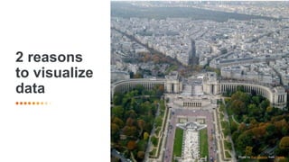
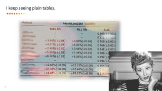
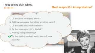
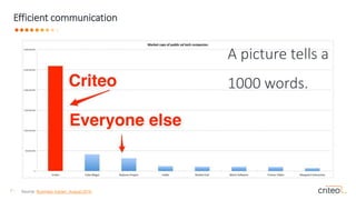
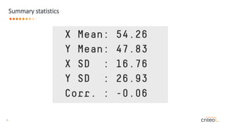
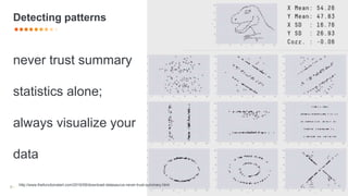
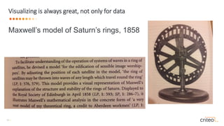
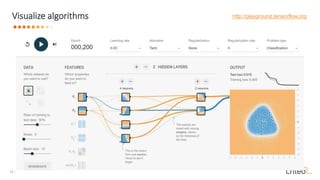
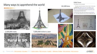
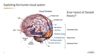
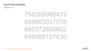
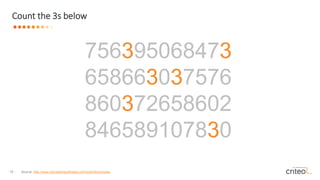
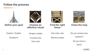
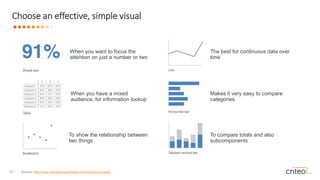
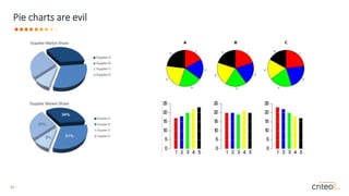
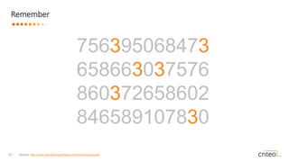
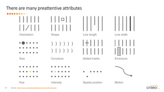
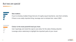
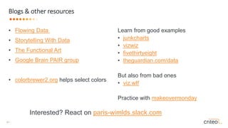
This document provides guidance on data visualization best practices. It discusses two main reasons to visualize data: for efficient communication and to detect patterns in data. It emphasizes exploiting the human visual system through techniques like Gestalt theory and preattentive attributes. The document provides tips on choosing effective visuals, focusing on the important information, removing clutter, and making visualizations accessible to broader audiences. Throughout, it stresses simplicity, truthful representation of data, and letting data drive visual design choices over aesthetics.
Why is it suboptimal to visualize data as plain figures? What is the purpose of data visualization? Why should you care? What is the interplay between statistics, data analysis, and a good marketing story? In this talk, I'll give some answers and try to convince you to adopt best practices in dataviz.
This slide deck gives a general overview of Data Visualization, with inspiring examples, the strength and weaknesses of the human visual system, a few technical frameworks that may be used for creating your own visualizations and some design concepts from the data visualization field.
Talk presented at the Houston UX Professional Association (H-UXPA) meeting on May 23, 2018
Abstract:
Data visualization is a general term to describe any effort to help people understand the significance of data by putting it in a visual context. Important stories live in our data, and data visualization is a powerful way to discover, understand, and share these stories with others. Conveying the meaning behind the story is most effective when the information is easily and rapidly grasped by our eyes so that our brains can readily understand. Executing this process effectively is much more a science than an art, and requires an understanding of how human perception works. Join me in this journey where we will walk through how our brains decode information and how we can leverage perceptual principles to create meaningful graphical interfaces between people and data.
Data visualization in data science: exploratory EDA, explanatory. Anscobe's quartet, design principles, visual encoding, design engineering and journalism, choosing the right graph, narrative structures, technology and tools.
A deep dive in data visualization covering some handful tools like Advance excel, Tableau, Qliksense etc.
You can add more content like discussing Google API, Perception and cognition theory,some more readable formats for data visualization and its framework.
A presentation presented by myself at the recent IEB Mathematics regional conference held on 10 February 2018 about the importance of Theory in Mathematical problem solving
A short workshop from MERL Tech 2016 on how we can think more purposefully about telling stories with our data and designing visualizations to bring those stories to life in global health and development.
This talk addresses the importance of being able to paint a clear picture with data and the foundational aspects of communicating data, giving a comprehensive overview of the field of information visualization, and introducing its goals, techniques, and applications. We will swiftly cover the necessary knowledge to reason about the appropriate visual encoding for each given problem and to make better choices regarding issues such as color, interaction, and tools
Data visualization has become increasingly more important and sits at the center of how people learn about and experience the world. We process information about politics, business insights and every day decisions through “visual soundbites”. As data journalists, we have incredible power to both positively influence as well as misguide conversations with the choices that we make when presenting graphical results.
In this presentation, we will share some of the best practices that help deliver stories that matter and avoid creating those that mislead.
A data visualisation story - top tips from the Guardian Masterclass. Creative...CharityComms
Horacio Herrera-Richmond, design manager, Anthony Nolan
Visit the CharityComms website to view slides from past events, see what events we have coming up and to check out what else we do: www.charitycomms.org.uk
This is a presentation I gave on Data Visualization at a General Assembly event in Singapore, on January 22, 2016. The presso provides a brief history of dataviz as well as examples of common chart and visualization formatting mistakes that you should never make.
2-day workshop in August of 2019 for NGO staff in Hyderabad.
Over the last decade, the social good sector has rapidly adopted data as a main tool to help accomplish their mission. Whether driven by funder requirements, or internal measurement-focused motivations, CSOs from every sector now use data in a wide variety of pro-social ways. However, this can be a struggle on limited budgets, in low data-literacy settings, and with communities victimized by data efforts in the past.
Come join us for a workshop on new approaches to using data within non-profit settings. We will explore a wider approach to involving communities in all stages of the data pipeline, inspirational low-tech examples, and ways to create and measure effective data storytelling. You’ll walk away with new participatory data activities, a tool belt for more creative and appropriate data storytelling, and experience applying the to your data needs and concerns.
Qualitative data definition and examples. Qualitative metaphors. Data visualization & journalism. Common kinds: mind maps, flow diagrams, words cloud, user journey, tube map, maps. Qualitative chart chooser
Data visualization & Story Telling with DataDr Nisha Arora
Storytelling with data using the appropriate visualization is a skill that is well sought-after for data-driven decision making and it spans many industries and roles (technical/non-technical).
In this presentation, we will briefly discuss the importance of understanding the context, selecting the right visuals, key points for effectively using those for storytelling, design dos, and don’ts, etc.
Designing with Data: Creating Visualizations to Tell Your StoryDominic Prestifilippo
A presentation explaining the importance of visualizations. I begin by reviewing some general theories about translating data into visuals, and then dive deeper into some specifics for using qualitative and quantitative information to tell your story. Finally I close by discussing some more technical details that everyone making visualizations should be aware of.
It was geared towards an internal audience that has varying levels of technical understanding regarding the artistic, psychological, and narrative principles that inform well made visualizations and infographics.
Similar to Data is beautiful, please don't ruin it (20)
From DevOps to MLOps: practical steps for a smooth transitionAnne-Marie Tousch
Abstract: There has been tremendous progress in artificial intelligence recently. There's no doubt one day it will also power Datadog products and you'll have to deal with it in your pipelines. What is it going to change? In this talk, I'll explain what makes ML fundamentally different than software engineering, and present a few of the operational challenges of setting up a machine learning system in the real world. Most importantly, I’ll propose practical steps to prepare the transition, that do not require you having a machine model running yet.
This talk was given at a Ladies of Code Meetup in Paris, in May 2023.
Recording: https://www.youtube.com/watch?v=S9l8GO4wtdY
Meetup: https://www.meetup.com/fr-FR/ladies-of-code-paris/events/293711765/
How often do you ask yourself this question? In this talk, I’ll use it as a guide and walk you through a few interesting problems that we have at Datadog around anomaly detection in time series. We’ll see how this questioning can help us improve our understanding on a variety of topics such as when to use machine learning, how to select the best algorithm for a problem, when to publish a paper, or how to build useful products.
Meetup talk from https://www.meetup.com/fr-FR/pyladiesparis/events/297190950/
As a machine learning practitioner, you probably have met people asking the question: how can I use machine learning to solve my problem? In this talk, we'll present a few of the challenges of setting up a machine learning pipeline in the real world. We'll explain why it is fundamentally different from a typical software engineering pipeline. And we'll (try to) give a few best practices to help software engineers "think ML" and prepare their collaboration with data scientists.
Recording: https://youtu.be/TZOWthpeqUY?si=MxQfT9FhPSx7fc1X&t=481
Levelwise PageRank with Loop-Based Dead End Handling Strategy : SHORT REPORT ...Subhajit Sahu
Abstract — Levelwise PageRank is an alternative method of PageRank computation which decomposes the input graph into a directed acyclic block-graph of strongly connected components, and processes them in topological order, one level at a time. This enables calculation for ranks in a distributed fashion without per-iteration communication, unlike the standard method where all vertices are processed in each iteration. It however comes with a precondition of the absence of dead ends in the input graph. Here, the native non-distributed performance of Levelwise PageRank was compared against Monolithic PageRank on a CPU as well as a GPU. To ensure a fair comparison, Monolithic PageRank was also performed on a graph where vertices were split by components. Results indicate that Levelwise PageRank is about as fast as Monolithic PageRank on the CPU, but quite a bit slower on the GPU. Slowdown on the GPU is likely caused by a large submission of small workloads, and expected to be non-issue when the computation is performed on massive graphs.
6. 6 •
I keep seeing plain tables.
Do they want me to read all this?
Did they copy-paste their slides from their paper?
Do they care about their audience?
Do they care about giving this talk?
Are they hiding something?
Do they realize a dataviz would be much more
powerful?
Most respectful interpretation?
9. 9 •
never trust summary
statistics alone;
always visualize your
data
Detecting patterns
http://www.thefunctionalart.com/2016/08/download-datasaurus-never-trust-summary.html
13. 13 • Pictures credits : Wiki Commons / the_jetboy CC2.0 / Sandor Vamos / Wiki Commons / Acute3D / Walkerssk / Pixabay / Wiki Commons / Wiki Commons
Many ways to apprehend the world
7,000,000 visitors a year2,500,000 rivets
10,100 tons
21. 21 •
Define your goal Choose an
effective visual
Find the right
focus
Close the loop
Explore / Explain
Question?
Simple is better
Function first,
form next
Use color, size
Remove clutter
Do you answer your
question?
Do you have a
story?
Follow the process
22. 22 •
Follow best practices
Actively take control
Think accessibility
Use rules of thumbs
Be truthful
23. 23 •
When you want to focus the
attention on just a number or two
When you have a mixed
audience, for information lookup
To show the relationship between
two things
The best for continuous data over
time
Makes it very easy to compare
categories
To compare totals and also
subcomponents
Choose an effective, simple visual
Source: http://www.storytellingwithdata.com/book/downloads
26. 26 •
There are many preattentive attributes
Source: http://www.storytellingwithdata.com/book/downloads
27. 27 •
But two are special
Colour is the most powerful tool you have.
Use it sparingly and resist the urge to use colour for the sake of being colourful.
Leverage colour selectively to highlight the important parts of your visual.
Size matters.
If you’re showing multiple things that are of roughly equal importance, size them similarly.
If there is one really important thing, leverage size to indicate that: make it BIG!
28. 28 •
Maximise data-ink ratio, within
reason.
Edward Tufte, The Visual Display of Quantitative Information
29. 29 •
Forgo chartjunk, including
moiré vibration, the grid, and the duck.
Edward Tufte, The Visual Display of Quantitative Information
37. 37 •
You should care
It’s not only about nice graphics
There’s a wealth of resources
Well-grounded best practices
38. Further tips
Highlight the important stuff
Eliminate distractions
Create a visual hierarchy of
information
Make it accessible
1
2
3
4
Only highlight 10% of the overall visual. Use preattentive attributes to do so, even together
for very important stuff
When detail isn’t needed, summarize. Ask yourself if eliminating this would change
anything. If not, take it out. Push less impacting items to the background with light grey
Organize information to guide the audience. Follow a Z-pattern from top left to bottom right.
You might be an engineer, but it shouldn’t take someone with an engineering degree to
understand your graph.
Use simple language5
Choose simple language over complex, choose fewer words over more words, define any
specialized language with which your audience may not be familiar, and spell out
acronyms.
Be mindful of aestethics6
Be smart with colors. Pay attention to alignment to give a sense of unity and cohesion.
Leverage white space, and don’t add stuff just to fill space
Always prefer simple over complex
39. 39 •
The Visual Display of Quantitative Information. Edward Tufte. Graphics Press, 2d edition,
2001. The classic on beautiful, faithful displays.
Visualization Analysis and Design. Tamara Munzner. AK Peters / CRC Press, Oct 2014. A
comprehensive textbook.
Visualize this: the FlowingData guide to design, visualization, and statistics. Nathan Yau. John
Wiley & Sons, 2011. For practical examples and code.
The Wall Street Journal Guide to Information Graphics: The Dos and Don'ts of Presenting
Data, Facts, and Figures. Dona M. Wong. W. W. Norton & Company, 2013.
Storytelling with Data: A Data Visualization Guide for Business Professionals. Cole
Nussbaumer Knaflic. Wiley, 2015.
Books
40. 40 •
Tukey, John W. "The future of data analysis." The annals of mathematical statistics 33.1 (1962): 1-67. pdf
Cleveland, William S., and Robert McGill. "Graphical perception: Theory, experimentation, and application to
the development of graphical methods." Journal of the American statistical association 79.387 (1984): 531-554.
pdf
Gelman, Andrew, Cristian Pasarica, and Rahul Dodhia. "Let's practice what we preach: turning tables into
graphs." The American Statistician 56.2 (2002): 121-130. pdf
Gelman, Andrew, and Antony Unwin. "Infovis and statistical graphics: different goals, different looks." Journal of
Computational and Graphical Statistics 22.1 (2013): 2-28. pdf
Gelman, Andrew, and Thomas Basbøll. "When do stories work? Evidence and illustration in the social
sciences." Sociological Methods & Research 43.4 (2014): 547-570. pdf
Maaten, Laurens van der, and Geoffrey Hinton. "Visualizing data using t-SNE." Journal of machine learning
research 9.Nov (2008): 2579-2605. pdf
Kim, Been, Rajiv Khanna, and Oluwasanmi O. Koyejo. "Examples are not enough, learn to criticize! criticism for
interpretability." Advances in Neural Information Processing Systems. 2016. pdf
Wongsuphasawat, Kanit, et al. "Visualizing Dataflow Graphs of Deep Learning Models in TensorFlow." IEEE
transactions on visualization and computer graphics 24.1 (2018): 1-12. pdf
Research papers
41. 41 •
• Flowing Data
• Storytelling With Data
• The Functional Art
• Google Brain PAIR group
• colorbrewer2.org helps select colors
Blogs & other resources
Learn from good examples
• junkcharts
• vizwiz
• fivethirtyeight
• theguardian.com/data
But also from bad ones
• viz.wtf
Practice with makeovermonday
Interested? React on paris-wimlds.slack.com
Why are we interested in data visualization?
Disclaimer: I’m not a dataviz specialist. My interest in the topic is fairly recent.
Out of curiosity, I animated the roundtable on data visualization at the first WiMLDS Paris Meetup… we had interesting discussions, and I bought one more book.
I did some more serious research after the Meetup. Read some books & papers.
To be honest, I didn’t find it mindblowing. The most disappointing is, yes, it takes lots of time and practice to do _really_ good dataviz. However, there are lots of easy-to-follow best practices.
What I found most shocking is, how little these basic best practices are actually followed by the machine learning experts, engineers, researchers etc. We should behave better towards our data. _I_ can do better.
There are much more than 2 reasons. But these ones I found important for anyone in data-related engineering/science/research.
These are the 2 reasons I'm giving this talk :-)
It might be OK in a paper which I can take the time to read carefully. Time is limited in a presentation. And it’s always precious.
What’s the most respectful interpretation?
Copy-pasting just means they rushed preparing the talk. So, … do they care?
Maybe people just don’t realize how powerful a good dataviz is to convey information.
Data visualisation is about communication: let people see by themselves what _you_ want to tell them.
This one is not even very good (and it’s a bit outdated). But it gets the message across.
When dealing with lots of data, it’s tempting to only look at summary statistics to analyse the data.
However, aggregated statistics can hide lots of patterns.
You can create a dataset that has the same summary statistics with a totally different underlying distribution.
An answer to:
What can you do to facilitate understanding?
If it was good for Maxwell, it certainly is good for me!
In machine learning, it's about explainability and interpretability.
Google is pushing it very far. ICML talk at workshop on Human Interpretability by Fernanda Viégas and Martin Wattenberg, Google Brain.
http://playground.tensorflow.org
We've been given 5 senses to explore the world and learn.
There are always different ways to explain / understand / explore the same place ==> or the same data.
https://www.quora.com/How-fast-is-the-human-visual-system-as-a-whole
"High-bandwidth channel to our brain" (Munzner) Parallel processing / preconscious level
Also role of iconic memory (https://en.wikipedia.org/wiki/Iconic_memory)
'Popout', 'grouping' => Gestalt theory
In the next slide do the same game
By highliting the 3 it was that much easier for our brain to spot them, even before we knew they were «3»
So we want to take advantage of our brain power. Let’s take a step back.
Dataviz is a tool for a purpose, don’t use it at random => Follow the process.
Side note: who is this Cail I just spotted on the Eiffel Tower? https://fr.wikipedia.org/wiki/Jean-Fran%C3%A7ois_Cail
Accessibility: eg colorblind friendly colors, police as big as possible.
Truthfulness: don’t truncate axis, state data sources.
« All things whatsoever ye would that men should do unto you, even so do ye also unto them ».
Tables may be useful when people may be looking for a specific figure – have them ordered in a sensible way for easy lookup!
Which is the bigger supplier?
Is the yellow share bigger than green?
Pie charts are tricky because we are much more capable to compare lengths than arcs or angles.
They are especially bad as a tool of comparison where bars are far superior in rapidity of insight.
By highliting the 3 it was that much easier for our brain to spot them, even before we knew they were «3»
Note as you scan across the attributes in Figure 4.4, your eye is drawn to the one element within each group that is different from the rest:
you don’t have to look for it. That’s because our brains are hardwired to quickly pick up differences we see in our environment.
Don’t overdo it with colors.
Think of colorblindess & other interpretations of colors (context matters).
Comparing different nearest neighbors algorithms (but who cares?)
Depending on the scale, your eyes may blink differently.
Note that matplotlib defaults have been improved a lot in the last 2 years.
I’m not a data viz expert. I still find it hard to have nice plots. But seaborn really makes it easy to get it clean.
Note that matplotlib defaults have been improved a lot in the last 2 years.
I’m not a data viz expert. I still find it hard to have nice plots. But seaborn really makes it easy to get it clean.
Also mention: ggplot, Tableau, and for interactive viz, Python Altair, d3js,
Note that matplotlib defaults have been improved a lot in the last 2 years.
I’m not a data viz expert. I still find it hard to have nice plots. But seaborn really makes it easy to get it clean.
We’re not done!
It’s not random
You should care
If you want to communicate results
If you want to know your data better
It’s not only about nice graphics
It’s about statistics
It’s about putting the human in the loop
It’s about asking the right questions
There’s a wealth of resources
It’s not easy to plot nice graphs
Follow best practices
Provided as a reference.
A very incomplete list, but these books were used in the preparation of (the previous versions of) this talk.
https://en.wikipedia.org/wiki/Jacques_Bertin
Tufte's duck: a really pretty house which is not a house anymore (not even windows, or on the wrong side!)
https://en.wikipedia.org/wiki/Big_Duck