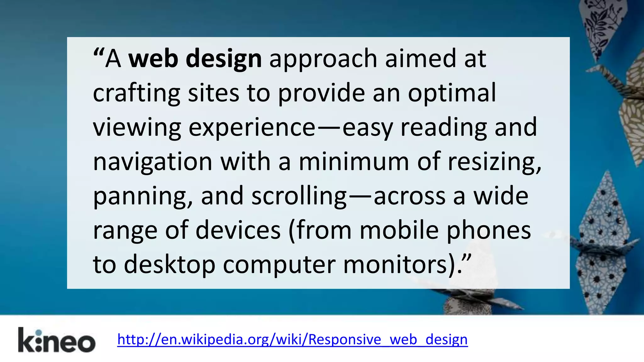
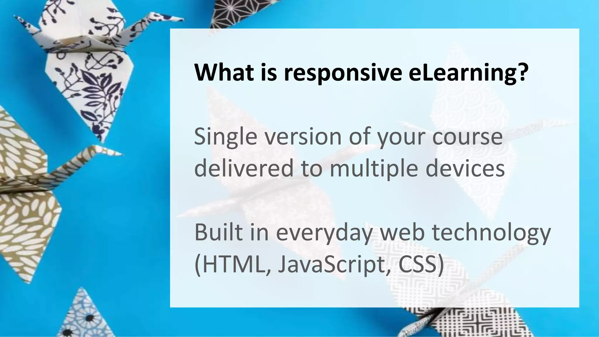
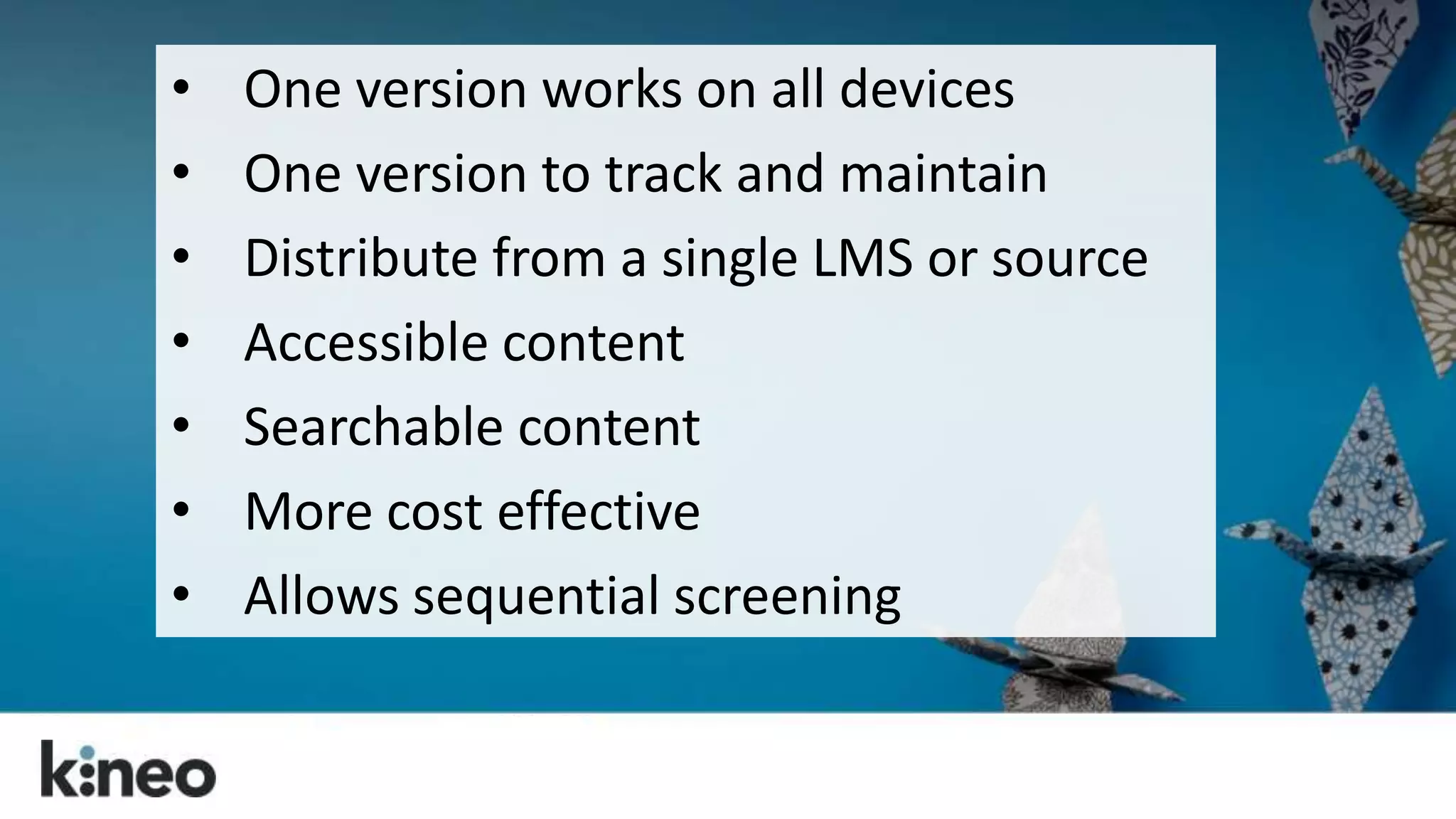
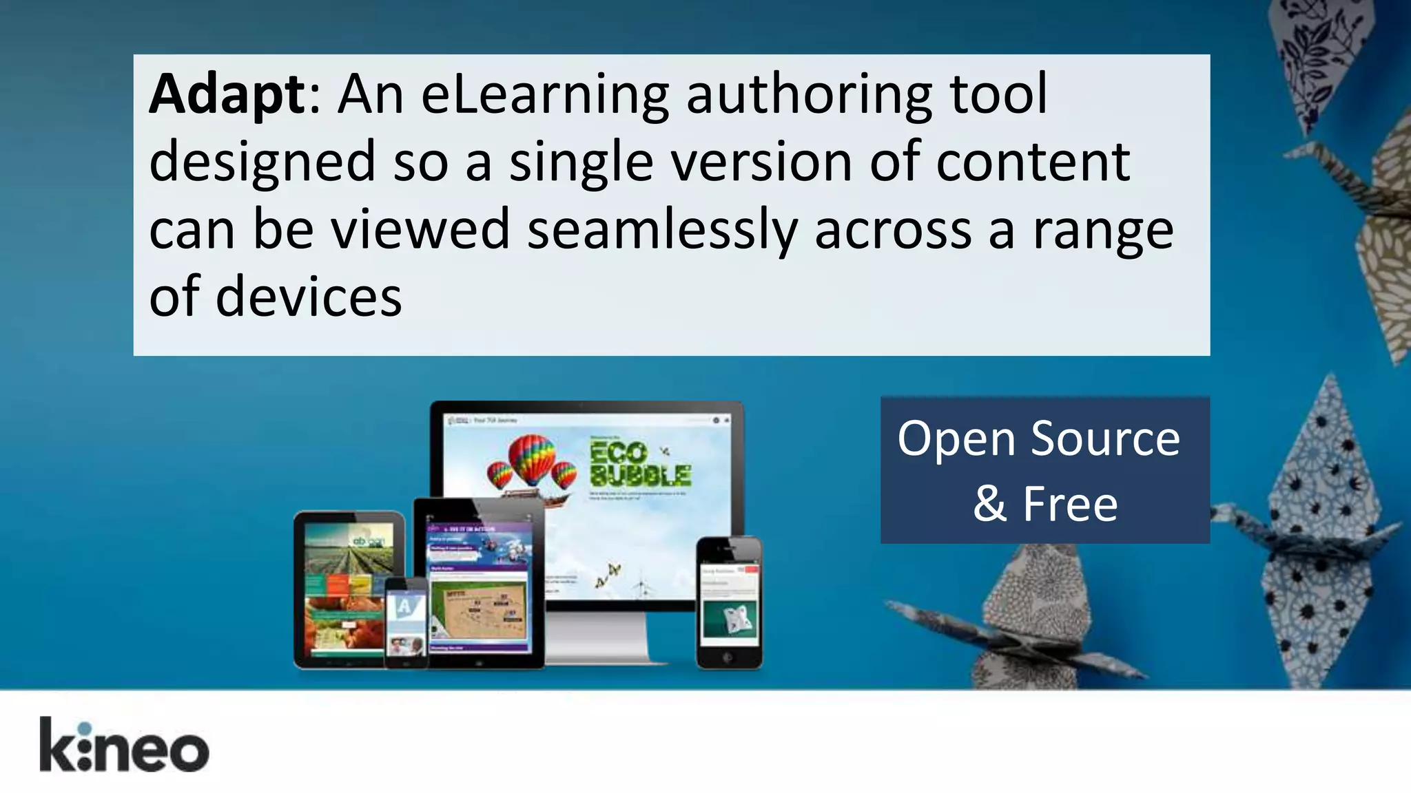
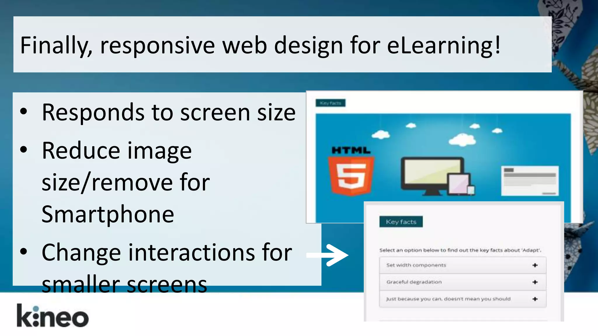
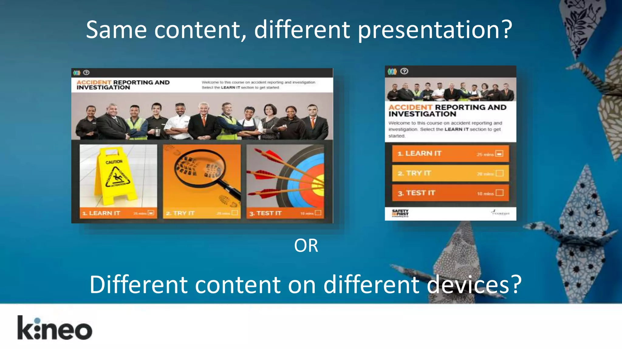
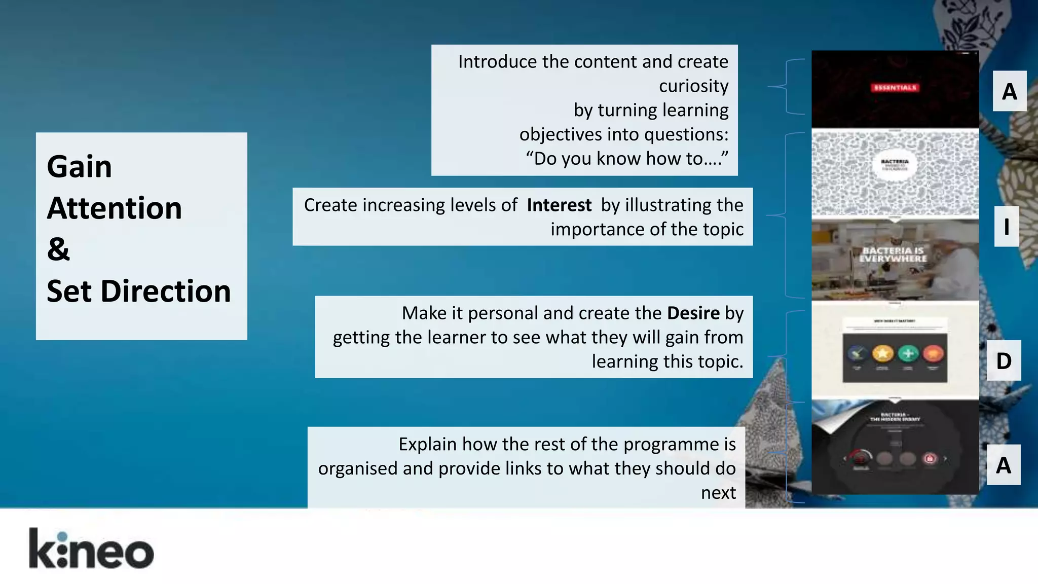
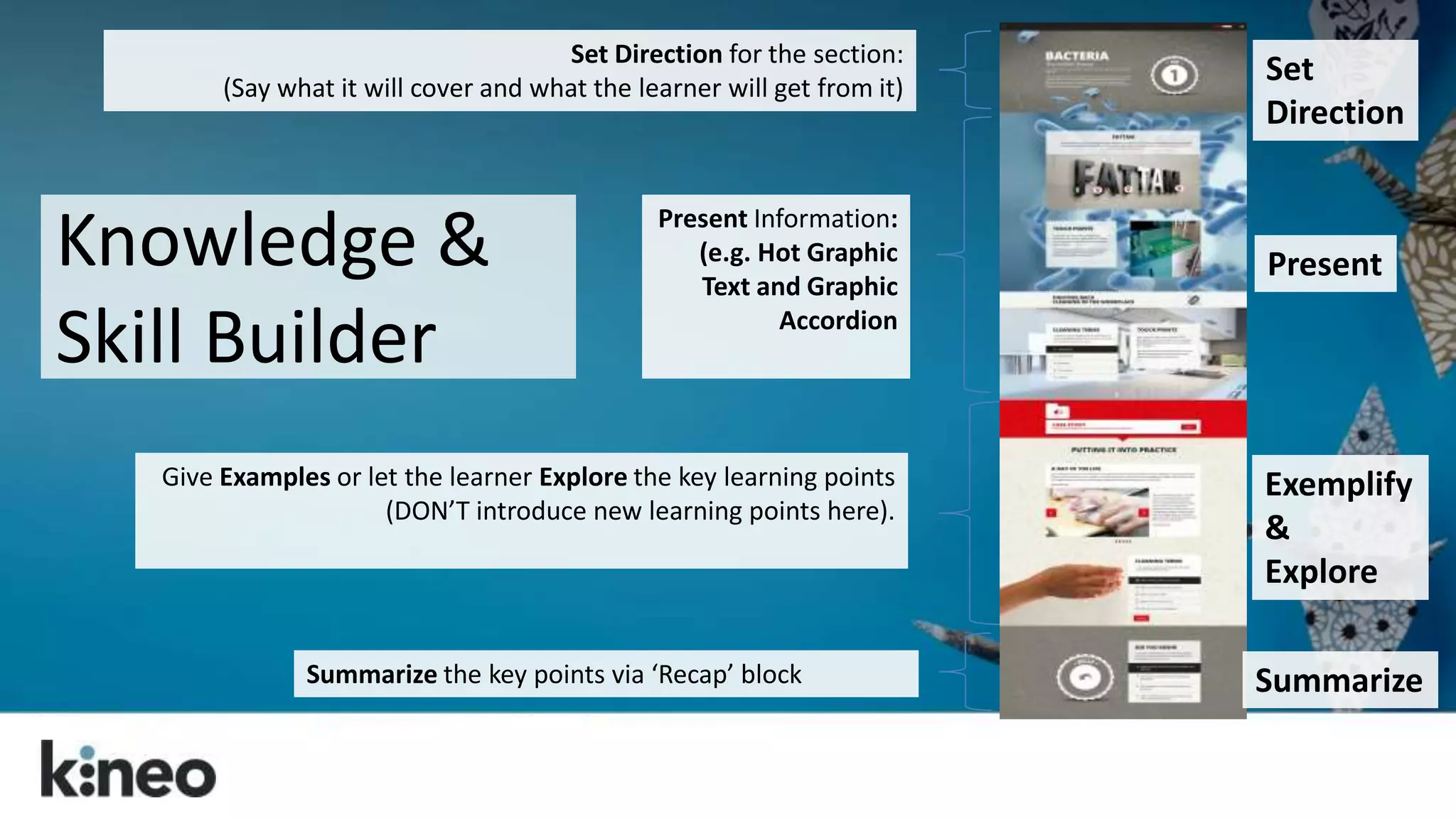
Top Tips 
for 
Responsive eLearning 
Instructional Design 
Cammy Bean 
DevLearn 2014
How many devices do you use in a 
typical day? 
(Desktop, laptop, smartphone, tablets) 
1) One 
2) Two 
3) Three 
4) More than 3
We live in a multi-device world. Deal with it.
What is this word “Responsive?”
Content that responds to your 
screen size. 
www.bostonglobe.com
“A web design approach aimed at 
crafting sites to provide an optimal 
viewing experience—easy reading and 
navigation with a minimum of resizing, 
panning, and scrolling—across a wide 
range of devices (from mobile phones 
to desktop computer monitors).” 
http://en.wikipedia.org/wiki/Responsive_web_design
How do you build responsive sites? 
Think WEB DESIGN tools. 
HTML, jQuery, CSS, JSON…and other 
things I can’t explain…
≠ Responsive
Responsive web design can take more 
time…and budget. 
But it can be worth it.
From web design to eLearning design…
Consider first: Do you need to deliver 
eLearning that only works on one device 
or on multiple devices?
are you creating 
content?
http://cammybean.kineo.com/2014/05/whats-your-technology-mix-for-learning.html
How will your audience use their devices? 
Know your use cases.
It’s a grand convergence: smart phones, large 
phones (phablets), tablets with keyboards, laptops 
with touch screens.
“Making mLearning Usable: How We Use Mobile Devices”, 
Steven Hoober with Patti Shank, PhD, CPT, eLearning Guild Research Report, 2014.
What is responsive eLearning? 
Single version of your course 
delivered to multiple devices 
Built in everyday web technology 
(HTML, JavaScript, CSS)
• One version works on all devices 
• One version to track and maintain 
• Distribute from a single LMS or source 
• Accessible content 
• Searchable content 
• More cost effective 
• Allows sequential screening
So let’s change how we think 
about eLearning design.
Just because you can, doesn’t 
mean you should. 
Making the entire course 
available on mobile may not be 
the best approach…. 
Think through your use cases!
Put scrolling at the heart of your 
design. 
Your learners are already doing it! 
Make the navigation meaningful! 
Liberate yourself from the fold!
Let them scroll. Amazon does.
Scrolling Works 
Volvo site had car model information 
using click to go to next page 
Users only saw 18% of the content 
Changed to one long scrolling page 
46% of users now view the content
Web designers have transformed the 
page with the scroll. 
http://www.dangersoffracking.com/
They’ve found ways to set their content 
free. 
http://titanic.q-music.be/
We can do the same with eLearning!
Side bar note…
Adapt: An eLearning authoring tool 
designed so a single version of content 
can be viewed seamlessly across a range 
of devices 
Open Source 
& Free
Finally, responsive web design for eLearning! 
• Responds to screen size 
• Reduce image 
size/remove for 
Smartphone 
• Change interactions for 
smaller screens
Back to our tips…
Control the scroll. 
We’ve unlocked the 
scroll bar, but keep 
a “page” to a single 
learning objective 
or activity.
Think mobile first. 
Think about how 
your design and 
learning model will 
work on mobile.
Same content, different presentation? 
OR 
Different content on different devices?
Visualize the big picture. 
Think about how the 
layout and the visual 
treatment of the entire 
page can be used to 
support the content.
Pull them down the 
page. 
Tell a story by weaving 
the content, the 
graphics, and the 
navigation together.
Remember the people, man! 
Create well-structured content 
that follows a solid learning 
model. 
Don’t forget the instructional 
design!
A I D A
Gain 
Attention 
& 
Set Direction 
Introduce the content and create 
curiosity 
by turning learning 
objectives into questions: 
“Do you know how to….” 
Create increasing levels of Interest by illustrating the 
importance of the topic 
Make it personal and create the Desire by 
getting the learner to see what they will gain from 
learning this topic. 
Explain how the rest of the programme is 
organised and provide links to what they should do 
next 
A 
I 
D 
A
Attention
Interest
Desire
Action
Set Direction for the section: 
(Say what it will cover and what the learner will get from it) 
Summarize the key points via ‘Recap’ block 
Present 
Exemplify 
& 
Explore 
Present Information: 
(e.g. Hot Graphic 
Text and Graphic 
Accordion 
Give Examples or let the learner Explore the key learning points 
(DON’T introduce new learning points here). 
Set 
Direction 
Summarize 
Knowledge & 
Skill Builder
Observe and Analyze 
Audio to introduce 
a Case Study 
Narrative presents the 
example or 
case study 
M/C Question based 
on the case study 
Observe 
Analyze/Rate 
Decide/Reflect 
Your possible options here:
Learn and Apply…Challenge and Support
Consider the graphics. 
If you shrink that image 
down for mobile will it 
still be meaningful? 
Create separate versions 
of images – not just 
different sizes of the 
same image.
Consider the download 
time. 
No matter the device, a 
responsive site always 
downloads the entire 
CSS file. ALL images!
Plan your time and 
budget accordingly. 
It may take more time to 
design…and more 
testing!
Wireframe it. 
Work out your layout 
ideas early… 
…and then share them.
Prototype, test and share. 
Talk to your Front End Developers. 
Early proof of concept and full QA 
on all target devices. 
Engage your learners. 
Share and seek feedback.
??? 
@steverayson
Hey, look. 
I wrote a book! 
Available now: 
http://www.astd.org/Publications/Books/The-Accidental-Instructional-Designer and on Amazon
Cammy Bean 
twitter: @cammybean 
blog: http://cammybean.kineo.com 
References and more on responsive design: 
http://www.diigo.com/list/cammybean/design 
The Accidental Instructional Designer: 
http://www.astd.org/Publications/Books/The-Accidental-Instructional- 
Designer
Want to know more 
about Adapt?
Open source & free 
No vendor lock-in 
Fully responsive 
Industry standards 
Accessible 
Searchable 
Adopts web based scrolling principles 
https://community.adaptlearning.org/ 
Adapt
Why Open Source? 
We don’t compete on authoring tool 
We all want a great multi-device 
authoring tool 
Share investment 
No single company has monopoly on 
best ideas 
Give back to wider community
217 modules build 
and delivered 
70+ organisations 
using Adapt content 
45 plugins built 
and supported 
94,222 lines of code that 
took 24 years to write 
18,702 unique visitors 
across 145 countries 
7 active partners 
1,661 registered users
Adapt Technologies 
HTML5, Javascript & CSS 
Node.JS 
Bower, by Twitter 
Grunt.JS
Adapt Community Site 
The community site provides a 
place for everyone to discuss 
the project and discover more 
about using the framework.
Adapt Developer Site 
The developer site provides a 
place for technical discussion 
and access to the framework 
components.
What next… 
Join the Adapt Learning Community 
at adaptlearning.org 
Follow Adapt Learning on Twitter 
Check out our website for the latest 
multi-device case studies and 
updates

Top Tips for Responsive eLearning Design

  • 1.
    Top Tips for Responsive eLearning Instructional Design Cammy Bean DevLearn 2014
  • 2.
    How many devicesdo you use in a typical day? (Desktop, laptop, smartphone, tablets) 1) One 2) Two 3) Three 4) More than 3
  • 3.
    We live ina multi-device world. Deal with it.
  • 5.
    What is thisword “Responsive?”
  • 6.
    Content that respondsto your screen size. www.bostonglobe.com
  • 7.
    “A web designapproach aimed at crafting sites to provide an optimal viewing experience—easy reading and navigation with a minimum of resizing, panning, and scrolling—across a wide range of devices (from mobile phones to desktop computer monitors).” http://en.wikipedia.org/wiki/Responsive_web_design
  • 8.
    How do youbuild responsive sites? Think WEB DESIGN tools. HTML, jQuery, CSS, JSON…and other things I can’t explain…
  • 9.
  • 10.
    Responsive web designcan take more time…and budget. But it can be worth it.
  • 11.
    From web designto eLearning design…
  • 12.
    Consider first: Doyou need to deliver eLearning that only works on one device or on multiple devices?
  • 13.
  • 14.
  • 15.
    How will youraudience use their devices? Know your use cases.
  • 16.
    It’s a grandconvergence: smart phones, large phones (phablets), tablets with keyboards, laptops with touch screens.
  • 17.
    “Making mLearning Usable:How We Use Mobile Devices”, Steven Hoober with Patti Shank, PhD, CPT, eLearning Guild Research Report, 2014.
  • 18.
    What is responsiveeLearning? Single version of your course delivered to multiple devices Built in everyday web technology (HTML, JavaScript, CSS)
  • 19.
    • One versionworks on all devices • One version to track and maintain • Distribute from a single LMS or source • Accessible content • Searchable content • More cost effective • Allows sequential screening
  • 20.
    So let’s changehow we think about eLearning design.
  • 21.
    Just because youcan, doesn’t mean you should. Making the entire course available on mobile may not be the best approach…. Think through your use cases!
  • 22.
    Put scrolling atthe heart of your design. Your learners are already doing it! Make the navigation meaningful! Liberate yourself from the fold!
  • 23.
    Let them scroll.Amazon does.
  • 24.
    Scrolling Works Volvosite had car model information using click to go to next page Users only saw 18% of the content Changed to one long scrolling page 46% of users now view the content
  • 25.
    Web designers havetransformed the page with the scroll. http://www.dangersoffracking.com/
  • 26.
    They’ve found waysto set their content free. http://titanic.q-music.be/
  • 27.
    We can dothe same with eLearning!
  • 28.
  • 29.
    Adapt: An eLearningauthoring tool designed so a single version of content can be viewed seamlessly across a range of devices Open Source & Free
  • 30.
    Finally, responsive webdesign for eLearning! • Responds to screen size • Reduce image size/remove for Smartphone • Change interactions for smaller screens
  • 31.
    Back to ourtips…
  • 32.
    Control the scroll. We’ve unlocked the scroll bar, but keep a “page” to a single learning objective or activity.
  • 34.
    Think mobile first. Think about how your design and learning model will work on mobile.
  • 35.
    Same content, differentpresentation? OR Different content on different devices?
  • 36.
    Visualize the bigpicture. Think about how the layout and the visual treatment of the entire page can be used to support the content.
  • 38.
    Pull them downthe page. Tell a story by weaving the content, the graphics, and the navigation together.
  • 40.
    Remember the people,man! Create well-structured content that follows a solid learning model. Don’t forget the instructional design!
  • 41.
  • 42.
    Gain Attention & Set Direction Introduce the content and create curiosity by turning learning objectives into questions: “Do you know how to….” Create increasing levels of Interest by illustrating the importance of the topic Make it personal and create the Desire by getting the learner to see what they will gain from learning this topic. Explain how the rest of the programme is organised and provide links to what they should do next A I D A
  • 43.
  • 44.
  • 45.
  • 46.
  • 47.
    Set Direction forthe section: (Say what it will cover and what the learner will get from it) Summarize the key points via ‘Recap’ block Present Exemplify & Explore Present Information: (e.g. Hot Graphic Text and Graphic Accordion Give Examples or let the learner Explore the key learning points (DON’T introduce new learning points here). Set Direction Summarize Knowledge & Skill Builder
  • 48.
    Observe and Analyze Audio to introduce a Case Study Narrative presents the example or case study M/C Question based on the case study Observe Analyze/Rate Decide/Reflect Your possible options here:
  • 49.
  • 50.
    Consider the graphics. If you shrink that image down for mobile will it still be meaningful? Create separate versions of images – not just different sizes of the same image.
  • 51.
    Consider the download time. No matter the device, a responsive site always downloads the entire CSS file. ALL images!
  • 52.
    Plan your timeand budget accordingly. It may take more time to design…and more testing!
  • 53.
    Wireframe it. Workout your layout ideas early… …and then share them.
  • 54.
    Prototype, test andshare. Talk to your Front End Developers. Early proof of concept and full QA on all target devices. Engage your learners. Share and seek feedback.
  • 57.
  • 58.
    Hey, look. Iwrote a book! Available now: http://www.astd.org/Publications/Books/The-Accidental-Instructional-Designer and on Amazon
  • 59.
    Cammy Bean twitter:@cammybean blog: http://cammybean.kineo.com References and more on responsive design: http://www.diigo.com/list/cammybean/design The Accidental Instructional Designer: http://www.astd.org/Publications/Books/The-Accidental-Instructional- Designer
  • 60.
    Want to knowmore about Adapt?
  • 61.
    Open source &free No vendor lock-in Fully responsive Industry standards Accessible Searchable Adopts web based scrolling principles https://community.adaptlearning.org/ Adapt
  • 62.
    Why Open Source? We don’t compete on authoring tool We all want a great multi-device authoring tool Share investment No single company has monopoly on best ideas Give back to wider community
  • 63.
    217 modules build and delivered 70+ organisations using Adapt content 45 plugins built and supported 94,222 lines of code that took 24 years to write 18,702 unique visitors across 145 countries 7 active partners 1,661 registered users
  • 64.
    Adapt Technologies HTML5,Javascript & CSS Node.JS Bower, by Twitter Grunt.JS
  • 66.
    Adapt Community Site The community site provides a place for everyone to discuss the project and discover more about using the framework.
  • 68.
    Adapt Developer Site The developer site provides a place for technical discussion and access to the framework components.
  • 72.
    What next… Jointhe Adapt Learning Community at adaptlearning.org Follow Adapt Learning on Twitter Check out our website for the latest multi-device case studies and updates

Editor's Notes

  • #4 Learning has to work on multi-devices. Consumer’s expect it They want it when they need it On the device they are using – right now!
  • #5 Sequential screening is when you start an activity on one device and then move along to another. You start doing your shopping research on your phone, but then you want to get into the details and play around more and you move to your desktop.
  • #10 Misconception that HTML5 equals responsive design. This is just not true. Storyline can be published in HTML5 and can play on tablets, but that does not make it responsive. Captivate 8 says that it is responsive, and it is, more or less in that you can author for different “breakpoints”. That said, “Captivate doesn’t use standard web design methods to produce responsive design and therefore, may not be forward compatible.” Chad Udell, Float Learning
  • #15 Poll: http://cammybean.kineo.com/2014/05/whats-your-technology-mix-for-learning.html
  • #16 Airline pilots in the cockpit accessing manuals and checklists on their tablets; sales people in the field looking up product knowledge on their phones before a call; teachers going through a learning module at night on their couch from a tablet; a doctor accessing a product tutorial between patients from her tablet. What matters the most, is how we use them and when. Know your use cases.
  • #17 We have small smart phones, large phones (phablets), tablets with keyboards, laptops with touch screens.
  • #18 guildresearch_mobile2014.pdf page 17 of 49 So these are the types of questions and behaviors we should consider as we dive into “mobile” and multi-device delivery of content. learning
  • #25 Source?
  • #26 Note that this example isn’t “responsive” for all screen sizes. It adapts for desktop to tablet, but is not a great experience on a smartphone.
  • #27 This example is also not truly responsive, but meant to show the power of the scrolling navigation to unlock your user experience and flow through a narrative in a very different way.
  • #28 The increase space offered by scrolling pages offers learning designers several benefits, namely: the removal of unnecessary navigation (click next to continue) with pages being as long or as short as they need to be a more contemporary way of presenting information (learners are already scrolling when they’re on the web) More opportunities to present the learner journey in new and engaging ways
  • #33  Think about the length of your pages: Don’t make your pages too long. Each one of these scrolling pages would typically tackle a single learning objective. Anything longer than around 10 blocks and it’s probably getting to long. If the page has less interactivity and is more presentation you could probably make it slightly longer. Likewise if it’s a dense page, packed with interactions then it could maybe do with being a touch shorter. We’re trying to strike the balance between removing unnecessary navigation whilst not overloading the learner. Don’t cram scope by using interactive components when a simple presentation of text on an interesting background would be more appropriate. You have as much space as you need so use it and pick the right interaction to do a job for the learner. If you have a lot to say on a given objective you should definitely think about using submenus to break up your pages. (see below).
  • #34 https://clients.kineo.com/cityguilds/course/view.php?id=19 https://clients.kineo.com/cityguilds/file.php/19/review/140725_ken14140_m15_r364/index.html#/id/co-05
  • #35 How are your menus going to work on smartphone and tablet? There’s a lot less space to play with so it’s sensible to think through the mobile design first then think about how you can make use of the extra space on desktop rather than working up a great desktop design which just can’t be implemented on a screen 400 pixels wide. NB: Don’t forget there is no overstate/rollover on touch devices. Think about your treatment and learning model and consider whether they will work for mobile? Consider keeping pages short if it’s critical that the course is going to need to be completed on smartphone. Also remember that page background images will be removed on phones so ensure your treatment still works without these elements of the design. If you intend to offer reduced version of the course for mobile with perhaps some components or even entire pages or topics hidden then make sure you’ve thought through all the ramifications and the client understands the approach. Are you hiding some things from a mobile version? What will that do?
  • #37 Make use of the blank component to create a window through to the background image. This creates a sense of space, allowing your design to breathe as well as helping to create a flow down the page.
  • #39 Making navigation a part of the journey. Consider the visual elements to this learner journey. Lead the eye down the page with the art direction. Tell a story. Make it possible to dive deeper into the content by using triggered or revealed components as appropriate points in the journey. Look for opportunities to tell stories, particularly when you can weave the graphical backgrounds and the component content together to make the page a really coherent and well thought out experience for the learner. Building flexible content in small blocks and components
  • #41 We should continue to follow put the learner at the heart of what is produced; creating well-structured content that follows an appropriate learning model and which meets clearly defined objectives and is presented in a manner that resonates with the target audience. Adapt is a response to the changing nature of how our content is accessed and what our learners expect from their interactions with technology and whilst it presents us with opportunities to do things differently, best practice in instructional design should still underpin all that we do.
  • #42 AIDA – Attention, Interest, Desire, Action – we can still do this in a responsive eLearning program. It’s all about how you design your page and the components you use.
  • #44 Introduce the content and create curiosity by turning learning objectives into questions: “Do you know how to….”
  • #45 Create increasing levels of Interest by illustrating the importance of the topic
  • #46 Make it personal and create the Desire by getting the learner to see what they will gain from learning this topic.
  • #47 Inspire action. Set Direction. Explain how the rest of the programme is organised and provide links to what they should do next
  • #50 Analyse - to identify poor or best practice in a case study (matched to key principles) Rate - to decide how well a character performs in a scenario (in line with the key principles) Decide - to suggest the best way to respond to the situation (following the key principles) Reflect - to think about what they have seen and relate it to their own situation or needs
  • #54 Think about the length of your pages: Don’t make your pages too long. Each one of these scrolling pages would typically tackle a single learning objective. Anything longer than around 10 blocks and it’s probably getting to long. If the page has less interactivity and is more presentation you could probably make it slightly longer. Likewise if it’s a dense page, packed with interactions then it could maybe do with being a touch shorter. We’re trying to strike the balance between removing unnecessary navigation whilst not overloading the learner. Don’t cram scope by using interactive components when a simple presentation of text on an interesting background would be more appropriate. You have as much space as you need so use it and pick the right interaction to do a job for the learner. If you have a lot to say on a given objective you should definitely think about using submenus to break up your pages. (see below).
  • #55 You should build a technical prototype of the course that contains all the required functionality/styling so that you can carry out cross-browser compatibility testing in a timely manner. Different browsers will render the pages differently so best to tackle issues early and only once, rather than encounter them late in the day when it’s been replicated across multiple pages. IE8 will cause you problems. If it’s in the mix then design for it as your baseline and then look to add niceties as and when newer browsers are detected.
  • #57 The authoring tool interface is on its way!
  • #58 question
  • #64 Adapt went open source in Jan 2014. It caused quite a stir in the market FUNCTIONALITY EVEOLVES SO QUICKLY AND RPIDLY AS IT’S THE PRODUCT OF COIMMUNITY -25 years worth of code wouldn’t have been possible without collaboration of open source IMAGINE IF ADOBE CAPTIVATE AND ARTICULATE SOTRYLINE WERE WORKING TOGETHER ON A DEV TOOL INSTEAD OF COMPETING AGAINST EACH OTHER. THAT PLUS THAT ITS FREE MAKES ADPAT A UNIQUE OFFERRING
  • #67 http://community.adaptlearning.org
  • #70 The authoring tool interface is on its way!
  • #72 Its as simple as selecting a component