Download as PPSX, PPTX


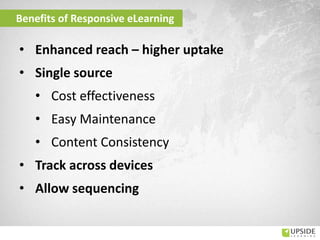

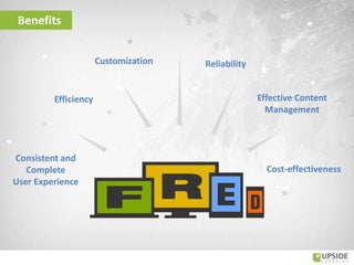


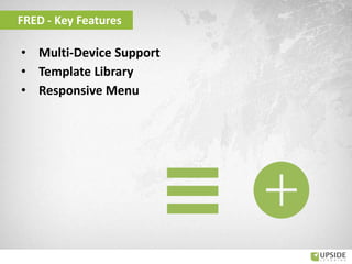
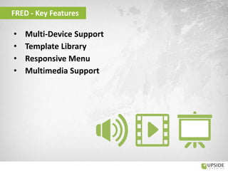
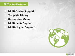
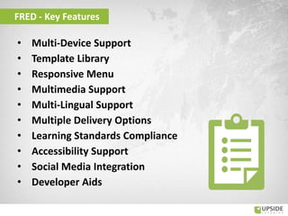
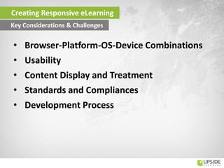
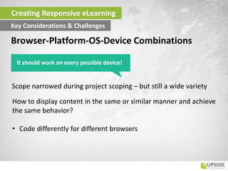


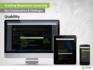
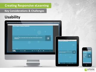
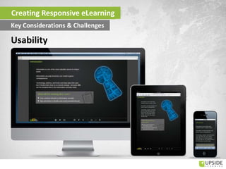
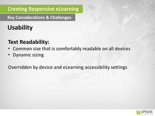

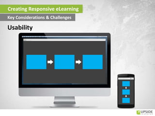

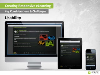
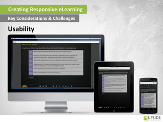


The document outlines the importance and benefits of responsive eLearning, emphasizing its ability to cater to various devices and improve accessibility for users. It details the challenges in creating responsive designs, such as browser compatibility and usability concerns, while showcasing a platform called 'fred' which supports multi-device learning. Through various polls and data, it highlights the growing reliance on mobile devices in professional settings and the necessity for learning solutions that can adapt across different platforms.


