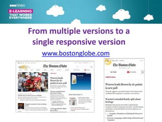
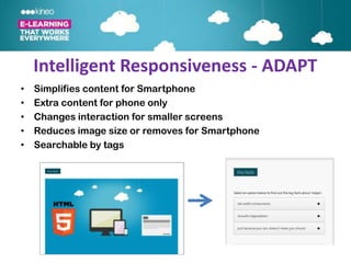
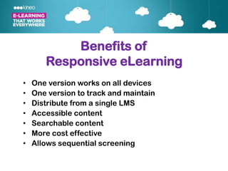
E-Learning in a
multi-device world
      Steve Rayson
http://www.worldofsuperheroes.com/wp-content/uploads/2012/04/phones.jpg
Today we will cover:

• How we use multiple devices
• How have online design technologies
  adapted to this?
• What does this mean for elearning?
How many devices do you use in a
         typical day?
  (Desktop, laptop, smartphones,
              tablets)

          •   One
          •   Two
          •   Three
          •   More than 3
• We live in a multi-device world


Google Survey - http://services.google.com/fh/files/misc/multiscreenworld_final.pdf
• We live in a multi-device world
MLearning Solutions – Vendor Hype?


Reality is not desktop v mobile but
       multi-device delivery
Web moving from mobile design to
         responsive multi-device design

Volume of Google
searches


Mobile web design
Responsive web design


      http://en.wikipedia.org/wiki/Responsive_Web_Design
From multiple versions to a single
      responsive version
         www.shell.com
From multiple versions to a
 single responsive version
   www.bostonglobe.com
New Scrolling Navigation
• Driven by scrolling
  on phones and
  tablets
• More elegant
• More exploratory
• No navigation
• Becoming a web
  norm
• Well known            http://titanic.q-music.be/
  scrolling advocates
  include Amazon,
Scrolling Example
HTML5 Interactivity
Implications for
  eLearning
Old World                    Publish to, or produce:
 Delivering to                 • native iPhone app
                               • native Blackberry app
Multiple Devices               • native Android app
                               • Flash version
                               • HTML version for iPads.


Even single source publishing still means different versions to
update and track. Can be further complicated if LMS tracking
required.
New world is responsive elearning design
One version that works on all devices regardless of
          screen size or Operating System


        • Why publish multiple versions?
  • Why develop a version that works only on one
                      device?
One version that responds,
  not multiple versions


 Fluid design, not fixed screen sizes
  Is it a dream? Let’s see a demo.
Intelligent Responsiveness - ADAPT
•   Simplifies content for Smartphone
•   Extra content for phone only
•   Changes interaction for smaller screens
•   Reduces image size or removes for Smartphone
•   Searchable by tags
Rethinking eLearning Design
• Shorter but deeper learner journeys
• Making navigation a meaningful part of the journey
  E.g. Titanic
• Searchable and reusable content objects or
  components
• Building content in small blocks
• Rethinking the journey on different devices –
  different content and content types
Benefits of
       Responsive eLearning
•   One version works on all devices
•   One version to track and maintain
•   Distribute from a single LMS
•   Accessible content
•   Searchable content
•   More cost effective
•   Allows sequential screening
The Future
• Advances in HTML5 have led to
  design innovations that challenge
  traditional e-learning design
• Though we cant be sure what the
  future holds, multi-device use is here
  to stay so we must adapt our current
  design methodologies
Common Questions
• Offline version
• IE6 needs fallback html
  version
• Access to phone
  functions
• Role of native apps
Designing for Multiple Devices?
•


•


•
Kineo - Global Leaders in eLearning


                          •
                          •
                          •
                          •
                          •
                          •
                          •
Thank you and please keep in touch…
•


•

•

•

•


•                 Learning Visions
Links
http://services.google.com/fh/files/misc/multiscreenworld_final.pdf

http://www.amazon.com/Kindle-Paperwhite-Resolution-Display-Built-
 /dp/B007OZNZG0/ref=sr_tr_sr_1?ie=UTF8&qid=1347890370&sr=8-
                     1&keywords=kindle

                       www.bostonglobe.com
             http://www.google.com/culturalinstitute/
                         www.shell.com
                         www.beetle.com
                http://www.dangersoffracking.com/
                      http://titanic.q-music.be/
HTML5 – Apps Debate
 http://mashable.com/2012/09/12/web-vs-native-apps/
http://www.businessinsider.com/html5-vs-apps-why-the-
debate-matters-and-who-will-win-2012-8#ixzz24yUXunf2

    http://learningandskillsgroup.ning.com/events/e-learning-in-a-multi-device-world

Designing and delivering elearning in a multi-device world

  • 1.
    E-Learning in a multi-deviceworld Steve Rayson
  • 2.
  • 3.
    Today we willcover: • How we use multiple devices • How have online design technologies adapted to this? • What does this mean for elearning?
  • 4.
    How many devicesdo you use in a typical day? (Desktop, laptop, smartphones, tablets) • One • Two • Three • More than 3
  • 5.
    • We livein a multi-device world Google Survey - http://services.google.com/fh/files/misc/multiscreenworld_final.pdf
  • 6.
    • We livein a multi-device world
  • 7.
    • We livein a multi-device world
  • 8.
    MLearning Solutions –Vendor Hype? Reality is not desktop v mobile but multi-device delivery
  • 9.
    Web moving frommobile design to responsive multi-device design Volume of Google searches Mobile web design Responsive web design http://en.wikipedia.org/wiki/Responsive_Web_Design
  • 10.
    From multiple versionsto a single responsive version www.shell.com
  • 11.
    From multiple versionsto a single responsive version www.bostonglobe.com
  • 12.
    New Scrolling Navigation •Driven by scrolling on phones and tablets • More elegant • More exploratory • No navigation • Becoming a web norm • Well known http://titanic.q-music.be/ scrolling advocates include Amazon,
  • 13.
  • 14.
  • 15.
  • 16.
    Old World Publish to, or produce: Delivering to • native iPhone app • native Blackberry app Multiple Devices • native Android app • Flash version • HTML version for iPads. Even single source publishing still means different versions to update and track. Can be further complicated if LMS tracking required.
  • 17.
    New world isresponsive elearning design One version that works on all devices regardless of screen size or Operating System • Why publish multiple versions? • Why develop a version that works only on one device?
  • 18.
    One version thatresponds, not multiple versions Fluid design, not fixed screen sizes Is it a dream? Let’s see a demo.
  • 19.
    Intelligent Responsiveness -ADAPT • Simplifies content for Smartphone • Extra content for phone only • Changes interaction for smaller screens • Reduces image size or removes for Smartphone • Searchable by tags
  • 20.
    Rethinking eLearning Design •Shorter but deeper learner journeys • Making navigation a meaningful part of the journey E.g. Titanic • Searchable and reusable content objects or components • Building content in small blocks • Rethinking the journey on different devices – different content and content types
  • 21.
    Benefits of Responsive eLearning • One version works on all devices • One version to track and maintain • Distribute from a single LMS • Accessible content • Searchable content • More cost effective • Allows sequential screening
  • 23.
    The Future • Advancesin HTML5 have led to design innovations that challenge traditional e-learning design • Though we cant be sure what the future holds, multi-device use is here to stay so we must adapt our current design methodologies
  • 24.
    Common Questions • Offlineversion • IE6 needs fallback html version • Access to phone functions • Role of native apps
  • 25.
    Designing for MultipleDevices? • • •
  • 26.
    Kineo - GlobalLeaders in eLearning • • • • • • •
  • 27.
    Thank you andplease keep in touch… • • • • • • Learning Visions
  • 28.
    Links http://services.google.com/fh/files/misc/multiscreenworld_final.pdf http://www.amazon.com/Kindle-Paperwhite-Resolution-Display-Built- /dp/B007OZNZG0/ref=sr_tr_sr_1?ie=UTF8&qid=1347890370&sr=8- 1&keywords=kindle www.bostonglobe.com http://www.google.com/culturalinstitute/ www.shell.com www.beetle.com http://www.dangersoffracking.com/ http://titanic.q-music.be/
  • 29.
    HTML5 – AppsDebate http://mashable.com/2012/09/12/web-vs-native-apps/ http://www.businessinsider.com/html5-vs-apps-why-the- debate-matters-and-who-will-win-2012-8#ixzz24yUXunf2 http://learningandskillsgroup.ning.com/events/e-learning-in-a-multi-device-world

Editor's Notes

  • #2 Welcome AND THANKS FOR COMING. I AM AWARE YOU’RE ON A BREAK, SO I’LL ENDEVOUR TO BE AS CONCISE AND VALUABLE AS POSSIBLEIts an EXCITING AND CHALLENGING TIME FOR ELEARNING WE’RE HERE TO TALK ABOUT ELEARNING IN A MULTIDEVICE WORLD – NOTE: NOT MLEARNING as you’ll see later…………………………
  • #3 Many would say that Apple kickstarted this journey with their innovative iPhones and iPads, so the link to what we will discuss today is clear – BUT REALLY, I HAVE BEEN LOOKING FOR AN EXCUSE TO SHARE THAT COMIC STRIP FOR AGES!Ok, lets get started…………………….
  • #4 Please note that we wont be doing a deep dive into the technical aspects of HTML5, rather into how these technical functionalities have contributed to new design principles
  • #5 Show of hands
  • #6 GOOGLE SURVEY ON HOW PEOPLE USE THEIR DEVICES LINK AT BOTTOM IF YOU WANT TO SEECAN SEND YOU SLIDE PACK VIA EMAILLAPTOP/DESKTOP:SeriousIntensiveTask-oriented workYOU SIT SOWN AT UR PC WHEN U HAVE WORK TO DO
  • #7 NO SURPRISES HERE WHEN WE LOOK AT HOW SM PHONES ARE USED:Mostly to communicate in short burstsinterestingly, most of the use is at home (twitter in front of TV)Also interestingly, most used of all devices
  • #8 -TABLETS PRIMARILY USED AT HOME TO BROWSE FOR LONGER PERIODS-MORE RELAXED LEAISURELY USESO ALL DEVICES AR USED DIFFERENTLY AND IN DIFFERENT CONTEXTS NO REAL SURPRISES,BUT WHAT DOES THIS MEAN FOR ELEARNING, AND ONLINE DESIGN IN GENERAL?…………………………..
  • #9 The DANGER IS PERCEPTION THAT THERE IS A BINARY SPLIT BTWN DESKTOP AND MOBILE LEARNING AND PUBLISHINGLHS: HTML AND FLASH FOR DESKTOP/LAPTOPRHS:APPS FOR IPJHONE, ANDROID AND BLACKBERY…………………………….A LOT OF HYPE AROUND MLEARNING, BUT RECENT STUDY WITH 35 ELEARNING DIRECTORS FOUND MLEARNING WASN’T AS SIGNIFICANT AS VENDORS WERE EXPECTINGWE PLAN TO MOVE TWRD IT, BUT NOT CRITICAL AT THIS STAGE………………………….REALITY IS MULTI-DEVICE DELIVERY FROM A SINGLE ITERATIONBUT HOW DO WE DO THIS? ONE OF THE ANSWERS IS RD……………………………………
  • #10  We did a search on Google trends Useful research tool to see what people are searching for 2010 – MORE FOR MLEARNING, LESS FOR RDSKIP TO 2011/2012 – ADVANCES IN HTML5 LED TO SIG INCREASED INTEREST IN RDBUT WHAT IS RD?………………
  • #11 HERE’S AN EXAMPLELSH: DESKTOPRHS: MOBILE/TABLET
  • #12 Connect TO GLOBEFLUID LAYOUTCOMPARE TO THE AGEBECOMING INCREASINGLY POPULAR – CMS LIKE DRUPAL HAVE RD TEMPLATES OUT OF THE BOXABOUT TO REDESIGN KINEO.COM AND WILL INCORPORATE RD
  • #13 Other things happening in web world which impact elearning = scrollingTRACKINGWhilst not all people scroll all the way down, 46% of users see the majority of the content. In the past, the typical user only saw 18% of the content of the relevant car chapter.SHOW TITANICARE YOU FREAKING OUT BECAUSE OF THE SCROLL BAR’S ASSOCIATION WITH POOR DESIGN? TIME TO CHALLENGE TRADITIONAL ELEARNING DESIGN - WE ARE USING HTML, NOT FLASH, SO WE NEED TO DRIVE ENGAGEMENT THROUGH GOOD DESIGNLETS LOOK AT ANOTHER EXAMPLE……
  • #14 Scrolling can drive engagement by presenting STATE CHANGESNAVIGATION BECOMES A FEATURE, NOT SIMPLY A DELIVERY TOOL
  • #15 Another exampleVISUAL MENU – DRAG SLIDER TO ACCESS ALL PARTS OF STORECAN SEE HOW HTML ALLOWS FOR MORE ENGAGING NAVIGATION THAN A SIMPLE NEXT CLICK – EQUALLY ENGAGING AS FLASH FROM THIS PERSPECTIVE
  • #16 SO 3 WEB TRENDS COMBINE TO IMPACT ELEARNINGRDINTERACTIVE HTMLSCROLLING HTMLLETS LOOK AT WHAT THIS MEANS IN MORE DETAIL
  • #17 Previously, delivering to multiple devices meantCREATINGMANAGINGTRACKINGOn multiple devices, WHAT DOES THE FUTURE HOLD?…..
  • #19 Here’s what we’ve been working on – WE DON’T HAVE ALL THE ANSWERS SO OPNIONS ARE WELCOMESHOW DEMO-BLOCKS OF CONTENTDYNAMIC CISPLAYCLICK T2ST1 – SHOW FEATURESAnimationGraphically activated textVideoMCQGraphicsCollasible textSHRINK SCREEN AND SHOW:Animation – static imageQ’s removedSearcheable tagsSupport accessible technologies eg screen reader
  • #20 We call this INTELLIGENT RESPONSIVENESSAND HAVE BUILT A FRAMEWORK CALLED ADAPT THAT ACHEIVES THIS
  • #22 One version works on all devices – FUTURE PROOOFINGOne version to track and maintain – DISTRIBUTED TO A SINGLE LMS, VS AN APP STORE AND TRY TO TRACKDistribute from a single LMSAccessible contentSearchable contentMore cost effective – still prototyping stage but so far costs are similar to FLASH; BROWSER TESTING TAKES LONGER, BUT ONCE ALL ARE WORKING DOESN’T COST MOREAllows sequential screening
  • #23 PEOPLE COMPLETE A SIGNLE TASK USING MULTIPLE DEVICES E.G. START NEWSPAPER ARTICLE ON PHONE, FINISH ON DESKTOP AT OFFICEFIGURE BASED ON GOOGLE RESEARCHSINGLE RESPONSIVE DESIGN MAKES TRACKING THIS ON A SINGLE VERSION MUCH EASIER
  • #25 Offline version – YES, U CAN DOWNLOAD AND COMPLETE A MODULE OFFLINE. IF YOU WANT TO TRACK, NEED TO DO THIS IN A PLAYER APP, SO NEXT TIME YOU’RE BACK ONLINE, TRACKING DATA IS SENTIE6 –BIG BUG BEAR, SOME CLIENTS STILL ON THIS EVEN THOUGH THIS IS OVER 13 YRS OLD AND NO LONGER SUPPORTED BY MICROSOFT. ISSUE IS IE6 DOESN’T SUPPORT HTML 5. TO ACCOMMODATE THEM, WE HAVE A FALLBACK VERSION WHICH DEGRADES TO IE6 SUPPORTED VERSIONAccess to phone functions – EG PHOTOS WITH CAMERA ARE RESTRICTED AS UR USING A WEB APP, NOT A NATIVE APPRole of native apps – used for performance support, less tracking, updating;on right is an APP we have created for Nikon staff to use in store