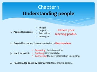
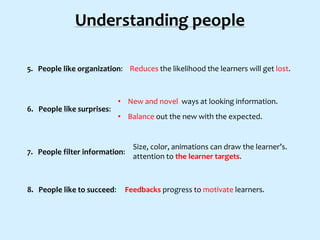
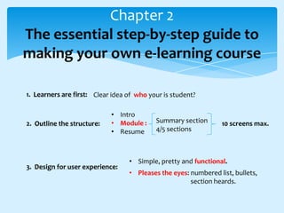
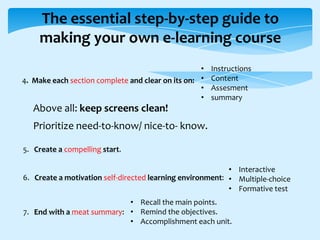
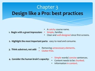
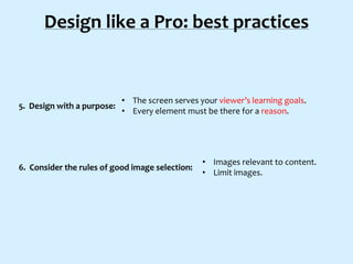
GUIDE TO E-LEARNING DESIGN
SIMPLE, QUICK, AND POWERFUL TIPS FOR NON-DESIGNERS

Elearning

never
sleeps

PUBLISHED BY:
BASED ON: THE ULTIMATE D.I.Y. GUIDE TO E-LEARNING DESIGN

SH!FT
DISRUPTIVE ELEARNING
Chapter 1
Understanding people

1. People like people:

•
•
•
•

Images
Graphics
Animations
messages

Reflect your
learning profile.

2. People like stories: draw upon stories to illustrate dates.
• Repeating the information.
3. Use it or lose it: • Applying it immediately.
• Connecting the new information to existing.
4. People judge books by their covers: font, images, colors…
Understanding people
5. People like organization: Reduces the likelihood the learners will get lost.

6. People like surprises:

• New and novel ways at looking information.
• Balance out the new with the expected.

7. People filter information:

8. People like to succeed:

Size, color, animations can draw the learner’s.
attention to the learner targets.

Feedbacks progress to motivate learners.
Chapter 2
The essential step-by-step guide to
making your own e-learning course
1. Learners are first: Clear idea of who your is student?

2. Outline the structure:

• Intro
• Module :
• Resume

3. Design for user experience:

Summary section
4/5 sections

10 screens max.

• Simple, pretty and functional.
• Pleases the eyes: numbered list, bullets,
section heards.
The essential step-by-step guide to
making your own e-learning course
•
4. Make each section complete and clear on its on: •
•
•

Instructions
Content
Assesment
summary

Above all: keep screens clean!
Prioritize need-to-know/ nice-to- know.
5. Create a compelling start.
• Interactive
6. Create a motivation self-directed learning environment: • Multiple-choice
• Formative test
• Recall the main points.
7. End with a meat summary: • Remind the objectives.
• Accomplishment each unit.
Chapter 3
Design like a Pro: best practices
• A catchy course name.
1. Begin with a great impression: • Simple, familiar.
• Clear and well-designed since first screens.
2. Highlight the most important parts: easy to read and consume.
3. Think substract, not add:

• Removing unnecessary elements.
• Clutter-free.

4. Consider the human brain’s capacity:

• Simple words/ concise sentences.
• Content needs to be chunked.
• Information in context.
Design like a Pro: best practices

5. Design with a purpose:

• The screen serves your viewer’s learning goals.
• Every element must be there for a reason.

6. Consider the rules of good image selection:

• Images relevant to content.
• Limit images.
Chapter 4
Things experts can teach you about
elearning design
1. Great design is getting people do what you want them to

2. Design is form and function combined:

Design is how it works

3. Design is the whole, the sum total of all parts
• Feel accomplished after finish
4. Usable design considers people’s emotions
every section.
• Emotionally-charged images.
• To tell stories that evoke relevant
memories.
Chapter 5
Tips for non-designers
• Text and images work better together.
1. Use strong images: • Relevant images instead of rows of bullet points.
• Impacful, images that evoke possitive emotional response.

INSERT PHOTOS INSTEAD OF CLIP ART!
CLIP ART HD IMAGES AVOID GENERIC ONES!
2. Be consistent: sitck to a scheme (a slide layout).

3. Keep titles simples and informative: Simple and precise words.
Tips for non-designers
4. Design a distraction-free templete: peel away the unnecessary elements.

• Text: black (dark color).
5. Use color effectively: • Background: soft tones.
• Not use more than three colors.

6. Empty spaces matters:

Empty spaces as important as content.

Help to us what’s important
and what to focus on.
Tips for non-designers
7. Break up text:

• Break idea into short bloks of text ans spaces between.
• Lists, tables, paragraphs.

8. Keep your lists short

9. Simplifly your visual data

10. Make it easier for your audience to focus

Every element plays a role on:
Learner’s goal / your main objetives.

GUIDE TO E-LEARNING DESIGN FOR NON-DESIGNERS

  • 1.
    GUIDE TO E-LEARNINGDESIGN SIMPLE, QUICK, AND POWERFUL TIPS FOR NON-DESIGNERS Elearning never sleeps PUBLISHED BY: BASED ON: THE ULTIMATE D.I.Y. GUIDE TO E-LEARNING DESIGN SH!FT DISRUPTIVE ELEARNING
  • 2.
    Chapter 1 Understanding people 1.People like people: • • • • Images Graphics Animations messages Reflect your learning profile. 2. People like stories: draw upon stories to illustrate dates. • Repeating the information. 3. Use it or lose it: • Applying it immediately. • Connecting the new information to existing. 4. People judge books by their covers: font, images, colors…
  • 3.
    Understanding people 5. Peoplelike organization: Reduces the likelihood the learners will get lost. 6. People like surprises: • New and novel ways at looking information. • Balance out the new with the expected. 7. People filter information: 8. People like to succeed: Size, color, animations can draw the learner’s. attention to the learner targets. Feedbacks progress to motivate learners.
  • 4.
    Chapter 2 The essentialstep-by-step guide to making your own e-learning course 1. Learners are first: Clear idea of who your is student? 2. Outline the structure: • Intro • Module : • Resume 3. Design for user experience: Summary section 4/5 sections 10 screens max. • Simple, pretty and functional. • Pleases the eyes: numbered list, bullets, section heards.
  • 5.
    The essential step-by-stepguide to making your own e-learning course • 4. Make each section complete and clear on its on: • • • Instructions Content Assesment summary Above all: keep screens clean! Prioritize need-to-know/ nice-to- know. 5. Create a compelling start. • Interactive 6. Create a motivation self-directed learning environment: • Multiple-choice • Formative test • Recall the main points. 7. End with a meat summary: • Remind the objectives. • Accomplishment each unit.
  • 6.
    Chapter 3 Design likea Pro: best practices • A catchy course name. 1. Begin with a great impression: • Simple, familiar. • Clear and well-designed since first screens. 2. Highlight the most important parts: easy to read and consume. 3. Think substract, not add: • Removing unnecessary elements. • Clutter-free. 4. Consider the human brain’s capacity: • Simple words/ concise sentences. • Content needs to be chunked. • Information in context.
  • 7.
    Design like aPro: best practices 5. Design with a purpose: • The screen serves your viewer’s learning goals. • Every element must be there for a reason. 6. Consider the rules of good image selection: • Images relevant to content. • Limit images.
  • 8.
    Chapter 4 Things expertscan teach you about elearning design 1. Great design is getting people do what you want them to 2. Design is form and function combined: Design is how it works 3. Design is the whole, the sum total of all parts • Feel accomplished after finish 4. Usable design considers people’s emotions every section. • Emotionally-charged images. • To tell stories that evoke relevant memories.
  • 9.
    Chapter 5 Tips fornon-designers • Text and images work better together. 1. Use strong images: • Relevant images instead of rows of bullet points. • Impacful, images that evoke possitive emotional response. INSERT PHOTOS INSTEAD OF CLIP ART! CLIP ART HD IMAGES AVOID GENERIC ONES! 2. Be consistent: sitck to a scheme (a slide layout). 3. Keep titles simples and informative: Simple and precise words.
  • 10.
    Tips for non-designers 4.Design a distraction-free templete: peel away the unnecessary elements. • Text: black (dark color). 5. Use color effectively: • Background: soft tones. • Not use more than three colors. 6. Empty spaces matters: Empty spaces as important as content. Help to us what’s important and what to focus on.
  • 11.
    Tips for non-designers 7.Break up text: • Break idea into short bloks of text ans spaces between. • Lists, tables, paragraphs. 8. Keep your lists short 9. Simplifly your visual data 10. Make it easier for your audience to focus Every element plays a role on: Learner’s goal / your main objetives.