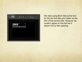
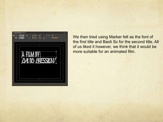
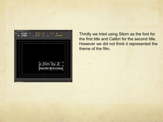
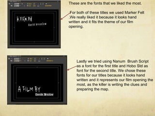
The document discusses different font combinations tested for film titles, but none were deemed suitable until the last combination tried. For the first and second titles, Marker Felt was selected because it looked handwritten and fit the theme of the film opening. Nanum Brush Script and Hobo Std were also considered good options because they resembled handwritten text, representing the killer writing clues and preparing a map in the film opening.