Titles
•Download as PPTX, PDF•
0 likes•104 views
The document discusses different font combinations tested for titles in a film opening. It describes trying Birch Std and Calibri, Marker Felt and Baoli Sc, and Silom and Calibri but finding they did not fit the theme. It then states Marker Felt was liked for both titles as it looks handwritten. Lastly, it settles on Nanum Brush Script for the first title and Hobo Std for the second as they look handwritten and best represent the film opening which involves a killer writing clues and preparing a map.
Report
Share
Report
Share

Recommended
Titles blogpost
The document discusses different font combinations tested for film titles, but none were deemed suitable until the last combination tried. For the first and second titles, Marker Felt was selected because it looked handwritten and fit the theme of the film opening. Nanum Brush Script and Hobo Std were also considered good options because they resembled handwritten text, representing the killer writing clues and preparing a map in the film opening.
Title planning
The document discusses title planning for a short film called "Adam". It will have only one title at the beginning, as is common for short films. The document considers using different fonts for the title, including a handwritten effect to represent the main character Adam's handwriting as he is a school boy. Another option discussed is a sharp, precise style font to represent the character's organized and precise personality with some OCD traits.
Research into the title and opening credit for final production
Daisy Newman is researching fonts and text styles for the title and opening credits of her final film production called "Where's Joey?". She evaluates several font options on criteria like readability, era appropriateness, and ability to fit the gangster genre. She narrows her choices down to Ariel, Algerian, and BatangChe for the main title, and Ariel and Bernard MT Condensed for the opening credits. She also considers variations in capitalization and punctuation for the main title to convey different meanings and tones.
Font types
This document discusses different font types including comic style fonts, old school fonts, script fonts, and slab serif fonts. It provides a brief overview of various font categories without going into detail about specific fonts. The document aims to introduce different font classifications at a high level.
Presentation3
Irregular verbs form their past tense and past participle in unpredictable ways unlike regular verbs which only require adding "ed". There are three types of irregular verbs: type 1 has identical forms, type 2 has the past tense and past participle the same, and type 3 has all three forms being different. Examples of each type are provided.
For the website task
The document analyzes the fonts used in various movie title designs and what they convey about the movie's genre and style. It discusses several different fonts like Footlight MT Light, Sexsmith, Aachen, Bauer Badoni Bold Oldstyle Figures, Arial, Bahnschrift Light Semi Condensed, Gotham Bold, and Brush Script. For each font, it notes whether letters are replaced by images, how letters are spaced, and the use of capital and lowercase letters to infer the movie's mood, atmosphere, and whether it is a thriller, horror, romantic, or other genre of film.
Robin hood cartoon strips 1
The students made their own cartoon strips retelling their favorite part of the Robin Hood story, "The Silver Arrow". Each student created their own version of the scene in their cartoon strip.
Fonts
The document discusses fonts used in film titles and marketing for different genres. It provides examples of how fonts for the films "Love and Basketball" and "Frozen" convey romantic comedy and thriller genres respectively through font style, colors, spacing of letters, and additional text. Two thriller film titles, "Insidious" and "Saw", are analyzed in depth for how their fonts use color schemes, letter positioning and styles to provide clues about the films' themes of injury, death, and mystery. The document concludes by discussing potential fonts for an original thriller title called "Another" based on a Japanese anime, analyzing strengths and weaknesses of options written in Japanese, a bold disoriented style, and one resembling dripping blood suited to scenes
Evaluation activity 1
The document summarizes the opening of a student film called "Dead End" in 16 paragraphs. It describes design elements like the title displayed over opening footage, establishing shots that set the urban location, costumes depicting the main character as homeless, and handheld camera work. Genre cues like a dark alley suggest social realism. Characters are introduced through montage footage and a scene of the main character begging. Special effects like a gray tint on montage shots distinguish past from present.
Typography research
The document discusses typography research for a film opening sequence. It summarizes how two mystery films used different fonts in their opening credits to hook viewers. It then considers various font options for the typography in their own opening sequence for a crime film. These include fonts with dotted, sharp, or missing lines that could reflect plot points like the murder that occurs. It decides sliding credits like in Psycho could intrigue viewers. After researching fonts' meanings, it chooses Didot font for its simplicity, sophistication, and ability to get straight to the plot point of the murder.
Typography Research
The document discusses typography research for an opening credits sequence. It summarizes how two mystery films used different fonts in their opening sequences to hook the audience. It then considers various font options for the typography in its own opening credits and how they could reflect elements of the plot, such as a font with sharp letters matching a sharp murder plot. It decides on the Didot font as it finds it sophisticated, simple and straight to the point like the film's central murder plot.
Typography research
The document discusses typography research for an opening credits sequence. It summarizes how two mystery films used different fonts to hook audiences. Options under consideration include a dotted font, one with sharp letters, and one with gaps in letters. Inspired by Psycho, sliding credits that slowly reveal the text are discussed. The final decision is to use the Didot font for its simplicity and sophistication to match the direct, plot-driven nature of the opening sequence about a murder.
Planning – casting
The document discusses plans for casting, costuming, makeup, and props for a film project. It will cast two actors of similar age and build to portray the two sides of the main characters. The "good" character Jeremy will wear simple clothing to represent everyday life while the villain Robbie will wear darker colors. The reaper Aydon will wear a black suit. Makeup will be used to alter the characters' appearances. Props will include a torch, candles to set the scene, and stones to add realism to a ritual scene.
Preliminary task
This document discusses techniques for filming continuity, including shot-reverse shot, match on action, and following the 180 degree rule. It then describes a preliminary task where a student filmed a conversation between a student and teacher. The student brought books back to the teacher and they discussed the student using them for revision notes. In filming the scene, the student aimed to apply techniques like shot-reverse shot and matching actions but encountered some issues like breaking the 180 degree rule. Overall, the task helped the student learn new filmmaking skills.
Flashbacks 4
The document provides instructions for students to plan a story that uses a flashback. It asks students to think about and describe in detail the scene where the flashback will take place without including any events that are part of the story. Students should imagine they are in the scene and describe the sights, sounds, smells, feelings, and other people to paint a picture using descriptive language and techniques like similes, metaphors, and personification.
Evaluation question 1
This document discusses conventions used in comedy films that the author's media product draws from or challenges. It examines conventions around setting, camera angles/cinematography, sound, plot, acting, and title sequences based on research of films like Get Hard and Grown Ups. For their comedy film opening, the authors incorporated relatable school settings, exaggerated characters following rom-com plots, and title sequences to define character personalities. Their goal was to utilize genre conventions to create humor while still appealing to their target teenage audience.
preliminary task to main task
This document discusses the learning and techniques applied in a preliminary filmmaking task and subsequent main filmmaking task. The preliminary task involved filming a character entering a room and having a conversation using match on action, shot/reverse shot, and maintaining the 180-degree rule. The main task involved creating opening titles and opening for a new fiction film using these same techniques. The document reflects on how understanding and applying continuity techniques like the 180-degree rule, match on action, and shot-reverse shot helps promote realism in filmed work.
Guidance with note taking kick ass
This document provides guidance on key areas to focus on when taking notes about the film Slumdog Millionaire. These include genre, narrative, and representation. It includes a table outlining aspects of each category to note, such as conventions, characters, themes, and visual style. The document also notes that Slumdog Millionaire has influences from multiple genres and discusses applying auteur theory to analyze Danny Boyle's authorship of the film.
PRACTING WRITING
This document provides guidance on practicing different types of writing such as picture descriptions, essays, and stories. It discusses how to structure a picture description by moving logically from left to right or from general to specific details. It also provides tips for describing paintings, including mentioning the artist, year, scene, and giving impressions. The document then outlines a 5-step process for understanding proverbs: 1) understand symbols, 2) substitute meanings, 3) find illustrative examples, 4) note similar proverbs, and 5) summarize. In conclusion, it states that writing helps develop communication and thinking skills.
Spiderman
This summarizes the opening sequence of the Spiderman film. It establishes that the sequence shows the names of actors and directors to attract audience attention. Images of Spiderman are included to indicate the main character. The dark colors, loud music, and moving text in the sequence help establish the action/thriller genre. The first shot of the character leaves their face hidden and shows a hand, making the character seem mysterious and hinting their hand will be important to the story.
Question 1 evaluation
The document discusses conventions of comedy films and how the media product challenges or develops those conventions. Some key conventions included are bright locations filmed during the day, schools and homes as common settings, natural camera work and medium shots, funny dialogue and edited sounds, socially awkward or idiotic characters, and exaggerated acting. The media product sets most of its scenes in a house and high school to follow conventions. However, it uses social realism as its subgenre rather than the typical romance subgenre of comedies. It presents credits in a creative way within the film and uses a simple title rather than hinting at the plot.
Question 7
Olivia Desanges discusses how she has improved in filmmaking techniques through her preliminary project and opening sequence. She learned to better establish continuity, properly apply the 180 degree rule, and incorporate match-on-action and shot reverse shot techniques. For her opening sequence, she experimented with different shots, angles, lighting, editing, titles and props to add mystery and meaning and better develop the thriller genre. Overall, she feels she has gained a deeper understanding of how technical elements can impact tone and storytelling.
Evaluation q7
Olivia Desanges discusses how she has improved in filmmaking techniques through her preliminary project and opening sequence. She learned to better establish continuity, properly apply the 180 degree rule, and implement match on action and shot reverse shot techniques. For her opening sequence, she utilized more angles, shots, lighting, props, and editing to add mystery and meaning. Overall, she feels she has gained a better understanding of how to thoughtfully incorporate various film elements to successfully achieve her chosen genre of mystery thriller.
Question 1 medi a
The document discusses conventions of comedy films and how the author's media product used and challenged some of those conventions. Some of the main conventions discussed include using bright, populated locations filmed during the day, locations like schools and bars, natural camera work and medium shots, funny dialogue and edited sounds, socially awkward or idiotic characters, subgenres like romance, exaggerated acting and props for humor. The author notes their film was set in a house and school, used theme music and portrayed an idiotic teacher character. They included credits in a creative way and did not follow conventions for titles or rely on dialogue for humor. The film included twists and used speech bubbles and facial expressions for comedy.
Final research
The document discusses four different horror genre fonts and their suitability for conveying supernatural themes. Font 1 is simple with a childlike style, conveying a young main character but not strong horror vibes. Font 2 is the most dramatic with bold lettering, clearly conveying horror. Fonts 3 and 4 have irregular lettering and incomplete endings that could suggest paralysis, harm, or slasher themes instead of the supernatural. In conclusion, Fonts 1 and 2 are best suited to subtly convey supernatural horror through their simplicity and childlike styles without strongly suggesting other genres like gothic or slasher themes.
Textbook pictures
In English class we did this assignment where you had to find certain things in our textbook to get used to the book and know where everything is at.
Fonts!
The document discusses potential fonts for a project, noting that the artist has used a variety of fonts in the past. It considers using a font similar to what the artist has commonly used but also something more different to reflect progression. It aims to select a clear, easy-to-read font that represents the artist while maintaining synergy across materials using the same font.
Nouns by anglicize
This document provides information about nouns, including the definition of a noun and different types of nouns. It defines nouns as words that name people, places, things, or ideas. It describes several types of nouns including proper nouns, common nouns, concrete nouns, abstract nouns, collective nouns, and compound nouns. It also discusses singular and plural nouns, including rules for making nouns plural and some irregular plural forms. The document aims to help the reader identify and understand different categories of nouns.
Cuestionario equipo 1
El documento contrasta las sociedades de la información con las sociedades del conocimiento, señalando que estas últimas comprenden dimensiones sociales, éticas y políticas más amplias que van más allá del progreso tecnológico. También destaca la importancia de considerar la diversidad cultural y lingüística para evitar modelos universales. Finalmente, resalta el papel clave de las personas adultas para compensar la superficialidad de la comunicación en tiempo real y recordar que el conocimiento conduce a la sabiduría.
Taxi Proxi UK
This short document promotes creating presentations using Haiku Deck, a tool for making slideshows. It encourages the reader to get started making their own Haiku Deck presentation and sharing it on SlideShare. In just one sentence, it pitches the idea of using Haiku Deck to easily create engaging slideshows.
More Related Content
What's hot
Evaluation activity 1
The document summarizes the opening of a student film called "Dead End" in 16 paragraphs. It describes design elements like the title displayed over opening footage, establishing shots that set the urban location, costumes depicting the main character as homeless, and handheld camera work. Genre cues like a dark alley suggest social realism. Characters are introduced through montage footage and a scene of the main character begging. Special effects like a gray tint on montage shots distinguish past from present.
Typography research
The document discusses typography research for a film opening sequence. It summarizes how two mystery films used different fonts in their opening credits to hook viewers. It then considers various font options for the typography in their own opening sequence for a crime film. These include fonts with dotted, sharp, or missing lines that could reflect plot points like the murder that occurs. It decides sliding credits like in Psycho could intrigue viewers. After researching fonts' meanings, it chooses Didot font for its simplicity, sophistication, and ability to get straight to the plot point of the murder.
Typography Research
The document discusses typography research for an opening credits sequence. It summarizes how two mystery films used different fonts in their opening sequences to hook the audience. It then considers various font options for the typography in its own opening credits and how they could reflect elements of the plot, such as a font with sharp letters matching a sharp murder plot. It decides on the Didot font as it finds it sophisticated, simple and straight to the point like the film's central murder plot.
Typography research
The document discusses typography research for an opening credits sequence. It summarizes how two mystery films used different fonts to hook audiences. Options under consideration include a dotted font, one with sharp letters, and one with gaps in letters. Inspired by Psycho, sliding credits that slowly reveal the text are discussed. The final decision is to use the Didot font for its simplicity and sophistication to match the direct, plot-driven nature of the opening sequence about a murder.
Planning – casting
The document discusses plans for casting, costuming, makeup, and props for a film project. It will cast two actors of similar age and build to portray the two sides of the main characters. The "good" character Jeremy will wear simple clothing to represent everyday life while the villain Robbie will wear darker colors. The reaper Aydon will wear a black suit. Makeup will be used to alter the characters' appearances. Props will include a torch, candles to set the scene, and stones to add realism to a ritual scene.
Preliminary task
This document discusses techniques for filming continuity, including shot-reverse shot, match on action, and following the 180 degree rule. It then describes a preliminary task where a student filmed a conversation between a student and teacher. The student brought books back to the teacher and they discussed the student using them for revision notes. In filming the scene, the student aimed to apply techniques like shot-reverse shot and matching actions but encountered some issues like breaking the 180 degree rule. Overall, the task helped the student learn new filmmaking skills.
Flashbacks 4
The document provides instructions for students to plan a story that uses a flashback. It asks students to think about and describe in detail the scene where the flashback will take place without including any events that are part of the story. Students should imagine they are in the scene and describe the sights, sounds, smells, feelings, and other people to paint a picture using descriptive language and techniques like similes, metaphors, and personification.
Evaluation question 1
This document discusses conventions used in comedy films that the author's media product draws from or challenges. It examines conventions around setting, camera angles/cinematography, sound, plot, acting, and title sequences based on research of films like Get Hard and Grown Ups. For their comedy film opening, the authors incorporated relatable school settings, exaggerated characters following rom-com plots, and title sequences to define character personalities. Their goal was to utilize genre conventions to create humor while still appealing to their target teenage audience.
preliminary task to main task
This document discusses the learning and techniques applied in a preliminary filmmaking task and subsequent main filmmaking task. The preliminary task involved filming a character entering a room and having a conversation using match on action, shot/reverse shot, and maintaining the 180-degree rule. The main task involved creating opening titles and opening for a new fiction film using these same techniques. The document reflects on how understanding and applying continuity techniques like the 180-degree rule, match on action, and shot-reverse shot helps promote realism in filmed work.
Guidance with note taking kick ass
This document provides guidance on key areas to focus on when taking notes about the film Slumdog Millionaire. These include genre, narrative, and representation. It includes a table outlining aspects of each category to note, such as conventions, characters, themes, and visual style. The document also notes that Slumdog Millionaire has influences from multiple genres and discusses applying auteur theory to analyze Danny Boyle's authorship of the film.
PRACTING WRITING
This document provides guidance on practicing different types of writing such as picture descriptions, essays, and stories. It discusses how to structure a picture description by moving logically from left to right or from general to specific details. It also provides tips for describing paintings, including mentioning the artist, year, scene, and giving impressions. The document then outlines a 5-step process for understanding proverbs: 1) understand symbols, 2) substitute meanings, 3) find illustrative examples, 4) note similar proverbs, and 5) summarize. In conclusion, it states that writing helps develop communication and thinking skills.
Spiderman
This summarizes the opening sequence of the Spiderman film. It establishes that the sequence shows the names of actors and directors to attract audience attention. Images of Spiderman are included to indicate the main character. The dark colors, loud music, and moving text in the sequence help establish the action/thriller genre. The first shot of the character leaves their face hidden and shows a hand, making the character seem mysterious and hinting their hand will be important to the story.
Question 1 evaluation
The document discusses conventions of comedy films and how the media product challenges or develops those conventions. Some key conventions included are bright locations filmed during the day, schools and homes as common settings, natural camera work and medium shots, funny dialogue and edited sounds, socially awkward or idiotic characters, and exaggerated acting. The media product sets most of its scenes in a house and high school to follow conventions. However, it uses social realism as its subgenre rather than the typical romance subgenre of comedies. It presents credits in a creative way within the film and uses a simple title rather than hinting at the plot.
Question 7
Olivia Desanges discusses how she has improved in filmmaking techniques through her preliminary project and opening sequence. She learned to better establish continuity, properly apply the 180 degree rule, and incorporate match-on-action and shot reverse shot techniques. For her opening sequence, she experimented with different shots, angles, lighting, editing, titles and props to add mystery and meaning and better develop the thriller genre. Overall, she feels she has gained a deeper understanding of how technical elements can impact tone and storytelling.
Evaluation q7
Olivia Desanges discusses how she has improved in filmmaking techniques through her preliminary project and opening sequence. She learned to better establish continuity, properly apply the 180 degree rule, and implement match on action and shot reverse shot techniques. For her opening sequence, she utilized more angles, shots, lighting, props, and editing to add mystery and meaning. Overall, she feels she has gained a better understanding of how to thoughtfully incorporate various film elements to successfully achieve her chosen genre of mystery thriller.
Question 1 medi a
The document discusses conventions of comedy films and how the author's media product used and challenged some of those conventions. Some of the main conventions discussed include using bright, populated locations filmed during the day, locations like schools and bars, natural camera work and medium shots, funny dialogue and edited sounds, socially awkward or idiotic characters, subgenres like romance, exaggerated acting and props for humor. The author notes their film was set in a house and school, used theme music and portrayed an idiotic teacher character. They included credits in a creative way and did not follow conventions for titles or rely on dialogue for humor. The film included twists and used speech bubbles and facial expressions for comedy.
Final research
The document discusses four different horror genre fonts and their suitability for conveying supernatural themes. Font 1 is simple with a childlike style, conveying a young main character but not strong horror vibes. Font 2 is the most dramatic with bold lettering, clearly conveying horror. Fonts 3 and 4 have irregular lettering and incomplete endings that could suggest paralysis, harm, or slasher themes instead of the supernatural. In conclusion, Fonts 1 and 2 are best suited to subtly convey supernatural horror through their simplicity and childlike styles without strongly suggesting other genres like gothic or slasher themes.
Textbook pictures
In English class we did this assignment where you had to find certain things in our textbook to get used to the book and know where everything is at.
Fonts!
The document discusses potential fonts for a project, noting that the artist has used a variety of fonts in the past. It considers using a font similar to what the artist has commonly used but also something more different to reflect progression. It aims to select a clear, easy-to-read font that represents the artist while maintaining synergy across materials using the same font.
Nouns by anglicize
This document provides information about nouns, including the definition of a noun and different types of nouns. It defines nouns as words that name people, places, things, or ideas. It describes several types of nouns including proper nouns, common nouns, concrete nouns, abstract nouns, collective nouns, and compound nouns. It also discusses singular and plural nouns, including rules for making nouns plural and some irregular plural forms. The document aims to help the reader identify and understand different categories of nouns.
What's hot (20)
Viewers also liked
Cuestionario equipo 1
El documento contrasta las sociedades de la información con las sociedades del conocimiento, señalando que estas últimas comprenden dimensiones sociales, éticas y políticas más amplias que van más allá del progreso tecnológico. También destaca la importancia de considerar la diversidad cultural y lingüística para evitar modelos universales. Finalmente, resalta el papel clave de las personas adultas para compensar la superficialidad de la comunicación en tiempo real y recordar que el conocimiento conduce a la sabiduría.
Taxi Proxi UK
This short document promotes creating presentations using Haiku Deck, a tool for making slideshows. It encourages the reader to get started making their own Haiku Deck presentation and sharing it on SlideShare. In just one sentence, it pitches the idea of using Haiku Deck to easily create engaging slideshows.
Atencion alumnos cecytes naco
El documento anuncia las fechas de asesorías de regularización, exámenes de regularización y reinscripción de alumnos regulares para el Centro de Estudios CECYTES en Naco durante junio de 2012. Las asesorías de regularización para segundo y cuarto semestre serán del 11 al 15 de junio, para sexto semestre del 11 al 13 de junio. Los exámenes de regularización para segundo y cuarto semestre serán del 18 al 20 de junio, y para sexto semestre el 14 y 15 de junio. La rein
Trabajo practico nº7
El documento resume las funciones básicas del navegador Google Chrome, incluyendo pestañas, marcadores, historial y configuración de cuenta. También describe las funciones de Picasa para administrar y compartir fotos, y explica brevemente Google Play, Google Groups, Google Sites y el Google Play Store.
Cuento
Dos hermanos que siempre jugaban juntos tuvieron una gran discusión por un juguete y decidieron dividir todas sus cosas. Pasaron los años dividiendo y discutiendo por cada objeto hasta que se convirtieron en viejos gruñones. Un día alguien mezcló todas sus cosas y los hermanos encontraron a dos niños jugando felizmente juntos sin preocuparse por la propiedad de los objetos.
Ecx training 20140118
This document provides an overview and introduction to communications procedures for the ECX 2014 sled dog race. It outlines the roles and responsibilities of key personnel like the Operations Chief and Net Control. Information is collected through Comm-Trac to track mushers, checkpoints, weather, and other resources. Protocols are established for normal communications as well as emergency situations. The primary goal is maintaining situational awareness through an effective communications network during this remote multi-day event.
Technical Advisory Group (TAG) recommendation for education
Technical Advisory Group (TAG) recommendation for education indicators for global and thematic monitoring.
5.636x5.07 Cst Premier Family Phys
Cornerstone Premier Family Physicians is a family practice located in St. Clair Shores, Michigan that is accepting new patients of all ages. They offer a variety of services including sclerotherapy, smoking cessation programs, and same-day/early morning/evening appointments. The doctors are board certified and treat the whole family with compassion.
cv infografica
This document discusses Adlerian psychodynamic theory and its application to psychological assessment, counseling, education, and therapy. It mentions using anamnestic interviews and various psychological tests and inventories to evaluate intelligence, personality, and careers from an Adlerian theoretical perspective. The goal is to provide counseling, education, and training to individuals and parents.
Case study waco
The West Waco Branch Public Library was designed by GBDR Architects and 720 Design. It features Estey Designer Series shelving and Estey Designer Series "A" Frame media storage. The library used Estey products for storage solutions.
Environmental Transformations in the Egyptian Village التحولات البيئية فى الق...
This paper will focus on the process of transformation and change taking place in Egyptian villages and its impact on the health and life of its inhabitants and the surrounding environment.
تركز هذه الورقة على عملية التحول والتغيير التي تجري في القرى المصرية وأثره على صحة وحياة سكانها والبيئة المحيطة.
Examen de computación
El documento parece ser una evaluación de computación para Stefania Merino. No contiene información sustantiva sobre el contenido o resultados del examen, solo menciona el nombre del estudiante evaluado y el tipo de examen.
Trabajo practico nº4
Este documento proporciona instrucciones para modificar el tema y contenido de una página web utilizando la herramienta Webs. Explica cómo agregar imágenes, videos, archivos y formularios. También describe cómo cambiar el título, modificar columnas y páginas, y aplicar temas y fondos de imagen a la cabecera y página.
Approach to heart failure medicos notes-com
1. Heart failure is a clinical syndrome where the heart cannot pump enough blood to meet the body's needs due to structural or functional abnormalities.
2. Common causes include coronary artery disease, hypertension, cardiomyopathy, and valvular heart disease. Precipitating factors include non-compliance with medications, arrhythmias, and infections.
3. Treatment involves controlling symptoms with diuretics, and preventing worsening of cardiac function with ACE inhibitors, beta-blockers, and aldosterone antagonists which have been shown to reduce mortality. Other therapies aim to improve contractility or treat underlying arrhythmias.
Using Banner Ads to Attract Customers
This month we'll explore the topic of Using Banner Ads to Attract Customers. Join us for this webinar as we get an overview of how important using banner ads to attract customers is for your organization.
CV
Leyre Allende Nieto es una ingeniera marina española nacida en 1991 en Irún, Guipúzcoa. Se graduó en Ingeniería Marina en la Universidad de Cádiz en 2014. Ha completado numerosos cursos de formación profesional relacionados con la seguridad marítima y la operación de buques cisterna y químicos. Tiene experiencia laboral como socorrista y cadete de máquinas en buques de pasaje y carga.
Loose bodies in knee
Loose bodies are fragments of bone or cartilage that float freely in the joint space, causing symptoms like knee pain, swelling, and locking. They are classified as stable or unstable. Individuals with joint diseases like arthritis are more at risk, as are athletes. Loose bodies are diagnosed by x-ray, CT, MRI or arthrography. Treatment options include NSAIDs, arthroscopic removal of large loose bodies, or open surgery. The focus of rehabilitation is controlling pain and restoring function through gait training and avoiding prolonged immobilization.
Patellofemoral Pain Syndrome (Final)
This document provides information on patellofemoral pain syndrome (PFPS), including two case studies, risk factors, diagnosis, functional anatomy, and rehabilitation approaches. It discusses that PFPS is a common cause of anterior knee pain, with risk factors including increased femoral internal rotation, knee abduction moment, pronated foot type, and decreased quadriceps flexibility. Rehabilitation involves identifying intrinsic and extrinsic risk factors, strengthening the quadriceps and hip muscles, improving motor control and flexibility, and gradually reloading the patellofemoral joint through functional exercises.
Viewers also liked (20)
Technical Advisory Group (TAG) recommendation for education
Technical Advisory Group (TAG) recommendation for education
Environmental Transformations in the Egyptian Village التحولات البيئية فى الق...
Environmental Transformations in the Egyptian Village التحولات البيئية فى الق...
Similar to Titles
Film noir typography
The document discusses typography choices for the title of a neo-noir film called "Freeze." [1] It examines fonts used in classic film noir titles such as serif fonts with decorative edges and titles with backdrops or shadows. [2] It also looks at newer neo-noir titles experimenting more with colors. [3] The summary discusses choosing an uppercase bold font with varying letter sizes and placing the title over an image of the London skyline to reflect the film's setting.
Fonts
The document summarizes font research for a film project. It details how the researchers selected their final three fonts from 13 options. They initially considered Nightbird and DK Face Your Fears II but felt they were better suited for horror films than thrillers. Their final selection was Bleeding Cowboys, which they edited in Photoshop to add curly lines representing the complex friendship between characters in the film.
Media fonts
The document discusses fonts chosen for different elements of a film project. Three fonts are considered for introducing actors, with "Eight days a week" selected as the favorite due to its bold, loud look aligning with the characters and film tone. Two fonts are discussed for the company name, with "White Elephant" chosen for its cleaner look providing some continuity while still differentiating its message. Three additional fonts are reviewed for the film title, with "Urban Jungle" and "Slave only dreams to be a king" favored for conveying grittiness and discomfort respectively, in line with the film's style.
Media powerpoint film
The document discusses the choices made for the titles and opening credits of a film. It describes selecting a dark background in red and black to convey danger and mystery and fit the scary genre. Different fonts were tested to find one that was chilling and matched the film's tone, ultimately choosing a scripted/handwritten style. Various title positions were also tested to suggest things changing and relate to the film's contents. Feedback from friends was gathered on the font's intended effect.
Fonts & titles
The document discusses font choices for different titles in an indie film project. It describes searching on "da font" for fonts that fit the overall project and film trailer. A font called "top secret" was chosen for the strap line to relate to the film's secret recipe and stand out from the main title "Synthacaine." A "comic" font called "badaboom" was selected for character introductions to fit the film's Tarantino influence. The font "cubic" was chosen for the main title "Synthacaine" as it looks like a science structure relating to the film's storyline about a new cocaine recipe.
Font research
The document discusses font research for a horror film opening. It examines several fonts including "Some Lines", "Zombified", "Face Your Fears", and "Scratch Kit" but ultimately selects "Trajan Pro" for the title and credits. "Trajan Pro" was chosen because it had a horror feel, was bold and clear to read, and could transition from red to white to represent the film's mysterious main character.
Choosing our fonts
This document discusses different fonts tested for a title screen. The first font, Corbel, had gaps between letters that were too small. The second font, Arial, had letters that were too long with inconsistent spacing. The third font, Calibri, had good letter spacing but was not bold enough. The final and best fitting font was Leelawadee, which had the best size and style of letters for the title screen.
Script da lip
The film is titled "Morvor", which comes from the Estonian translation for "Murder". This portrays the main character Frank in a negative light, fitting the detective thriller genre. The title is placed at the end of the teaser trailer to build tension and be memorable. It is also larger in font size than other text to make a bigger impression. Costumes for the main characters include casual clothes like jeans and coats to match recent similar films from the late 80s to now within the genre. Camera work focuses on close-ups during conversations to create tension without the audience realizing, as seen in films like "The Silence of the Lambs" and "Prisoner".
Typeface
This document discusses font ideas for the title of a thriller film called "Framed". It previews 3 fonts - "Lost Lubbock Motels", "Face Your Fears", and "Anarchy" - and analyzes how each font could establish themes for the film. The author selects "Anarchy" as their favorite font because it has a thin and imperceptible style that gives a sense of being enigmatic and written with a sharp object, fitting the film's themes of violence and uncertainty.
Idea’s for the horror movie
The document discusses the process of planning and filming a horror movie trailer. It describes how the group decided on a slasher genre, developed the plot, and selected a filming location. It also outlines deciding roles for directing, producing, writing, and camera operation. The group storyboarded scenes, drafted characters, and designed logos. Test filming occurred but additional footage was needed. The trailer was edited together with sound and transitions and uploaded online.
Typography
The document discusses choosing fonts for film titles and credits. It notes that the font should reflect the genre and mood of the film. Examples are given of fonts used in thriller films like Psycho and Black Swan that stand out against a black background to intrigue audiences without giving away the plot. Options for the font "INQUISITION" are presented, with Birch Std ultimately chosen as it fits the mystery/crime genre and title name while the white on black color scheme adds drama.
Font Issues
The group had initially decided on using the font "mix tape" for their digipak design, but realized it did not fit well with the font chosen for the artist name. They now plan to allow each member to choose their own fonts for the album title and track list that will better match the artist name font, while keeping the artist name font consistent across materials to maintain their synergy.
Media assign 16
This document summarizes the opening title sequence of the film "The Shining". It discusses the order of credits with the director first, then actors, and the title in the middle. The font used is Arial, which is basic and doesn't reveal much about the film, implying mystery. The font moves up the screen as the shots are in long takes, implying a journey. The font color is a light blue, which is ironic for a horror film, and its strangeness foreshadows the film. The font size is big and in capital letters to show importance. While not a generic horror convention, the subtle irony of the title sequence makes it suitable for the genre.
Final research
The document discusses different fonts that could be used for horror movie titles and analyzes how each font conveys different meanings and tones through their design. It examines fonts used in titles for films like The Blair Witch Project and Paranormal Activity and how their serif, spacing, and shadowing styles set ominous, unsettling, and mysterious tones. Several spooky fonts found on dafont.com are proposed for a potential horror film title based on how their bold, cut-out, or shadowed lettering could attract attention and relate to themes of mystery, the supernatural, and being watched.
Opening titles (1)
The document describes the process of creating a production logo for a thriller movie. They used Photoshop to combine elements from various sources, including titling selected from the 'da font' website. Layers for the titling and a splattered paint image were made separately in Photoshop and then combined. Initially the splattered paint was blue but was changed to red to better suit the thriller genre.
Opening titles
The document describes the process of creating a production logo for a thriller movie. They used Photoshop to combine elements from various sources, including titling selected from the 'da font' website. Layers for different elements like splattered paint and titling were made separately in Photoshop and then combined. The splattered paint background was initially blue but was changed to red to better suit the thriller genre.
Evaluation 1 (2)
This document provides an evaluation of a media product called "God of the Hill". It summarizes key elements of the film in separate sections:
1) The opening title sequence uses graffiti-style credits with the title "God of the Hill" to set the tone of the gangster thriller genre.
2) The film is set in East London, known for gang violence and drug trafficking, with an abandoned lock-up used as a stereotypical location.
3) Costumes like black hoodies and a shovel prop follow gangster film conventions.
4) Camera techniques like point-of-view shots, long shots, and tracking shots build suspense and scenery.
5
Title & Font
The document discusses title design and font choice in film trailers and openings. It analyzes how two films, Catch Me If You Can and Juno, used memorable title sequences to set the tone for their genres. The document also explores the use of serif versus sans-serif fonts and how cursive fonts are generally not suited for thriller genres. It highlights how film trailers like Catfish, Cloverfield, and Inception use mysterious black backgrounds with bright fonts to avoid revealing too much about the plot.
Fixation Evaluation
The document provides details about the production of an opening title sequence for a crime thriller film called "Fixation". It discusses the inspiration taken from films such as Se7en and Gone Girl. It describes the roles of the production team members, including the director, producer, editor, and director of photography. It discusses the camera work and editing approach, which involved close-ups, varied angles, and color grading to achieve a sinister tone. The production challenged some conventions by revealing the antagonist early and giving the audience an advantage of knowing the villain.
Similar to Titles (20)
More from Amanda_Liepina
Evaluation: Q3
Jess is a 17-year-old student who enjoys listening to pop, rock, and soul music. She finds music relaxing and helpful for concentrating on her studies. Some of her favorite artists are Nick Jonas, The Chainsmokers, and Rihanna. She typically listens to music on her phone, YouTube, or computer. This document provides initial research about Jess's music preferences and habits.
Editing
The student used various editing techniques in their music video project, including slow motion. To make slow motion shots smoother, the student cut clips into pieces with different speeds, such as 85% and 70%, making the slow motion come in gradually. The student also used limited transitions like dip to black and film dissolves to keep the video looking natural. Color grading was done using fast color corrector to lightly brighten shots and create a warmer feel.
Taylor Swift Analysis
The document provides an in-depth analysis of the album cover design for Taylor Swift's 1989 album. Some key points:
- The front cover features a mid-shot polaroid photo of Swift wearing a blue and white jumper with seagulls.
- The design is meant to look vintage and evoke Swift's childhood in the 1980s.
- Symbolic elements like the seagulls and lyrics referenced on the inside covers relate to themes of freedom and confidence in Swift's new pop style.
- Photographs, handwritten text, and polaroid designs throughout are intended to feel personal and engage fans.
Potential Artists
This document provides information on three potential artists for a music video coursework:
1) Afrojack, a Dutch DJ and producer known for collaborating with major artists and his album "Forget The World".
2) Wrabel, an American singer-songwriter whose album "Sideways" contains the song "Ten Feet Tall".
3) Ella Henderson, a British pop and soul singer who rose to fame on The X Factor and whose debut album is "Chapter One".
Eminem CD analysis
The CD cover depicts Eminem sitting behind red curtains on a stage. His name is prominently displayed in white on a black background. Below his name is the album title. The cover represents Eminem's personal life feeling like a public performance. Throughout the cover, the dominant color is royal red, symbolizing fame and its pains. Inside pages show lyrics and studio photos, giving fans insight into the album's creation. The CD itself maintains the stage theme in mainly red.
Media - CD digipack analysis
This document analyzes the cover of a country music CD digipack. It discusses several conventions used in the design of the front, back, and inside covers. The front cover features an illustrated image of a man in stereotypical country clothes calling a payphone, representing the album title "I'll Keep Calling." Dull, sandy colors are used to evoke a country style. The back cover continues the story with a hanging payphone and lists the tracks. The inside covers thank contributors and use connecting truck images and colors to link all parts of the digipack together into a cohesive design telling the story and genre through visual elements.
Artists
This document provides information on three potential artists for a music video coursework:
1) Afrojack - A Dutch DJ and producer known for collaborating with major artists. His 2014 album "Forget The World" and track "Ten Feet Tall" are proposed.
2) The Script - An Irish pop rock band with 3 members. Their 2012 album "#3" and track "If You Could See Me Now" are proposed due to familiarity with their music.
3) Ella Henderson - A British singer who rose to fame on The X Factor UK. Her 2014 debut album "Chapter One" and track "Glow" are proposed as she is new to the industry and works in pop and soul genres
Knife sharpener (107)
The document discusses the needs and considerations of manufacturers and consumers regarding knife sharpeners. For manufacturers, key priorities are minimizing labor costs, understanding target markets, keeping production costs low, and designing for easy assembly. Environmental impact and recyclability are also important. For consumers, key priorities are effectiveness, low cost, value for money, easy maintenance and use, safety, compact storage, and being environmentally friendly. The document then analyzes design criteria like storage, ergonomics, materials, function, safety, and maintenance from a designer's perspective.
F522 skirt (103)
The document provides information on a black chiffon skirt, including its intended purpose, target user, key design criteria, and faults. The skirt is short in length, made of polyester chiffon, and aimed at young females with an edgy style. Key criteria in designing the skirt were that it be comfortable, durable, on-trend, and easy to care for. The main faults with the skirt are its very short length and uncomfortable coarse material.
F522 ice pack (117)
The document provides an analysis of the Koolpak Instant Ice Pack product. It describes the product's intended function as a cold compress for soft tissue injuries. It identifies several weaknesses in the product's design, including its small rectangular size which makes it difficult to wrap around injuries, lack of ability to stay attached to the injury, and potential to cause freeze burns. The document also examines the manufacturer and consumer needs around the product, including safety, cost, instructions and disposal considerations.
Codes and conventions
This document analyzes the codes and conventions in existing teen horror films through a discussion of three films: "Dead Wood", "Wrong Turn", and "Dead Mary". Key conventions highlighted include isolated settings, revealing clothing on female characters, separation or death of characters within the first 5 minutes, and elements of being chased or in danger such as tripping while running. Sound and camera techniques like music, shots of the woods, and close-ups of characters' faces are discussed in building tension and fear.
Common Conventions in Horror Films
The document outlines common conventions found in horror films, including characters being isolated in remote locations like woods or abandoned buildings with no means of calling for help. It also describes how threats are often forgotten or ignored, lights and phones are disabled at crucial moments, and characters make poor decisions like investigating strange noises alone or running upstairs instead of outside to escape danger. Other conventions mentioned are vehicles that won't start, fake scares being mistaken for real threats, warnings going unheeded, early killings to set the mood, references to past events, and storms on nights of danger.
Preliminary Task: Filming Schedule
The document outlines details for a date casting on October 9th involving George and James in the school food tech room, where they will need school uniforms, milk, a pencil case, two backpacks and a notebook. No special equipment will be needed and there are no noted health and safety considerations.
12 Shot Challenge
This document describes a challenge called the "12 Shot Challenge" that was created by four individuals: Amanda, Lara, Enilze, and Colleen. No other details are provided about the challenge or the individuals.
More from Amanda_Liepina (14)
Recently uploaded
快速办理(BCR毕业证书)加州大学河滨分校毕业证文凭证书一模一样
学校原件一模一样【微信:741003700 】《(BCR毕业证书)加州大学河滨分校毕业证文凭证书》【微信:741003700 】学位证,留信认证(真实可查,永久存档)原件一模一样纸张工艺/offer、雅思、外壳等材料/诚信可靠,可直接看成品样本,帮您解决无法毕业带来的各种难题!外壳,原版制作,诚信可靠,可直接看成品样本。行业标杆!精益求精,诚心合作,真诚制作!多年品质 ,按需精细制作,24小时接单,全套进口原装设备。十五年致力于帮助留学生解决难题,包您满意。
本公司拥有海外各大学样板无数,能完美还原。
1:1完美还原海外各大学毕业材料上的工艺:水印,阴影底纹,钢印LOGO烫金烫银,LOGO烫金烫银复合重叠。文字图案浮雕、激光镭射、紫外荧光、温感、复印防伪等防伪工艺。材料咨询办理、认证咨询办理请加学历顾问Q/微741003700
【主营项目】
一.毕业证【q微741003700】成绩单、使馆认证、教育部认证、雅思托福成绩单、学生卡等!
二.真实使馆公证(即留学回国人员证明,不成功不收费)
三.真实教育部学历学位认证(教育部存档!教育部留服网站永久可查)
四.办理各国各大学文凭(一对一专业服务,可全程监控跟踪进度)
如果您处于以下几种情况:
◇在校期间,因各种原因未能顺利毕业……拿不到官方毕业证【q/微741003700】
◇面对父母的压力,希望尽快拿到;
◇不清楚认证流程以及材料该如何准备;
◇回国时间很长,忘记办理;
◇回国马上就要找工作,办给用人单位看;
◇企事业单位必须要求办理的
◇需要报考公务员、购买免税车、落转户口
◇申请留学生创业基金
留信网认证的作用:
1:该专业认证可证明留学生真实身份
2:同时对留学生所学专业登记给予评定
3:国家专业人才认证中心颁发入库证书
4:这个认证书并且可以归档倒地方
5:凡事获得留信网入网的信息将会逐步更新到个人身份内,将在公安局网内查询个人身份证信息后,同步读取人才网入库信息
6:个人职称评审加20分
7:个人信誉贷款加10分
8:在国家人才网主办的国家网络招聘大会中纳入资料,供国家高端企业选择人才
STUDY ON THE DEVELOPMENT STRATEGY OF HUZHOU TOURISM
ABSTRACT: Huzhou has rich tourism resources, as early as a considerable development since the reform and
opening up, especially in recent years, Huzhou tourism has ushered in a new period of development
opportunities. At present, Huzhou tourism has become one of the most characteristic tourist cities on the East
China tourism line. With the development of Huzhou City, the tourism industry has been further improved, and
the tourism degree of the whole city has further increased the transformation and upgrading of the tourism
industry. However, the development of tourism in Huzhou City still lags far behind the tourism development of
major cities in East China. This round of research mainly analyzes the current development of tourism in
Huzhou City, on the basis of analyzing the specific situation, pointed out that the current development of
Huzhou tourism problems, and then analyzes these problems one by one, and put forward some specific
solutions, so as to promote the further rapid development of tourism in Huzhou City.
KEYWORDS:Huzhou; Travel; Development
Project Serenity — 33% Life-time Commissions.docx
Project Serenity is an innovative initiative aimed at transforming urban environments into sustainable, self-sufficient communities. By integrating green architecture, renewable energy, smart technology, sustainable transportation, and urban farming, Project Serenity seeks to minimize the ecological footprint of cities while enhancing residents' quality of life. Key components include energy-efficient buildings, IoT-enabled resource management, electric and autonomous transportation options, green spaces, and robust waste management systems. Emphasizing community engagement and social equity, Project Serenity aspires to serve as a global model for creating eco-friendly, livable urban spaces that harmonize modern conveniences with environmental stewardship.
EASY TUTORIAL OF HOW TO USE REMINI BY: FEBLESS HERNANE
Using Remini is easy and quick for enhancing your photos. Start by downloading the Remini app on your phone. Open the app and sign in or create an account. To improve a photo, tap the "Enhance" button and select the photo you want to edit from your gallery. Remini will automatically enhance the photo, making it clearer and sharper. You can compare the before and after versions by swiping the screen. Once you're happy with the result, tap "Save" to store the enhanced photo in your gallery. Remini makes your photos look amazing with just a few taps!
UR BHATTI ACADEMY AND ONLINE COURSES.pdf
UR BHatti Academy dedicated to providing the finest IT courses training in the world. Under the guidance of experienced trainer Usman Rasheed Bhatti, we have established ourselves as a professional online training firm offering unparalleled courses in Pakistan. Our academy is a trailblazer in Dijkot, being the first institute to officially provide training to all students at their preferred schedules, led by real-world industry professionals and Google certified staff.
原版制作(Hull毕业证书)赫尔大学毕业证Offer一模一样
学校原件一模一样【微信:741003700 】《(Hull毕业证书)赫尔大学毕业证》【微信:741003700 】学位证,留信认证(真实可查,永久存档)原件一模一样纸张工艺/offer、雅思、外壳等材料/诚信可靠,可直接看成品样本,帮您解决无法毕业带来的各种难题!外壳,原版制作,诚信可靠,可直接看成品样本。行业标杆!精益求精,诚心合作,真诚制作!多年品质 ,按需精细制作,24小时接单,全套进口原装设备。十五年致力于帮助留学生解决难题,包您满意。
本公司拥有海外各大学样板无数,能完美还原。
1:1完美还原海外各大学毕业材料上的工艺:水印,阴影底纹,钢印LOGO烫金烫银,LOGO烫金烫银复合重叠。文字图案浮雕、激光镭射、紫外荧光、温感、复印防伪等防伪工艺。材料咨询办理、认证咨询办理请加学历顾问Q/微741003700
【主营项目】
一.毕业证【q微741003700】成绩单、使馆认证、教育部认证、雅思托福成绩单、学生卡等!
二.真实使馆公证(即留学回国人员证明,不成功不收费)
三.真实教育部学历学位认证(教育部存档!教育部留服网站永久可查)
四.办理各国各大学文凭(一对一专业服务,可全程监控跟踪进度)
如果您处于以下几种情况:
◇在校期间,因各种原因未能顺利毕业……拿不到官方毕业证【q/微741003700】
◇面对父母的压力,希望尽快拿到;
◇不清楚认证流程以及材料该如何准备;
◇回国时间很长,忘记办理;
◇回国马上就要找工作,办给用人单位看;
◇企事业单位必须要求办理的
◇需要报考公务员、购买免税车、落转户口
◇申请留学生创业基金
留信网认证的作用:
1:该专业认证可证明留学生真实身份
2:同时对留学生所学专业登记给予评定
3:国家专业人才认证中心颁发入库证书
4:这个认证书并且可以归档倒地方
5:凡事获得留信网入网的信息将会逐步更新到个人身份内,将在公安局网内查询个人身份证信息后,同步读取人才网入库信息
6:个人职称评审加20分
7:个人信誉贷款加10分
8:在国家人才网主办的国家网络招聘大会中纳入资料,供国家高端企业选择人才
The Evolution of SEO: Insights from a Leading Digital Marketing Agency
Explore the latest trends in Search Engine Optimization (SEO) and discover how modern practices are transforming business visibility. This document delves into the shift from keyword optimization to user intent, highlighting key trends such as voice search optimization, artificial intelligence, mobile-first indexing, and the importance of E-A-T principles. Enhance your online presence with expert insights from Digital Marketing Lab, your partner in maximizing SEO performance.
Lifecycle of a GME Trader: From Newbie to Diamond Hands
Your phone buzzes with a Reddit notification. It's the WallStreetBets forum, a cacophony of memes, rocketship emojis, and fervent discussions about Gamestop (GME) stock. A spark ignites within you - a mix of internet bravado, a rebellious urge to topple the hedge funds (remember Mr. Mayo?), and maybe that one late-night YouTube rabbit hole about tendies. You decide to YOLO (you only live once, right?).
Ramen noodles become your new best friend. Every spare penny gets tossed into the GME piggy bank. You're practically living on fumes, but the dream of a moonshot keeps you going. Your phone becomes an extension of your hand, perpetually glued to the GME ticker. It's a roller-coaster ride - every dip a stomach punch, every rise a shot of adrenaline.
Then, it happens. Roaring Kitty, the forum's resident legend, fires off a cryptic tweet. The apes, as the GME investors call themselves, erupt in a frenzy. Could this be it? Is the rocket finally fueled for another epic launch? You grip your phone tighter, heart pounding in your chest. It's a wild ride, but you're in it for the long haul.
HMS Facebook Stories All V1 06092024.docx
The conversations on Facebook from the Herringswell Manor School group from 2009 to the first half of 2024
Your LinkedIn Success Starts Here.......
In order to make a lasting impression on your sector, SocioCosmos provides customized solutions to improve your LinkedIn profile.
https://www.sociocosmos.com/product-category/linkedin/
Dominate Reddit Discussions.............
Dominate Reddit Discussions: Become a top Reddit influencer with our proven methods. Learn More.
https://www.sociocosmos.com/product-category/reddit/
LORRAINE ANDREI_LEQUIGAN_HOW TO USE TELEGRAM
Telegram is a messaging platform that ushers in a new era of communication. Available for Android, Windows, Mac, and Linux, Telegram offers simplicity, privacy, synchronization across devices, speed, and powerful features. It allows users to create their own stickers with a user-friendly editor. With robust encryption, Telegram ensures message security and even offers self-destructing messages. The platform is open, with an API and source code accessible to everyone, making it a secure and social environment where groups can accommodate up to 200,000 members. Customize your messenger experience with Telegram's expressive features.
HOW TO USE FACEBOOK _ by Clarissa Credito
This tutorial presentation provides a step-by-step guide on how to use Facebook, the popular social media platform. In simple and easy-to-understand language, this presentation explains how to create a Facebook account, connect with friends and family, post updates, share photos and videos, join groups, and manage privacy settings. Whether you're new to Facebook or just need a refresher, this presentation will help you navigate the features and make the most of your Facebook experience.
HOW TO USE THREADS an Instagram App_ by Clarissa Credito
This tutorial presentation offers a beginner-friendly guide to using THREADS, Instagram's messaging app. It covers the basics of account setup, privacy settings, and explores the core features such as close friends lists, photo and video sharing, creative tools, and status updates. With practical tips and instructions, this tutorial will empower you to use THREADS effectively and stay connected with your close friends on Instagram in a private and engaging way.
EASY TUTORIAL OF HOW TO USE G-TEAMS BY: FEBLESS HERNANE
Using Google Teams (G-Teams) is simple. Start by opening the Google Teams app on your phone or visiting the G-Teams website on your computer. Sign in with your Google account. To join a meeting, click on the link shared by the organizer or enter the meeting code in the "Join a Meeting" section. To start a meeting, click on "New Meeting" and share the link with others. You can use the chat feature to send messages and the video button to turn your camera on or off. G-Teams makes it easy to connect and collaborate with others!
Recently uploaded (15)
STUDY ON THE DEVELOPMENT STRATEGY OF HUZHOU TOURISM
STUDY ON THE DEVELOPMENT STRATEGY OF HUZHOU TOURISM
EASY TUTORIAL OF HOW TO USE REMINI BY: FEBLESS HERNANE
EASY TUTORIAL OF HOW TO USE REMINI BY: FEBLESS HERNANE
The Evolution of SEO: Insights from a Leading Digital Marketing Agency
The Evolution of SEO: Insights from a Leading Digital Marketing Agency
Lifecycle of a GME Trader: From Newbie to Diamond Hands
Lifecycle of a GME Trader: From Newbie to Diamond Hands
HOW TO USE THREADS an Instagram App_ by Clarissa Credito
HOW TO USE THREADS an Instagram App_ by Clarissa Credito
EASY TUTORIAL OF HOW TO USE G-TEAMS BY: FEBLESS HERNANE
EASY TUTORIAL OF HOW TO USE G-TEAMS BY: FEBLESS HERNANE
Titles
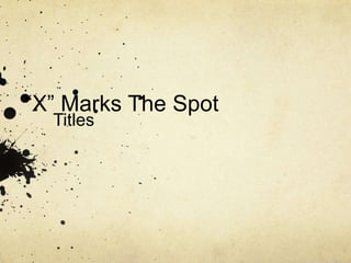
- 1. “X” Marks The Spot Titles
- 2. We tried using Birch Std as the font for the the first title and Calibri as the font of the second title. However we couldn’t agree on this font as it doesn’t fit our film opening.
- 3. We then tried using Marker felt as the font of the first title and Baoli Sc for the second title. All of us liked it however, we think that it would be more suitable for an animated film.
- 4. Thirdly we tried using Silom as the font for the first title and Calibri for the second title. However we did not think it represented the theme of the film.
- 5. These are the fonts that we liked the most. For both of these titles we used Marker Felt .We really liked it because it looks hand written and it fits the theme of our film opening. Lastly we tried using Nanum Brush Script as a font for the first title and Hobo Std as font for the second title. We chose these fonts for our titles because it looks hand written and it represents our film opening the most, as the killer is writing the clues and preparing the map.
- 6. Finally we tried using Nanum Brush Script as a font for the first title and Hobo Std as font for the second title. We chose these fonts for our titles because it looks hand written and it represents our film opening the most, as the killer is writing the clues and preparing the map.