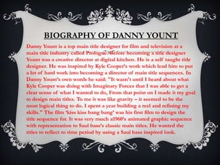
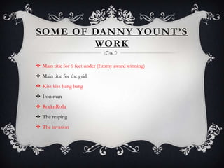
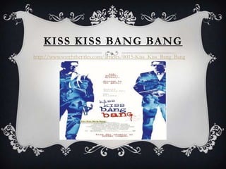
BIOGRAPHY OF DANNY YOUNT
Danny Yount is a top main title designer for film and television at a
main title industry called Prologue. Before becoming a title designer
Yount was a creative director at digital kitchen. He is a self taught title
designer. He was inspired by Kyle Cooper’s work which lead him to put
a lot of hard work into becoming a director of main title sequences. In
Danny Yount’s own words he said: "It wasn't until I heard about what
Kyle Cooper was doing with Imaginary Forces that I was able to get a
clear sense of what I wanted to do, From that point on I made it my goal
to design main titles. To me it was like gravity – it seemed to be the
most logical thing to do. I spent a year building a reel and refining my
skills." The film ‘kiss kiss bang bang’ was his first film to design the
title sequence for. It was very much a1960’s animated graphic sequence
with representation to Saul bass’s classic main titles. He wanted the
titles to reflect to time period by using a Saul bass inspired look.
SOME OF DANNY YOUNT’S
        WORK

 Main title for 6 feet under (Emmy award winning)
 Main title for the grid
 Kiss kiss bang bang
 Iron man
 RocknRolla
 The reaping
 The invasion
KISS KISS BANG BANG
http://www.watchthetitles.com/articles/0015-Kiss_Kiss_Bang_Bang
A NA LY S I S O F K I S S K I S S BA N G BA N G
                          TITLES

The typography used in the title sequence are bock capitals which give the
sense of an action genre the use of capitals tells the audience that it has action
in it. The way in which the titles appear in each shot gives the idea that there is
a chase to this story as they move smoothly through each different shot leading
on to each other. The titles go through windows and over fences and many
other places this helps the audience pin point the location and setting we are
yet to see in the film. We can also see that there will be some kind of murder
in the film as we see the ‘kiss kiss bang bang’ appear in a disturbing typography
that we could perhaps relate to a murderer’s hate mail type writing it also
appears with blood so we know there is some kind of death. In the sequence
the titles almost creep out from behind posts and it becomes mysterious as if
there could be some kind of mystery to the story of this film. The use of the
lips in the sequence tells us there is a womanly input in the film
IRON MAN
http://www.youtube.com/watch?v=lhwl2ibaDUw
A NA LY S I S O F I RO N M A N T I T L E S


In this sequence it begins with almost a prologue to the next film. The mans
image turns black and white almost like a news paper symbolising that what he's
just said will become big news in the world of the film. The writing in the
sequence is red this tells us there is danger in the film. Scamatic drawings and use
of graphical colours show this is a sci-fi film the black back ground and the
colours give a sort of in space sense to it. Also an action film as we can see the
suggestions to knives and guns.

Danny younts presentation

  • 2.
    BIOGRAPHY OF DANNYYOUNT Danny Yount is a top main title designer for film and television at a main title industry called Prologue. Before becoming a title designer Yount was a creative director at digital kitchen. He is a self taught title designer. He was inspired by Kyle Cooper’s work which lead him to put a lot of hard work into becoming a director of main title sequences. In Danny Yount’s own words he said: "It wasn't until I heard about what Kyle Cooper was doing with Imaginary Forces that I was able to get a clear sense of what I wanted to do, From that point on I made it my goal to design main titles. To me it was like gravity – it seemed to be the most logical thing to do. I spent a year building a reel and refining my skills." The film ‘kiss kiss bang bang’ was his first film to design the title sequence for. It was very much a1960’s animated graphic sequence with representation to Saul bass’s classic main titles. He wanted the titles to reflect to time period by using a Saul bass inspired look.
  • 3.
    SOME OF DANNYYOUNT’S WORK  Main title for 6 feet under (Emmy award winning)  Main title for the grid  Kiss kiss bang bang  Iron man  RocknRolla  The reaping  The invasion
  • 4.
    KISS KISS BANGBANG http://www.watchthetitles.com/articles/0015-Kiss_Kiss_Bang_Bang
  • 5.
    A NA LYS I S O F K I S S K I S S BA N G BA N G TITLES The typography used in the title sequence are bock capitals which give the sense of an action genre the use of capitals tells the audience that it has action in it. The way in which the titles appear in each shot gives the idea that there is a chase to this story as they move smoothly through each different shot leading on to each other. The titles go through windows and over fences and many other places this helps the audience pin point the location and setting we are yet to see in the film. We can also see that there will be some kind of murder in the film as we see the ‘kiss kiss bang bang’ appear in a disturbing typography that we could perhaps relate to a murderer’s hate mail type writing it also appears with blood so we know there is some kind of death. In the sequence the titles almost creep out from behind posts and it becomes mysterious as if there could be some kind of mystery to the story of this film. The use of the lips in the sequence tells us there is a womanly input in the film
  • 6.
  • 7.
    A NA LYS I S O F I RO N M A N T I T L E S In this sequence it begins with almost a prologue to the next film. The mans image turns black and white almost like a news paper symbolising that what he's just said will become big news in the world of the film. The writing in the sequence is red this tells us there is danger in the film. Scamatic drawings and use of graphical colours show this is a sci-fi film the black back ground and the colours give a sort of in space sense to it. Also an action film as we can see the suggestions to knives and guns.