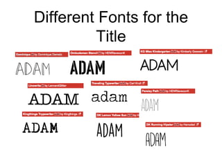
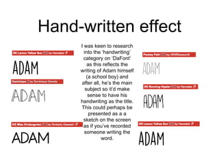
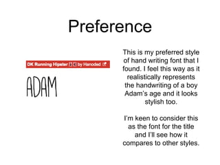
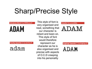
Titles
Planning
Title
• Due to common conventions of short film titles (as
discovered in a previous blog post) my short film will
only have the title at the beginning. This is
contrasting to feature length films where several
names are also in the opening title sequence.
• The title of my short film is ‘Adam’, which will be
displayed in my short film roughly 30 seconds into
the film.
Different Fonts for the
Title
Hand-written effect
I was keen to research
into the ‘handwriting’
category on ‘DaFont’
as this reflects the
writing of Adam himself
(a school boy) and
after all, he’s the main
subject so it’d make
sense to have his
handwriting as the title.
This could perhaps be
presented as a a
sketch on the screen
as if you’ve recorded
someone writing the
word.
Preference
This is my preferred style
of hand writing font that I
found. I feel this way as it
realistically represents
the handwriting of a boy
Adam’s age and it looks
stylish too.
I’m keen to consider this
as the font for the title
and I’ll see how it
compares to other styles.
Sharp/Precise Style
This style of font is
very organised and
neat, something that
our character is
reliant and keen on.
This style of font
would therefore
represent our
character as he is
also organised and
precise with aspects
of O.C.D creeping
into his personality

Title planning

  • 1.
  • 2.
    Title • Due tocommon conventions of short film titles (as discovered in a previous blog post) my short film will only have the title at the beginning. This is contrasting to feature length films where several names are also in the opening title sequence. • The title of my short film is ‘Adam’, which will be displayed in my short film roughly 30 seconds into the film.
  • 3.
  • 4.
    Hand-written effect I waskeen to research into the ‘handwriting’ category on ‘DaFont’ as this reflects the writing of Adam himself (a school boy) and after all, he’s the main subject so it’d make sense to have his handwriting as the title. This could perhaps be presented as a a sketch on the screen as if you’ve recorded someone writing the word.
  • 5.
    Preference This is mypreferred style of hand writing font that I found. I feel this way as it realistically represents the handwriting of a boy Adam’s age and it looks stylish too. I’m keen to consider this as the font for the title and I’ll see how it compares to other styles.
  • 6.
    Sharp/Precise Style This styleof font is very organised and neat, something that our character is reliant and keen on. This style of font would therefore represent our character as he is also organised and precise with aspects of O.C.D creeping into his personality