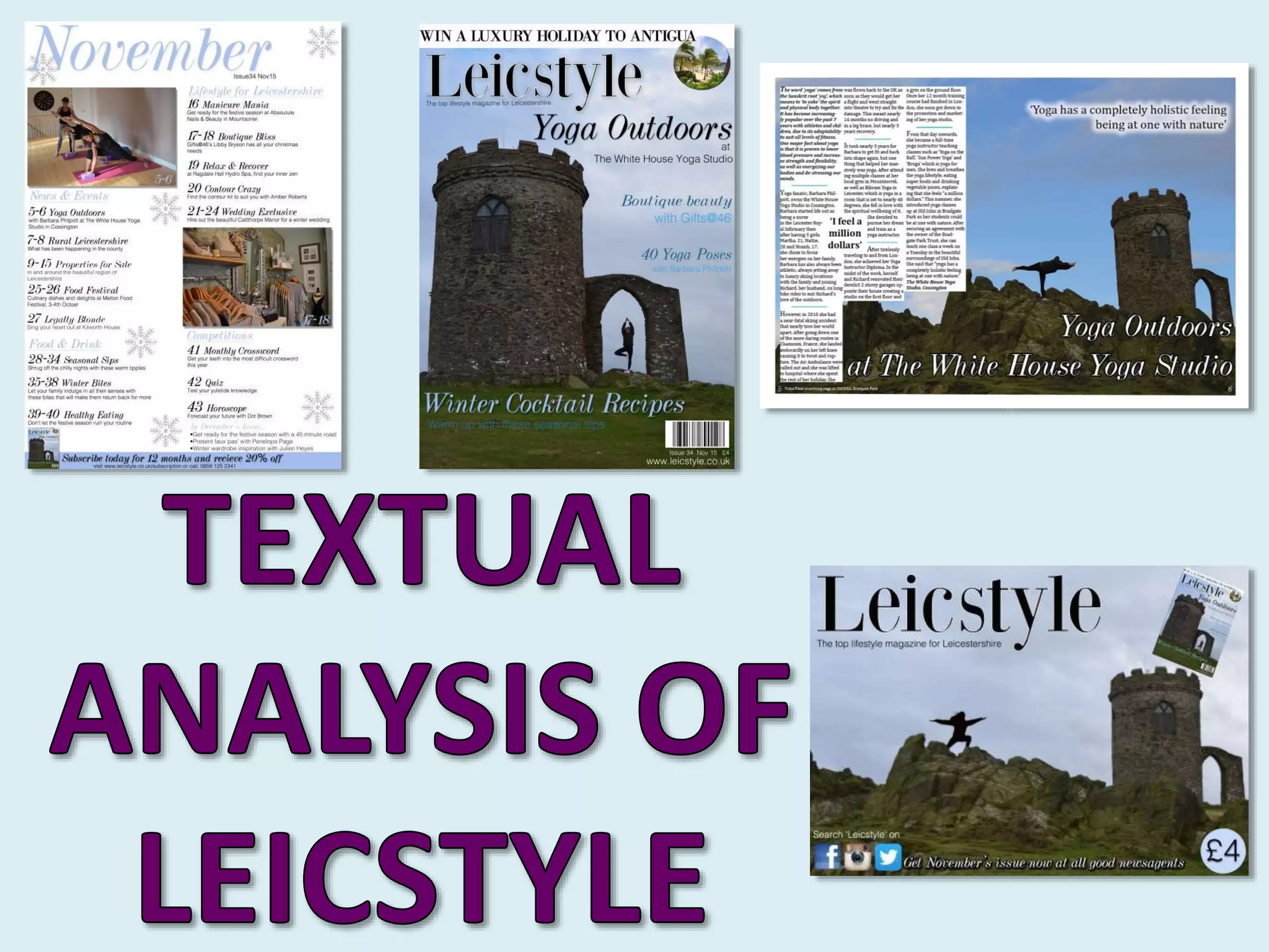
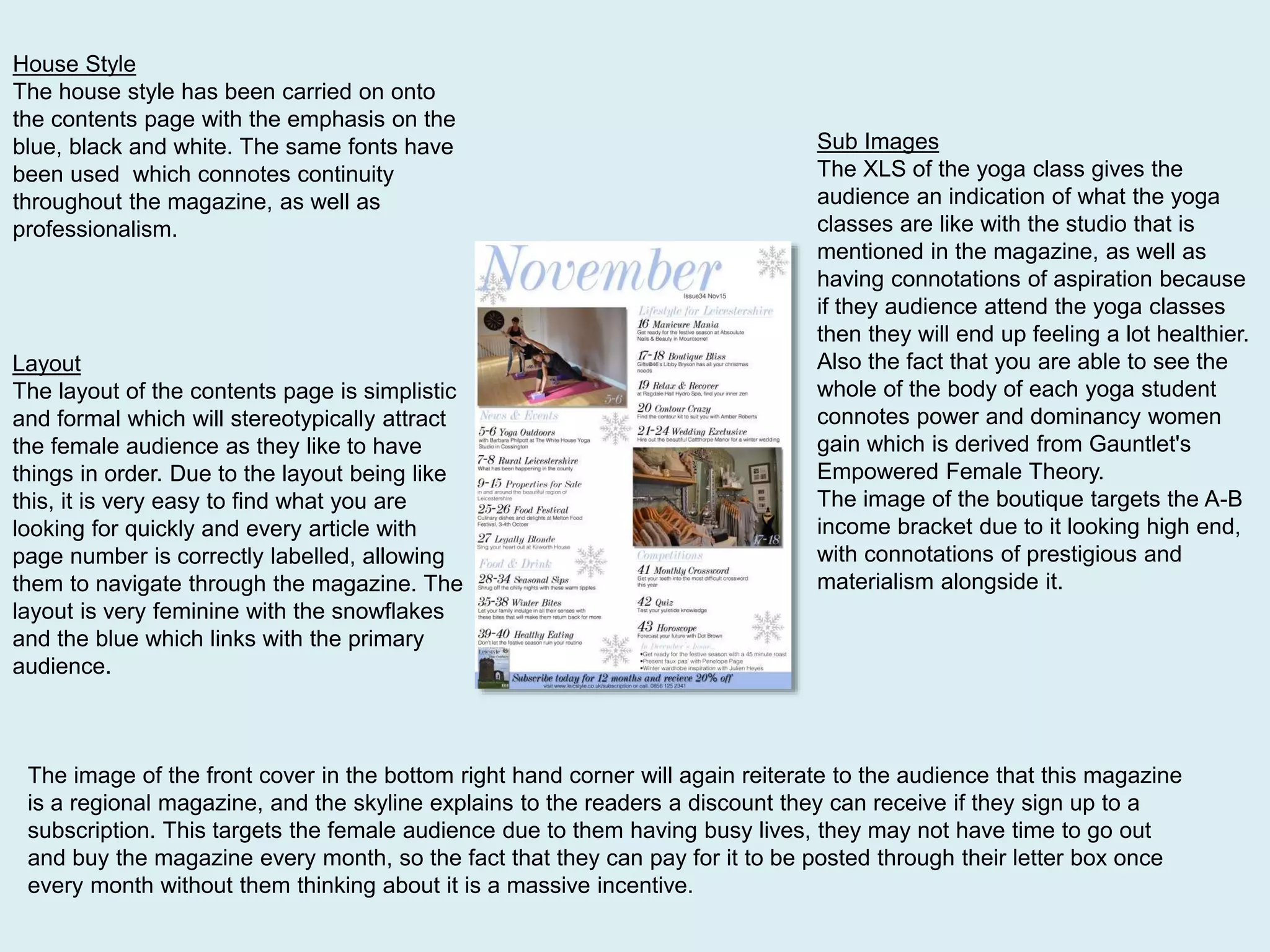
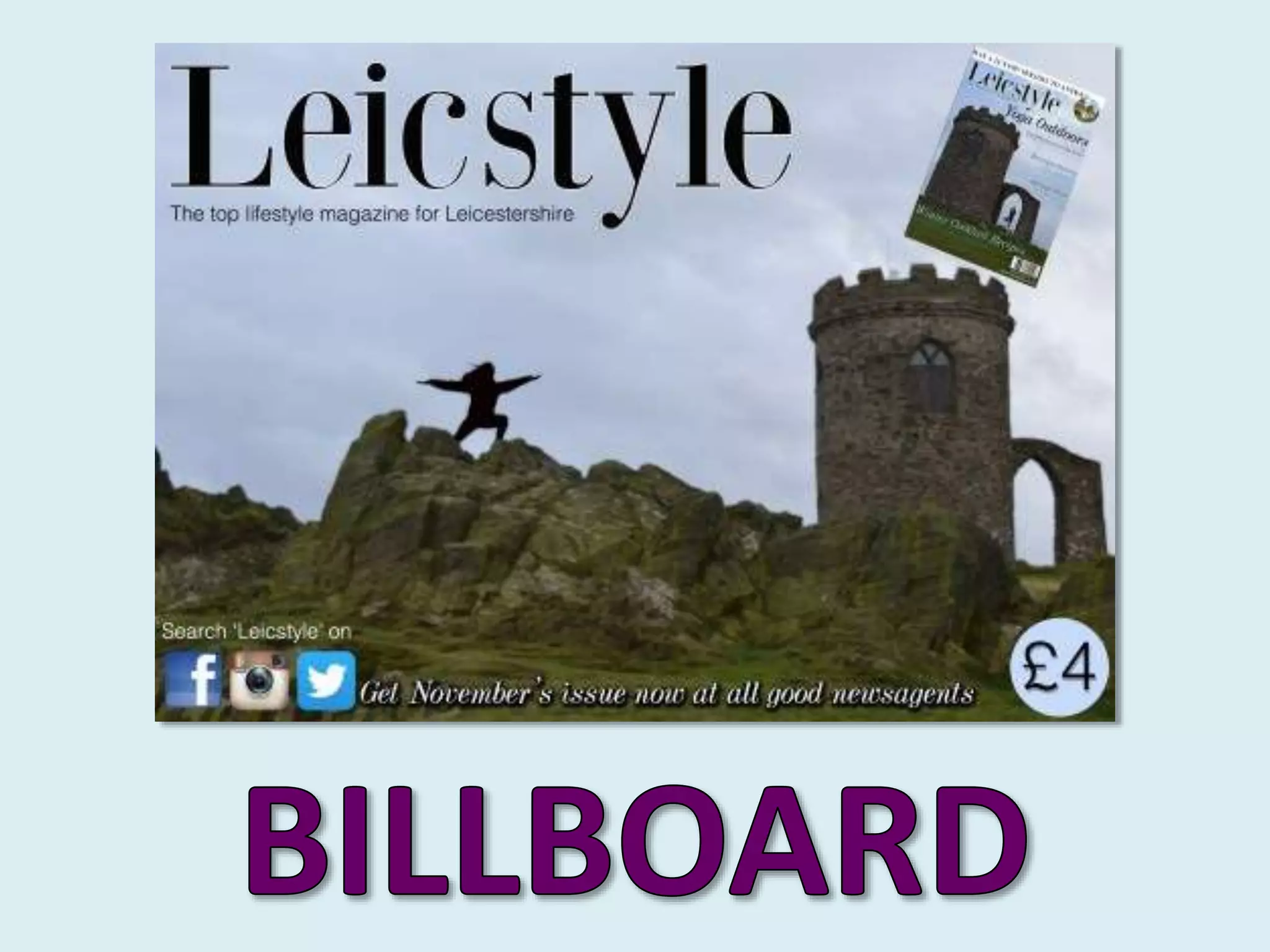
The document discusses the design elements of a regional magazine's front cover, contents page, and billboard advertisement.
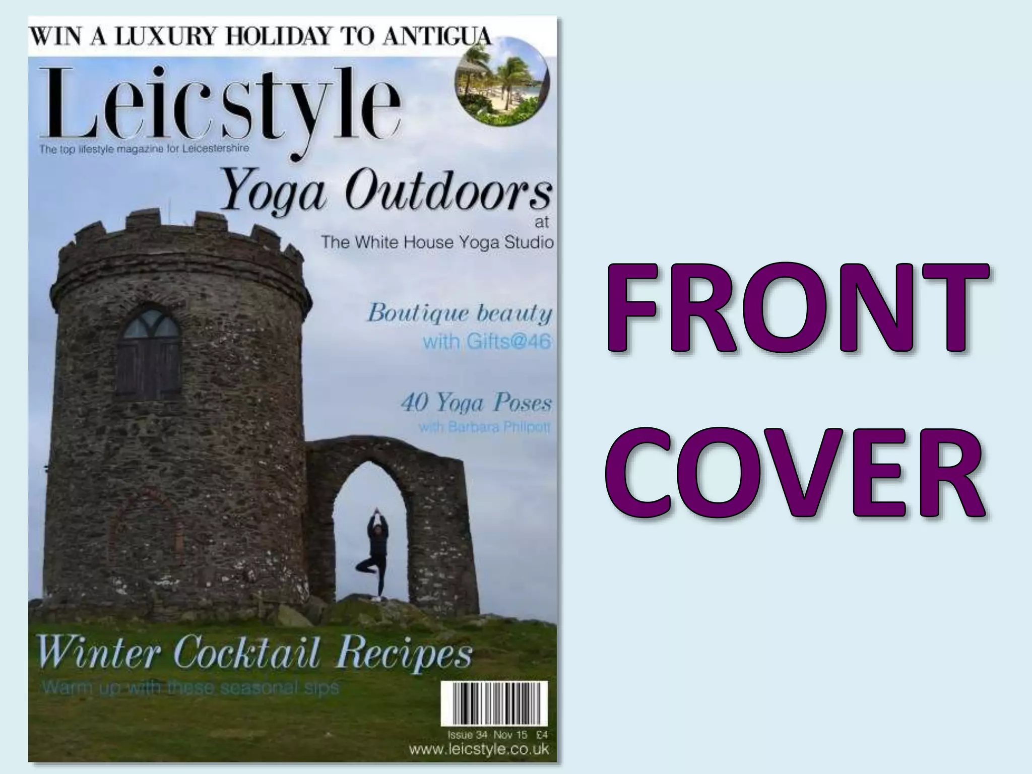
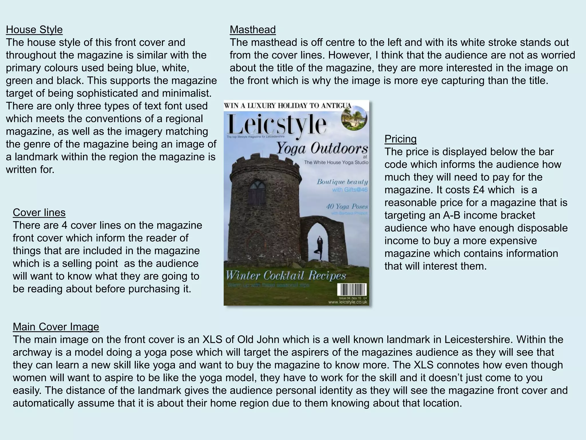
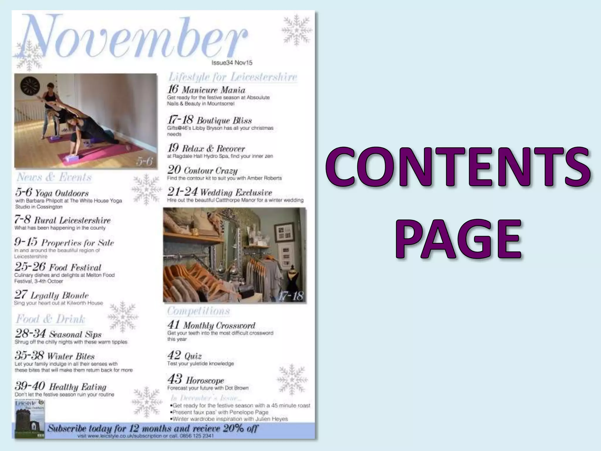
The front cover features an image of a local landmark with a yoga model to represent aspirational lifestyle content. The contents page continues the minimalist color scheme and layout for easy navigation.
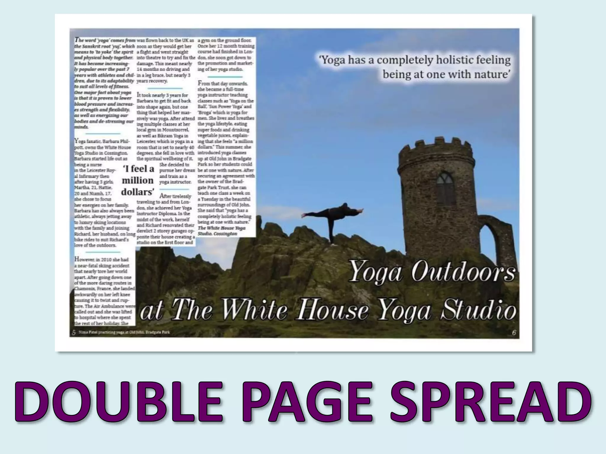
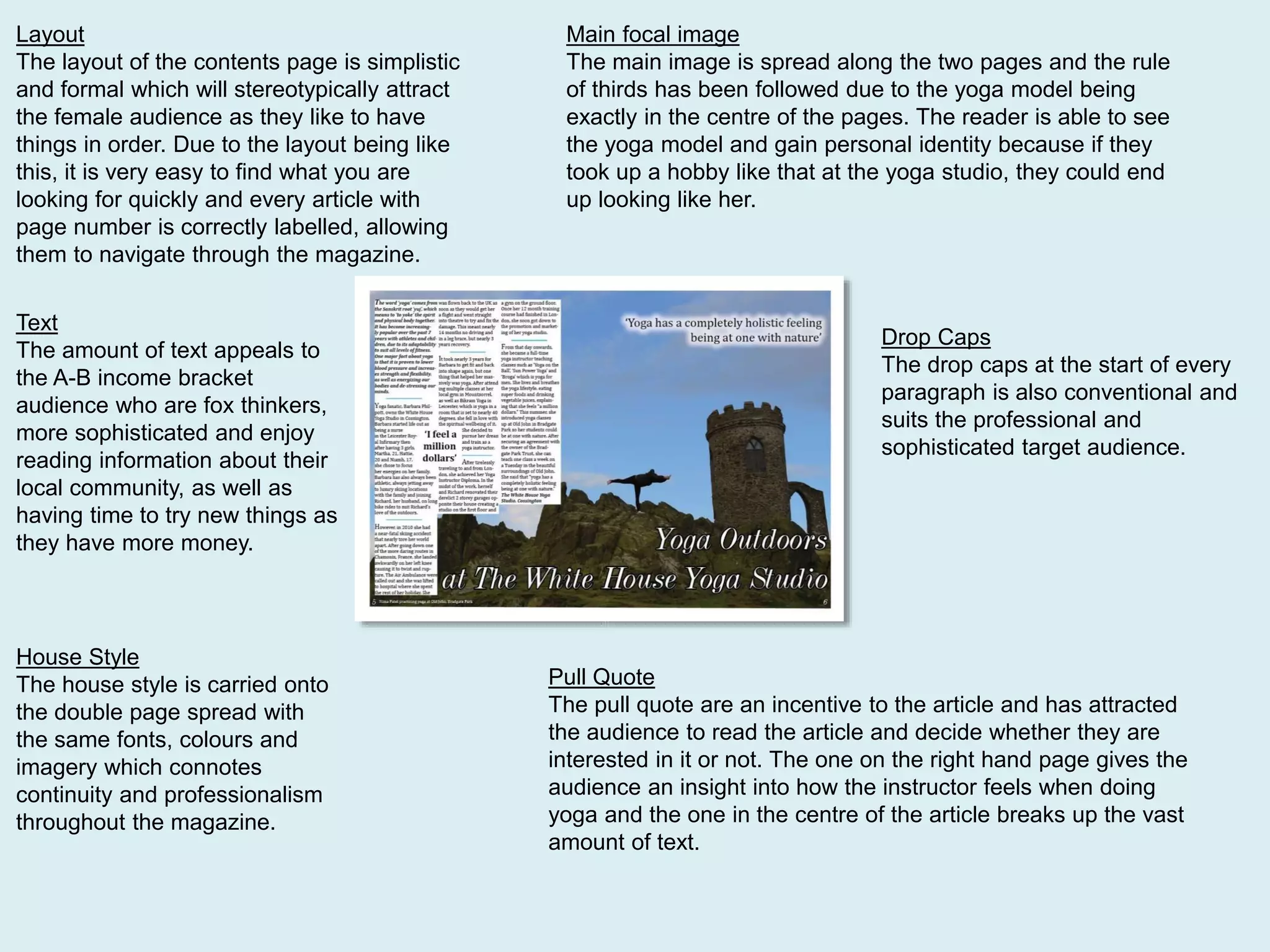
The double-page article spread centers around an image of a yoga class to promote health and empowerment. Consistent design elements like fonts, colors, and imagery provide continuity across the magazine's visual identity.