Download to read offline


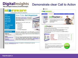

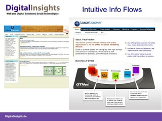


This document discusses website design, optimization, and testing strategies. It provides examples of case studies and recommendations for: 1) Conducting A/B and multi-variate testing of key design elements like images, copy, and calls to action to optimize conversions. 2) Employing a clear information architecture with obvious navigation and calls to action to guide users through intuitive information flows. 3) Following best practices like removing clutter, using large buttons and links, and answering questions upfront to improve the user experience.