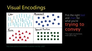
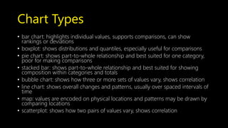
Simple Slide Design +
Visual Encodings for Data Viz
ESC the City NYC Founding Members Lightning Talk
http://www.escapethecity.org/nyc
Agenda
• Reading versus presentation slides
• Key design tips for presentation slides
• Key content tips for presentation slides
• A quick note on reading slides
• Data visualization definition
• A crash course in visual encodings
• Resources
Decide Your Purpose
Are you presentingyour slides or do you expect people to read
them?
Deck Variants
Presentation slides
are a
speaking
aid
Reading decks are
designed to be
consumed
alone https://hbr.org/ideacast/2015/11/slide-deck-presentations-dont-have-to-be-terrible.html
Presentation Deck Design Tips
http://www.slideshare.net/slidecomet/great-presentations-are-like-ads
Avoid Themes Like the Plague
Go beyond standardized font schemes or themes in Keynote or
Office
http://www.slideshare.net/edahn/10-tips-for-making-beautiful-slideshow-presentations-9210564/17
Quick Design
Pick five theme colors
Three fonts
title, body copy, accents
http://www.slideshare.net/edahn/10-tips-for-making-beautiful-slideshow-presentations-9210564/17
Four basic layouts
 Transitions
 Image slides
 Text slides
 Mixed slides
Make It Easy
Learn to use tools and resources
Office Styling Templates
Keynote Styling Templates
Last Word On Design
Show restraint
Don’t distract from content
http://www.quiethorizon.com/2013/12/the-virtue-of-restraint.html
Presentation Content Tips
And then let’s not get crazy
http://sd.keepcalm-o-matic.co.uk/i/content-is-king-context-is-queen-.png
Define and Sketch First
1) Find the purpose
2) Have empathy
3) Storyboard and outline first
http://i2.wp.com/ianmckendrick.com/wp-content/uploads/2011/04/powerpoint-storyboard-template.jpg
Image Tips
Icons as a way to demonstrate concepts
Google image is your hustle friend
Use Stock Photos wisely
https://www.colourbox.com/image/white-weather-icons-with-black-background-image-10881867
Keep Slides Friendly
Source your content
15 words or less
Appendices are your friend
White space is your friend
https://5thcolor.wordpress.com/tag/white-space/
Last Word On Content
Show restraint
Ideally one idea and one minute per slide
http://www.quiethorizon.com/2013/12/the-virtue-of-restraint.html
HBR on Reading Slides
So I find some of my most compelling slides to be one beautiful photograph that
may have no words on it at all.
Clearly, that doesn’t mean a lot to someone if they’re
reading it on their own.
So my version of what we call the reading deck is pretty much the same as the
presentation deck, except at the bottom it can have
two, three, four, even five lines of copy at the
bottom. That the reader would sit and literally
just read those sentences.
https://hbr.org/ideacast/2015/11/slide-deck-presentations-dont-have-to-be-terrible.html
A Quick Note on Reading Slides
Show restraint
The added content should serve more as annotations than a novel
http://www.quiethorizon.com/2013/12/the-virtue-of-restraint.html
Data Visualization Crash Course
https://kimoquaintance.files.wordpress.com/2011/08/screen-shot-2011-08-16-at-6-04-54-pm.png
What is Data Visualization?
Mapping data to pictures that convey a story accurately
http://www.ibm.com/design/assets/language/images/framework/visual/color/Color_Assets_chart.svg
Data Visualization for Slides
Define, decode, and find narrative
in your data
Make the reader take minimal effort
Source properly and don’t distort
http://www.pewinternet.org/2016/08/15/social-media-conversations-about-race/
Visual Encodings
https://www.udacity.com/course/data-visualization-and-d3js--ud507
Pick the right tool
and chart for
what you’re
trying to
convey
*This might not what looks
most cool or sexy
Chart Types & Visual Encodings
https://www.udacity.com/course/data-visualization-and-d3js--ud507
Storytelling above all
https://www.udacity.com/course/data-visualization-and-d3js--ud507
*Don’t be afraid to break the rules
Summary & Last Words
 Know what you’re trying to communicate
 Find system and purpose that works for you
 Customization is key for design
 Don’t force your audience to think
 Study visuals and presentations
 Take advantage of free resources
 Hustle
Thank You
Appendices Go here
What is Data Visualization?
Continued
• Data viz is about conveying a story with as little words as possible
• Use color size, shape, and other visual
encodings to convey info and insight to reader with storytelling
and narrative elements.
• Mapping data to visuals
• Turning numbers into pictures and stories
• Helps people explore and understand the data
• Good data viz = aha moments!
Data Types
• Types of Data
• Numeric/Quantitative Data: Any data where data points are exact numbers, have
meaning as measurement (eg. height and weight) or a count (number of hits)
• Discrete: distinct values (home runs - e.g. only whole numbers)
• Continuous: any value in a rank (fall anywhere between a range, like a batting average,
income))
• Categorical/Nominal Data
• Represents characteristics (eg. position, hometown, team)
• Can take numerical scales, but they don’t have mathematical meaning (e.g. 1 and 2 in
basketball, you can’t add them together or take average)
• Ordinal Data
• Categories with some order or ranking (power ratings, 1 to 5 stars for a movie)
• Time Series Data
• Data collected via repeated measurements over time (avg number of home run/player
over many years)
• Some implied ordering
Chart Types
• bar chart: highlights individual values, supports comparisons, can show
rankings or deviations
• boxplot: shows distributions and quantiles, especially useful for comparisons
• pie chart: shows part-to-whole relationship and best suited for one category,
poor for making comparisons
• stacked bar: shows part-to-whole relationship and best suited for showing
composition within categories and totals
• bubble chart: shows how three or more sets of values vary, shows correlation
• line chart: shows overall changes and patterns, usually over spaced intervals of
time
• map: values are encoded on physical locations and patterns may be drawn by
comparing locations
• scatterplot: shows how two pairs of values vary, shows correlation
Resources
Slide Design and Presentation
10 Tips for Making Beautiful Slide Show Presentations
Do Your Slides Pass the Glance Test
Slide Design for Developers
Slide Deck Presentations Don’t Have to Be Terrible
Guy Kawasaki's 10-20-30 Rule for Presentations
How Can I Make My PowerPoint Presentations Amazing?
How to Give a Killer Presentation
Resources
Some Favorite Slide Examples
Frog Design’s Slides
Displaying Data
What Would Steve Do? 10 Lessons from the World's Most Captivating
Presenters
The best stats you’ve ever seen
Crap. The Content Marketing Deluge.
Sponsorship trends for 2014
Resources
Finding Colors, Style Schemes, etc.:
COLOURlovers: Color Trends + Palette
Adobe Color Wheel
Paletton
Color Hunter
Flat Icon
Resources
Data Visualization Books
• Data Points and Visualize This by Nathan Yau of FlowingData.com
• The Functional Art by Alberto Cairo
• Wall Street Journal Guide to Information Graphics
• The Visual Display of Quantitative Information by Edward Tufte
Presenting Data
Displaying Data
Data Visualization 101: How to Design Charts and Graphs
From Data to Visualization, what happens in between?
Data Journalism Handbook
Resources
Learning Data Visualization
Perceptual Edge Whitepapers
8 Basics of Data Interpretation
OpenVisConf Videos
Data Stories
Viz Examples
DataIsBeautiful
Pew Research Center
FiveThirtyEight

Simple Slide Design and Data Visualization Crash Course

  • 1.
    Simple Slide Design+ Visual Encodings for Data Viz ESC the City NYC Founding Members Lightning Talk http://www.escapethecity.org/nyc
  • 2.
    Agenda • Reading versuspresentation slides • Key design tips for presentation slides • Key content tips for presentation slides • A quick note on reading slides • Data visualization definition • A crash course in visual encodings • Resources
  • 3.
    Decide Your Purpose Areyou presentingyour slides or do you expect people to read them?
  • 4.
    Deck Variants Presentation slides area speaking aid Reading decks are designed to be consumed alone https://hbr.org/ideacast/2015/11/slide-deck-presentations-dont-have-to-be-terrible.html
  • 5.
    Presentation Deck DesignTips http://www.slideshare.net/slidecomet/great-presentations-are-like-ads
  • 6.
    Avoid Themes Likethe Plague Go beyond standardized font schemes or themes in Keynote or Office http://www.slideshare.net/edahn/10-tips-for-making-beautiful-slideshow-presentations-9210564/17
  • 7.
    Quick Design Pick fivetheme colors Three fonts title, body copy, accents http://www.slideshare.net/edahn/10-tips-for-making-beautiful-slideshow-presentations-9210564/17 Four basic layouts  Transitions  Image slides  Text slides  Mixed slides
  • 8.
    Make It Easy Learnto use tools and resources Office Styling Templates Keynote Styling Templates
  • 9.
    Last Word OnDesign Show restraint Don’t distract from content http://www.quiethorizon.com/2013/12/the-virtue-of-restraint.html
  • 10.
    Presentation Content Tips Andthen let’s not get crazy http://sd.keepcalm-o-matic.co.uk/i/content-is-king-context-is-queen-.png
  • 11.
    Define and SketchFirst 1) Find the purpose 2) Have empathy 3) Storyboard and outline first http://i2.wp.com/ianmckendrick.com/wp-content/uploads/2011/04/powerpoint-storyboard-template.jpg
  • 12.
    Image Tips Icons asa way to demonstrate concepts Google image is your hustle friend Use Stock Photos wisely https://www.colourbox.com/image/white-weather-icons-with-black-background-image-10881867
  • 13.
    Keep Slides Friendly Sourceyour content 15 words or less Appendices are your friend White space is your friend https://5thcolor.wordpress.com/tag/white-space/
  • 14.
    Last Word OnContent Show restraint Ideally one idea and one minute per slide http://www.quiethorizon.com/2013/12/the-virtue-of-restraint.html
  • 15.
    HBR on ReadingSlides So I find some of my most compelling slides to be one beautiful photograph that may have no words on it at all. Clearly, that doesn’t mean a lot to someone if they’re reading it on their own. So my version of what we call the reading deck is pretty much the same as the presentation deck, except at the bottom it can have two, three, four, even five lines of copy at the bottom. That the reader would sit and literally just read those sentences. https://hbr.org/ideacast/2015/11/slide-deck-presentations-dont-have-to-be-terrible.html
  • 16.
    A Quick Noteon Reading Slides Show restraint The added content should serve more as annotations than a novel http://www.quiethorizon.com/2013/12/the-virtue-of-restraint.html
  • 17.
    Data Visualization CrashCourse https://kimoquaintance.files.wordpress.com/2011/08/screen-shot-2011-08-16-at-6-04-54-pm.png
  • 18.
    What is DataVisualization? Mapping data to pictures that convey a story accurately http://www.ibm.com/design/assets/language/images/framework/visual/color/Color_Assets_chart.svg
  • 19.
    Data Visualization forSlides Define, decode, and find narrative in your data Make the reader take minimal effort Source properly and don’t distort http://www.pewinternet.org/2016/08/15/social-media-conversations-about-race/
  • 20.
    Visual Encodings https://www.udacity.com/course/data-visualization-and-d3js--ud507 Pick theright tool and chart for what you’re trying to convey *This might not what looks most cool or sexy
  • 21.
    Chart Types &Visual Encodings https://www.udacity.com/course/data-visualization-and-d3js--ud507
  • 22.
  • 23.
    Summary & LastWords  Know what you’re trying to communicate  Find system and purpose that works for you  Customization is key for design  Don’t force your audience to think  Study visuals and presentations  Take advantage of free resources  Hustle
  • 24.
  • 25.
  • 26.
    What is DataVisualization? Continued • Data viz is about conveying a story with as little words as possible • Use color size, shape, and other visual encodings to convey info and insight to reader with storytelling and narrative elements. • Mapping data to visuals • Turning numbers into pictures and stories • Helps people explore and understand the data • Good data viz = aha moments!
  • 27.
    Data Types • Typesof Data • Numeric/Quantitative Data: Any data where data points are exact numbers, have meaning as measurement (eg. height and weight) or a count (number of hits) • Discrete: distinct values (home runs - e.g. only whole numbers) • Continuous: any value in a rank (fall anywhere between a range, like a batting average, income)) • Categorical/Nominal Data • Represents characteristics (eg. position, hometown, team) • Can take numerical scales, but they don’t have mathematical meaning (e.g. 1 and 2 in basketball, you can’t add them together or take average) • Ordinal Data • Categories with some order or ranking (power ratings, 1 to 5 stars for a movie) • Time Series Data • Data collected via repeated measurements over time (avg number of home run/player over many years) • Some implied ordering
  • 28.
    Chart Types • barchart: highlights individual values, supports comparisons, can show rankings or deviations • boxplot: shows distributions and quantiles, especially useful for comparisons • pie chart: shows part-to-whole relationship and best suited for one category, poor for making comparisons • stacked bar: shows part-to-whole relationship and best suited for showing composition within categories and totals • bubble chart: shows how three or more sets of values vary, shows correlation • line chart: shows overall changes and patterns, usually over spaced intervals of time • map: values are encoded on physical locations and patterns may be drawn by comparing locations • scatterplot: shows how two pairs of values vary, shows correlation
  • 29.
    Resources Slide Design andPresentation 10 Tips for Making Beautiful Slide Show Presentations Do Your Slides Pass the Glance Test Slide Design for Developers Slide Deck Presentations Don’t Have to Be Terrible Guy Kawasaki's 10-20-30 Rule for Presentations How Can I Make My PowerPoint Presentations Amazing? How to Give a Killer Presentation
  • 30.
    Resources Some Favorite SlideExamples Frog Design’s Slides Displaying Data What Would Steve Do? 10 Lessons from the World's Most Captivating Presenters The best stats you’ve ever seen Crap. The Content Marketing Deluge. Sponsorship trends for 2014
  • 31.
    Resources Finding Colors, StyleSchemes, etc.: COLOURlovers: Color Trends + Palette Adobe Color Wheel Paletton Color Hunter Flat Icon
  • 32.
    Resources Data Visualization Books •Data Points and Visualize This by Nathan Yau of FlowingData.com • The Functional Art by Alberto Cairo • Wall Street Journal Guide to Information Graphics • The Visual Display of Quantitative Information by Edward Tufte Presenting Data Displaying Data Data Visualization 101: How to Design Charts and Graphs From Data to Visualization, what happens in between? Data Journalism Handbook
  • 33.
    Resources Learning Data Visualization PerceptualEdge Whitepapers 8 Basics of Data Interpretation OpenVisConf Videos Data Stories Viz Examples DataIsBeautiful Pew Research Center FiveThirtyEight