Download as PDF, PPTX
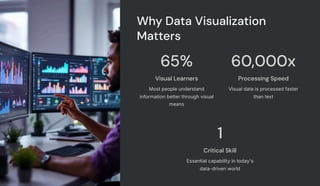
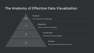
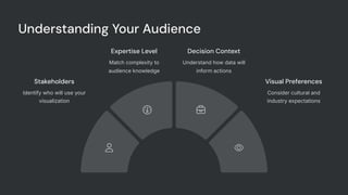
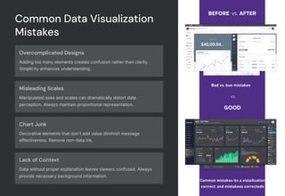
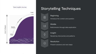
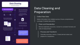
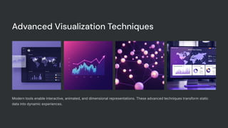
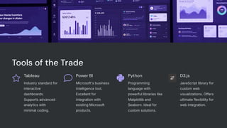

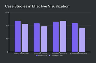

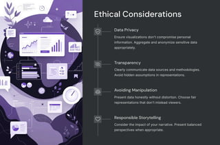

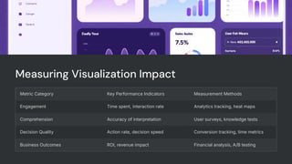

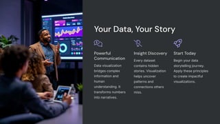

Great data alone doesn’t drive change—clear visual storytelling does. This beginner-friendly presentation will teach you how to create powerful visualizations that communicate insights effectively. We cover design principles for charts, dashboards, and infographics that resonate with non-technical audiences. Learn how to choose the right chart types, avoid clutter, and emphasize the most important takeaways. Whether you’re using Excel, Power BI, Tableau, or Python libraries, you’ll discover best practices for turning numbers into narratives that influence decisions. Perfect for business analysts, data professionals, and content creators looking to level up their presentation game.


![Hacking-Uncovered-How-People-Get-Hacked-and-How-to-Stay-Safe[1].pptx](https://cdn.slidesharecdn.com/ss_thumbnails/hacking-uncovered-how-people-get-hacked-and-how-to-stay-safe1-260130170011-4883a9c7-thumbnail.jpg?width=640&height=640&fit=bounds)
![7.__Developing_a_Research_Proposal[1].pptx](https://cdn.slidesharecdn.com/ss_thumbnails/7-260131073037-df92dd7d-thumbnail.jpg?width=640&height=640&fit=bounds)


![제 23회 보아즈(BOAZ) 빅데이터 컨퍼런스 - [MBOAX] : ABSA를 활용한 소비자 반응 분석 기반 운영 효율화 대시보드 설계](https://cdn.slidesharecdn.com/ss_thumbnails/3-1boaz23rdconferencemboax-260203102709-9d519923-thumbnail.jpg?width=640&height=640&fit=bounds)


