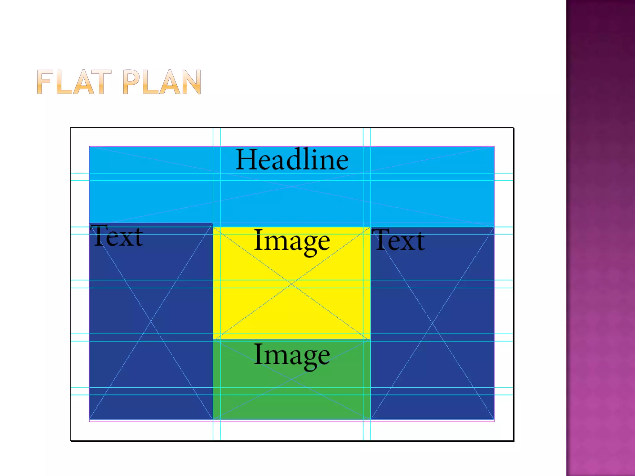
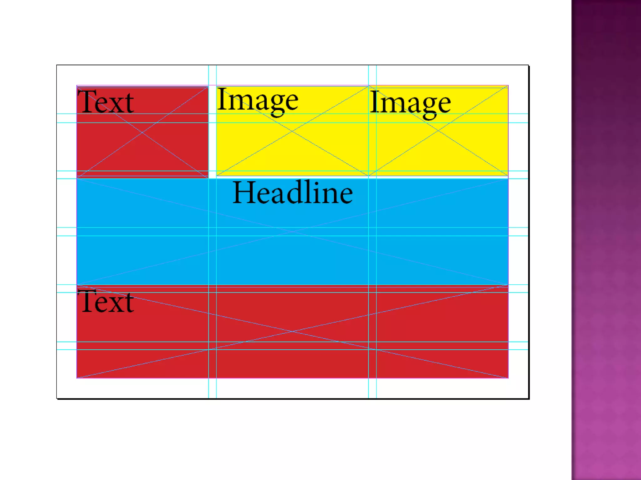
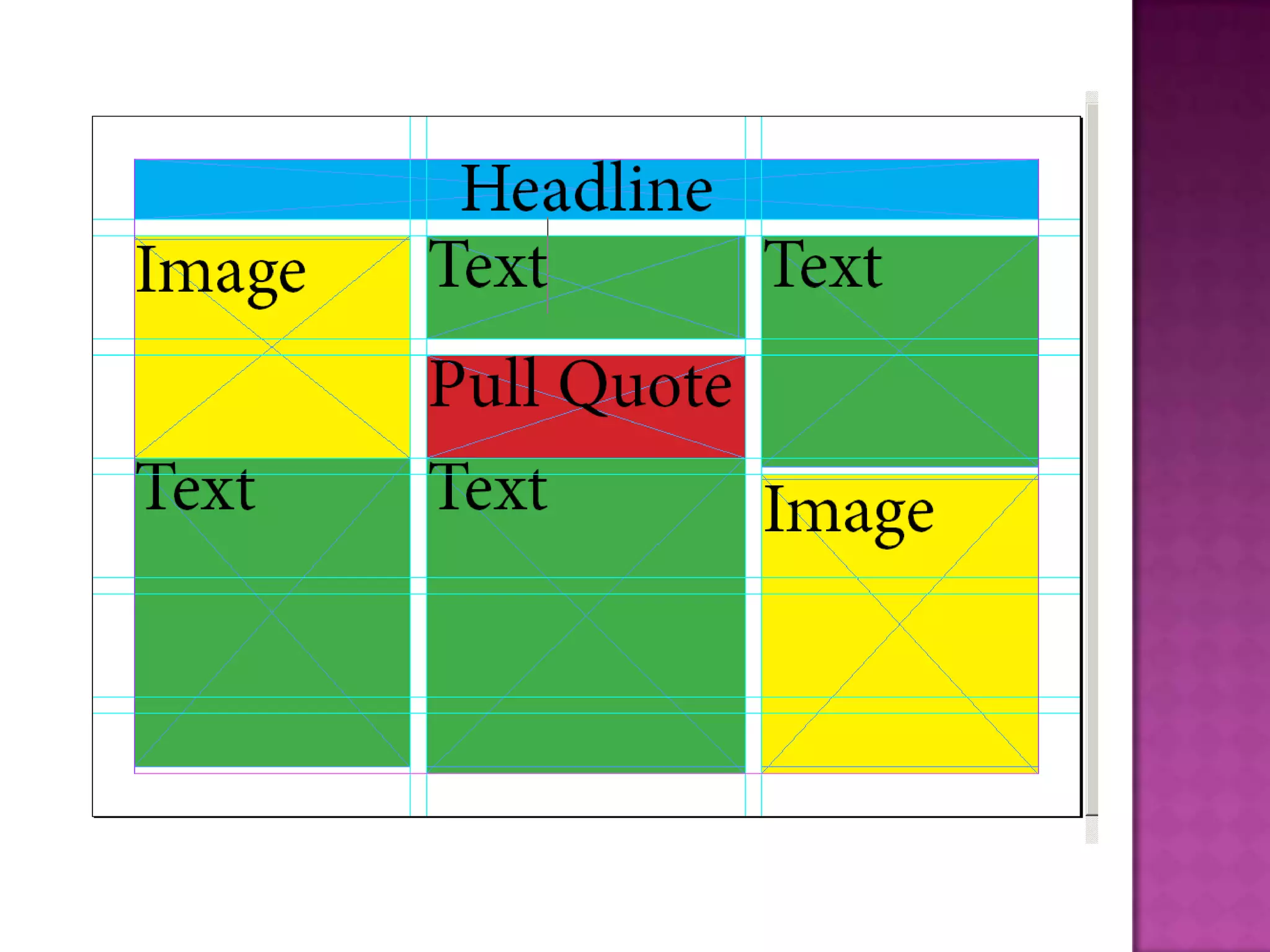
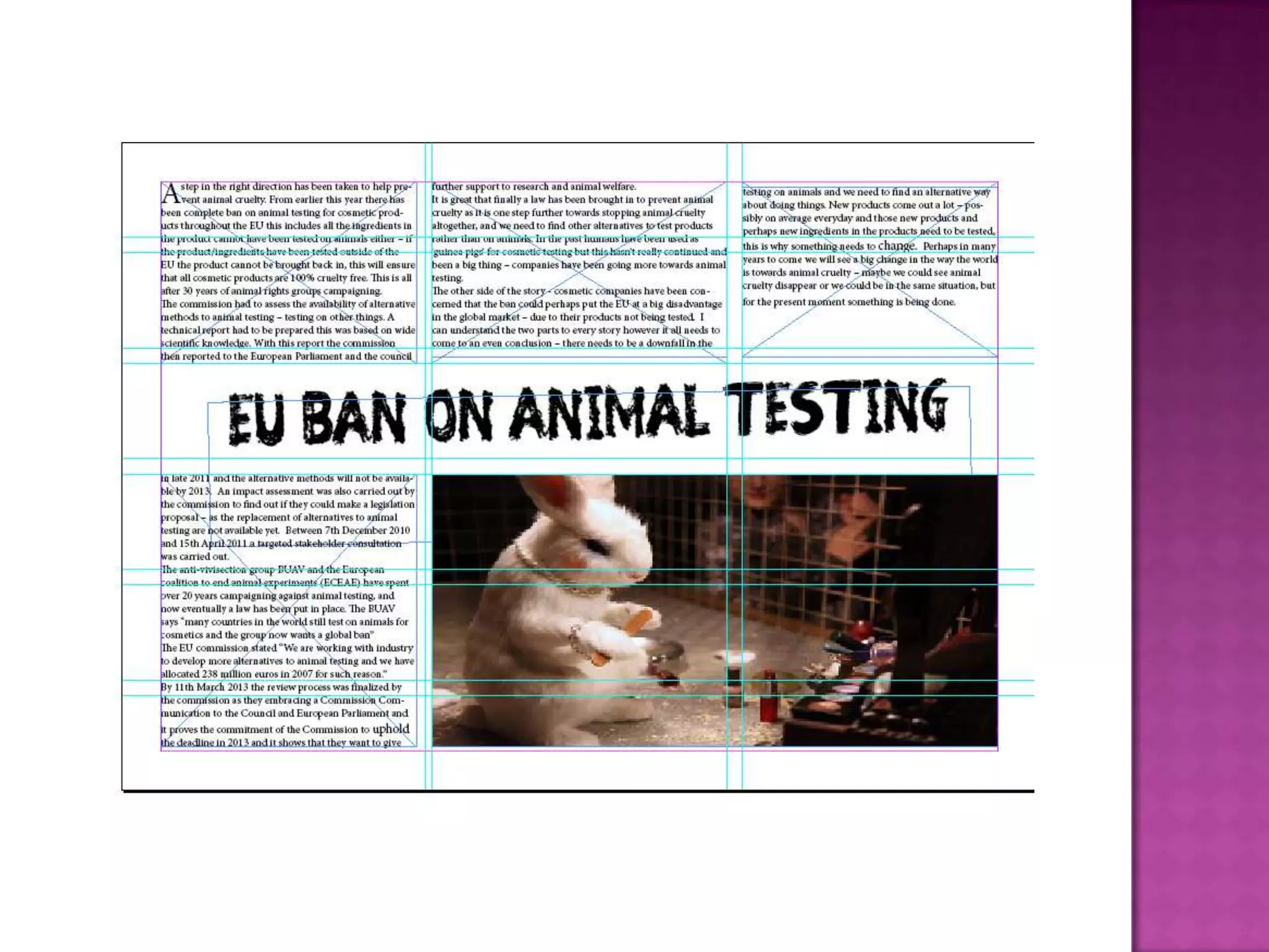
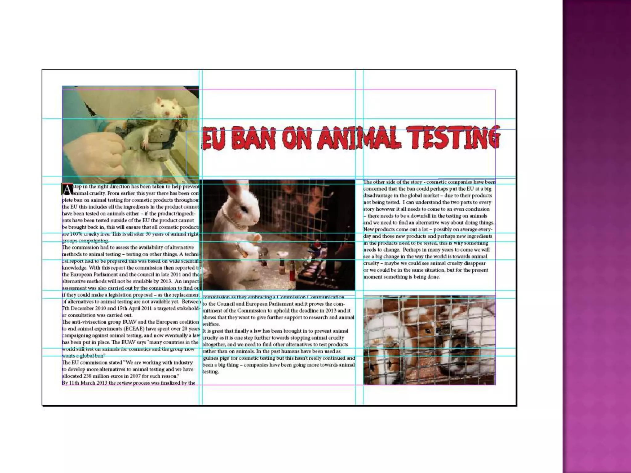
 I had quite a few ideas of what I wanted to do for the layout of the fanzine. I decided to make a few
different ones so I could get an idea of which one I wanted to base my layout upon. When I was looking
through different fanzines on the internet I saw that they were all set out differently but mostly on double
page spreads.
 I liked the idea of the double page spread as I thought it was more suitable to a fanzine article rather than
just one page of text. I wanted a double page spread so I could include lots of writing and text but I
wanted to change it up a bit and have things in different positions and not just a basic layout.
 I haven't decided completely on a layout but I want to go towards the second flat plan as I think that
layout is different compared to the things being in the normal place such as a headline at the top ill have
it in the middle.
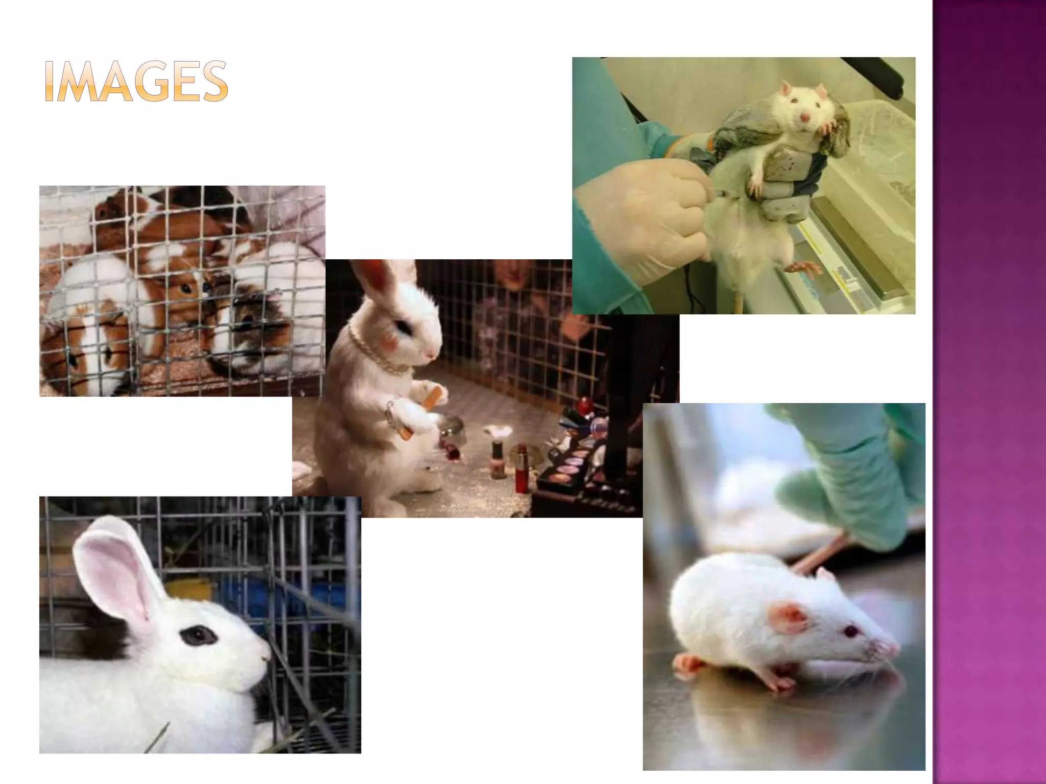
 For my fanzine I am doing it based on the EU testing ban for animal testing. For my images I am thinking on
using these – they aren't extremely graphic but they are showing what is going on. I will obviously have
more images than this but I will add them in depending on my layout, I was thinking of having a few big
images and then some little ones with captions.
 The image in the middle I think is the best one, it is giving you an insight into what is going on without
actually showing you, it is really simplistic but it gets the message across.
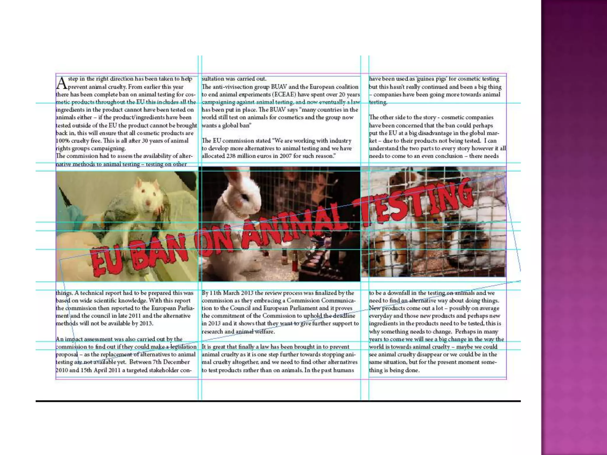
 I most likely will have the images together in a row going across the page with the headline going through
it although I haven't completely decided on the position of the images yet.
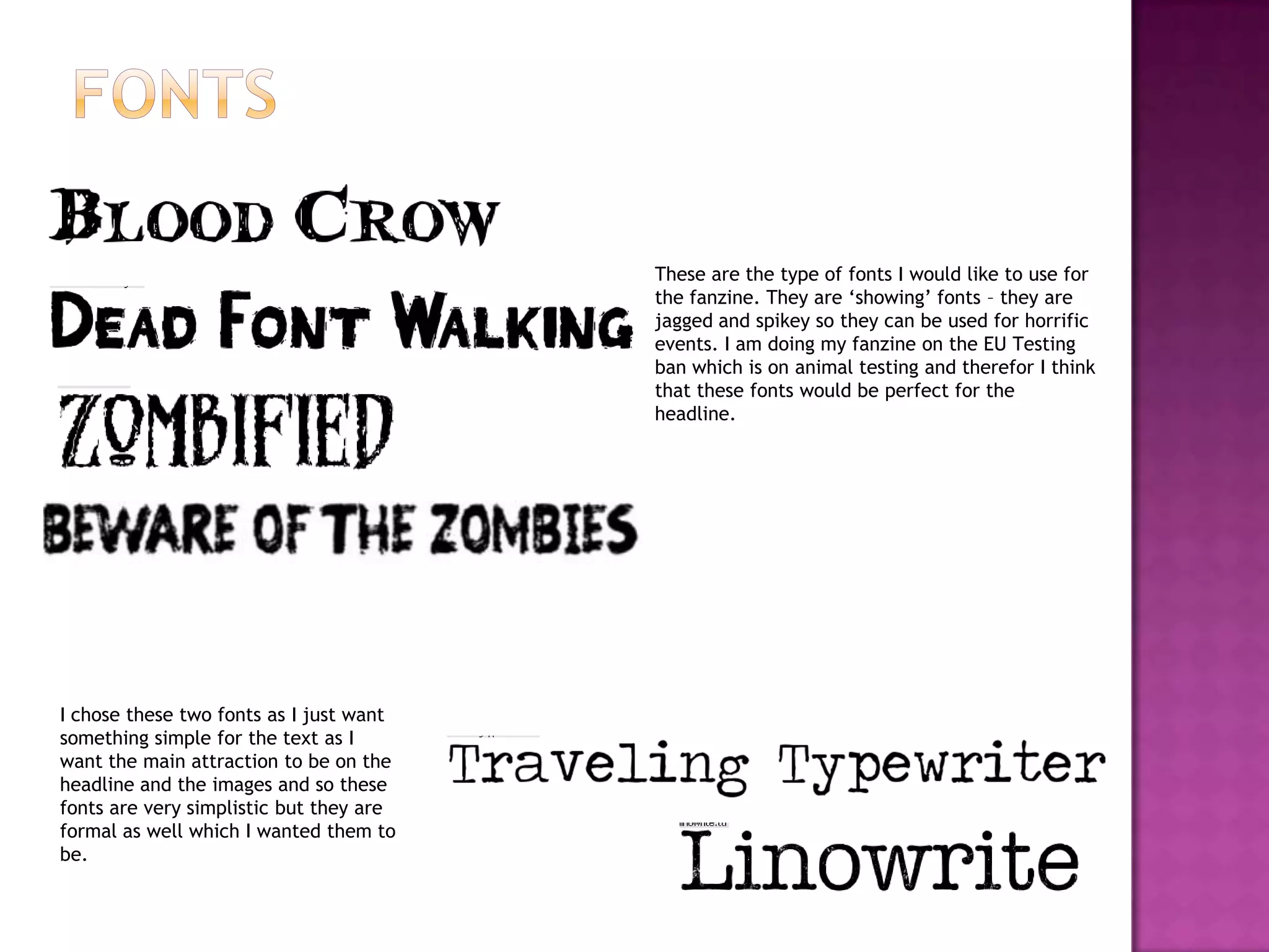
These are the type of fonts I would like to use for
the fanzine. They are ‘showing’ fonts – they are
jagged and spikey so they can be used for horrific
events. I am doing my fanzine on the EU Testing
ban which is on animal testing and therefor I think
that these fonts would be perfect for the
headline.
I chose these two fonts as I just want
something simple for the text as I
want the main attraction to be on the
headline and the images and so these
fonts are very simplistic but they are
formal as well which I wanted them to
be.
 At first I was experimenting on what layout looked best, I decided to put the images far apart and have the
text around it and the headline at the top but I thought it was a bit too plain and the headline wasn’t
really that noticeable.
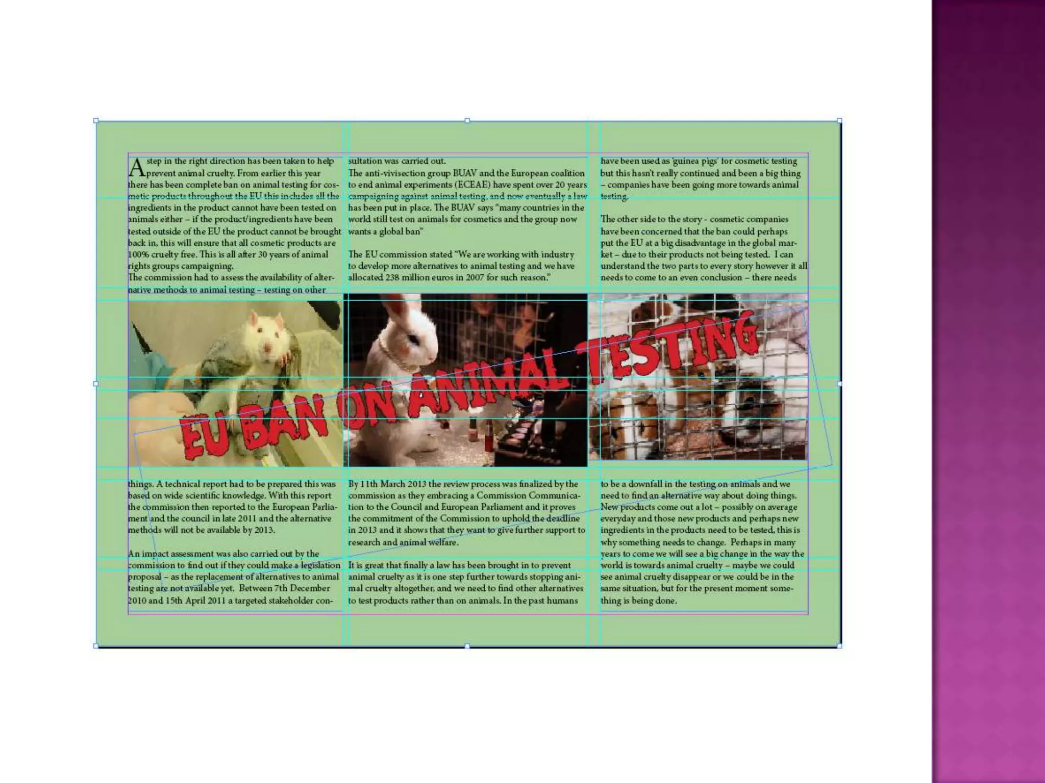
 I then decided to have my images going across the middle of the page as I thought that looked a lot better
than having them all spaced out as it didn’t really fit the page, I decided to put the headline through the
images as I wanted it to look noticeable – having images of animals and then a headline saying that animal
cruelty was banned through it so it gave a better impression.
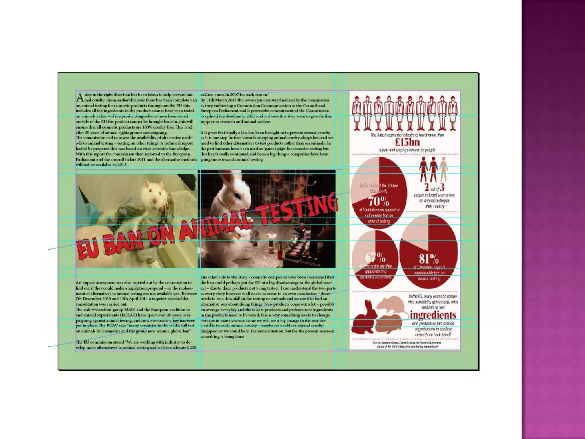
 I thought that it still looked a bit plain and needed something more doing to it so I decided so include a
bigger image what included some facts about animal cruelty to make it a bit more interesting rather than
just having a lot of plain text and a few images.
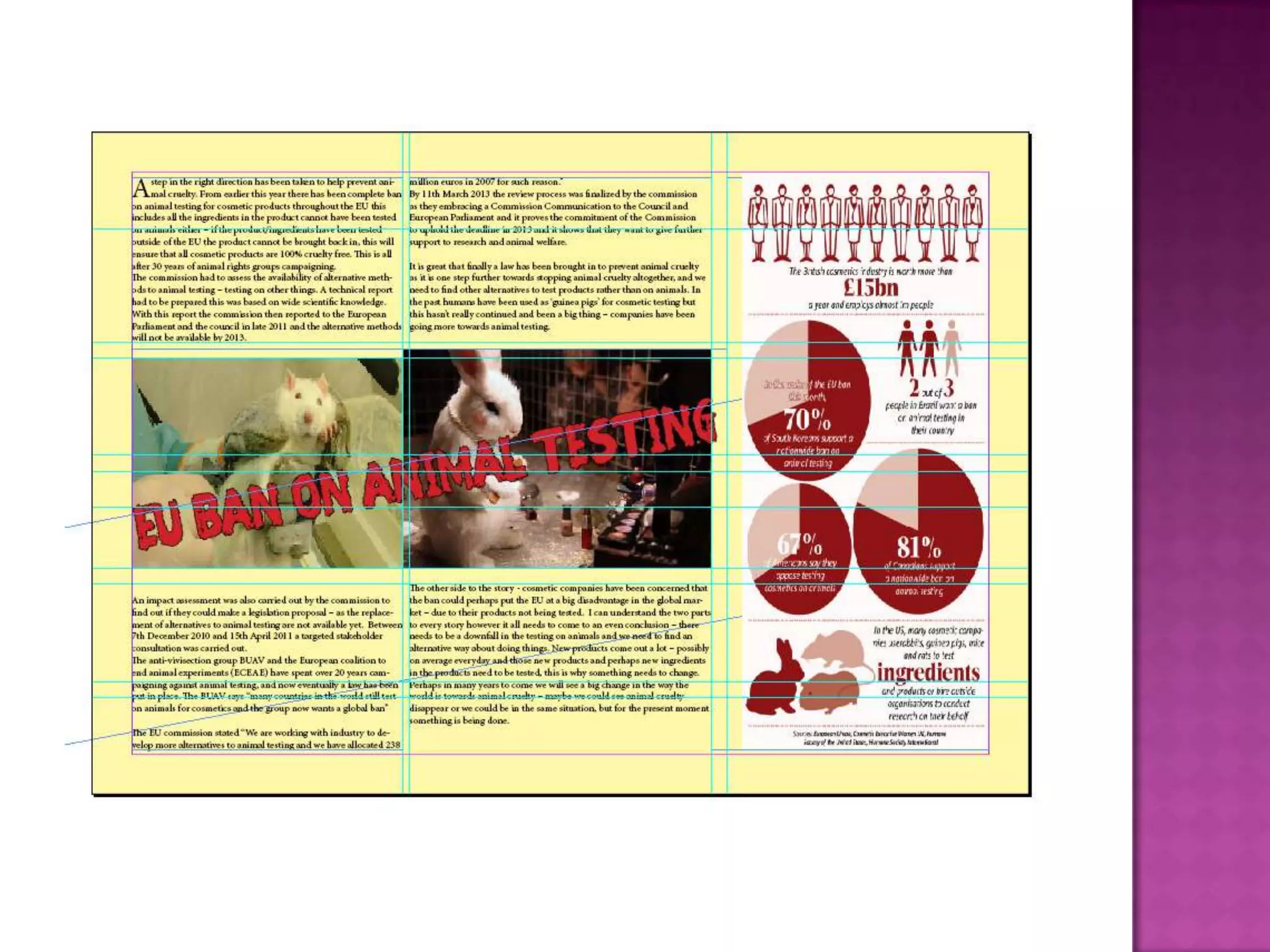
 After that I thought it looked better but the background was plain so I just decided to give it a bit more
colour to make it look better and more complete.
 Overall I am happy with my final design but it could do with a bit of improvement – it just needs something
to make it more eye catching and appealing to the readers, I think it looks ok but not 100% professional it
just needs things doing to it to make it more eye catching like I say as when I look at it all I see is a lot of
text. I could have improved it by having small chunks of informative text in sections and image captions –
having it all spaced out rather than having it like a standard article.

Task 9

  • 5.
     I hadquite a few ideas of what I wanted to do for the layout of the fanzine. I decided to make a few different ones so I could get an idea of which one I wanted to base my layout upon. When I was looking through different fanzines on the internet I saw that they were all set out differently but mostly on double page spreads.  I liked the idea of the double page spread as I thought it was more suitable to a fanzine article rather than just one page of text. I wanted a double page spread so I could include lots of writing and text but I wanted to change it up a bit and have things in different positions and not just a basic layout.  I haven't decided completely on a layout but I want to go towards the second flat plan as I think that layout is different compared to the things being in the normal place such as a headline at the top ill have it in the middle.
  • 7.
     For myfanzine I am doing it based on the EU testing ban for animal testing. For my images I am thinking on using these – they aren't extremely graphic but they are showing what is going on. I will obviously have more images than this but I will add them in depending on my layout, I was thinking of having a few big images and then some little ones with captions.  The image in the middle I think is the best one, it is giving you an insight into what is going on without actually showing you, it is really simplistic but it gets the message across.  I most likely will have the images together in a row going across the page with the headline going through it although I haven't completely decided on the position of the images yet.
  • 8.
    These are thetype of fonts I would like to use for the fanzine. They are ‘showing’ fonts – they are jagged and spikey so they can be used for horrific events. I am doing my fanzine on the EU Testing ban which is on animal testing and therefor I think that these fonts would be perfect for the headline. I chose these two fonts as I just want something simple for the text as I want the main attraction to be on the headline and the images and so these fonts are very simplistic but they are formal as well which I wanted them to be.
  • 16.
     At firstI was experimenting on what layout looked best, I decided to put the images far apart and have the text around it and the headline at the top but I thought it was a bit too plain and the headline wasn’t really that noticeable.  I then decided to have my images going across the middle of the page as I thought that looked a lot better than having them all spaced out as it didn’t really fit the page, I decided to put the headline through the images as I wanted it to look noticeable – having images of animals and then a headline saying that animal cruelty was banned through it so it gave a better impression.  I thought that it still looked a bit plain and needed something more doing to it so I decided so include a bigger image what included some facts about animal cruelty to make it a bit more interesting rather than just having a lot of plain text and a few images.  After that I thought it looked better but the background was plain so I just decided to give it a bit more colour to make it look better and more complete.  Overall I am happy with my final design but it could do with a bit of improvement – it just needs something to make it more eye catching and appealing to the readers, I think it looks ok but not 100% professional it just needs things doing to it to make it more eye catching like I say as when I look at it all I see is a lot of text. I could have improved it by having small chunks of informative text in sections and image captions – having it all spaced out rather than having it like a standard article.