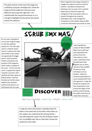
1. Task 6: The Step by Step and Evaluation
For this unit we were assigned the job of designing and creating our own
magazine covers from the genre of our choice. We gained inspiration from
magazines that we were already familiar with, being interested in the genre
that we chose was a huge benefit to gain an understanding of what we were
expecting from our creations. I chose the genre of ‘extreme sports’ as I felt I
had the best understanding in that field. My main sources of inspiration were
magazines such as ‘The Albion’ and ‘Ride UK BMX Mag’. After thinking of a
couple of names I chose the name ‘Scrub BMX Mag’ as it tells the reader the
purpose of the magazine and scrub is quite a unique BMX term.
Part One (Step by Step)
To create my magazine cover I used Photoshop. This programme is very
well suited to editing photos and creating work such as magazine covers;
making it ideal for the task we had been given. I had previously used
Photoshop in other assignments so I had already developed a clear
understanding of how to use the programme and the majority of its
tools and features.
(Annotated cover for step by step and evaluation)
Extra Evaluation
I am satisfied with the outcome of my cover of it fits the genre of which I
had chosen to base it on. The main strength of magazine I feel is the
photo along with the border around the edge of the photograph. I feel
that it is unique and really makes it stand out; this is a key factor for a
magazine cover as it will ultimately contribute towards the amount of
copies sold. If I did the project differently than I think I would be slightly
more original with my overall ideas, I’m saying as I feel that I was vastly
influenced by mainstream industry magazines rather than more unique
variations.
2. For my cover I decided to
use my own original image
as I like the aesthetic
quality of it. The shot type
used is a medium-action
shot as it captures the rider
and his bike so the reader
can appreciate the bigger
picture. Also the photo
relates to the genre and
purpose of the magazine
which made it suitable for
the cover. To fit it onto the
cover I cropped the original
using the crop tool, I then
adjusted the layer option to
black & white. I felt that
the black and white colour
added to the aesthetic
quality of the picture, so I
interpreted into my cover.
I was inspired by a
variety of ‘Ride UK BMX
Mag’ covers with how
they separated their
pictures from the
information on their
covers. Sometimes they
blended them both
together but on many
occasions they isolated
the picture using
techniques such as
borders. I liked this
concept and decided my
cover would benefit from
this approach. I made the
border by using the line
tool, drawing four lines
around the edges of the
pictures and increasing
the width of the lines to
make them stand out.
Many magazines have plugs and puffs to
engage the readers to want to read the
content. I decided to interpret this
technique into my cover; first I used the
ellipse tool to draw the shape and
changed it to the same green colour as
present throughout by using the
eyedropper tool. I also changed the
transparency of the ellipse shape to 80%
so that the information was easier to read.
I made the extra information in Bradley Hand ITC
which is the same font as the other information so
the readers can understand the writing clearly. I
also alternated the colours for the writing to match
the ‘scrub BMX mag’ title as I feel that it draws the
audience to the cover.
The green banner at the top of the page was
created by using the rectangle tool; I drew the
shape to fit the width but tried out many
different sizes to get the right feel. I am
satisfied with the sizing of the banner as it is
enough to highlight the key points that would
attract the audience.