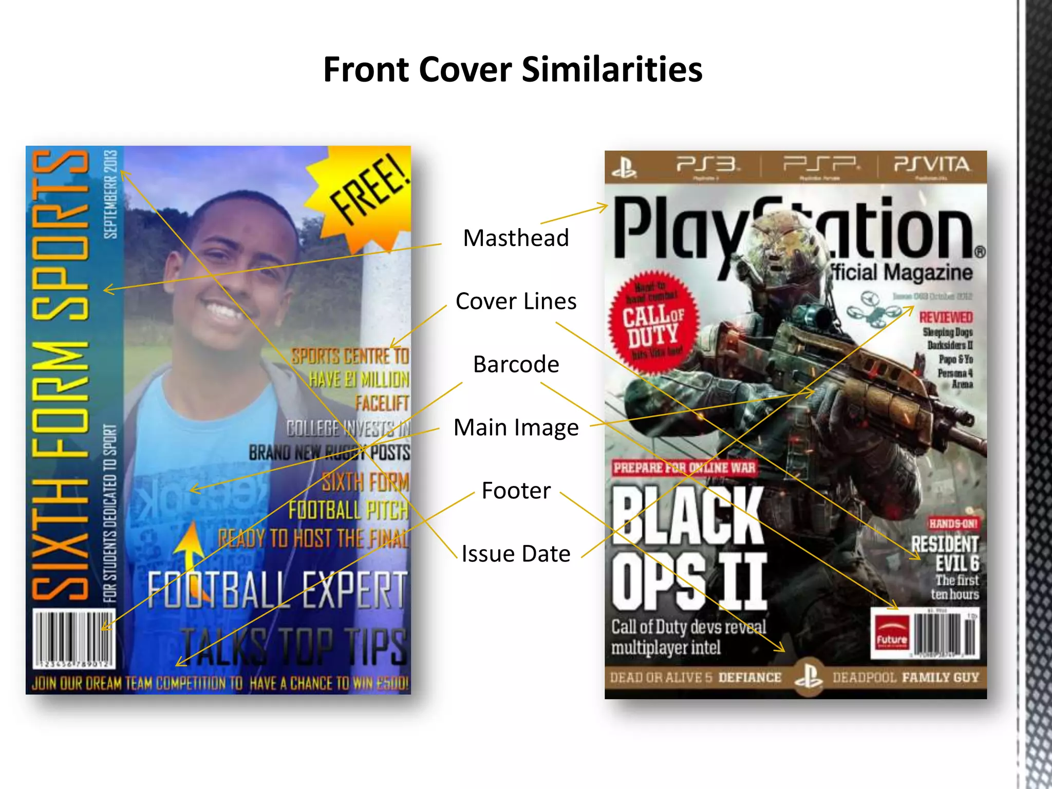
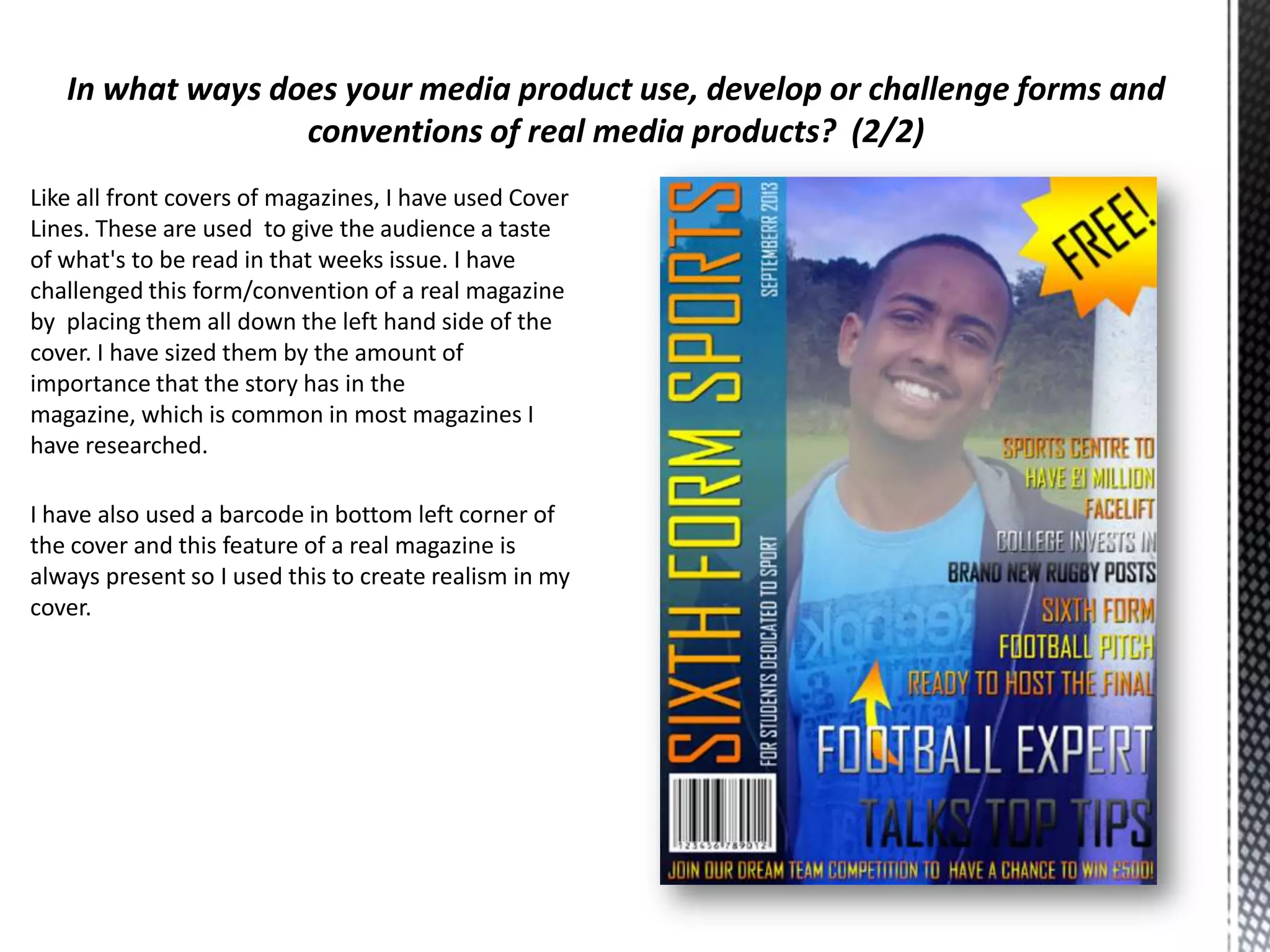
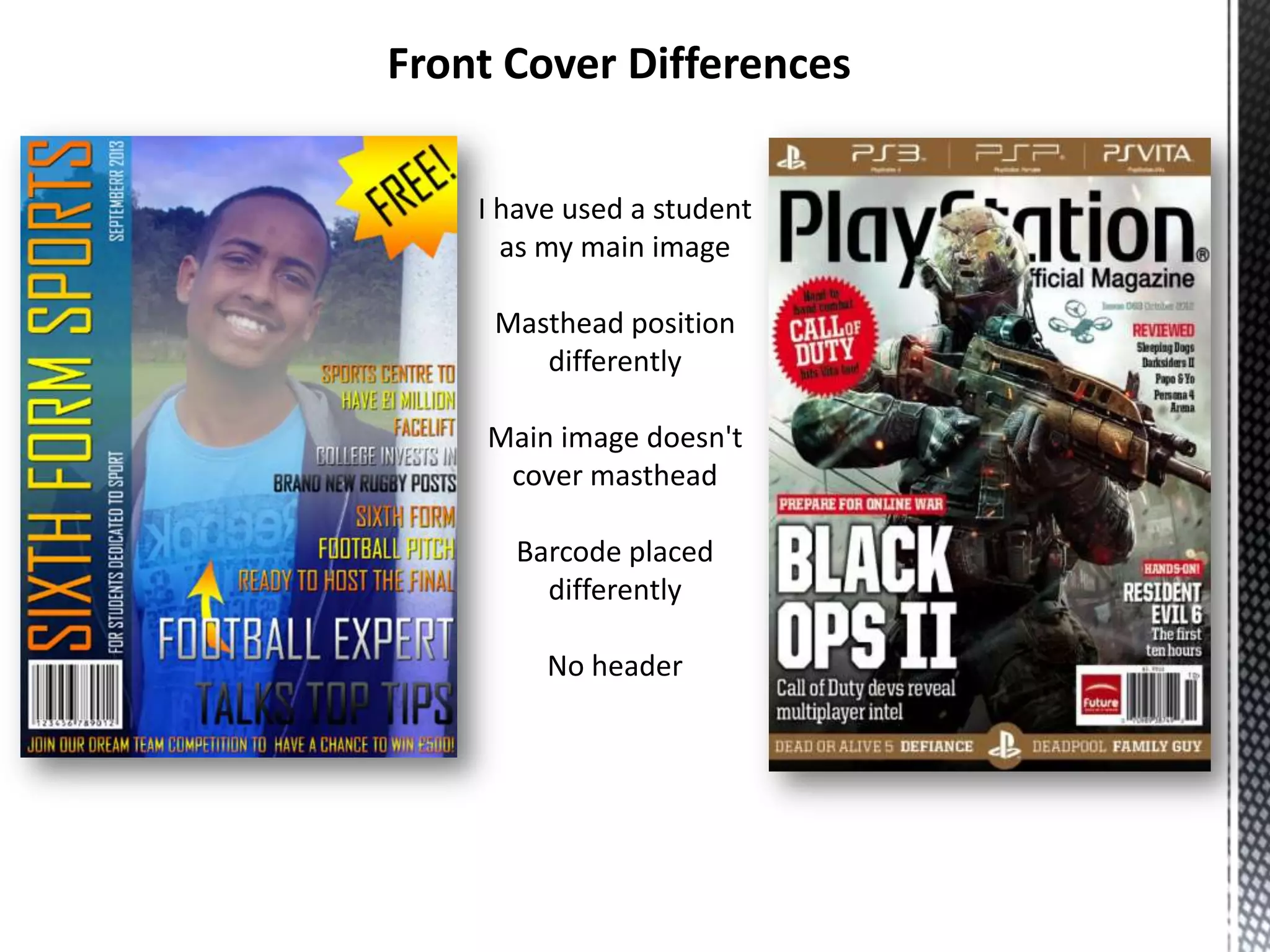
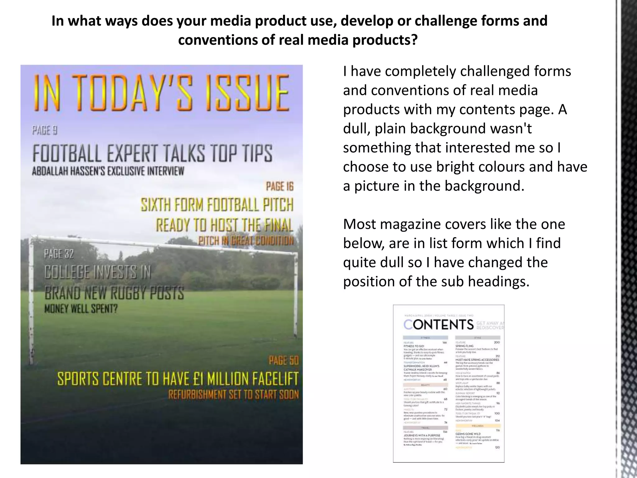
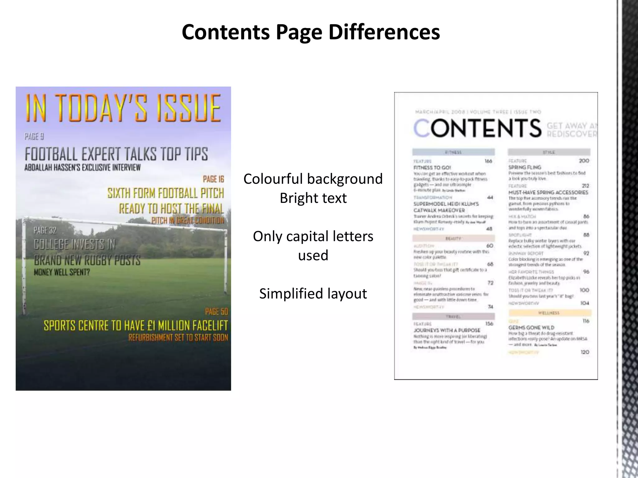
By Marcus Stanley
27th September 2013
Front Cover Similarities

Masthead
Cover Lines
Barcode
Main Image
Footer
Issue Date
I believe that my media product uses forms and conventions of real media products in a variety of ways.

When visually comparing my magazine with a real life one it's obvious to see that there are forms and
conventions that I have used to make my version more realistic and convincing.
Firstly, I have used a unique masthead. All magazines use a masthead to show to the audience what magazine it
is. In terms of challenging this form or convention of real media products, I have rotated the masthead 270
degrees and placed it down the left hand side of the cover. I have done this because I knew it would look unique
and secondly because it would be easier to establish what magazine it was if it were to be on the shelves of a
shop. Magazines are normally stacked in a way that you can only see the left hand side of it because of another
magazine overlapping it and so on. Most magazines have their mastheads placed on the top of the magazine, so
by changing the positioning of the masthead, I have challenged that form or conventions of a real magazine.
Again like most magazines the main images of the cover is placed central and covers the whole page. I have
developed this form by using a range of colours that overlays the image to create a gradient. This isn't usually
seen in most magazines as they usually have a plain background. I chose to do this to make the cover match the
colour code that I created with shades of a blue and gold and I thought that the colours went well and made a
colourful cover.
Like all front covers of magazines, I have used Cover
Lines. These are used to give the audience a taste
of what's to be read in that weeks issue. I have
challenged this form/convention of a real magazine
by placing them all down the left hand side of the
cover. I have sized them by the amount of
importance that the story has in the
magazine, which is common in most magazines I
have researched.
I have also used a barcode in bottom left corner of
the cover and this feature of a real magazine is
always present so I used this to create realism in my
cover.
Front Cover Differences
I have used a student
as my main image
Masthead position
differently
Main image doesn't
cover masthead
Barcode placed
differently
No header
In what ways does your media product use, develop or challenge forms and
conventions of real media products?
I have completely challenged forms
and conventions of real media
products with my contents page. A
dull, plain background wasn't
something that interested me so I
choose to use bright colours and have
a picture in the background.
Most magazine covers like the one
below, are in list form which I find
quite dull so I have changed the
position of the sub headings.
Contents Page Differences

Colourful background
Bright text
Only capital letters
used
Simplified layout
What have you learnt about the technologies from the process of
constructing this product?
During the process of creating this magazine, I have learned a lot about the technologies I
have used.
Through the use of PhotoShop I have learned how to manipulate and edit the photos that
I took using a digital camera.
Through use of this, I learned the range of different camera angles and which ones suited
my magazine most appropriately.
I learned how to use Moodle effectively through use of gaining information and
researching.

Preliminary task evaluation

  • 1.
    By Marcus Stanley 27thSeptember 2013
  • 2.
    Front Cover Similarities Masthead CoverLines Barcode Main Image Footer Issue Date
  • 3.
    I believe thatmy media product uses forms and conventions of real media products in a variety of ways. When visually comparing my magazine with a real life one it's obvious to see that there are forms and conventions that I have used to make my version more realistic and convincing. Firstly, I have used a unique masthead. All magazines use a masthead to show to the audience what magazine it is. In terms of challenging this form or convention of real media products, I have rotated the masthead 270 degrees and placed it down the left hand side of the cover. I have done this because I knew it would look unique and secondly because it would be easier to establish what magazine it was if it were to be on the shelves of a shop. Magazines are normally stacked in a way that you can only see the left hand side of it because of another magazine overlapping it and so on. Most magazines have their mastheads placed on the top of the magazine, so by changing the positioning of the masthead, I have challenged that form or conventions of a real magazine. Again like most magazines the main images of the cover is placed central and covers the whole page. I have developed this form by using a range of colours that overlays the image to create a gradient. This isn't usually seen in most magazines as they usually have a plain background. I chose to do this to make the cover match the colour code that I created with shades of a blue and gold and I thought that the colours went well and made a colourful cover.
  • 4.
    Like all frontcovers of magazines, I have used Cover Lines. These are used to give the audience a taste of what's to be read in that weeks issue. I have challenged this form/convention of a real magazine by placing them all down the left hand side of the cover. I have sized them by the amount of importance that the story has in the magazine, which is common in most magazines I have researched. I have also used a barcode in bottom left corner of the cover and this feature of a real magazine is always present so I used this to create realism in my cover.
  • 5.
    Front Cover Differences Ihave used a student as my main image Masthead position differently Main image doesn't cover masthead Barcode placed differently No header
  • 6.
    In what waysdoes your media product use, develop or challenge forms and conventions of real media products? I have completely challenged forms and conventions of real media products with my contents page. A dull, plain background wasn't something that interested me so I choose to use bright colours and have a picture in the background. Most magazine covers like the one below, are in list form which I find quite dull so I have changed the position of the sub headings.
  • 7.
    Contents Page Differences Colourfulbackground Bright text Only capital letters used Simplified layout
  • 8.
    What have youlearnt about the technologies from the process of constructing this product? During the process of creating this magazine, I have learned a lot about the technologies I have used. Through the use of PhotoShop I have learned how to manipulate and edit the photos that I took using a digital camera. Through use of this, I learned the range of different camera angles and which ones suited my magazine most appropriately. I learned how to use Moodle effectively through use of gaining information and researching.