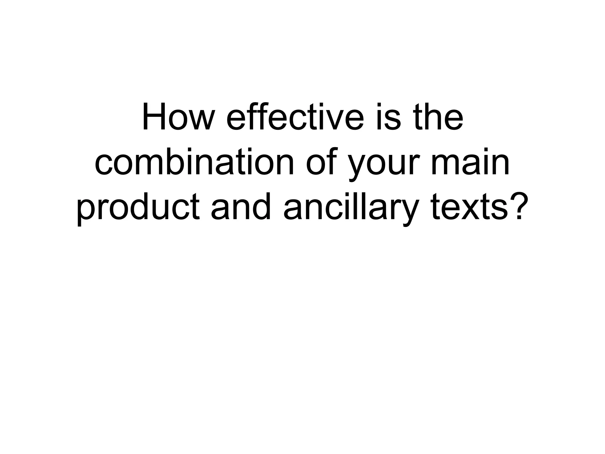
The document discusses the consistency of style across a band's main music video product and two ancillary texts: a digipak and poster. It analyzes the use of typography, layout, design, color, lighting, mise-en-scene, props, and editing to create a cohesive style and effectively promote the genre (indie/romance) across all three products. Some key aspects that helped achieve consistency included using the same fonts, similar color palettes with low-key lighting, central characters/imagery, and props that suggested the genre. However, the poster's contrasting background was criticized for breaking consistency with the other pieces.


![Music%20 video%20evaluation[1]](https://cdn.slidesharecdn.com/ss_thumbnails/music20video20evaluation1-100514122133-phpapp02-thumbnail.jpg?width=640&height=640&fit=bounds)
![C:\Users\Hannah\Documents\Music%20 Video%20 Evaluation[1]](https://cdn.slidesharecdn.com/ss_thumbnails/cusershannahdocumentsmusic20video20evaluation1-100514130527-phpapp01-thumbnail.jpg?width=640&height=640&fit=bounds)


