Download to read offline


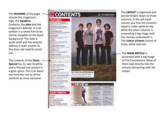
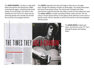
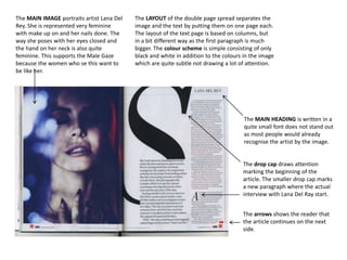
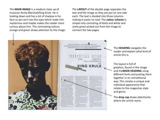

The document analyzes magazine layouts, covers, and contents pages. It finds several similarities across magazines. Front covers typically feature studio portraits of artists looking at the camera. Contents pages are organized into columns with clear headings and page numbers. Double page spreads commonly have a large image on one side and the article text divided into three columns on the other, often using drop caps. One cover analyzed breaks the convention by having the subject look in a different direction. The analyses provide insights into magazine design conventions and how elements are used to effectively present information and attract readers.


