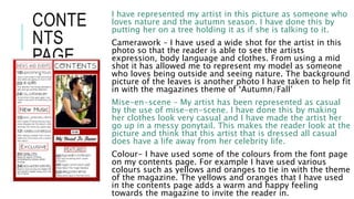
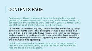
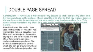
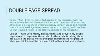
QUESTION 2 By Briar-Rose Wilding
REPRESENTATION
Normally in a POP Magazine the artist is represented as a happy and
loveable person who can also be serious. The magazine editors make
the artist look like this by using a range of elements such as camera
work, mise-en-scene, colour, language and typography to create a
image for the artist.
FRONT
PAGE
In the front cover my artist is represented as quite a serious
person as the main article is about her life to fame and the
image shows the audience that she is serious about this
article and its something that is important to her so she is
represented in a way which shows she's not messing
around.
Camera Work – I have placed my artist at a angle where her
body is facing one way and her head another, while her eyes
are not looking at my audience but at something in the
distance. I have used a mid shot for the image so that my
audience is able to see how my artists body is angled and
the emotion that they have on their face.
Mise-en-scene – The outfit that my artist is wearing relates
to the magazines theme which is Autumn, so the orange
jumper that is wearing co-ordinates in with the theme. My
models hair is wavy as if her hair has been wind swept. My
artist is not wearing any makeup to represent her self as a
natural person so she can show her audience that you don’t
have to wear makeup.
Colour- I have made the main colours on my magazine red,
orange and yellow to fit in with the magazines theme of
‘Autumn/Fall’ I have done this by adding a orange
FRONT PAGE
Gender/Age – The reason why I have made my artist a young and female
artist as its typically for a female artist to be on a front cover on a pop
magazine. I have represented my artist as a young person so that my
audience who would roughly be the same age as the artist would be able to
relate to the artist. This is good for the magazine as it creates a link and
connection between the artist and the target audience.
I have tried to represent my magazine to females and males by using things
that both genders would like. I have also aimed it at 15-25 year olds. I have
represented them by cover lines and stories by making sure there are some
that boys would find appealing, some girls would find appealing and some
that both boys and girls would find appealing.
This is stereotypical as most magazines would aim their magazine cover
lines to attract the interest of their chosen gender and age group so that
when they see the stories they would be interested and pick it up.
CONTE
NTS
PAGE
I have represented my artist in this picture as someone who
loves nature and the autumn season. I have done this by
putting her on a tree holding it as if she is talking to it.
Camerawork – I have used a wide shot for the artist in this
photo so that the reader is able to see the artists
expression, body language and clothes. From using a mid
shot it has allowed me to represent my model as someone
who loves being outside and seeing nature. The background
picture of the leaves is another photo I have taken to help fit
in with the magazines theme of ‘Autumn/Fall’
Mise-en-scene – My artist has been represented as casual
by the use of mise-en-scene. I have done this by making
her clothes look very casual and I have made the artist her
go up in a messy ponytail. This makes the reader look at the
picture and think that this artist that is dressed all casual
does have a life away from her celebrity life.
Colour- I have used some of the colours from the font page
on my contents page. For example I have used various
colours such as yellows and oranges to tie in with the theme
of the magazine. The yellows and oranges that I have used
in the contents page adds a warm and happy feeling
towards the magazine to invite the reader in.
CONTENTS PAGE
Gender/Age- I have represented the artist through their age and
gender by representing my artist as a young and care free women to
connect with my audience to show that even if you are a famous artist
you still can go ut and be who you were before fame.
I have tried to represent my magazine to females and males by using
different contents stories that both genders would like. I have also
aimed it at 15-25 year olds. I have represented them by the contents
in the magazine by making sure there are some that boys would find
appealing, some girls would find appealing and some that both boys
and girls would find appealing.
I think that my magazine is stereotypical as most magazine make
their contents page welcoming so that the reader will read on and
read the article sin the magazine.
DOUBLE PAGE SPREAD
Camerawork – I have used a wide shot for my picture so that I can get my artist and
her surroundings in the picture. I have used the mid shot so that my readers can see
the outfit my artist is wearing and the expression they hold upon their face. This
camera shot represents my artist as a very happy person who loves to be around
nature.
Mise-En-Scene- The outfit I have
used in this photo for my artist has
represented her as a casual person.
This send a message to the readers
saying that she isn’t sucked into the
life of fame wearing designer
clothes and wearing makeup. She
also likes wearing casual clothes
which she can go around in without
caring if she is being judged or not.
DOUBLE PAGE SPREAD
Gender/Age : I have represented gender in my magazine with my
model who is female. I have made look anti stereotypical as in stead
of wearing a dress she is wearing a baggy jumper, jeans and combat
boots. I have used age to represent my artist as young and care free
so that it would relate to the target audience of my magazine.
Colour – I have used mainly blacks, whites and greys in my double
page spread to represent the article. As the article is talking about
her past so the blacks whites and greys represent the her past. As
when you think about the past you think of black and white photos.

Representation

  • 1.
    QUESTION 2 ByBriar-Rose Wilding
  • 2.
    REPRESENTATION Normally in aPOP Magazine the artist is represented as a happy and loveable person who can also be serious. The magazine editors make the artist look like this by using a range of elements such as camera work, mise-en-scene, colour, language and typography to create a image for the artist.
  • 3.
    FRONT PAGE In the frontcover my artist is represented as quite a serious person as the main article is about her life to fame and the image shows the audience that she is serious about this article and its something that is important to her so she is represented in a way which shows she's not messing around. Camera Work – I have placed my artist at a angle where her body is facing one way and her head another, while her eyes are not looking at my audience but at something in the distance. I have used a mid shot for the image so that my audience is able to see how my artists body is angled and the emotion that they have on their face. Mise-en-scene – The outfit that my artist is wearing relates to the magazines theme which is Autumn, so the orange jumper that is wearing co-ordinates in with the theme. My models hair is wavy as if her hair has been wind swept. My artist is not wearing any makeup to represent her self as a natural person so she can show her audience that you don’t have to wear makeup. Colour- I have made the main colours on my magazine red, orange and yellow to fit in with the magazines theme of ‘Autumn/Fall’ I have done this by adding a orange
  • 4.
    FRONT PAGE Gender/Age –The reason why I have made my artist a young and female artist as its typically for a female artist to be on a front cover on a pop magazine. I have represented my artist as a young person so that my audience who would roughly be the same age as the artist would be able to relate to the artist. This is good for the magazine as it creates a link and connection between the artist and the target audience. I have tried to represent my magazine to females and males by using things that both genders would like. I have also aimed it at 15-25 year olds. I have represented them by cover lines and stories by making sure there are some that boys would find appealing, some girls would find appealing and some that both boys and girls would find appealing. This is stereotypical as most magazines would aim their magazine cover lines to attract the interest of their chosen gender and age group so that when they see the stories they would be interested and pick it up.
  • 5.
    CONTE NTS PAGE I have representedmy artist in this picture as someone who loves nature and the autumn season. I have done this by putting her on a tree holding it as if she is talking to it. Camerawork – I have used a wide shot for the artist in this photo so that the reader is able to see the artists expression, body language and clothes. From using a mid shot it has allowed me to represent my model as someone who loves being outside and seeing nature. The background picture of the leaves is another photo I have taken to help fit in with the magazines theme of ‘Autumn/Fall’ Mise-en-scene – My artist has been represented as casual by the use of mise-en-scene. I have done this by making her clothes look very casual and I have made the artist her go up in a messy ponytail. This makes the reader look at the picture and think that this artist that is dressed all casual does have a life away from her celebrity life. Colour- I have used some of the colours from the font page on my contents page. For example I have used various colours such as yellows and oranges to tie in with the theme of the magazine. The yellows and oranges that I have used in the contents page adds a warm and happy feeling towards the magazine to invite the reader in.
  • 6.
    CONTENTS PAGE Gender/Age- Ihave represented the artist through their age and gender by representing my artist as a young and care free women to connect with my audience to show that even if you are a famous artist you still can go ut and be who you were before fame. I have tried to represent my magazine to females and males by using different contents stories that both genders would like. I have also aimed it at 15-25 year olds. I have represented them by the contents in the magazine by making sure there are some that boys would find appealing, some girls would find appealing and some that both boys and girls would find appealing. I think that my magazine is stereotypical as most magazine make their contents page welcoming so that the reader will read on and read the article sin the magazine.
  • 7.
    DOUBLE PAGE SPREAD Camerawork– I have used a wide shot for my picture so that I can get my artist and her surroundings in the picture. I have used the mid shot so that my readers can see the outfit my artist is wearing and the expression they hold upon their face. This camera shot represents my artist as a very happy person who loves to be around nature. Mise-En-Scene- The outfit I have used in this photo for my artist has represented her as a casual person. This send a message to the readers saying that she isn’t sucked into the life of fame wearing designer clothes and wearing makeup. She also likes wearing casual clothes which she can go around in without caring if she is being judged or not.
  • 8.
    DOUBLE PAGE SPREAD Gender/Age: I have represented gender in my magazine with my model who is female. I have made look anti stereotypical as in stead of wearing a dress she is wearing a baggy jumper, jeans and combat boots. I have used age to represent my artist as young and care free so that it would relate to the target audience of my magazine. Colour – I have used mainly blacks, whites and greys in my double page spread to represent the article. As the article is talking about her past so the blacks whites and greys represent the her past. As when you think about the past you think of black and white photos.