AS COURSE WORKBy BEN FRANCIS
My Project My project is to create a front cover and contents page as well as show how I researched to create my magazine cover and also show how I edited images .I will then create a music magazine using the experience  gained by this magazine. The huge benefits and experience gained by this project I can put into my main magazine .
RESEARCHWe had a look at magazine produced before and looked at them to see what we liked about them and what we would incorporate into our magazine. These things include Masthead ,layouts and pictures .With school magazines the common theme is the school uniform
IMAGE MANIPULATION Here I have played with colour filters to change and create an unrealistic image .The  new image is more exciting to me with bright with  colours   ,I would change an image to create a vibrancy to the image .
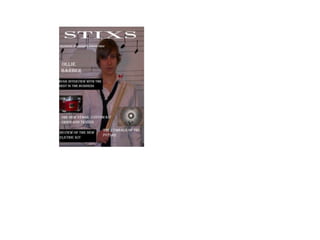
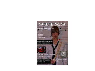
I decide  to use red in my mast head and white in my cover lines because the colour of the shirts of the players and also the darkness in the background
FRONT COVERCONTENTS PAGE
Main Task Music Magazine
“drumming matters" has two meanings firstly the matter of meaning to everyone that drumming maters and the other is the meaning of matters for drummers The mast head  is that same in every issue , so this  mean it is recognized and this backed up by the fact These snippet of the articles bring the target audience Both these word bring the audience in and make them want to read more. You can see this all over the page The common image of a mid shot used by drummer . It is a consistent cover image
All mid shots with the artist and sticks
Different colour scheme between the masthead and cover lines . The red and white is iconic to rhythm magazine but the black and white of this issues .More items that draw the reader in . Word that entice the reader into buying it . Offer to a drummer, different to drummer magazine who give CDs  . Rhythm give something back to that individual drummer .
READER Likes  rock music , metal as well . Thinks piercing and tattoos are coolGoes to college half the week then have a part time job . He works at subway .Hang out with other fan  of rock and  plays   the drums in a band . He spend his money on new drum items Aged 19 , lives in Bracknell .
The colour scheme used it very similar to front cover , recognisable . The main picture represent the main article and bring the reader in . The contents page is mainly used for information so it has to tell the consumer where  all the big articles are .  The use of font persuade the writer to go to the main article even if they are not interested
Editor letter used in mine There a consistent colour scheme used throughout. The use of images is used throughout the content page  . The pictures are important because they show the iconic people in the band and are Important for the sale of the magazine . The content numbers . The colour scheme  really make the individual titles stand out and let the reader know where their favourite articles is .
The main picture in the content direct you to the main article . This will probably be the main article and ne the main cover line on the front . The colours scheme are used through out .
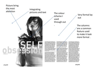
Picture bring the most attention Integrating pictures and text The colour scheme I used through out . Very formal lay out The columns are a common feature used to make it look more formal .
The magazine is less formal compared to the last one The black background makes the white text stand out This will usually be a main part of an interview .The picture is a huge part of  the spread and the picture explain the article straight away . Rhetorical  question
Big letter shows informal and also the start of the paragraph Same colour scheme is used A casual lay out for the text .Image on the text page A lot of blank space on the double page .
As course work presentation  media

As course work presentation media

  • 1.
    AS COURSE WORKByBEN FRANCIS
  • 2.
    My Project Myproject is to create a front cover and contents page as well as show how I researched to create my magazine cover and also show how I edited images .I will then create a music magazine using the experience gained by this magazine. The huge benefits and experience gained by this project I can put into my main magazine .
  • 3.
    RESEARCHWe had alook at magazine produced before and looked at them to see what we liked about them and what we would incorporate into our magazine. These things include Masthead ,layouts and pictures .With school magazines the common theme is the school uniform
  • 4.
    IMAGE MANIPULATION HereI have played with colour filters to change and create an unrealistic image .The new image is more exciting to me with bright with colours ,I would change an image to create a vibrancy to the image .
  • 5.
    I decide to use red in my mast head and white in my cover lines because the colour of the shirts of the players and also the darkness in the background
  • 6.
  • 7.
  • 8.
    “drumming matters" hastwo meanings firstly the matter of meaning to everyone that drumming maters and the other is the meaning of matters for drummers The mast head is that same in every issue , so this mean it is recognized and this backed up by the fact These snippet of the articles bring the target audience Both these word bring the audience in and make them want to read more. You can see this all over the page The common image of a mid shot used by drummer . It is a consistent cover image
  • 9.
    All mid shotswith the artist and sticks
  • 11.
    Different colour schemebetween the masthead and cover lines . The red and white is iconic to rhythm magazine but the black and white of this issues .More items that draw the reader in . Word that entice the reader into buying it . Offer to a drummer, different to drummer magazine who give CDs . Rhythm give something back to that individual drummer .
  • 12.
    READER Likes rock music , metal as well . Thinks piercing and tattoos are coolGoes to college half the week then have a part time job . He works at subway .Hang out with other fan of rock and plays the drums in a band . He spend his money on new drum items Aged 19 , lives in Bracknell .
  • 14.
    The colour schemeused it very similar to front cover , recognisable . The main picture represent the main article and bring the reader in . The contents page is mainly used for information so it has to tell the consumer where all the big articles are . The use of font persuade the writer to go to the main article even if they are not interested
  • 15.
    Editor letter usedin mine There a consistent colour scheme used throughout. The use of images is used throughout the content page . The pictures are important because they show the iconic people in the band and are Important for the sale of the magazine . The content numbers . The colour scheme really make the individual titles stand out and let the reader know where their favourite articles is .
  • 16.
    The main picturein the content direct you to the main article . This will probably be the main article and ne the main cover line on the front . The colours scheme are used through out .
  • 17.
    Picture bring themost attention Integrating pictures and text The colour scheme I used through out . Very formal lay out The columns are a common feature used to make it look more formal .
  • 18.
    The magazine isless formal compared to the last one The black background makes the white text stand out This will usually be a main part of an interview .The picture is a huge part of the spread and the picture explain the article straight away . Rhetorical question
  • 19.
    Big letter showsinformal and also the start of the paragraph Same colour scheme is used A casual lay out for the text .Image on the text page A lot of blank space on the double page .