The document discusses conventions and design elements commonly found on album covers and advertisements for metal music. It provides examples of fonts, color palettes, imagery, and layouts typically used to represent the genre. Key focal points are the band's name in a bold font and the use of dark, menacing artwork featuring monsters or skulls rather than band photographs. Advertisements aim to prominently feature the album cover artwork alongside the band's established visual identity.
Essentials of Automations: Optimizing FME Workflows with ParametersSafe Software
Are you looking to streamline your workflows and boost your projects’ efficiency? Do you find yourself searching for ways to add flexibility and control over your FME workflows? If so, you’re in the right place.
Join us for an insightful dive into the world of FME parameters, a critical element in optimizing workflow efficiency. This webinar marks the beginning of our three-part “Essentials of Automation” series. This first webinar is designed to equip you with the knowledge and skills to utilize parameters effectively: enhancing the flexibility, maintainability, and user control of your FME projects.
Here’s what you’ll gain:
- Essentials of FME Parameters: Understand the pivotal role of parameters, including Reader/Writer, Transformer, User, and FME Flow categories. Discover how they are the key to unlocking automation and optimization within your workflows.
- Practical Applications in FME Form: Delve into key user parameter types including choice, connections, and file URLs. Allow users to control how a workflow runs, making your workflows more reusable. Learn to import values and deliver the best user experience for your workflows while enhancing accuracy.
- Optimization Strategies in FME Flow: Explore the creation and strategic deployment of parameters in FME Flow, including the use of deployment and geometry parameters, to maximize workflow efficiency.
- Pro Tips for Success: Gain insights on parameterizing connections and leveraging new features like Conditional Visibility for clarity and simplicity.
We’ll wrap up with a glimpse into future webinars, followed by a Q&A session to address your specific questions surrounding this topic.
Don’t miss this opportunity to elevate your FME expertise and drive your projects to new heights of efficiency.
UiPath Test Automation using UiPath Test Suite series, part 3DianaGray10
Welcome to UiPath Test Automation using UiPath Test Suite series part 3. In this session, we will cover desktop automation along with UI automation.
Topics covered:
UI automation Introduction,
UI automation Sample
Desktop automation flow
Pradeep Chinnala, Senior Consultant Automation Developer @WonderBotz and UiPath MVP
Deepak Rai, Automation Practice Lead, Boundaryless Group and UiPath MVP
Accelerate your Kubernetes clusters with Varnish CachingThijs Feryn
A presentation about the usage and availability of Varnish on Kubernetes. This talk explores the capabilities of Varnish caching and shows how to use the Varnish Helm chart to deploy it to Kubernetes.
This presentation was delivered at K8SUG Singapore. See https://feryn.eu/presentations/accelerate-your-kubernetes-clusters-with-varnish-caching-k8sug-singapore-28-2024 for more details.
Epistemic Interaction - tuning interfaces to provide information for AI supportAlan Dix
Paper presented at SYNERGY workshop at AVI 2024, Genoa, Italy. 3rd June 2024
https://alandix.com/academic/papers/synergy2024-epistemic/
As machine learning integrates deeper into human-computer interactions, the concept of epistemic interaction emerges, aiming to refine these interactions to enhance system adaptability. This approach encourages minor, intentional adjustments in user behaviour to enrich the data available for system learning. This paper introduces epistemic interaction within the context of human-system communication, illustrating how deliberate interaction design can improve system understanding and adaptation. Through concrete examples, we demonstrate the potential of epistemic interaction to significantly advance human-computer interaction by leveraging intuitive human communication strategies to inform system design and functionality, offering a novel pathway for enriching user-system engagements.
Kubernetes & AI - Beauty and the Beast !?! @KCD Istanbul 2024Tobias Schneck
As AI technology is pushing into IT I was wondering myself, as an “infrastructure container kubernetes guy”, how get this fancy AI technology get managed from an infrastructure operational view? Is it possible to apply our lovely cloud native principals as well? What benefit’s both technologies could bring to each other?
Let me take this questions and provide you a short journey through existing deployment models and use cases for AI software. On practical examples, we discuss what cloud/on-premise strategy we may need for applying it to our own infrastructure to get it to work from an enterprise perspective. I want to give an overview about infrastructure requirements and technologies, what could be beneficial or limiting your AI use cases in an enterprise environment. An interactive Demo will give you some insides, what approaches I got already working for real.
JMeter webinar - integration with InfluxDB and GrafanaRTTS
Watch this recorded webinar about real-time monitoring of application performance. See how to integrate Apache JMeter, the open-source leader in performance testing, with InfluxDB, the open-source time-series database, and Grafana, the open-source analytics and visualization application.
In this webinar, we will review the benefits of leveraging InfluxDB and Grafana when executing load tests and demonstrate how these tools are used to visualize performance metrics.
Length: 30 minutes
Session Overview
-------------------------------------------
During this webinar, we will cover the following topics while demonstrating the integrations of JMeter, InfluxDB and Grafana:
- What out-of-the-box solutions are available for real-time monitoring JMeter tests?
- What are the benefits of integrating InfluxDB and Grafana into the load testing stack?
- Which features are provided by Grafana?
- Demonstration of InfluxDB and Grafana using a practice web application
To view the webinar recording, go to:
https://www.rttsweb.com/jmeter-integration-webinar
Neuro-symbolic is not enough, we need neuro-*semantic*Frank van Harmelen
Neuro-symbolic (NeSy) AI is on the rise. However, simply machine learning on just any symbolic structure is not sufficient to really harvest the gains of NeSy. These will only be gained when the symbolic structures have an actual semantics. I give an operational definition of semantics as “predictable inference”.
All of this illustrated with link prediction over knowledge graphs, but the argument is general.
Connector Corner: Automate dynamic content and events by pushing a buttonDianaGray10
Here is something new! In our next Connector Corner webinar, we will demonstrate how you can use a single workflow to:
Create a campaign using Mailchimp with merge tags/fields
Send an interactive Slack channel message (using buttons)
Have the message received by managers and peers along with a test email for review
But there’s more:
In a second workflow supporting the same use case, you’ll see:
Your campaign sent to target colleagues for approval
If the “Approve” button is clicked, a Jira/Zendesk ticket is created for the marketing design team
But—if the “Reject” button is pushed, colleagues will be alerted via Slack message
Join us to learn more about this new, human-in-the-loop capability, brought to you by Integration Service connectors.
And...
Speakers:
Akshay Agnihotri, Product Manager
Charlie Greenberg, Host
The Art of the Pitch: WordPress Relationships and SalesLaura Byrne
Clients don’t know what they don’t know. What web solutions are right for them? How does WordPress come into the picture? How do you make sure you understand scope and timeline? What do you do if sometime changes?
All these questions and more will be explored as we talk about matching clients’ needs with what your agency offers without pulling teeth or pulling your hair out. Practical tips, and strategies for successful relationship building that leads to closing the deal.
GDG Cloud Southlake #33: Boule & Rebala: Effective AppSec in SDLC using Deplo...James Anderson
Effective Application Security in Software Delivery lifecycle using Deployment Firewall and DBOM
The modern software delivery process (or the CI/CD process) includes many tools, distributed teams, open-source code, and cloud platforms. Constant focus on speed to release software to market, along with the traditional slow and manual security checks has caused gaps in continuous security as an important piece in the software supply chain. Today organizations feel more susceptible to external and internal cyber threats due to the vast attack surface in their applications supply chain and the lack of end-to-end governance and risk management.
The software team must secure its software delivery process to avoid vulnerability and security breaches. This needs to be achieved with existing tool chains and without extensive rework of the delivery processes. This talk will present strategies and techniques for providing visibility into the true risk of the existing vulnerabilities, preventing the introduction of security issues in the software, resolving vulnerabilities in production environments quickly, and capturing the deployment bill of materials (DBOM).
Speakers:
Bob Boule
Robert Boule is a technology enthusiast with PASSION for technology and making things work along with a knack for helping others understand how things work. He comes with around 20 years of solution engineering experience in application security, software continuous delivery, and SaaS platforms. He is known for his dynamic presentations in CI/CD and application security integrated in software delivery lifecycle.
Gopinath Rebala
Gopinath Rebala is the CTO of OpsMx, where he has overall responsibility for the machine learning and data processing architectures for Secure Software Delivery. Gopi also has a strong connection with our customers, leading design and architecture for strategic implementations. Gopi is a frequent speaker and well-known leader in continuous delivery and integrating security into software delivery.
DevOps and Testing slides at DASA ConnectKari Kakkonen
My and Rik Marselis slides at 30.5.2024 DASA Connect conference. We discuss about what is testing, then what is agile testing and finally what is Testing in DevOps. Finally we had lovely workshop with the participants trying to find out different ways to think about quality and testing in different parts of the DevOps infinity loop.
FIDO Alliance Osaka Seminar: Passkeys at Amazon.pdf
Digipak and advert
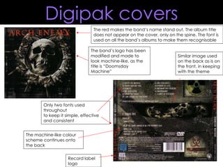
1. Only two fonts used throughout to keep it simple, effective and consistent Similar image used on the back as is on the front, in keeping with the theme The red makes the band’s name stand out. The album title does not appear on the cover, only on the spine. The font is used on all the band’s albums to make them recognisable The band’s logo has been modified and made to look machine-like, as the title is “Doomsday Machine” Record label logo The machine-like colour scheme continues onto the back Digipak covers
2. The colour scheme is kept very simple so as not to detract attention The band’s logo is used to make it recognisable to fans The band’s own font is used to make it recognisable to fans The background image isn’t clear, which helps create a sense of mystery. It would also make people look closely at it to try and see what’s going on The black and white colour scheme creates fear and creepiness, again as it is not completely clear what is going on in the image. The track list is not the focal point of the back cover The record label’s logo is very small and insignificant Digipak covers
3. The band’s font is very big, bold and plain so as to attract attention and make it recognisable. The fire effect on the copy makes the band name seem included in the cover art, and not a separate thing. The track listing is the main focal point on the back cover. It has been made more important than the previous two The fire is bright and stands out against the pure black background. The simplicity makes it bold and attention grabbing, as does the image of the person in the flames. Digipak covers
4. Colours Usually dark, but not always, as in the case of Pantera Usually a small colour palette of about 2 -3 colours Copy The band name is usually at the top in the biggest, boldest or brightest font, with the album title underneath Bands often use the same fonts for their name on all their albums and merchandise Images Photographs of the band are rarely used on metal albums, instead it is usually a constructed image of a fictional creature, such as a monster There will usually be just one main image Conventions of covers
5. Beyond wonderland Pieces of eight Hitman Ringbearer Grymmoire VTKS distress Dreaming of Lillian Maszyna Font ideas (band name)
6. Riesling Evanescent Hitman Wretched Fiddums family Fiolex mephisto Marigold wild Dark 11 Font ideas (album name)
7. Dead secretary CGF off-road Social animal Rugged type Times new yorker Dirty headline Death font Times and times again Font ideas (track list)
8. The band’s name is the main focus of the page, using the brightest colour and the biggest font. The font style is representative of the genre of music The same fonts are used here as on the album, so that after seeing this advert, people will recognise the album when they see it in shops. The artwork is also the same as seen on the album. Blue is not a colour conventionally seen much in thrash metal, but the evil-looking skeleton would be an image more likely to be seen in metal This has been constructed with the alien in the foreground, like a barrier between the skeleton and the audience. However the skeleton’s hand so close to the audience has connotations of fear and doom. The record label’s logo is also a main focus point. It’s been constructed so it stands out against the lighter background and so it promotes the label as best as possible The slogan at the top is likely to be the second thing the audience sees, after the band’s name. This sets out the album’s theme for the audience and the rhyme constructed makes it memorable Adverts
9. The band’s name is small and not the main focus, but the font is so iconic and widely recognised as belonging to this band that the audience will still be drawn to it The main imagery used is very conventional for metal. The face is evil-looking, representing fear, death or doom, and the preferred meaning of the horns is to imply some reference to evil and Satan, another commonly occurring theme in metal. The black background is plain and simple, while still having many connotations of death and evil. The colour scheme is kept simple so as not to make it too busy on the eye or to detract focus from the band name or album. The band name font provides an identity for the band and is like a continuity feature, as it is seen on all their albums and merchandise Adverts
10. The actual album artwork is shown so that the audience knows what to look for in the shop The sharp edges of the band’s font have connotations with the metal genre, and the colour makes it look dirty, or like rusted metal. This represents the nature of metal music, as it is not a clean-cut genre. The main image used is very conventional for metal. The face and eyes look dark, twisted and evil, to represent the music. The camouflage helmet represents the patriotism conveyed in this album, which is evident by the title alone; “The American Way”. The creature’s hand is in the foreground, close to the audience to instil fear in them, while holding a withered plant to show the preferred meaning of death. The long black claws were constructed to make the creature look menacing and fearless, as it is being restrained by sharp barbed wire and showing no pain. The sky in the background is typically dark and cloudy, perhaps to represent the dark and fearful themes of the album. This tagline describes the album to the audience, so they know what sort of things to expect from it Adverts
11. Colours Often dark and simple such as black or grey, or maybe black and a bright colour, such as red or yellow The colour of the copy will be themed with the colour of the imagery used Copy The band’s name will be the main masthead, in the biggest font Aside from the band and album title, there will be few words, such as a couple of the tracks featured, when it is released, what label etc The band’s own font will be used wherever necessary Images Sometimes an image of the band is used but usually it’s something of a fictional scary creature, such as a monster or a skeleton There is usually just one main image If this image is not related to the album artwork, a picture of the album cover will be used additionally Conventions of adverts