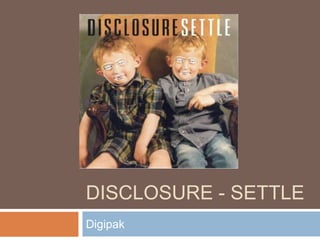
3. Front Cover
Image relates as the boys in the
image look like brothers (Artist are
brothers
Band Name in black, bold letters to
stand out.
The etching over the face hide the
identities of the boys which is linked
to the genre which is mysterious
Ordinary setting which could be
linked to the artist as they had an
ordinary upbringing in Surrey.
4. CD
The CD itself is very plain nothing
really to look at
Bold letters Black for the Band
Name, White for the album title.
Both stand out making it clear what
your listening to
Orange cover link to the rest of the
album which has very neutral
colours.
5. Back Cover
Brown Back, seems to be a theme
that the whole digipak is made of
very neutral colours.
Barcode, Producers and distributors
on the back
CD ring imprint to make it seem
vintage