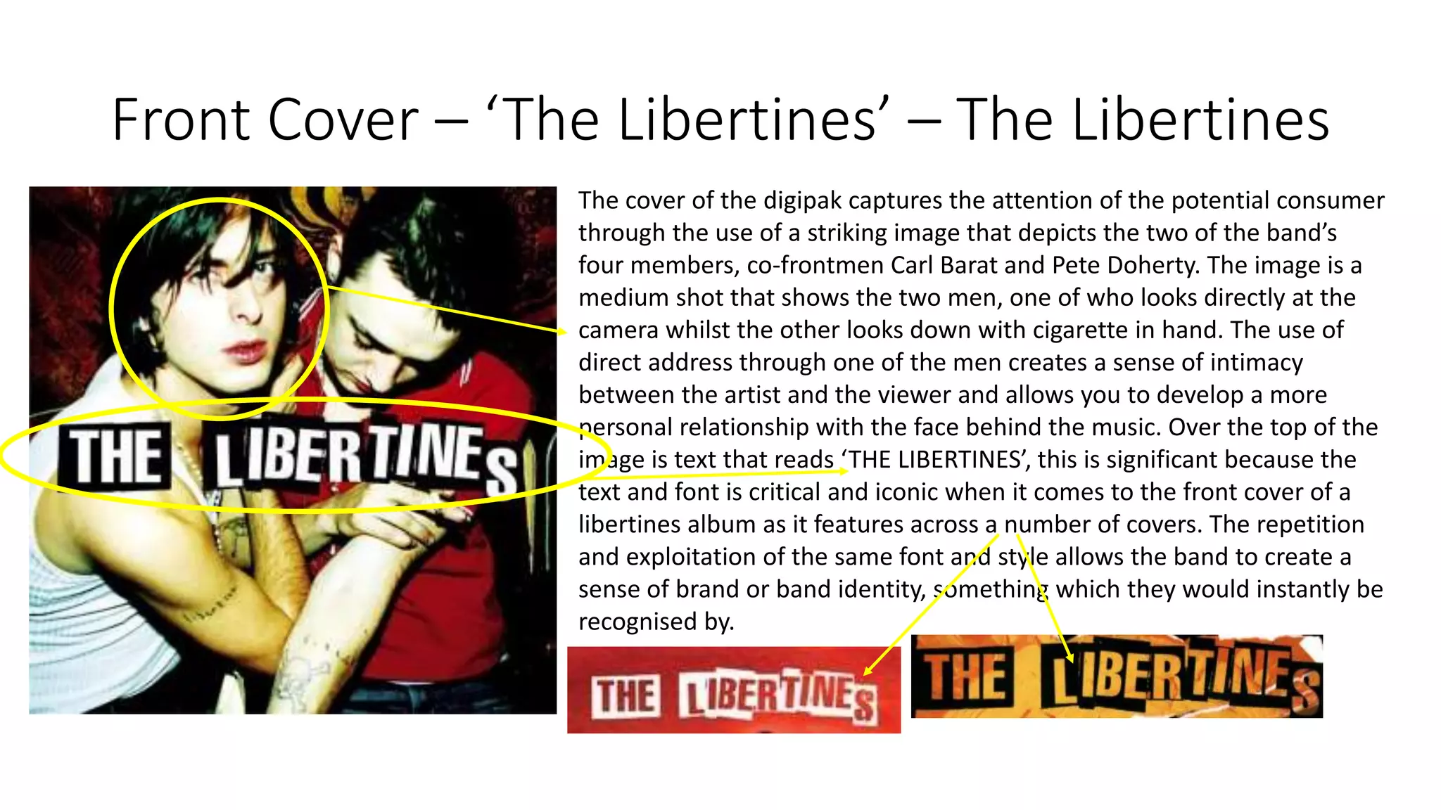
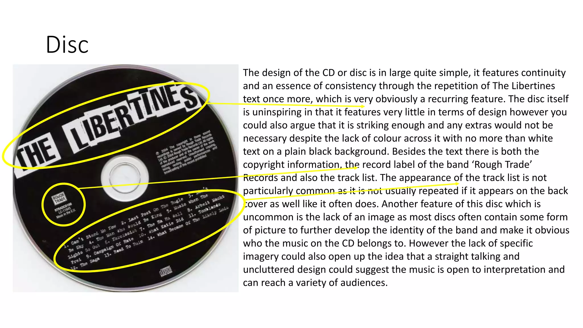
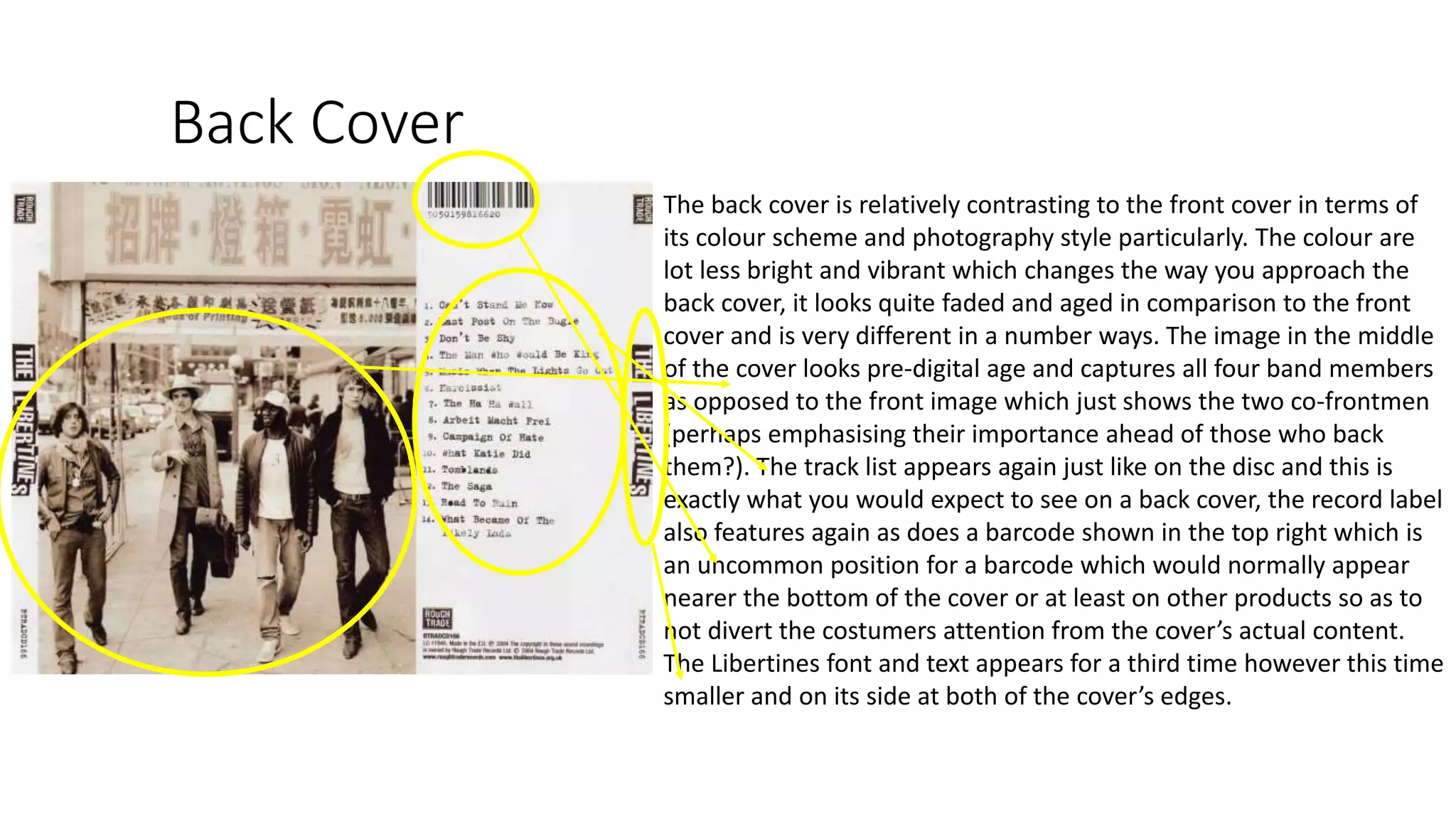
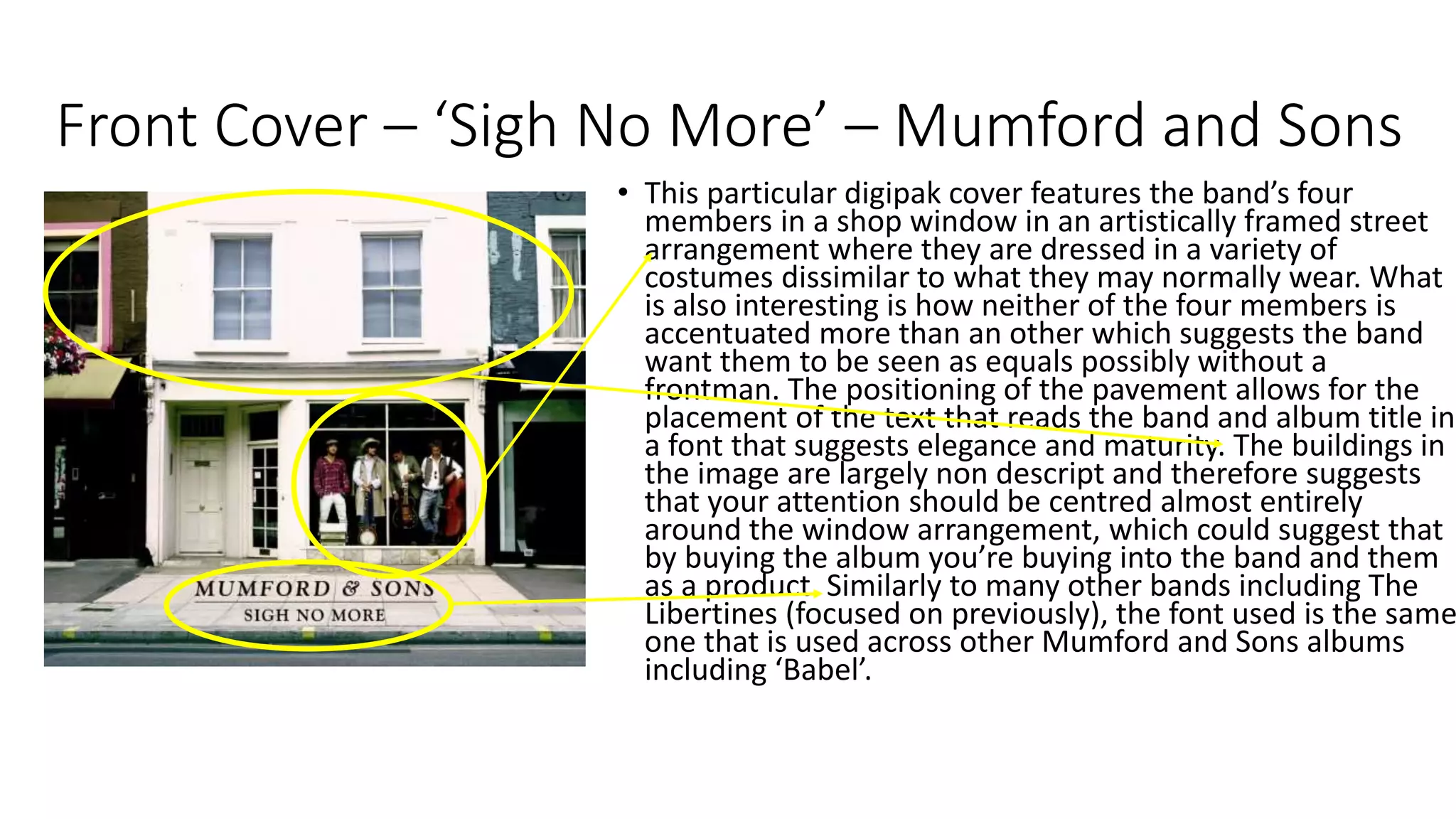
Digipak Analysis
Front Cover – ‘The Libertines’ – The Libertines
The cover of the digipak captures the attention of the potential consumer
through the use of a striking image that depicts the two of the band’s
four members, co-frontmen Carl Barat and Pete Doherty. The image is a
medium shot that shows the two men, one of who looks directly at the
camera whilst the other looks down with cigarette in hand. The use of
direct address through one of the men creates a sense of intimacy
between the artist and the viewer and allows you to develop a more
personal relationship with the face behind the music. Over the top of the
image is text that reads ‘THE LIBERTINES’, this is significant because the
text and font is critical and iconic when it comes to the front cover of a
libertines album as it features across a number of covers. The repetition
and exploitation of the same font and style allows the band to create a
sense of brand or band identity, something which they would instantly be
recognised by.
Disc
The design of the CD or disc is in large quite simple, it features continuity
and an essence of consistency through the repetition of The Libertines
text once more, which is very obviously a recurring feature. The disc itself
is uninspiring in that it features very little in terms of design however you
could also argue that it is striking enough and any extras would not be
necessary despite the lack of colour across it with no more than white
text on a plain black background. Besides the text there is both the
copyright information, the record label of the band ‘Rough Trade’
Records and also the track list. The appearance of the track list is not
particularly common as it is not usually repeated if it appears on the back
cover as well like it often does. Another feature of this disc which is
uncommon is the lack of an image as most discs often contain some form
of picture to further develop the identity of the band and make it obvious
who the music on the CD belongs to. However the lack of specific
imagery could also open up the idea that a straight talking and
uncluttered design could suggest the music is open to interpretation and
can reach a variety of audiences.
Back Cover
The back cover is relatively contrasting to the front cover in terms of
its colour scheme and photography style particularly. The colour are
lot less bright and vibrant which changes the way you approach the
back cover, it looks quite faded and aged in comparison to the front
cover and is very different in a number ways. The image in the middle
of the cover looks pre-digital age and captures all four band members
as opposed to the front image which just shows the two co-frontmen
(perhaps emphasising their importance ahead of those who back
them?). The track list appears again just like on the disc and this is
exactly what you would expect to see on a back cover, the record label
also features again as does a barcode shown in the top right which is
an uncommon position for a barcode which would normally appear
nearer the bottom of the cover or at least on other products so as to
not divert the costumers attention from the cover’s actual content.
The Libertines font and text appears for a third time however this time
smaller and on its side at both of the cover’s edges.
Front Cover – ‘Sigh No More’ – Mumford and Sons
• This particular digipak cover features the band’s four
members in a shop window in an artistically framed street
arrangement where they are dressed in a variety of
costumes dissimilar to what they may normally wear. What
is also interesting is how neither of the four members is
accentuated more than an other which suggests the band
want them to be seen as equals possibly without a
frontman. The positioning of the pavement allows for the
placement of the text that reads the band and album title in
a font that suggests elegance and maturity. The buildings in
the image are largely non descript and therefore suggests
that your attention should be centred almost entirely
around the window arrangement, which could suggest that
by buying the album you’re buying into the band and them
as a product. Similarly to many other bands including The
Libertines (focused on previously), the font used is the same
one that is used across other Mumford and Sons albums
including ‘Babel’.
Disc
• The disc of the digipak is fairly neutral again with the
recurring font featuring for a third time along with the
underlining of the band name. There is also the feature
of a small piece of artwork/illustration below the centre
of disc that adds to the aura that the style and font has
already put in place both inside and on the outside of the
promotional package. Below that are the logos of the
record labels and written around the disc in small text is
the copyright information. The layout of the text is
simple and the title is made obvious. On this disc the
track list does not feature and this is the case with many
CD’s purely because is the track list needed a second
time if you’ve already read it on the back cover? Also the
track list on the disc cannot be referenced if the disc is
playing. The use of black and white supports the simple
theme of both covers but does lack the sort of imagery
that the covers possess.
Additional Content
• Besides the two covers and disc there is also
additional content in the shape of a lyrics booklet
within the left leaf of the digipak, something
which is a common feature of these, allowing the
consumer to develop their understanding and
knowledge of the music within their purchased
album. To the right of the booklet is a second
image on its own showing the band members
again within presumably the same white building,
this time framed in a window each. This image
again helps to grow the sense of intimacy
between the artists and their fans, all the time
bridging the gap between the idol and the
supporters.
Back Cover
• The back cover of the digipak features very little that
relates to the band in terms of something to be
recognised by, it simply has a window as its centrepiece
which is undoubtedly meant to be the back of the main
building from the front cover which does at least show
continuity and allows the consumer to make a
relationship between the two images. Below the
window is the track list which is presented in a slightly
different manner to some which made it difficult to
interpret the order of the songs within the album as
opposed to if they were in a up to down list like they
often are. The font from the cover is used again in the
song titles and also this time on the spine of the digipak
which has a small record label logo, the band name and
the album title. In the top right similarly to the
previously analysed digipak is the barcode which is
slightly bigger than normal perhaps and takes up slightly
more space however it is clear that the vague layout is
similar amongst most back covers.
Summary
• To summarise, the two analysed digipaks in question have many features in
common and both are quintessentially English, both the digipaks feature the
music artists on the front cover with the use direct address as well as in one
case the back cover and the other through additional content, this emphasises
the relationship between the artist and the consumer and brings to prominence
the placing of the artist and the repetition of certain images helping to make
the intentions of the digipak bold and obvious. Both of the discs are plain with a
black background and have a minimalistic outlook on disc art featuring little to
no illustrations or artwork and instead deeming simple and assured fonts/text
the method for success. Both back covers both feature images that relate
directly to the front cover and additional contents and both track lists are
simple with black text on white backgrounds in listed layouts. ‘Quintessentially’
English literally translates ‘representing the most perfect or typical example of
the quality or class relevant to the subject’. For example the costumes used by
the artists are quite typically british including suit jackets, waistcoats, white
trousers and bowler hats. There also certain aspects that are typical both of
Britain and the indie music genre such as the feature of tattoos and cigarettes
which both show a sense of rebellion and a casual approach to body art and
possibly drug use.

Digipak Analysis

  • 1.
  • 2.
    Front Cover –‘The Libertines’ – The Libertines The cover of the digipak captures the attention of the potential consumer through the use of a striking image that depicts the two of the band’s four members, co-frontmen Carl Barat and Pete Doherty. The image is a medium shot that shows the two men, one of who looks directly at the camera whilst the other looks down with cigarette in hand. The use of direct address through one of the men creates a sense of intimacy between the artist and the viewer and allows you to develop a more personal relationship with the face behind the music. Over the top of the image is text that reads ‘THE LIBERTINES’, this is significant because the text and font is critical and iconic when it comes to the front cover of a libertines album as it features across a number of covers. The repetition and exploitation of the same font and style allows the band to create a sense of brand or band identity, something which they would instantly be recognised by.
  • 3.
    Disc The design ofthe CD or disc is in large quite simple, it features continuity and an essence of consistency through the repetition of The Libertines text once more, which is very obviously a recurring feature. The disc itself is uninspiring in that it features very little in terms of design however you could also argue that it is striking enough and any extras would not be necessary despite the lack of colour across it with no more than white text on a plain black background. Besides the text there is both the copyright information, the record label of the band ‘Rough Trade’ Records and also the track list. The appearance of the track list is not particularly common as it is not usually repeated if it appears on the back cover as well like it often does. Another feature of this disc which is uncommon is the lack of an image as most discs often contain some form of picture to further develop the identity of the band and make it obvious who the music on the CD belongs to. However the lack of specific imagery could also open up the idea that a straight talking and uncluttered design could suggest the music is open to interpretation and can reach a variety of audiences.
  • 4.
    Back Cover The backcover is relatively contrasting to the front cover in terms of its colour scheme and photography style particularly. The colour are lot less bright and vibrant which changes the way you approach the back cover, it looks quite faded and aged in comparison to the front cover and is very different in a number ways. The image in the middle of the cover looks pre-digital age and captures all four band members as opposed to the front image which just shows the two co-frontmen (perhaps emphasising their importance ahead of those who back them?). The track list appears again just like on the disc and this is exactly what you would expect to see on a back cover, the record label also features again as does a barcode shown in the top right which is an uncommon position for a barcode which would normally appear nearer the bottom of the cover or at least on other products so as to not divert the costumers attention from the cover’s actual content. The Libertines font and text appears for a third time however this time smaller and on its side at both of the cover’s edges.
  • 5.
    Front Cover –‘Sigh No More’ – Mumford and Sons • This particular digipak cover features the band’s four members in a shop window in an artistically framed street arrangement where they are dressed in a variety of costumes dissimilar to what they may normally wear. What is also interesting is how neither of the four members is accentuated more than an other which suggests the band want them to be seen as equals possibly without a frontman. The positioning of the pavement allows for the placement of the text that reads the band and album title in a font that suggests elegance and maturity. The buildings in the image are largely non descript and therefore suggests that your attention should be centred almost entirely around the window arrangement, which could suggest that by buying the album you’re buying into the band and them as a product. Similarly to many other bands including The Libertines (focused on previously), the font used is the same one that is used across other Mumford and Sons albums including ‘Babel’.
  • 6.
    Disc • The discof the digipak is fairly neutral again with the recurring font featuring for a third time along with the underlining of the band name. There is also the feature of a small piece of artwork/illustration below the centre of disc that adds to the aura that the style and font has already put in place both inside and on the outside of the promotional package. Below that are the logos of the record labels and written around the disc in small text is the copyright information. The layout of the text is simple and the title is made obvious. On this disc the track list does not feature and this is the case with many CD’s purely because is the track list needed a second time if you’ve already read it on the back cover? Also the track list on the disc cannot be referenced if the disc is playing. The use of black and white supports the simple theme of both covers but does lack the sort of imagery that the covers possess.
  • 7.
    Additional Content • Besidesthe two covers and disc there is also additional content in the shape of a lyrics booklet within the left leaf of the digipak, something which is a common feature of these, allowing the consumer to develop their understanding and knowledge of the music within their purchased album. To the right of the booklet is a second image on its own showing the band members again within presumably the same white building, this time framed in a window each. This image again helps to grow the sense of intimacy between the artists and their fans, all the time bridging the gap between the idol and the supporters.
  • 8.
    Back Cover • Theback cover of the digipak features very little that relates to the band in terms of something to be recognised by, it simply has a window as its centrepiece which is undoubtedly meant to be the back of the main building from the front cover which does at least show continuity and allows the consumer to make a relationship between the two images. Below the window is the track list which is presented in a slightly different manner to some which made it difficult to interpret the order of the songs within the album as opposed to if they were in a up to down list like they often are. The font from the cover is used again in the song titles and also this time on the spine of the digipak which has a small record label logo, the band name and the album title. In the top right similarly to the previously analysed digipak is the barcode which is slightly bigger than normal perhaps and takes up slightly more space however it is clear that the vague layout is similar amongst most back covers.
  • 9.
    Summary • To summarise,the two analysed digipaks in question have many features in common and both are quintessentially English, both the digipaks feature the music artists on the front cover with the use direct address as well as in one case the back cover and the other through additional content, this emphasises the relationship between the artist and the consumer and brings to prominence the placing of the artist and the repetition of certain images helping to make the intentions of the digipak bold and obvious. Both of the discs are plain with a black background and have a minimalistic outlook on disc art featuring little to no illustrations or artwork and instead deeming simple and assured fonts/text the method for success. Both back covers both feature images that relate directly to the front cover and additional contents and both track lists are simple with black text on white backgrounds in listed layouts. ‘Quintessentially’ English literally translates ‘representing the most perfect or typical example of the quality or class relevant to the subject’. For example the costumes used by the artists are quite typically british including suit jackets, waistcoats, white trousers and bowler hats. There also certain aspects that are typical both of Britain and the indie music genre such as the feature of tattoos and cigarettes which both show a sense of rebellion and a casual approach to body art and possibly drug use.