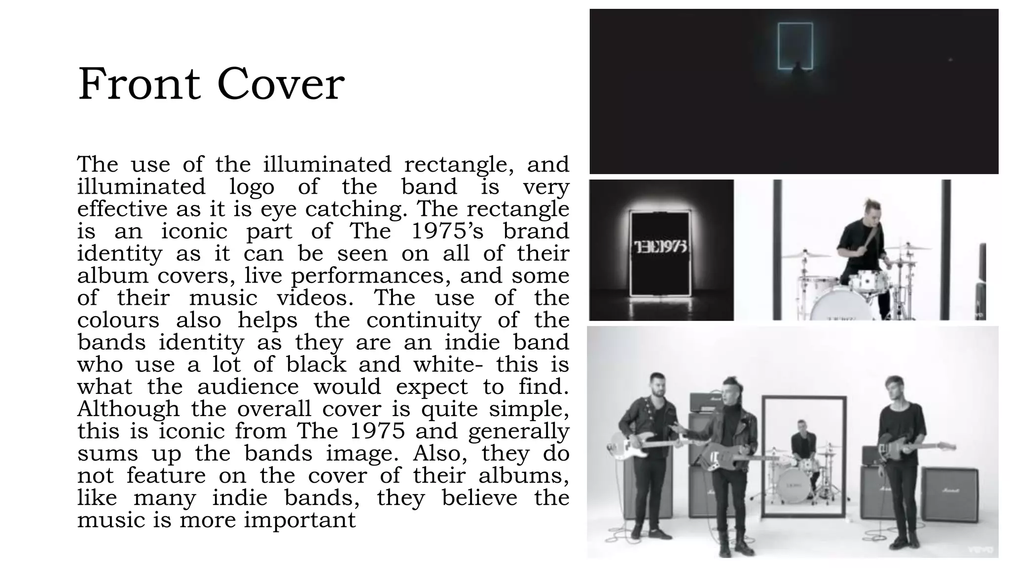
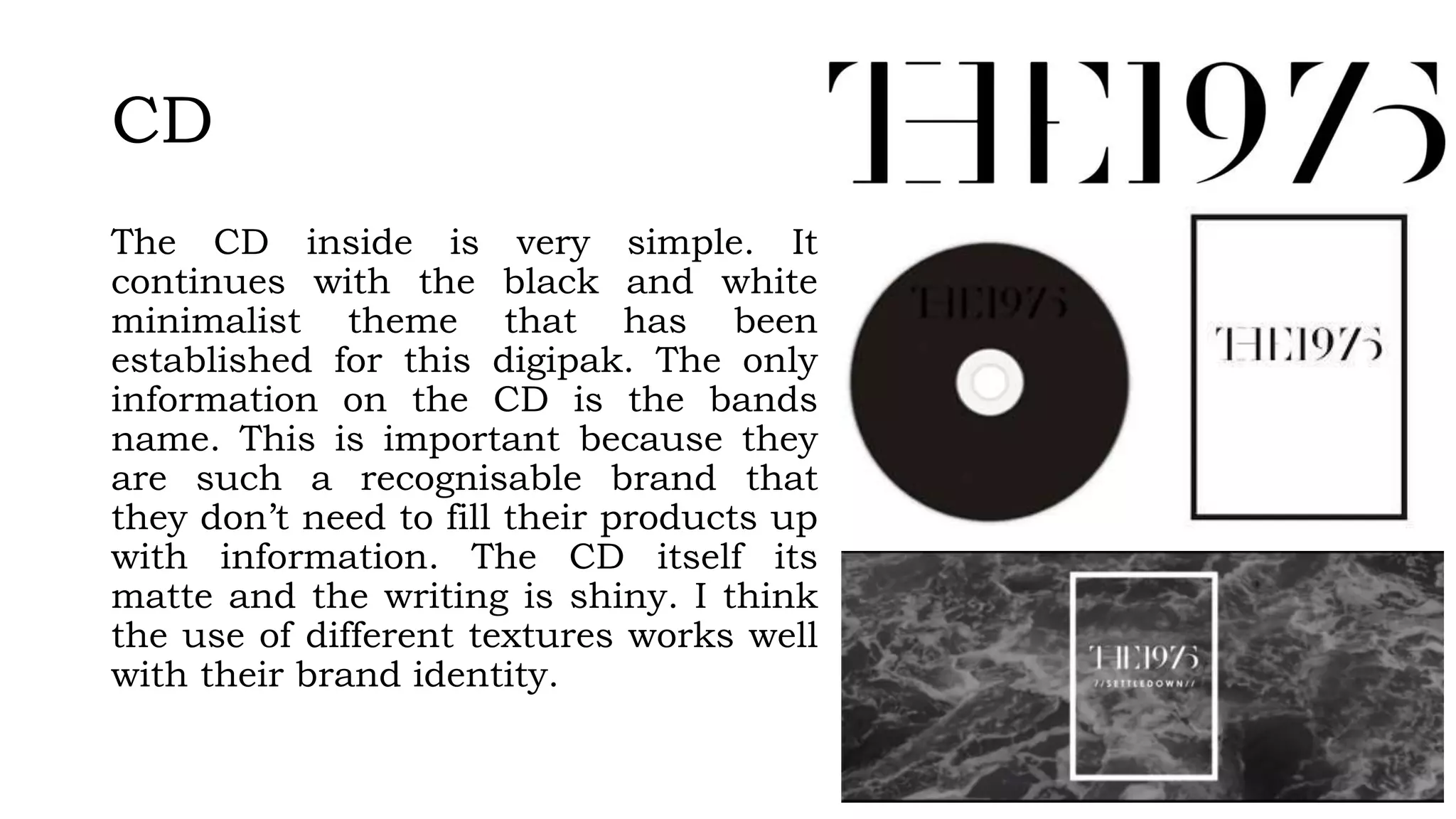
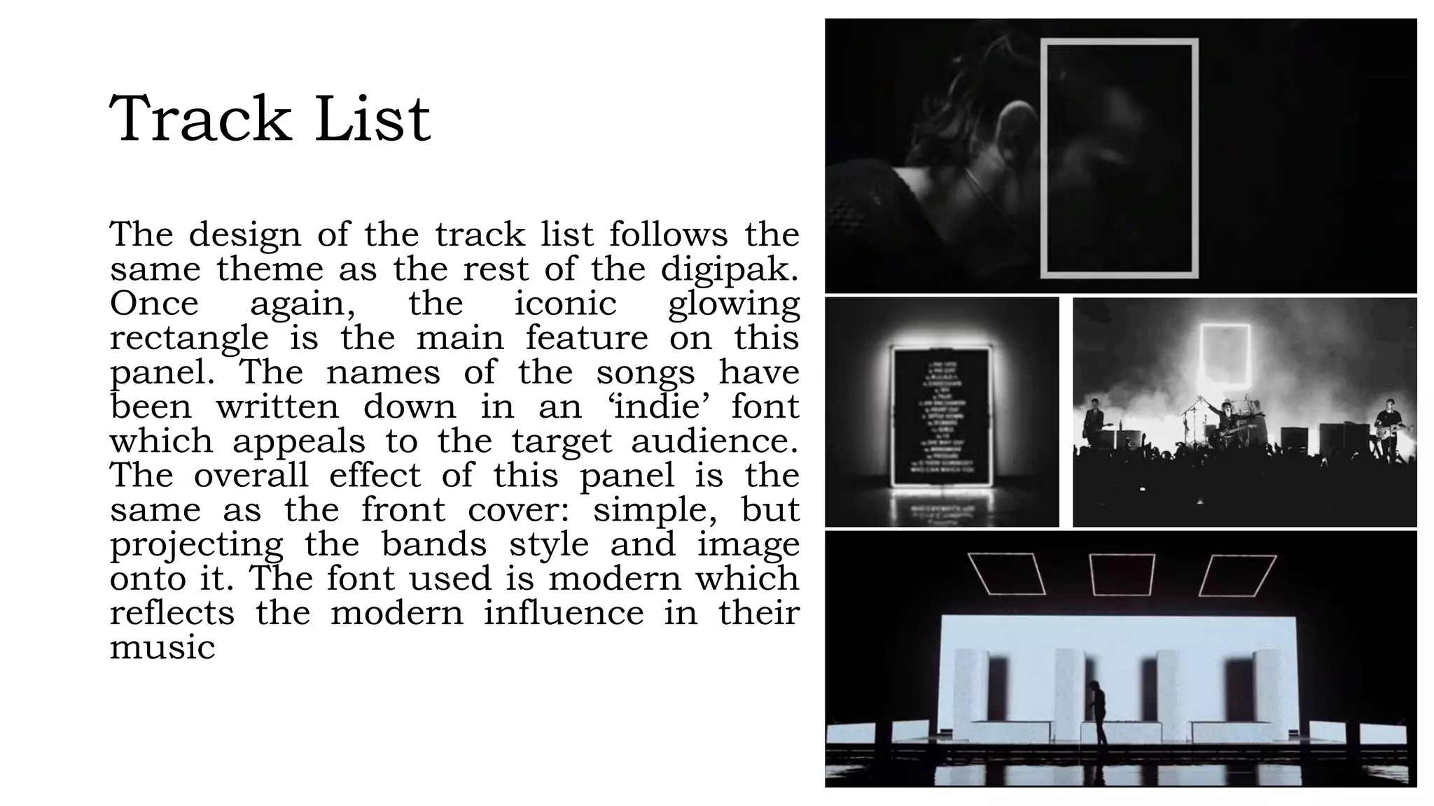
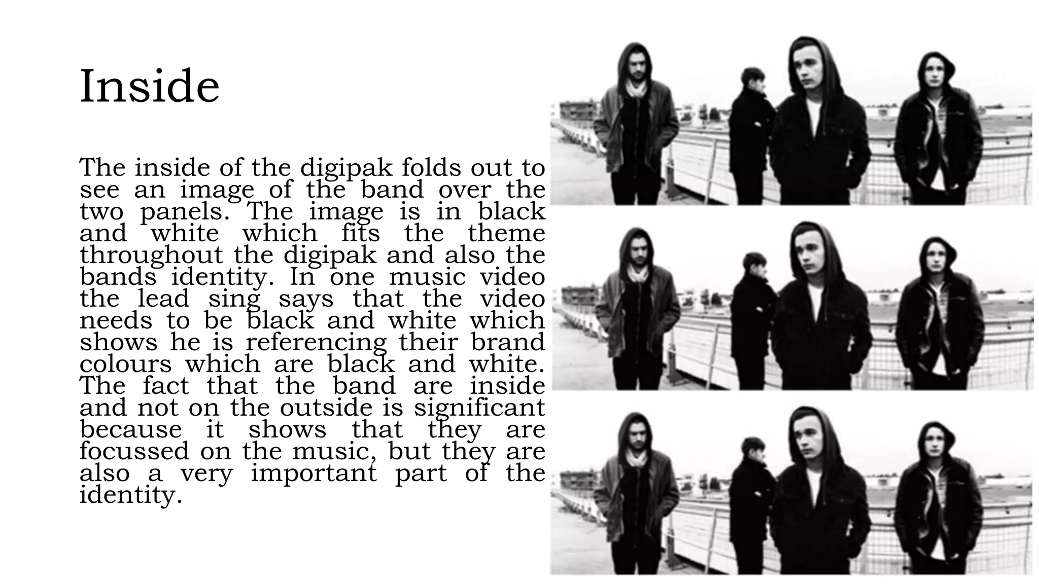
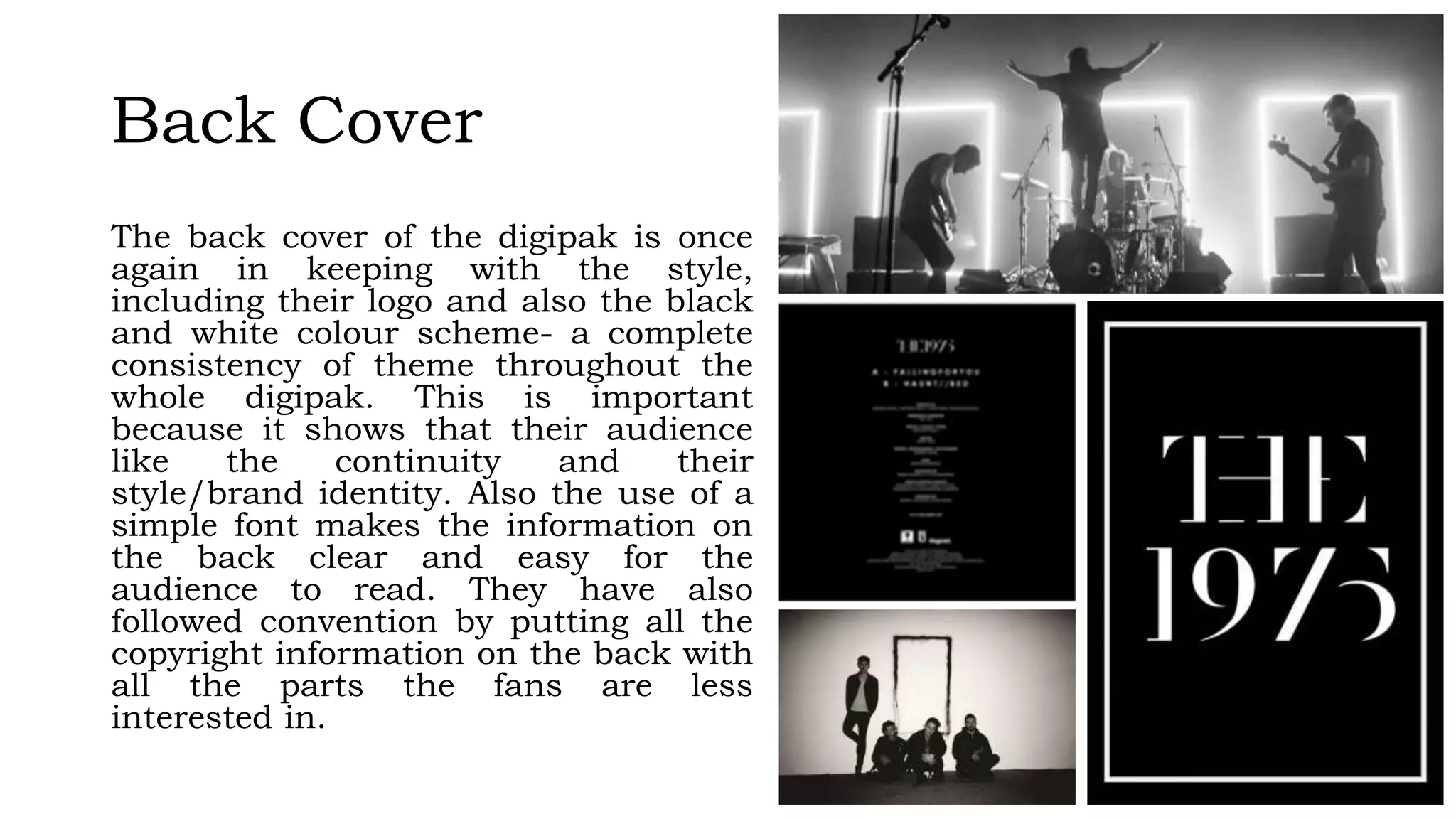
2. Front Cover
The use of the illuminated rectangle, and
illuminated logo of the band is very
effective as it is eye catching. The rectangle
is an iconic part of The 1975’s brand
identity as it can be seen on all of their
album covers, live performances, and some
of their music videos. The use of the
colours also helps the continuity of the
bands identity as they are an indie band
who use a lot of black and white- this is
what the audience would expect to find.
Although the overall cover is quite simple,
this is iconic from The 1975 and generally
sums up the bands image. Also, they do
not feature on the cover of their albums,
like many indie bands, they believe the
music is more important
3. CD
The CD inside is very simple. It
continues with the black and white
minimalist theme that has been
established for this digipak. The only
information on the CD is the bands
name. This is important because they
are such a recognisable brand that
they don’t need to fill their products up
with information. The CD itself its
matte and the writing is shiny. I think
the use of different textures works well
with their brand identity.
4. Track List
The design of the track list follows the
same theme as the rest of the digipak.
Once again, the iconic glowing
rectangle is the main feature on this
panel. The names of the songs have
been written down in an ‘indie’ font
which appeals to the target audience.
The overall effect of this panel is the
same as the front cover: simple, but
projecting the bands style and image
onto it. The font used is modern which
reflects the modern influence in their
music
5. Inside
The inside of the digipak folds out to
see an image of the band over the
two panels. The image is in black
and white which fits the theme
throughout the digipak and also the
bands identity. In one music video
the lead sing says that the video
needs to be black and white which
shows he is referencing their brand
colours which are black and white.
The fact that the band are inside
and not on the outside is significant
because it shows that they are
focussed on the music, but they are
also a very important part of the
identity.
6. Back Cover
The back cover of the digipak is once
again in keeping with the style,
including their logo and also the black
and white colour scheme- a complete
consistency of theme throughout the
whole digipak. This is important
because it shows that their audience
like the continuity and their
style/brand identity. Also the use of a
simple font makes the information on
the back clear and easy for the
audience to read. They have also
followed convention by putting all the
copyright information on the back with
all the parts the fans are less
interested in.