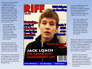
1. The document describes how the student's music magazine uses conventions of real music magazines in its formatting and design. It includes a masthead, cover lines describing content, a main image on the cover, and barcodes on the front page like real magazines.
2. However, it also challenges some conventions. For example, it does not use the rule of thirds on the cover photo. It also places the date under the masthead rather than with the barcode.
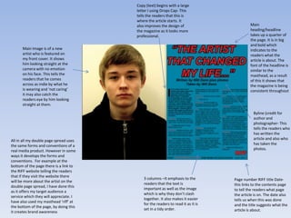
3. The contents page continues using conventions like labeled sections and page numbers but challenges them by leaving out the website and date that are included elsewhere. Overall, the magazine borrows real conventions but also develops its own style.


![Evaluation[1]](https://cdn.slidesharecdn.com/ss_thumbnails/evaluation1-120305073155-phpapp01-thumbnail.jpg?width=640&height=640&fit=bounds)


