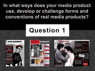
The document discusses Thabile Kwepile's inspiration and design choices for the front cover and contents page of a neo-soul music magazine. Thabile was inspired by the layout and color scheme of the magazine Blues & Soul and used it as a template. Elements copied from Blues & Soul and other magazines include large images, quotes, and an "editors view" section. The goal was to create a magazine that appealed to neo-soul fans while challenging conventions of typical soul magazines.
The Roman Empire A Historical Colossus.pdfkaushalkr1407
The Roman Empire, a vast and enduring power, stands as one of history's most remarkable civilizations, leaving an indelible imprint on the world. It emerged from the Roman Republic, transitioning into an imperial powerhouse under the leadership of Augustus Caesar in 27 BCE. This transformation marked the beginning of an era defined by unprecedented territorial expansion, architectural marvels, and profound cultural influence.
The empire's roots lie in the city of Rome, founded, according to legend, by Romulus in 753 BCE. Over centuries, Rome evolved from a small settlement to a formidable republic, characterized by a complex political system with elected officials and checks on power. However, internal strife, class conflicts, and military ambitions paved the way for the end of the Republic. Julius Caesar’s dictatorship and subsequent assassination in 44 BCE created a power vacuum, leading to a civil war. Octavian, later Augustus, emerged victorious, heralding the Roman Empire’s birth.
Under Augustus, the empire experienced the Pax Romana, a 200-year period of relative peace and stability. Augustus reformed the military, established efficient administrative systems, and initiated grand construction projects. The empire's borders expanded, encompassing territories from Britain to Egypt and from Spain to the Euphrates. Roman legions, renowned for their discipline and engineering prowess, secured and maintained these vast territories, building roads, fortifications, and cities that facilitated control and integration.
The Roman Empire’s society was hierarchical, with a rigid class system. At the top were the patricians, wealthy elites who held significant political power. Below them were the plebeians, free citizens with limited political influence, and the vast numbers of slaves who formed the backbone of the economy. The family unit was central, governed by the paterfamilias, the male head who held absolute authority.
Culturally, the Romans were eclectic, absorbing and adapting elements from the civilizations they encountered, particularly the Greeks. Roman art, literature, and philosophy reflected this synthesis, creating a rich cultural tapestry. Latin, the Roman language, became the lingua franca of the Western world, influencing numerous modern languages.
Roman architecture and engineering achievements were monumental. They perfected the arch, vault, and dome, constructing enduring structures like the Colosseum, Pantheon, and aqueducts. These engineering marvels not only showcased Roman ingenuity but also served practical purposes, from public entertainment to water supply.
Introduction to AI for Nonprofits with Tapp NetworkTechSoup
Dive into the world of AI! Experts Jon Hill and Tareq Monaur will guide you through AI's role in enhancing nonprofit websites and basic marketing strategies, making it easy to understand and apply.
Honest Reviews of Tim Han LMA Course Program.pptxtimhan337
Personal development courses are widely available today, with each one promising life-changing outcomes. Tim Han’s Life Mastery Achievers (LMA) Course has drawn a lot of interest. In addition to offering my frank assessment of Success Insider’s LMA Course, this piece examines the course’s effects via a variety of Tim Han LMA course reviews and Success Insider comments.
A Strategic Approach: GenAI in EducationPeter Windle
Artificial Intelligence (AI) technologies such as Generative AI, Image Generators and Large Language Models have had a dramatic impact on teaching, learning and assessment over the past 18 months. The most immediate threat AI posed was to Academic Integrity with Higher Education Institutes (HEIs) focusing their efforts on combating the use of GenAI in assessment. Guidelines were developed for staff and students, policies put in place too. Innovative educators have forged paths in the use of Generative AI for teaching, learning and assessments leading to pockets of transformation springing up across HEIs, often with little or no top-down guidance, support or direction.
This Gasta posits a strategic approach to integrating AI into HEIs to prepare staff, students and the curriculum for an evolving world and workplace. We will highlight the advantages of working with these technologies beyond the realm of teaching, learning and assessment by considering prompt engineering skills, industry impact, curriculum changes, and the need for staff upskilling. In contrast, not engaging strategically with Generative AI poses risks, including falling behind peers, missed opportunities and failing to ensure our graduates remain employable. The rapid evolution of AI technologies necessitates a proactive and strategic approach if we are to remain relevant.
The French Revolution, which began in 1789, was a period of radical social and political upheaval in France. It marked the decline of absolute monarchies, the rise of secular and democratic republics, and the eventual rise of Napoleon Bonaparte. This revolutionary period is crucial in understanding the transition from feudalism to modernity in Europe.
For more information, visit-www.vavaclasses.com
Acetabularia Information For Class 9 .docxvaibhavrinwa19
Acetabularia acetabulum is a single-celled green alga that in its vegetative state is morphologically differentiated into a basal rhizoid and an axially elongated stalk, which bears whorls of branching hairs. The single diploid nucleus resides in the rhizoid.
Palestine last event orientationfvgnh .pptxRaedMohamed3
An EFL lesson about the current events in Palestine. It is intended to be for intermediate students who wish to increase their listening skills through a short lesson in power point.
Instructions for Submissions thorugh G- Classroom.pptxJheel Barad
This presentation provides a briefing on how to upload submissions and documents in Google Classroom. It was prepared as part of an orientation for new Sainik School in-service teacher trainees. As a training officer, my goal is to ensure that you are comfortable and proficient with this essential tool for managing assignments and fostering student engagement.
June 3, 2024 Anti-Semitism Letter Sent to MIT President Kornbluth and MIT Cor...Levi Shapiro
Letter from the Congress of the United States regarding Anti-Semitism sent June 3rd to MIT President Sally Kornbluth, MIT Corp Chair, Mark Gorenberg
Dear Dr. Kornbluth and Mr. Gorenberg,
The US House of Representatives is deeply concerned by ongoing and pervasive acts of antisemitic
harassment and intimidation at the Massachusetts Institute of Technology (MIT). Failing to act decisively to ensure a safe learning environment for all students would be a grave dereliction of your responsibilities as President of MIT and Chair of the MIT Corporation.
This Congress will not stand idly by and allow an environment hostile to Jewish students to persist. The House believes that your institution is in violation of Title VI of the Civil Rights Act, and the inability or
unwillingness to rectify this violation through action requires accountability.
Postsecondary education is a unique opportunity for students to learn and have their ideas and beliefs challenged. However, universities receiving hundreds of millions of federal funds annually have denied
students that opportunity and have been hijacked to become venues for the promotion of terrorism, antisemitic harassment and intimidation, unlawful encampments, and in some cases, assaults and riots.
The House of Representatives will not countenance the use of federal funds to indoctrinate students into hateful, antisemitic, anti-American supporters of terrorism. Investigations into campus antisemitism by the Committee on Education and the Workforce and the Committee on Ways and Means have been expanded into a Congress-wide probe across all relevant jurisdictions to address this national crisis. The undersigned Committees will conduct oversight into the use of federal funds at MIT and its learning environment under authorities granted to each Committee.
• The Committee on Education and the Workforce has been investigating your institution since December 7, 2023. The Committee has broad jurisdiction over postsecondary education, including its compliance with Title VI of the Civil Rights Act, campus safety concerns over disruptions to the learning environment, and the awarding of federal student aid under the Higher Education Act.
• The Committee on Oversight and Accountability is investigating the sources of funding and other support flowing to groups espousing pro-Hamas propaganda and engaged in antisemitic harassment and intimidation of students. The Committee on Oversight and Accountability is the principal oversight committee of the US House of Representatives and has broad authority to investigate “any matter” at “any time” under House Rule X.
• The Committee on Ways and Means has been investigating several universities since November 15, 2023, when the Committee held a hearing entitled From Ivory Towers to Dark Corners: Investigating the Nexus Between Antisemitism, Tax-Exempt Universities, and Terror Financing. The Committee followed the hearing with letters to those institutions on January 10, 202
Model Attribute Check Company Auto PropertyCeline George
In Odoo, the multi-company feature allows you to manage multiple companies within a single Odoo database instance. Each company can have its own configurations while still sharing common resources such as products, customers, and suppliers.
How to Make a Field invisible in Odoo 17Celine George
It is possible to hide or invisible some fields in odoo. Commonly using “invisible” attribute in the field definition to invisible the fields. This slide will show how to make a field invisible in odoo 17.
Welcome to TechSoup New Member Orientation and Q&A (May 2024).pdfTechSoup
In this webinar you will learn how your organization can access TechSoup's wide variety of product discount and donation programs. From hardware to software, we'll give you a tour of the tools available to help your nonprofit with productivity, collaboration, financial management, donor tracking, security, and more.
2. I searched into some traditional magazine front covers, I found BLUES & SOUL
which was attractive to the eye. This magazines really suited my genre as I’m
focusing on soul, the magazine cover interested me and I decided to use it for
inspiration on my front cover. BLUES & SOUL is the most popular soul
magazine I’ve found which is why I’ve decided to use it, BLUES & SOUL is
published bi-monthly and was first published in 1966 they’re based in London
with representatives in New York and LA - and a readership that spans all over
the world. The magazine has many archives such as live reviews, features, charts
etc. The magazine also has a website offering similar genres to also be able to
view and read their magazine. The magazine really highlights options of being
able to see soul artists live at venues, also features a lot of current soul artists and
giving an option to readers to be able to blog about soul music events etc, really
involving their readers.
THABILE KWEPILE
3. Masthead: I chose Showcard gothic
Selling line: It’s short Barcode: I used a standard font with the size of 60pt because I think
sweet and true for barcode to make the the font made it easily recognised and
magazine traditional. unique. I’ve made it like this for
those who love soul.
advertising purposes and as general
logo. I then got a picture of a quaver
note from Google imported it on my
Main image: My main image is cover. I used the line tool to make
my model, representing Robin a black line to underline my masthead.
Thicke whose a neo-soul music
artist famous for his song ‘Lost
Without You’. The image is making Dateline: I’ve added a dateline
full eye contact to connect with the in the same way a traditional
audience. magazine has mine has specific
dares, most magazines used just
a month and year of
publication, often with the price
but mine has no price written on
Cover lines: My cover it.
lines are organised on the
left side of the magazine
Main cover line: My main cover like
isn’t as big as most main cover lines
but not distracting too
would be but stands out at the top
much from the main image.
highlighting what the main article.
Left third: This part of the magazine
Colour Scheme: I used the is crucial as most magazines are sold
colour scheme of red, white showing just that part but I’ve
and black as they work well decided not to have a left third just
together and I got this idea including that part with
from a Kerrang double page COMPETITION to capture the reader
spread for MCR. quickly as people love competitions.
4. I used Kerrang magazine as a basis to start from for ideas for
my contents page, I realise Kerrang is a metal/rock magazine
and my genre is the total opposite but I really think the way
Kerrang designed their contents page and front cover really
works well as it uses normal magazine skills to look realistic
and to engage the correct audience, they way they’ve done
that is to add a lot of colour which contrasts well together
and also stick to a colour scheme that works for their
magazine as it links it when you see the contents page this
helps the reader connect the two and not feel as if they’ve
entered a new world. They’ve used a lot of images to also
reel in their audience which makes the audience not have
too much text to read so suiting their audience well and
putting in an editors view on the top of every contents that
helps the magazine reach out more to the public as it feels
more personal. I really like this idea for my magazine, The
magazine masthead is really large and can’t be ignored and
the same with the contents page, I like the way they’ve used
that to capture people.
THABILE KWEPILE
5. I have adapted some ideas from
Kerrang magazine for my magazine
like having an editors view in the
In order for my corner adds a sense of class as it’s a
magazine to appeal to soul magazine, this really gives it a
my niche audience I sense of being professional. Kerrang
researched into some uses this too and it’s a rock
neo-soul artists that magazine it still seems not too crazy
are current and also which means it’s not conforming to
some more older soul the sort of stereotypes that would
artists so my audience be expected of a rock magazine. I
can have a variation in really like this idea and have
artists to do this, I incorporated that into my
looked in the blues & magazine.
soul as it has categories
for different genres I have also used a big title to
such as hip stand out and having a quote
hop, r’n’b, soul, blues from an infamous blues & soul
etc which really helped
singer, Etta James on the top
with making my
magazine as I imported also taking the magazine a
some ideas from other scale up.
genres to give my
audience a sense of I’ve made the image of the two
difference and not too main models who’ll be featured in
much focus on just soul the double page spread the largest
music but still focussing to make it obvious who the
on soul. magazine is based on but also
My magazine does challenge other forms of soul magazines on the marker adding pictures of other models
included within the magazine, is
but that's too appeal to my niche audience and to be different. similar to Kerrangs layout using the
THABILE KWEPILE same convention.
6. I researched into some double page spreads from some popular music magazines and founds some that I like, such as
Kerrang I like the layout and I also like it because of the colour scheme as it matches mine exactly with the red, white
and black! The layout is professional precise and clear as there is not too much writing taking over the page and the
fact the picture on the left side of the double page spread is so large, makes the reader feel a little involved with what’s
going on. Adding the images on the bottom makes it seem like the magazine is telling a story of something important
they way the images are captioned. For my music magazine contents page I also used Kerrang as my inspiration
which really is the opposite to soul music and shows I’m not conforming to what a normal soul magazine would look
like, as Kerrang is a rock magazine. I also found more double page spreads that I find interesting Vibe magazine
being one of them, Solange Knowles(model) being in colour on the front but having little figures of her in the
background being black and white, it’s really effective makes her seem like her lifestyle is colourful and the
background images are like other little crazy pieces of her. I like the layout of LIVE magazine and how bright it is, it’s
really appealing to the eye with the colours and pictures on the side the magazine seems more editorial as if it the
double page spread would’ve been found within a news paper instead of a magazine. It doesn’t look too professional
but the magazine looks good, the text however seems a little too much read. But making the title so bold really makes
certain parts of the double page stand out.
THABILE KWEPILE
7. I’ve kept the body text
simple starting straight I wanted my double page spread to be clear
into an interview with and neat therefore have not overcrowded it
Robin thicke about his
wife and life. Still kept in with too much. I’ve made the first letter
of the article big to stand
line with my colour
out as this is a traditional
scheme. I’ve made the
thing to do with
font size quite at 14
magazines and
make it large enough for
newspapers.
readers to see.
I added the magazine
Headline – shows website and names of
the reader what the the people featured
feature is about. I together so if readers
used all three would like to find out
more they would know
colours red, white where to go. This also
and black and added makes the magazine
a grey outline and a look more professional.
shadow to make the
words stand out I’ve used a quotation to
more. show the reader what the
people in the feature are
saying. Also including the
I used a large image quotation might interest
taking up the first Added the world exclusive box to make the reader to read the
it seem more exciting and professional! story.
page of my double
Similar to Kerrang double page spread.
page spread. This
makes the feature I’ve included a page number to make it seem more
THABILE KWEPILE
visually stimulating. professional.