1. Front Cover
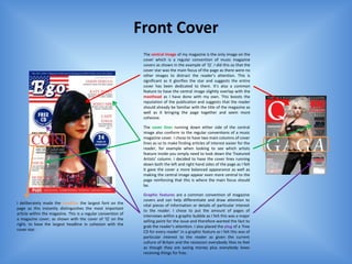
The central image of my magazine is the only image on the
cover which is a regular convention of music magazine
covers as shown in the example of ‘Q’. I did this so that the
cover star was the main focus of the page as there were no
other images to distract the reader’s attention. This is
significant as it glorifies the star and suggests the entire
cover has been dedicated to them. It’s also a common
feature to have the central image slightly overlap with the
masthead as I have done with my own. This boosts the
reputation of the publication and suggests that the reader
should already be familiar with the title of the magazine as
well as it bringing the page together and seem more
cohesive.
The cover lines running down either side of the central
image also conform to the regular conventions of a music
magazine cover. I chose to have two main columns of cover
lines as so to make finding articles of interest easier for the
reader, for example when looking to see which artists
feature inside you simply need to look down the ‘Featured
Artists’ column. I decided to have the cover lines running
down both the left and right hand sides of the page as I felt
it gave the cover a more balanced appearance as well as
making the central image appear even more central to the
page reinforcing that this is where the main focus should
be.
Graphic features are a common convention of magazine
covers and can help differentiate and draw attention to
I deliberately made the headline the largest font on the
vital pieces of information or details of particular interest
page as this instantly distinguishes the most important
to the reader. I chose to put the amount of pages of
article within the magazine. This is a regular convention of
interviews within a graphic bubble as I felt this was a major
a magazine cover, as shown with the cover of ‘Q’ on the
selling point for the issue and therefore wanted the fact to
right, to have the largest headline in cohesion with the
grab the reader’s attention. I also placed the plug of a ‘free
cover star.
CD for every reader’ in a graphic feature as I felt this was of
particular interest to the reader as given the current
culture of Britain and the recession everybody likes to feel
as though they are saving money plus everybody loves
receiving things for free.
2. The masthead is the most important part of a magazine as
it is, initially, the first thing the reader looks for and so it’s
vital to have a suitable font that carries the correct
connotations and fits the genre of the magazine. I tried out
several different fonts but ultimately chose this one as I
feel it's attractive and stylish which appeals to my target
audience of teenagers. I placed my masthead in the top left
hand corner – a familiar convention among most
magazines – as this is logical place because we naturally
read left to right, top to bottom.
I chose to include a banner at the very top of my cover
featuring the slogan ‘The UK’s ONLY magazine dedicated to
bringing the BEST music from The States’ because after
studying several different examples of existing
publications, I realised this was a common convention to
have as shown with the example of ‘Q’ on the right . This is
an important feature as it boosts the reputation of the
magazine and enforces to the reader that this is a reliable
and trustworthy publication, enticing them to purchase it. I
also added a banner along the bottom of my cover,
another enticing feature, as the large, bold font of ‘Plus’
grabs the reader’s attention and suggests there is loads
more inside than just what’s on the cover.
Every magazine has a barcode on the cover and therefore I
placed one on my own cover in order to keep with this
convention. I did this to create a more polished and
professional look as well as to express that I have
considered everything that needs to be included in order
to make a successful, credible music magazine cover.
3. Contents Page
A regular convention of contents pages is to have a main
image of the feature artist which is why I chose to use the
same subject here as on my cover. This also makes my
project more cohesive and expresses that they are pages
taken from the same issue of the same publication.
I added the official logo taken from the masthead of my
magazine in the top left hand corner of my contentions
page which follows the codes of a regular magazine page.
This, again, reinforces to the reader that this is just one
page taken from a much larger publication. If I was to
pursue with this project and produce the completed
issue, every page would feature the this icon in the top left
corner to make every page - and ultimately the entire
magazine – cohesive with one another.
The featured articles are a crucial element of the entire
magazine. I chose to divide my menu bar into two separate
categories – ‘Inside’ and ‘On the Cover’. This is a common
convention used throughout magazines and I chose to
follow this as it makes it easier for the reader to navigation
through the list and find exactly what they are looking for
quicker. In my ‘On The Cover’ section, I listed the article
titles exactly as they appeared on the
cover, again, improving the cohesion of my magazine and
building a strong connection between the two.
4. I included a small editorial within my contents at the top of
the page which I learned, through studying several
examples, was a common convention of a music magazine
contents page. This acts as a small introduction to the issue
for the reader and provides a little inside into the content
within it’s pages. To polish off my editorial and give it a
truly professional appearance I added a ‘photo of the
editor’ and a hand written signature which I scanned into
the computer – both following with the regular codes of an
existing music magazine.
To finish off my contents page, I added a subscription box
at the bottom including an image of my front cover. I chose
to feature a subscription offer as this is a common
convention of a music magazine and provides an
incentive, enticing the reader to subscribe. I included the
image of the front cover to express that the two pages are
connected as part of the same publication and also to give
an example of what the reader will receive once they
subscribe.
5. Double Page Spread
The most obvious convention of a double page article
I added the official logo of the within a magazine is the distinct layout as, although each
magazine in the top left corner magazine adapts it slightly to suit the individual piece,
again to express the article is primarily the layout always stays the same. The common
official and to keep cohesion convention is to divide the piece into two very distinct
between the pages pages and have the article on one side and an image of the
Page 2. relevant subject on the other as shown with both of the
Page 1. examples on the right. I followed this convention as I felt it
was the best suitable layout for my spread and gave the
page an equally balanced appearance which is pleasing on
the eyes.
I deliberately followed conventions and chose to use a
variety of fonts , colours and sizes on my headline in order
to grab the reader’s attention straight away. Through
placing certain words in a colour or making them larger, I
aimed – as many magazines do – to subconsciously make
the reader pay more attention to some elements more
than other’s. For example, in the headline, ‘Queen’ is the
largest and therefore is the most eye catching. This is
3. significant as it makes the reader want to read on to
discover how ‘queen’ is relevant to the article.
2.
1.
I divided the main body of my article into three individual
columns as this is easier on the eyes and makes navigation
through the text easier for the reader as it gives them clear
direction on which sections to read in which order. This is a
Drop Capitals are a common convention used through common code used throughout magazines and newspaper
magazine articles, signalling the start of the main body of the articles as shown with the example. Three is the average
article. I decided to include a drop capital within my own article number of columns though sometimes magazines use just
as I wanted to clearly direct the reader and indicate exactly two and sometimes four.
where to start reading from.
6. I added a page number in the top right
hand corner to reinforce the theoretical I incorporated a quote taken directly from the article into
idea that this is just one page taken from my main image of the double page as many magazines do.
an entire publication. This gives the page a I chose carefully the quote I thought was most inspirational
more polished, professional appearance. and the most appealing to the reader as so to grab their
attention and entice them to read the full article. I placed
the quote in a graphic bubble so as to make it cohesive
with the image and create the illusion that my subject was
thinking about the words. I deliberately used different font
sizes and colours in order to make the most important
words ‘regular girl’ and ‘blessed’ stand out as I felt these
were the exact two that summed up the entire message of
the article.
The positioning of my subject in the main image is
significant as I deliberately placed the model in a stance
which I felt best conveyed her personality and the persona
I wanted my music artist to have. This is a common
convention for the photography that accompanies
magazines articles – the models are often displaying poses
to suggest things about them for example Lily Allen, on the
right, has her hands on her hips signalling that she is a
strong woman in control of herself. I placed my subject in a
sitting down position looking upwards at the sky as if
daydreaming as I wanted to convey the innocence and
purity of her character.