
More Related Content
What's hot
What's hot (20)
Viewers also liked
Viewers also liked (14)
Similar to Student Album cover and Magazine advert analysis
Similar to Student Album cover and Magazine advert analysis (20)
More from harrisoncattell123
Recently uploaded
Recently uploaded (20)
Student Album cover and Magazine advert analysis
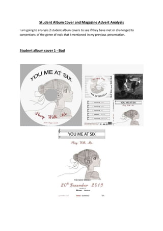
- 1. Student Album Cover and Magazine Advert Analysis I am going to analysis 2 student album covers to see if they have met or challenged to conventions of the genre of rock that I mentioned in my previous presentation. Student album cover 1 - Bad
- 2. Font and style The font used is not very stereotypicalfor a rock band, it is very plain and doesn't portray the connotation of rock (I checked the band and their genre is rock). The album title's swirly fontis more suitable for a pop album. The font colour somewhatfollows the conventions becauseit uses black. However, the album title is in maroon font, which doesn'treally portray the genreor style of music. Both titles are not very big and therefore would be hard to see on a shelf, this doesn't make it very attractive thereforeit doesn't create an iconic logo. There is consistency which doesn'tconfusethe audience. The use of two of the actors is good becauseit is showing and keeping a theme. The font used in the magazineadvert is the same as in the digipak, this cements the brand identity between the two product. The font,however, isn'tvery stereotypically of the genre. Itis very clear and easy to see which allows it to be easily spotted by the audience. There is no difference in font between the artist name and the album title, which can lead to confusion over which is which Image The image used is not really relevant to the genre. The picture of the anime girl doesn't not bring around connotation of rock and there is no useof instruments and the picture doesn't really suit the lyrics. There is no picture of the band which fails to make it noticeable. Overallthe image doesn't really link in with the genre but they have kept it consistent throughout. The image in the magazine used is the same image used in the digipak, even thou it sticks with the brand identify, it still doesn't connote the genre to the audience, it's too happy and isn't really relevant to the genre Camera The photo in the centre of the album cover structurehas used a mid-shotand does show the actors, this follow the conventions however it doesn'treally follow the genre very well. The main image isn't a photograph so I can't comment on it. The main image on the magazine advertisn't a photo so I can't comment on it Framing and Layout
- 3. The album is framed really well, the back and front covers arenot cluttered, the information's is clearly laid out and visible. There is a lot of blank space on the frontcover that could of been used a bit more but overall its very professionaldonein terms of photoshop-ing. Theframing of the information in the magazineadvert is done very professionally, noneof the text is cramped together and the information is equally spaced. There is the 'need-to-know' basic information on the magazine advertwhich allows it not to looked cluttered and confuseto audience. The album title is centrally framed as to stand out. The framing is probably the best part of this magazine advert. Iconography There is no real iconography used in this album cover, the main image is pretty boring and not relevant to the genre, I'mguessing the picture is more about showing off the drawer's skillrather than actually make something that is appropriateto the genre. There is no really iconography used on the magazine advert, the picture used is one again, not trying to promotethe artist, but more show off the drawers skill. Costume In the image on the back, the 2 actors arevery casual clothed. This connotes there laid back attitude with is a common stereotypeof rock. The actors are wearing jeans and a top which fits in with certain conventions. This is the area wherethe album excess in its place in the rock genre. The magazine adverthas no really actors on it so I can't comment on the costumeaspects. Colours The colours used in this album sortof follows the conventions. The use of grey scale suits because it connote a memory, mostrock songs areabout an event in the past. The red colour in the album name can also connote the outrageous aspects of rock, even though the fontused is very girly. The colours are consistentwhich is a good aspect. The colours used in the magazine advertare consistentwith what is in the digipak, this can link the two texts together in the audience's eyes. The colours sortof follow the conventions of rock but not to a great and noticeable detail which lets it down when establishing the genre to the audience.
- 4. Audience The font used and the image doesn'treally fit in with the genre and also doesn't fit with the target audience. The image of the girl is more targeted towards a younger TA and the girly font isn't very suitable neither. Once again, like the digipak, the magazine advertwould seem to be aimed at girls under 15 due to the anime-like drawing. This does not appeal to their chosen audience of both genders over 15. Composition The continuous use of the theme of music and using the treble clef as the surrounding of the track list and the title follows the conventions of the rock genre album covers, the useof an instrument theme presents the audience with the instruments as the main focus. Thefront and rear cover are joined by the headphonecable brings you nicely to the back of the album. Also the headphones connote the theme and also allows the actually music to be the main focus. The composition of the magazineadvert is not that great, the main focus is the picture in the middle, this picture doesn't not promote the artist which should be a main thing. The album title ad artists name is sortof overlooked becauseof the sizeof the picture. This would not instantly draw the audience to the name of the band. Conclusion Overall, I think this is a very bad album cover, it doesn't follow a lot of the conventions and I think its prime goal is to show of the drawer's work. The image, font style and colour doesn't not fit in with the genre. They haveclearly taken no time to think about these aspects and how it fits in with the genre. The magazine advert, like the digipak, doesn'tin my opinion target their audience very well. Some basic conventions havebeen overlooked and it's at the costof promoting the artist
- 5. Student album cover and magazine advert 2 - Good Font and Style
- 6. The font used in this album cover is very big and bold, it connotes a brash expression in the music, which is common in Madness songs. Thefont colour is dark which follows the conventions of rock album cover. The font is used throughoutand the same colour is used as well and is a perfect match for the genre and speaks volumes aboutthe music in the album to the audience giving it a positive re-enforcement. The magazine advertuses the samebig, bold font as in the digipak. This create a brand identity and presents the genre of the music straight to the audience. Image The front image is of the band. The picture uses a mid shotto clearly view all the band members. There facial expressions areneutral, this connotes there almost un-emotional like appearance, this allows the audience to separate them fromnormalpeople becausethey are seen to haveno emotions which puts them across as being highly regarded. The main band member is also used on the lyrical page. This focus on the band members and not irrelevant art work really follows the conventions, it allows the band members to be the main focus which is very stereotypically of the rock genre. The music and the band isn't the most important part. The magazine advert uses the same image as the digipak, follow the conventions of image in rock magazineadverts really makes it stand out from the rest and shows theaudience that this is a advert for a rock song, and that it is a very profession piece Framing and Layout The album is framed really well as well, the main picture is centrally framed and the text is clearly presented around it. The border on the back cover is not offsetand is very effective as a border to the text. The copy right information and the barcode is a bit squashed together becauseof the border which kind of gives it an amateur feel. The image in the advert is very well spaced so people can clearly see it. The border sticks with the brand identity and keeps it memorable. The studio logo and websiteis very small and not clear to people passing and doesn't not do a very good job of promoting the record label. Camera
- 7. The picture used has been taken very centrally, this focus the attention of the audience primarily on the people on the cover and establishes them as they are also the band members in the music video. The magazine advertuses the same picture as the digipak, the photo is centrally framed. This keeps the actors as the primary focus to the audience. Iconography Madness are always remembered for wearing suits and smart clothing. This album covertsticks with the iconography of there original albums. This very iconic dress and style adds definition to the cover and also makes it stand out and recognisableto the audience. This is a great example of following the conventions of iconography which makes this album so good and professionally done. The brand identity that the magazineadvert follows really makes it appealing, the use of the band and there suits really make the advert memorable and follows someof the conventions of Madness as well. Costume The costumes used in this album cover are outstanding, they not only follow the conventions of costume in rock album covers, butalso stick to the typical dress for the official band. This styleof clothing is present of the lyrical page as- well. This group have clearly done the research into the band and the genre. Colours There colours used in the cover is mainly black, the is continued throughout the wholealbum. Madness is famed for being a rebellious band, there lyrics can connote there rebelliously feelings. The use of black in the album cover re- enforces that connotations of rebelliousness and portrays thegenre very appropriately. The magazine advertuses a colour schemeof black and white. The black, like in the digipak, re-enforces the connotations of rebelliousness and portrays thegenre suitably. Audience Unlike the firstalbum cover, this one really suits the audience it is intended for. The image of the band is very appealing to the TA becausethey will recognisewho the band is, the lack of silly drawings is very refreshing and
- 8. allows a retro feel to be added which complements the cover very nicely. The continued use of the retro theme in the magazine advertreally makes it appealing to their target audience, the advertportrays the digipak as a serious album which is what their target audience want Composition The way the album is structured is pretty amazing, it is clear that there are separate areas but the art does bring them all together. The border around the track list complements the border around the front. Consistency is key in a roc album cover, this cover is perfectly consistent, the colours and fontmatch very well. The position of key elements such as the barcode and the copyrightinfo has been professionaldoneso it is clearly and uncluttered for the audience. The magazine advertcontinues to use the border as a main structureand houses all the information and picture, this works really well and makes the album uncluttered and structured. Conclusion Overall, this album cover is one of the best I have seen. it is very clear that the designers havelooked around at other rock covers and also researched into the official band and there covers. Itfollows nearly all the conventions perfectly which makes it a memorable cover which its own little quirks with the creativity. This magazine advertis also one of the best I have seen, it meets conventions of rock magazineadverts and also sticks with the brand identity of the digipak in a solid way.