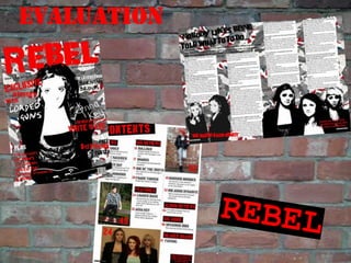
Final Evaluation
•Download as PPTX, PDF•
1 like•350 views

The document discusses how the student's media product uses and develops conventions of real magazines. It summarizes the key design elements and styles incorporated from Ray Gun magazine and other music magazines. The student explains how they developed the style to feature punk music genre specifically and attract that target audience while still including recognizable magazine conventions.

Recommended
More Related Content
What's hot
What's hot (20)
Viewers also liked
Viewers also liked (7)
Similar to Final Evaluation
Similar to Final Evaluation (20)
Recently uploaded
Recently uploaded (20)
Final Evaluation
- 2. IN WHAT WAYS DOES YOUR MEDIA PRODUCT USE DEVELOP OR CHALLENGE FORMS AND CONVENTIONS OF REAL MEDIA PRODUCTS? For my magazine I have used the idea of creating an art style magazine from Ray Gun magazine. However, I have developed the idea of a more individual style by incorporating the more typical conventions of magazines of the colour palette, use of thirds to create a more recognisable and understandable layout. I have created a specifically punk music genre magazine which is not very common because punk is quite a niche genre therefore my magazine would not appeal to the masses like mixed genre music magazines like Q and NME do. I mixed the styles and conventions used in Ray Gun and more well known music magazines like NME to create a mix of art style but keep the recognisable conventions of mainstream magazines so that I attract my target audience. I created the street art style by editing the photographs and replicating the painted stencil style of street art. To add to the art effect of the cover I wanted to create a layered, ripped collage to suggest a warn away billboard. I replicated Miss-Tic’s style of street art by using a strong black and white defined photo against a collage of ripped images. To link in another aspect of punk genre I used a roughly painted worn image of the Union flag. I also included images of a worn down brick wall to link to street art and the idea that punk comes from rough urban areas. I used a bold font for the masthead that represented the style of the magazines as it patchy which again links to street art.
- 3. The title REBEL links strongly with the music genre and it also links to the street art influence. As well as the masthead I used several other fonts throughout my magazine in a typical mainstream magazine there might not be somemany different fonts on the cover but I wanted to link it to graffiti and how lots of tags with different handwriting and styles are painted onto walls. I used the typical convention of red, black and white because it is recognisable and stands out well but also because the contrasting colour fits with the punk genre. I used appropriate costumes and props, ripped clothing, leather jackets and blazers with safety pins, and the guitar to portray punk style and attitude.I also portrayed the punk attitude through the poses and stance of the models. I had the models look nonchalantly directly into the camera to connect to the audience and in the long shots of the artists on the contents page I had the models look away from the camera as though they were uninterested. I wanted to use a picture of an artist swearing however I thought it might put people off it was used on the cover so I decided to use it in the article. In the article I used a colloquial tone to engage the reader and make them feel more involved in the interview by using a colloquial tone for the interviewer as well as the band. I wanted the interview to seem natural and reflect the punk attitude so I included swear words which made it sound more realistic. I kept the contents page layout simple and less busy as the cover because like typical magazine layouts the contents needs to be easy to read and broken down into sections to make it interesting to reader and easy to find certain sections. I kept the street art and punk style on the content page by using military style fonts and creating the black bands which I wanted to link to police tape. Also the photographs, poses and colour scheme help show the genre on the contents page.
- 4. Masthead Plug Issue Number and Price Puffs Cover lines Free merchandise – a reason to buy it Other features
- 5. HOW DOES YOUR MEDIA PRODUCT REPRESENTPARTICULAR SOCIAL GROUPS? The band I have featured in my magazine are quite unique being an all-girl rock band there are not a lot of bands around today that I could compare them to. In terms of social groups, my bands would attract “young alternative” teenagers who like alternative, anti-pop/mainstream styles of music. I chose to compare Loaded Guns to Paramore especially Hayley Williams because she is good example of a strong female front band member. Hayley Williams gives Paramore a different edge to other alternative rock bands because she gives the band a different look and sound. This is what I tried to get across with my band it turns of look all the members of my band have a different look, style and would bring their own personality to the band. This would represents young alternative teenagers who experiment with their own style and incorporate punk, alternative and grunge styles together to create their own look. This is true to Paramore as well because each member has a different style which shows that they are not clones and have a different personality and style influence. Paramore obviously have two male members whereas my band is all-female but this adds to the unique and individual style of the band. The fact that Hayley Williams is the lead singer and the only female member of Paramore means that the emphasis is usually centred on her whereas my band being all girl fit together better and would stand as a whole rather than one member standing out more. Although Nade, having bright red hair automatically attracts the attention.
- 6. WHAT KIND OF MEDIA INSTITUTION MIGHT DISTRIBUTE YOUR MEDIA PRODUCT & WHY? Publishing is the process of preparing, creating and issuing newspapers, books, magazines and other media text for the general public to access. For my magazine, I would want an independent publishing company like Development Hell Ltd to be my publisher because although it is very small publishing company I think my magazine style fits their type of publishing. They only publish two other magazines – The Word and Mixmag which are specific genres of music aimed at a certain audience which is what my magazine is. The Word magazine also has an art style like my magazine so it might open up the audience for my magazine from current customers of The Word. Development Hell Ltd is based in London which good for my magazine because it is aimed at a British audience. However, I think with the artists featured and style there would be some interest internationally because there are bigger bands included who would be more widely known. Development Hell Ltd’s other magazines are not mainstream so are not distributed to every shop and news agent however there would be certain branches of retailers who would be issued a few copies of every issue where the target audience will return to because they know the retailers sell the magazine.
- 7. WHO WOULD BE THE AUDIENCE FOR YOUR MEDIA PRODUCT? Katie Riley is an A-Level student who is very interested in music specifically classic British rock. Her Dad introduced her to lots of different types of music from his era from mod to punk and everything in between. He has a large record collection which Katie has grown up with and her interest in that era of music and the punk attitude of individuality and not compromising style for mainstream acceptance has grown. She is a very individual when it comes to fashion and likes to mix different styles of British culture. Her country pursuit interest comes through with designer clothes from Jack Wills which she mixes with a more laid back style. Although she does like designer labels she does not follow the crowd and doesn’t look to modern mainstream celebrities to inspire her. My magazine would appeal to her because of the style of the artists she might look to the type of artists I use in my magazine for inspiration on her own style. As well as fashion, Katie is very interested in art, more specifically street and urban art as well as more traditional forms of art. She likes the expressiveness of art, my magazine with its strong links to street art and individual style would appeal to her. Thetarget audience for my music magazine is older teenagers and young adults who are interested in alternative styles of music and who are interested in older bands and genres of music but also like modern alternative bands. My target audience might also be some of the older generation who were the originalpunk fans who might still have an interest in current punk rock bands and they would like the recognition of the original punk rock bands. My magazine is aimed at males and females because it features both male and female artist and the colour scheme is nonspecific to either gender. My target audience would be interested in art and more individual styles of media, they will like the unique alternative style of the magazine and the specific music genre will appeal because its not so broad that it incorporates pop/ mainstream bands which my target try to avoid.
- 8. HOW DID YOU ATTRACT / ADDRESS YOUR AUDIENCE? I attracted/ addressed my audience by using an unusual style of magazine mixing street art a recognisably anti-establishment form of art with punk music which is also anti-establishment. The mix of individual style and typical conventions will appeal to people who want a different style and specific music genre magazine and also other people who may enjoy other types of music besides punk but like the artistic style of the magazine. I attracted my audience by keeping typical conventions involved because if I went against all conventions and made a completely different style of magazine like Ray Gun it might make the market smaller because its too different. I wanted to include a variety of punk music within my magazine so I mentioned more pop-punk style Green Day, acoustic style Frank Turner and Big Audio Dynamite who are associated with the past punk generation through Mick Jones (The Clash). The range of punk artists and information about upcoming and returning artist would attract my target audience of young adults and those of the past punk generation who are still interested in staying in touch with past and present punk artists. I included male and female models to show my audience that it is aimed at males and females. I was going to use an all-male band as my artist which is recognisable in the punk music genre however I wanted to attract more female audience members so I decided to portray a all-female punk band to shows that girls can pull off punk too. This was my unique selling point for my first issue – an upcoming all-girl punk band which is not very common so this would attract an audience to find out more. For the photo edits I tried to replicate Banksy’s stencil style which is well known and would stand out on the shelf and draw my audience’s attention.
- 9. WHAT HAVE YOU LEARNT ABOUT TECHNOLOGIES FROM THE PROCESS OF CONSTRUCTING THIS PRODUCT? FUJIFILM Finepix HS10 Seagate External Hard-drive I learnt to use the different settings on my camera depending on what lighting I wanted. I also learnt how to focus it so that I could focus on a certain feature. I used this to transport working PSD files to and from school. I also saved all the images on this. I did nearly all of the work for the project on this laptop. HP Officejet Scanner and Printer Canon Inkjet printer I printed the drafts and final draft on off on this printer. Toshiba laptop with Window Vista I used this to scan magazines for analysis and to scan my annotated drafts.
- 10. I used Adobe Photoshop Elements 7 to create my magazine and mock-ups. I have used photoshop before but not to create my own images/product so I had to practice using the layers, text and effects. I practised while making the mock-ups and preliminary task however I also developed my skills during the production of the final product testing what worked and what did not look as effective. I had used the effects gallery before so it was a case of testing what effect worked best with the photos. For the magazine I wanted to create, I had to use layers of photographs which took a long time and was quite hard to get the right effect. However I am quite pleased at how the background turned out. I used the text effects to edit the fonts to make them bolder, engraved or italic depending on what effect I wanted them to create. I have definitely developed my skills further by using photoshop for my magazine as I have learnt how to use the layers effectively and learnt more about the effects I can use on photographs to create a completely different artistic look. I used the spot remover to enhance the images which I hadn’t used before it was quite easy to use and made it look more professional. I become more confident using the lasso tool to cut the background from the subject of a photo. This made my product look more professional and was very useful for the photos on the cover and in the article where I just wanted the subject of the shot without the background.
- 11. I used Blogger to present all process I made from the initial research to the final evaluation. I was new to blogging and at the beginning I found it hard not knowing my way around it. However once I got the hang of it I found it easier to create and edit posts, I also learnt how to embed videos and other applications into posts. The blog was very useful to find relevant information that I had found and posted because the posts were in order. I could also follow other blogs that I used as sources of information and inspiration, like teachers’ and other students’ blogs. I hadn’t used Scribd before but I found it quite easy to upload Word documents. I used it as a more interesting way of presenting information in my posts. I used it to present the results from my questionnaire and the current magazine analyses. Scribd allowed me to upload analysed images and pie charts onto my blog which I found very useful. I had used Animoto before so I was able to develop the video further. From the first time I use it I learnt that it looks more effective if the text and images are mixed up together and if the images that follow the text relates to what the text says. I learnt how to import my own song and how to convert the file to the right sort for the song to be uploaded. I used Slideshare for the first time to present my information on magazine institutions. I found it a very useful and quick way to upload information which made it look more interesting than in simple post form. I learnt how to embed the Scribd documents, Animoto and Slideshare files onto my post which I hadn’t done before. I used Facebook to collect my research for the questionnaire and to organise the photo shoot via the Facebook messages. I also used YouTube to upload and excess the video of my pitch questions. This was the first time I had uploaded a video onto YouTube which I found surprisingly easy to do. It then made it easier to post the video on my blog. I discovered Flickr whilst doing research into Street Artists and thought it would be good to create my own account because it was easy to view all the pictures people had uploaded. I have now uploaded all my pictures from the magazine shoots, test shots and other random shots I took. I found this very easy to upload and the website is very useful for myself and others to access and view my photos.
- 12. LOOKING BACK AT YOUR PRELIMINARY TASK – WHAT DO YOU FEEL YOU HAVE LEARNT IN THE PROGRESSION FROM IT TO YOUR FULL PRODUCT? From my preliminary task I have learnt what is and isn’t successful techniques to include in a magazine. For example on my preliminary cover I used different fonts for the cover lines however they didn’t stand out from each other so it wouldn’t really attract the audience. So for my final piece I knew to use different fonts, sizes and colours for the cover lines and puffs to make them stand out more. Also the effect for the background on my preliminary cover was the same as the contents page which didn’t make it look very professional therefore I didn’t use the same background for the cover and contents page on my final magazine. I also learnt to use a background that linked better to the genre of the magazine. Since the preliminary task I have learnt more about photography and my camera skills have improved. I now know that the location and lighting of the photoshoot is important. The images for my prelim magazine were taken indoors with little light so the images are quite dark and the models looked quite orange whereas for my final photoshoot I tested the lighting until I got the lighting right with a small amount of shadow. I also learnt more about thirds and how I had to layout the cover and DPS for it to look right and not have lots of empty spaces.
- 13. For the contents page, I learnt from my preliminary task that I needed to break up the text so it was less like a list and more interesting to read, and the bullet points made the magazine seem short and too formal. I also needed to shorten names of the features to make them stand out more. However my draft contents page was to simplistic which made it ineffective and the features didn’t have anything to encourage the audience to read them. So I had to research more into other magazines’ contents pages to use typical conventions of sections and subheadings with text to entice the reader to go to the pages. My contents page improved greatly from the preliminary task to the final product because I learnt what did not work (bullet point list and page names too long or too short) so I did not use this in the final version.