This document summarizes and compares the styles of three music magazines: Kerrang, RockSound, and Classic Rock.
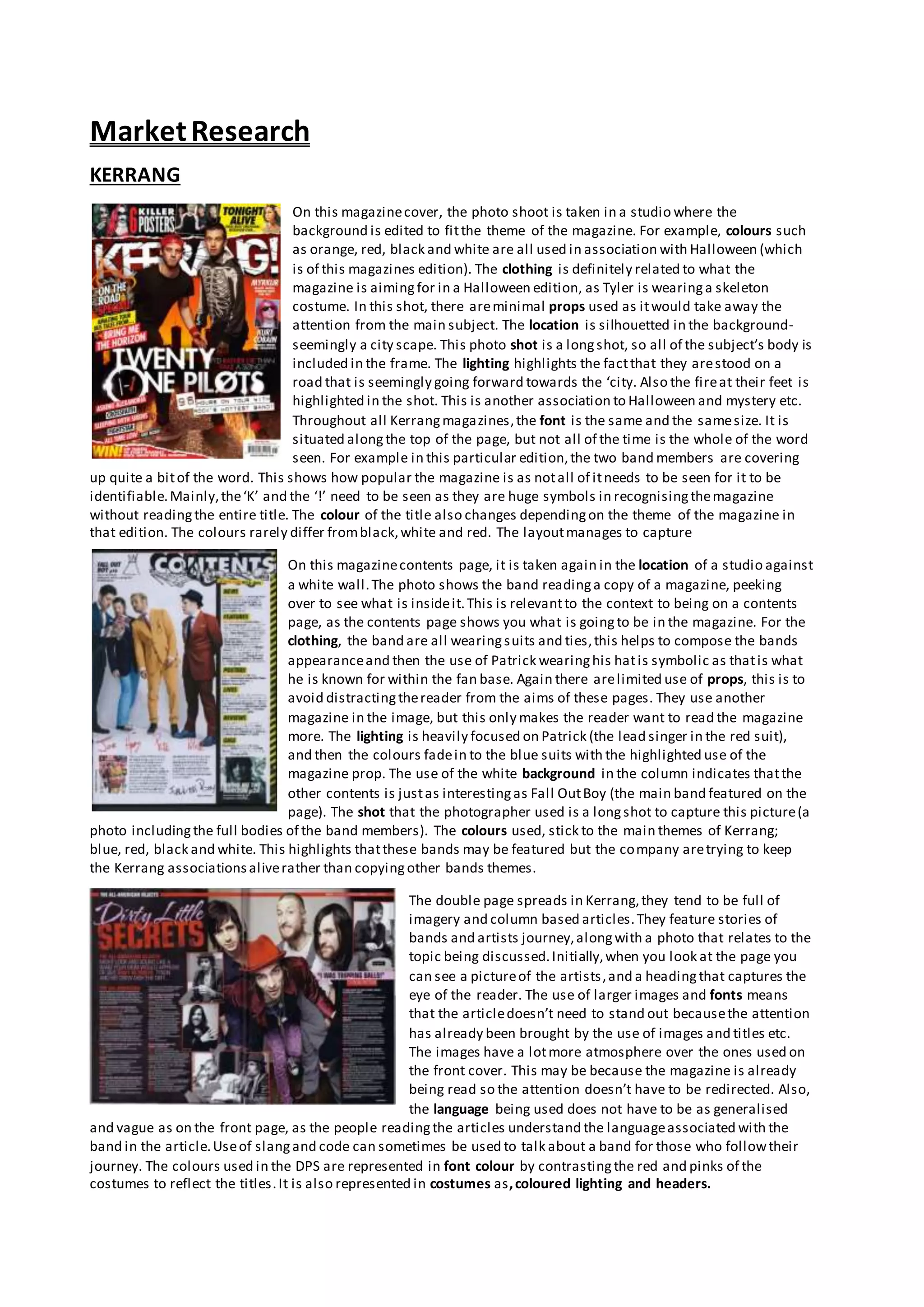
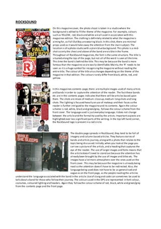
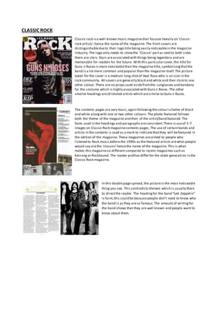
1) Kerrang and RockSound feature colorful studio backgrounds in photos on the covers, with minimal props to draw attention to the subjects. Classic Rock uses black and white photos with one accent color.
2) The magazines' logos are prominently displayed in distinctive fonts and colors related to their brands. Not all letters need to be visible for recognition.
3) Contents pages include multiple artist/band photos to entice readers. Formats are consistent with covers in color schemes and fonts.
4) Double page spreads focus on stories/photos but use large images and titles to draw


