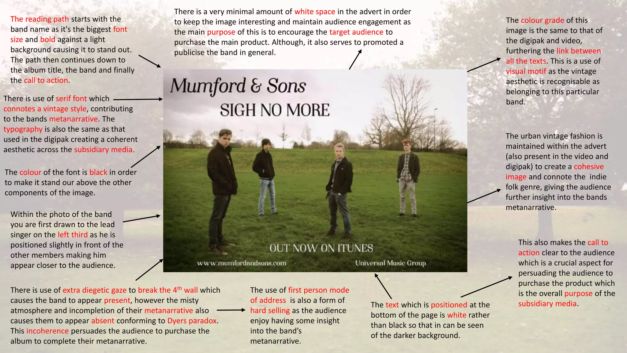
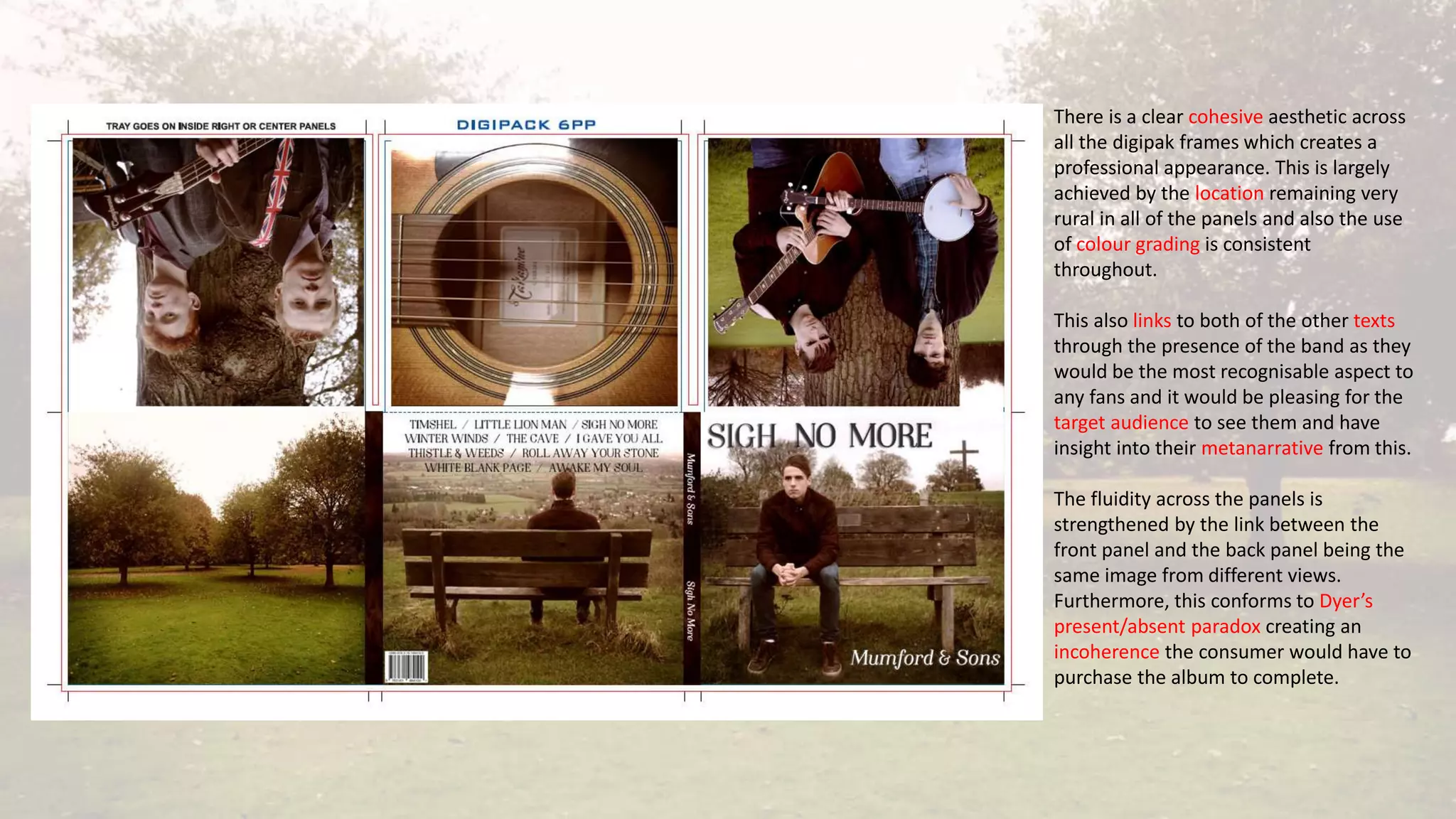
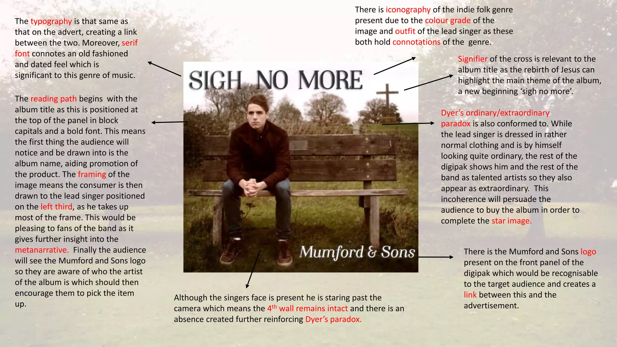
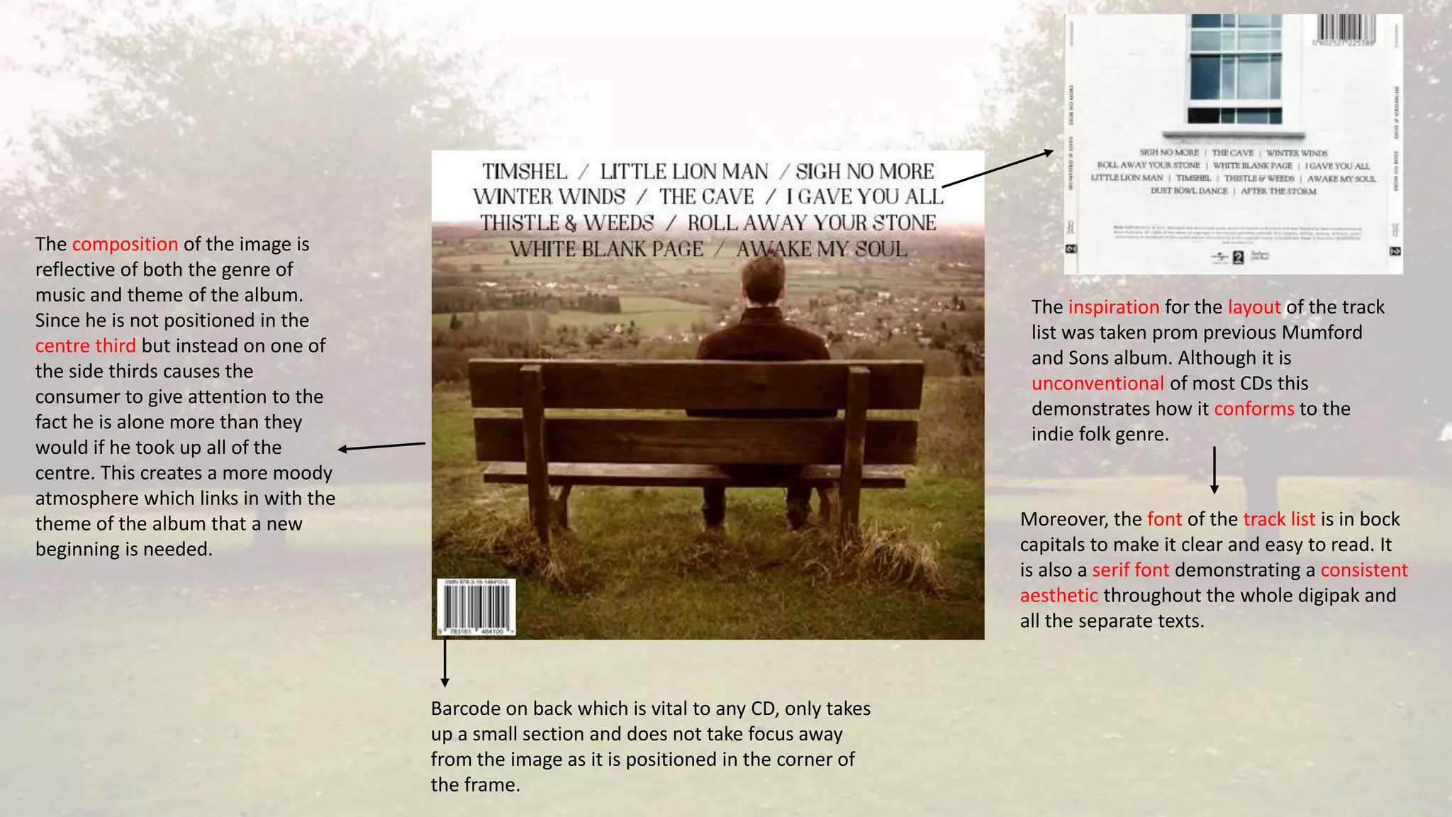
Evaluation – Question 2
Hannah Bennett
BRIEF
• The brief was to create a promotional campaign for our artist, Mumford and Sons, which consisted
of three media texts. This included a music video, digipak and advert.
• We set out to create a cohesive band image to promote the album ‘Sigh No More’ by using typical
folk conventions and creating a consistent style.
CONVENTIONS
• The rural location, consisting of woodland and
greenery which helped to create a vintage aesthetic
by the autumn colours and surroundings. This
ensured continuity throughout the three texts in
terms of location and made the indie folk genre
more evident to audiences.
• We took inspiration for this location from our
research into other texts of the folk genre to help
construct a metanarrative which was truly reflective
of the genre. We felt that the location used in
Mumford and Sons’ Hopeless Wanderer video was
particularly effective so decided to use this in our
production.
• The urban vintage costume, including blazers, flannel
shirts and jackets. This conforms to the indie folk genre
and helps contribute to the bands metanarrative as it
holds connotations of being more dated showing that
the band are rather sophisticated and do not
necessarily conform to Dyer’s star values such as
rebellion and youthfulness. Additionally this aesthetic
was cohesive across the main and ancillary products to
contribute to the cohesive band image.
CONVENTIONS
• This was again informed by our research carried out in
the planning stage. We looked at artists such as Frank
Turner and The Paper Kites as well as Mumford and
Sons in order to look at the genre as a whole and
perhaps extend the metanarrative we created in our
products.
• The presence of the band is crucial for creating a cohesive image throughout the main product and
ancillary texts as this conforms to one of Dyers paradoxes and is the most important way to gain
them exposure and allow the audience insight into their metanarrative.
CONVENTIONS
• Dyer states that an artist should be simultaneously present and absent which is achieved
throughout these texts by having the band visually present across all the texts, yet their talent or
perhaps lack of breaking the 4th wall means that they are also absent.
Still taken from music video
4th wall remains intact – present/absent
Panel taken from Digipak
4th wall broken, however the
instruments connotes talent
which creates an absence
• Myth - While the band conform to Dyer’s common star values of talent and originality I would not
say that they conform to any typical myths which are associated with stardom.
CONVENTIONS
• The band are largely presented as being rather rooted and do not appear very eccentric and
rebellious which would probably be seen as the main myth created by the media that many artists
are subsequently endowed with.
• This demonstrates how the metanarrative the video and print work are helping to construct can be
seen to challenge aspects conventional star image.
Someone such
as Lady Gaga
may be seen as
conforming to
the stardom
myth as she is
very eccentric
This is not
conformed to in
our products,
mainly due to
the genre, as we
portrayed a
natural look
ADVERTISEMENT
• The advertisement was designed to run in NME magazine as when we researched the band this
was where they had previously appeared and the indie folk genre is often present in this magazine
meaning our target audience would take interest and would be less likely to ignore the advert when
flipping through.
• We chose to design a double page spread advertisement as the band are already well established
and would be able to afford this.
The band had
previously had a
front page in the
magazine so we
decided that a
double page spread
advertisement
would be
appropriate.
The reading path starts with the
band name as it's the biggest font
size and bold against a light
background causing it to stand out.
The path then continues down to
the album title, the band and finally
the call to action.
There is use of serif font which
connotes a vintage style, contributing
to the bands metanarrative. The
typography is also the same as that
used in the digipak creating a coherent
aesthetic across the subsidiary media.
The colour of the font is black in order
to make it stand our above the other
components of the image.
Within the photo of the band
you are first drawn to the lead
singer on the left third as he is
positioned slightly in front of the
other members making him
appear closer to the audience.
There is use of extra diegetic gaze to break the 4th wall which
causes the band to appear present, however the misty
atmosphere and incompletion of their metanarrative also
causes them to appear absent conforming to Dyers paradox.
This incoherence persuades the audience to purchase the
album to complete their metanarrative.
The use of first person mode
of address is also a form of
hard selling as the audience
enjoy having some insight
into the band’s
metanarrative.
The text which is positioned at the
bottom of the page is white rather
than black so that in can be seen
of the darker background.
This also makes the call to
action clear to the audience
which is a crucial aspect for
persuading the audience to
purchase the product which
is the overall purpose of the
subsidiary media.
The urban vintage fashion is
maintained within the advert
(also present in the video and
digipak) to create a cohesive
image and connote the indie
folk genre, giving the audience
further insight into the bands
metanarrative.
The colour grade of this
image is the same to that of
the digipak and video,
furthering the link between
all the texts. This is a use of
visual motif as the vintage
aesthetic is recognisable as
belonging to this particular
band.
There is a very minimal amount of white space in the advert in order
to keep the image interesting and maintain audience engagement as
the main purpose of this is to encourage the target audience to
purchase the main product. Although, it also serves to promoted a
publicise the band in general.
There is a clear cohesive aesthetic across
all the digipak frames which creates a
professional appearance. This is largely
achieved by the location remaining very
rural in all of the panels and also the use
of colour grading is consistent
throughout.
This also links to both of the other texts
through the presence of the band as they
would be the most recognisable aspect to
any fans and it would be pleasing for the
target audience to see them and have
insight into their metanarrative from this.
The fluidity across the panels is
strengthened by the link between the
front panel and the back panel being the
same image from different views.
Furthermore, this conforms to Dyer’s
present/absent paradox creating an
incoherence the consumer would have to
purchase the album to complete.
There is iconography of the indie folk genre
present due to the colour grade of the
image and outfit of the lead singer as these
both hold connotations of the genre.
There is the Mumford and Sons logo
present on the front panel of the
digipak which would be recognisable
to the target audience and creates a
link between this and the
advertisement.
The typography is that same as
that on the advert, creating a link
between the two. Moreover, serif
font connotes an old fashioned
and dated feel which is
significant to this genre of music.
The reading path begins with the
album title as this is positioned at
the top of the panel in block
capitals and a bold font. This means
the first thing the audience will
notice and be drawn into is the
album name, aiding promotion of
the product. The framing of the
image means the consumer is then
drawn to the lead singer positioned
on the left third, as he takes up
most of the frame. This would be
pleasing to fans of the band as it
gives further insight into the
metanarrative. Finally the audience
will see the Mumford and Sons logo
so they are aware of who the artist
of the album is which should then
encourage them to pick the item
up.
Although the singers face is present he is staring past the
camera which means the 4th wall remains intact and there is an
absence created further reinforcing Dyer’s paradox.
Signifier of the cross is relevant to the
album title as the rebirth of Jesus can
highlight the main theme of the album,
a new beginning ‘sigh no more’.
Dyer’s ordinary/extraordinary
paradox is also conformed to. While
the lead singer is dressed in rather
normal clothing and is by himself
looking quite ordinary, the rest of the
digipak shows him and the rest of the
band as talented artists so they also
appear as extraordinary. This
incoherence will persuade the
audience to buy the album in order to
complete the star image.
The inspiration for the layout of the track
list was taken prom previous Mumford
and Sons album. Although it is
unconventional of most CDs this
demonstrates how it conforms to the
indie folk genre.
Moreover, the font of the track list is in bock
capitals to make it clear and easy to read. It
is also a serif font demonstrating a consistent
aesthetic throughout the whole digipak and
all the separate texts.
Barcode on back which is vital to any CD, only takes
up a small section and does not take focus away
from the image as it is positioned in the corner of
the frame.
The composition of the image is
reflective of both the genre of
music and theme of the album.
Since he is not positioned in the
centre third but instead on one of
the side thirds causes the
consumer to give attention to the
fact he is alone more than they
would if he took up all of the
centre. This creates a more moody
atmosphere which links in with the
theme of the album that a new
beginning is needed.
All of the band members are
present which proved to be
conventional when looking at
other digipaks as this is
pleasing to fans of the band.
The relaxed body language
of the band connotes a laid
back atmosphere which is
reflective of the style of
music .
Iconography of the indie folk
genre; the band are holding
instruments which are
typically associated with the
genre such as banjo and
acoustic guitar which helps to
further construct their
metanarrative.
The centre panel the disc would be
positioned on has the sound hole for
an acoustic guitar which maintains the
iconography of the genre and is also
fitting at the disc is the same circular
shape creating a professional and
clean appearance.

Evaluation - Question 2

  • 1.
    Evaluation – Question2 Hannah Bennett
  • 2.
    BRIEF • The briefwas to create a promotional campaign for our artist, Mumford and Sons, which consisted of three media texts. This included a music video, digipak and advert. • We set out to create a cohesive band image to promote the album ‘Sigh No More’ by using typical folk conventions and creating a consistent style.
  • 3.
    CONVENTIONS • The rurallocation, consisting of woodland and greenery which helped to create a vintage aesthetic by the autumn colours and surroundings. This ensured continuity throughout the three texts in terms of location and made the indie folk genre more evident to audiences. • We took inspiration for this location from our research into other texts of the folk genre to help construct a metanarrative which was truly reflective of the genre. We felt that the location used in Mumford and Sons’ Hopeless Wanderer video was particularly effective so decided to use this in our production.
  • 4.
    • The urbanvintage costume, including blazers, flannel shirts and jackets. This conforms to the indie folk genre and helps contribute to the bands metanarrative as it holds connotations of being more dated showing that the band are rather sophisticated and do not necessarily conform to Dyer’s star values such as rebellion and youthfulness. Additionally this aesthetic was cohesive across the main and ancillary products to contribute to the cohesive band image. CONVENTIONS • This was again informed by our research carried out in the planning stage. We looked at artists such as Frank Turner and The Paper Kites as well as Mumford and Sons in order to look at the genre as a whole and perhaps extend the metanarrative we created in our products.
  • 5.
    • The presenceof the band is crucial for creating a cohesive image throughout the main product and ancillary texts as this conforms to one of Dyers paradoxes and is the most important way to gain them exposure and allow the audience insight into their metanarrative. CONVENTIONS • Dyer states that an artist should be simultaneously present and absent which is achieved throughout these texts by having the band visually present across all the texts, yet their talent or perhaps lack of breaking the 4th wall means that they are also absent. Still taken from music video 4th wall remains intact – present/absent Panel taken from Digipak 4th wall broken, however the instruments connotes talent which creates an absence
  • 6.
    • Myth -While the band conform to Dyer’s common star values of talent and originality I would not say that they conform to any typical myths which are associated with stardom. CONVENTIONS • The band are largely presented as being rather rooted and do not appear very eccentric and rebellious which would probably be seen as the main myth created by the media that many artists are subsequently endowed with. • This demonstrates how the metanarrative the video and print work are helping to construct can be seen to challenge aspects conventional star image. Someone such as Lady Gaga may be seen as conforming to the stardom myth as she is very eccentric This is not conformed to in our products, mainly due to the genre, as we portrayed a natural look
  • 7.
    ADVERTISEMENT • The advertisementwas designed to run in NME magazine as when we researched the band this was where they had previously appeared and the indie folk genre is often present in this magazine meaning our target audience would take interest and would be less likely to ignore the advert when flipping through. • We chose to design a double page spread advertisement as the band are already well established and would be able to afford this. The band had previously had a front page in the magazine so we decided that a double page spread advertisement would be appropriate.
  • 8.
    The reading pathstarts with the band name as it's the biggest font size and bold against a light background causing it to stand out. The path then continues down to the album title, the band and finally the call to action. There is use of serif font which connotes a vintage style, contributing to the bands metanarrative. The typography is also the same as that used in the digipak creating a coherent aesthetic across the subsidiary media. The colour of the font is black in order to make it stand our above the other components of the image. Within the photo of the band you are first drawn to the lead singer on the left third as he is positioned slightly in front of the other members making him appear closer to the audience. There is use of extra diegetic gaze to break the 4th wall which causes the band to appear present, however the misty atmosphere and incompletion of their metanarrative also causes them to appear absent conforming to Dyers paradox. This incoherence persuades the audience to purchase the album to complete their metanarrative. The use of first person mode of address is also a form of hard selling as the audience enjoy having some insight into the band’s metanarrative. The text which is positioned at the bottom of the page is white rather than black so that in can be seen of the darker background. This also makes the call to action clear to the audience which is a crucial aspect for persuading the audience to purchase the product which is the overall purpose of the subsidiary media. The urban vintage fashion is maintained within the advert (also present in the video and digipak) to create a cohesive image and connote the indie folk genre, giving the audience further insight into the bands metanarrative. The colour grade of this image is the same to that of the digipak and video, furthering the link between all the texts. This is a use of visual motif as the vintage aesthetic is recognisable as belonging to this particular band. There is a very minimal amount of white space in the advert in order to keep the image interesting and maintain audience engagement as the main purpose of this is to encourage the target audience to purchase the main product. Although, it also serves to promoted a publicise the band in general.
  • 9.
    There is aclear cohesive aesthetic across all the digipak frames which creates a professional appearance. This is largely achieved by the location remaining very rural in all of the panels and also the use of colour grading is consistent throughout. This also links to both of the other texts through the presence of the band as they would be the most recognisable aspect to any fans and it would be pleasing for the target audience to see them and have insight into their metanarrative from this. The fluidity across the panels is strengthened by the link between the front panel and the back panel being the same image from different views. Furthermore, this conforms to Dyer’s present/absent paradox creating an incoherence the consumer would have to purchase the album to complete.
  • 10.
    There is iconographyof the indie folk genre present due to the colour grade of the image and outfit of the lead singer as these both hold connotations of the genre. There is the Mumford and Sons logo present on the front panel of the digipak which would be recognisable to the target audience and creates a link between this and the advertisement. The typography is that same as that on the advert, creating a link between the two. Moreover, serif font connotes an old fashioned and dated feel which is significant to this genre of music. The reading path begins with the album title as this is positioned at the top of the panel in block capitals and a bold font. This means the first thing the audience will notice and be drawn into is the album name, aiding promotion of the product. The framing of the image means the consumer is then drawn to the lead singer positioned on the left third, as he takes up most of the frame. This would be pleasing to fans of the band as it gives further insight into the metanarrative. Finally the audience will see the Mumford and Sons logo so they are aware of who the artist of the album is which should then encourage them to pick the item up. Although the singers face is present he is staring past the camera which means the 4th wall remains intact and there is an absence created further reinforcing Dyer’s paradox. Signifier of the cross is relevant to the album title as the rebirth of Jesus can highlight the main theme of the album, a new beginning ‘sigh no more’. Dyer’s ordinary/extraordinary paradox is also conformed to. While the lead singer is dressed in rather normal clothing and is by himself looking quite ordinary, the rest of the digipak shows him and the rest of the band as talented artists so they also appear as extraordinary. This incoherence will persuade the audience to buy the album in order to complete the star image.
  • 11.
    The inspiration forthe layout of the track list was taken prom previous Mumford and Sons album. Although it is unconventional of most CDs this demonstrates how it conforms to the indie folk genre. Moreover, the font of the track list is in bock capitals to make it clear and easy to read. It is also a serif font demonstrating a consistent aesthetic throughout the whole digipak and all the separate texts. Barcode on back which is vital to any CD, only takes up a small section and does not take focus away from the image as it is positioned in the corner of the frame. The composition of the image is reflective of both the genre of music and theme of the album. Since he is not positioned in the centre third but instead on one of the side thirds causes the consumer to give attention to the fact he is alone more than they would if he took up all of the centre. This creates a more moody atmosphere which links in with the theme of the album that a new beginning is needed.
  • 12.
    All of theband members are present which proved to be conventional when looking at other digipaks as this is pleasing to fans of the band. The relaxed body language of the band connotes a laid back atmosphere which is reflective of the style of music . Iconography of the indie folk genre; the band are holding instruments which are typically associated with the genre such as banjo and acoustic guitar which helps to further construct their metanarrative. The centre panel the disc would be positioned on has the sound hole for an acoustic guitar which maintains the iconography of the genre and is also fitting at the disc is the same circular shape creating a professional and clean appearance.