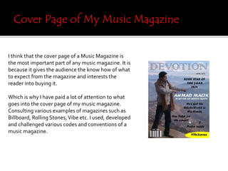
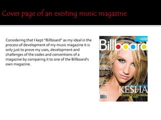
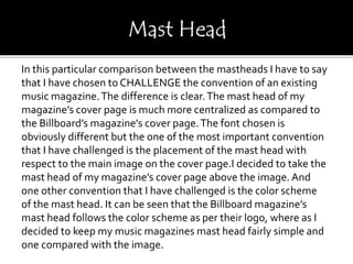
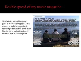
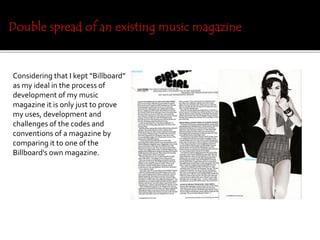
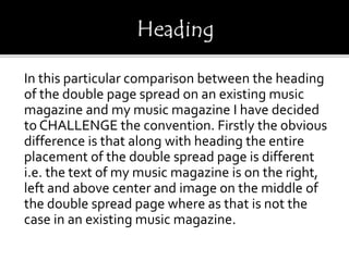
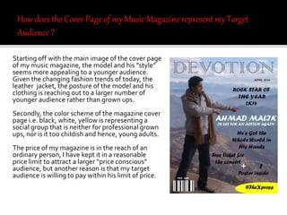
The document discusses how the creator of a music magazine challenged conventions from existing music magazines like Billboard in developing their own magazine cover, contents page, and double page spread. Specifically, they centralized the masthead on the cover, placed it above the image instead of following the color scheme of the logo. On the contents page, they vertically wrote the heading on the left instead of the top right. For the double page spread, they placed the text on right, left and center of the spread instead of just left, and used a band image instead of an individual artist. Overall, the creator sought to challenge placement conventions while maintaining consistent color schemes to develop their own magazine for a target audience of teenagers and young adults.