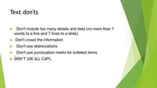
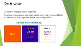
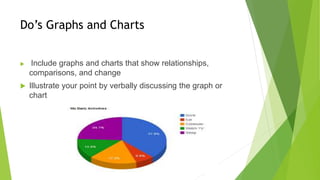
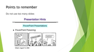
SLIDE PRESENTATION
GUIDELINES
By Malebo Confidence Moganedi
Text Do’s
Keep slides concise
- Font size should range between 18 to 48 (according to
importance)
- Use fonts that are easy to read, such as Arial, Helvetica,
Times New Roman, etc.
- Use uppercase letters for the first letter - Leave space
between the lines of text
- Use statements, not sentences - Use keywords to help the
audience focus on your message
Text don'ts
 Don't include too many details and data (no more than 7
words to a line and 7 lines to a slide)
 Don't crowd the information
 Don't use abbreviations
 Don't use punctuation marks for bulleted items
 DON’T USE ALL CAPS.
Do’s Colour
 Limit the use of colour to 2 to 4 colours/shades
 Use colours that will stand out and will be easy on the
eyes (dark backgrounds and light text is best or vice versa)
 Remember, the colours projected from a data projector will
look different than the colours on your computer screen
Don'ts colour
Don't have multiple colour schemes
Don't use dark colours on a dark background (red, blue, and black
should not be used together as text and background)
Do’s Graphs and Charts
 Include graphs and charts that show relationships,
comparisons, and change
 Illustrate your point by verbally discussing the graph or
chart
Don’ts
 Avoid meaningless graphs that are difficult to read
Image and Shapes Do’s
 Include images that make the issue you are presenting
more true to life, so your audience will understand and
identify with it
 Only include 1 to 2 images per slide - Use shapes to
illustrate difficult topics
Images and shapes don’ts
 Don't use too many graphics because it can be distractive
 Don't use low-quality images (images should not be
pixilated)
Points to remember
Do not use too many slides
Points to remember …
 Another thing to avoid is the use of a large block
paragraph to introduce your information. Please
use short, bulleted statements and avoid typing
out your whole presentation on to the slides. Also,
it is difficult for some to listen and read a large
amount of text at the same time.
Remember !!!!
Reference list .
 plusOrMinusZero.(2009).Slide Presentation Guidelines.Department of
Computer Applications Vidya Accademy of Science & Technology.
http://www.slideshare.net/PlusOrMinusZero/slide-presentation-guidelines
[28 August 2016]
 67renat. (2008).Presentation guidlines.
http://www.slideshare.net/67renat/6-presentation-guidelines1-
presentation?qid=b7d8519b-614a-47a3-bdac-
432ddce8b2ab&v=&b=&from_search=4 [28 August 2016]
 Harth, K. (2011). PowerPoint Presentation Guidelines.
http://www.slideshare.net/kharth/powerpoint-guidelines?qid=95f1f70b-6f0f-
4b53-9bb5-935072fc58e0&v=&b=&from_search=12 [29 August 2016]

Slide presentation guidelines

  • 1.
  • 2.
    Text Do’s Keep slidesconcise - Font size should range between 18 to 48 (according to importance) - Use fonts that are easy to read, such as Arial, Helvetica, Times New Roman, etc. - Use uppercase letters for the first letter - Leave space between the lines of text - Use statements, not sentences - Use keywords to help the audience focus on your message
  • 3.
    Text don'ts  Don'tinclude too many details and data (no more than 7 words to a line and 7 lines to a slide)  Don't crowd the information  Don't use abbreviations  Don't use punctuation marks for bulleted items  DON’T USE ALL CAPS.
  • 4.
    Do’s Colour  Limitthe use of colour to 2 to 4 colours/shades  Use colours that will stand out and will be easy on the eyes (dark backgrounds and light text is best or vice versa)  Remember, the colours projected from a data projector will look different than the colours on your computer screen
  • 5.
    Don'ts colour Don't havemultiple colour schemes Don't use dark colours on a dark background (red, blue, and black should not be used together as text and background)
  • 6.
    Do’s Graphs andCharts  Include graphs and charts that show relationships, comparisons, and change  Illustrate your point by verbally discussing the graph or chart
  • 7.
    Don’ts  Avoid meaninglessgraphs that are difficult to read
  • 8.
    Image and ShapesDo’s  Include images that make the issue you are presenting more true to life, so your audience will understand and identify with it  Only include 1 to 2 images per slide - Use shapes to illustrate difficult topics
  • 9.
    Images and shapesdon’ts  Don't use too many graphics because it can be distractive  Don't use low-quality images (images should not be pixilated)
  • 10.
    Points to remember Donot use too many slides
  • 11.
    Points to remember…  Another thing to avoid is the use of a large block paragraph to introduce your information. Please use short, bulleted statements and avoid typing out your whole presentation on to the slides. Also, it is difficult for some to listen and read a large amount of text at the same time.
  • 12.
  • 13.
    Reference list . plusOrMinusZero.(2009).Slide Presentation Guidelines.Department of Computer Applications Vidya Accademy of Science & Technology. http://www.slideshare.net/PlusOrMinusZero/slide-presentation-guidelines [28 August 2016]  67renat. (2008).Presentation guidlines. http://www.slideshare.net/67renat/6-presentation-guidelines1- presentation?qid=b7d8519b-614a-47a3-bdac- 432ddce8b2ab&v=&b=&from_search=4 [28 August 2016]  Harth, K. (2011). PowerPoint Presentation Guidelines. http://www.slideshare.net/kharth/powerpoint-guidelines?qid=95f1f70b-6f0f- 4b53-9bb5-935072fc58e0&v=&b=&from_search=12 [29 August 2016]