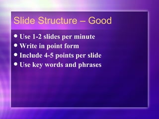
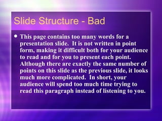
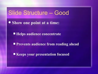
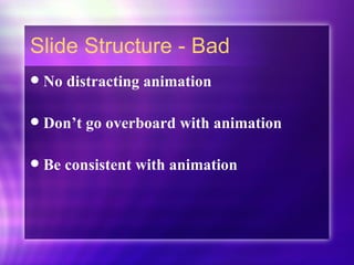
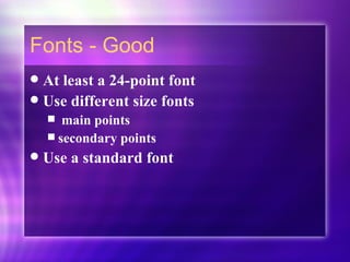
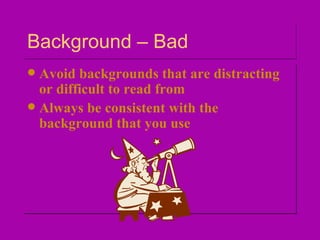
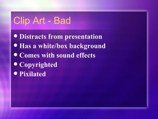
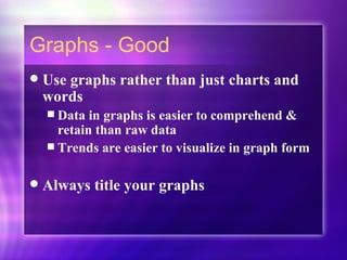
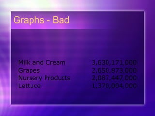
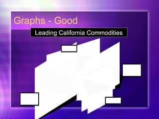
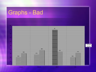
PowerPoint Presentations That Get The Point Across ACSI 2008
 
Tips to be Covered Slide Structure Fonts Color Background Clip Art Graphs Spelling and Grammar Conclusions Questions
Slide Structure – Good Use 1-2 slides per minute  Write in point form Include 4-5 points per slide Use key words and phrases
Slide Structure - Bad This page contains too many words for a presentation slide.  It is not written in point form, making it difficult both for your audience to read and for you to present each point. Although there are exactly the same number of points on this slide as the previous slide, it looks much more complicated.  In short, your audience will spend too much time trying to read this paragraph instead of listening to you.
Slide Structure – Good Show one point at a time: Helps audience concentrate  Prevents audience from reading ahead Keeps your presentation focused
Slide Structure - Bad No distracting animation Don’t go overboard with animation Be consistent with animation
Fonts - Good At least a 24-point font Use different size fonts  main points  secondary points Use a standard font
Fonts - Bad If you use a small font, your audience won’t be able to read what you have written CAPITALIZE ONLY WHEN NECESSARY.  IT IS DIFFICULT TO READ Don’t use a complicated font
Font Color - Good Contrasts with the background Ex: white on purple background Reinforces the logic of your structure Ex: Yellow title and white text Emphasize a point But only use this  occasionally
Font Color - Bad Using a font color that does not contrast with the background color is hard to read   Using color for decoration is  distracting  and  annoying . Using a different color for each point is unnecessary Using a different color for secondary points is also unnecessary T r y i n g  t o   b e  c r e a t i v e   c a n  a l s o   b e  b a d
Background - Good Attractive but simple Let the background reflect the light of the room.  Light room light background / dark font Dark room dark background/ light font Be consistent throughout  presentation
Background – Bad Avoid backgrounds that are distracting or difficult to read from Always be consistent with the background that you use
Clip Art - Good Enhances Presentation A picture is worth a thousand words Is NOT copyrighted
Clip Art - Bad Distracts from presentation Has a white/box background Comes with sound effects Copyrighted Pixilated
Graphs - Good Use graphs rather than just charts and words Data in graphs is easier to comprehend & retain than raw data Trends are easier to visualize in graph form Always title your graphs
Graphs - Bad
Graphs - Good Leading California Commodities
Graphs - Bad
Graphs - Bad Minor gridlines are unnecessary Font is too small Colors could show more contrast Title is missing
Spelling and Grammar Proof your slides for: spelling mistakes use of of repeated words grammatical errors  Have someone else proof your slides
Conclusion Should be effective and strong Summarize the main points Suggest future avenues of research Chance to give opinion
Questions?? End your presentation with a simple question slide  Invite your audience to ask questions Provides a visual aid during question period Avoids ending a presentation abruptly
Questions? So… any question??

Making a Good PowerPoint

  • 1.
    PowerPoint Presentations ThatGet The Point Across ACSI 2008
  • 2.
  • 3.
    Tips to beCovered Slide Structure Fonts Color Background Clip Art Graphs Spelling and Grammar Conclusions Questions
  • 4.
    Slide Structure –Good Use 1-2 slides per minute Write in point form Include 4-5 points per slide Use key words and phrases
  • 5.
    Slide Structure -Bad This page contains too many words for a presentation slide. It is not written in point form, making it difficult both for your audience to read and for you to present each point. Although there are exactly the same number of points on this slide as the previous slide, it looks much more complicated. In short, your audience will spend too much time trying to read this paragraph instead of listening to you.
  • 6.
    Slide Structure –Good Show one point at a time: Helps audience concentrate Prevents audience from reading ahead Keeps your presentation focused
  • 7.
    Slide Structure -Bad No distracting animation Don’t go overboard with animation Be consistent with animation
  • 8.
    Fonts - GoodAt least a 24-point font Use different size fonts main points secondary points Use a standard font
  • 9.
    Fonts - BadIf you use a small font, your audience won’t be able to read what you have written CAPITALIZE ONLY WHEN NECESSARY. IT IS DIFFICULT TO READ Don’t use a complicated font
  • 10.
    Font Color -Good Contrasts with the background Ex: white on purple background Reinforces the logic of your structure Ex: Yellow title and white text Emphasize a point But only use this occasionally
  • 11.
    Font Color -Bad Using a font color that does not contrast with the background color is hard to read Using color for decoration is distracting and annoying . Using a different color for each point is unnecessary Using a different color for secondary points is also unnecessary T r y i n g t o b e c r e a t i v e c a n a l s o b e b a d
  • 12.
    Background - GoodAttractive but simple Let the background reflect the light of the room. Light room light background / dark font Dark room dark background/ light font Be consistent throughout presentation
  • 13.
    Background – BadAvoid backgrounds that are distracting or difficult to read from Always be consistent with the background that you use
  • 14.
    Clip Art -Good Enhances Presentation A picture is worth a thousand words Is NOT copyrighted
  • 15.
    Clip Art -Bad Distracts from presentation Has a white/box background Comes with sound effects Copyrighted Pixilated
  • 16.
    Graphs - GoodUse graphs rather than just charts and words Data in graphs is easier to comprehend & retain than raw data Trends are easier to visualize in graph form Always title your graphs
  • 17.
  • 18.
    Graphs - GoodLeading California Commodities
  • 19.
  • 20.
    Graphs - BadMinor gridlines are unnecessary Font is too small Colors could show more contrast Title is missing
  • 21.
    Spelling and GrammarProof your slides for: spelling mistakes use of of repeated words grammatical errors Have someone else proof your slides
  • 22.
    Conclusion Should beeffective and strong Summarize the main points Suggest future avenues of research Chance to give opinion
  • 23.
    Questions?? End yourpresentation with a simple question slide Invite your audience to ask questions Provides a visual aid during question period Avoids ending a presentation abruptly
  • 24.