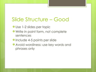
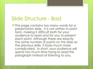
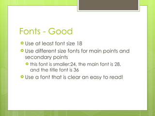
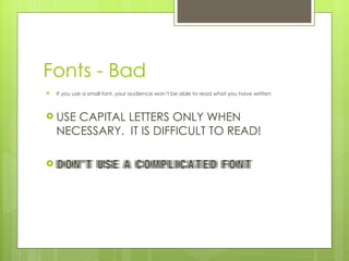
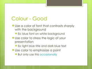
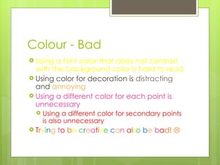
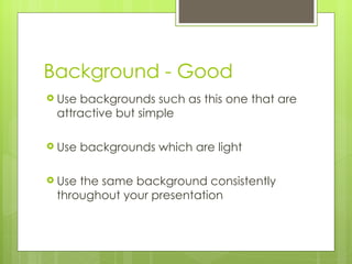
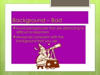
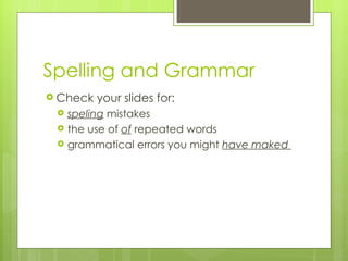
Making Good PowerPoint Slides Avoiding Bad Slides
Slide Structure – Good Use 1-2 slides per topic Write in point form, not complete sentences Include 4-5 points per slide Avoid wordiness: use key words and phrases only
Slide Structure - Bad This page contains too many words for a presentation slide.  It is not written in point form, making it difficult both for your audience to read and for you to present each point. Although there are exactly the same number of points on this slide as the previous slide, it looks much more complicated.  In short, your audience will spend too much time trying to read this paragraph instead of listening to you.
Slide Structure – Good Show one point at a time: Will help audience concentrate on what you are saying Will prevent audience from reading ahead Will help you keep your presentation focused
Slide Structure - Bad Do not use distracting animation Do not go overboard with the animation!
Fonts - Good Use at least font size 18 Use different size fonts for main points and secondary points this font is smaller:24, the main font is 28, and the title font is 36 Use a font that is clear an easy to read!
Fonts - Bad If you use a small font, your audience won’t be able to read what you have written USE CAPITAL LETTERS ONLY WHEN NECESSARY.  IT IS DIFFICULT TO READ! Don’t use a complicated font
Colour - Good Use a color of font that contrasts sharply with the background Ex: blue font on white background Use color to stress the logic of your presentation Ex: light blue title and dark blue text Use color to emphasize a point But only use this  occasionally
Colour - Bad Using a font color that does not contrast with the background color is hard to read  Using color for decoration is  distracting  and  annoying Using a different color for each point is unnecessary Using a different color for secondary points is also unnecessary T r y i n g  t o   b e  c r e a t i v e   c a n  a l s o   b e  b a d!  
Background - Good Use backgrounds such as this one that are attractive but simple Use backgrounds which are light Use the same background consistently throughout your presentation
Background – Bad Avoid backgrounds that are distracting or difficult to read from Always be consistent with the background that you use
Spelling and Grammar Check your slides for: speling  mistakes the use of  of  repeated words grammatical errors you might  have maked
Conclusion Use an effective and strong closing Your audience is likely to remember your last words Thank you audience!  

Presentation Tips 2011

  • 1.
    Making Good PowerPointSlides Avoiding Bad Slides
  • 2.
    Slide Structure –Good Use 1-2 slides per topic Write in point form, not complete sentences Include 4-5 points per slide Avoid wordiness: use key words and phrases only
  • 3.
    Slide Structure -Bad This page contains too many words for a presentation slide. It is not written in point form, making it difficult both for your audience to read and for you to present each point. Although there are exactly the same number of points on this slide as the previous slide, it looks much more complicated. In short, your audience will spend too much time trying to read this paragraph instead of listening to you.
  • 4.
    Slide Structure –Good Show one point at a time: Will help audience concentrate on what you are saying Will prevent audience from reading ahead Will help you keep your presentation focused
  • 5.
    Slide Structure -Bad Do not use distracting animation Do not go overboard with the animation!
  • 6.
    Fonts - GoodUse at least font size 18 Use different size fonts for main points and secondary points this font is smaller:24, the main font is 28, and the title font is 36 Use a font that is clear an easy to read!
  • 7.
    Fonts - BadIf you use a small font, your audience won’t be able to read what you have written USE CAPITAL LETTERS ONLY WHEN NECESSARY. IT IS DIFFICULT TO READ! Don’t use a complicated font
  • 8.
    Colour - GoodUse a color of font that contrasts sharply with the background Ex: blue font on white background Use color to stress the logic of your presentation Ex: light blue title and dark blue text Use color to emphasize a point But only use this occasionally
  • 9.
    Colour - BadUsing a font color that does not contrast with the background color is hard to read Using color for decoration is distracting and annoying Using a different color for each point is unnecessary Using a different color for secondary points is also unnecessary T r y i n g t o b e c r e a t i v e c a n a l s o b e b a d! 
  • 10.
    Background - GoodUse backgrounds such as this one that are attractive but simple Use backgrounds which are light Use the same background consistently throughout your presentation
  • 11.
    Background – BadAvoid backgrounds that are distracting or difficult to read from Always be consistent with the background that you use
  • 12.
    Spelling and GrammarCheck your slides for: speling mistakes the use of of repeated words grammatical errors you might have maked
  • 13.
    Conclusion Use aneffective and strong closing Your audience is likely to remember your last words Thank you audience! 