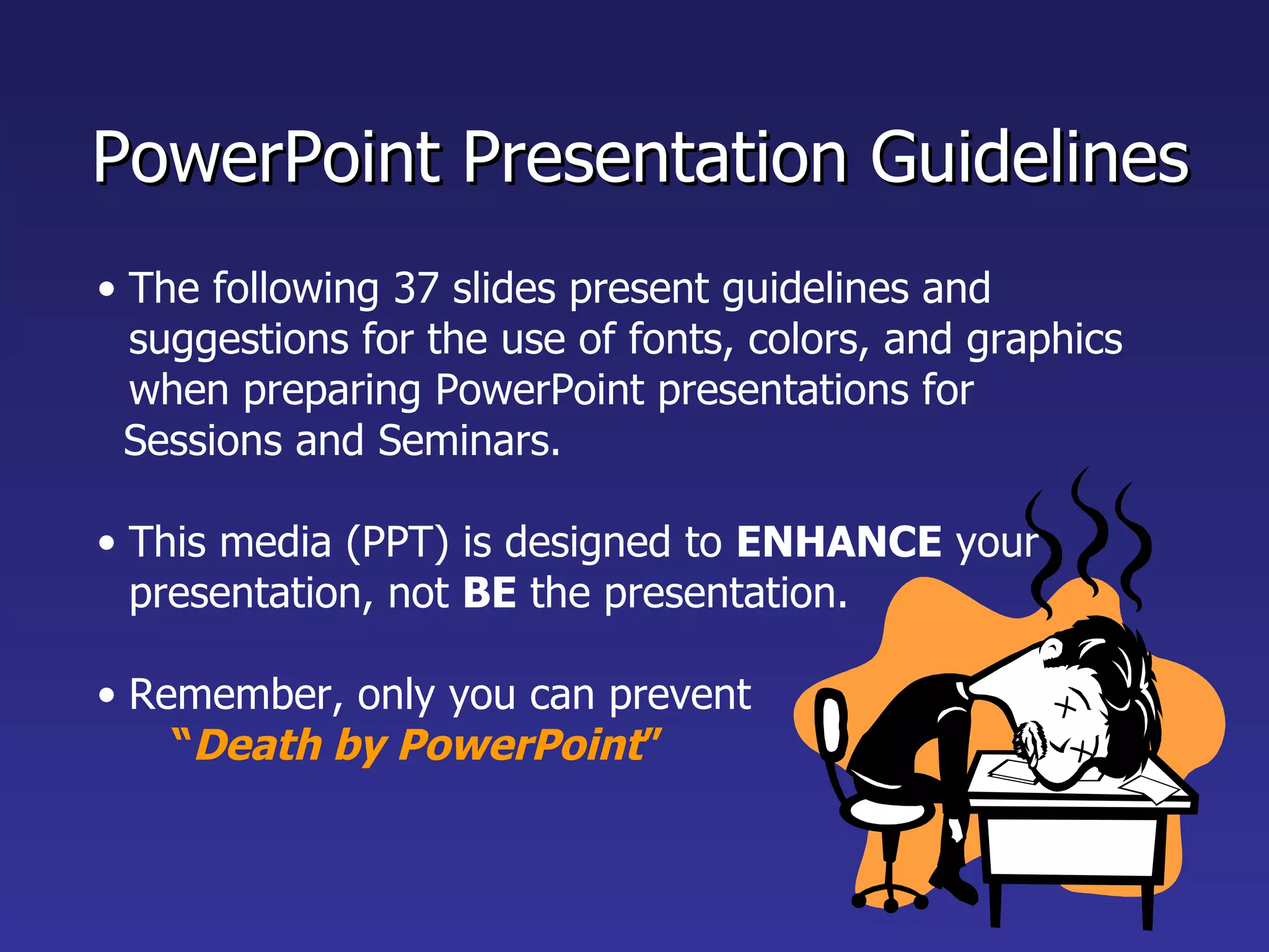
The document provides guidelines for creating effective PowerPoint presentations, including:
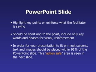
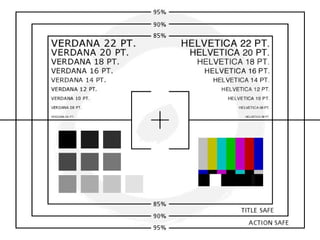
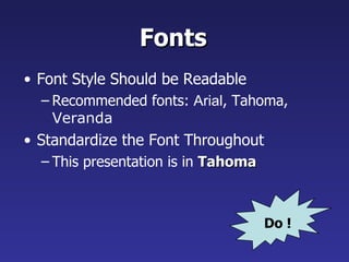
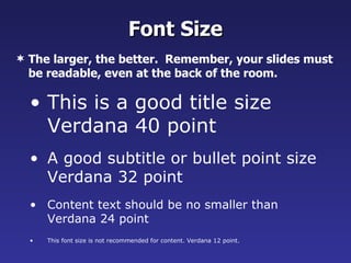
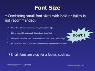
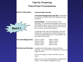
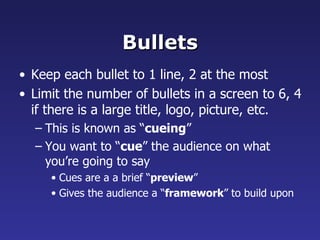
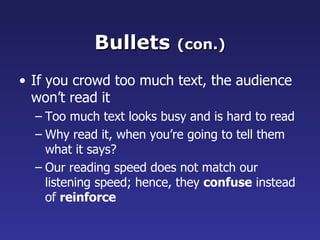
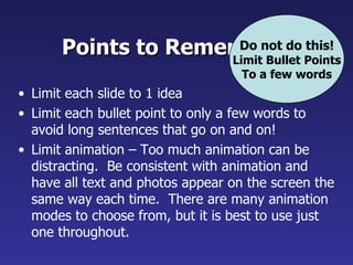
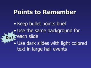
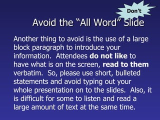
- Keep slides concise with key points, using large readable fonts. Limit content to fit on most screens.
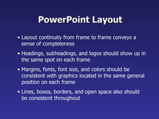
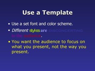
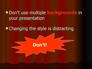
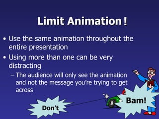
- Maintain consistent layout, formatting, colors and graphics across slides for continuity.
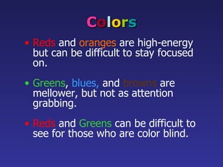
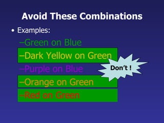
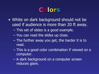
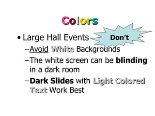
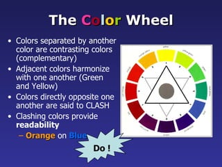
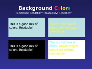
- Use dark backgrounds with light text for large presentations. Avoid busy or hard to read color combinations.
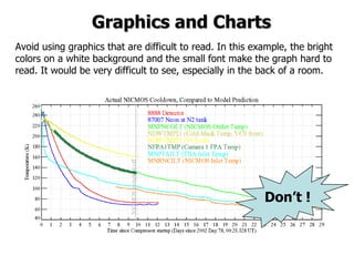
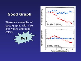
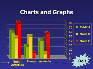
- Include only simple graphs and tables that clearly display information. Limit each slide to one main idea and use bullet points to break it into components.