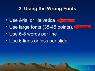
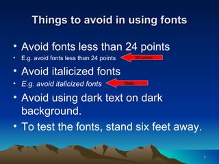
TEN MISTAKES IN POWERPOINT PRESENTATION
Have you experienced that… You walked into the meeting room, They dimmed the light, The presenter click on the mouse again and again. Guess what happen next…
After five minutes or so… They start nodding Or meditating? Maybe praying?
What can go wrong? Anything can go wrong, at anytime  However mistakes can be avoided Let’s look at 10 common mistakes often found in PowerPoint presentations
1. Poor Knowledge on the Topic Do it only if your are ready, Use cue cards, Don’t give the handout at the beginning, Don’t read word by word, Be confident.
2. Using the Wrong Fonts Use Arial or Helvetica Use large fonts (35-45 points),  Use 6-8 words per line Use 6 lines or less per slide 36 points Arial
Things to avoid in using fonts Avoid fonts less than 24 points E.g. avoid fonts less than 24 points Avoid italicized fonts E.g. avoid italicized fonts Avoid using dark text on dark background. To test the fonts, stand six feet away. 20 points Italic
3. Using the Wrong Background Avoid using too many colors,  Limit the colors on each screen, Poor background choices will resulted in poor visibility, E.g. next slide… Next
Font colour and backgrounds Text should be an appropriate contrast to the background Avoid this combination it is too dark
4. Poor Text Color  Choose the right text contrast, Use the high contrast so that easy to read, Like white text on dark blue, E.g. this is very poor text color Poor color
5.   Text too Small Avoid using small text, Use over 30 points size text, Not less than 24 points, e.g. this text is too small 20 points
6. Use Bullet Points Use bullet points for key ideas, Avoid using to many bullets, Don’t use more than 6 lines per slide, Use full sentences only when quote.
Avoid too many bullet points avoid too many bullet points avoid too many bullet points Avoid too many bullet points Avoid too many bullet points Avoid too many bullet points avoid too many bullet points Avoid too many bullet points Avoid too many bullet points Avoid too many bullet points This is bad
7. Spelling and Grammar Check Click on Tools, Easy to check for erors, However, some words can’t be check, … .. And most people think there grate at spelling
8. Annoying Animations and Sound Effect Animation with sound effect distract, It can be effective if wisely used, Avoid flashy, flying and twirling animation, Use less annoying like Appear effect and Dissolve effect, Avoid using sound effect.
Annoying animation and sound effect
9. Don’t Copy Images from Websites Check out the copyright issues, Choose from the clip art, If websites, get free photos at Photoshop Tutorials Blog, Get wmf file with vector images, www.flickr.com/creativecommons/
Enlarged Pictures from the Website stretch Stretch up
10. Remember Your Audience Take full control of your audience, Don’t speak to yourself but speak out, You should be the main attraction not the PowerPoint, Speak to your audience not the screen, Control your voice.
Extra Tips Use the K.I.S.S. principle  Check all the equipment Rehearse, Bring extra projector bulb, Check the lines of sight,
PowerPoint is not Evil! If only we can avoid these silly ten mistakes, Much more better than… This one
PowerPoint is Great! Thank You

Ten Mistakes In Powerpoint Presentation2854

  • 1.
    TEN MISTAKES INPOWERPOINT PRESENTATION
  • 2.
    Have you experiencedthat… You walked into the meeting room, They dimmed the light, The presenter click on the mouse again and again. Guess what happen next…
  • 3.
    After five minutesor so… They start nodding Or meditating? Maybe praying?
  • 4.
    What can gowrong? Anything can go wrong, at anytime However mistakes can be avoided Let’s look at 10 common mistakes often found in PowerPoint presentations
  • 5.
    1. Poor Knowledgeon the Topic Do it only if your are ready, Use cue cards, Don’t give the handout at the beginning, Don’t read word by word, Be confident.
  • 6.
    2. Using theWrong Fonts Use Arial or Helvetica Use large fonts (35-45 points), Use 6-8 words per line Use 6 lines or less per slide 36 points Arial
  • 7.
    Things to avoidin using fonts Avoid fonts less than 24 points E.g. avoid fonts less than 24 points Avoid italicized fonts E.g. avoid italicized fonts Avoid using dark text on dark background. To test the fonts, stand six feet away. 20 points Italic
  • 8.
    3. Using theWrong Background Avoid using too many colors, Limit the colors on each screen, Poor background choices will resulted in poor visibility, E.g. next slide… Next
  • 9.
    Font colour andbackgrounds Text should be an appropriate contrast to the background Avoid this combination it is too dark
  • 10.
    4. Poor TextColor Choose the right text contrast, Use the high contrast so that easy to read, Like white text on dark blue, E.g. this is very poor text color Poor color
  • 11.
    5. Text too Small Avoid using small text, Use over 30 points size text, Not less than 24 points, e.g. this text is too small 20 points
  • 12.
    6. Use BulletPoints Use bullet points for key ideas, Avoid using to many bullets, Don’t use more than 6 lines per slide, Use full sentences only when quote.
  • 13.
    Avoid too manybullet points avoid too many bullet points avoid too many bullet points Avoid too many bullet points Avoid too many bullet points Avoid too many bullet points avoid too many bullet points Avoid too many bullet points Avoid too many bullet points Avoid too many bullet points This is bad
  • 14.
    7. Spelling andGrammar Check Click on Tools, Easy to check for erors, However, some words can’t be check, … .. And most people think there grate at spelling
  • 15.
    8. Annoying Animationsand Sound Effect Animation with sound effect distract, It can be effective if wisely used, Avoid flashy, flying and twirling animation, Use less annoying like Appear effect and Dissolve effect, Avoid using sound effect.
  • 16.
  • 17.
    9. Don’t CopyImages from Websites Check out the copyright issues, Choose from the clip art, If websites, get free photos at Photoshop Tutorials Blog, Get wmf file with vector images, www.flickr.com/creativecommons/
  • 18.
    Enlarged Pictures fromthe Website stretch Stretch up
  • 19.
    10. Remember YourAudience Take full control of your audience, Don’t speak to yourself but speak out, You should be the main attraction not the PowerPoint, Speak to your audience not the screen, Control your voice.
  • 20.
    Extra Tips Usethe K.I.S.S. principle Check all the equipment Rehearse, Bring extra projector bulb, Check the lines of sight,
  • 21.
    PowerPoint is notEvil! If only we can avoid these silly ten mistakes, Much more better than… This one
  • 22.