Downloaded 125 times


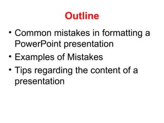
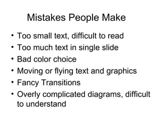

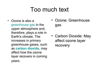
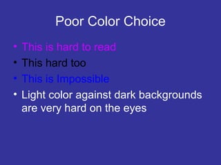
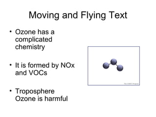

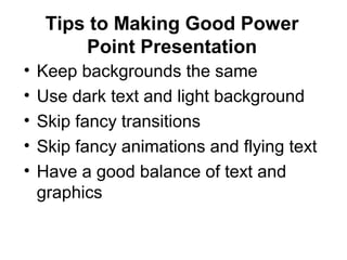
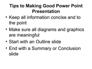
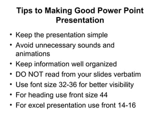
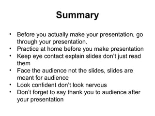
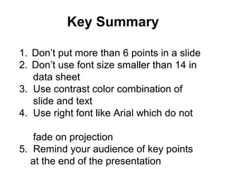


The document provides guidance on creating effective PowerPoint presentations, highlighting common mistakes such as small text, excessive content, poor color choices, and unnecessary animations. It emphasizes the importance of clear, concise information and effective slide design, recommending optimal text size, layout, and audience engagement techniques. Key tips include using consistent backgrounds, limiting bullet points per slide, and practicing presentation delivery for better engagement.
![Introduction to Graphic Design PDF [slideshare]](https://cdn.slidesharecdn.com/ss_thumbnails/prologuegraphicdesignslideshare-190815200118-thumbnail.jpg?width=640&height=640&fit=bounds)


